Photography Tutorial · 2020-03-01
One-Click Night Teal-Orange Grading with 3D LUT Creator
Thomas Chu Photo
Teal-orange / yellow-blue grading is a very popular look for city night photography.
In the earlier tutorials "How Is This Beautiful Night Tone Created?" and "The Chongqing Night Shots That Went Viral — Graded Like This!", Thomas shared how to achieve this look with various PS tools.
In today's video tutorial, Thomas shares a faster, handier technique: one-click night teal-orange grading with the 3D LUT Creator plugin.
Video Tutorial
▶ Watch the video tutorial on Bilibili
This is the fully illustrated companion to the video above. Thomas used to jump between five or six tools — Camera RAW white balance, HSL, Split Toning, even Selective Color — to grade night shots teal-orange; in this tutorial a single AB panel inside 3D LUT Creator does it in one pass (a technique he learned from Ye Luo's 3D LUT Creator course). Below, every step is broken out with screenshots and timestamps so you can follow along in the video.
The core idea first: the AB panel is essentially a hue wheel. Direction encodes hue — red 0°, orange 30°, yellow 60°, green 120°, cyan 180°, blue 240°, purple 270°, magenta 300° (1:31 in the video); radius encodes saturation — grayer toward the center, more vivid toward the rim. Once this one map clicks, every move that follows is just 'drag a point from A to B'.
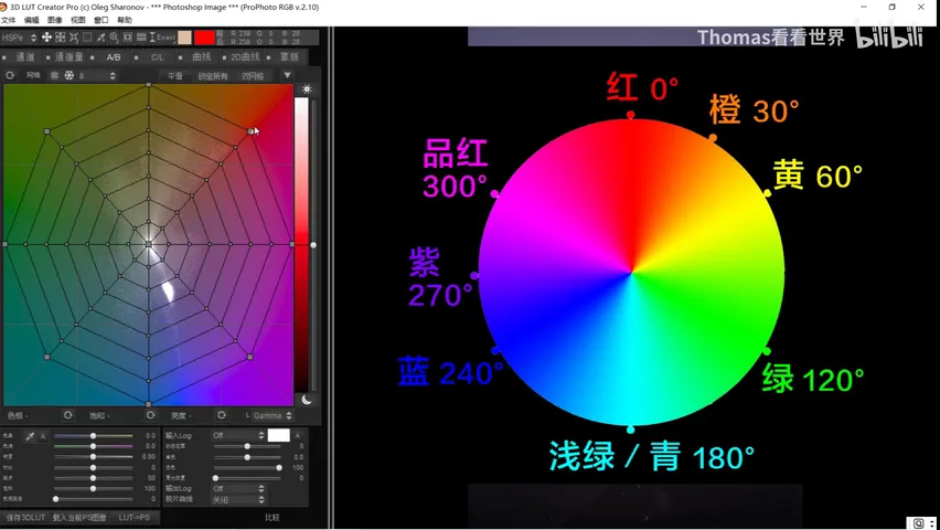
01 Meet the AB Panel: One Hue Wheel, Two Jobs
3D LUT Creator is a professional-grade color grading program with many analysis and adjustment tools PS lacks. The workflow is simple: open the photo in Photoshop first, then choose 'import current PS image' and it lands inside 3D LUT Creator (1:01 in the video). Today's subject is the Hong'en Pavilion in Chongqing at night — a purple sky with orange-yellow lights, perfect raw material for a teal-orange grade.
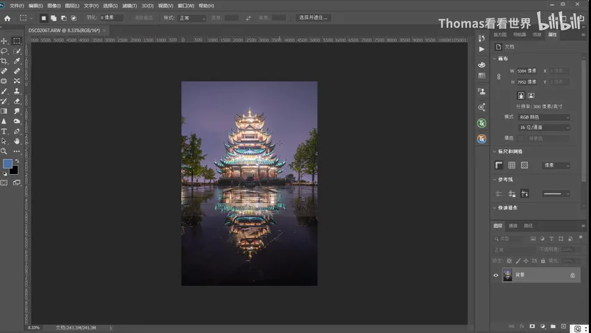
The AB panel spreads the photo's colors across the wheel: the mesh shows the image's color distribution, and dragging any point shifts the corresponding colors in the picture. Compared with Photoshop's Hue/Saturation, its algorithm is better behaved — even large moves rarely produce hue banding (2:55 in the video).
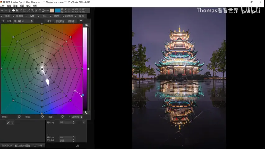
02 Drag a Point: Free Hue and Saturation
How intuitive is hue shifting? The sky leans heavily purple, so drag the purple point toward red and the sky turns red; drag it toward green and it turns green on the spot (2:14 in the video). The lights are mostly yellow-orange: pull them toward green and they go green, toward blue and the whole row of lamps flips blue (2:35 in the video) — as if the palette of the whole frame were being turned by hand.
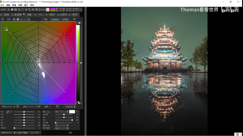
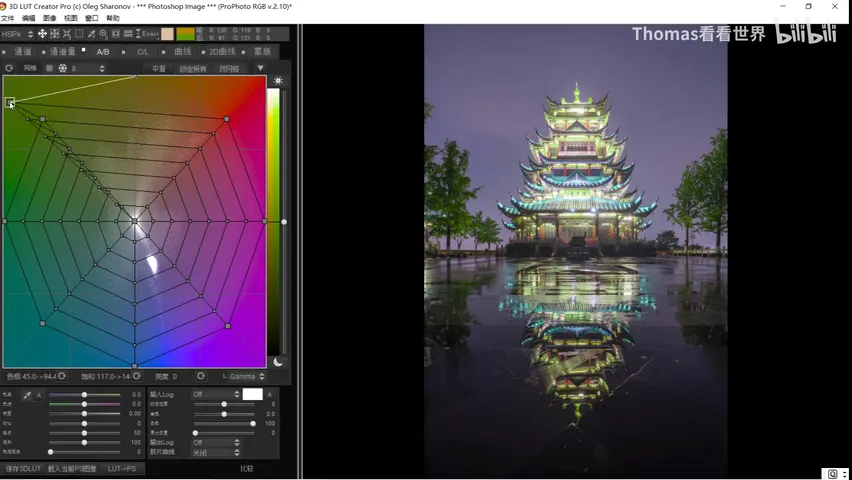
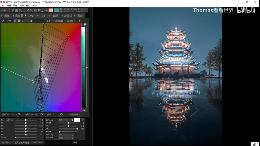
Saturation lives along the radius: pull toward the center to desaturate, toward the rim to intensify. Night frames often need the cluttered color of plants tamed — gather the yellow-green and cyan-green points toward the center and the trees' green recedes into gray, no longer stealing the show; in reverse, push any color outward to make it pop (3:20 in the video).
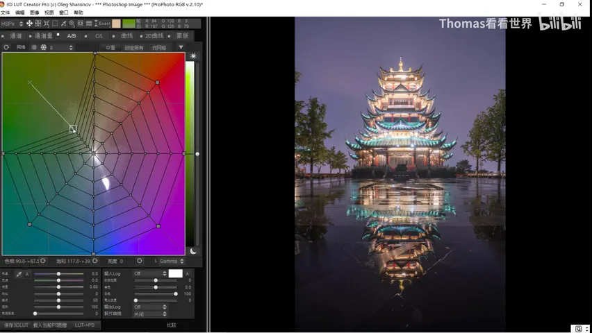
03 Teal-Orange in Two Moves: Neutrals First, Then Unify
The teal-orange idea boils down to two moves (3:56 in the video): first, cool the white balance overall by shifting the image's neutral colors toward cyan and blue; second, unify the palette — all warms gathered into orange, all cools into teal. Let's run both moves on the AB panel.
Move one, set the white balance. The panel's center point represents neutrals with zero saturation; drag it toward blue and the whole photo's white balance eases into blue — the 'night' in the night shot appears immediately (4:27 in the video).
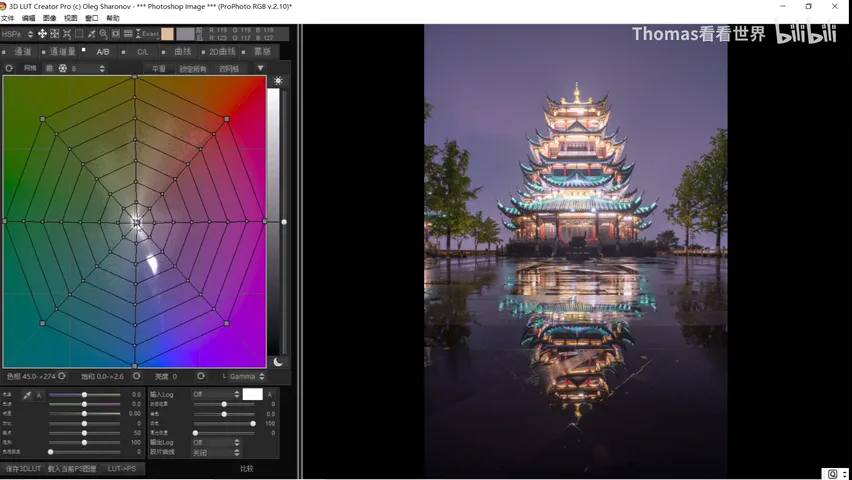
Move two, unify the colors. Drag the purples toward blue, and gather the cyans into the teal-blue family as well (4:45 in the video). On the warm side, nudge yellow slightly toward orange and ease red leftward so it folds into orange-yellow — but Thomas deliberately pulls only a little, keeping the layered variation of red and yellow so the warm areas don't smear into one blob (5:16 in the video).
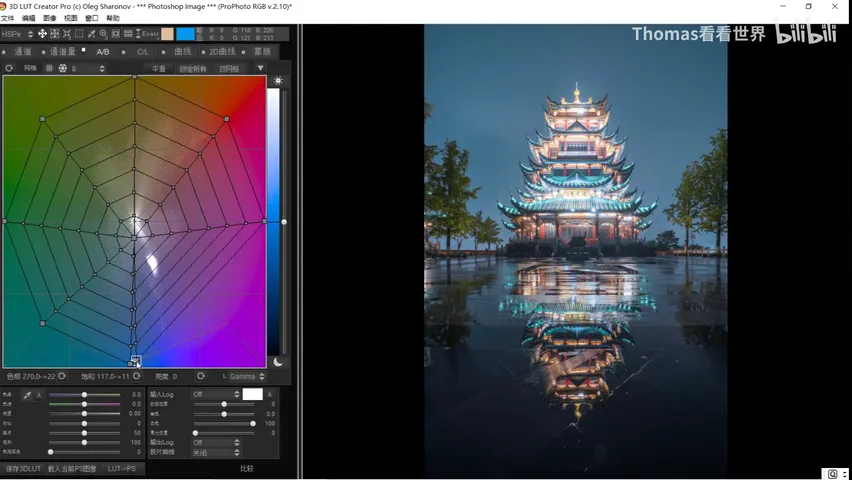
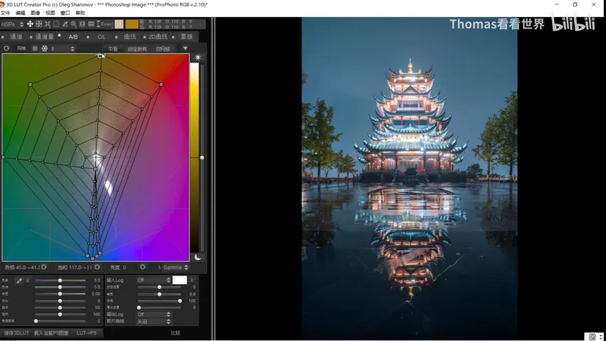
Green invites several treatments: desaturate it toward the center as before, or shift its hue outright — toward yellow looks odd, so Thomas pulls green into cyan-blue and folds it into the cool family, saving the frame's focal core for the warm roofline of the Hong'en Pavilion at center (5:41 in the video).
04 Back to PS in One Click: A Single LUT Layer
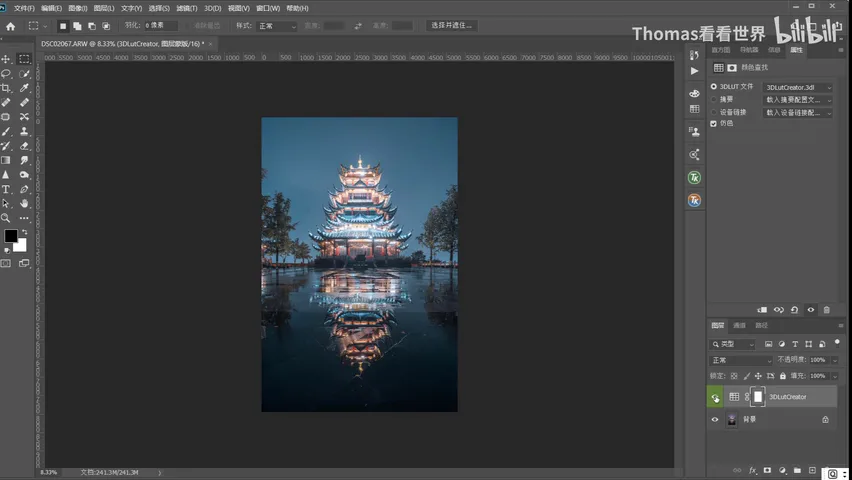
When the grade is done, click 'back to PS' and the software applies the look as a brand-new 3D LUT (Color Lookup) adjustment layer (6:17 in the video). A teal-orange grade that used to be ground out across white balance, HSL, Split Toning and Selective Color now lands in one tool, one pass — stylized grading stops being a chore.
1. The AB panel in 3D LUT Creator is a hue wheel: direction controls hue, radius controls saturation — one map that governs every color in the photo; 2. Its algorithm beats the Hue/Saturation tool, so even large shifts avoid hue banding; 3. Night teal-orange in two moves — drag the neutrals (the center) toward blue to set white balance, then unify warms into orange, cools into teal, pulling green toward cyan while keeping warm-side variation; 4. One click back to PS and the look lands as a 3D LUT adjustment layer — one tool replacing five or six.