Photography Tutorial · 2019-09-15
Finally Clear on All the Color Tools! A Full ACR/LR Color Workflow Summary
Thomas Chu Photo
There are many post-processing color grading tools, each with its own applicable range.
In today's tutorial, following the three big grading steps — establishing the base tone, color matching, and local fine-tuning — Thomas summarizes and organizes all the grading tools in Lightroom and Adobe Camera Raw.
After this, you'll understand the usage and differences of Camera Raw's color tools: white balance temperature, tint, saturation, vibrance, the Camera Calibration panel, split toning, color curves, HSL, radial filters, graduated filters, the adjustment brush and more.
Video Tutorial
▶ Watch the video tutorial on Bilibili
This is the fully illustrated companion to the video above. ACR and Lightroom offer a dozen-plus grading tools, and most people's confusion is not how a slider works but which one to touch first, and which stage each tool belongs to. In this tutorial Thomas gives the master outline — three big steps: set the base tone, do the color matching, then fine-tune locally — and hangs every grading tool on that skeleton. The chapters below keep the video's screenshots and timestamps.
First, the route map of the whole video (the summary card at 12:03): step one, set the base tone — only white balance and saturation; step two, color matching — calibration, split toning/curves, and HSL; step three, local fine-tuning — the brush, radial filter and graduated filter. Keep this map in mind and every detail below falls into place.

01 Set the Base Tone: White Balance First, Then Saturation
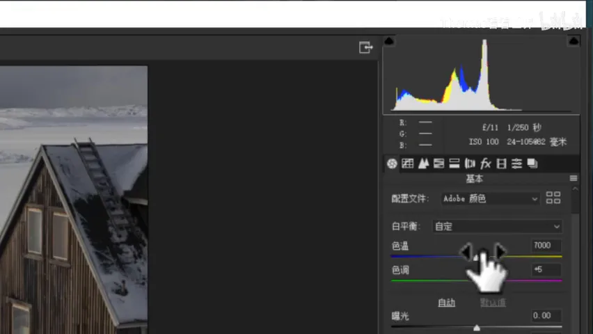
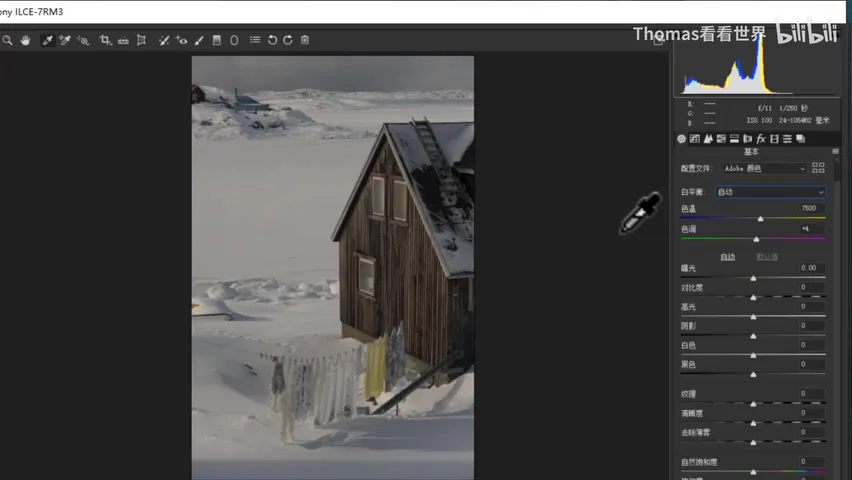
Why must white balance come first? Thomas proves it with a snowy cabin photo (1:35 in the video): with an off white balance, cranking yellow saturation in HSL barely moves the yellow jacket in frame; after correcting the white balance, the same slider makes it bloom instantly. If the base tone is wrong, every later move circles on a faulty foundation — so calibrating white balance is always step one.
There are three routes to correct white balance (2:17 in the video): drag the temperature and tint sliders by eye — temperature left goes bluer, right more yellow; tint left greener, right more magenta — until the neutrals look right; try 'Auto' first, which is quite accurate most of the time; or use the White Balance Selector tool — when the frame contains something you know is white or neutral gray, one click on it recalibrates everything, like the jacket here that really should be white (2:56 in the video).
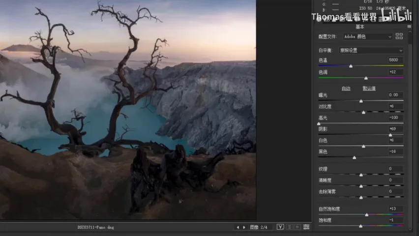
The other half of the base tone is saturation, and vibrance should usually come before saturation (3:28 in the video): plain saturation treats all colors equally and tips into excess fast — the soil in the photo turns obviously fake; vibrance boosts the least-saturated colors first and goes easy on skin and earthy yellows that are already near clipping. Thomas's habit: +50-60 of vibrance is still safe, and only fine-tune globally with saturation afterwards.
02 Camera Calibration: Turn Chaos into Complementary Colors
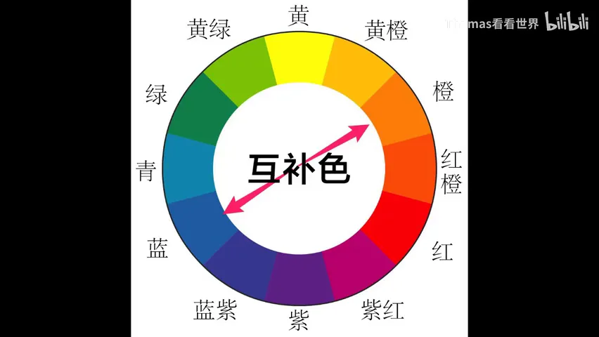
With the base tone set, color matching begins. Thomas's first tool of choice is the Camera Calibration panel (4:42 in the video): the theory is complex, but one rule suffices — moving a primary's hue converges the image's many colors into a pair of complements. Blue primary left, and the whole photo resolves into a teal-orange contrast (5:17 in the video); right, it becomes green-purple (5:51 in the video); green primary left gives yellow-blue (5:56 in the video). Fewer hues, more unified color — excellent for cleaning up visual clutter.
How far to move them on any given photo? No numbers to memorize — just drag each slider both ways and watch (6:18 in the video): in this canyon-with-bare-tree frame, blue primary left made the water's teal cleaner; green primary right felt off while left felt softer overall; red primary left faked the yellows, right looked better. Two directions per slider, and the direction of your color scheme reveals itself.
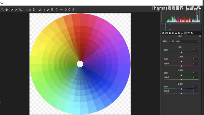
Of the three primaries' saturation sliders, red and green are rarely touched — blue primary saturation gets all the use (7:00 in the video): raising it pumps blue, cyan and purple strongly while the warm colors are lifted only gently. When you want the landscape's colors to bloom naturally, raise blue primary saturation — cools strengthen while warms quietly follow, far more organic than dragging plain saturation.
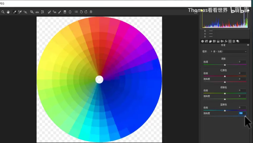
03 Split Toning, Curves and HSL: Color by Luminance Zone
After calibration comes coloring the luminance zones separately — the tools are Split Toning or Curves, purely a matter of habit (7:54 in the video). Split Toning is direct: pick orange for the highlights and raise its saturation, and the bright zones take on a unified orange cast (8:02 in the video); add a touch of blue to the shadows for contrast, but just a touch (8:27 in the video). Its essence is adding color to a luminance zone — and unifying that zone's tone along the way.
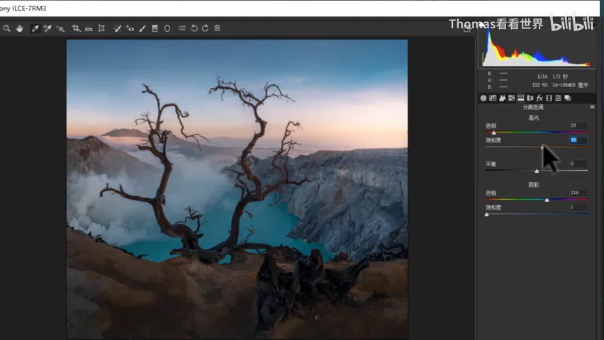
The same effect can be replicated exactly with curves (8:39 in the video): add red in the highlights and none — or a little cyan — in the shadows, mirroring orange highlights and blue shadows; lower the blue channel in the highlights for a warmer tint, raise it in the shadows for blue; then drift the midtones slightly purple (9:19 in the video). Curves buy finer control of luminance ranges at the cost of a steeper learning curve.
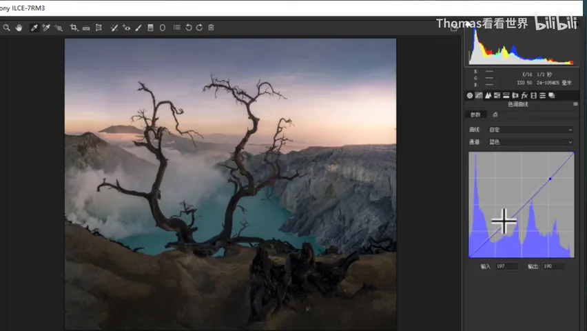
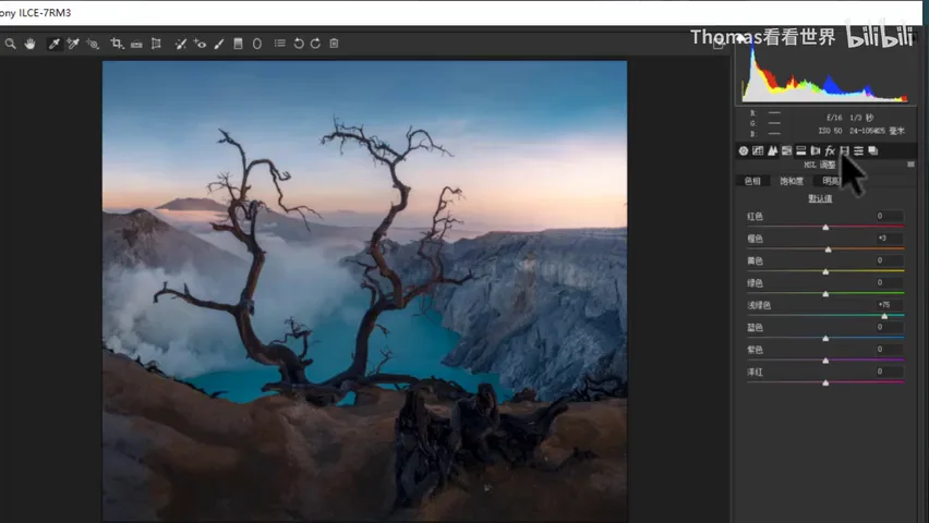
The last and most straightforward matching tool is HSL (9:43 in the video): eight colors — red, orange, yellow, green, cyan, blue, purple, magenta — each with its own hue, saturation and luminance. To make the cyan water brighter here, lift the luminance of both blue and cyan and add a bit of saturation (10:04 in the video). With calibration, split toning/curves and HSL working together, an orange-blue scheme for the photo takes shape.
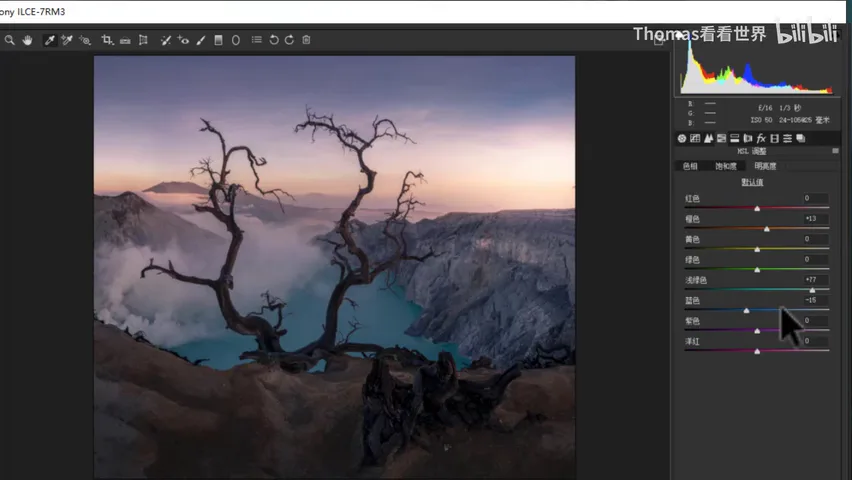
04 Local Fine-Tuning: Graduated, Radial and the Brush
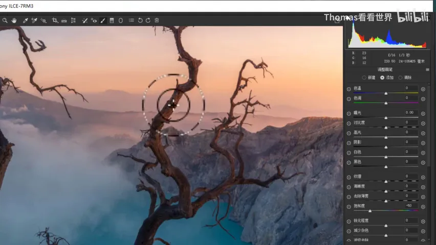
With the global palette settled, only locals remain. The soil at the bottom is oversaturated: create a graduated filter over the ground and ease its saturation down (10:49 in the video). To add light, drop a radial filter around the mountain and push its tint, saturation and temperature warm — the horizon floods with red glow in an instant, and an evening-light effect is born (11:06 in the video; the demo exaggerates on purpose — rein it in for real work).
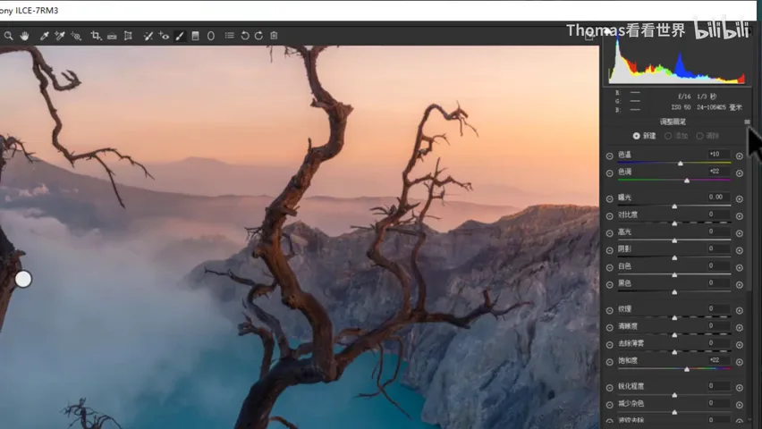
For smaller spots there is the brush: the bare branch in the foreground is too bright and too saturated, so paint along it and pull down brightness and saturation (11:27 in the video). The graduated filter handles whole swaths, the radial filter an area, the brush a specific spot — precision from coarse to fine, and that is the final step of the ACR color workflow.
1. Grade in three steps: set the base tone (white balance + saturation), do the color matching (calibration + split toning/curves + HSL), then fine-tune locally (graduated + radial + brush) — never out of order; 2. With an inaccurate white balance every later move circles on a faulty foundation — fix it via manual sliders, Auto, or clicking a neutral gray with the selector; 3. Prefer vibrance over saturation: it lifts the dull, spares the vivid, and prevents clipping; 4. Moving primary hues in Camera Calibration converges the whole image into complementary pairs — blue primary left gives teal-orange, and blue primary saturation is the shortcut to gently rich landscape colors.