Photography Tutorial · 2017-12-24
Every Post-Processing Color Grading Method in One Article
In this article, AdventureX photographer Miller姚明来 rounds up every color-adjustment method.
Read on for the common color-adjustment techniques, with their pros and cons.
1
Selective Color
This command lives in the adjustment-layer menu at the bottom of the Layers panel:
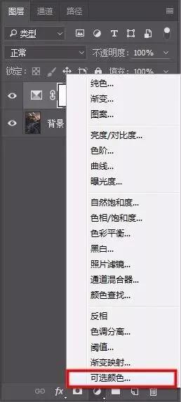
The Colors option offers 9 adjustable colors, and the final three — white, black, gray — target the highlights, shadows, and midtones respectively.
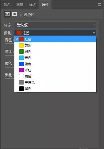
Pick the color you want to change, then move the sliders below left or right to shift its hue.
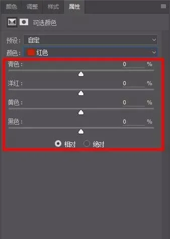
Before adjusting, you first need to understand how colors relate to one another.
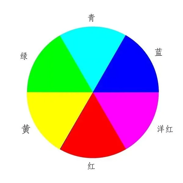
If I want the reds in the frame to be redder — closer to a sunset hue — I move the Cyan slider left:
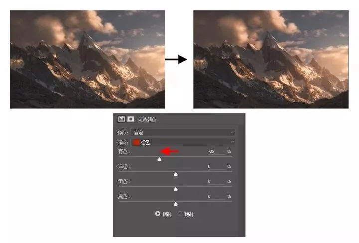
Because red and cyan are opposites, reducing cyan effectively adds red, making reds redder.
The formula below describes how colors mix:
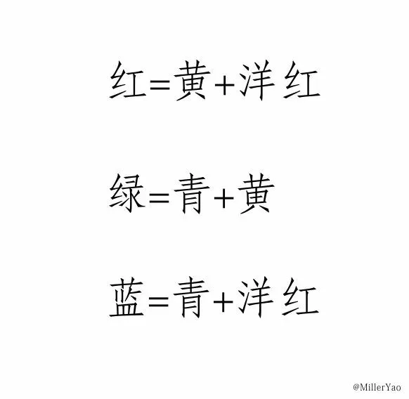
Red = Yellow + Magenta; Green = Cyan + Yellow; Blue = Cyan + Magenta
From the formula, red = yellow + magenta. So another way to make reds redder is to move both the Yellow and Magenta sliders right by the same amount.
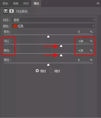
If yellow increases more than magenta, the extra yellow shifts the red toward orange.
All other colors in Selective Color follow the formulas in the two images above — extrapolate freely.
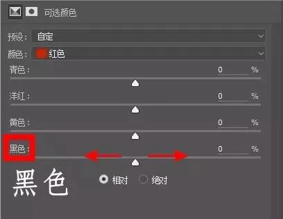
The final Black slider adjusts the lightness of the chosen color: right for deeper and richer, left for fresher and brighter.
Summary: Selective Color adjusts one color in the frame without affecting others — ideal for finely crafting a few specific colors.
2
Color Balance
Likewise, the Color Balance adjustment layer is found in the adjustment-layer menu at the bottom of the Layers panel.
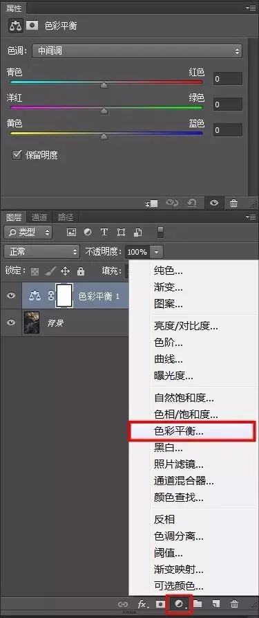
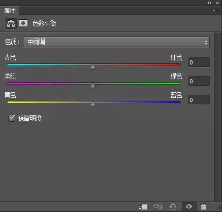
The Color Balance panel has three slider pairs: red–cyan, yellow–blue, and magenta–green.
For example, to add a cool tone to the shadows, select "Shadows" and move the Yellow–Blue slider right — the dark areas turn cooler.
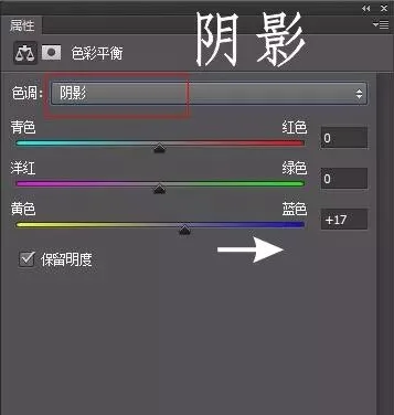
Summary: Color Balance quickly adjusts color across shadows, midtones, and highlights at large scale — usually to set a base color tone before fine work. For precise adjustment of a specific color, use other commands.
3
Hue/Saturation
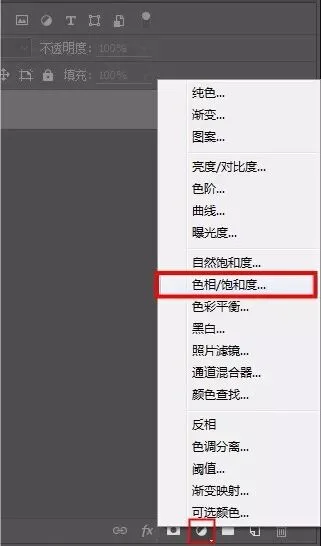
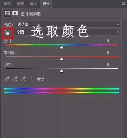
The usual approach: click the "hand symbol" in the panel — the cursor becomes an eyedropper over the image — and click to sample.
Here I want to change the hue of the blues: click the hand icon, move to the image, and sample the blue.
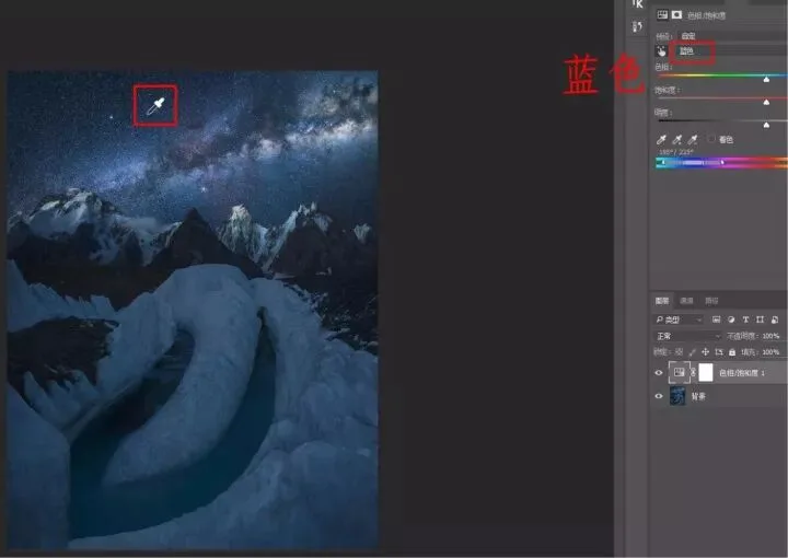
Then move the Hue slider below to change that color's hue.
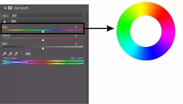
The Hue slider is really an unfolded color wheel — you can turn the selected color into any color on the wheel. The Saturation and Lightness sliders adjust its saturation and brightness.
Summary: Hue/Saturation quickly turns a selected color into whatever hue you want — typically used when a color clashes and needs replacing with a more suitable one. For details, see the article "A Powerful Color Adjustment Tool: Hue/Saturation."
4
Camera Raw Filter
After Photoshop moved to CC, Camera Raw became a standalone filter — so JPEGs can finally enjoy raw-style rapid adjustments.
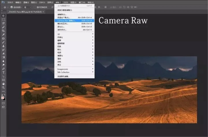
The White Balance row on top quickly shifts the frame warm or cool by combining Temperature and Tint.
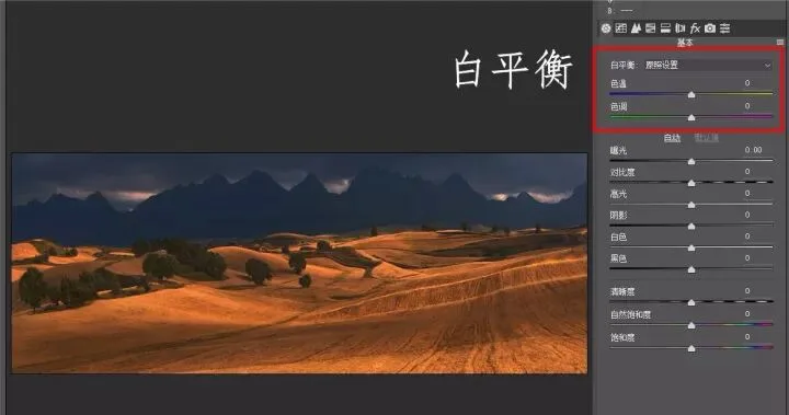
Summary: After repeated practice, I've found Camera Raw's white balance produces more realistic color than Color Balance — it's my go-to for large-area tonal treatment. Detailed tutorial: "Easy Photo Beautification — Understanding Lightroom's Basic Panel Tonal and Color Controls."
5
Photo Filter
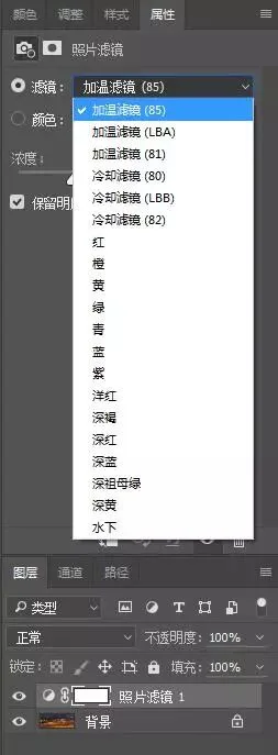
Photo Filter is also in the adjustment-layer menu; it changes the frame's tone by applying different colored filters:
You can also click the color swatch to open the picker and customize a color:
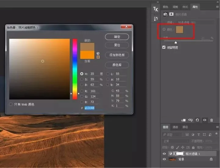
Summary: I rarely use Photo Filter — Camera Raw's white balance does the same job, more simply and intuitively.
6
Brush Painting
Painting with a colored brush where you want color gives finer local control than adjustment layers, with more delicate, realistic results.
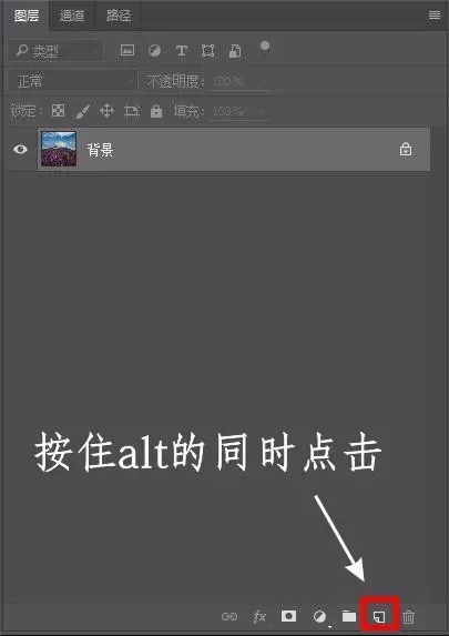
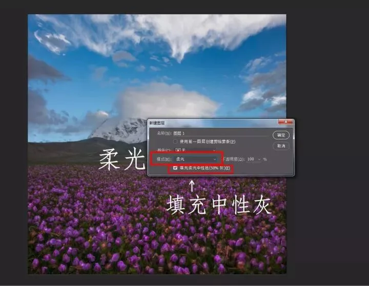
1. First, create a Soft Light layer filled with 50% neutral gray: hold Alt and click the New Layer button in the Layers panel.
In the dialog, set Mode to "Soft Light," then check "Fill with Soft-Light-neutral color (50% gray)."
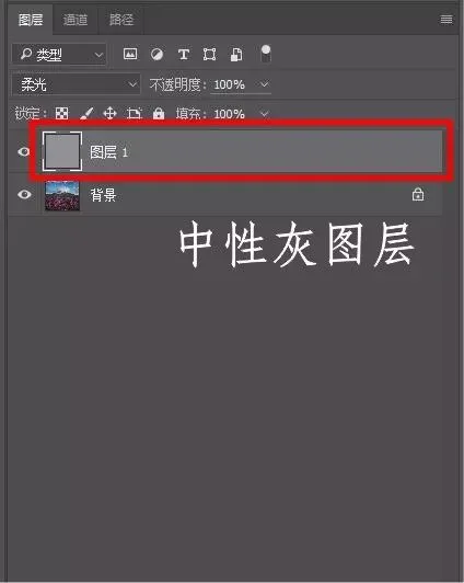
2. Click OK, and a gray-filled Soft Light layer appears in the Layers panel. It's like a transparent adjustment layer — nothing you do on it harms the original pixels. This layer is your canvas.
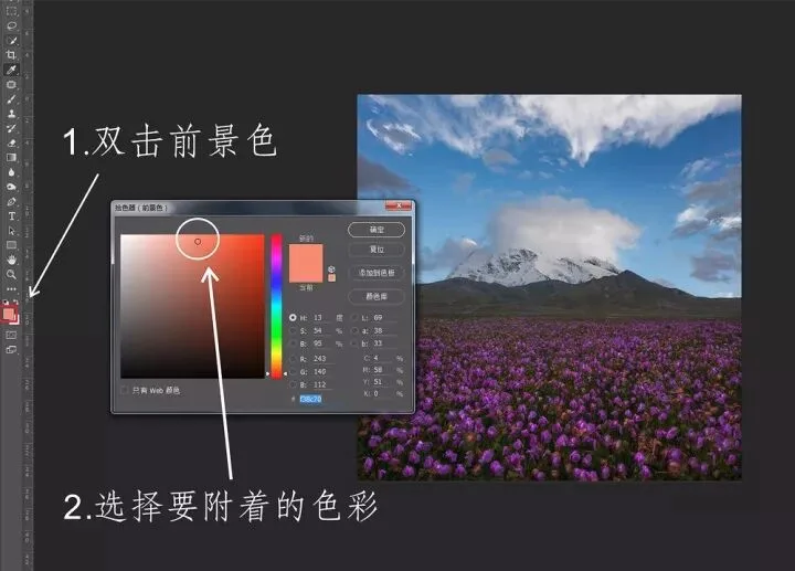
3. Take the Brush tool and double-click the foreground color to open the picker; choose the color you want to apply. Here I want to enhance the sunset clouds, so I pick an orange-red.
4. Paint with a low-opacity brush over the areas you want to color. After some painting, here is the final result:
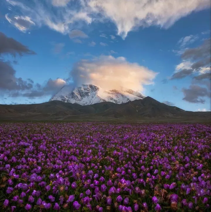
Comparing a crop of the clouds before and after painting, the color looks natural with no sense of dissonance.
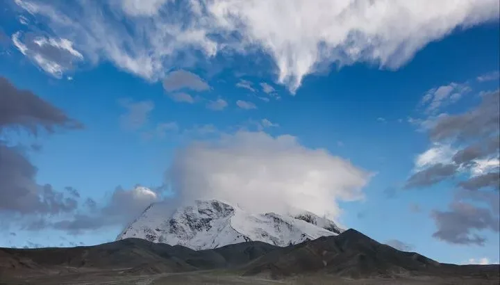
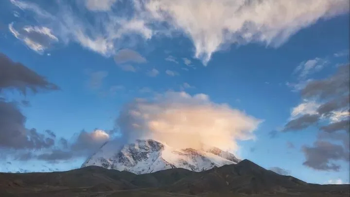
That method affects the brightness of the painted area along with the color. If we don't want to change brightness, we use the following method — it shifts hue only, never luminance.
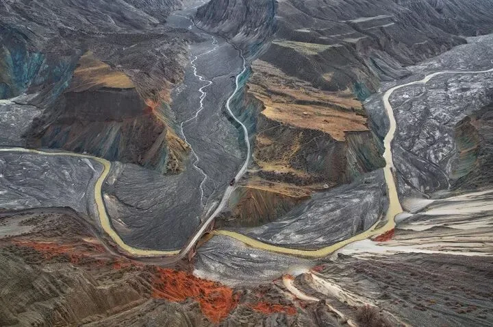
This is a canyon I shot in Xinjiang three years ago; it's also a mining area, and the colorful stains on the canyon walls are mineral deposits.
Suppose I want to turn the red rocks cyan without affecting their brightness. Simple: create a new blank layer as before, but set its blend mode to "Color."
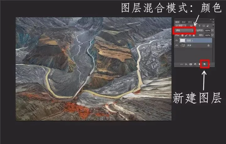
Then sample the cyan from the rock wall above with the eyedropper, and paint over the areas you want to recolor.
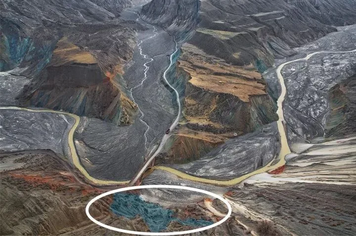
The circled area above is the painted region — from orange-red to cyan-blue. The hue changed completely while brightness stayed untouched.
Summary: There are many ways to apply color, and brush painting is definitely the most precise.
7
Curves Adjustment Layer
Add a Curves adjustment layer; it defaults to RGB, and dragging the curve then adjusts the frame's brightness.
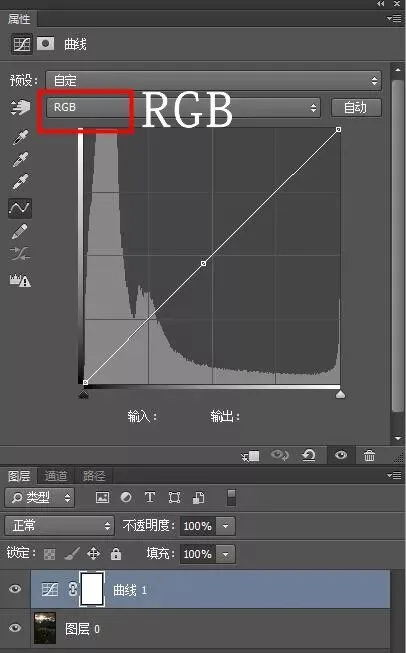
The dropdown offers the three primaries — red, green, blue. Pick the color you want to adjust, and shape the curve to color the shadows, midtones, and highlights.
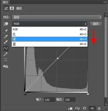
Beneath the curve sits the image's histogram: the X axis runs from shadows on the left through midtones to highlights on the right.
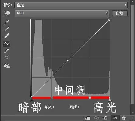
With a color channel selected, pulling the curve up adds that color to the corresponding tonal zone; pulling it down adds the color's opposite.
For example, I select the Red channel and shape the curve as shown:
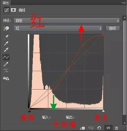
In the highlight region the curve goes up, so highlights get red. In the shadows the curve goes down, so shadows get red's opposite: cyan. Midtones from the center toward highlights turn red, while the darker midtones from center toward shadows turn cyan.
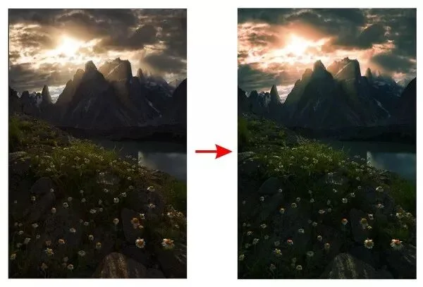
Here's the before-and-after comparison.
The same logic applies to the Green and Blue channels: remember their opposites (magenta and yellow), note which tonal zone the curve sits in, and the principle and scope of the adjustment become clear.
Summary: Curves can handle both sweeping global color grading and point-by-point fine adjustment of shadows, midtones, and highlights — a very commonly used technique.
8
Other Tools
Other complex grading tools — Nik filters, Gradient Maps, Channel Mixer, Calculations, and more — will be covered in future tutorials on the thomaskksj account.
A Word from Yao:
Over the years I've traveled widely, seen countless beautiful sights, and tasted countless foods. In the end, what I miss most is the plain yellow sea of my hometown, and my mother's simple stir-fried greens.
After trying countless post-processing styles and dazzling plugin effects, you may find that the ultimate color grade is simply restoring reality — what you see is what you get.