Photography Tutorial · 2023-07-16
This Photo Won an Award? Do Not Use "Art" as a Fig Leaf for Coterie Culture!
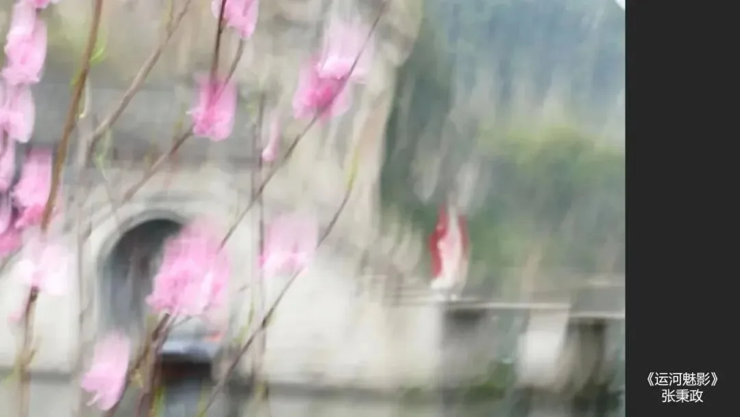
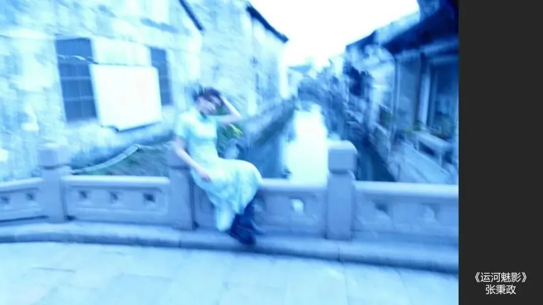
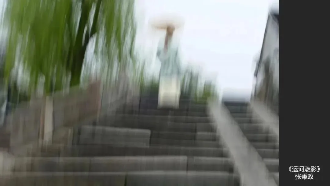
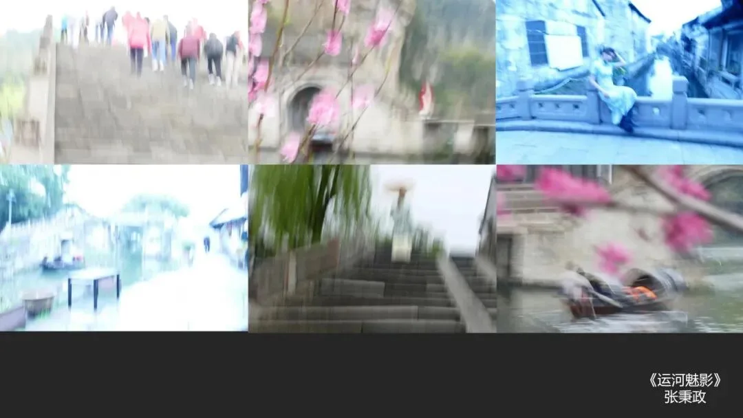
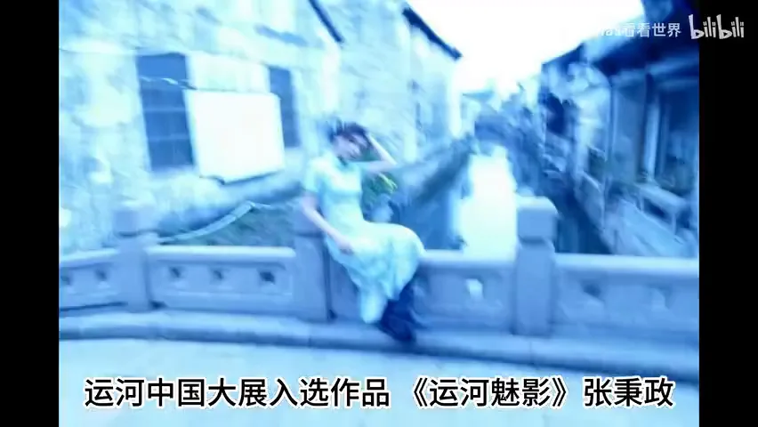
Many friends have asked me to comment on the award-winning "Canal Phantom" (《运河魅影》) incident. After much deliberation, although it may offend people, I will just state my conclusion directly:
1) The overall level of the "Canal Phantom" photo is not high
2) At his age, still trying new approaches, the photographer himself should not be overly blamed
3) What should really be questioned is the organizer: why select such an obvious "student exercise" for the major exhibition. Unless the coterie culture behind this - which values connections over skill - is eradicated, how can China move from an economic power to a cultural power?
This week's photography tutorial is not just venting emotion; it unfolds from three teaching dimensions:
1) Can out-of-focus, blurry photos be beautiful?
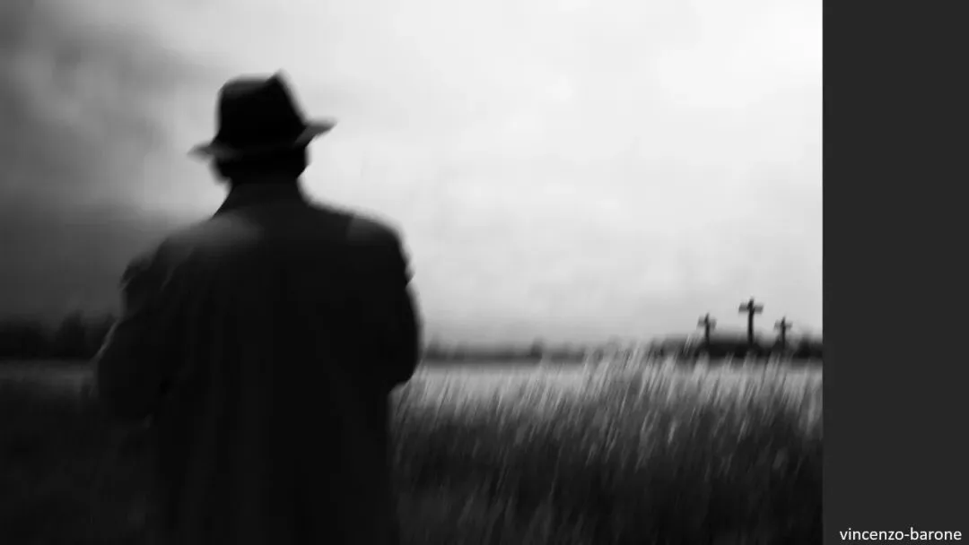
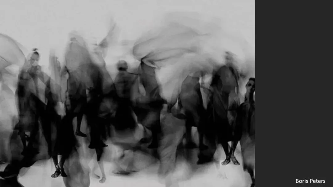
2) How can motion and defocus convey concepts and themes?
3) What famous blurred works are there in the history of photography?
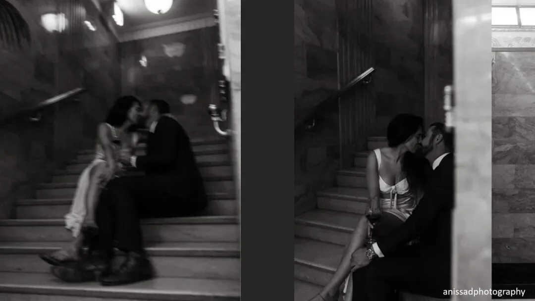
The tutorial will cite blurred works by photographers such as HenriFilm, anissadphotography, Todd Hido, Bresson, Capa, Edward Steichen, Man Ray, Hiroshi Sugimoto, and Masahisa Fukase as case studies.
Whether this set won the award because of "art" or for other reasons, after watching, you will be able to make an objective and fair assessment of similar photos too.
Video
▶ Watch the video tutorial on Bilibili
This is the illustrated companion to the video above. When a set of blurry canal photographs titled 'Canal Phantom' was selected for a major exhibition, the internet asked: this can win a prize? Rather than venting, Thomas turns it into a photography lesson: can blur be beautiful? How can blur serve an idea? And is blur even an innovation in photographic history? The notes below follow those three threads with all the example images.

01 The Incident and Three Questions
First, the conclusion: 'Canal Phantom' as a set is not strong, but blur itself is not the problem — out-of-focus photographs can be creative and beautiful. A professor in his sixties or seventies still experimenting with new techniques deserves encouragement and respect; what deserves scrutiny is the organizer that selected such an obvious student exercise for a major exhibition (at 0:59 in the video).

The public outrage runs deeper: people despise a circle culture that values connections over work. To judge objectively, return to three questions — can blur be beautiful? Can it serve an idea? Is it innovative? The following chapters answer them one by one (at 1:24 in the video).
02 Blur Can Be Beautiful
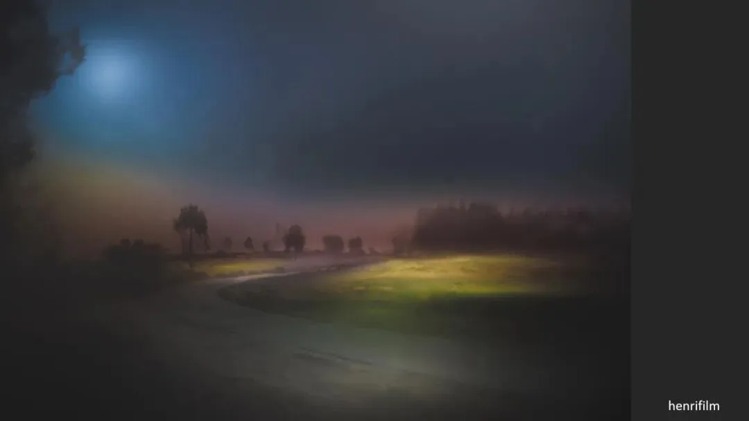
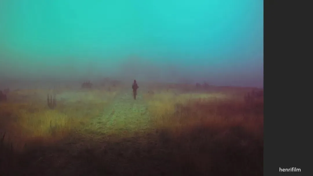
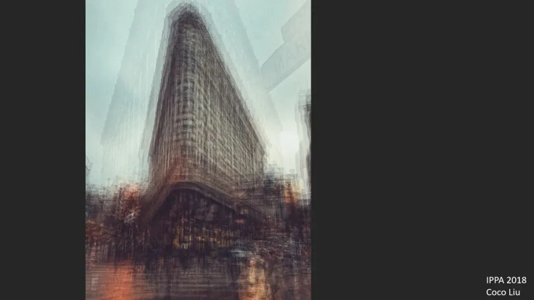
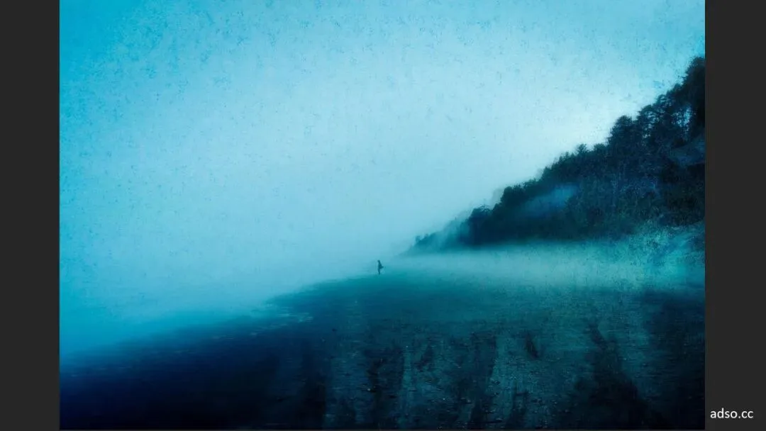
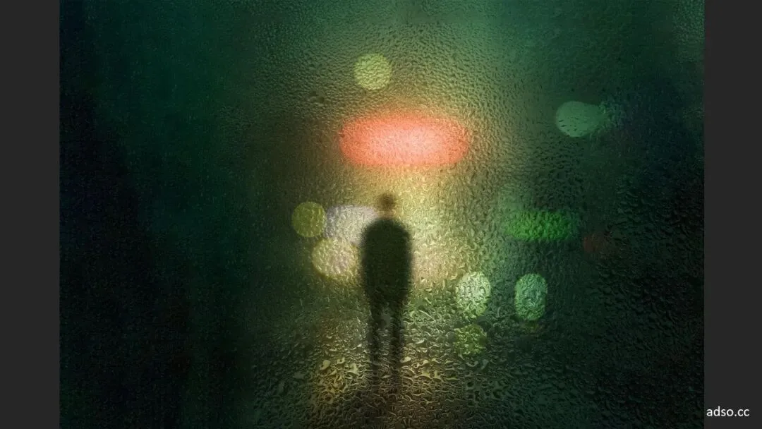
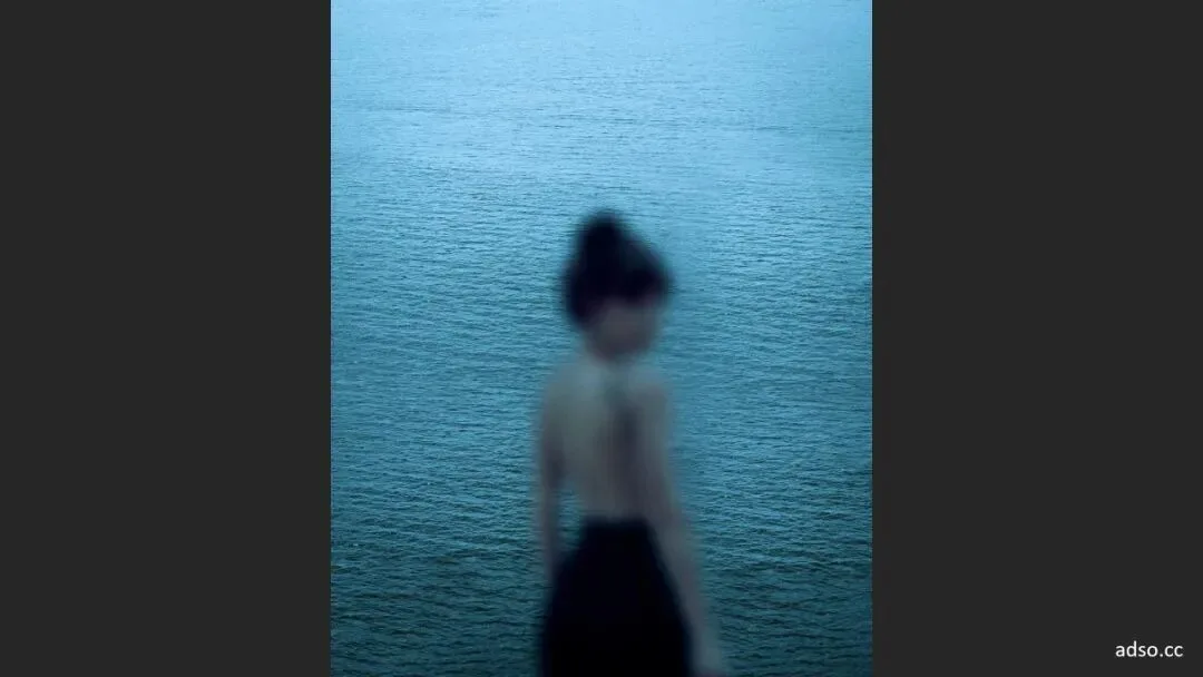
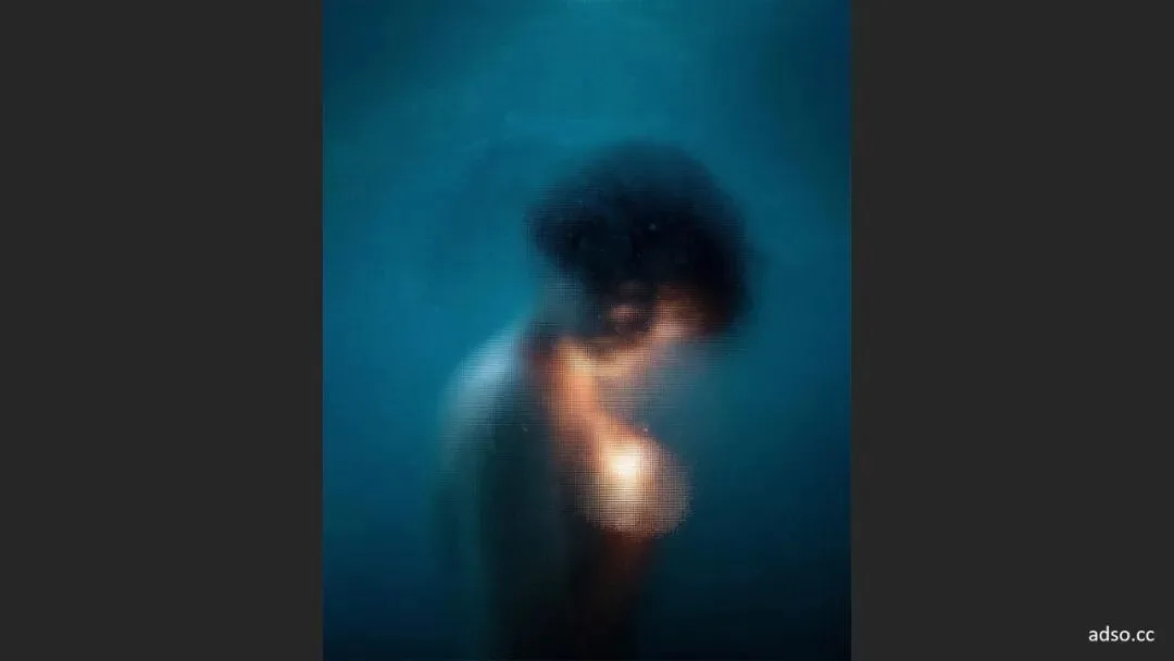
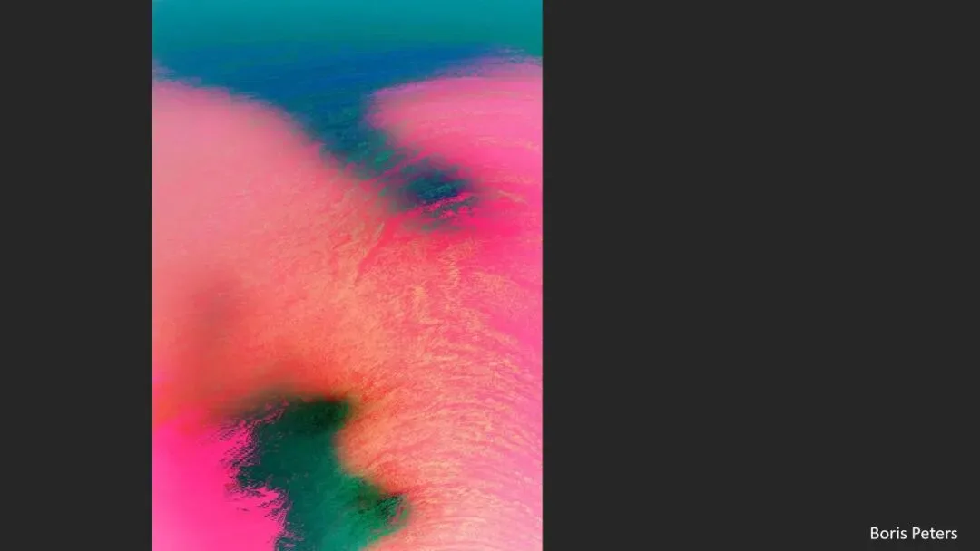
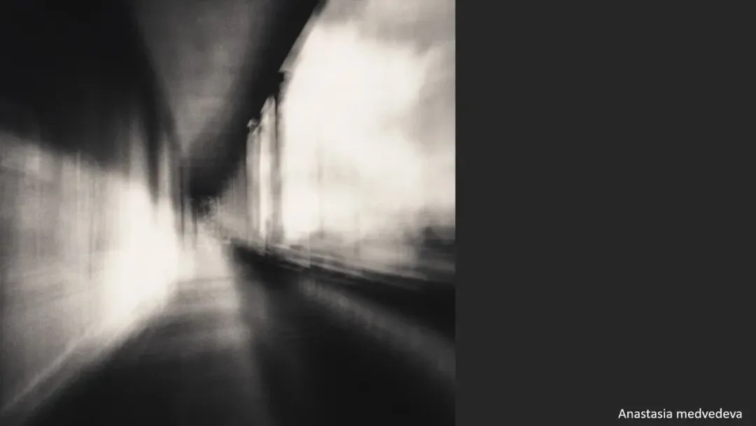
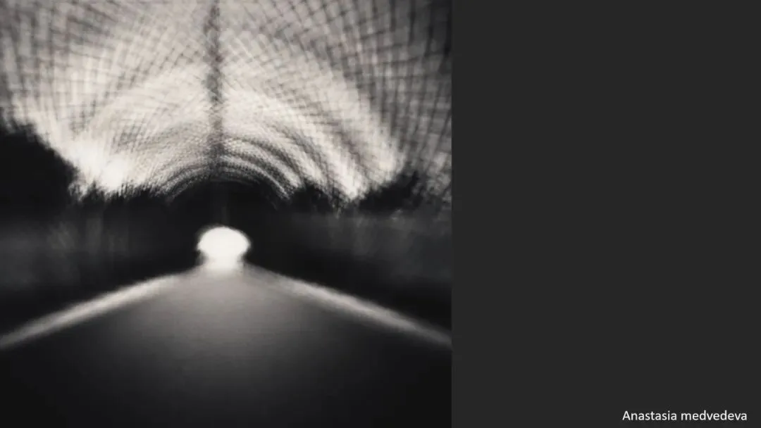
Start with the good ones: Henri Film's series is blurred to the extreme yet superb in color and mood; Todd Hido uses fog and special lens rendering to make night scenes hazy and melancholic; an IPPA 2018 winner built a painterly blur with multiple exposures on a phone (at 1:55 in the video).

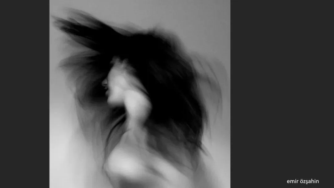
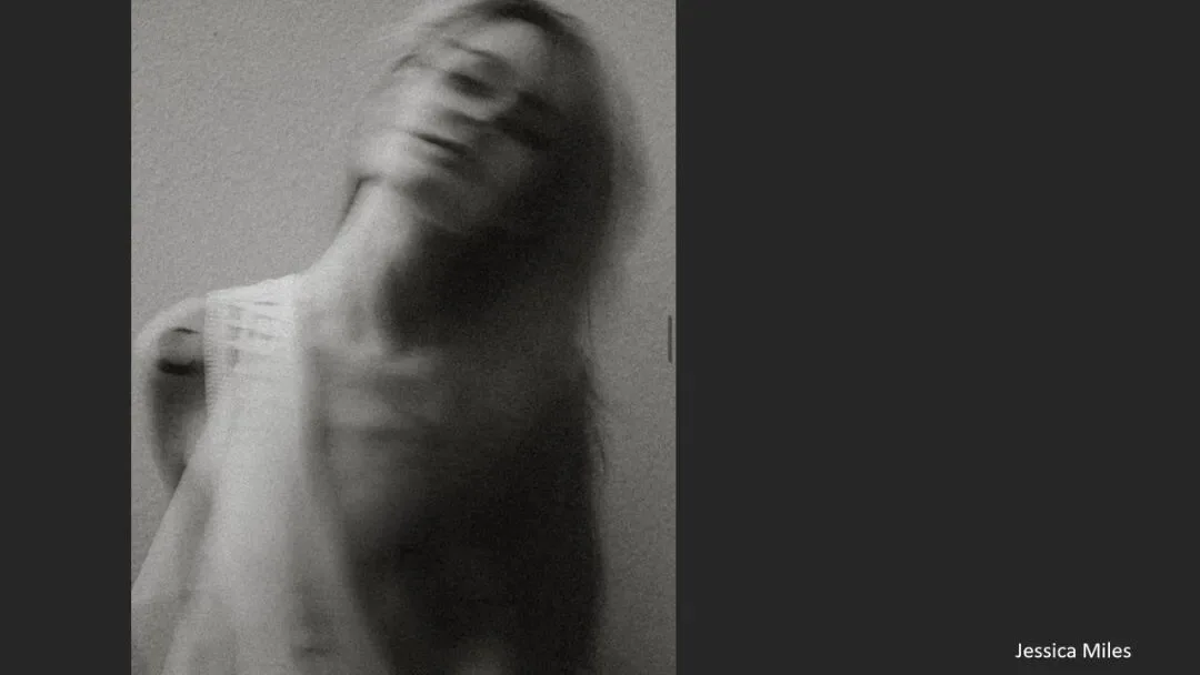
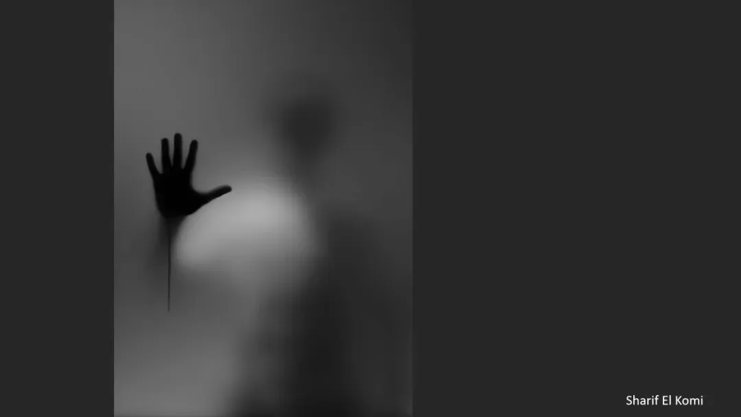
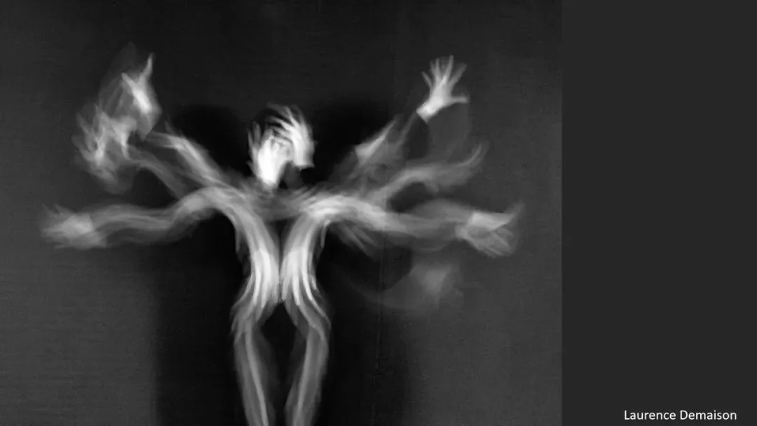
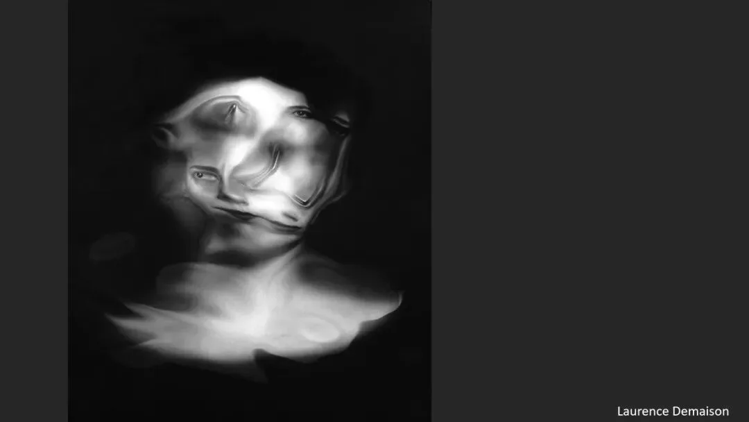
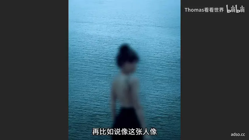
Portraits need not be tack-sharp either: with motion and defocus, one image captures a subject's free-spirited grace, another their inner emotion — a blurred distant figure inside a hazy setting is thick with atmosphere. Such approaches are common in contemporary portraiture (at 2:30 in the video).
03 Blur in the Service of Ideas
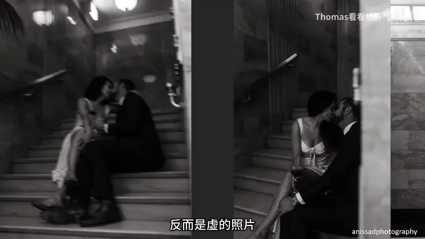
A photograph need not be beautiful; blur can carry an idea. Of a couple shot twice — sharp and blurred — Thomas prefers the blurred one: love that turns the world upside down is best rendered as blur (at 4:03 in the video). For his unfinished-buildings project he also chose defocus on purpose: the colorful city lights were the owners' hope, and after eight or nine years of waiting that hope grows less and less real, more and more blurred (at 4:28 in the video).

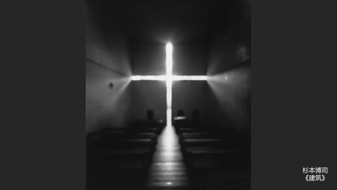
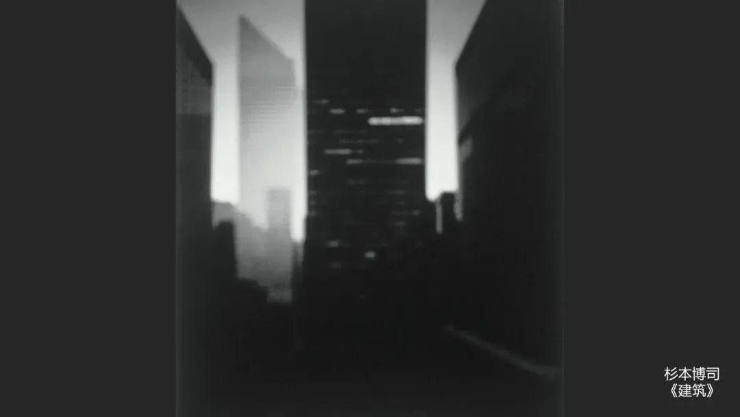
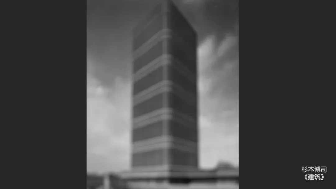
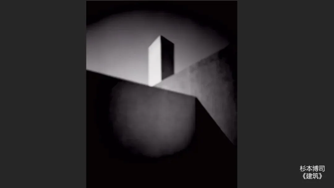
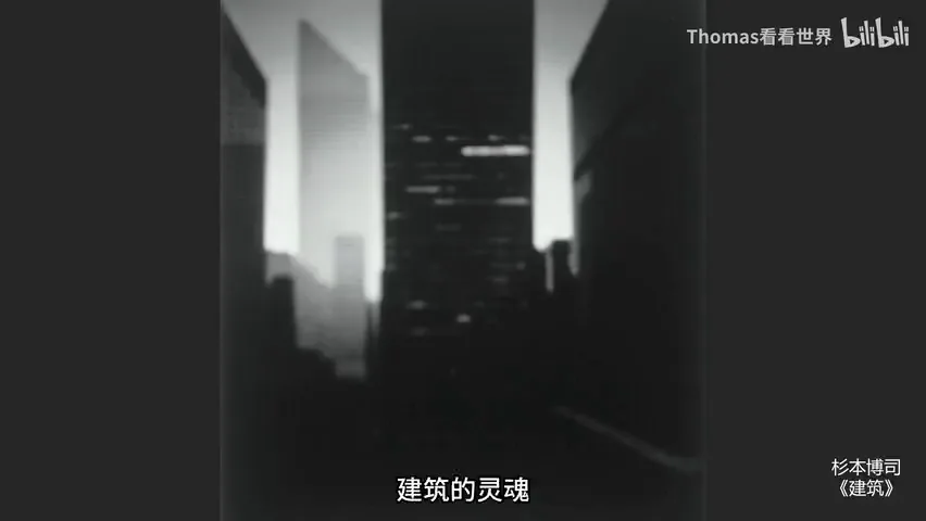
Hiroshi Sugimoto's 'Architecture' goes further: he renders buildings by masters like Tadao Ando completely out of focus, trying to photograph their soul. Even blurred, you still recognize the Church of the Light — pushed to the limit, the design sense survives, idea and method perfectly matched (at 5:26 in the video). By contrast, 'Canal Phantom' claims hazy beauty, yet its blue tones and motion blur read as eerie and oppressive — method and intention out of joint (at 6:15 in the video).
04 Blur in Photographic History: From Pictorialism to Capa
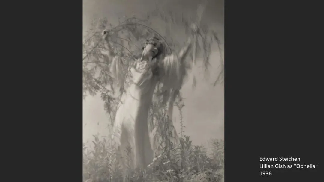
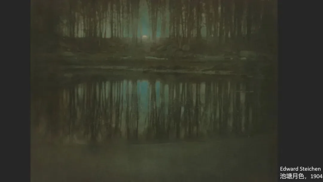
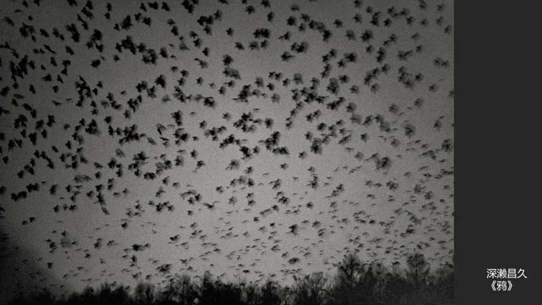
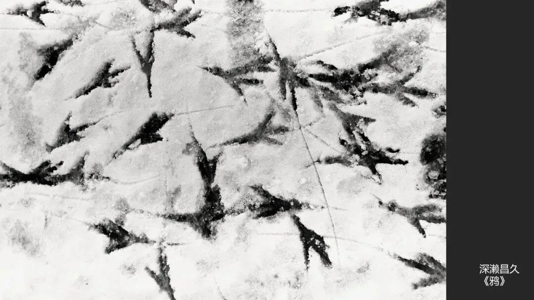
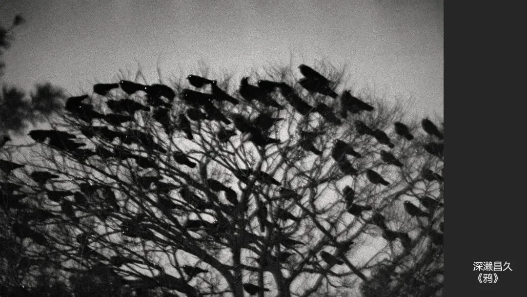
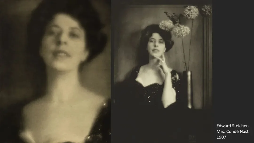
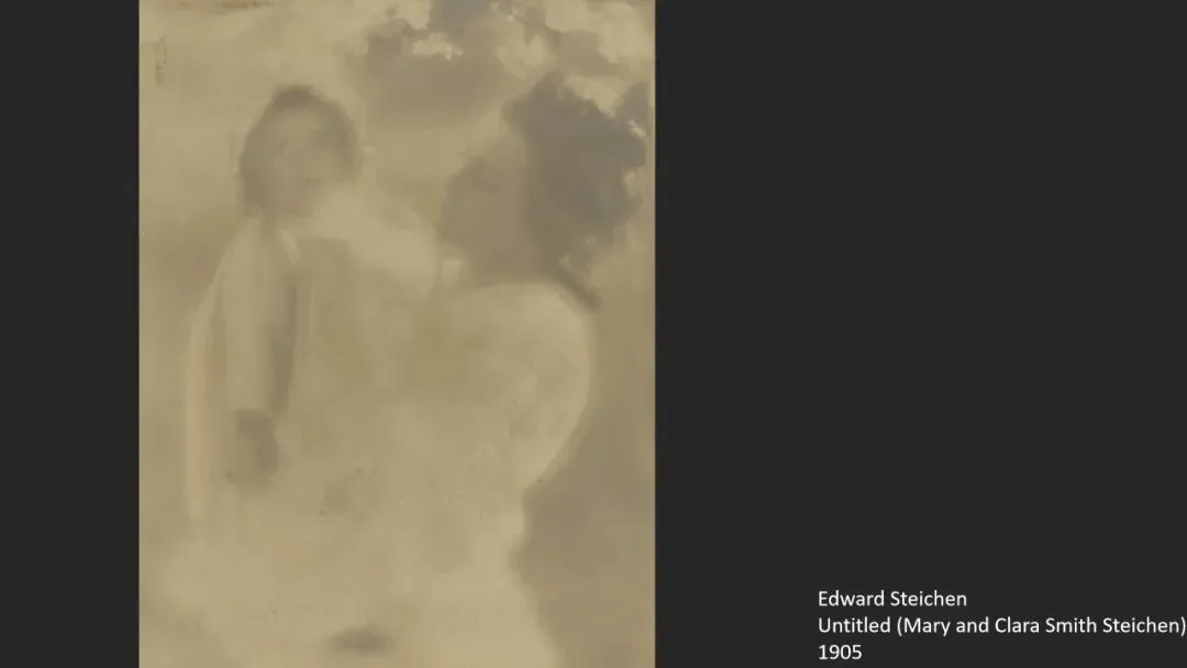
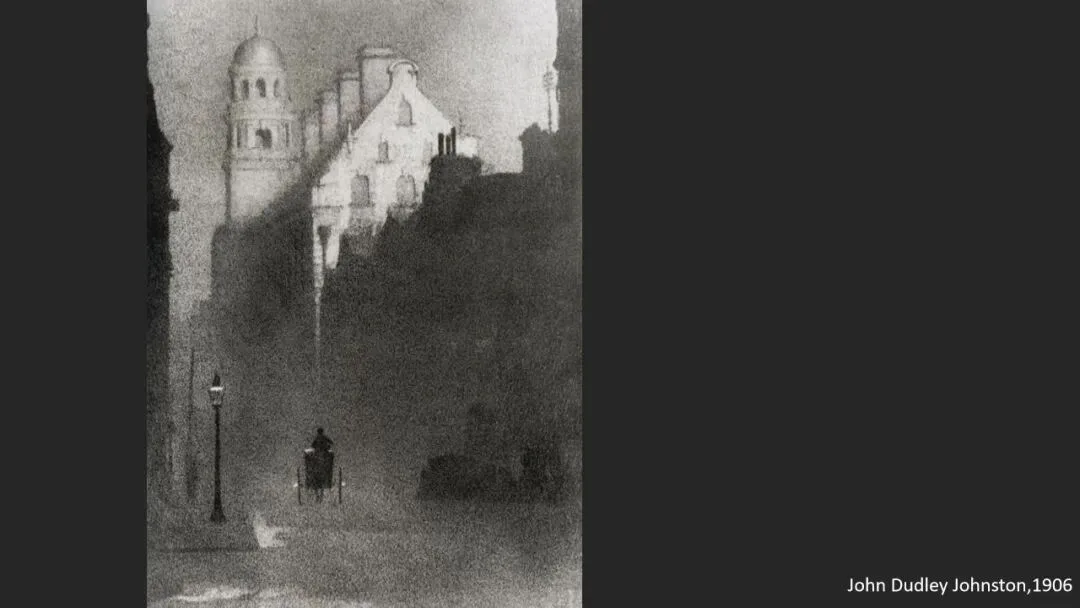
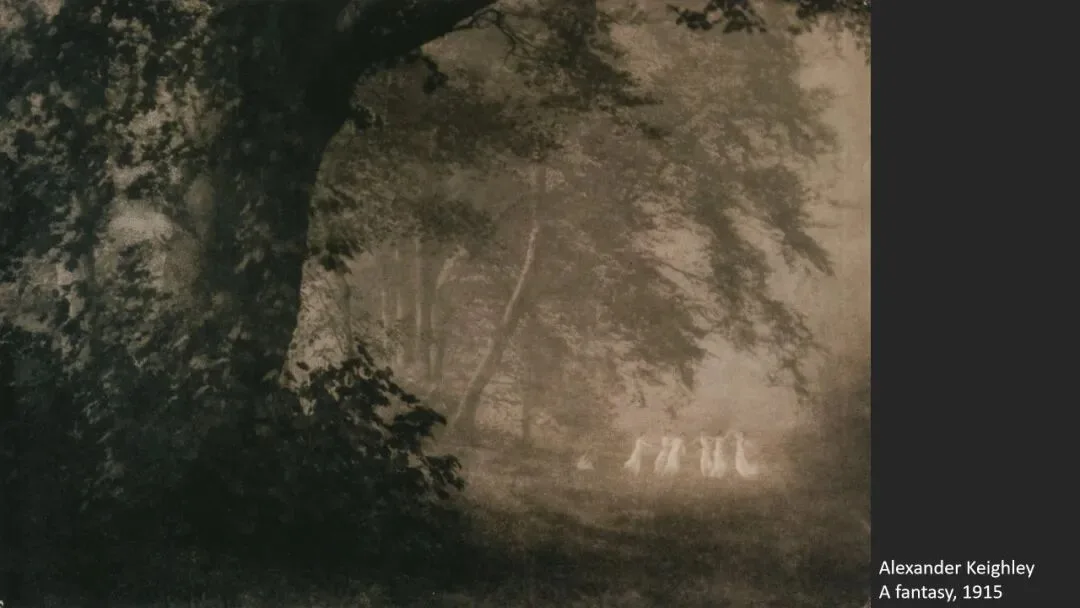
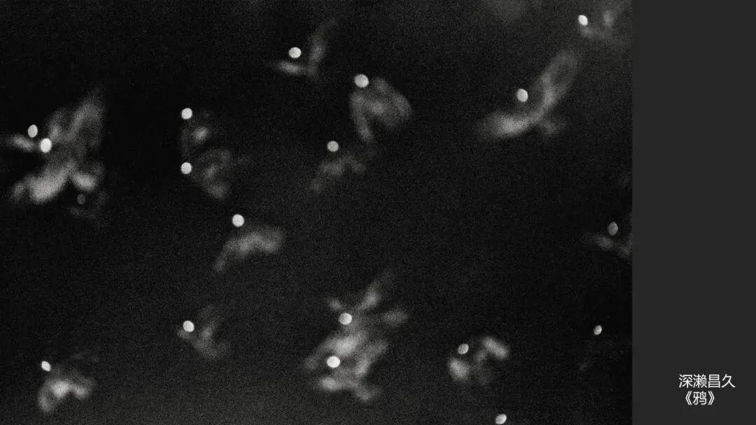
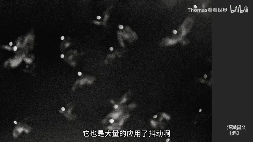
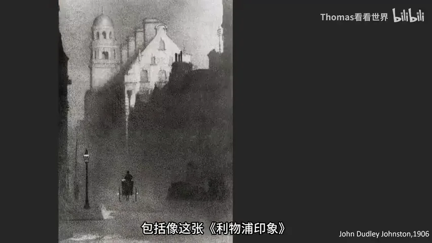
As for the defense of 'widening photography's boundaries' — blur is not new. Fukase Masahisa's 'Ravens' leaned on shake and blur to express disorientation, mania and despair; in the Pictorialist era J. Dudley Johnston's 'Liverpool Impression' (1899) was already a celebrated 'blurred' image, and Steichen and peers deliberately used soft focus to imitate painting (at 5:01 in the video).
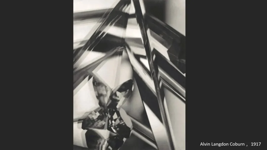
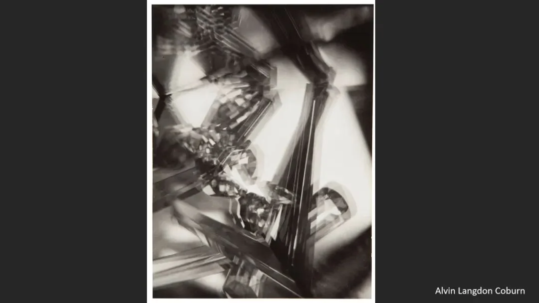
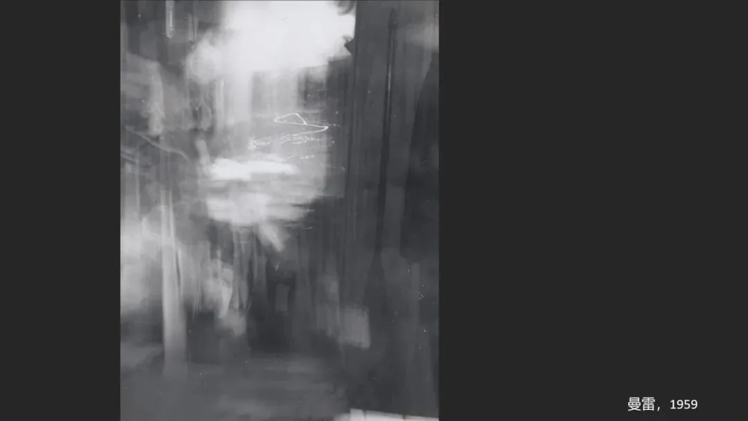
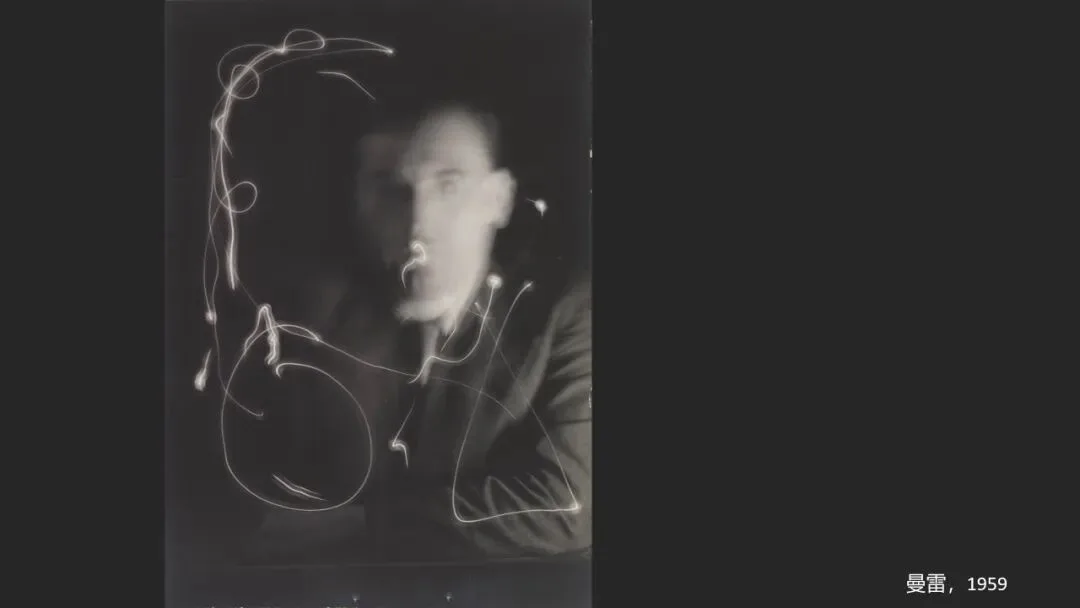
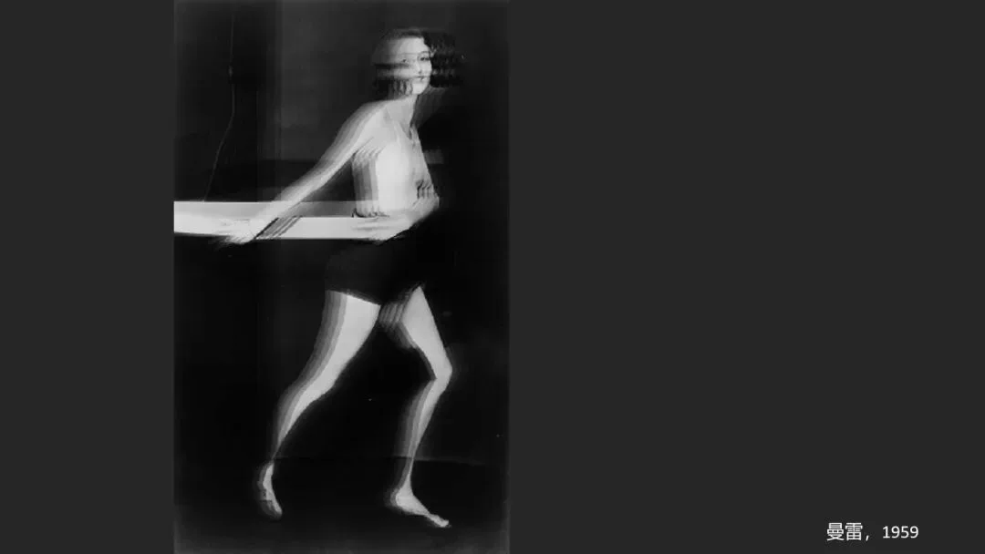
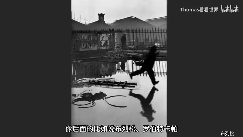
Then Robert Capa's D-Day: the negative shakes, the focus swims, yet it is better than sharp — it carries back the precipice between life and death on Omaha Beach. Abstract camera-swing experiments existed by 1917, and Man Ray left plenty of surreal blur. Blur and defocus are everywhere in modern photography; they are hardly a personal innovation (at 7:52 in the video).
05 Conclusion: Question the Organizer, Not the Medium
So back to the start: the professor's experimentation deserves encouragement, but selecting a weak exercise for a grand exhibition either exposes the organizer's poor taste or confirms suspicions of a connections-first circle culture. Internet-era audiences are not easily fooled; judged by beauty, photographic history or art history alike, these are weak works — exhibiting them insults the audience's intelligence (at 9:40 in the video).

1. Blur is no sin: it can be beautiful and can carry ideas, but it is no alibi for weak work; 2. Method must match intent — if you want hazy beauty, don't let the palette and motion tell a horror story; 3. Before claiming innovation, read photographic history: Pictorialism, 'Ravens', Sugimoto and Capa exhausted blur long ago; 4. The one who must answer questions is always the selection mechanism, not the old man trying something new.
HD video:
https://www.bilibili.com/video/BV1dh4y1j7fj/
PPT