Photography Tutorial · 2022-01-29
Stock Photo Rescue Plan: A Blue-Tone Fishing Village Edit in 5 Minutes
Thomas Chu Photo
As our editing ideas and grading skills improve, revisiting old photos often reveals new possibilities — "reject" shots become "great" shots.
In today's tutorial, Thomas digs into his archived Greenland photos and shares how to polish a blue-hour landscape in just 5 minutes~
Video Tutorial
▶ Watch the video tutorial on Bilibili
This is the fully illustrated companion to the video above: Thomas digs into his Greenland archive, picks a fishing-village night frame he once considered mediocre, and turns it into a clean blue-hour landscape in five minutes of Camera Raw — selection, lens and geometry corrections, cropping, exposure, the calibration panel, per-color HSL tweaks, local gradients, and a final Topaz Denoise AI pass in Photoshop. The walkthrough below follows the edit in order, paired with keyframe screenshots; skim here for the framework, then dive into the video for the details.
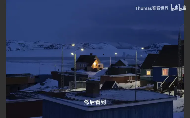
Start with the original (at 1:37 in the video): dusk has already fallen, the sky and snow are muddy with underexposure, the colors of the houses are barely readable, and only a lone street lamp glows. By the end of this article it becomes the crisp, well-balanced blue-hour village you'll see in the final figure — and the gap between the two is exactly what this tutorial explains.
01 Selection and Prep: A Worthwhile Frame from the Greenland Archive
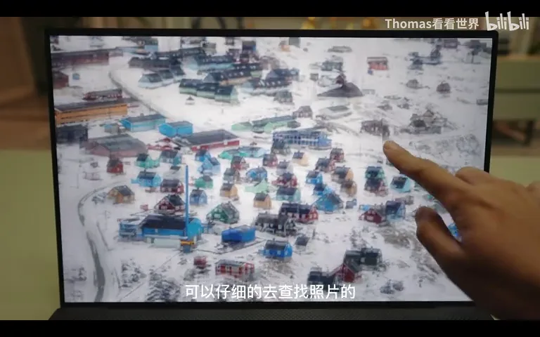
Looking back at old files with better skills often reveals possibilities you missed the first time. Scrolling through the Greenland archive on a 4K touchscreen (at 1:01 in the video), Thomas finds the daytime people shots cluttered and the pretty isolated cabins lacking a human presence. He settles on this one: a clean foreground with a house and a lone street lamp in the snow, plus a row of houses on the right whose parallel rhythm is deeply satisfying — the composition already deserves a finished image; it only lacks light and color.
Prep is a fixed ritual for every file: in the Optics panel, check Remove Chromatic Aberration and Enable Lens Profile Corrections (at 2:00 in the video). Since buildings and their verticals matter here, he then applies the auto Upright correction in the Geometry panel to straighten the lines (at 2:16 in the video).
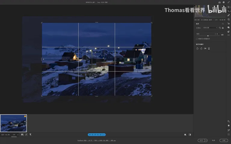
Next, the crop (at 2:22 in the video): the sky takes too much room, the bottom rocks are unattractive, and the left side is messy — all get cropped away. The parallel row of houses on the right is the structural core, so it stays. The result centers on the lit house in the middle, neither empty nor cramped, and the framing is locked.
02 Exposure, Calibration and Curves: Rescuing the Underexposed Frame
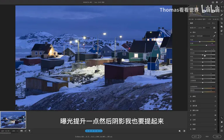
First, push exposure up substantially — the raw frame is simply too dark (at 2:58 in the video). Then raise Shadows to about +50: the moment the shadows lift, the colors of the houses emerge from the darkness, the first turning point in bringing this photo back to life (at 3:15 in the video).
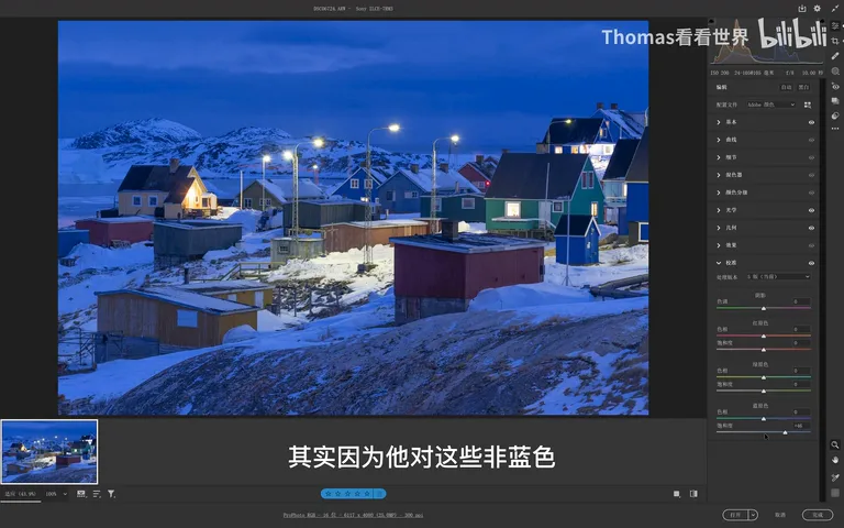
Next comes the calibration panel (at 3:19 in the video): push the blue primary's saturation all the way up to +46. It's a common misconception that this only affects blue — the real magic is that non-blue colors like greens, yellows and purples get a gentle, very pleasant saturation lift along with it, enriching the whole image at once. Since blue itself can overshoot when its primary is maxed, he later trims blue saturation slightly in the HSL mixer to even things out (at 3:53 in the video).
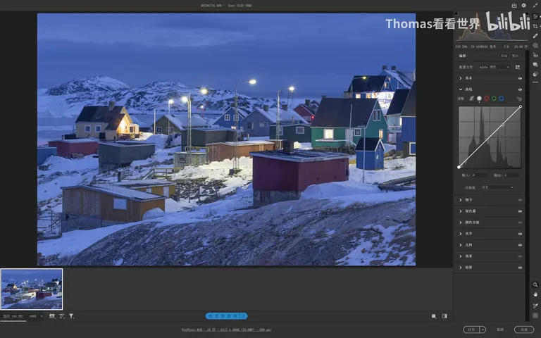
Finally, a gentle reshape with the curve (at 3:59 in the video): lift the shadows slightly and brighten the highlights a touch, but be careful not to raise the dark end too much — preserving the weight of the night is what keeps the blue-hour mood intact.
03 The HSL Mixer: Per-Color Tweaks for a Clean Blue Look
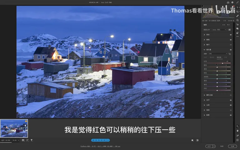
The HSL mixer is the core of this edit (at 4:13 in the video), and the approach is to sort the frame's limited palette color by color. On hue: red governs the street lamp and the central house, so nudge it toward red for warmth and presence (at 4:22 in the video); orange also manages the houses — shift it slightly left for a better rendering; the aqua house would look jarring pulled toward green, so ease it toward blue instead, letting it merge into the overall teal-blue scheme (at 5:07 in the video); a hint of purple in the blue is fine; and magenta moves right to enrich that patch of the frame (at 5:43 in the video). Yellow stays untouched, green is barely present, and purple is left alone — it influences the whole image too much.
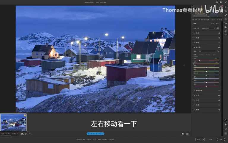
Saturation comes next (at 5:51 in the video): blue was already reduced; aqua — that teal patch — needs to come down or it turns jarring; the trace of green drops slightly and grays out, which ages better. In the opposite direction, red gains saturation to make the central house stand out, orange gets a slight boost, and magenta rises too, deepening the color of the houses.
Luminance needs just one move (at 6:47 in the video): pull red down slightly, so the central house reads grounded rather than glowing — colorful enough to register, never shouting.
04 Local Gradients: Darkening the Edges, Lifting the Center
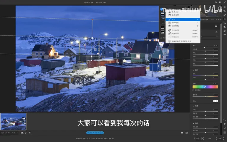
With the global pass done, the key move is redistributing local light with graduated filters (at 6:58 in the video). The trick: create a separate linear gradient for the sky, the bottom rocks and the surrounding edges, each reducing exposure by just -0.2 (at 7:13 in the video). Because each gradient's direction and reach vary slightly, the stacked -0.2s work as many small doses — the edges end up darkened so naturally and evenly that no editing trace shows.
Once the edges are tamed, lift the center in reverse (at 8:52 in the video). Create a radial gradient with exposure at just +0.1 — the center already carries bright highlights and must not clip — and raise shadows by +40; stacking one or two more radials makes the central lift transition beautifully. The foreground rocks get their own radial: highlights only, exposure untouched, pressing those reflections firmly down (at 8:26 in the video).
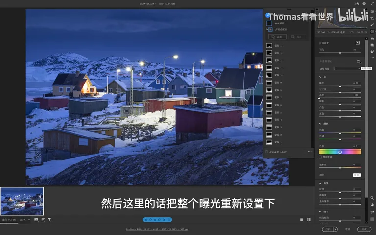
One easily missed detail: the street lamp leans slightly green (at 9:31 in the video). A dedicated radial over it, plus some yellow and a touch of purple, turns the lamp a welcoming warm orange — a tiny change that instantly restores the human warmth of the scene.
05 Denoise and Export: Finishing with Topaz Low Light
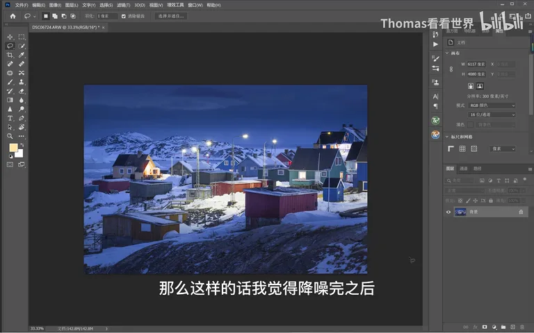
Inside Photoshop, step one is denoising (at 9:51 in the video). Thomas uses the Topaz Denoise AI plugin, which builds previews from four auto-generated templates with different algorithms: Standard for a very clean result, plus Low Light, Severe Noise and more. For a dim dusk frame like this one, Low Light works best — keep Settings on Auto and apply (at 10:40 in the video).
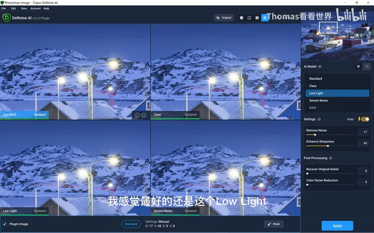
After denoising the image is essentially done; export with Save for Web (at 11:13 in the video). Looking back at the whole flow — from an underexposed "reject" to a clean blue-hour village — the actual editing took barely five minutes. Go dig through your own archive; a frame worth regrading might be waiting there.
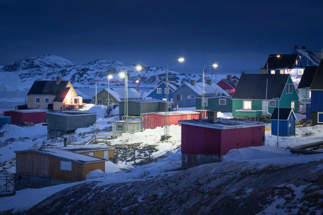
1. Judge old files by their compositional bones — a clean ground, parallel house rhythms and a lone accent lamp make a frame worth rescuing; 2. Pushing the blue primary's saturation in the calibration panel is a powerful landscape color booster — greens, yellows and purples enrich pleasantly along with it, then fine-tune each hue, saturation and luminance in the HSL mixer; 3. Redistribute local light with many small gradients: linear gradients at -0.2 exposure each darken the edges, radial gradients lift the center, and little color patches like the lamp get their own dedicated radial; 4. For dim frames, denoise first in Photoshop with Topaz Denoise AI's Low Light model, then export via Save for Web.