Photography Tutorial · 2017-05-24
Turn Ordinary Landscapes into Black-and-White Masterpieces
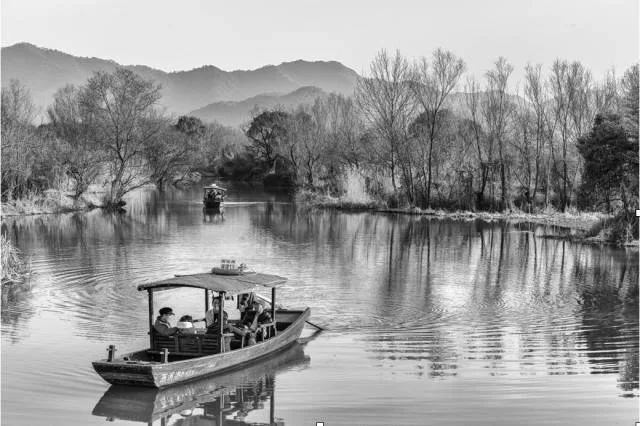
This article by Damon is a thorough black-and-white post-processing tutorial: it not only walks through the editing of a sample photo, but also analyzes which photos suit B&W conversion and what to watch for when shooting.
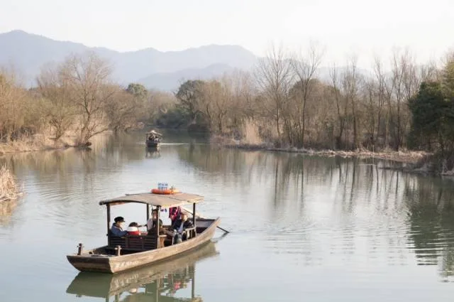
Let's first look at the original image:
First, we need to talk about which photos suit B&W conversion:
Which Photos Suit B&W Conversion
1. Colors aren't rich and the palette is monotone — nothing in the color grabs the eye.
2. Colors are overly messy. Photography prizes simplicity; chaotic colors distract the viewer.
3. HDR-processed photos. These have rich detail and can push tonal range to the extreme, whereas scenes with very high contrast are unfavorable for multi-layered rendering.
4. Long exposures — blown-out clouds or water. Although overexposed, they don't look unnatural in B&W; instead the conversion emphasizes the sense of motion.
Now let's look at the original again:
1. The colors are clearly unattractive and very monotone: only the grass, trees, and boat are yellow, part of the water and trees are green, and the figure on the boat has a touch of red.
2. The reflections on the water and the sky are blown out — detail-less and harsh on the eyes.
3. But the image overall is rich in detail; the histogram isn't clipped, and exposure sits slightly to the right.
As a color photo this is unremarkable, but it does fit several of the B&W-conversion cases we mentioned.
Cases NOT Suited to B&W Conversion
That is, images with strong color contrast but lacking brightness and tonal contrast. More specifically: frames dominated by complementary colors aren't suited to B&W.
(What are complementary colors? Two colors 180° apart on the color wheel below.)
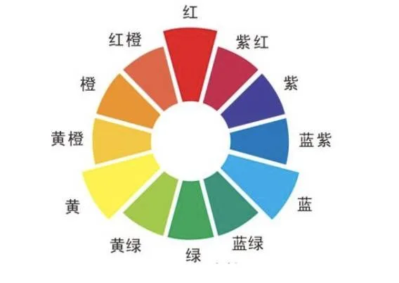
Highly saturated complementary pairs — blue/orange, red/green, yellow/purple — turn into very similar dark grays in B&W. So unless you change the hues first, this kind of photo shouldn't be converted; avoid this type of conversion when shooting too.
Looking at our original again: most colors cluster in the "yellow–yellow-green–green" range, so contrast and detail emerge after conversion, while the red figure and the yellow-green boat — being complementary — mash into the same gray.
A Word on Shooting
According to Adams' theory, a good landscape image should contain 11 distinct gray zones — the 11 steps from black to white; the more zones, the more it rewards viewing. Since color itself interferes with light and shadow, converting to B&W lets us focus better on tonal gradation.
1. Shoot RAW to leave room for post
Don't shoot JPEG with the camera's built-in B&W mode.
Why? Because the camera's presets aren't necessarily what we want, while RAW records all the color temperature, hue, tone, and saturation data. Lightroom and PS can alter each color, and all that information ultimately differentiates the grays — those subtle differences give you endlessly variable B&W photos.
Worst case, if you're really unsure about toning a B&W image, you can just apply a filter preset in post — PS and LR plugins offer plenty; pick one you like. In fact, that's what I do: apply a filter, then tweak some parameters.
You can, however, enable the B&W preset while shooting RAW: the file keeps all color information, but your camera's LCD previews the shot in black and white.
2. Dare to Use High ISO
Everyone knows low ISO gives good image quality, so use the lowest ISO conditions allow. But if the scene is too dark, raise the ISO as needed — some people even add grain to B&W photos in post.
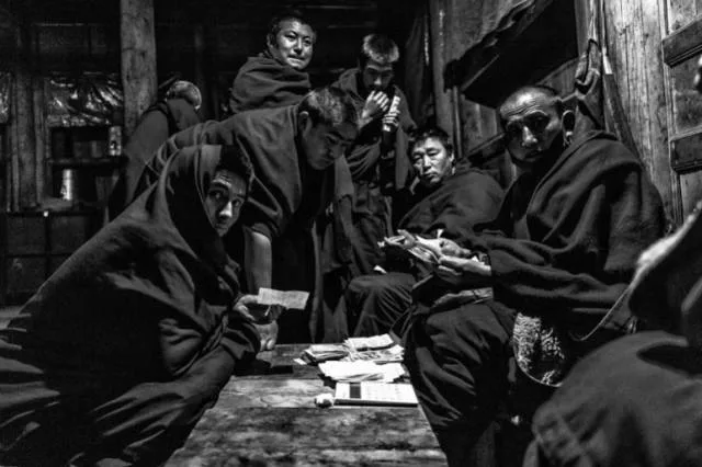
This shot is around ISO 6400 — no problem; it even has a bit of a Magnum feel.
3. Composition and Timing
A B&W photo's point of interest must stand out even more. Though the palette is flat, good light better draws viewers into the mood the photographer intends. Choose cloudy-weather days: in crisp autumn air, shooting landscapes with the sun at the side brings more surprises than at noon on a clear day; with the sun at 45°, objects reveal more detail and color.
Composition matters enormously in B&W photography — it tests a photographer's fundamentals. Use the classic rule of thirds, or compose with points and lines in the frame. Beginners can start simple and slowly include more elements.
And how does a good composition happen? You wait for it. When I saw this boat rowing over, I kept shooting it until it reached just the right position.
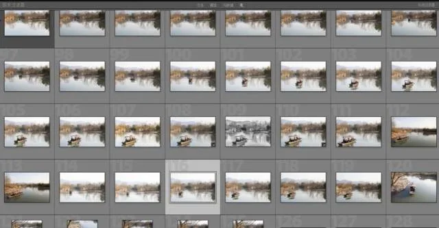
4. Watch the Light
Since B&W can only express the picture through light and dark, pay attention to the light's direction and strength when shooting. This photo was taken as the sun was setting, so the light isn't harsh, and the distant mountains and midground trees have more dimension than with the sun overhead. Generally, front light increases contrast; side light reveals texture (especially facial detail in portraits); light from a single direction creates shadows.
5. Look for Patterns and Textures
In color photos, color steals the focus, so patterns and textures are often overlooked. One element of a good B&W photo is expressing distinctive patterns and textures — give it a try!
Outlines and textures are often inconspicuous in color photography (color splits the viewer's attention), but in B&W they tend to receive a sharper, more refined rendering.
6. Bring a Tripod
Beginners shooting B&W landscapes can add one element — motion! That is, moving clouds or water: since clouds and water are white, they produce bright areas, and their movement creates layers of light and dark that instantly bring a B&W photo alive!
Post-Processing Workflow
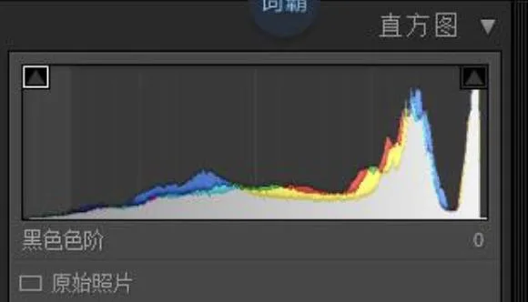
1. First task: check the histogram
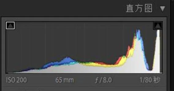
2. Analyze the histogram
A. We can see the original histogram is slightly overexposed — a habit of mine when shooting Canon. I still shoot with a 5D Mark II, whose dynamic range isn't great; recovering shadow detail is very difficult, so my habit is slight overexposure. But note the histogram's right side isn't cut off — the sky isn't actually blown, and if the sky had detail we could theoretically recover it. Nikon users can expose slightly left instead, provided the histogram doesn't clip.
B. The highlights occupy a huge number of pixels — checking the image, they're the large water reflections and part of the sky. Highlight recovery will be a priority in post.
For this B&W photo, we want to distribute the histogram as evenly as possible within the existing tones — in Lightroom, balance Blacks, Shadows, Exposure, Highlights, and Whites so pixel counts across zones don't differ too much. An even histogram gives a B&W photo very rich tonal layering.
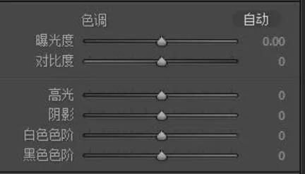
C. The midtones (Exposure) transition well — we only need to enhance micro-contrast.
D. Shadows and Blacks pixels are lacking.
E. The bump at the far right is the sky; it occupies little of the frame, and the weather was too bad for any detail, so we'll give up on it.
F. This photo used ISO 200, which produces some noise in the shadows — a denoise step is needed in post.
Now look at the histogram after processing:
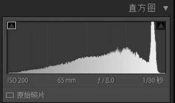
Pretty even, right — basically a normal distribution. The bump on the right is the sky; there's truly no detail, so we gave up on it.
3. Ways to Convert to B&W
Before converting, two wrong approaches:
1. Desaturating directly. From the explanation above, we know we want HSL to control gray contrast — kill saturation outright and our RAW was shot for nothing.
2. "Image → Mode → Grayscale" to discard color information. Obviously wrong too — without color information we lose control in post.
So I think these and similar "desaturation" methods aren't enough.
Instead, I recommend Lightroom's B&W panel for the conversion. See the image.
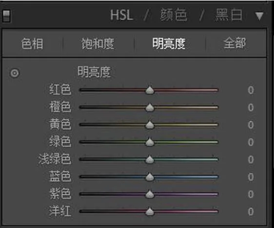
Click "Black & White" here or press "V" to convert. The benefit: we can control how bright each hue becomes in the B&W conversion.
In Lightroom, the V key toggles between "Color" and "Black & White." It's a very practical shortcut worth remembering: after a series of adjustments in B&W mode, pressing V back to Color keeps your B&W adjustments recorded in Lightroom — next time you press V again, you continue where you left off. That's convenient for those less confident with color: switch back to Color anytime, check the colors, then adjust whichever needs it.
Another way: apply the Silver Efex Pro B&W filter directly in PS — it's part of the Nik Collection, which is now completely free.
It's the lazy method, but my personal favorite. My workflow: try the B&W filters in PS first; if none satisfies, go back to Lightroom's B&W panel for manual adjustment. That saves time.
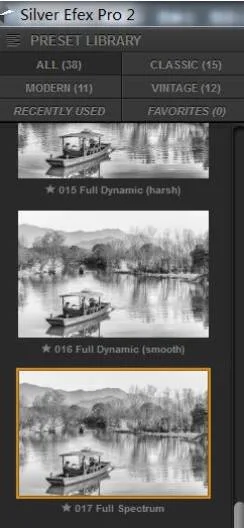
Hands-On
Step one: lens corrections, as always.
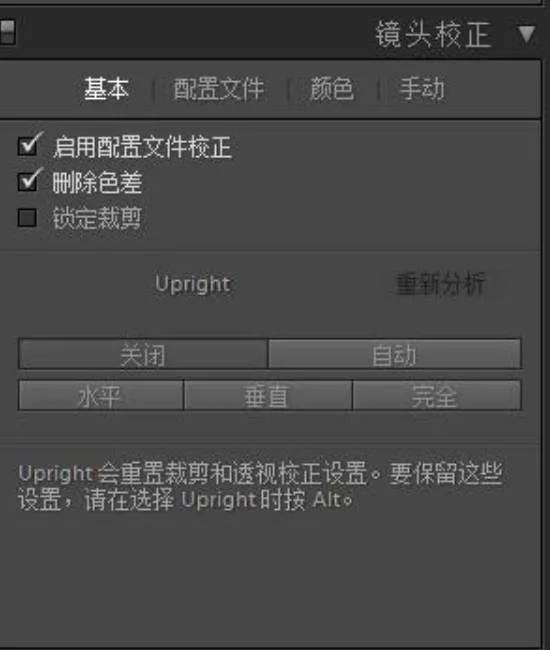
Just use Auto here — Auto isn't a panacea; try it first and adjust manually if it fails.
Step two: choose the Landscape profile.
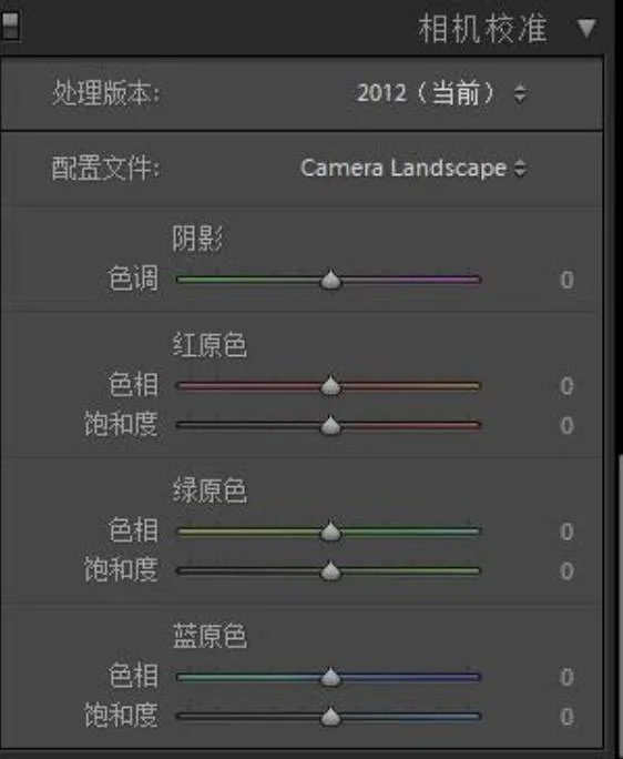
These are personal habits — I think Canon's built-in Landscape mode is decent, so I try it first.
Step three: adjust the Basic panel.
Make the histogram as even as possible. I do roughly the same for all photos: mainly adjust the six values — Exposure, Shadows, Highlights, Whites, Blacks — and leave Clarity, Vibrance, and Saturation untouched for PS.
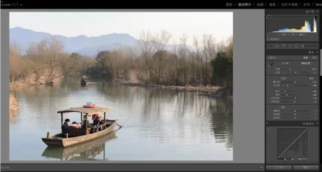
Watch the histogram while adjusting to keep highlights and shadows from clipping — you can turn on the clipping warnings, the two little triangles at the top corners of the histogram.
Step four
Slightly brighten the figure inside the boat. The figure is clearly underexposed with weak contrast. This is the foreground and the point of interest — and as I said, its color will convert to a gray close to the surroundings.
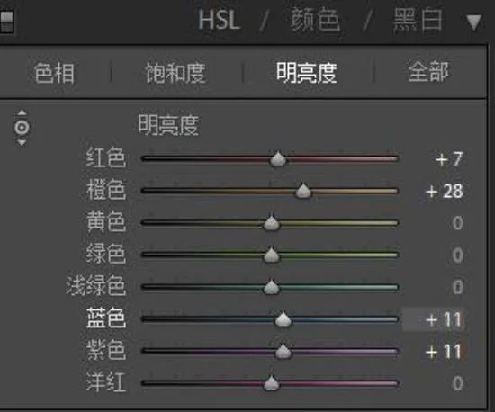
Step five: right-click the image → Edit In → Photoshop.
Use Silver Efex Pro to convert the image to B&W.
I chose preset 024.
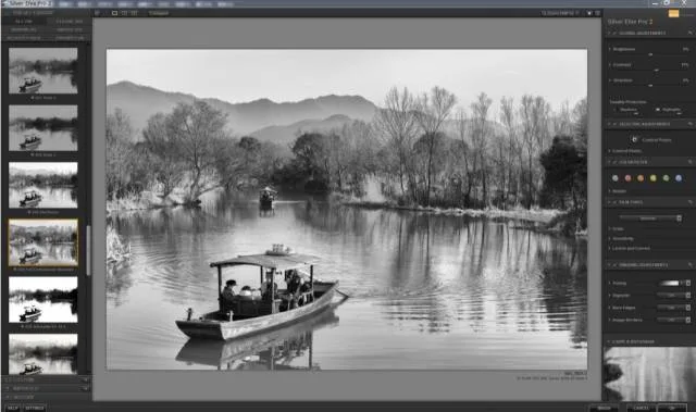
There are about 38 presets — very intuitive; try which suits your photo.
Step six
Create a midtones luminosity mask.
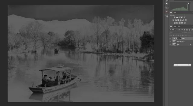
Don't worry if you're unfamiliar with luminosity masks — plugins (like the TK Panel and StarsTail panel) and many free actions build them in one click.
Step seven
Pull an S-curve on the midtones, then add a Nik Tonal Contrast filter to further boost contrast.
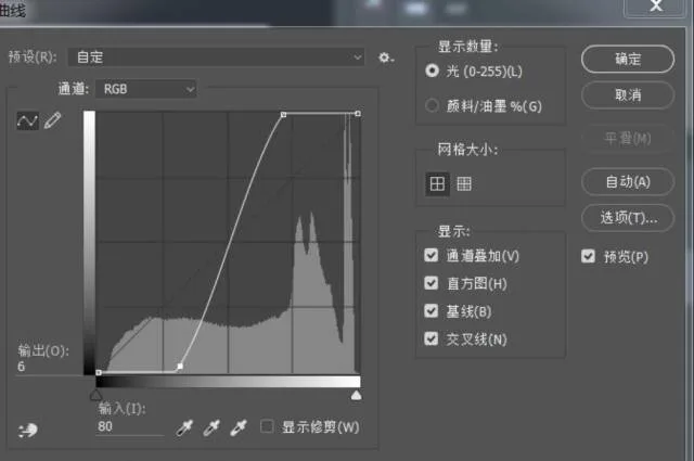
A curve like this — protected by the mask, even such an extreme curve transitions nicely.
Tonal Contrast is another Nik plugin that increases tonal contrast — and sharpness along with it. See the tutorial "Enhancing Photo Detail: Nik Tonal Contrast Filter Explained."
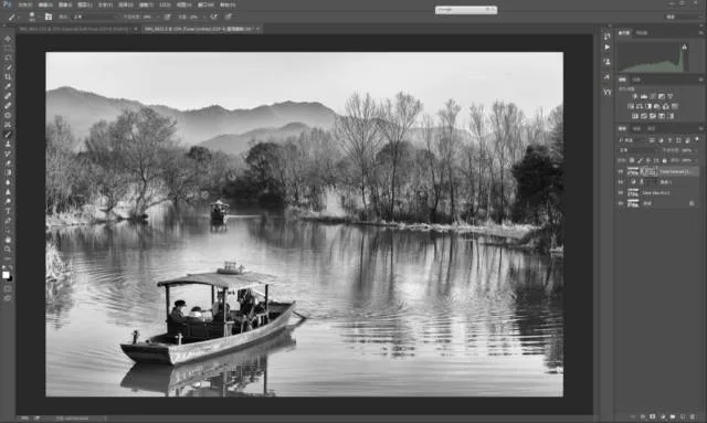
By now the overall tonality is there — that simple!!! Look at the histogram again: apart from the sky we abandoned sticking out, everything else is very even.
Step eight
Since we increased contrast — which also increases sharpness — let's soften some areas slightly to add a sharp-versus-soft contrast. We'll continue with a Nik plugin.
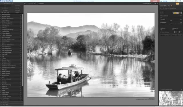
I'm using the Classical Soft Focus filter (see the tutorial "Soft Focus in Post: Make Your Photos Dreamier"). Then hold Alt and click the mask icon to add a black mask.
Set the brush to about 20–25% opacity and flow, and paint where you want softening. Remember: softening also slightly raises brightness.
Here, the distant mountains, the brighter grass on the water, and the lower water surface can be softened.
Whatever you do, don't paint over the detailed trees, the boat, or the ripples — those are exactly the areas we sharpened earlier.
You can also adjust the mask's opacity and feather for smoother transitions.
Double-click the mask to open its settings:
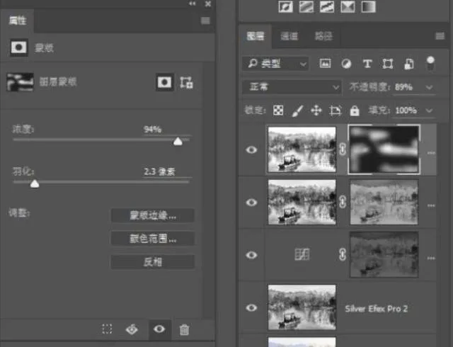
The foreground boat lacks detail: create a Curves adjustment layer to brighten it, then carefully paint the hull back in with the mask.
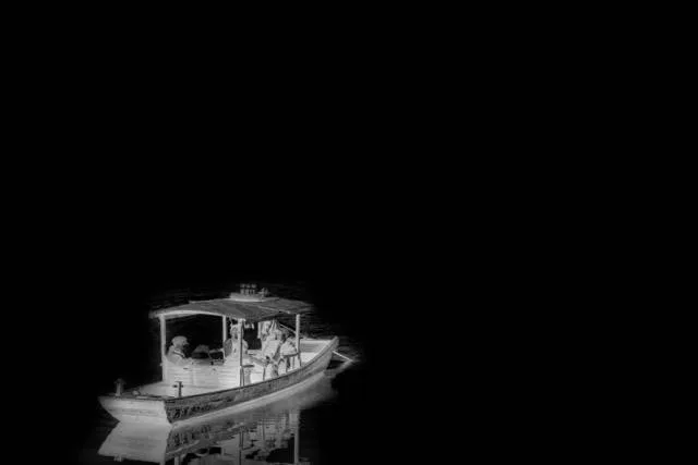
Finally, denoise appropriately, sharpen for output — and the whole process is done.
Last, what we're not satisfied with in this image: first, the sky. Landscape photography lives and dies by the sky — once it's dead white, detail can't be recovered.
Second, the boat's size — relative to the frame, I still think it's too big.
And the figure on the boat: for the complementary-color reason explained earlier, the figure lacks detail. Although I shot before sunset in cloudy weather, the light was still very harsh, as you can see. I added softening in post, but the transitions aren't great. Had another boat come by a bit later, the light would have been better.
Author: Damon
A Hangzhou landscape shooter — photographs West Lake in his spare time, and dog food too.
Damon's portfolio:
Tuchong: https://tuchong.com/244903/
LOFTER: http://zhusimin2008.lofter.com/
Enjoy!
Reposted from Xiangyuqing's new WeChat account — We Photography

Thomas's Qianliao livestream channel is live!
Thomas will host free lectures, interactive photo critiques, and advanced training camps on Qianliao from time to time.
Scan the QR code or read the original post to follow!