Photography Tutorial · 2022-10-16
Can Black and White Rescue Failed Photos and Work Magic?
Can black-and-white photography rescue failed photos and work magic?
My answer is that black and white can often present scenes that look plain in color in a truly stunning way.
If you don't understand the characteristics and strengths of black-and-white photos, you would call these failed shots — but in fact they all have the makings of masterpieces.
Video
▶ Watch the video tutorial on Bilibili
This is the illustrated companion to the video above. Using a single photo — a frozen lake and stream in Tibet — Thomas walks through the complete before-and-after workflow from colour original to black-and-white final, and answers a question on the way: can black and white really rescue a failed photo? He opens his Photoshop layer stack panel by panel; keyframe screenshots with timestamps are paired below so you can follow along.
The verdict first. The finished black-and-white image (at 0:26 in the video) turns the winding stream into a glowing ribbon and presses the sand into a pure black stage; the colour original (at 0:28) is just a flat grey winter scene. One moment, two temperaments — that is what this tutorial is about.
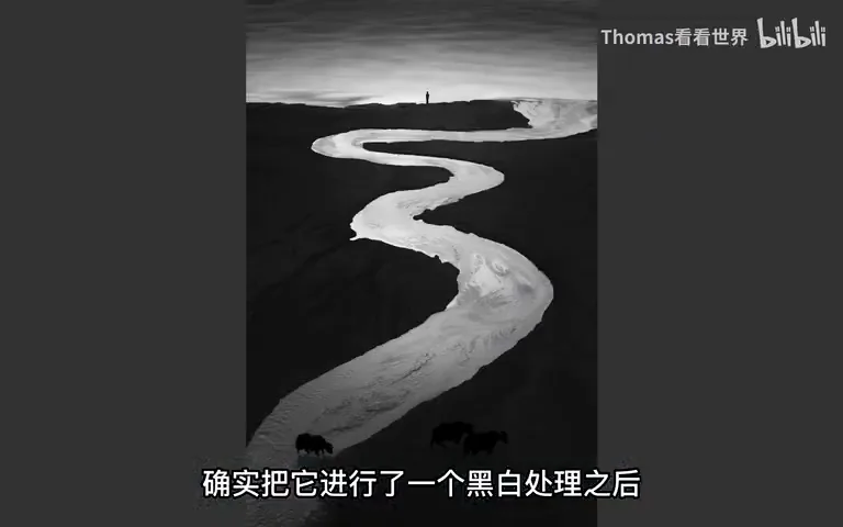
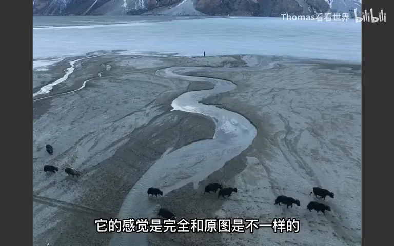
01 Yes and No: Can Black and White Rescue a Failed Photo
Thomas's answer is "yes, and no". Yes, because after the black-and-white conversion the photo feels completely different from the original — far more striking (at 0:19-0:33 in the video). No, because he had already decided it would be a black-and-white image before pressing the shutter: it was never a failed shot, but a frame designed for black and white from the very start (at 0:34-0:44 in the video).
How did he know on the spot? From patterns absorbed through years of studying great black-and-white photography. That leads to the video's core methodology: black and white is not an after-the-fact rescue, but a form of expression you plan from the framing stage onward.
02 Patterns from the Masters: Rivers and Freedom of Brightness
Leafing through Salgado, the Indonesian photographer Hengki Koentjoro and Ansel Adams, Thomas noticed they all favour one element: rivers (at 0:54 in the video). A river carries a dreamlike line, and its brightness is naturally a notch above the surrounding land — a ready-made "brush of light" in a monochrome frame.
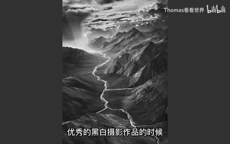
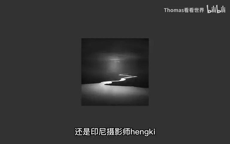
Even more important is black and white's unique strength: brightness can be pushed to extremes without looking fake. Take Hengki's beach image — no sunlit ground could be that dark in reality, yet as a monochrome it still reads as true (at 1:15 in the video). The reason: human eyes only ever see the world in colour. Darken a beach that far in a colour photo and it feels wrong; do exactly the same in black and white and nothing feels off (at 1:44 in the video). Only by understanding this can you truly exploit black and white rather than merely apply it.
03 In the Field: Framing Designed for Black and White
Back on location in Tibet. The moment he framed this stream, Thomas knew it was made for black and white (at 2:03 in the video). But a stream alone fell short — the masters' rivers are broad and mighty, while his is a very shallow creek. How to convey that shallowness and smallness? Wait for a reference: at sunset a herd of yaks happened to pass by. With the yaks in frame, the geography and the scale click instantly — the viewer sees at a glance that this is no great river, just a shallow creek (at 2:41 in the video).
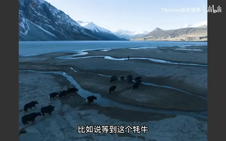
Then his teammate Yao happened to be scouting ice textures on the frozen lake across the way, and was invited into the frame too (at 3:01 in the video). The result: one person walking, a herd of yaks also walking — a figure lost in thought before the lake, yaks ambling past, a stream tying human and nature together. These elements are more than a scale bar; they bring story and association (at 3:16 in the video).
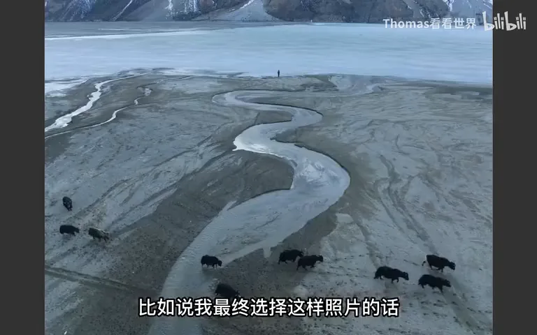
04 Post, Part One: Pressing the Sand into a Black Stage
Post begins with a simple crop in Camera Raw: the original is horizontal, the sand at both edges adds nothing, so only the central stream is kept (at 3:57 in the video). Then comes the guiding idea of the whole edit — strip the sand of as much detail as possible and push it dark, so the stream stands as the only bright protagonist.
The method is a two-version light blend: develop the same raw file into a dark black-and-white version and a bright one, then blend the bright into the dark (at 4:13 in the video). The bright layer is gated by a Lights-1 luminosity mask so it only acts where the image was already bright; finding the effect too weak, he duplicates the layer three times for triple strength (at 4:45 in the video). But "brights only" has a side effect — the sand has its own highlights and gets lifted too. So he wraps everything in a group, builds the group mask with the Quick Selection tool refined by brush, and lets only the frozen lake and the stream take part in the blend. With both masks stacked, the net effect is "lift only the brights of lake and river", keeping the sand's texture intact (at 5:25 in the video).
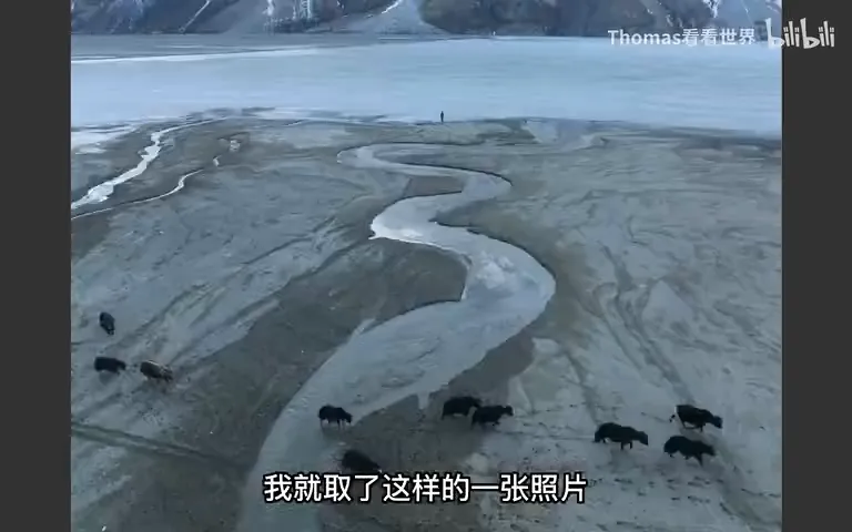
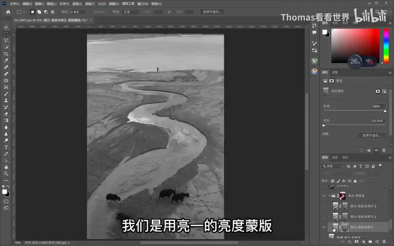
Then comes a series of clean-up moves: stamp visible and use Content-Aware Fill to remove a yak at the bottom edge that added clutter (at 5:59 in the video); select a patch of ice, duplicate it with Ctrl+J and stretch it upward over the original sand, then apply Filter → Blur → Motion Blur both horizontally and vertically — the messy ice textures turn into something as ethereal as flowing water (at 6:10 in the video); afterwards the earlier mask is inverted to darken the sand specifically (at 6:46 in the video). A broken segment in the stream is patched with the Clone Stamp; one more stamp visible, then Ctrl+T with Shift stretches the whole frame slightly longer so stream and figure both breathe (at 7:04 in the video).
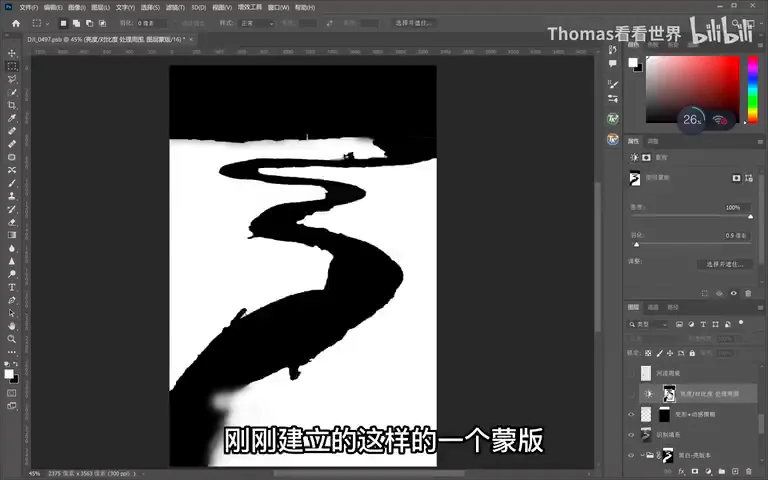
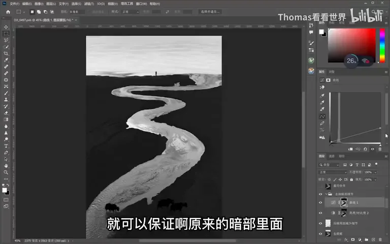
Removing shadow detail takes two steps: first lift all the shadows via a luminosity mask, then pull them back down with Curves (at 7:54 in the video). The curve's shape ensures brighter patches inside the shadows get darkened more and darker patches less — in essence lowering local contrast within the shadows. The sand's overall brightness barely changes, yet its speckled detail is strongly suppressed, making the black purer (at 8:13 in the video).
05 Post, Part Two: Refining Light and Line
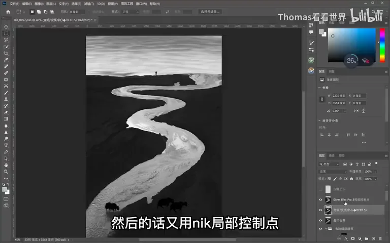
One conspicuous bright patch remains on the sand. Thomas adds a normal layer and paints over it with a very-low-opacity black brush, letting it sink into darkness — continuing the detail-reduction doctrine (at 7:36 in the video). Then comes his signature centre-weighted dodge and burn: brighten the middle, darken the edges, executed precisely with Silver Efex Pro control points (selections or other local tools work just as well) — darkening the top, lifting the central stream (at 8:40 in the video).
Still not satisfied, he adds another normal layer to deepen the edges toward black while lifting only the stream. At this point the light completely changes: dark sides, bright centre, and that brightness graduates in smooth layers — the eye cannot help following the glowing stream from end to end (at 9:17 in the video).
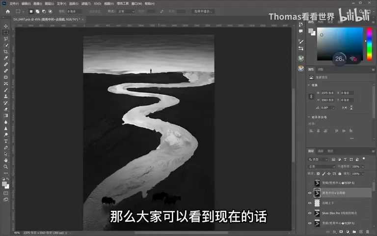
The final move is, by his own admission, a controversial one: filling the gaps in the stream and smoothing its line (at 9:28 in the video). The gain is a more supple flow that serves the mood he wants; the cost is a further step from the real terrain. Because it is the last, separate layer, it can be dialled back anytime — a reminder that every edit deserves its own layer.
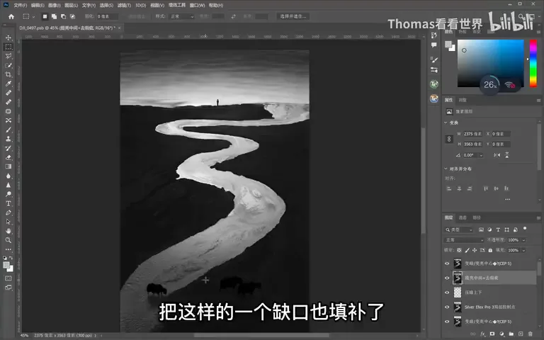
Looking at the finished image: the black-and-white works because the capture stage did half the job — the stream destined to glow, the sand destined to go black, yaks and a human as scale and story. That ability to "know in advance" comes from constantly studying great monochrome work and accumulating visual experience (at 9:59 in the video). Next time you meet a similar scene, the workflow will assemble itself.
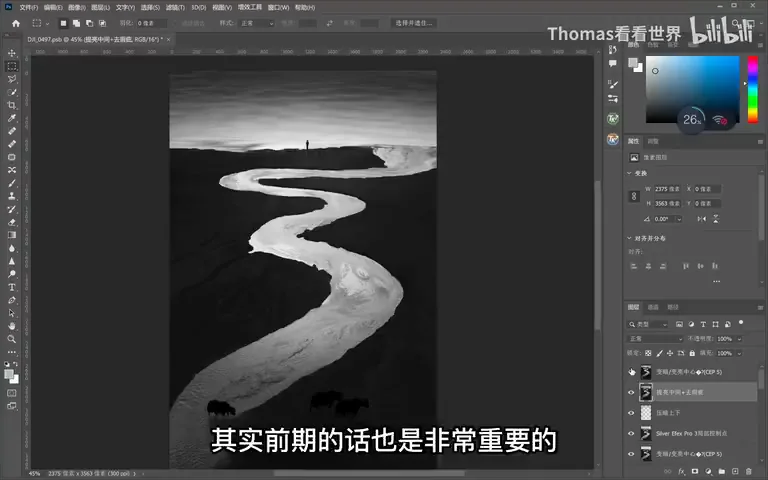
1. Black and white is not a rescue for failed shots but a language planned from the framing stage — decide before you press the shutter; 2. The masters' pattern: rivers bring line and natural brightness, a ready brush of light in monochrome, and black and white permits exaggerations of brightness that colour never could; 3. Shoot for the conversion: wait for yaks and a human to enter as reference and story, giving the shallow creek scale and association; 4. The edit's through-line is "remove detail, build light": dual-version blending gated by luminosity and group masks lifts the stream, shadows are lifted then pressed back with Curves to flatten contrast, and a centre-bright, edges-dark finish leaves the eye to the stream alone.