Photography Tutorial · 2022-06-17
The Hidden Color King in PS: A Tutorial on the Calibration Panel Primaries
When looking at popular presets and trending tones, you'll notice a somewhat hidden PS tool — the primaries in the Calibration panel.
This tool is a bit complex; many tutorials fail to explain its principle, yet many photographers regard it as a grading gem in practice.
In today's video, Thomas explains in an accessible yet deep way: what does this tool do? How do you use it? And why is it so effective?
Video
▶ Watch the video tutorial on Bilibili
This is the fully illustrated companion to the video above. The mysterious move behind influencer presets — a photographer twiddles a couple of blue-green sliders and beautiful color appears — is the three primaries (blue, green, red) in the Calibration panel at the very bottom of Camera Raw / Lightroom. This episode is the theory: using a color wheel as a live demo, Thomas distills the rule of the hue sliders — how the primary moves and how its complement follows — builds a clean teal-orange look in three moves, and explains the nature-inspired logic behind the landscape photographer's beloved blue primary saturation at +100. The next episode applies it to internet-famous looks.
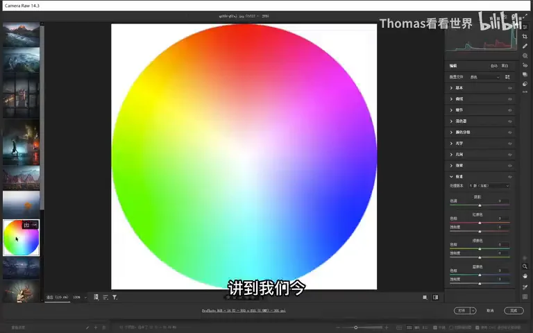
The whole lesson runs on this color wheel (at 1:53 in the video): treat the wheel as a "photo" in Camera Raw, move the primary sliders, and the wheel's deformation lays bare where every hue goes. Understand the figures below and you understand the entire tool.
01 Two Traits of Great Color: Clean and Complementary
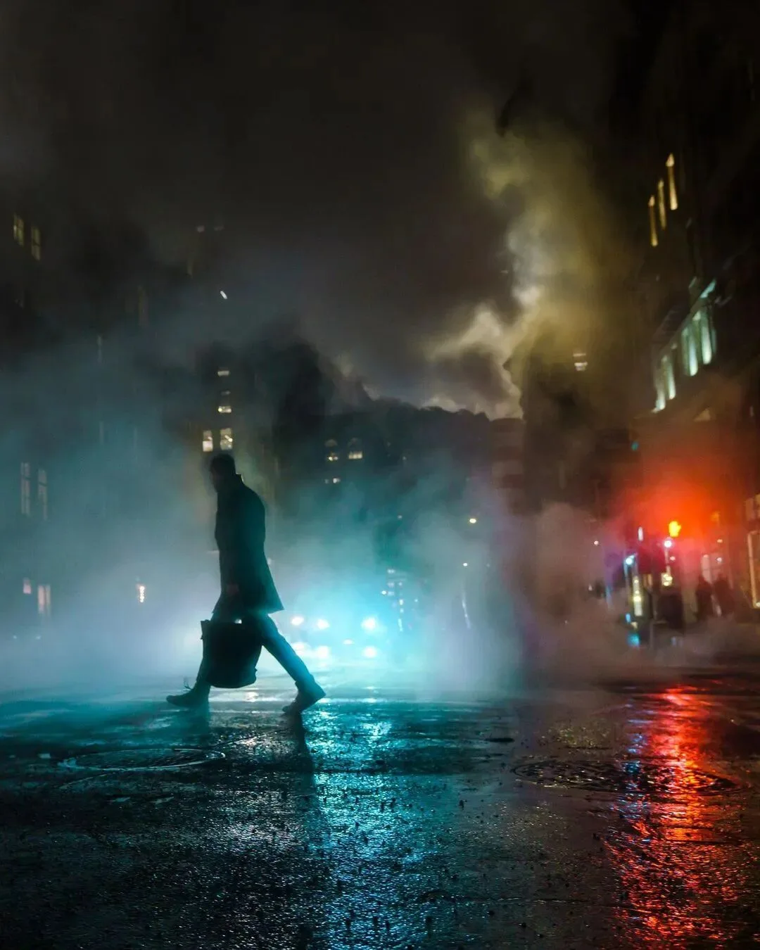
Thomas opens with a set of photos — his most popular work plus trending portraits and landscapes from Instagram (at 0:42 in the video) — and asks for common traits. Two answers: first, the colors are remarkably clean, free of chaotic stray hues, usually one dominant palette supported by a few supporting hues; second, the color relationships are almost always complementary, opposing pairs — teal-orange, teal-red, orange-blue (at 1:16 in the video).
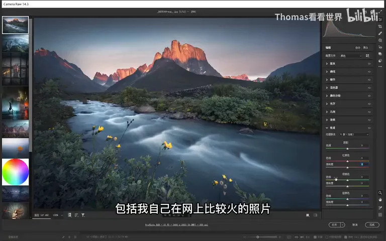
Is there a single tool that produces "clean plus complementary" color in one move? There is — today's protagonist: the three primaries in the calibration panel.
02 The Calibration Panel: Where the Three Primaries Live
In Lightroom or Adobe Camera Raw it's the group at the very bottom — the Calibration panel (at 2:01 in the video). Originally built to calibrate the color of digital and film cameras, its greater value today is creative grading. You'll rarely touch the shadow tint here — Color Grading (split toning) is the better tool for that; what we care about are the three primaries — red, green, blue — each with a hue and a saturation slider (at 2:33 in the video).
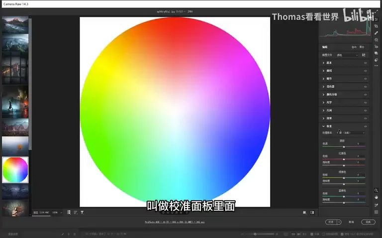
03 Hue Slider Rules: Move a Primary, Its Complement Follows
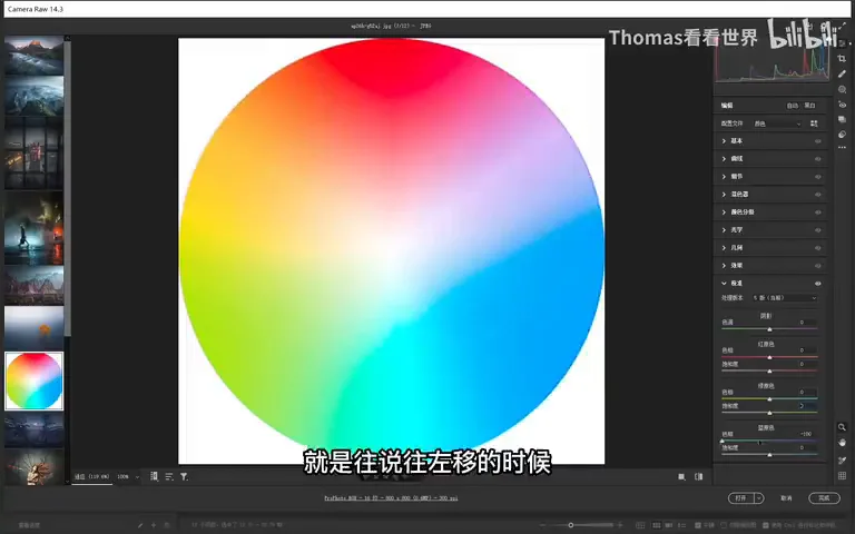
Take the blue primary's hue (at 2:51 in the video). Drag left: purple's saturation collapses almost to nothing, the broad band of cyan and blue unifies toward teal, and on the opposite side the red-orange territory expands — much of the original green gets absorbed into orange-yellow and red (at 3:14 in the video). The primary hue slider, in other words, unifies color: cool tones all collapse into teal, and the two colors it produces are precisely a complementary pair — teal versus red-orange (at 3:49 in the video).
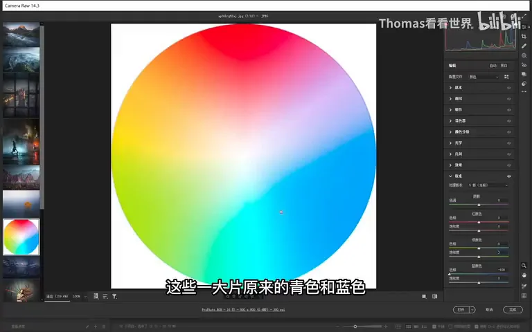
How do you remember which direction does what? Don't memorize — derive it (at 4:06 in the video). The blue primary governs blue and its neighbors: slide left, and since cyan sits to blue's left, blue shifts toward teal; slide right, and purple sits to blue's right, so blue shifts toward purple (at 4:24 in the video). Meanwhile the complementary side moves in tandem: yellow faces blue — when blue goes left (teal), yellow shifts toward teal's complement, red-orange (at 5:05 in the video); when blue goes right (purple), yellow shifts toward purple's complement, green (at 5:26 in the video).
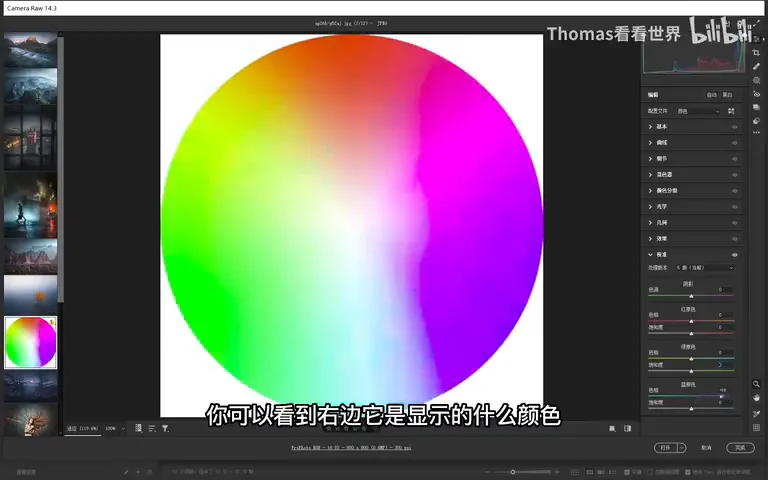
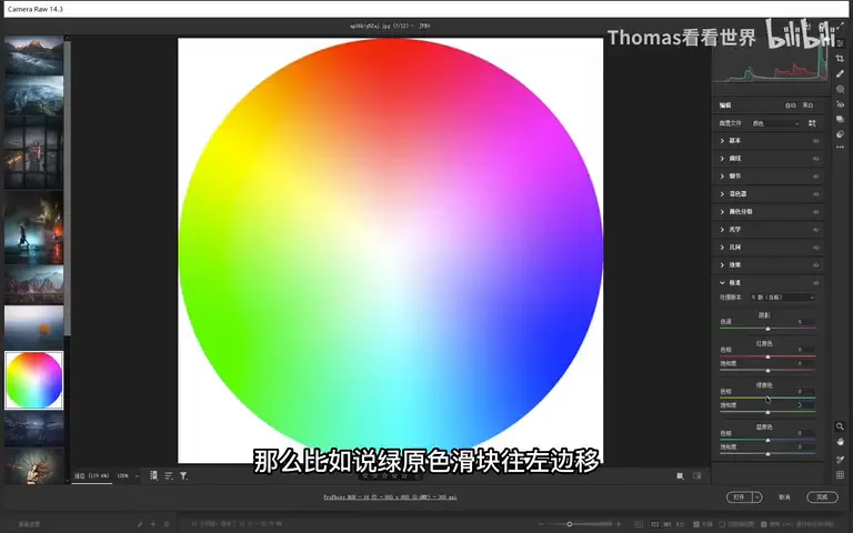
The same logic applies to the green primary (at 5:39 in the video): it governs green and, across the wheel, purple. Slide left and green drifts toward yellow-green and yellow — grass in the frame visibly warms — while the opposing magenta eases toward blue-purple (at 5:51 in the video). Slide right and green heads toward teal while magenta heads toward red (at 6:14 in the video).
The red primary works the same way (at 6:24 in the video), and Thomas makes viewers predict before he reveals: slide left and red turns magenta, while the opposing cyan drifts toward magenta's opposite — green (at 6:35 in the video); slide right and red plainly shifts toward orange, with cyan heading for orange's complement — blue (at 6:55 in the video). And if the logic escapes you, no matter: in practice just nudge the slider left and right — teal or purple, orange or green — it's instantly visible (at 7:14 in the video).
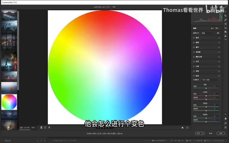
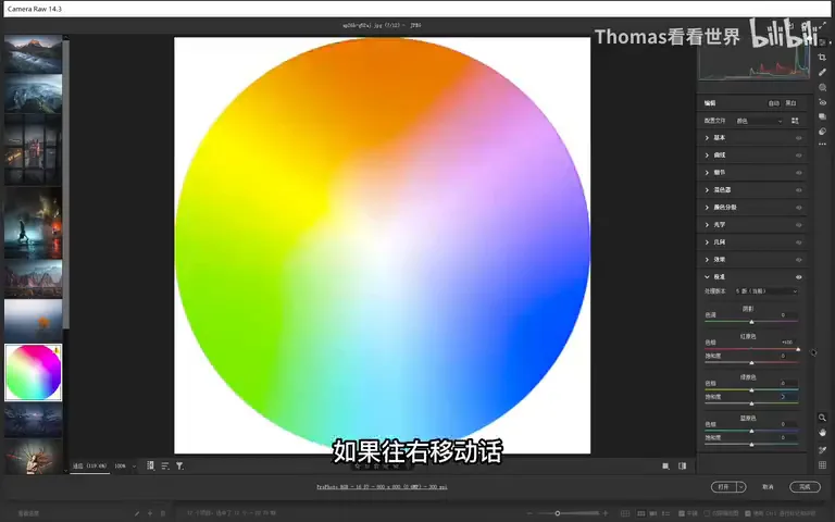
04 Teal and Orange in Three Moves
Live demo (at 7:30 in the video): for a teal-orange look, first drag the blue primary's hue left — a broad field of teal appears at once and the orange territory grows with it. But the warm side still carries reds and greens, not pure enough. Step two: drag the red primary's hue right — red merges into orange (at 7:47 in the video) and green gets folded into the warm zone. The frame now holds exactly two tones, teal and orange; purple's saturation has all but vanished, stray hues are gone, and a pristine "morning" palette is done (at 8:28 in the video).
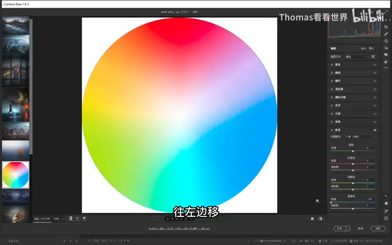

How far can hue sliders go? Candy tones, cartoon tones, cyberpunk, berry-pink — the internet-famous looks all fall out of primary hue moves (at 8:39 in the video); the case studies are reserved for the next, hands-on episode.
05 Saturation Sliders: Why Landscapes Max Out the Blue Primary
The saturation sliders follow a simple rule: each primary's saturation mostly affects that color and its neighbors — drop the blue primary's saturation and blue plus its surroundings plunge while the opposing hues barely feel it; raise it and blue's neighborhood gains the most (at 8:56 in the video). The green and red primaries behave identically (at 9:17 in the video).
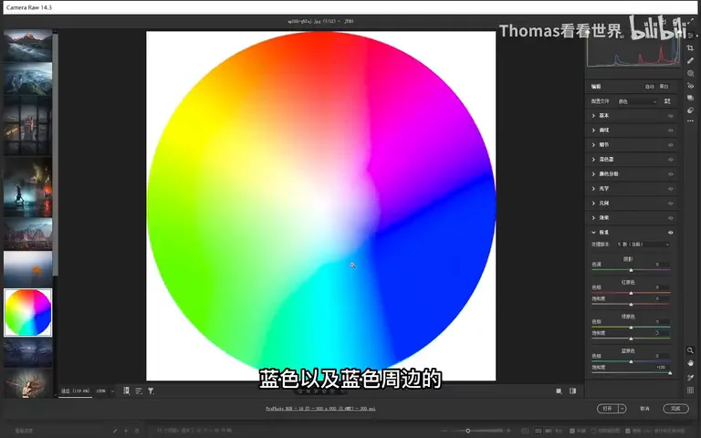
So why do landscape photographers often slam the blue primary's saturation straight to +100 (at 9:45 in the video)? Look at nature's palette: terrain and vegetation live in greens, yellows, oranges and near-reds, while the sky and water are essentially blue. Raising the blue primary lifts the whole frame's saturation, yet the warm colors — orange, green, yellow — increase proportionally and pleasantly, never oversaturated (at 10:18 in the video). If the sky overshoots, just pull blue and cyan down individually with the HSL tool — the two tools together: warm colors enriched in proportion, blue held flat or even reduced (at 10:34 in the video).
Why not use the green or red primary for this (at 11:08 in the video)? Raise green and the frame's vast vegetation can tip into oversaturation; raise red and its neighbors orange and yellow follow, making flowers garish. With a clear goal, though, exceptions apply — to strengthen red, yellow or purple blossoms, nudging the red primary is perfectly fine. For a normal photo you want the land's greens, yellows, oranges and reds lifted gently in proportion — that's the blue primary's home turf (at 11:40 in the video).
1. Great color shares two traits: a clean dominant palette with few stray hues, and complementary relationships (teal-orange, teal-red, orange-blue); 2. Primary hue sliders can be derived, not memorized — a primary shifts toward its wheel-neighbor in the slider's direction (blue: left teal, right purple; green: left yellow, right teal; red: left magenta, right orange), while the facing complement shifts in tandem; 3. Teal-orange in three moves: blue primary left for teal and a wider orange zone, red primary right to fold red into orange — purple and other strays vanish on their own; 4. Blue primary +100 is a landscape staple — nature keeps warm colors on the ground and blue in the sky, so warm tones enrich in pleasant proportion; rein an oversaturated sky with targeted HSL drops in blue and cyan.