Photography Tutorial · 2018-12-30
The Most Magical PS Color Tool: Why Do Viral Presets Love Camera Calibration Primaries?
Thomas Chu Photo
In the earlier series tutorial 'To Learn Camera Raw Editing, This Article Is Enough', Thomas covered almost every Adobe Camera Raw (ACR) tool — except the Calibration panel's primaries, which weren't shared in detail.
Yet in countless popular presets and trending grading tutorials, the primaries tool appears with extremely high frequency — it's one of the most magical grading tools.
In today's tutorial, Thomas shares how to use the primaries tool.
1
Why is the primaries tool so magical?
First, let's browse a set of 'viral' photos.
These popular photos online — whether landscapes or portraits — actually follow certain patterns and formulas. Can you summarize them?
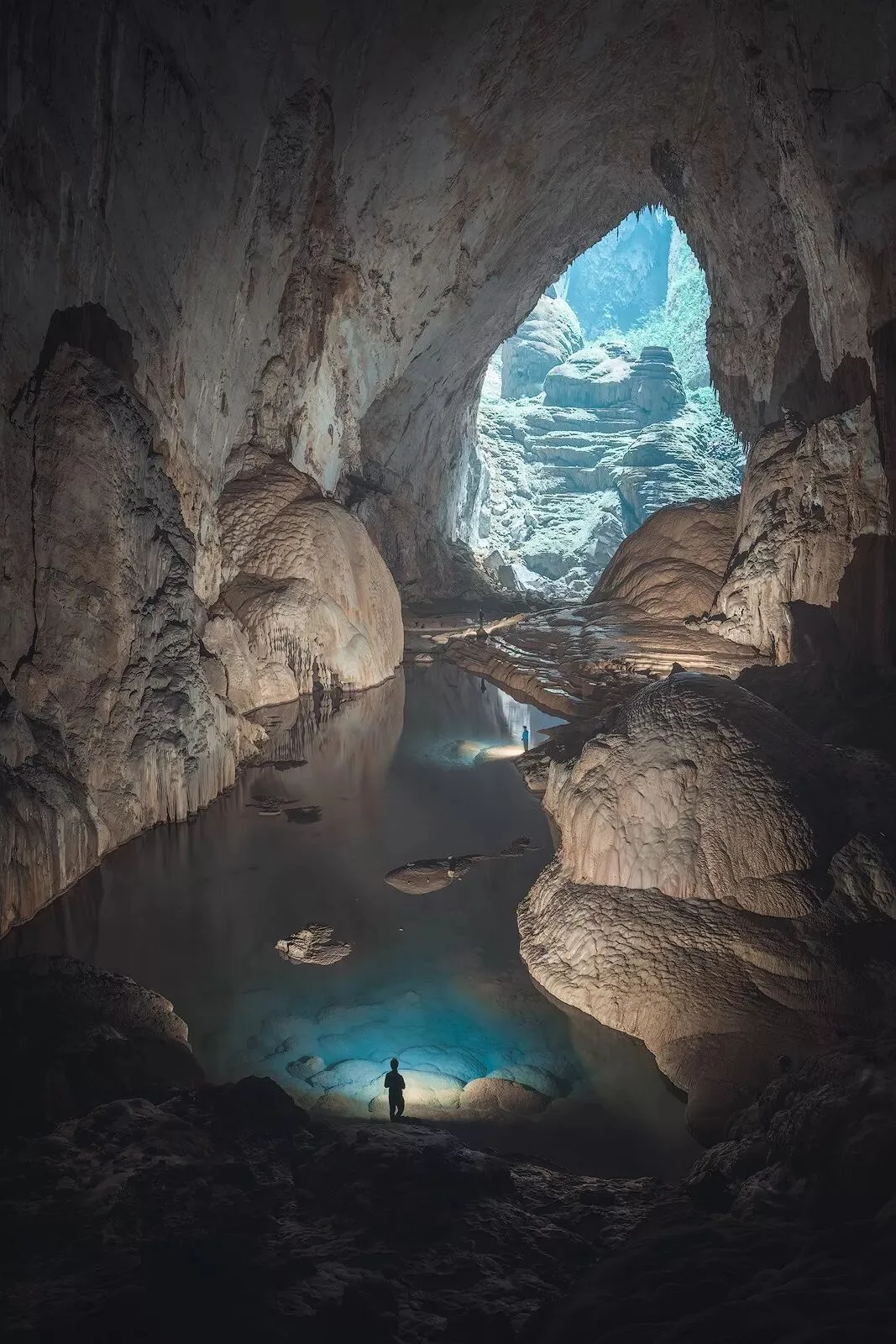
Photographer: Thomas Chu Photo (landscape)
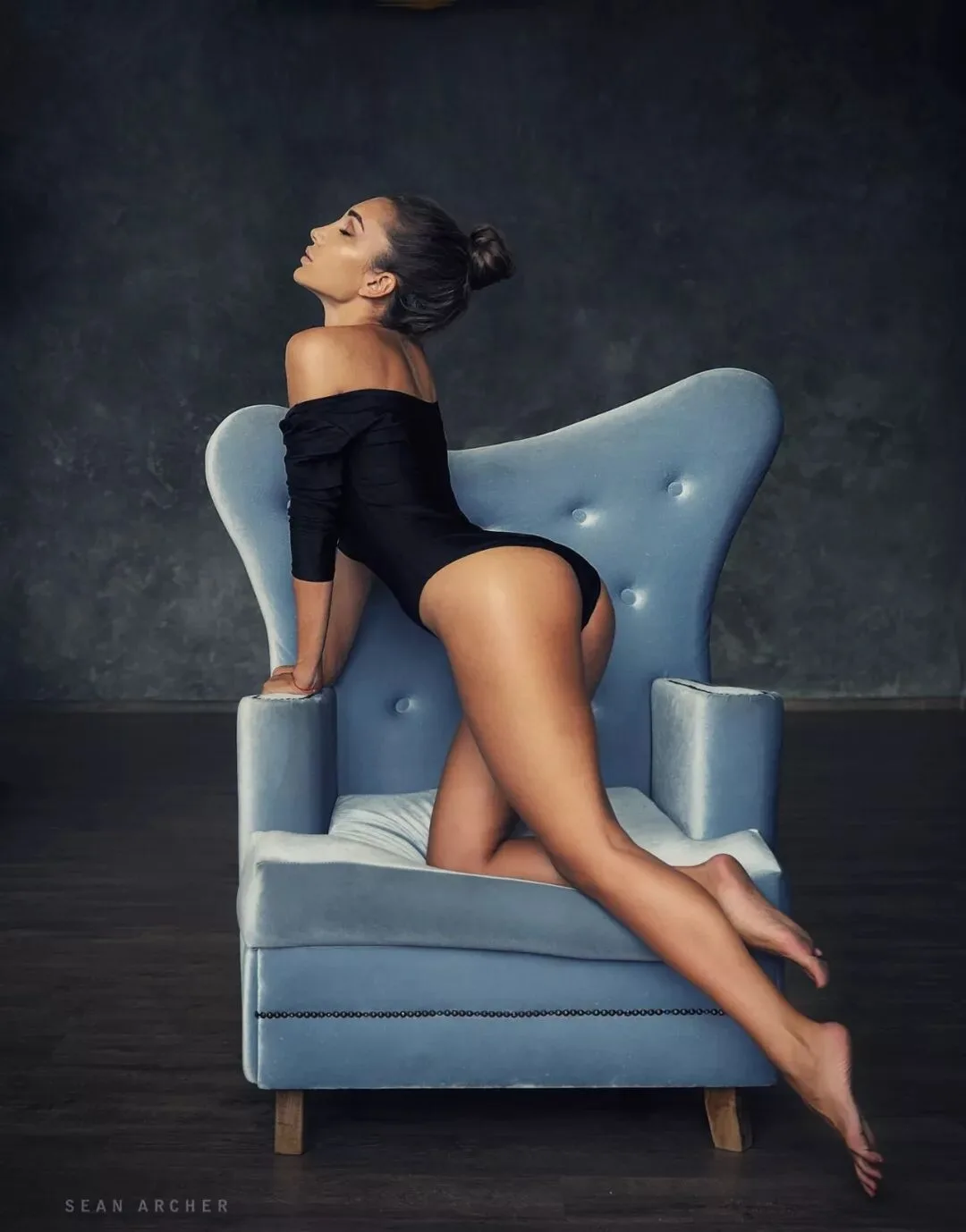
Photographer: Sean Archer (portrait)
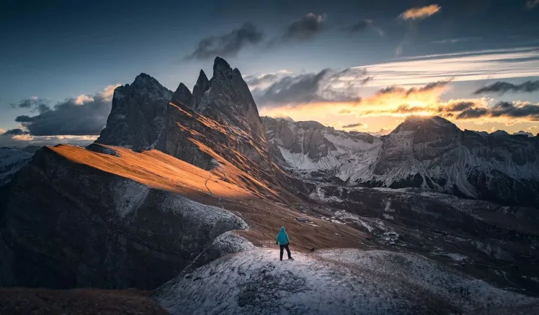
Photographer: Thomas Chu Photo (landscape)
Have you noticed what these photos have in common?
1) The colors across each photo are clean and unified — not many hues appear; nothing is a garish riot of color. This makes the photo comfortable and harmonious, never messy.
2) The colors follow color-matching models — for example the complementary pairing mentioned in the tutorial 'Learn Common Color-Matching Principles and Never Fear Grading Again'. All 3 photos mainly use the 'cyan-orange' RYB complementary pair. Color matching is widely used not only in photography but also in art and design.
'Not too many hues' and 'hues following color-matching models' are also two of the 'five color-matching formulas' I mention in my book 'Foundations of Landscape Photography Post-Processing'.
So how do we reduce the number of hues in a frame and make colors fit classic pairings? We can use many tools — HSL, curves, channel mixer and so on.
But the 'Calibration - Primaries' tool covered today is so magical and so omnipresent in viral grading precisely because it accomplishes both at once!
The Calibration panel sits near the end of ACR's panels. It mainly contains six sliders: Red Primary Hue, Red Primary Saturation, Green Primary Hue, Green Primary Saturation, Blue Primary Hue, Blue Primary Saturation.
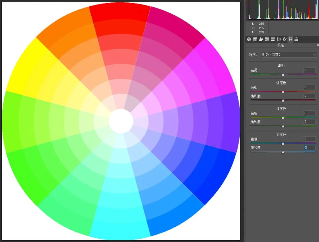
Our demo image is a 12-color wheel built from red, green and blue primaries, so we can see each color's change intuitively.
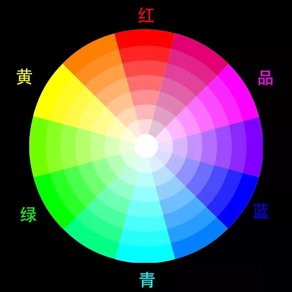
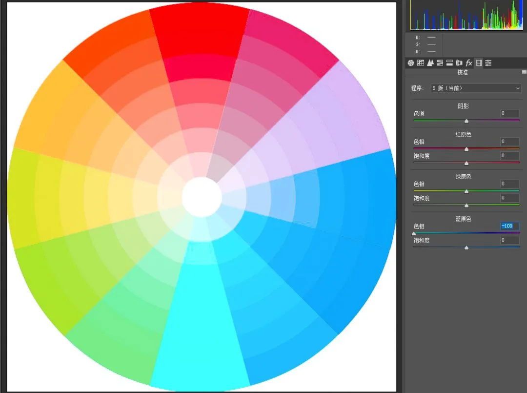
Try moving the 'Blue Primary - Hue' slider to the left — the wheel undergoes a magical change.
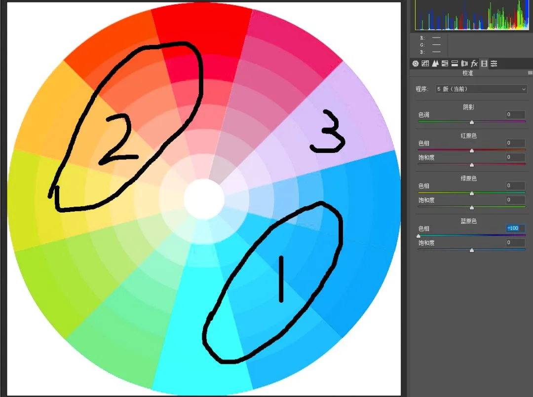
Circle 1 marks the blues and their neighbors in the original: they all shift toward cyan, their hues unified. Circle 2 marks the yellows and neighbors: they shift toward orange, also becoming unified.
Even more magical, the transitional colors marked 3 — like magenta — actually lose saturation, effectively reducing the number of hues.
By moving the Blue Primary hue slider left alone, we simultaneously reduced the number of colors in the frame and pushed most hues toward the classic 'orange-teal' pairing — nailing two formulas of trendy tones in one move. No wonder influencers love it!
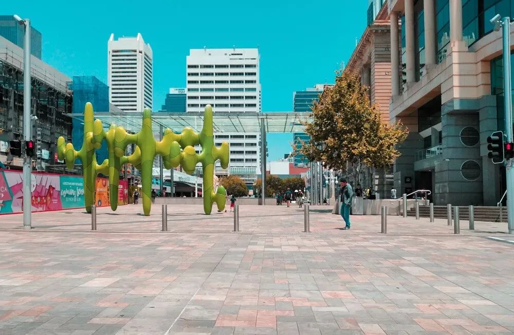
Here's another case using a phone photo: the colors below are ordinary, with many hues and a messy pairing.
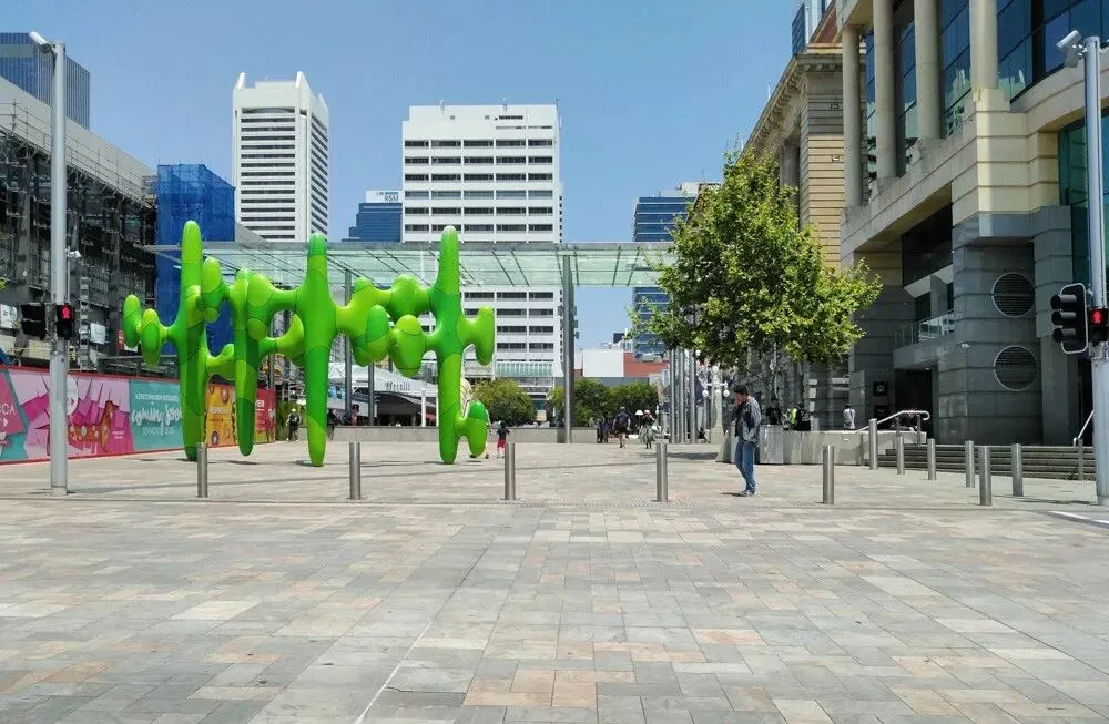
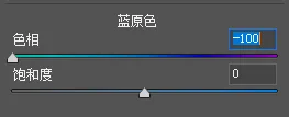
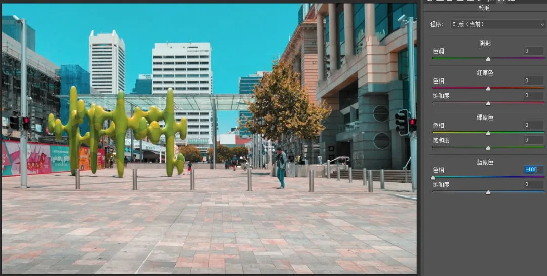
I entered the Calibration panel and moved the Blue Primary hue left to -100.
Instantly the photo took on the 'candy color' style introduced in 'Check Out These 3 Landscape Photographers': cool tones all lean teal, warm tones all lean orange-red, and stray colors are largely eliminated — a single step basically nails the effect!
2
How to use the primaries hue sliders?
From the cases above we learned a core strength of the primaries tool: it controls the number of hues in the frame and pushes them toward complementary pairings.
So what effects do these hue sliders have when moved left or right, and how exactly should we adjust them? That's what we explore next.
But first, an introduction: the primaries tool lives in the 'Calibration' panel because, when Photoshop was first developed, it was meant to correct color casts between the RAW file and the camera standard.
Its underlying principle is correcting RAW color casts by changing the relationship between the red, green and blue channels (the three sensor elements). As calibration technology evolved, its original function was superseded, and it's now mostly used for creative grading.
If you're not yet familiar with adjacent and complementary color relationships, I recommend first reading the tutorial 'Mastering Post Grading Starts with Understanding Color', or Chapter 2 Section 3 of 'Foundations of Landscape Photography Post-Processing', before continuing.
Let's start with the Blue Primary slider. Blue Primary Hue affects the whole image's colors, especially the blue and yellow parts of the original.
Because real photos often contain blue (sky, sea, shadows) and yellow (sunlight, rocks, skin, vegetation), the Blue Primary hue slider is the most-used of the three.
Move Blue Primary left (toward the cyan end of the slider): the blues and neighboring colors gain cyan, unifying toward blue-teal overall.
Meanwhile the yellows' neighbors also shift (why yellow? Because in RGB, yellow is blue's complement): these warm colors all gain red (cyan's complement), pushing them toward orange and orange-red.
As for colors sitting between blue and yellow — like green and purple — not only do their hues shift, their saturation decreases.
What about moving Blue Primary hue right?
Moving Blue Primary hue right (toward magenta): blues and neighbors shift toward magenta; yellows and neighbors shift toward green (magenta's complement); and again the in-between colors lose a lot of saturation.
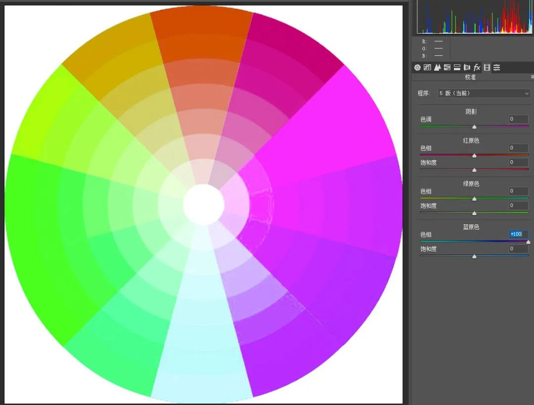
In short, the Blue Primary hue slider mainly affects blues, yellows and their neighbors: left unifies them into a 'teal-orange' pairing, right pushes everything toward 'magenta-green'.
Since pure green and pure purple rarely appear in nature, for landscape grading the Blue Primary slider is almost always moved left.
For the other hue sliders I'll just give conclusions — you can reason them out from the Blue Primary example combined with complementary relationships.
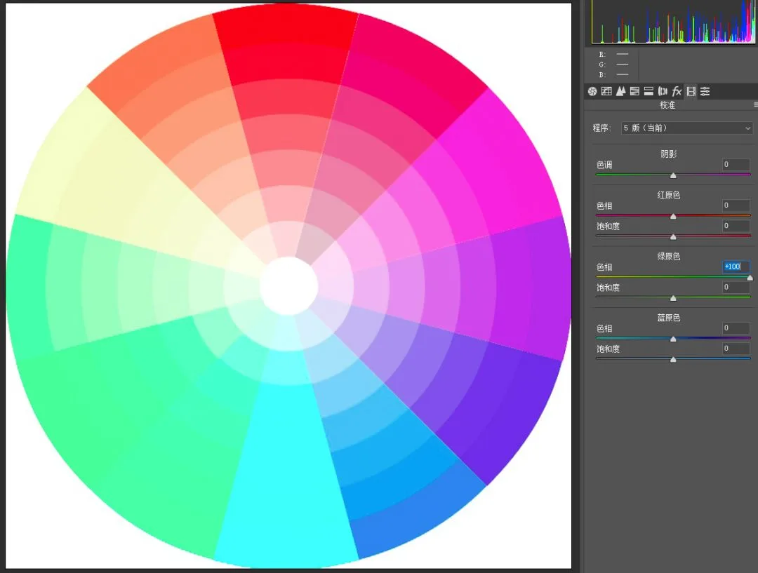
The Green Primary hue slider mainly affects greens and their complement magentas, plus their neighbors. (These two colors are rare in normal photos, so Green Primary is used less often.)
Move Green Primary hue left (toward yellow on the hue bar): greens (and neighbors) shift yellow; magentas (and neighbors) shift blue.

Move Green Primary hue right (toward cyan on the hue bar): greens (and neighbors) shift cyan; magentas (and neighbors) shift red.
Red Primary hue mainly affects reds and their neighbors, plus cyans and their neighbors. Since red objects are common in real life — skin, flames and so on — this slider is also used often, especially in portrait grading.
Move Red Primary hue left: reds (and neighbors) shift magenta; cyans (and neighbors) shift green. As mentioned, the 'magenta-green' combo is not very natural, so I rarely move Red Primary left.
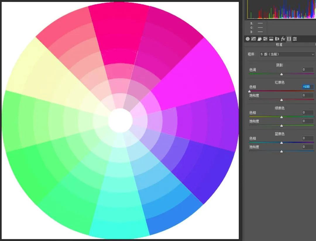
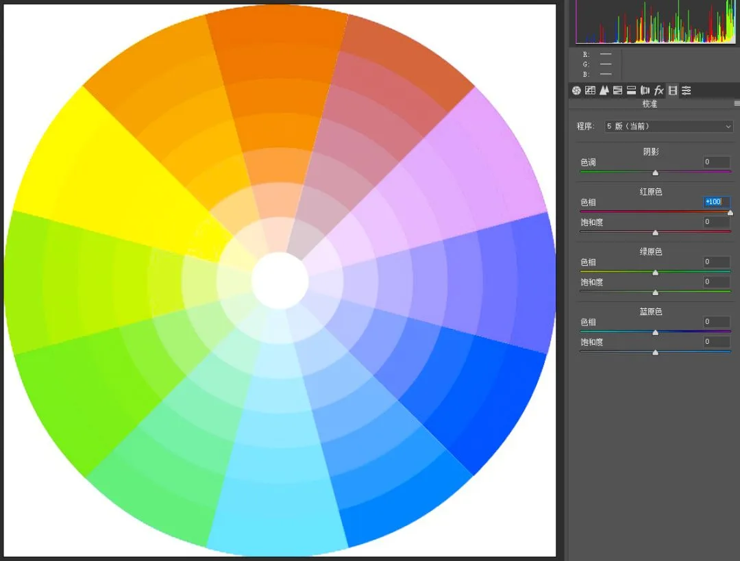
Move Red Primary hue right: reds and similars shift orange-yellow; cyans and similars shift purple-blue — also a common color pairing.
In real cases we often combine multiple primary sliders, and even the HSL tool, to grade.
Take the earlier 'candy color' example:
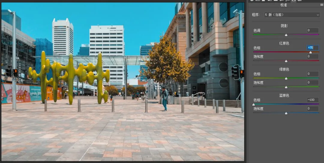
Blue Primary hue left to -100 gives the basic feel, but the person's skin is too orange-red and needs shifting toward yellow, and the blue in the sky is a bit insufficient.
Moving Red Primary right pushes the warm family toward orange-yellow and the cool family toward purple-blue — exactly what's needed, so I moved Red Primary to +75.
The orange-yellow in the frame felt a bit stuffy for a sunny mood, so in the HSL tool I raised Orange luminance by 87. (HSL tutorial: 'Mastering Grading Starts with Understanding the HSL Panel'.)
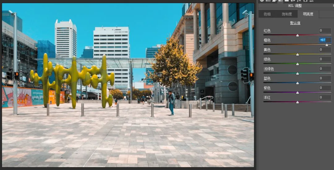
There will be a more detailed tutorial on candy colors later. But with the primaries and HSL tools, we're already ninety percent there.
3
How to use the primaries saturation sliders?
Besides hue sliders, the red, green and blue primaries each have a saturation slider.
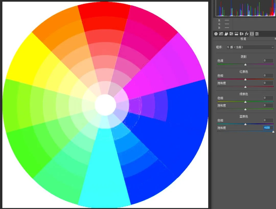
Blue Primary Saturation mainly affects the saturation of blue-ish color families. Move it left and the blue family loses saturation dramatically, while other colors drop only slightly.
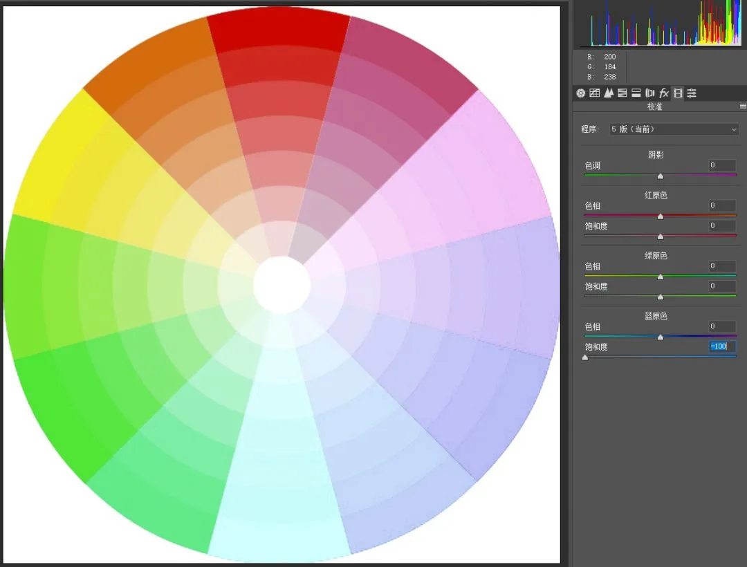
Move it right and the blue family gains saturation greatly, while other colors are barely affected — the boost feels natural and harmonious.
Green Primary Saturation mainly affects green-ish families. Move it left: greens lose saturation dramatically; other colors drop slightly.
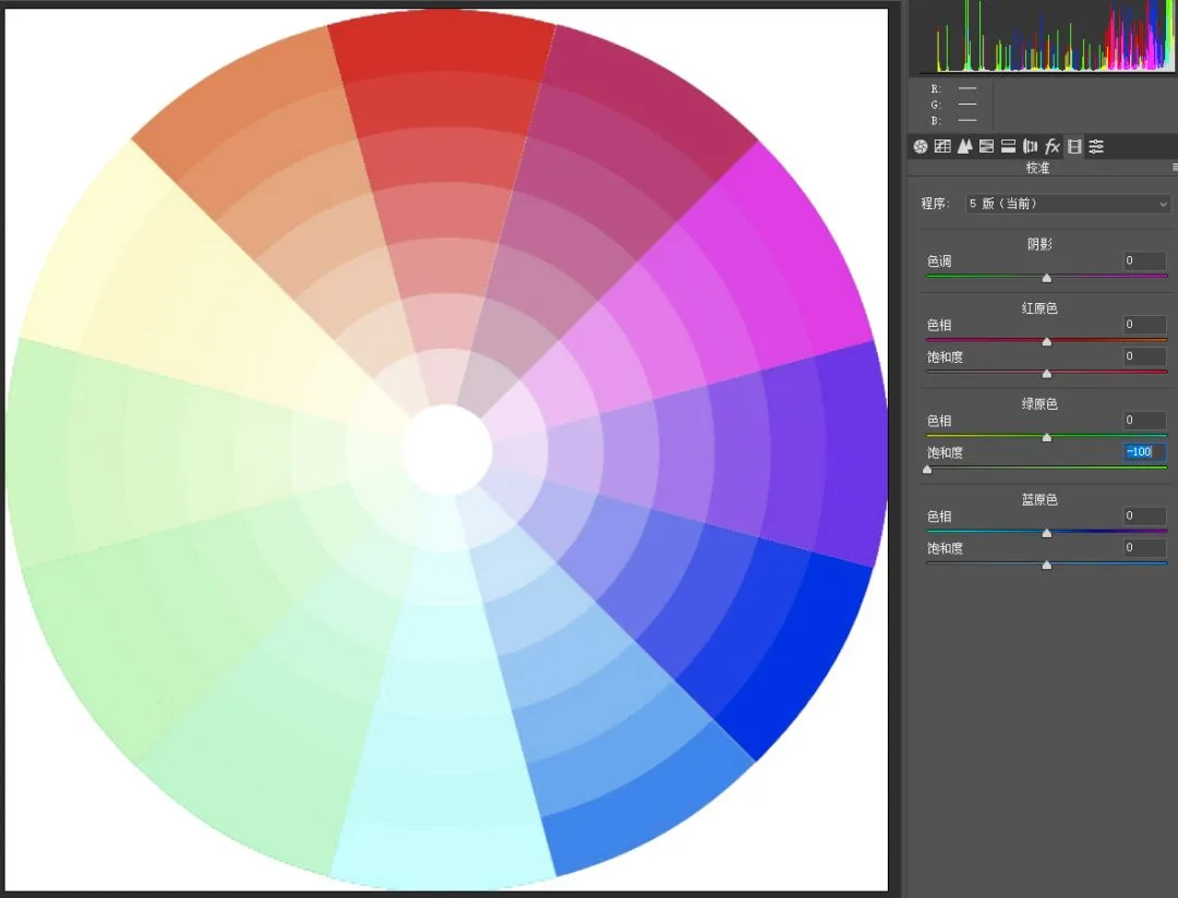
Move it right: greens gain saturation greatly; other colors gain only slightly.
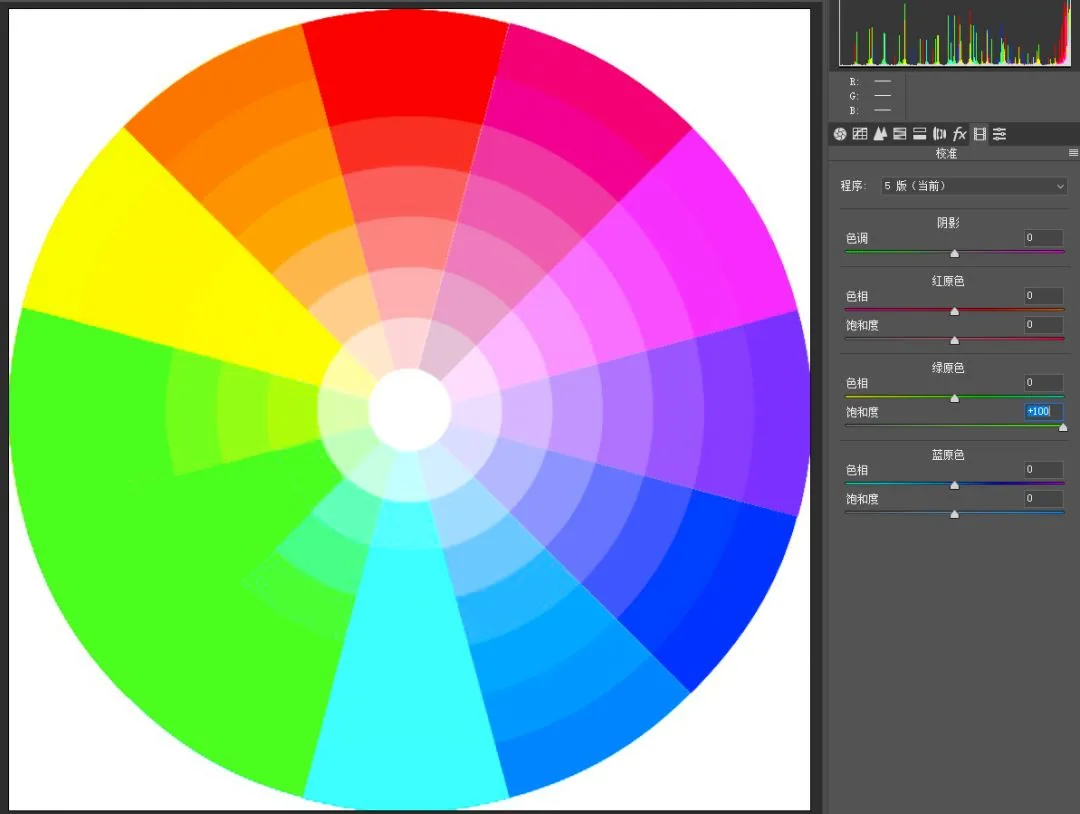
Red Primary Saturation behaves similarly: left greatly reduces reds and related colors; right greatly boosts them. Other colors are barely affected.
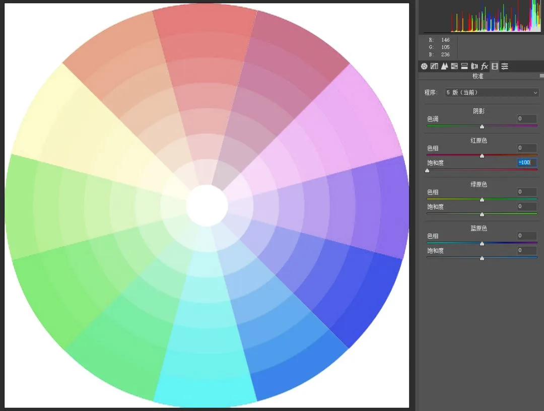
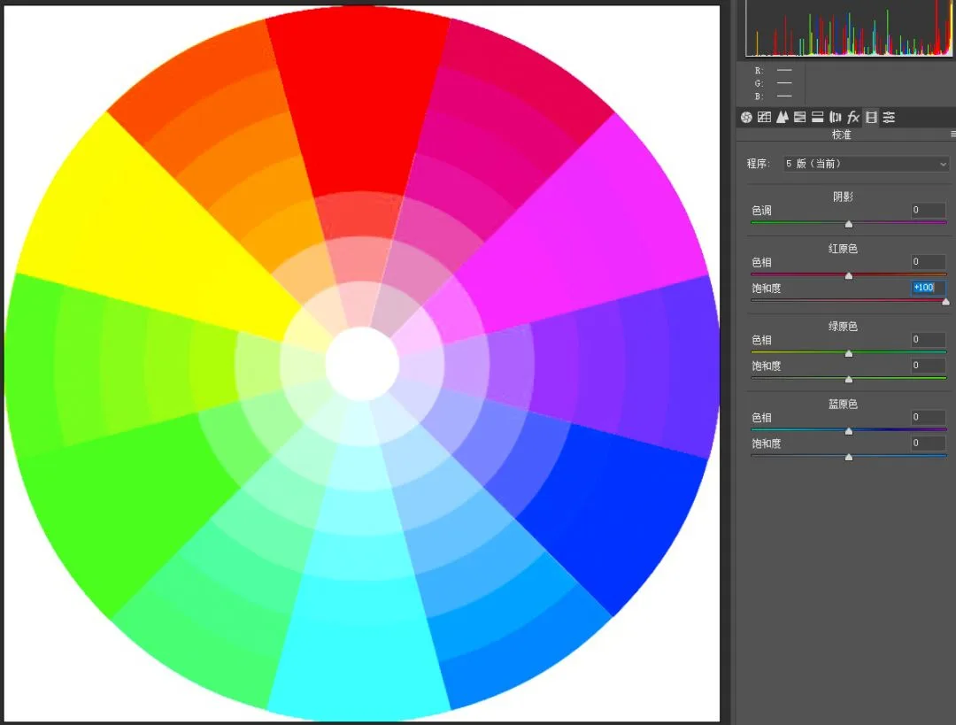
In natural landscape photos, ground elements like skin, trees, flowers, rocks and brick walls usually have hues near orange and yellow. Their saturation generally shouldn't be raised much — over-saturated skin and sandstone look unnatural.
Earlier we noted that raising Blue Primary Saturation strongly boosts cool colors while warm colors rise only slightly — comfortable and natural. That's why many landscape photographers love raising Blue Primary Saturation.
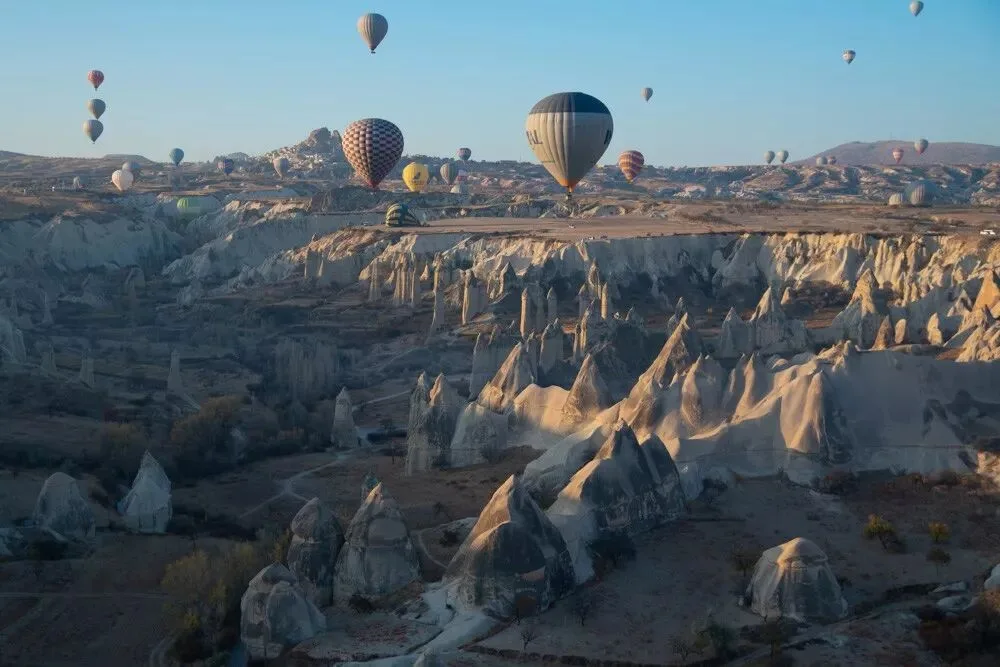
The photo below is a typical case: the original colors are too pale.
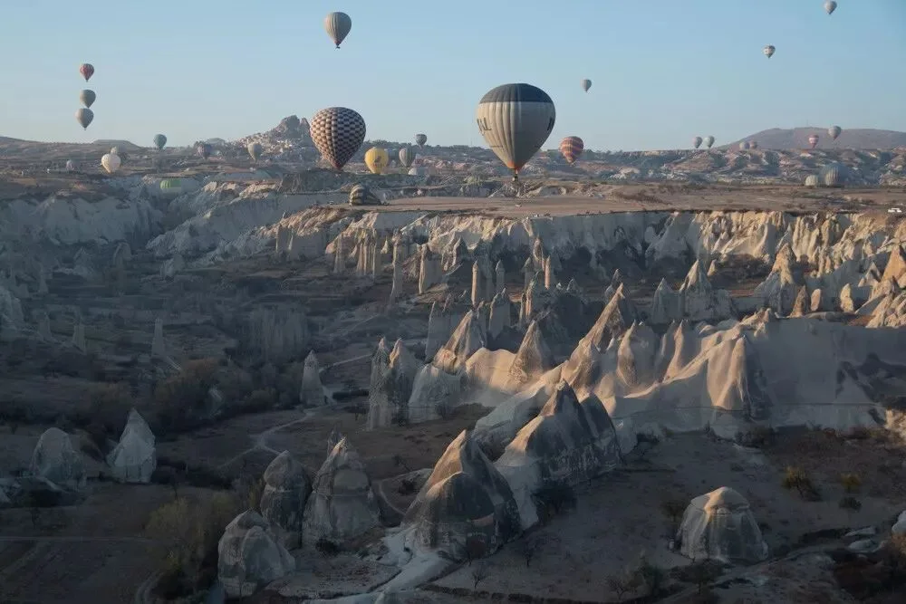
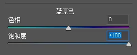
Raise Blue Primary Saturation to +100.
The saturation rises, and it looks natural overall.
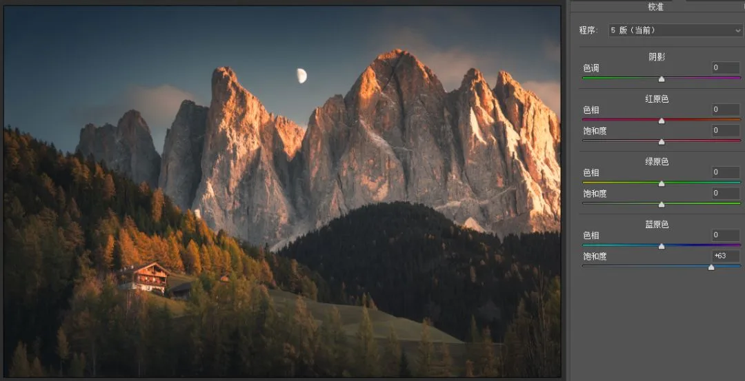
Of course, some photos already have intense blue skies, and raising Blue Primary Saturation over-saturates the sky.
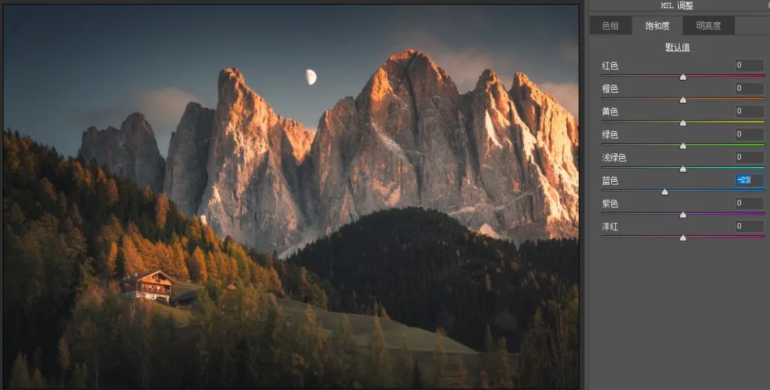
In that case, combine it with the HSL tool to reduce blue saturation.
Summary
1. Controlling the number of hues and matching classic color pairings are common formulas behind trendy tones — and the Camera Calibration primaries tool accomplishes this handily.
2. Blue Primary hue left: warm colors lean orange-red, cool colors lean teal. Red Primary hue right: warm colors lean orange-yellow, cool colors lean purple-blue. Other primaries follow similar principles but are used less.
3. Raising Blue Primary Saturation strongly boosts cool colors while warm colors rise naturally — a common trick among photographers. Primary adjustments often pair with HSL, and can sometimes even be fully replaced by it.