Photography Tutorial · 2019-03-28
Those Gorgeous Candy-Color Photos — Here's How They're Graded
Thomas Chu Photo
Hasselblad Master Ben Thomas's candy-color grade is hugely popular on social networks — perfect for grading sunny city street photos.
In today's tutorial, Thomas demonstrates how to create candy colors in post, using a reader submission from our photo critique column.
Everything is done with Photoshop's Camera Raw tool alone — very simple.
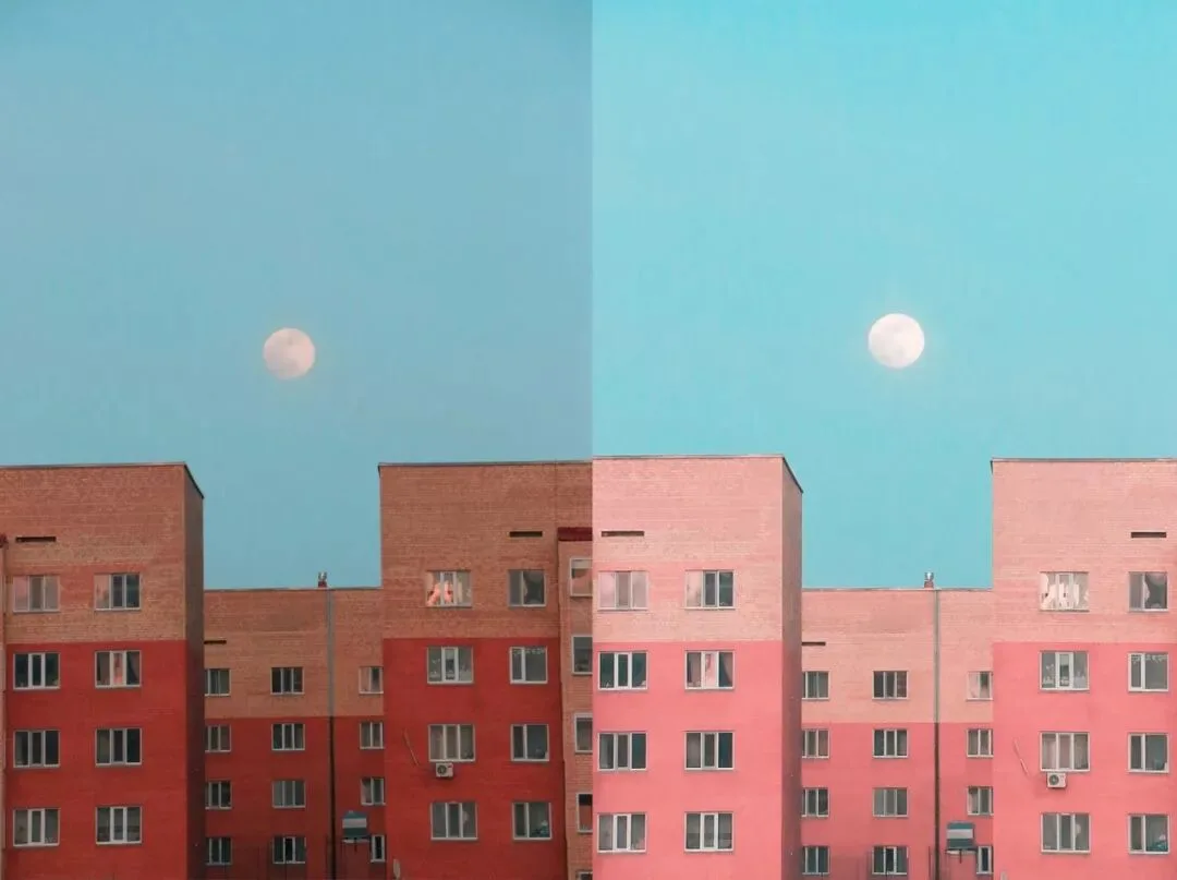
Original photo by: 霖宇霏 (Tuchong)
Video Tutorial
▶ Watch the video tutorial on Bilibili
This is the fully illustrated companion to the video above (a photo-critique episode). Using a Tuchong submission by Lin Yufei — a telephoto frame of the moon over a red-brick block — the episode demonstrates how to produce a Hasselblad master Ben Thomas-style candy-tone image entirely in Camera Raw: corrections and crop first to build the geometry, a bright-and-soft tonal base, the calibration panel's blue primary for a one-slider color shift, then HSL polish. It pairs perfectly with the site's calibration-panel theory article: one explains the principle, this one shows it in action.
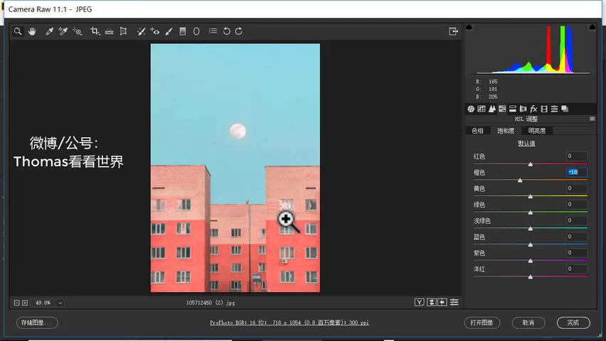
First, the finished image (at 6:55 in the video): candy-pink buildings, a milky teal sky, and the moon suspended between the two blocks — an ordinary JPEG turned candy. Below, the edit is unpacked step by step.
01 Ben Thomas and the Submitted Frame
You can't talk candy tones without Hasselblad master Ben Thomas: his work pairs cool teal-blue against warm orange-pink, bright and clean throughout, with geometry-driven compositions built on playful moments and structures (at 0:17 in the video). That's also the shooting-side prerequisite — a simple geometric frame first, sweetness later.
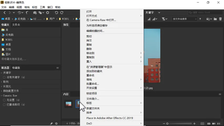
This episode's submission comes from the Tuchong critique column (at 0:59 in the video, original by Lin Yufei): a telephoto compression of the moon against a building, already clean in color and comfortable in composition — exactly the kind of base that needs only simple Camera Raw moves. Right-click in Bridge and choose Open in Camera Raw (or enter via Photoshop's Filter menu), and the JPEG enters the editing flow (at 1:32 in the video).

02 Corrections and Crop: Building the Geometry
Start with analysis: the goal is a candy tone — raise overall brightness, ease blue toward teal, nudge warm colors toward orange and pink. First, the fundamentals: check lens corrections and remove chromatic aberration as always; since the subject is architecture, run the Transform tool on Auto to square up the buildings (at 2:13 in the video) — the frame instantly gains that geometric structure.
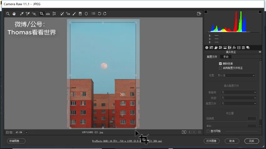
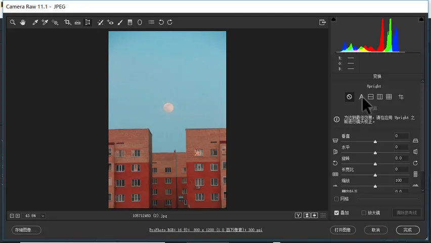
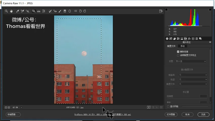
The critique also offers a shooting tip: step a little further left so the two buildings align perfectly symmetric — rather than one protruding and one recessing — and the shot levels up (at 2:28 in the video). In post, the crop tool preserves that clean symmetry by trimming the extra edges on both sides (at 2:46 in the video).
03 The Tonal Foundation: Bright, Soft, No Pure Black
Candy tones live high on the brightness scale, so exposure goes up first (at 3:20 in the video); pull highlights down a touch to guard against clipping; raise shadows substantially — candy looks keep plenty of shadow detail; and lift the black point so nothing turns too dark (at 3:41 in the video).
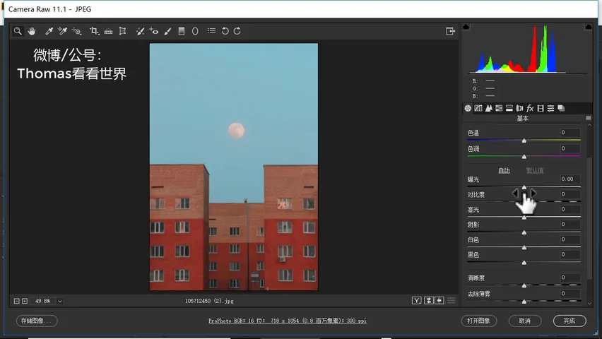
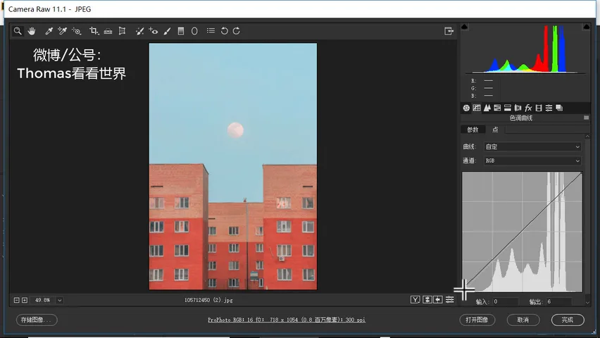
Then the signature move: in the tone curve, lift the black point at the far left (at 3:51 in the video). Watch the histogram — the darkest pixels slide right, pure black becoming deep gray. Don't overdo it; the rule is simply that the photo should contain no pure or near-black: keeping the darkest tones in deep gray is what creates the candy look's creamy softness.
04 The Calibration Panel: Shifting the Blue Primary
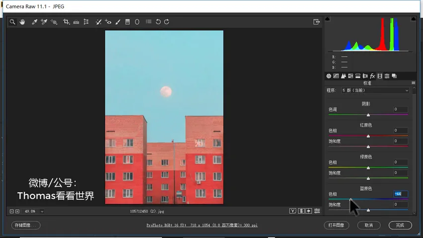
Now the color. As noted in the video, Thomas leans on the HSL tool, but the demonstrator found another tool exceptionally efficient for candy tones — the calibration panel (at 4:43 in the video; see the site's calibration-panel article for the theory). Slide the blue primary's hue left and the whole frame's cool tones drift toward teal while warm tones drift toward orange-red — precisely candy's two poles. Around -50, the classic candy palette appears at once (at 5:12 in the video); a slight boost to the blue primary's saturation brings the overall richness along (at 5:24 in the video).
05 HSL Polish: Making Candy Colors Sing
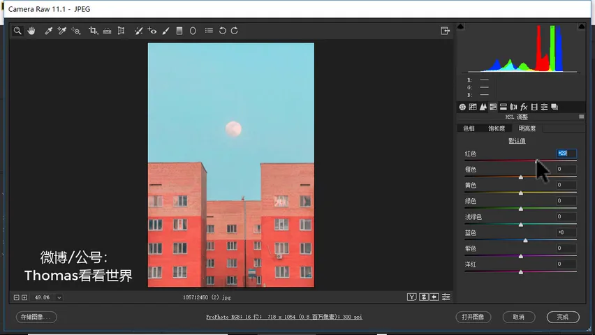
With the blue primary shift in place, the reds start feeling too red — time for fine-tuning in HSL. Hue: ease red slightly toward orange (at 5:43 in the video), and pull orange back toward red so it doesn't go purple-red (at 5:52 in the video); blue is already settled by the calibration panel. Luminance is the key here: raise blue's luminance a touch more (at 6:04 in the video), and push orange and red up substantially — that's what makes candy colors turn translucent, clean and pleasant (at 6:15 in the video).
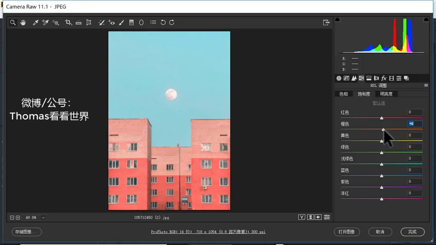
For saturation, dial red back slightly if it feels strong, and ease orange's saturation too (at 6:29 in the video). At this point the candy grade is essentially done; remaining local distractions — small messy elements — can be cleaned up in Photoshop with spot removal (at 6:49 in the video). Looking at the before and after: lifted and softened tones, a raised black point, the blue primary shifted, orange and red brightened in HSL — four moves, and a candy-tone image is born.
1. Candy tones are built on geometric simplicity up front: the Ben Thomas formula pairs teal-blue cool tones with orange-pink warm ones, bright, clean and symmetrically composed; 2. The tonal mantra: raise exposure, pull highlights down, lift shadows substantially and lift the black point, then raise the curve's black point to deep gray — no pure black anywhere; 3. The color shortcut lives in the calibration panel: slide the blue primary's hue to about -50 so cool tones shift toward teal and warm tones toward orange-red, with a slight saturation boost; 4. Finish in HSL: red toward orange, orange back toward red, orange and red luminance raised substantially for that translucent glow, saturation trimmed if too strong, then clean up and export.