Photography Tutorial · 2019-08-22
The Viral Chongqing Night Shots — This Is How the Color Grade Was Done
Thomas Chu Photo
A while ago, Thomas collaborated with Changan Automobile to shoot a commercial series in Chongqing for the new CS75 PLUS.
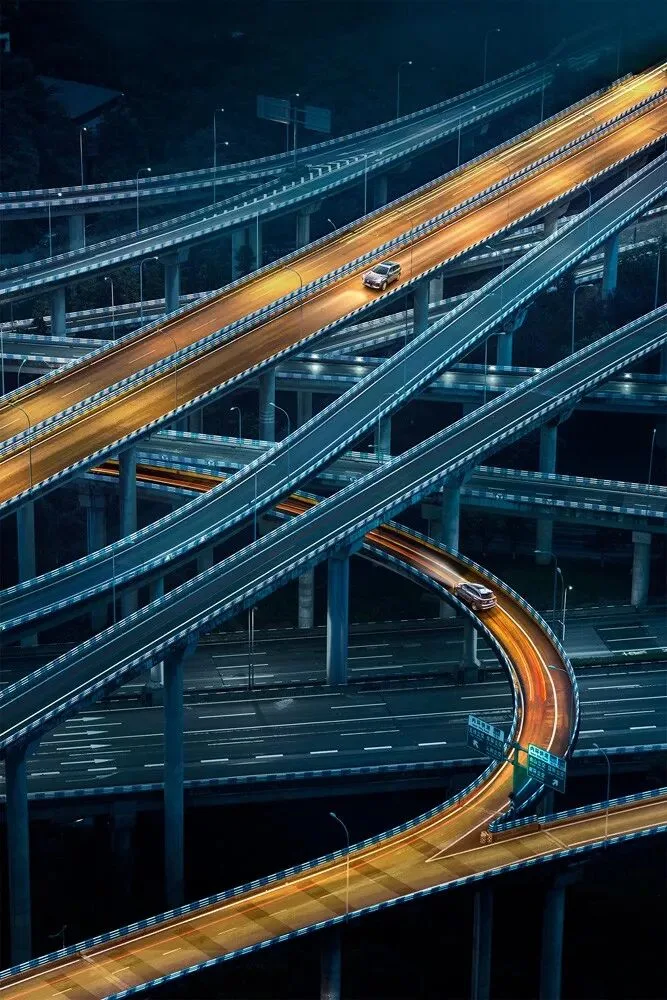
Huangjueping Interchange
Many friends loved this series and were especially curious about the color grading behind it.

So today, Thomas will use a similar Chongqing night cityscape to share the thinking and technique behind this color style.
The grade can be done entirely in Lightroom or Camera Raw — very simple. The original file is available for practice; see the download link at the end.
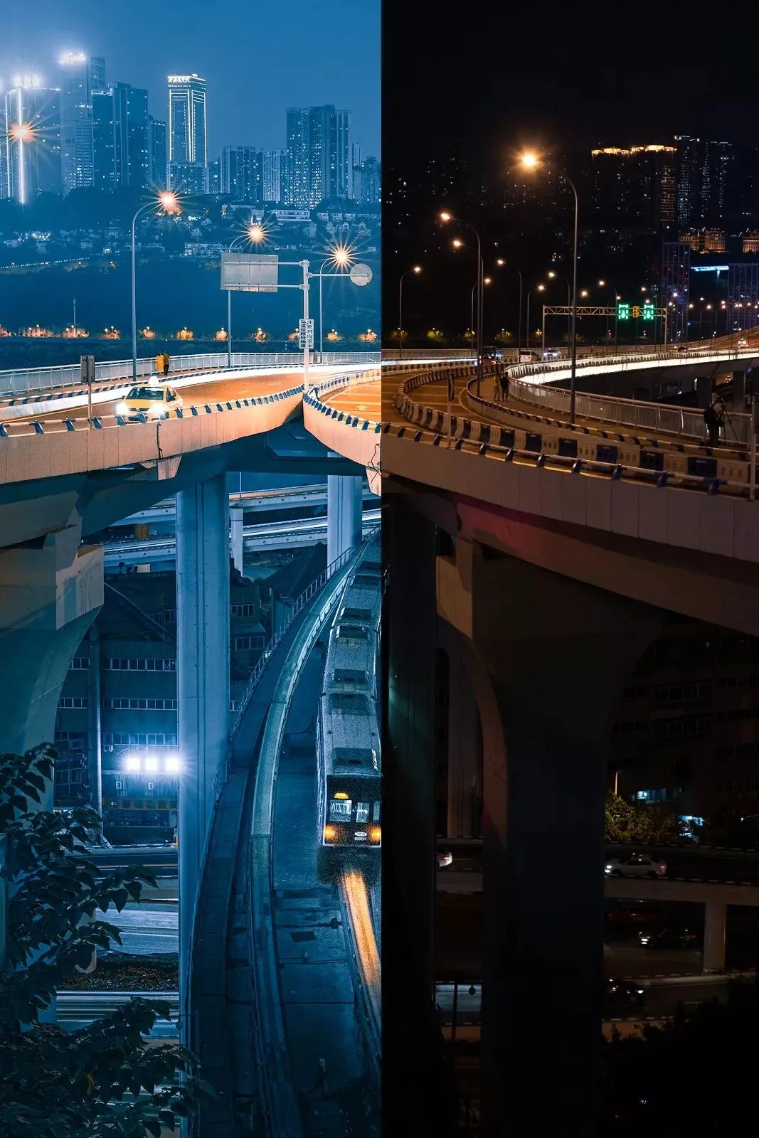
Caiyuanba Yangtze River Bridge — edited vs. original
1. Shooting and Editing a Futuristic City
Most commercial car photography emphasizes speed or luxury — a fairly formulaic approach.
The new CS75 PLUS, however, is a bold, fashionable, avant-garde attempt, so it called for fresh shooting and grading ideas too.
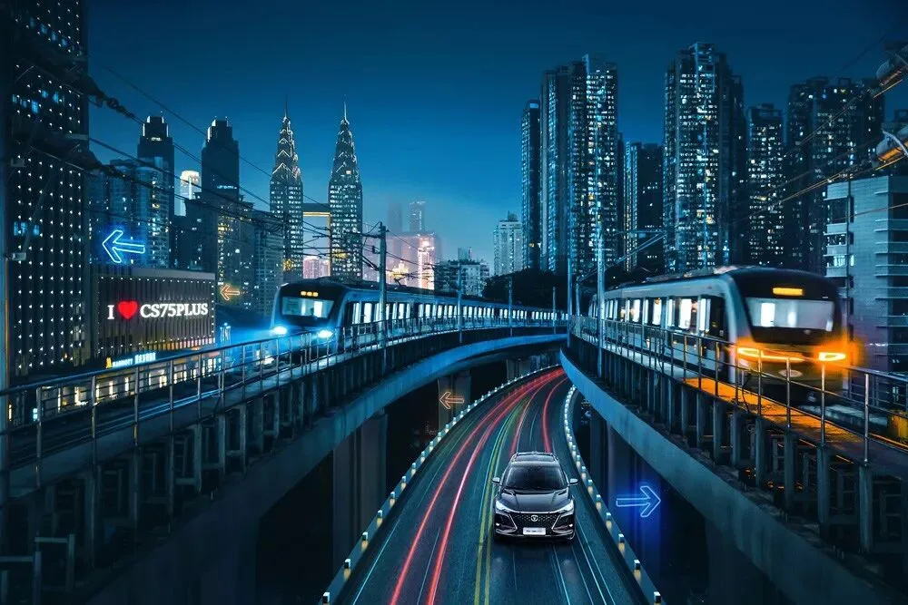
Haitangxi Metro Station
The CS75 PLUS is a highly intelligent car, with automatic parking, driver assistance, and more. To convey that sense of technology, we needed a cutting-edge, futuristic dominant color.
As I wrote in "Thoughts on Color Grading — No Feel for Color? Three Colors That Set the Mood": blue symbolizes modern technology, while teal-blue is used extensively in cyberpunk scenes as an even more fashionable hue.
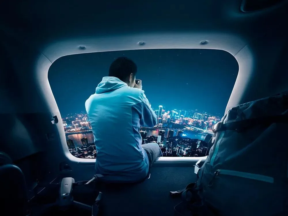
Nanshan, Chongqing
Beyond the high-tech dominant palette, our framing also drew heavily on Chongqing's most futuristic landmarks — the Grand Theatre, the Guotai Arts Center, Raffles City — so composition and color reinforce each other.
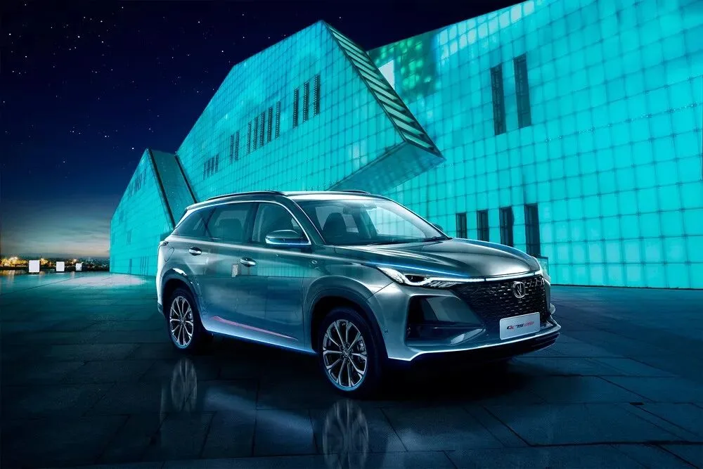
Chongqing Grand Theatre
Beyond its strong tech feel, the CS75 PLUS's dynamic aesthetic design, full-width front light bar, and phoenix-wing flame taillights also reveal an artistic side.
So last year's trendiest color, orange, became our main accent — paired with warm purples, yellows, and reds — letting the city beneath its cool teal-blue backdrop regain a warm, human touch.
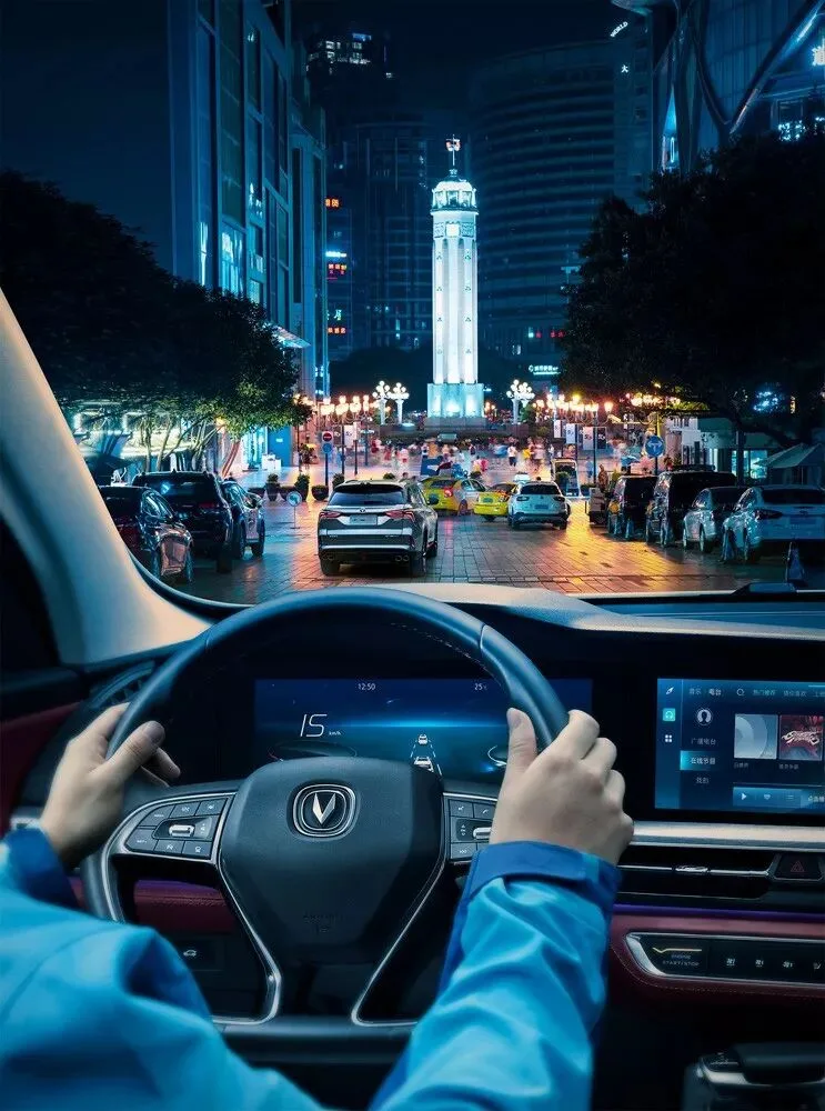
Jiefangbei
Chongqing is also a city rich in human character: Hongya Cave, the Yangtze River Cableway, the metro that runs through a building — all embody the distinctive life wisdom of Chongqing people living among mountains and rivers.
These most characteristic Chongqing scenes became our backdrops.
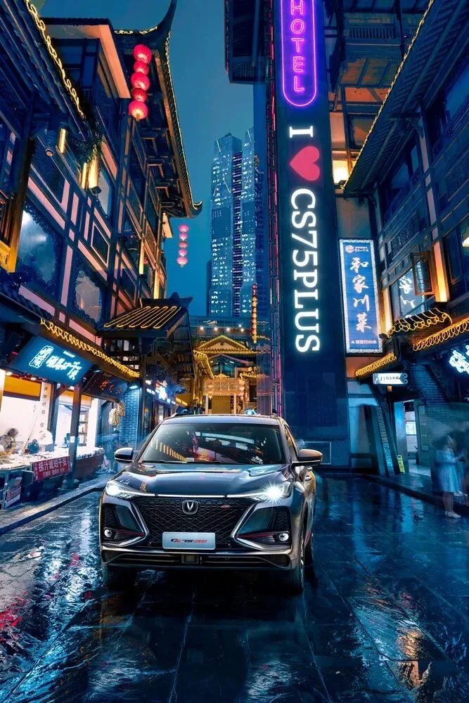
Hongya Cave
Merging technological teal-blue with artistic orange, letting human history and future technology shine against each other, and blending the CS75 PLUS — built by Changan in Chongqing — into the city's mountains, rivers, and architecture: that was the design thinking behind this series.
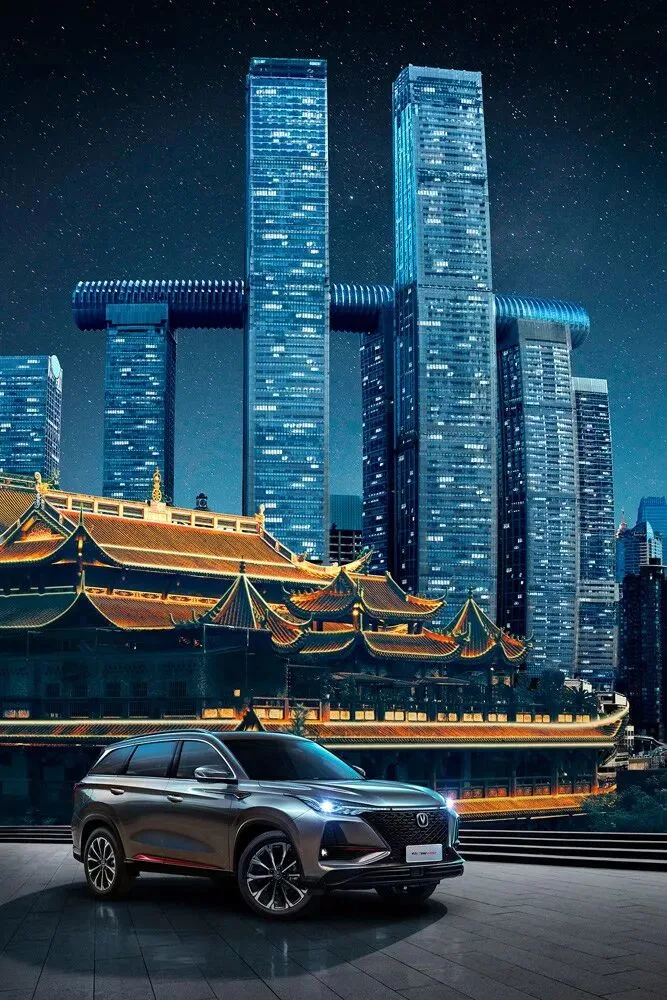
Raffles City and Qianfo Temple
That covers the overall shooting and grading concept for the series. Next, Thomas shares the specific post-processing techniques.
2. The Main Grading Process
I'll use this photo to walk through the key steps of this color style.
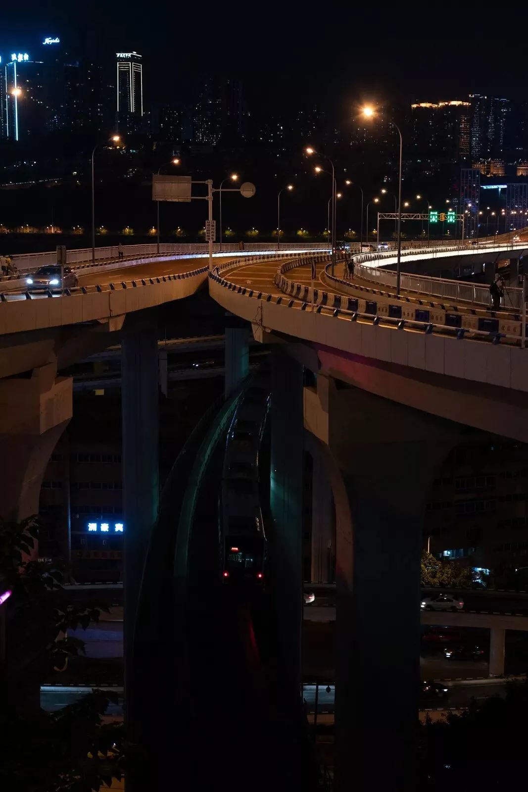
To capture the fast-moving metro train, the original was shot at 53mm, f/4, ISO 4000, 1/60s, on a Sony a7R III with a 24-105mm lens.
The main editing tool is Photoshop's built-in Adobe Camera Raw, on a Dell XPS 15 OLED laptop.
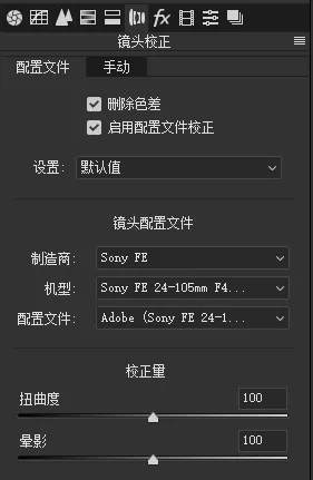
My first step is always lens corrections: check "Remove Chromatic Aberration" and "Enable Profile Corrections."
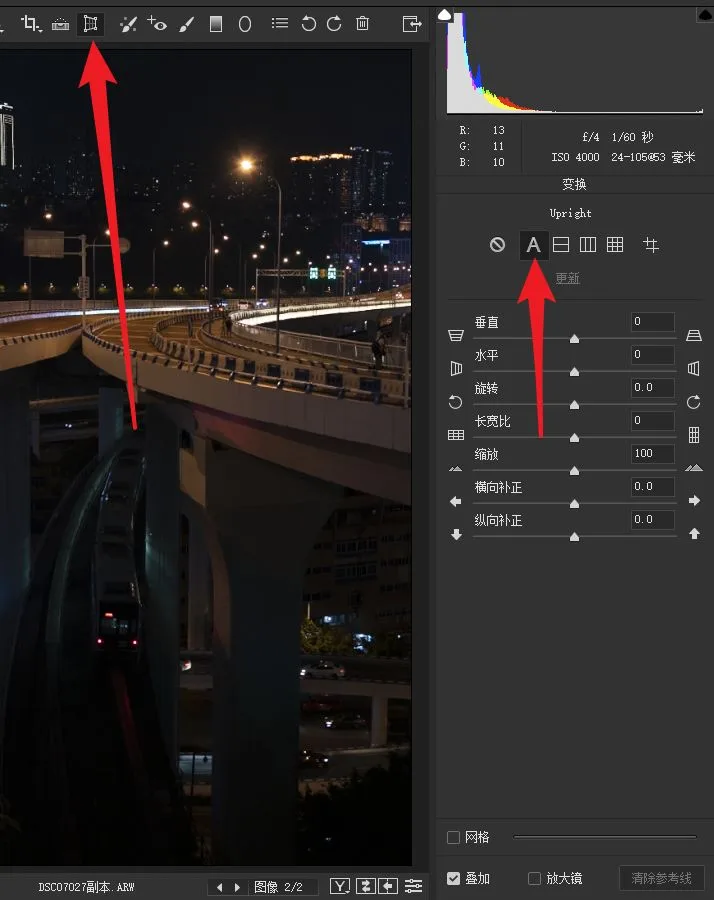
Since this is a cityscape, buildings look best level and upright, so a horizon correction is needed too.
(Related tutorial: "Don't Let Distortion Ruin Your Photos — Basic Corrections in ACR/Lightroom")
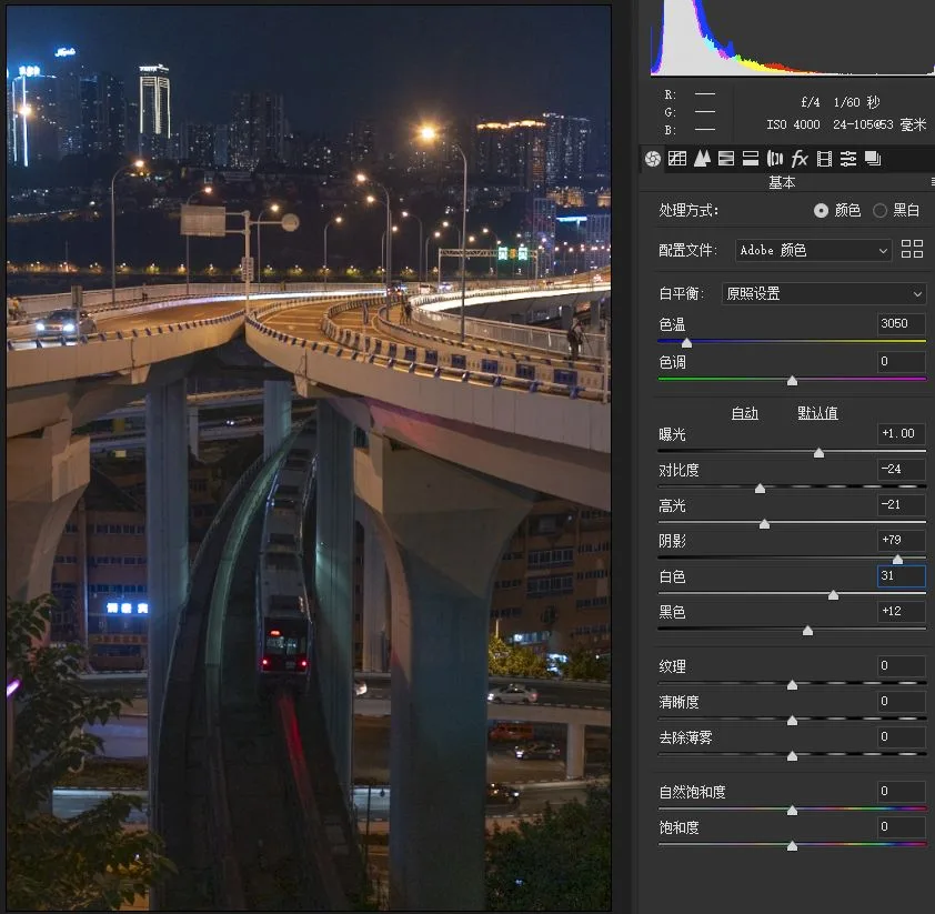
The original was underexposed, so in the Basic panel: Exposure +1, Shadows +79, Blacks +12 to recover shadow detail; plus Highlights -21 and Contrast -24 to repair some blown areas.
After these two steps the photo looks rather dull, so Whites +31 restores brightness at the top end and keeps the image crisp and clear.
(Related tutorial: "Beautify Your Photos Easily — Understanding Tone and Tonal Controls in Lightroom's Basic Panel")
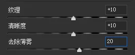
Next: Texture +10, Clarity +10, Dehaze +20 to enhance detail and definition.
(Texture slider tutorial: "Photoshop's New Texture Feature — A Retouching Gem for Landscapes and Portraits!")
(Clarity tutorial: "Understanding the Difference Between Clarity, Contrast, and Sharpening")
(Dehaze tutorial: "A Few Steps to Remove Haze from Your Photos")
Then we overlay a "film curve" on the photo, boosting contrast while eliminating pure blacks.
(Related tutorial: "Once and for All — How Curves Actually Work in Post-Processing")
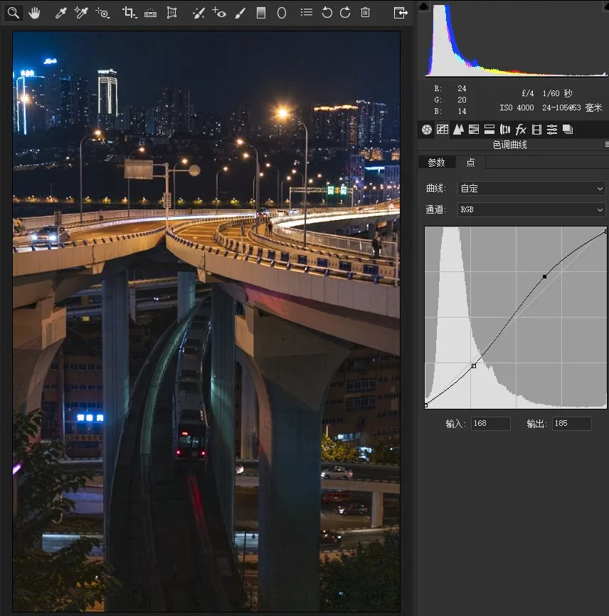
After these steps, the photo's tonal foundation is set, and we can move on to color.
For this photo, we want a bluish dominant palette.
The simplest method: drag the Temp slider left until the white balance sits around 2500K — the whole image naturally turns blue.
The once black-grey night sky and ground shadows now read as blue, setting us up for further grading.
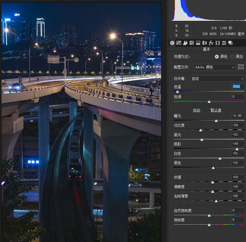
In the final image, the darker sky and ground shadows carry a teal-blue cast, while the brighter lights and road surfaces are orange-yellow.
The most direct tool for this is Split Toning.
(Related tutorial: "The Often-Overlooked Grading Gem — the Split Toning Tool")
For Split Toning, set the highlight hue to a yellow around 32 with saturation up to 8.
Set the shadow hue to a teal-blue around 212, pushing saturation much higher, to 44.
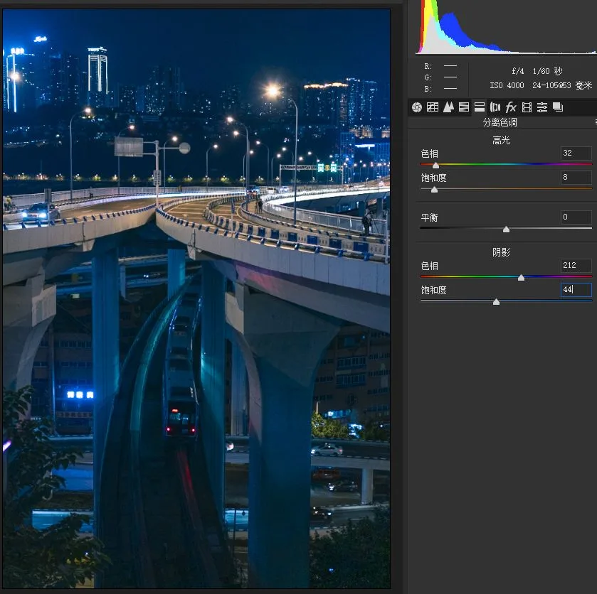
After white balance and split toning, the color foundation is in place. Next, use HSL to fine-tune individual colors.
(Related tutorial: "Master Color Grading by Understanding the HSL Panel")
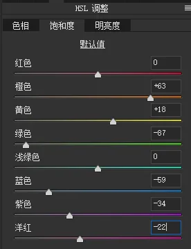
In the final image the cool tones are subdued, so lower the saturation of blue, purple, and magenta.
With the overall white balance leaning cool, the warm tones look a bit grey, so raise the saturation of yellows, oranges, and other warm colors to restore their warmth.
Green is a tricky stray color here — the best move is slashing its saturation to weaken its presence. Here's the result after these adjustments.
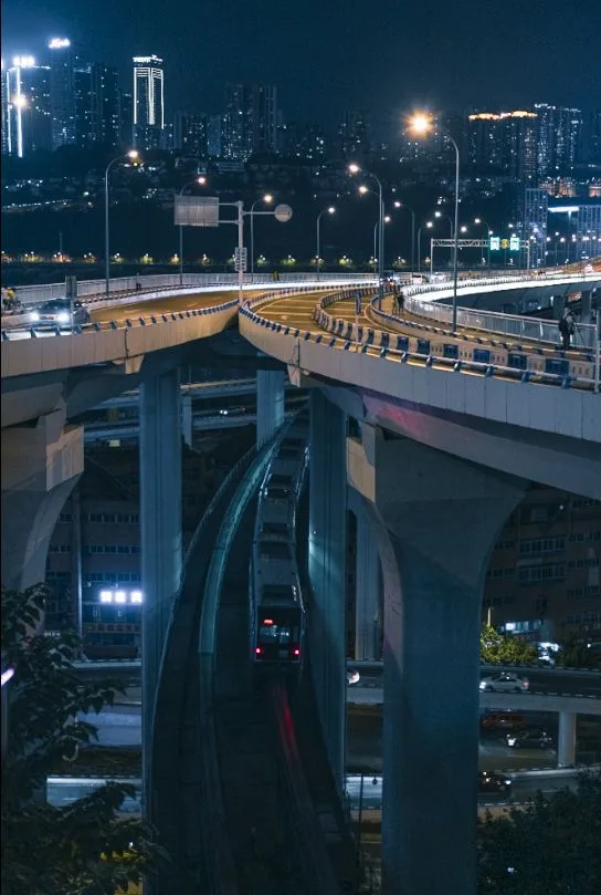
The photo is still rather dark overall, especially at the points of interest — the lights, road surface, and train — so various colors need brightening to different degrees.
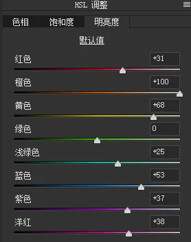
Here's the result after lifting the relevant colors in HSL's Luminance panel.
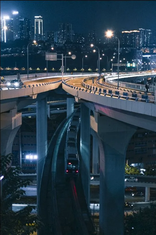
Finally, use HSL's Hue sliders to unify the colors in the frame.
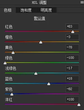
Magenta, red, orange, yellow, and green are all unified toward golden yellow.
Blue and purple are first unified toward a midpoint between the two.
The original cyan (aqua) in the frame sits mainly on the rails — one of the lines I wanted to emphasize — so here I shift cyan toward green instead, creating some separation from the overall cool palette.
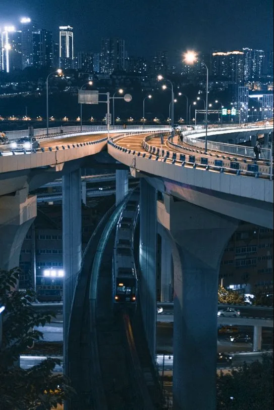
Finally, use the Calibration tool to further unify and fine-tune the colors.
Calibration is a wonderfully useful tool. If you haven't tried it, check out the tutorial "The Most Magical PS Grading Tool — Why Do Trending Presets All Use Camera Calibration Primaries?"
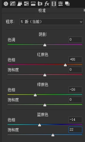
After white balance, split toning, and HSL, the colors are basically there.
But the photo still feels flat. We need Camera Raw's local adjustment tools to reshape the light and strengthen the points of interest.
(Related tutorial: "How to Reshape Light and Shadow with Local Filters")
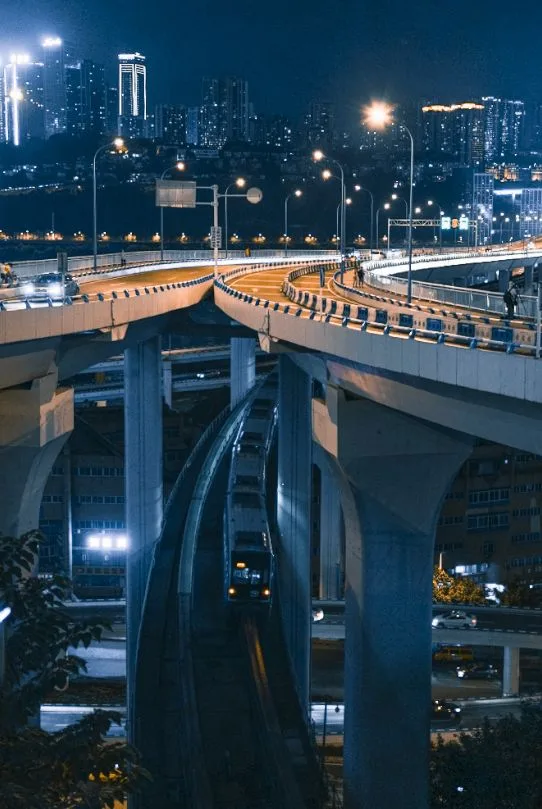
First, take the Graduated Filter to brighten the sky while creating a hazy, atmospheric sense of distance.
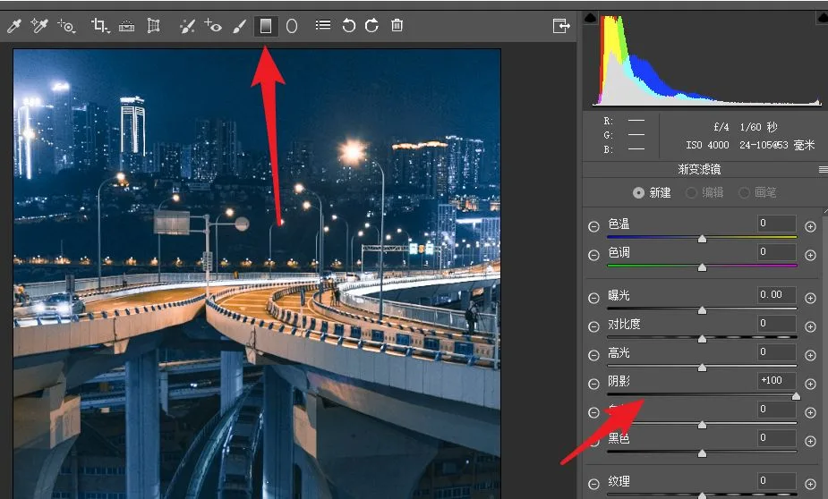
The distant lights are already bright, so to prevent further clipping I didn't raise exposure in the filter — I set Shadows +100 instead.
After three such Graduated Filters, the sky looks bright and far away.
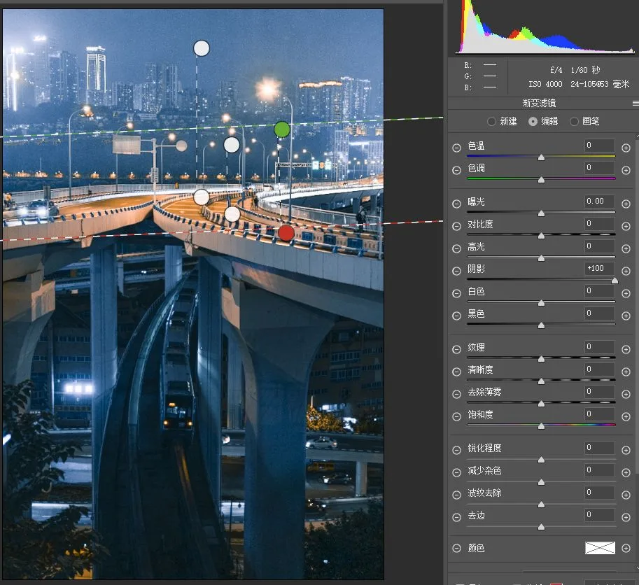
Next, use the Radial Filter to strengthen or weaken local areas.
For example, this tree under the overpass stands out because a streetlight illuminates it — but it's not what I want to feature.
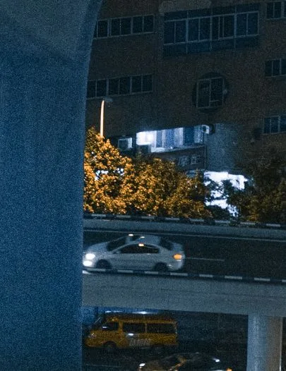
So I framed it with a Radial Filter at Highlights -100, Temp -30, making its highlights darker and color cooler so it blends into the surroundings and draws less attention.
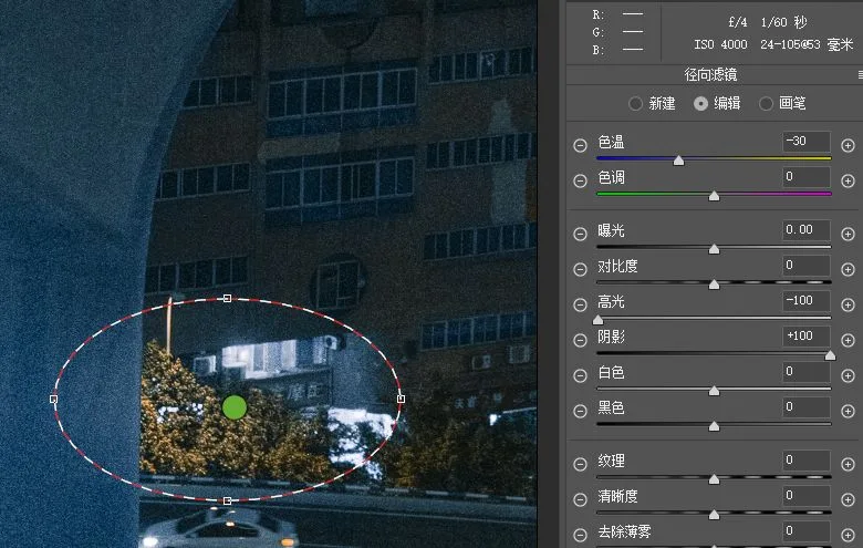
Conversely, for areas lit by lamps — like the rails in the image below — I used a Radial Filter with Temp +10, Tint +10 (pushing the area toward orange) and Exposure +0.4 (brightening it) for emphasis.
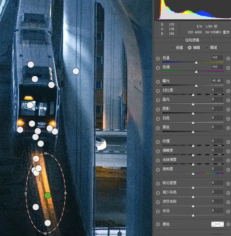
In total, I used more than 40 Radial Filters on this photo, adjusting different areas to different degrees.
Each Radial Filter uses only a modest adjustment, keeping the transitions natural.
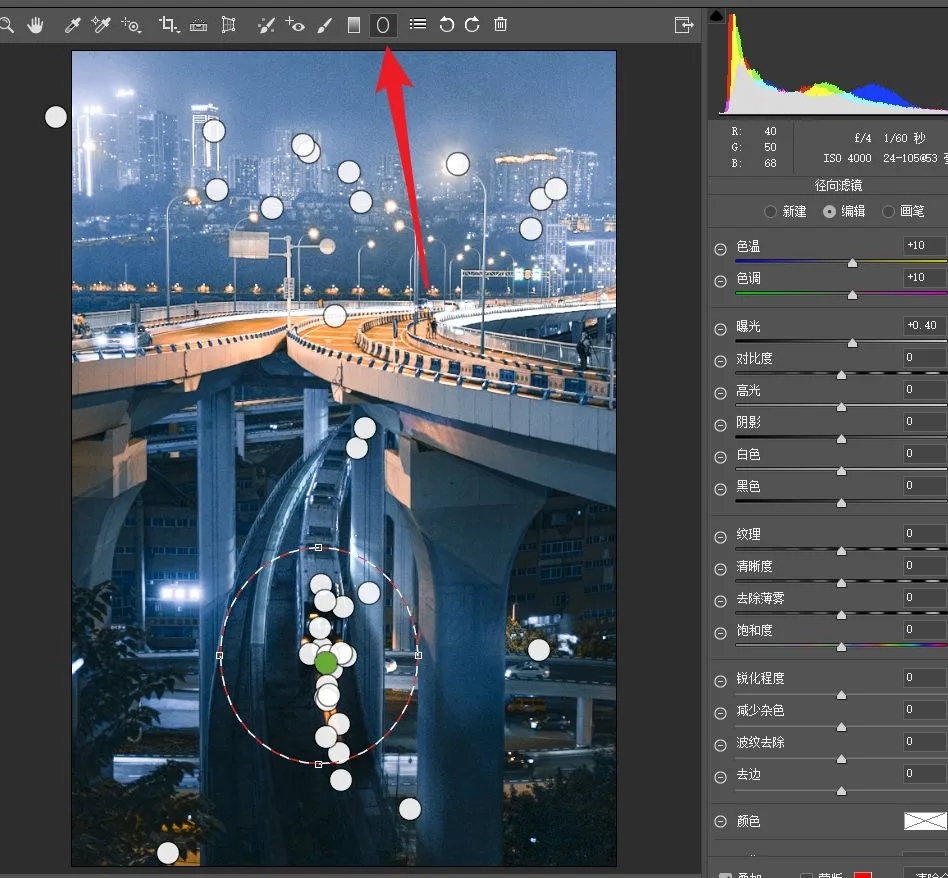
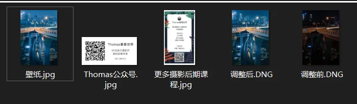
For brevity I can't list every filter here — download my adjustment file at the end of the article, open it, and you'll see all the filters and their settings.
Local adjustment is the core of post-processing.
Compare for yourself: below is the image before Graduated and Radial Filter work.
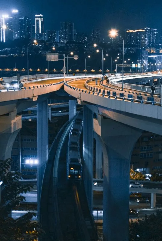
And here it is after — the light is entirely different.
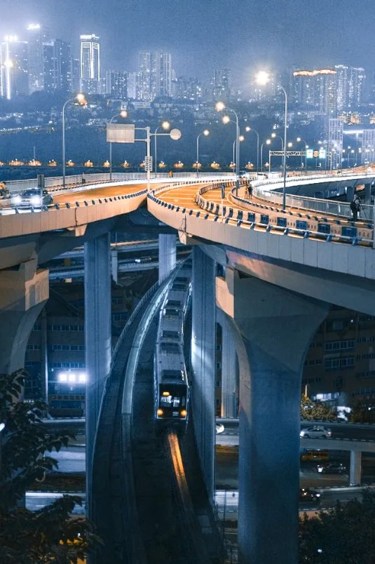
Because the original was shot at high ISO to catch the train, brightening revealed significant noise.
Fortunately, I had shot many frames from the same position — including several clean background frames at ISO 100, f/16, 20s.
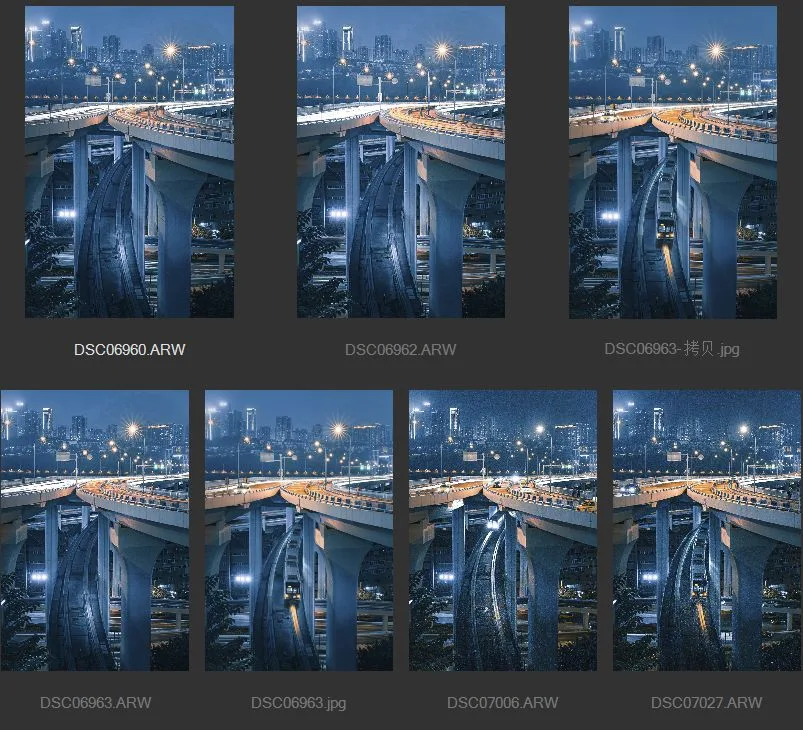
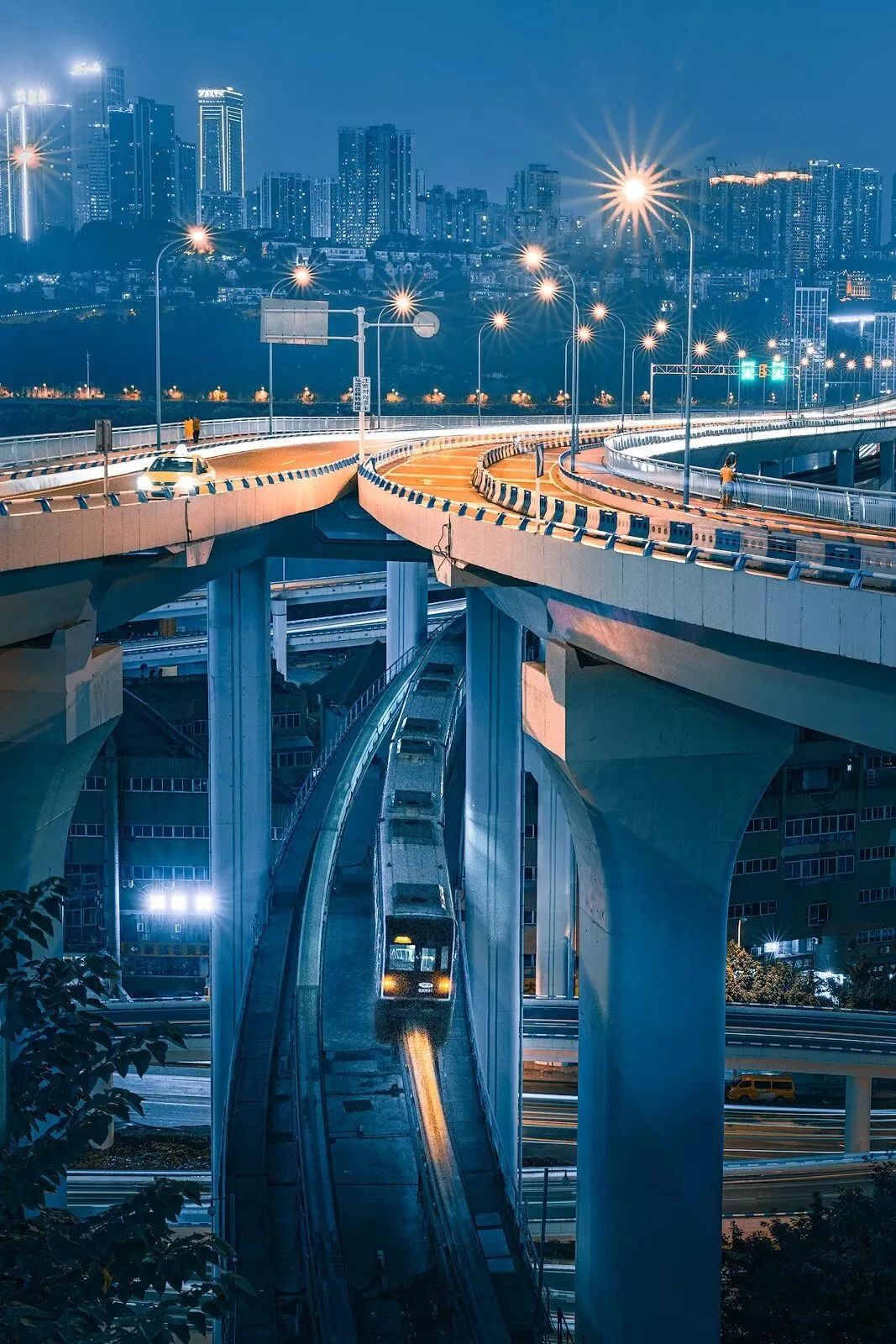
So after syncing the settings, I used Photoshop masks to combine the train from the frame above with the clean city background, completing the final edit.
3. Enjoy the Series
Finally, let's enjoy the full series of the CS75 PLUS in magical Chongqing.
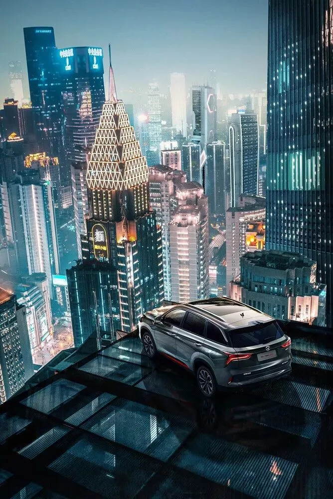
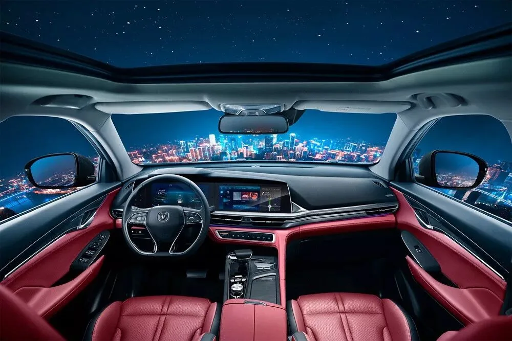
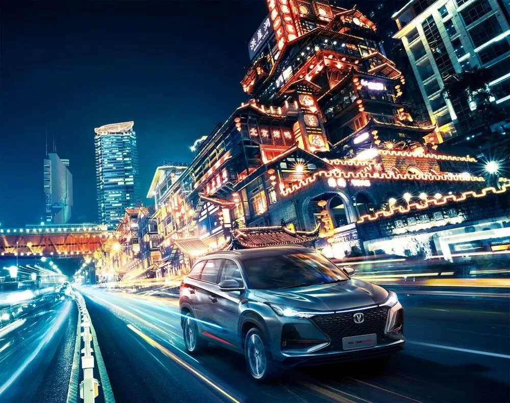

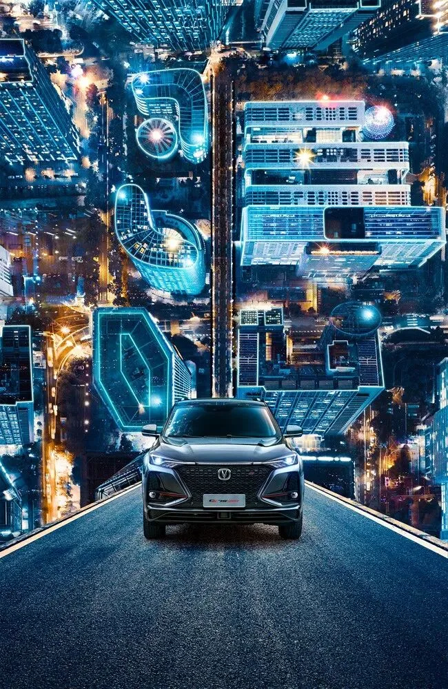

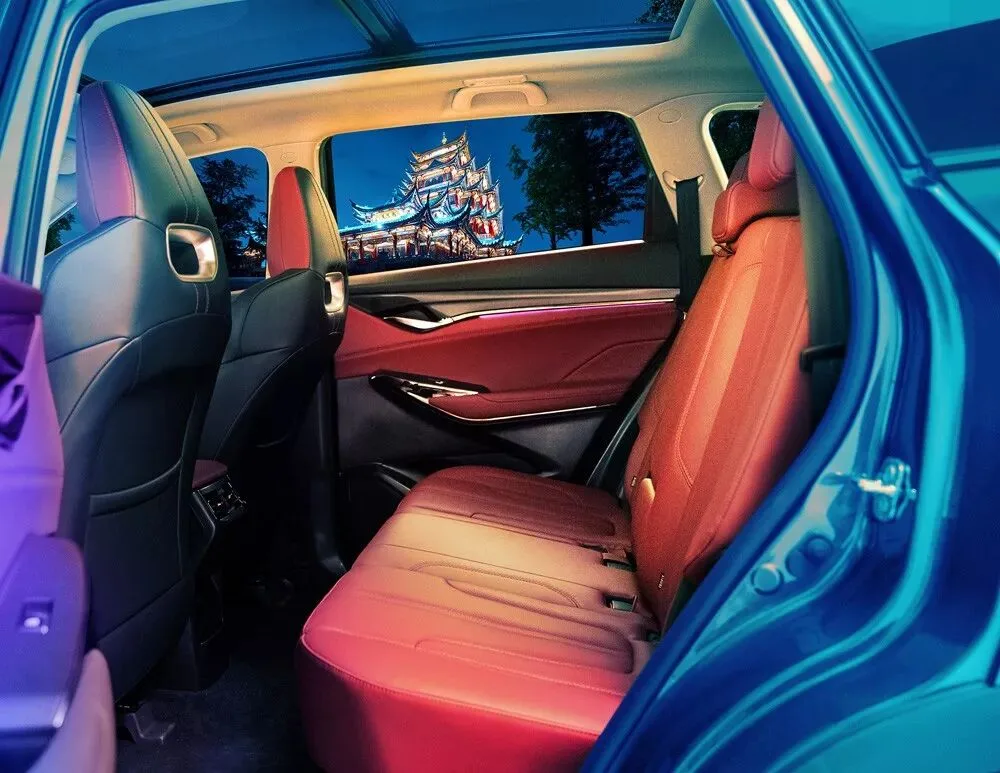
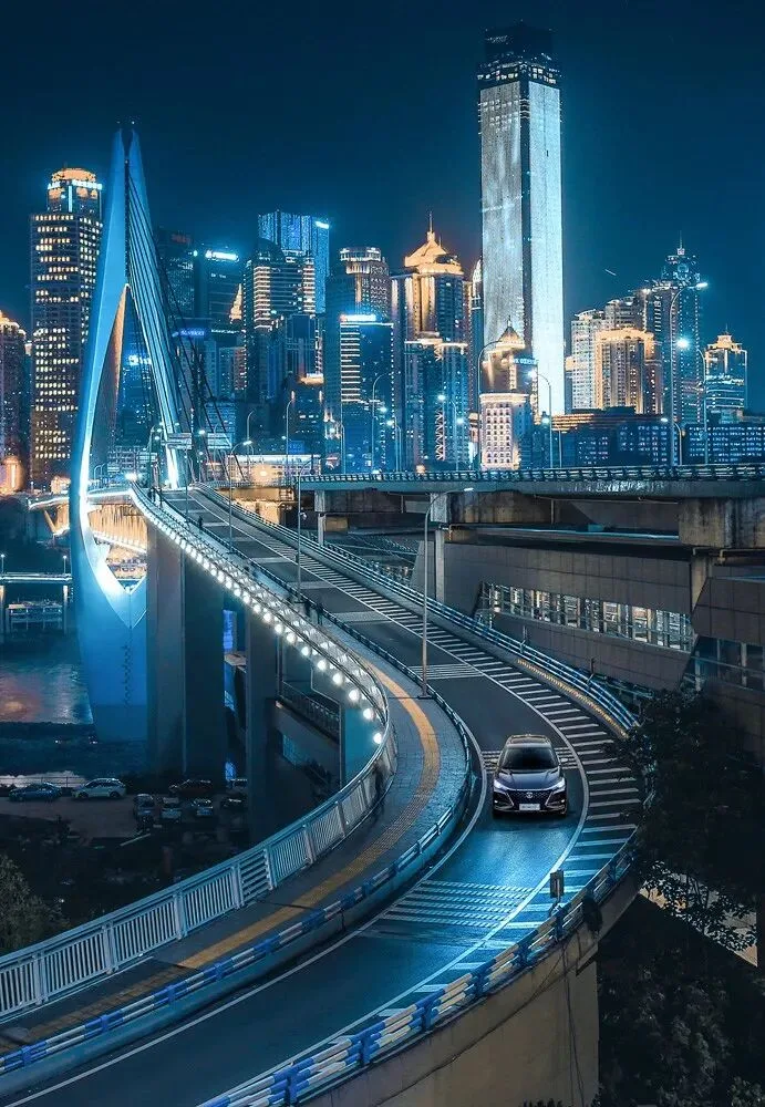
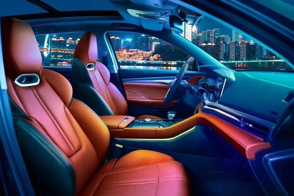

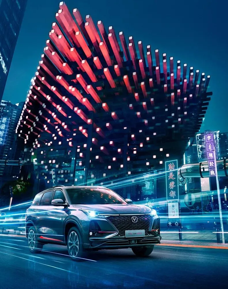
Chongqing is one of China's most distinctive cities — come visit!
Practice files download:
Link: https://pan.baidu.com/s/1YKf8xE_wSC5_9jcpg4c1vw
Extraction code: h6ea
(Includes the original file, the edited DNG, and a large wallpaper)