Photography Tutorial · 2017-11-26
Clarity vs Contrast vs Sharpening: The Differences in One Article
Adjusting Clarity, Contrast and Sharpening are three important steps in post-processing. They're easily confused, but their effects are quite different. This article clarifies their differences from first principles.
1
Contrast
Contrast refers to the degree of brightness difference across the frame. Increasing contrast makes bright areas brighter and dark areas darker — the tonal difference grows.
To better explain the difference between contrast, clarity and sharpness, I'll use the texture edge below, magnified 20×, as an example.
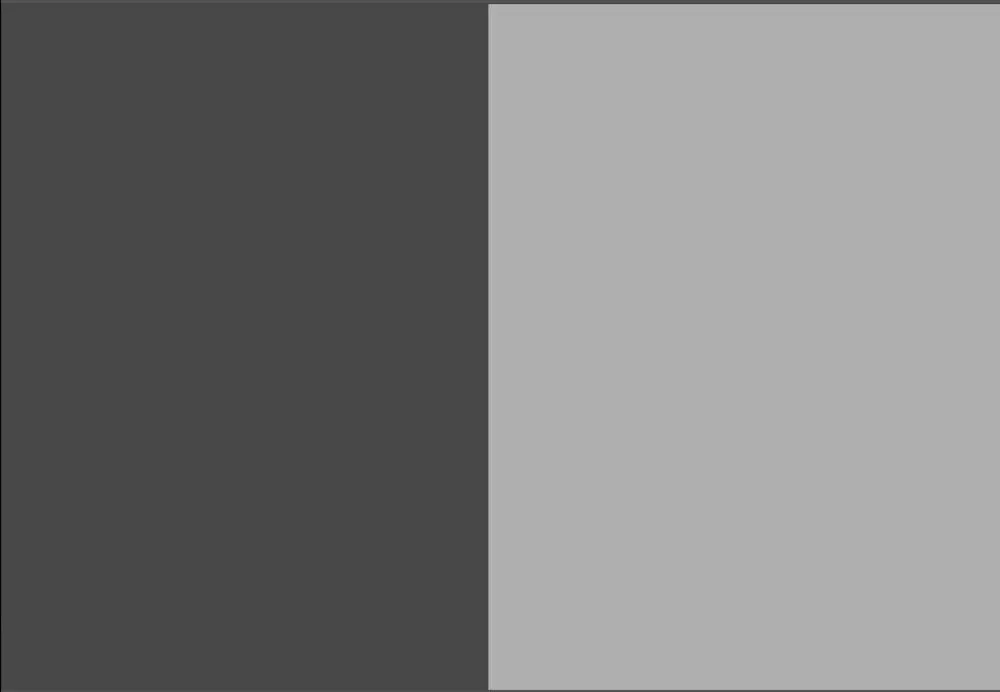
The image below shows the result of increasing contrast: the difference between the two objects expands.

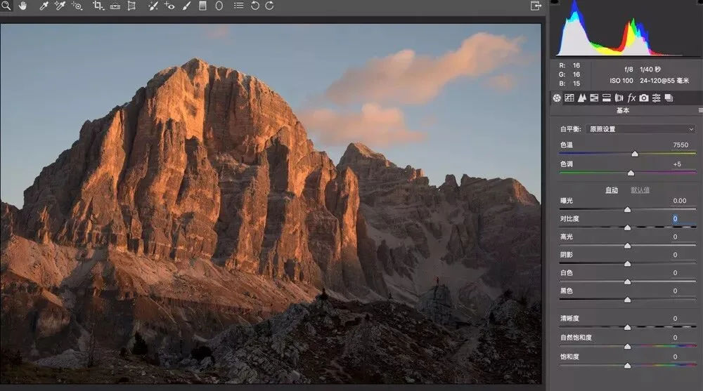
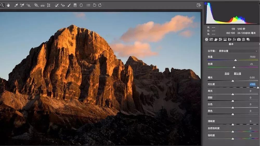
Contrast acts globally and greatly affects the photo's overall tonality. Take this photo for example:
After increasing contrast, bright areas get brighter and dark areas darker — the difference immediately opens up.
2
Clarity
Photoshop and many other applications provide a Clarity adjustment tool.
When we increase a photo's clarity, the darker side near an edge becomes darker and the brighter side becomes brighter — but this brightness-contrast change is confined to the area around the edge.
Clarity is like adding a white gradient strip on the bright side of an edge and a black gradient strip on the dark side, making object outlines and fine textures clearer.
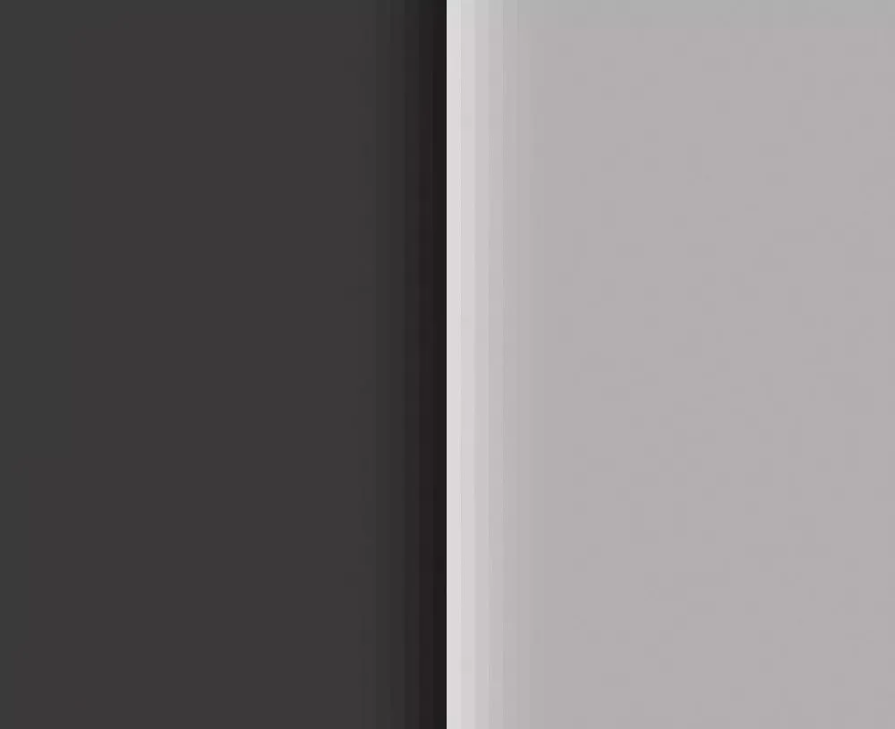
So increasing clarity only raises contrast near edges, making outlines clearer. Its effect on the photo's overall contrast is much smaller than the Contrast slider's.
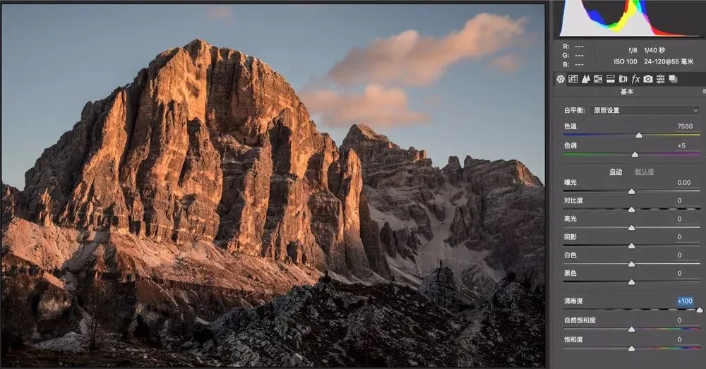
Because clarity is like adding a white strip on the bright side and a black strip on the dark side of each edge, be careful with its amount — otherwise terrible halos appear. In the image below, wildly increasing clarity created extremely unnatural white and black fringes along the mountain borders.
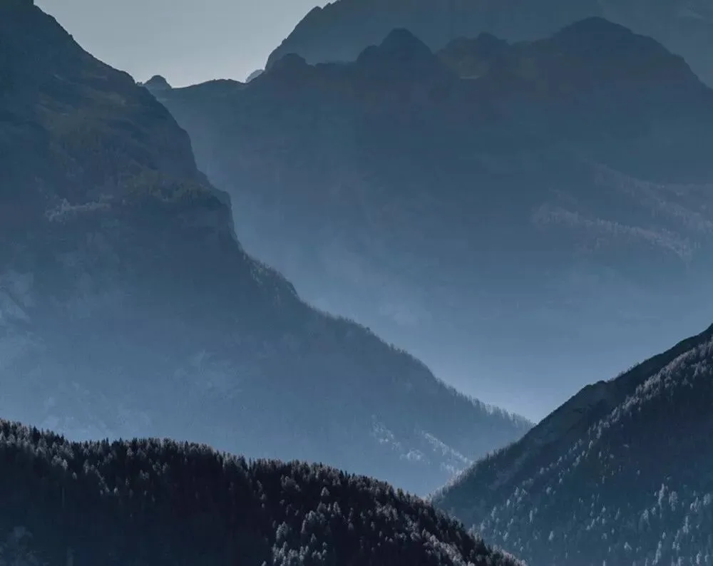
Also, clarity is best applied locally with masks, graduated filters, radial filters and so on — otherwise the whole frame gets overloaded with black detail, which quickly looks dirty.
For example, in the image below, globally raising clarity makes the scene look dirty.
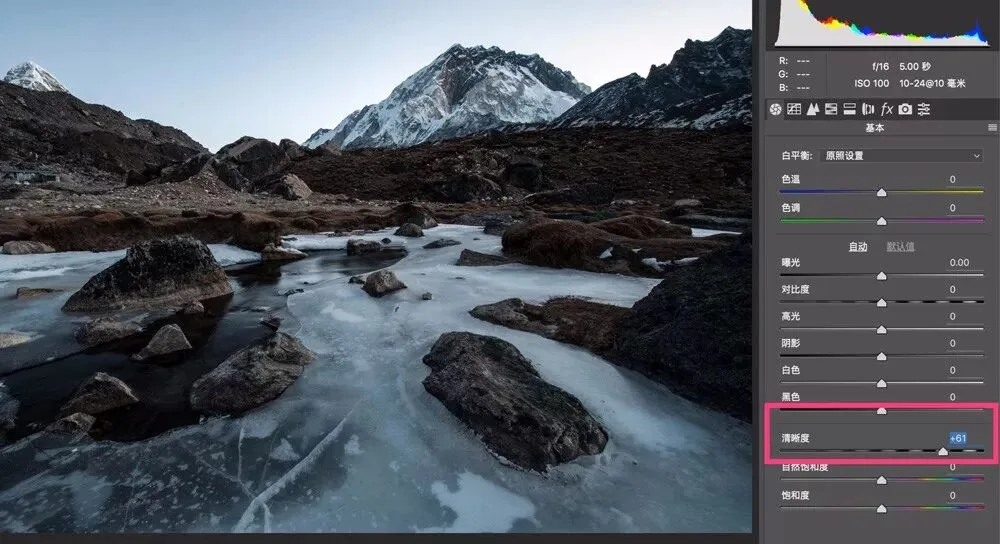
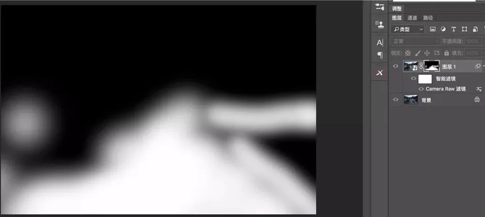
Using a mask, the clarity-increased layer shows only in the foreground — meaning we only raised the clarity of the foreground rocks and ice.
After locally increasing clarity, the foreground ice texture improves dramatically without the whole photo looking dirty.
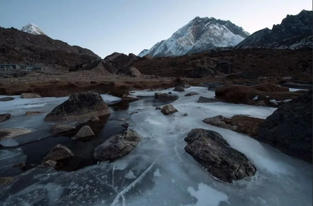
3
Sharpness
Sharpening is similar to clarity in acting only on object edges, but the principle differs. Sharpening works mainly by adding alternating black-and-white high-contrast 'separation lines' along both sides of an edge, making it look more pronounced and crisp.
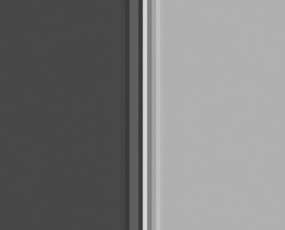
In Adobe Camera Raw, the sharpening tool lives in the third panel — the Detail panel.
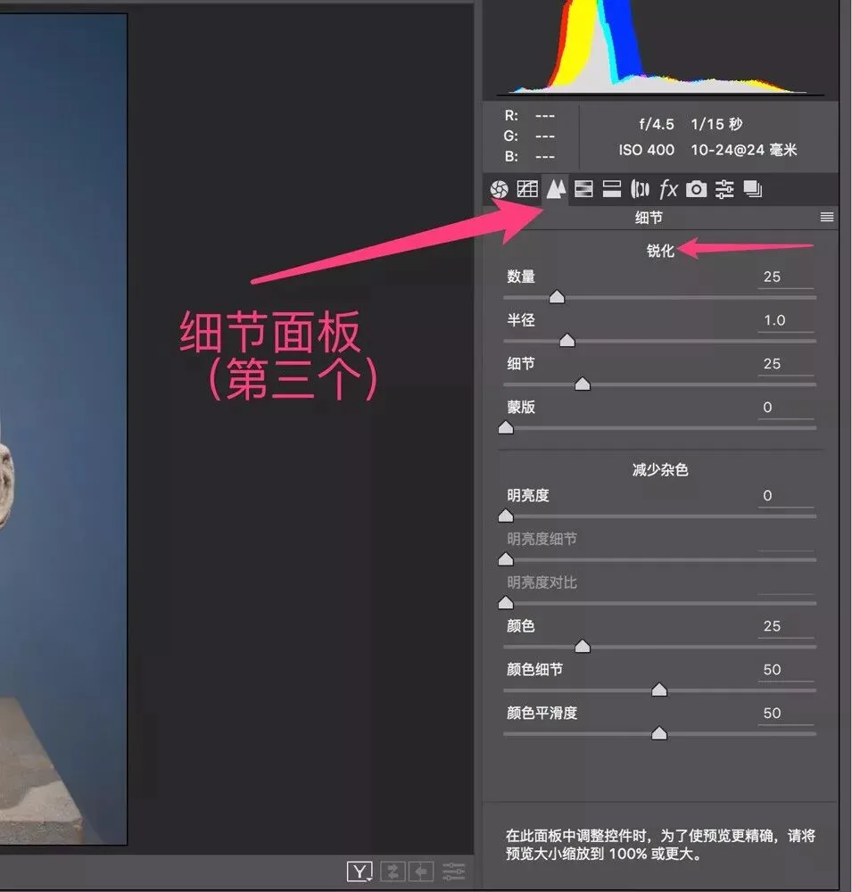
In either application, the sharpening tool in the Detail panel has four sliders: Amount, Radius, Detail and Masking. They correspond exactly to the three major problems in sharpening.
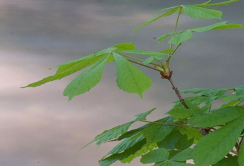
Take the over-sharpened photo above as an example — the three problems are:
1) The leaf edges are sharpened too strongly and look fake. Sharpening strength is decided by the 'Amount' slider.
2) Obvious white and black fringes appear along the leaf edges — the sharpened region is too wide, turning what should be a subtle edge contrast into big white and black blobs. The sharpening region is controlled by the 'Radius' slider.
3) Areas inside the water that aren't edges got sharpened too, suddenly adding lots of noise. Deciding what is and isn't an edge is controlled by the 'Detail' and 'Masking' sliders.
Sharpening Amount
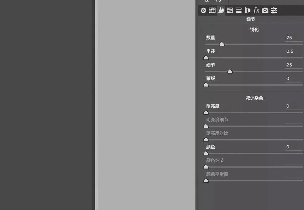
Amount decides the sharpening strength — i.e., the edge contrast and the degree of separation between edge and object. Below is the edge at ACR's default Amount of 25.
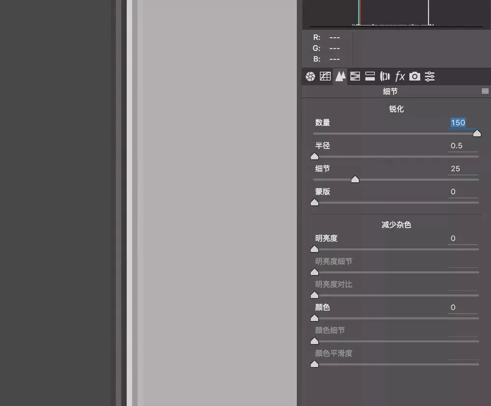
Once Amount is raised to 150, not only is the contrast between the two edge tones greater, but multiple 'separation bands' appear, making the edge even more prominent.
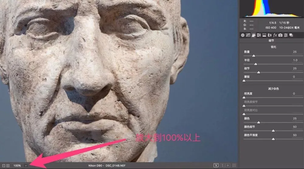
On real photos, we decide Amount based on the subject: portraits may only need 20-30, while architecture and sculptures can exceed 100 without looking overdone. How to judge? Step one: zoom the photo to 100% or more, so you can clearly see the sharpening effect.
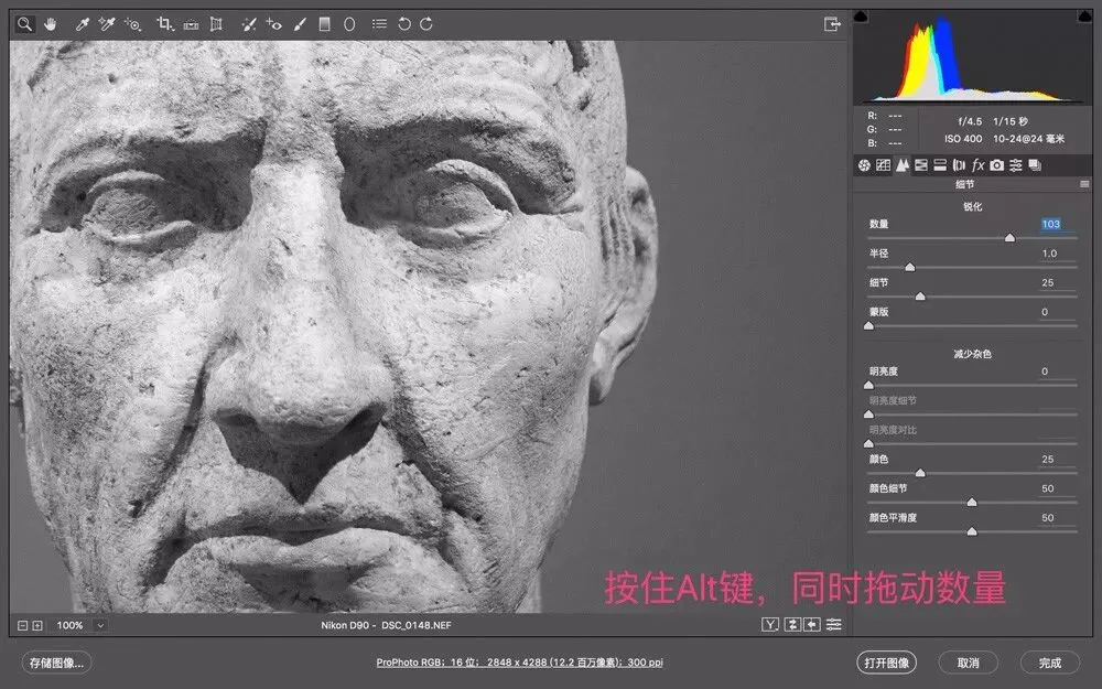
Step two: drag the Amount slider until the object's edges and details stand out. (While dragging, hold Alt to turn the photo black-and-white for easier observation.)
Sharpening Radius
Radius decides the region the sharpening acts on — the larger the radius, the more area around an edge becomes a contrast band. In the photo below, with the default Radius of 1.0, only 3 pixels along the edge are sharpened.
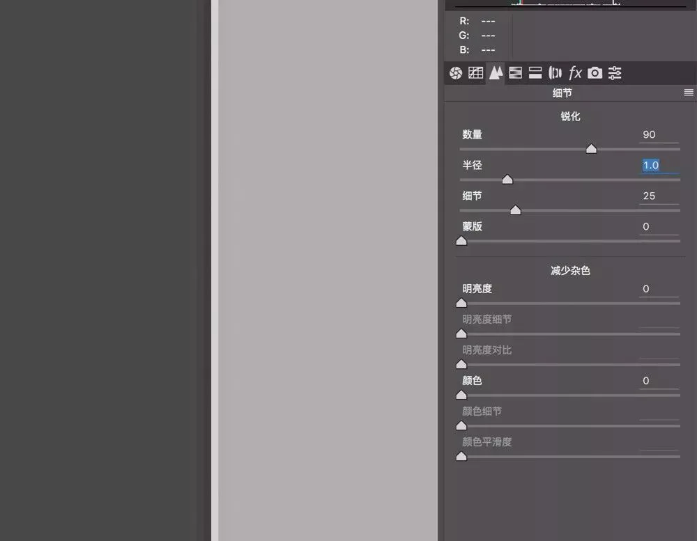
When Radius increases to 3.0, the sharpened region along the edge grows to 8-9 pixels.
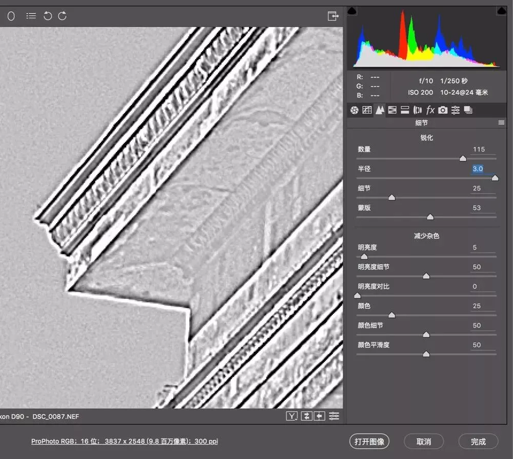
Too large a radius creates black and white fringes around object edges — looking rather scary.
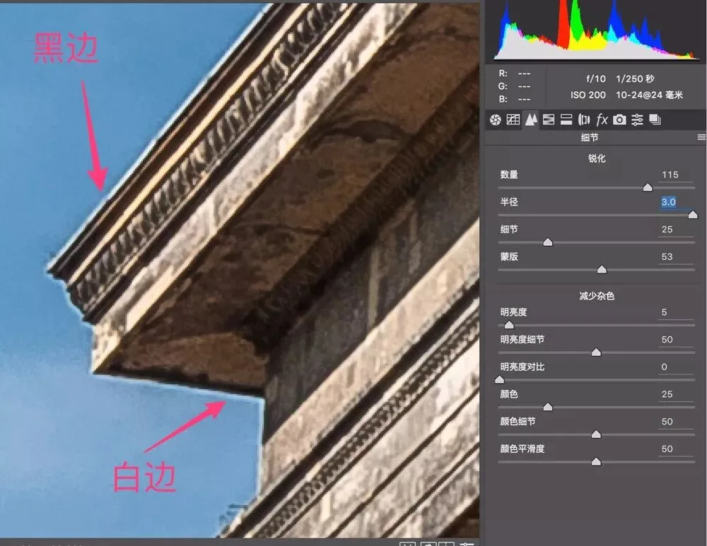
Remember: in the Detail panel, the Alt key is extremely useful. While adjusting Radius, hold Alt to see exactly where sharpening acts along the edges.
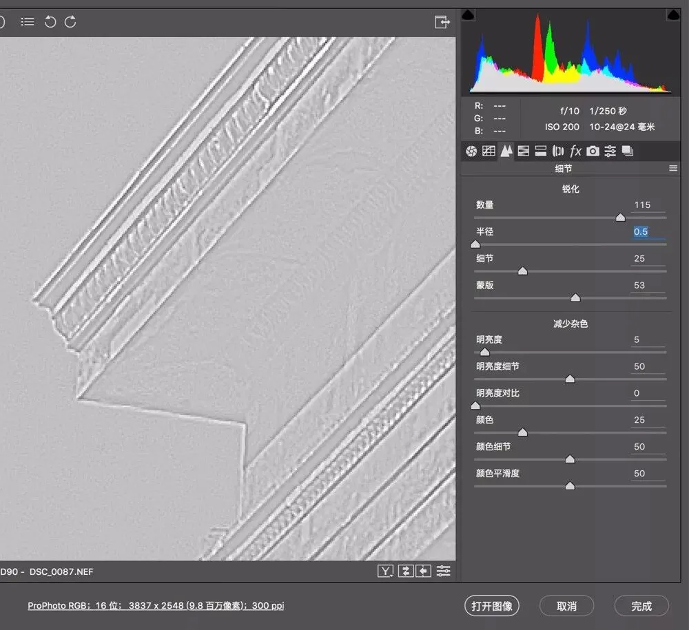
Holding Alt, an oversized radius shows obvious black and white lines. For most photos, keep Radius at the default 1 or lower — it rarely exceeds 1.5.
Sharpening Detail
As the word suggests, the Detail slider decides how much contrast an edge must have to get sharpened.
A small Detail value means we want little detail — only large, obvious edges get sharpened. A large value means we want lots of detail — even low-contrast edges get sharpened.
Likewise, hold Alt while adjusting Detail: a mid-gray image appears, where 50% gray areas are detail unaffected by sharpening, while darker and lighter parts are detail that will be sharpened. In this architecture photo, holding Alt with Detail at 0, only the crisply outlined building edges show.
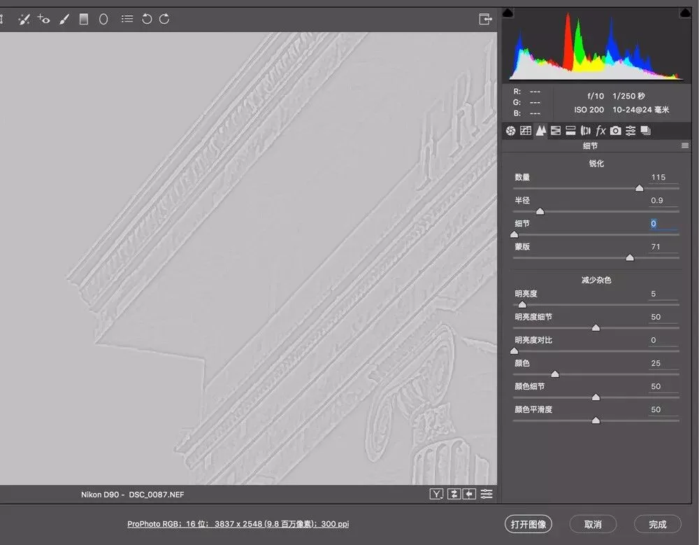
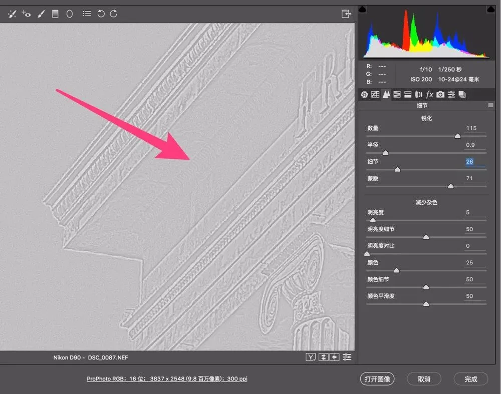
If I raise Detail to 26, some smaller edges get sharpened too. For example, the patterns on the building's wall indicated by the arrow were ignored at Detail 0, but get sharpened at 26.
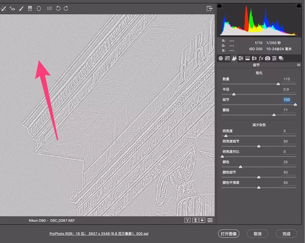
If I push Detail further to 100, all fine edges big and small get sharpened — even noise in the pure-color sky gets sharpened, which is obviously not what we want. In general, the default 25 suits most photos.
Masking
Detail is additive — the larger its value, the finer the edges that get sharpened. Masking is subtractive: it identifies large solid-color areas like sky, water and skin, and keeps sharpening away from them. Masking is the most important slider in the sharpening tool — it gives us local sharpening.
With Masking at 0, the whole sky gets sharpened, and what should be pure blue sky shows many grainy artifacts.
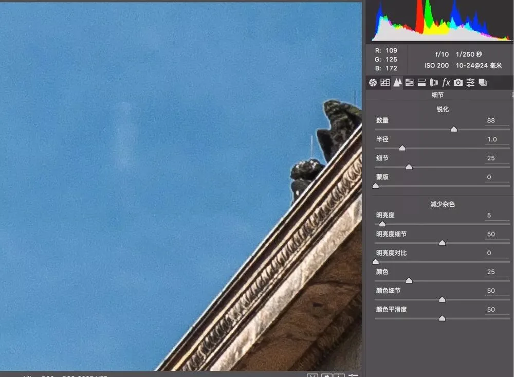
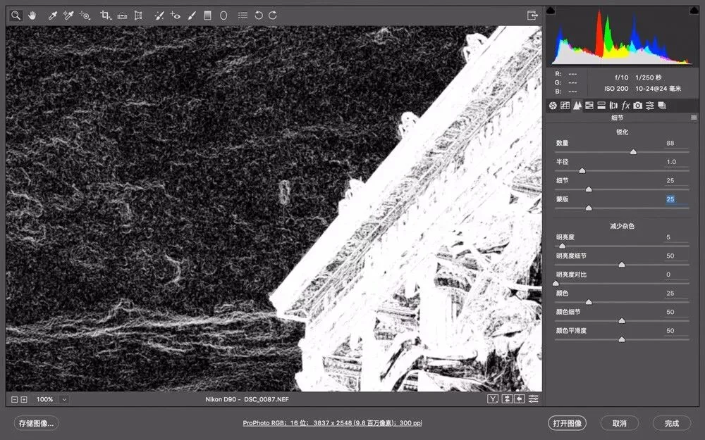
Likewise, hold Alt while moving the Masking slider: black means completely protected from sharpening, white means sharpened. At Masking 25, the sky still shows many white lines — those areas would be sharpened. Not good!
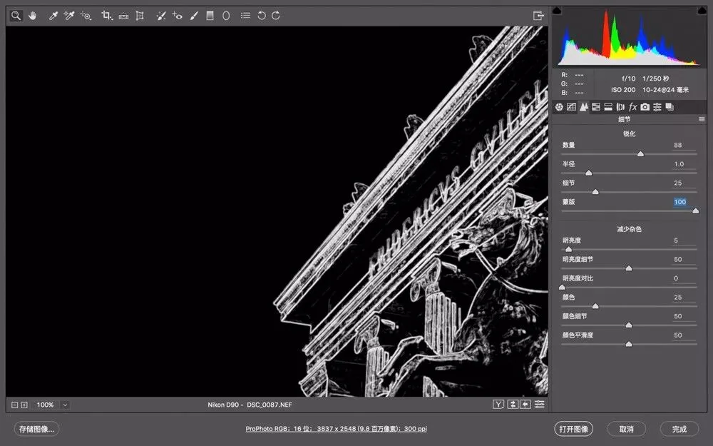
Push Masking straight to 100: the sky turns fully black — it won't be sharpened at all. But now the building interior is also largely black — wall details that should be sharpened aren't. Masking has gone too far!
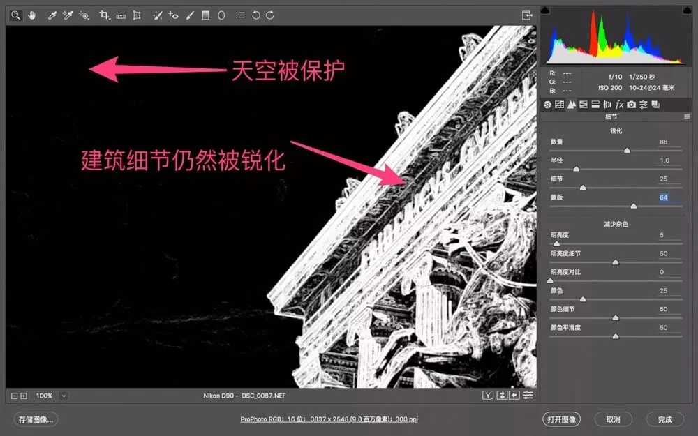
For this image, a Masking value around 60 is balanced. The sky is almost fully black (unsharpened), while the building textures remain white (sharpened).
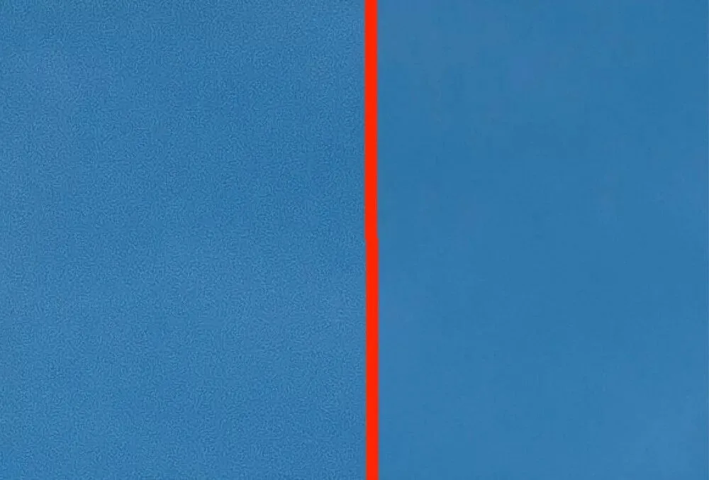
Now compare the sky's 'grain noise' at Masking 0 vs 60. Left is 0, right is 60 — the protection of solid-color areas is instantly obvious.
Thought question:
Sharpening with an extremely large radius (e.g. 20 pixels or more) actually produces an effect very similar to raising Clarity — can you see why? Feel free to discuss in the comments.
Theory is good, but it must be tested in practice.