Photography Tutorial · 2023-12-03
Color Grading for Cloudy Days: 3 Post-Processing Tricks for Great Shots in the Rain
For many photography enthusiasts, an overcast day is a real headache.
Photos taken on cloudy days lack the contrast of light and shadow, and the colors look flat. Force up the contrast and saturation in post, and they look anything but natural.
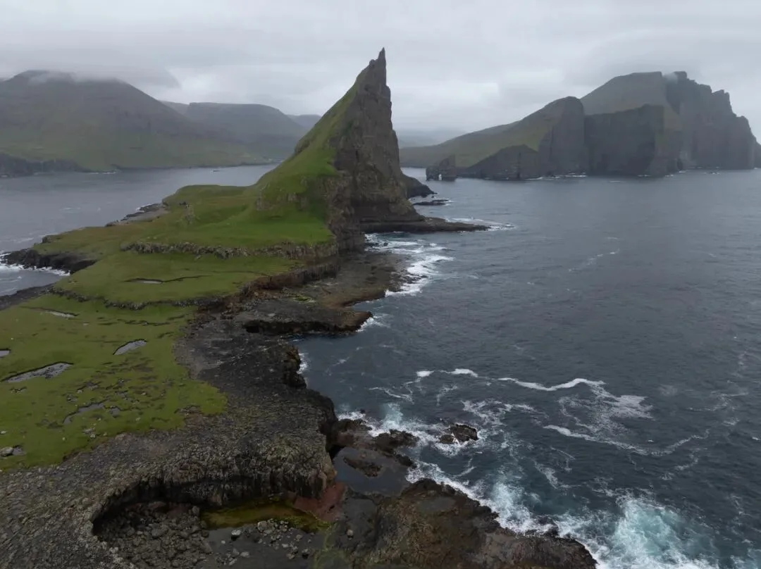
In today's tutorial, Thomas will teach you three tricks to boost the sense of light, color and depth of your cloudy-day photos in post-processing!
Video
▶ Watch the video tutorial on Bilibili
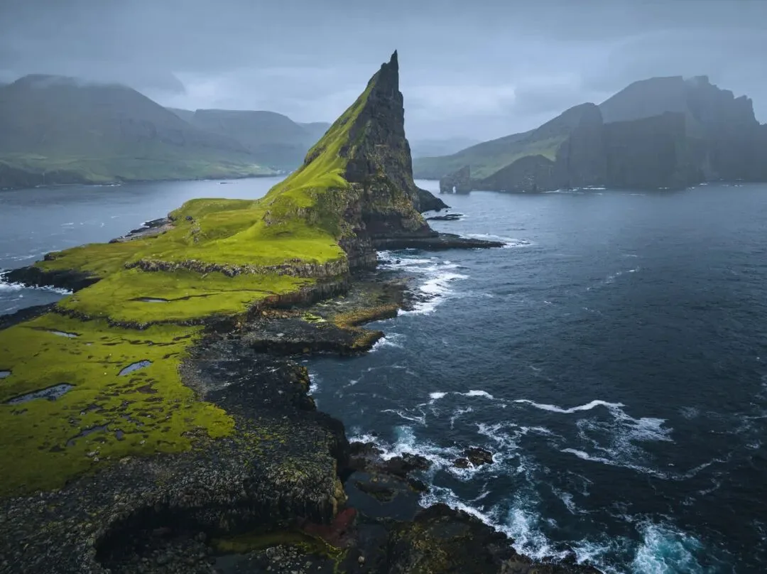
The video above is Thomas's tutorial on grading overcast photos: a drone frame from the Faroe Islands, flat and colorless, transformed in three steps through Camera Raw and Photoshop into a cool-toned image with real light and atmosphere. This article is the full write-up, with key parameters and interface screenshots from the video so you can follow along step by step.
Start with the final image: the same sea stack, grey and murky in the original, now carries a blue-tinted sky, light and shade on the water, and a layer of mist behind the peak. Overcast days can absolutely produce portfolio shots — you just need a different editing mindset.
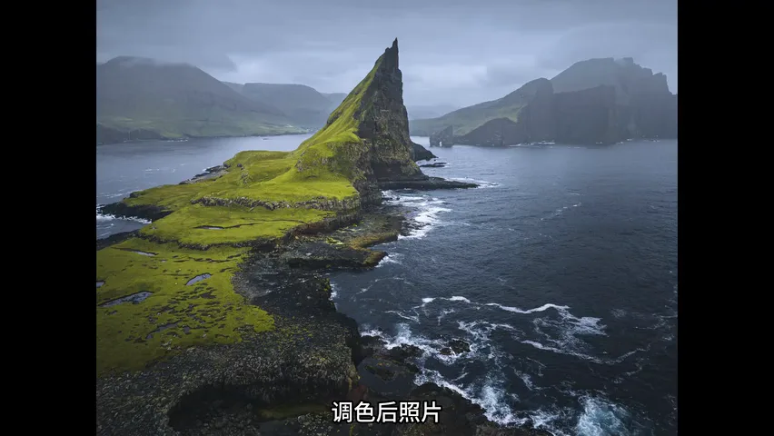
01 Three flaws of an overcast photo
The original was shot in the Faroe Islands. The composition already works, but as an overcast photo it has three classic problems (around 0:45 in the video). First, poor light: the whole frame is tonally flat. Second, almost no color, so the image tastes watered-down. Third, and most awkward, it is neither as crisp and "sharp" as a sunny photo nor blessed with the clear sharp-blurry separation of a foggy one — stuck in the middle, belonging to neither.
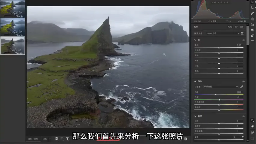
Each flaw gets its own fix (1:23-2:29 in the video): paint a natural blue tint into the grey sky instead of cranking saturation; rebuild contrast with local adjustments so bright, dark, sharp and soft zones reappear; and finally add fog to the background in Photoshop, letting the sharp subject set off the hazy backdrop. The rest of this article walks through each one.
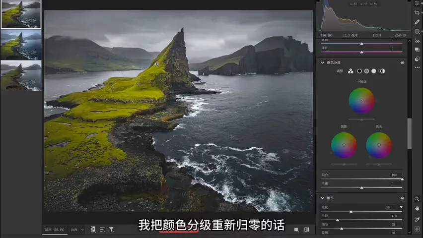
02 Color grading: blue in highlights, teal in shadows
The first fix happens in Camera Raw's Color Grading panel. Thomas resets the grading to zero for comparison — and the sky instantly falls back to its flat, grey state (around 3:08). His move is to push blue into the highlights: overcast weather already reads as cold and quiet, so blue-leaning highlights feel natural and harmonious, none of the falseness you get from dragging the saturation slider.
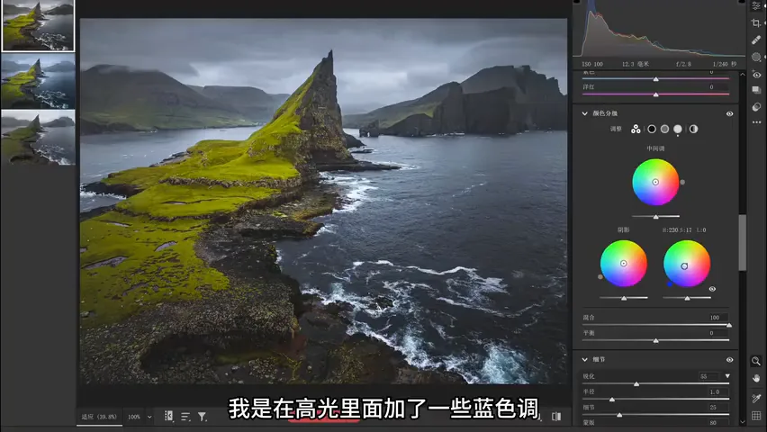
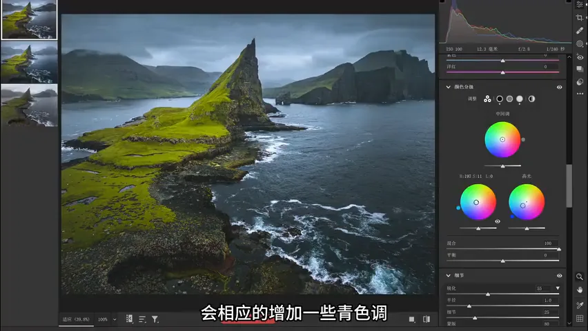
Then he adds teal to the shadows, so highlights lean blue while shadows lean teal — the color instantly gains layers, yet the whole frame stays within one cool palette (around 3:30). The core rule: on rainy, overcast days do not slam the vibrance slider. Color should come from grading, not from quantity — only then does the result stay rich and harmonious at the same time.
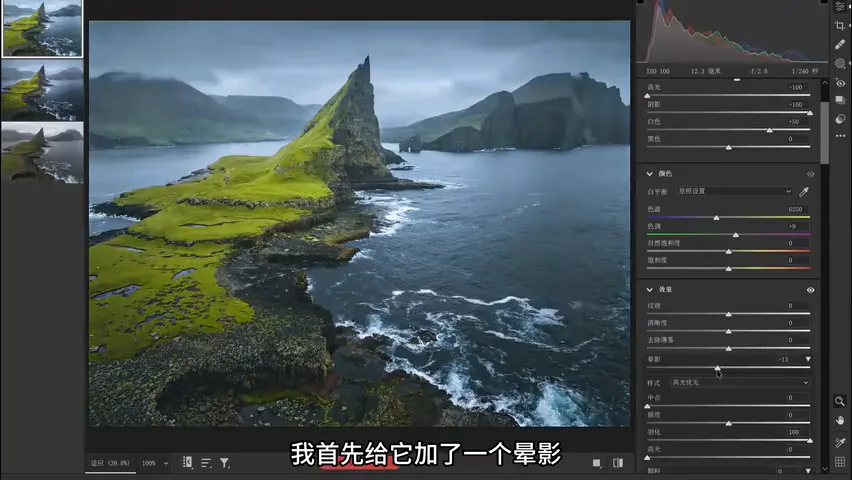
03 Global light: vignette and dehaze
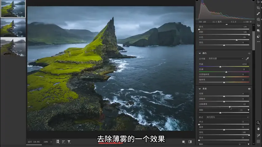
The second fix rebuilds the light, starting with a vignette in the Effects panel (around 3:50). Never overdo it — too much turns into an obvious dark frame; a subtle one is enough to guide the viewer's eye toward the sea stack at the center.
Next comes Dehaze, which lifts both the overall color and the tonal contrast considerably (around 4:00); a touch of Clarity and Texture firms the image up as well. Both are global moves — their job is to knock the grey down first and lay the groundwork for the local work that follows.
04 Local gradients: many small moves rebuild the light
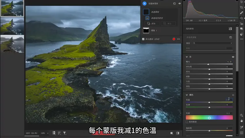
After the global pass, it is the local masks that make the photo feel lit. First select the sky with the Masking tool and darken it overall — overcast skies run bright, and pressing them down restores a sense of layers immediately (around 4:20). Then build several linear gradients, following Thomas's often-repeated "many small moves" principle: each mask lowers the color temperature by 1 to cool it slightly and the exposure by 0.2, stacking into a gradual transition from top to bottom.
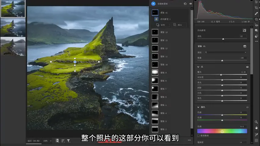
The ground is not a flat slab either — add a few linear gradients there as well to strengthen its light and shade (around 4:53). The original frame is already slightly brighter on the left, so lean into that unevenness: use radial gradients to lift the bright side by +0.2 exposure while leaving the temperature untouched (around 5:13), and press the areas that already hold a hint of shadow down a little more. Keep the amplitude restrained — never let it look like the harsh contrast of direct sunlight.
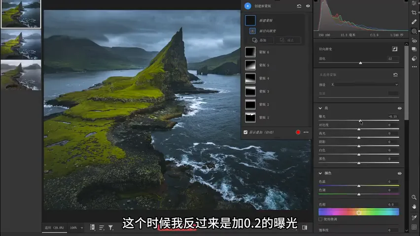
Once these gradients stack up, the picture gains an immediate sense of dimension (around 6:09). Note that the original already contained the embryo of highlights and shadows — the edit simply amplifies a light that was almost there. Overcast light is never invented from nothing; it is pushed further along its own direction.
05 Adding fog in Photoshop: sharp versus soft
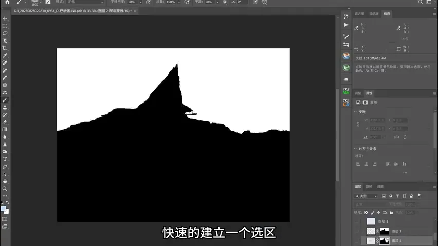
The third fix moves into Photoshop. Build a selection around the subject with the Quick Selection tool and turn it into a layer mask, separating the peak from the background (around 6:49); every bit of fog added afterwards affects only the masked background. Create a new layer in Normal blending mode — no blend-mode tricks required.
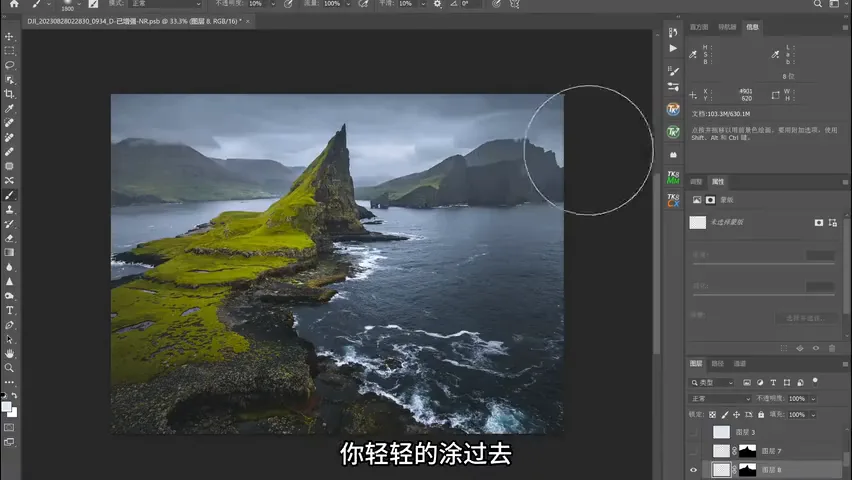
The first fog layer uses an ordinary brush: Alt-click to sample the existing mist color in the background, nudge its brightness up a touch and its saturation down, set the brush opacity to 10%, and brush gently across the background — the fog appears as if it grew there (around 7:13). At this stage, though, it is still a single flat sheet of mist.
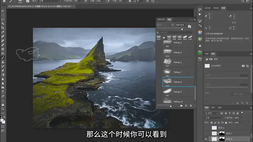
So create another Normal layer, switch to downloaded cloud-fog brushes — still at 10% opacity — and stamp textured fog patches into the background, giving the mist rich layering (around 7:36); alternating between several fog brush presets works even better. Finally, on one more layer, brush a whisper of fog into the foreground too (around 8:00). The frame now carries a sharp-to-soft progression from front to back, which suits overcast, rainy weather perfectly.
1. Skip the saturation slider on overcast days: grade blue into the highlights and teal into the shadows — cool tones match the mood and give the color real depth. 2. Build light in two passes: globally, a subtle vignette plus dehaze to tame the grey; locally, "many small moves" with linear and radial gradients that amplify the light already hiding in the frame. 3. Paint fog into the background in Photoshop: confine it with a selection mask, brush at 10% opacity with a sampled color, then layer cloud-fog brushes and a hint of foreground mist — once sharp-versus-soft contrast appears, the overcast photo gains both atmosphere and pulling power.