Photography Tutorial · 2020-06-07
What Makes Color Grading Look Good? 3 Rules Distilled from Viral Photos
Thomas Chu Photo
Color grading tests a photographer's long-term aesthetic instincts — it's one of the hardest parts of post-processing for enthusiasts.
In this tutorial, Thomas shares the three major color-grading rules I've distilled from the most popular photos on Instagram.
Portraits, landscapes or still lifes — most viral photos follow the rules we're about to cover.
Video Tutorial
▶ Watch the video tutorial on Bilibili
This is the fully illustrated companion to the video above. In just over 20 minutes, Thomas digs through the most popular photography on Instagram — healing-tone bloggers, Japanese street masters, Russian portrait shooters — and distills three color-grading rules that almost never fail, unpacking each with concrete photos. All the key points and keyframe screenshots are preserved here; read it first for the framework, then revisit the video for the details.

01 Rule One: A Dominant Tone Sets the Mood
The first rule is the most basic and the most important: a photo needs a dominant color, with a clear hierarchy of hues — never a jumble. The classic beginner mistake is piling up a blob of red, a blob of green, a blob of blue and purple all cranked at once, and the frame descends into chaos. Browse the most popular photographers on Instagram and you will notice that whether they shoot portraits or landscapes, their palettes almost always settle into one or two dominant colors (at 0:47 in the video).
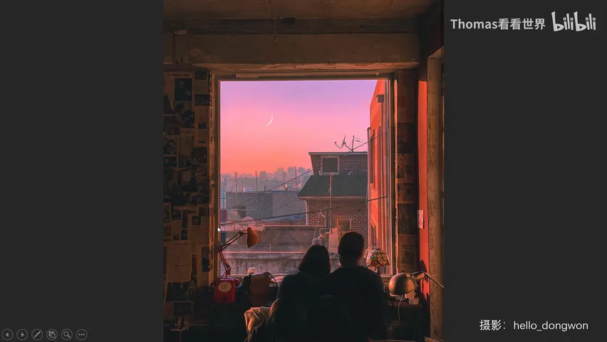
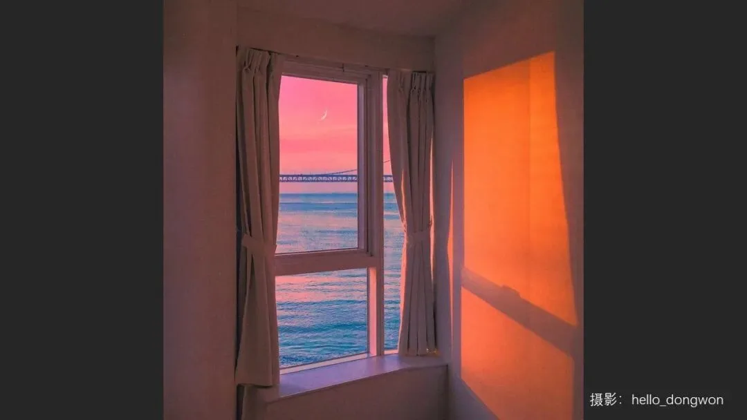
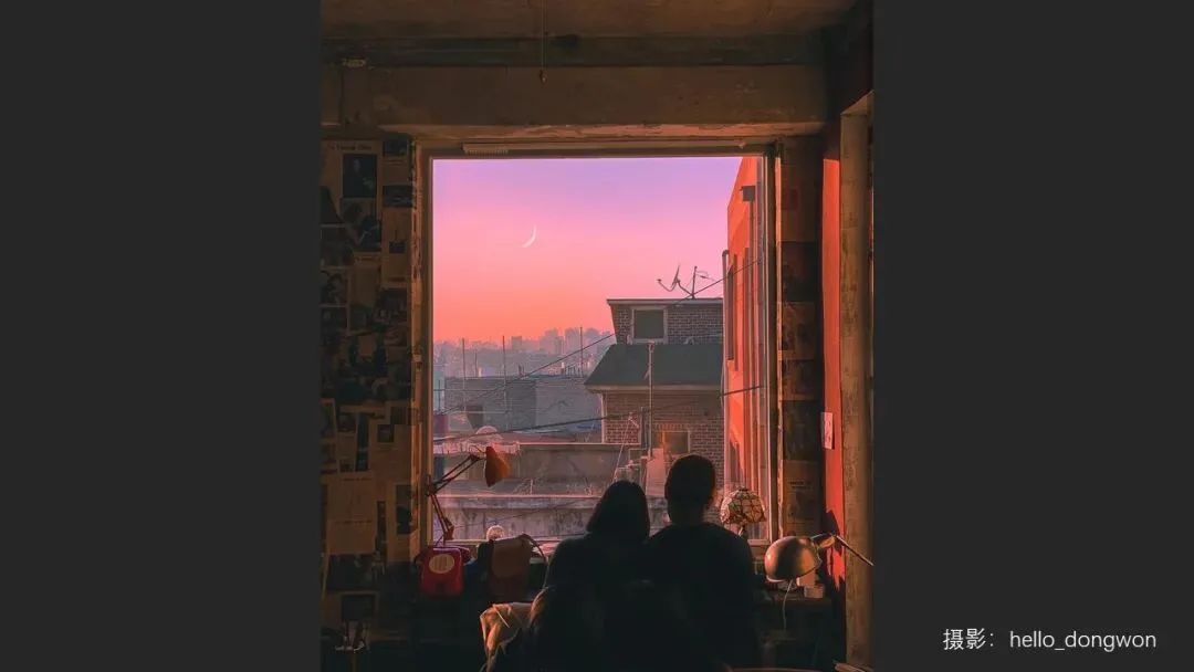
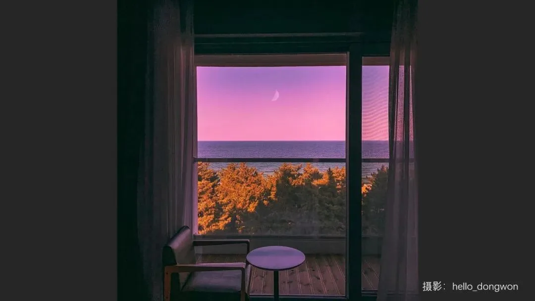
Take the work of Korean healing-tone photographer hello_dongwon: the dominant palette is red-orange plus violet, and those two hues hold up the color skeleton of the whole frame. Other colors do exist in the image, but their saturation and brightness are deliberately suppressed — like the two protagonists' clothes, quiet and unobtrusive. Crank up the green of that clothing and the photo would fall apart instantly (at 1:13 in the video).
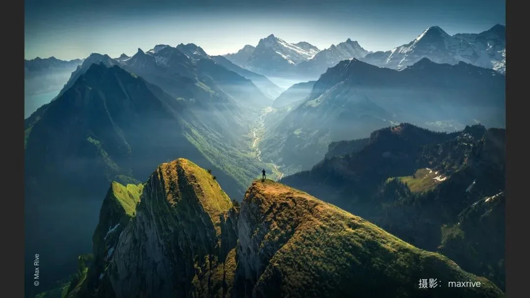
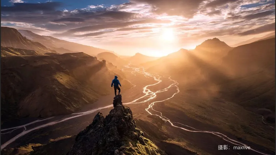
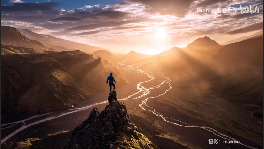
A dominant tone's bigger job is setting the mood. A quick self-check: hold the phone farther away or shrink the image — the big field of color that hits your eye first should be the dominant tone, like the sweeping cyan in the landscape below, accented with only a little yellow-green. Orange evokes sunshine, which is why this backlit mountain scene feels full of hope and energy; the hiker's clothes are a deep blue chosen to echo the sky rather than a jarring red or green (at 5:37 in the video).
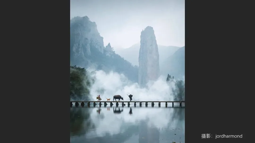
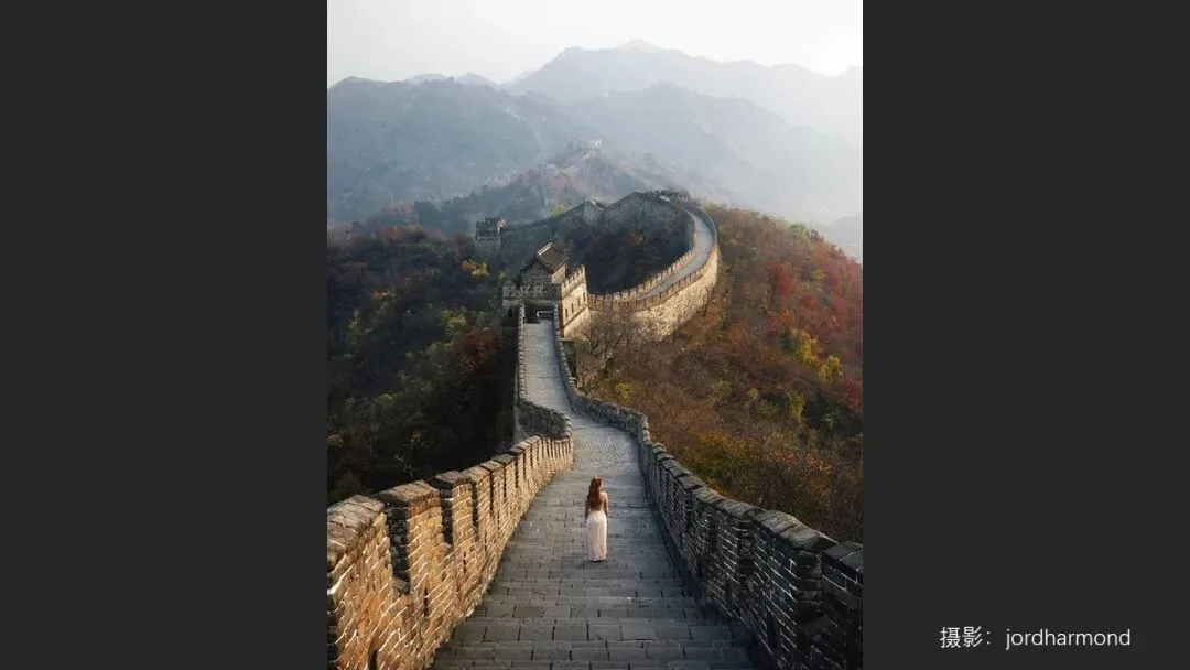
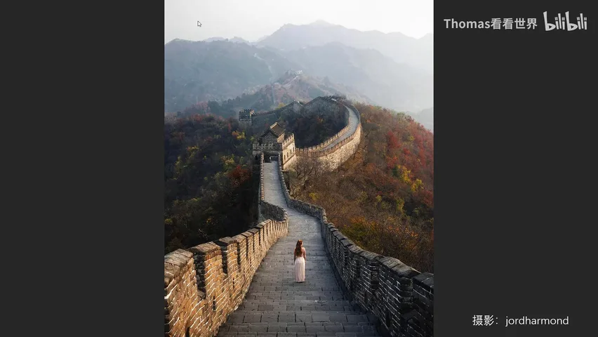
British photographer Jordan Hammond works the same way on China's classic viewpoints: on a much-photographed subject like the Great Wall, he unifies the whole frame into a comfortable low-saturation blue with touches of yellow-green, and the mood instantly separates his work from the casual crowd. Remember: the more colors, the harder the control. Mastering one or two dominant tones first is the safest path for a beginner (at 6:41 in the video).
02 Rule Two: Pair Analogous or Complementary Hues
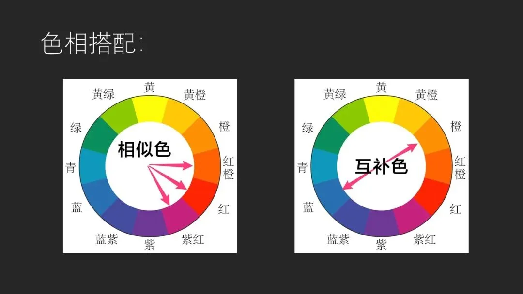
The second rule refines the palette on top of the dominant tone. The two core hue schemes: analogous colors, adjacent on the color wheel — red-orange with violet-red, say — and complementary colors, opposite each other on the wheel. Thomas covers these in detail in his book Fundamentals of Landscape Post-Processing; the most popular Instagram shooters lean toward complementary schemes, above all warm-cool contrast — the blue and orange of dawn (at 8:44 in the video).
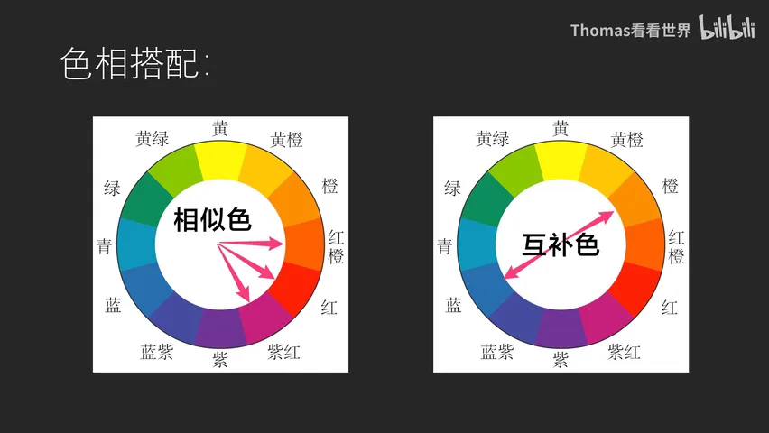
Once the hue scheme sets the base, real skill shows in how saturation and brightness are arranged. Popular work keeps the hues unified while saturation and brightness rise and fall across the frame — rarely flattening everything into one uniform level.
03 Rule Two: Stagger Brightness and Saturation
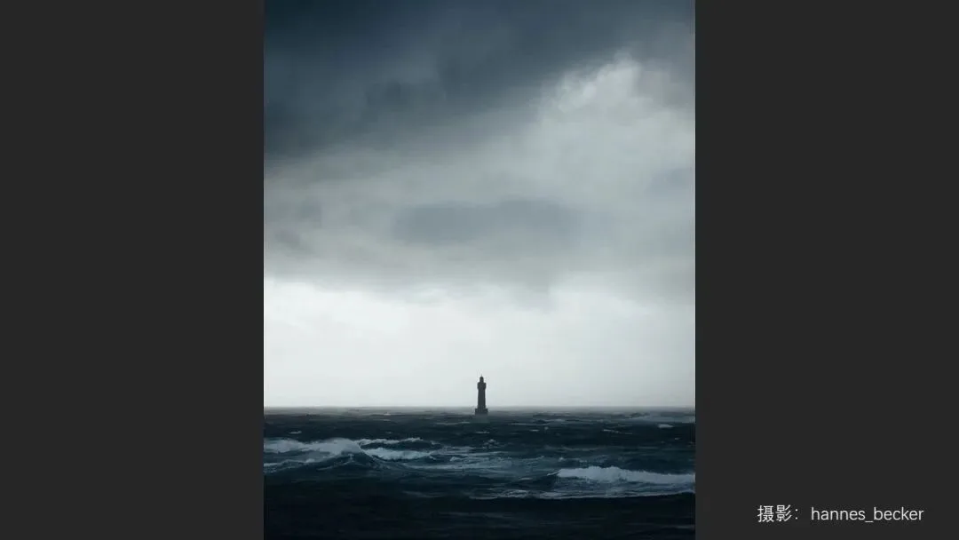
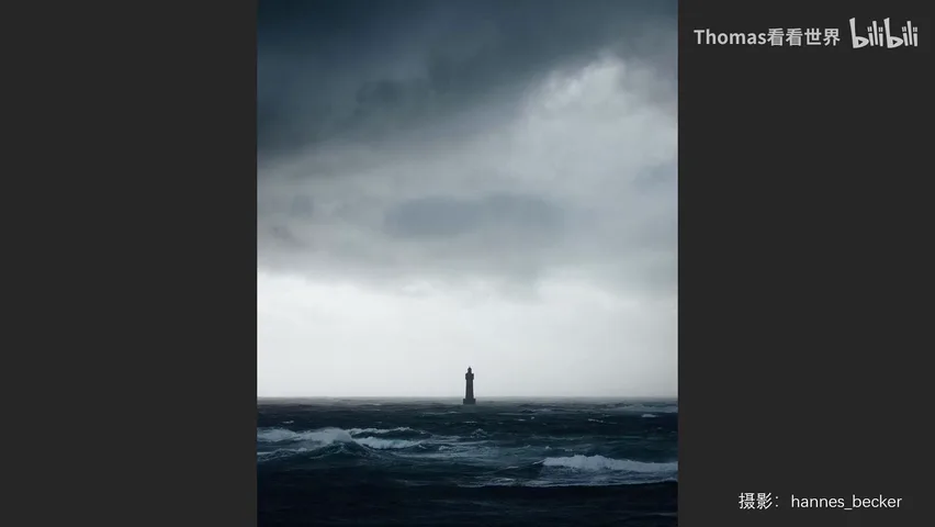
The beginner's habit is uniform saturation or uniform darkness across the whole frame. The lighthouse photo below is a textbook counterexample: nearly monochrome in hue, yet the lighthouse sinks very dark, the sea stays low-key, and the sky grades from grey to bright — that broad luminance range makes the lighthouse leap out of the background. Push highlights and shadows to the max everywhere and the photo goes flat (at 9:44 in the video).
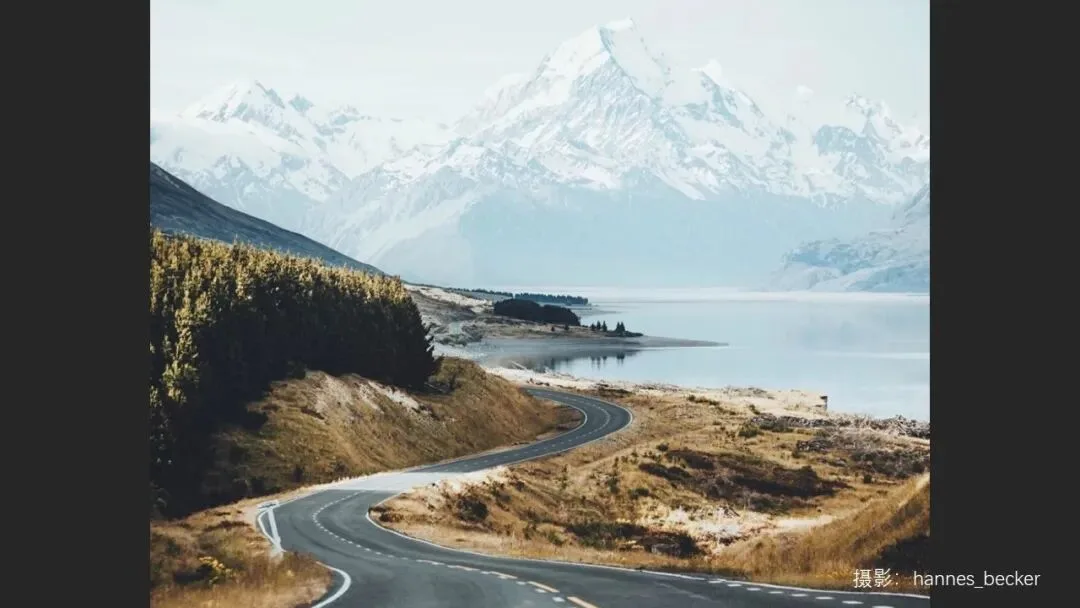
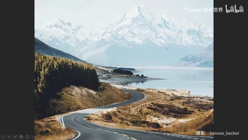
Look again at the classic Mount Cook viewpoint: the hue scheme is the timeless cyan-orange complement, yet the distance sits in low-saturation cyan-blue, the midground peaks and morning glow in medium-saturation orange, and the foreground rock keeps the cyan hue at a lowered brightness — light and dark, warm and cool, saturated and muted interlocking. That is what makes the image so rewarding to look at (at 10:40 in the video).
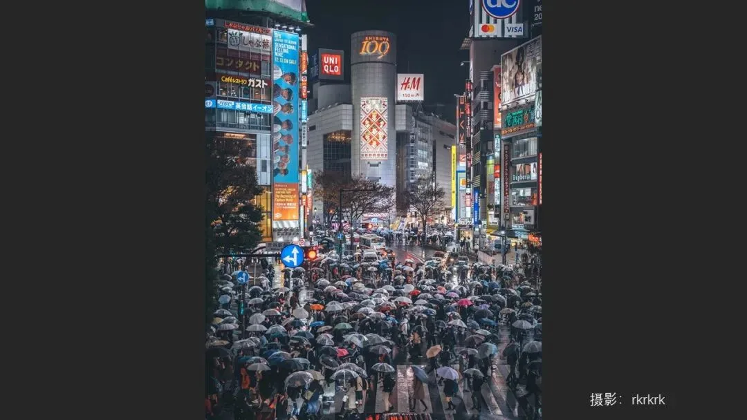
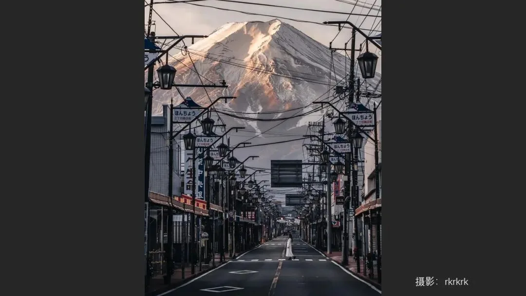
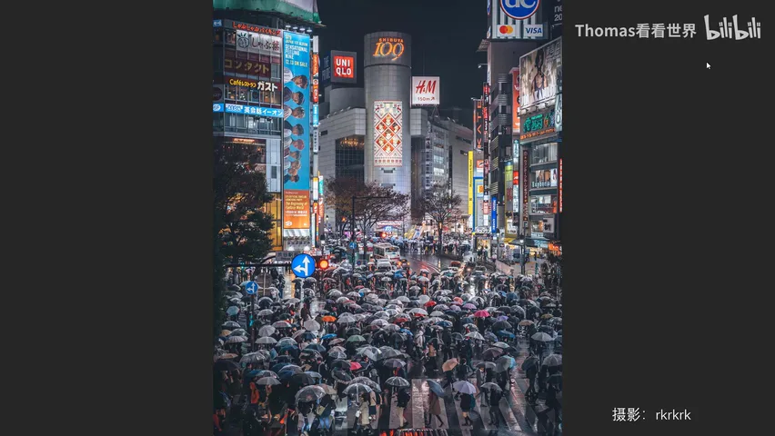
Japanese photographer RK (rkrkrk) plays Tokyo nights a different way: neon fills the frame with many colors yet never looks messy, because his true dominant tone is a low-saturation grey and blue-grey — sky, buildings, pavement and even pedestrians' clothes all sit under that grey base, leaving the high-saturation lights as accents. His signature pairing is cyan against red: the cyan low in saturation and a touch dark, the red slightly more saturated with lifted brightness, hierarchy always clear (at 11:40 in the video).
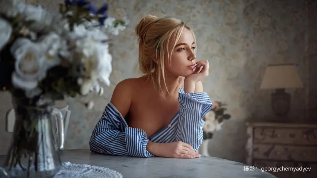
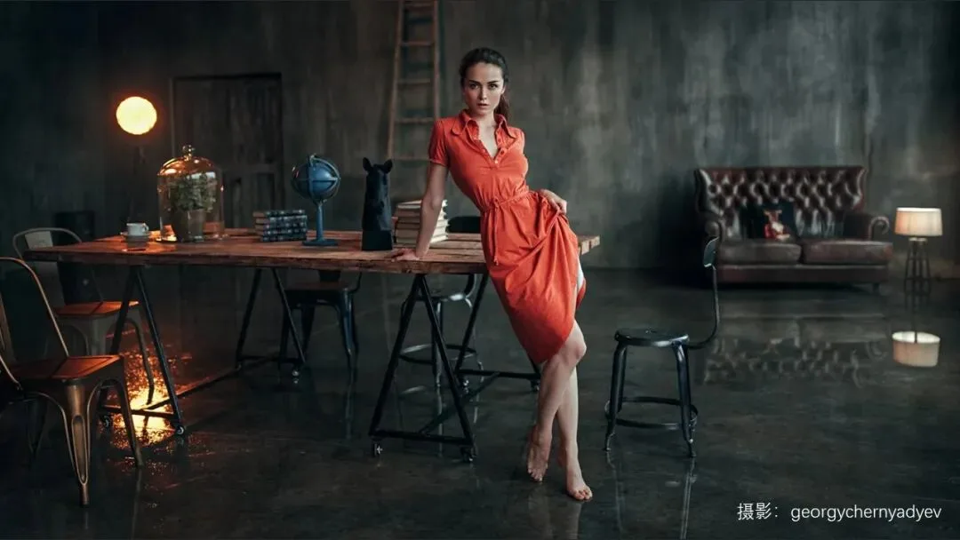
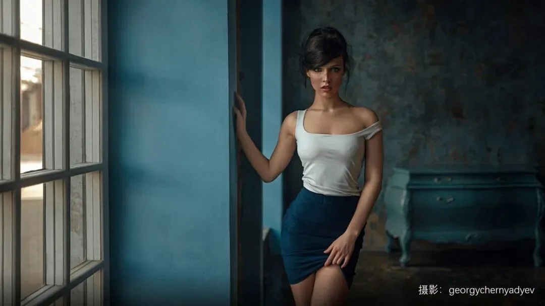
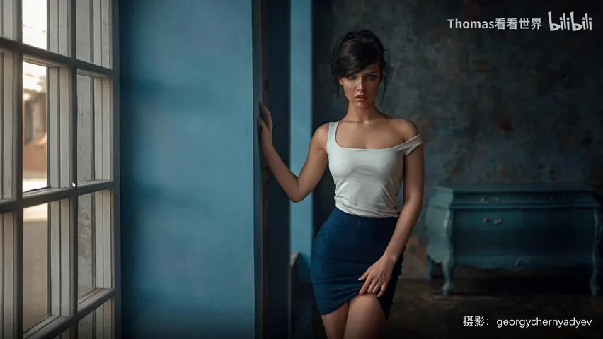
The Russian portrait look so often asked about on Zhihu follows the same logic. In Georgy Chernyadyev's frames, the background unifies into low-saturation cyan and green, while the warm elements meant to stand out — lamplight, skin, clothing — carry higher saturation and brightness. His photos often hold only two hues, yet the staggered saturation and brightness give them remarkably rich layering (at 13:52 in the video).
04 Rule Three: Match the Style to the Shoot Itself
The third rule is the most overlooked: every color style is rooted in a matching environment, weather, light and set dressing at the shooting stage — it cannot be slapped onto any photo. Thomas often gets this question: readers hold a master's original next to their imitation and ask why the colors never quite match. The answer usually lies not in settings but in the capture: they shot in sunshine while you had overcast; they were in a city while you were in the wild — the foundation of the tone is entirely different (at 15:42 in the video).

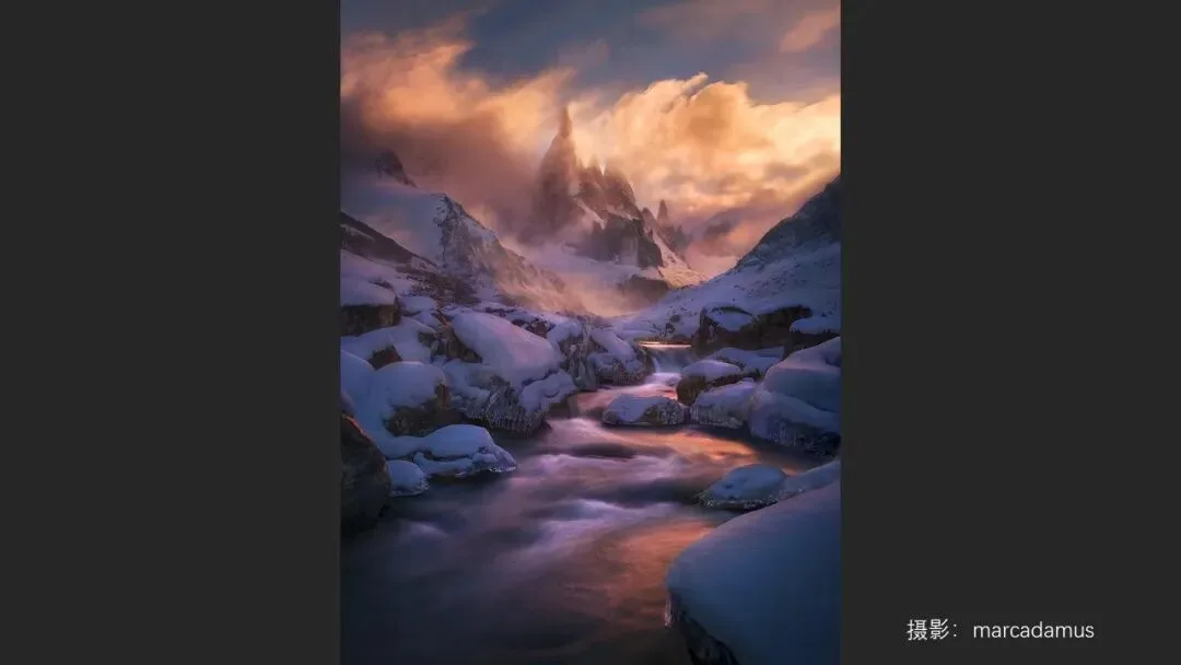
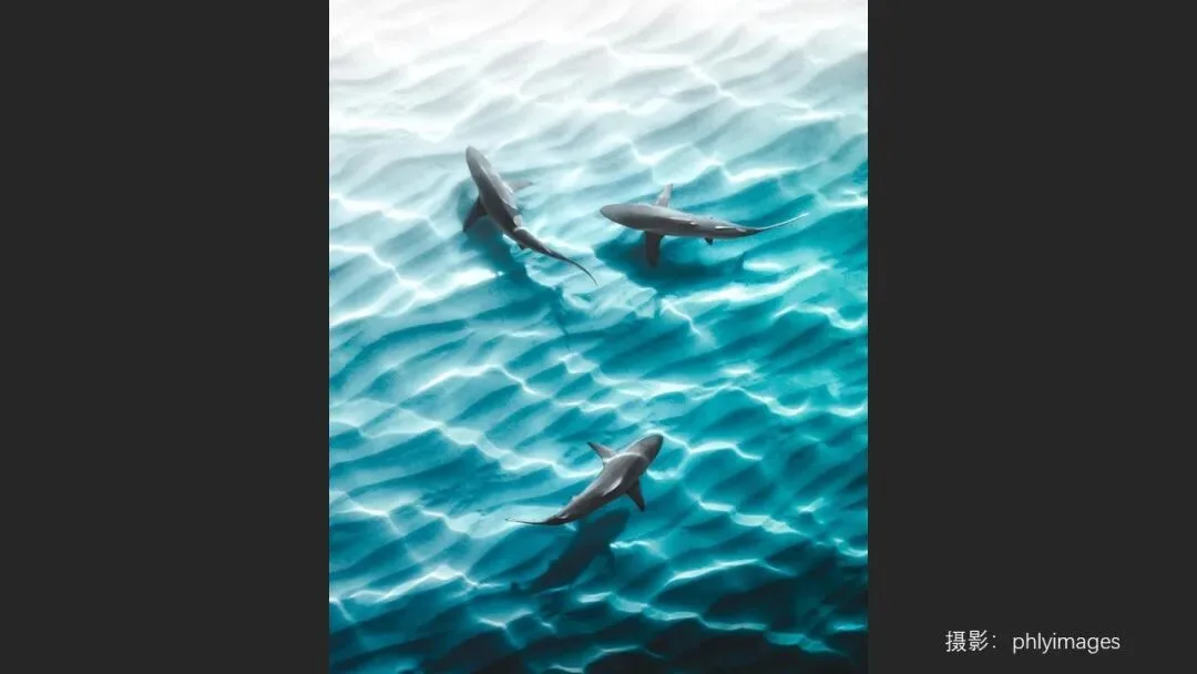
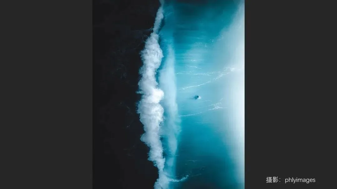
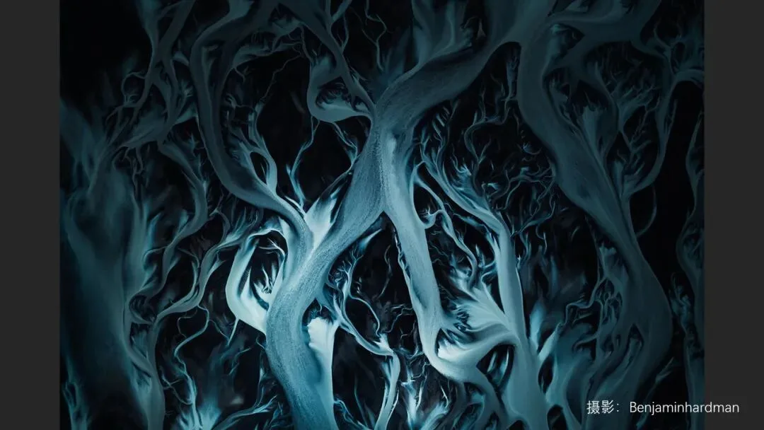
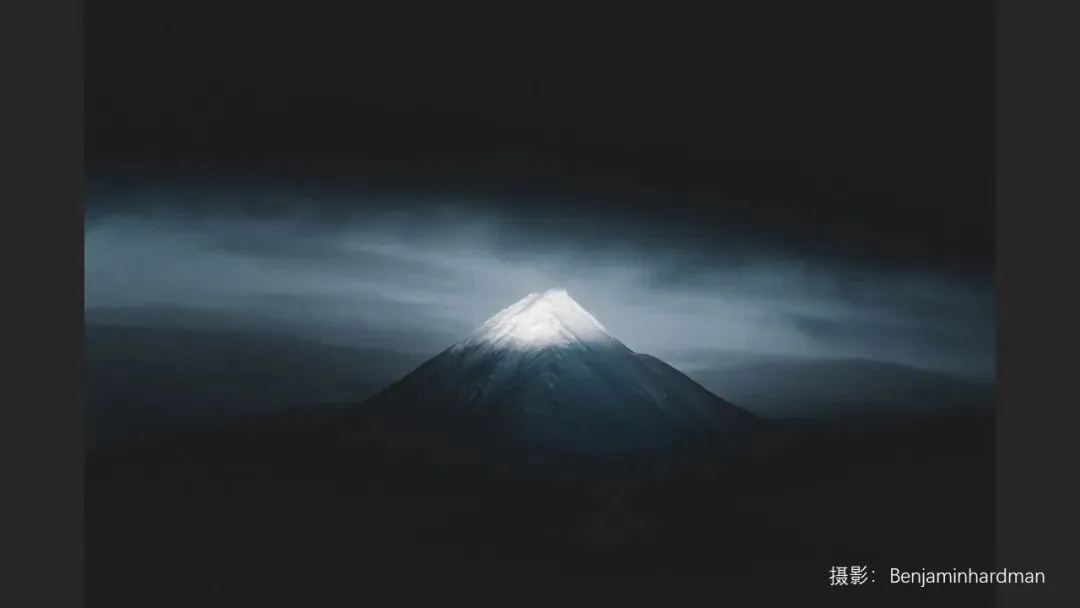
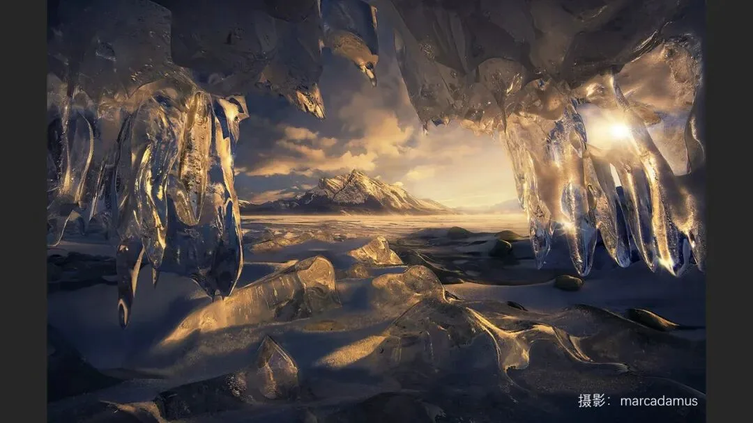
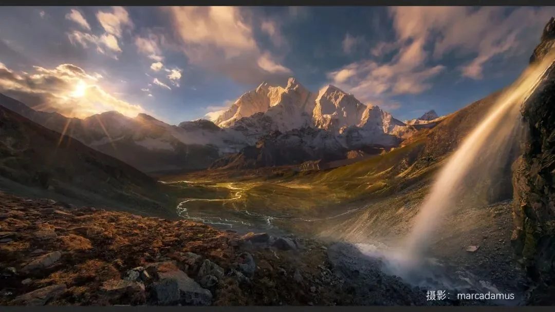
He puts three very different photographers side by side: Benjamin Hardman, based year-round in Iceland and Greenland, builds a cool Nordic restraint from deep, subdued cyans; Australia's Ben Thomas leans on harsh midday sun and its shadows to bring out bright, candy-rich color; Marc Adamus keeps to the grand light of sunrise and sunset for epic landscapes. Try forcing a Marc Adamus raw file into Ben Thomas's candy palette and the whole thing collapses at the root. So when you study or imitate a photographer, analyze their framing, composition, tonality and weather together — never judge the image by color alone (at 16:18 in the video).
05 Running Thomas's Own Photos Through the Rules
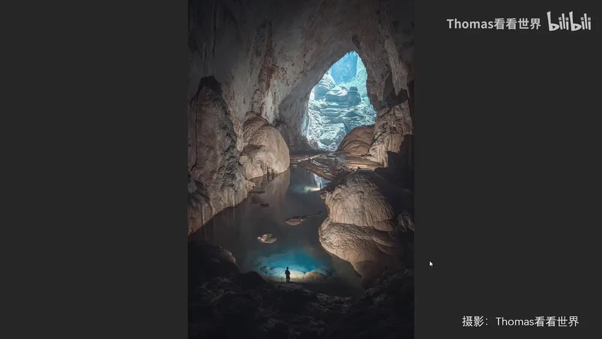
At the end of the video, Thomas runs his own three photos through these rules. The cave image is his most-liked online: its palette is exactly the classic warm-cool duel of orange and blue, free of miscellaneous colors — unified in hue, decisive in temperature (at 17:55 in the video).
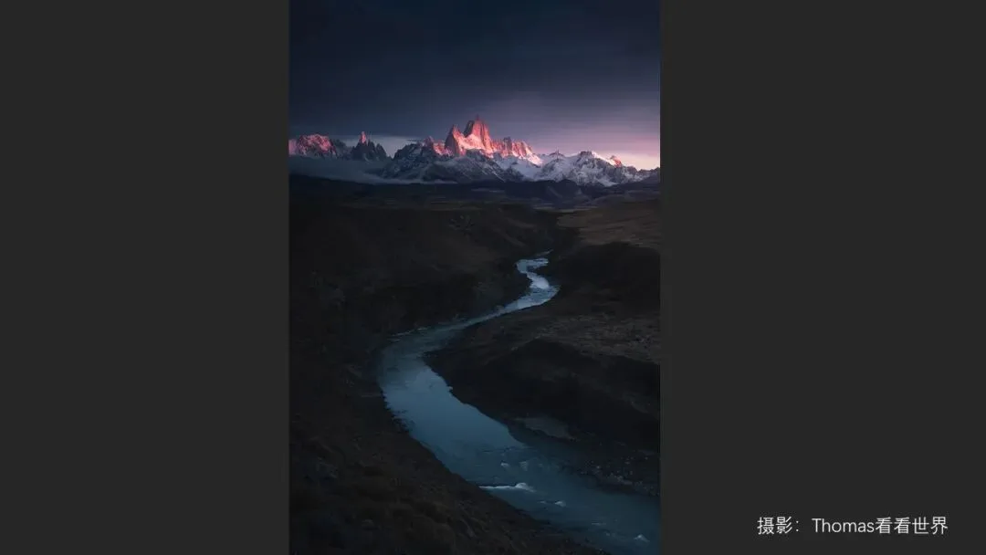
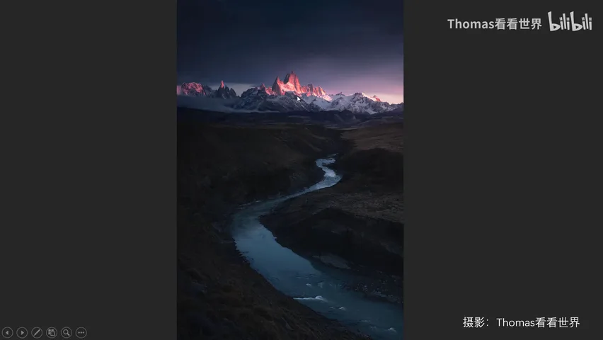
The second is Fitz Roy at dawn: the largest share of the frame goes to the low-saturation, low-brightness violet sky and the muted yellow grassland, while the cyan river and red peaks serve only as accents — and the red mountains were deliberately graded toward a reddish orange, echoing the sky as analogous hues. Unified in hue, yet staggered everywhere in saturation and brightness (at 18:31 in the video).
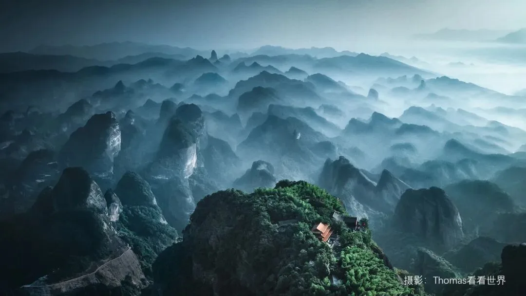
The third is the viral shot from Weibo: a cyan-dominant frame where the foreground trees lean blue-green rather than the background's cyan-blue, brightened by a yellow temple as the complementary accent; high saturation up front, medium in the middle, low in the distance, with light and dark interleaved — the layering emerges at once (at 19:28 in the video).
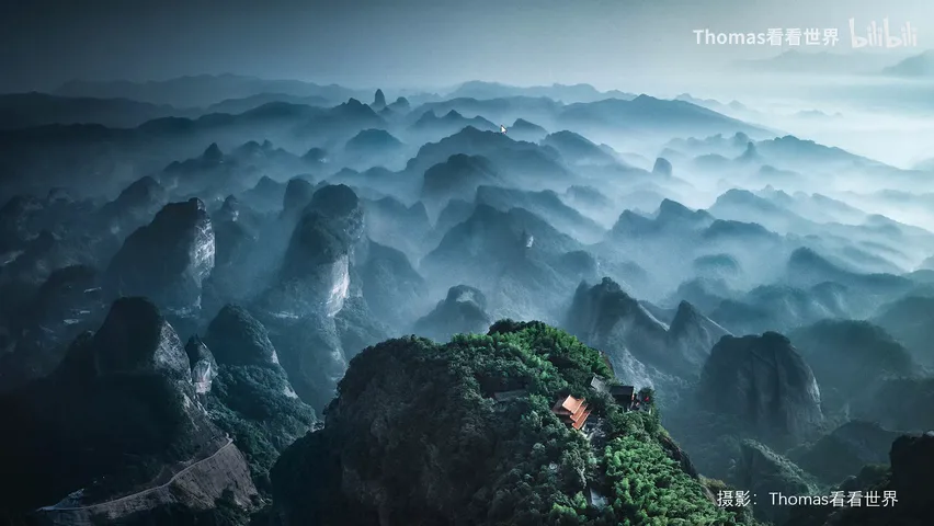
Whether it is the world's most popular photographers or our own work, good grading is almost always this trio combined: establish a dominant tone first, then layer hue pairings with staggered saturation and brightness — and never forget that the light and environment you shoot in is the true foundation of any palette.
1. Establish a dominant tone first, keep a clear color hierarchy and small accents — only then will the mood stay unified; 2. Pair hues as analogous or complementary, and stagger saturation and brightness instead of flattening the whole frame to one level; 3. Every color style matches a specific shooting environment, weather and light — imitate the capture before the settings, and never force the look.
Tutorial PPT