Photography Tutorial · 2020-12-06
Split Toning Becomes Color Grading: Lightroom's Strongest Color Tool Is Born
Thomas Chu Photo
In the new versions of Lightroom and Adobe Camera Raw, the familiar 'Split Toning' tool is gone — replaced by a 'Color Grading' tool very similar to those in Premiere, DaVinci Resolve and Capture One.
Color Grading is actually an enhanced version of Split Toning — more powerful and more intuitive.
In today's post-processing tutorial, Thomas shares how to use the Color Grading tool to grade your photos.
Video Tutorial
▶ Watch the video tutorial on Bilibili
This is the full illustrated write-up of the video above. After the latest Lightroom and Adobe Camera Raw updates, many noticed the trusty Split Toning tool was gone — it has been renamed Color Grading, with major upgrades. Thomas walks through the panel layout, how the color wheels work, and the four new capabilities: Luminance, Blending, Balance, and Global — with timestamps for key moments.
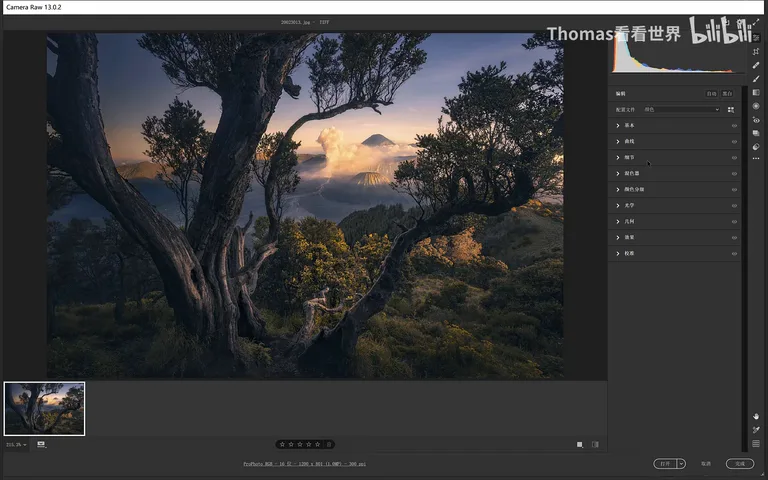
01 Where Did Split Toning Go
Color Grading sits in the fifth panel slot in Adobe Camera Raw. Inside you'll find five icons: the first is the 3-way mode showing all three wheels — shadows, midtones, and highlights — together; the middle three adjust shadows, midtones, and highlights individually; and the last one is Global, which shifts the color tendency of the entire image (at 0:28 in the video).
If you prefer the old workflow, it's still there: to the right of the Hue and Saturation sliders is a small triangle icon — click it and the familiar Split Toning interface returns, letting you dial in hue and saturation for shadows or highlights with sliders as before (at 1:13 in the video).
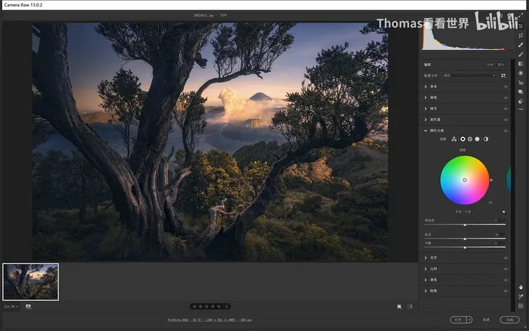
02 The Wheels: Angle Sets Hue, Radius Sets Saturation
The new default interface is a color wheel, but the old logic transfers completely: the control point's angle sets the hue, and its distance from the center sets the saturation — at zero saturation the point sits right at the center. Once that clicks, rotating the point picks a hue while moving it along the radius dials saturation in or out, controlling two variables in one gesture to find the color you want fast. Thomas finds it even more convenient than the old Split Toning (at 1:35 in the video).
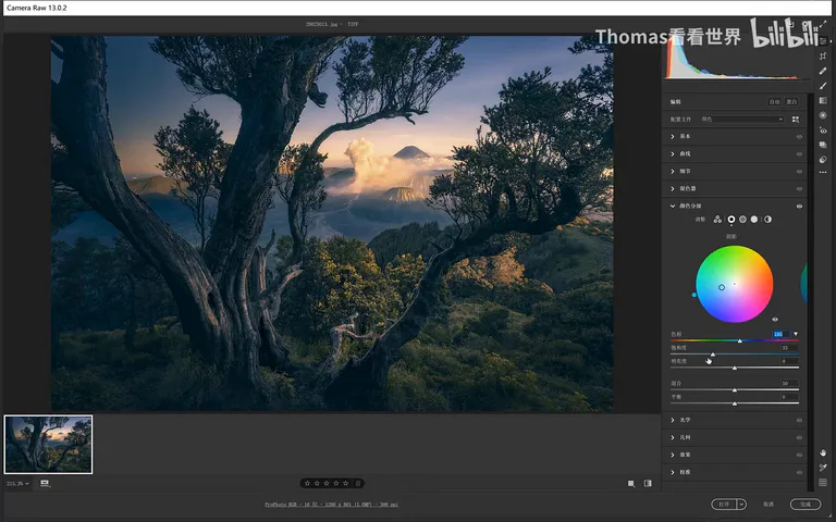
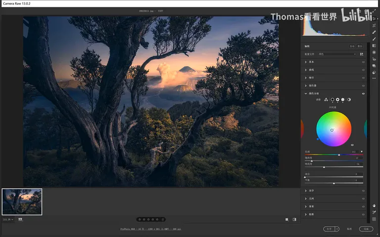
Below hue and saturation sits a new Luminance slider — one of the key additions. After adding a cyan-blue to the shadows, say it feels too bright: pull Luminance down a touch and that blue sinks into the shade. You're no longer limited to the color itself — you can control how bright it reads too (at 2:35 in the video).
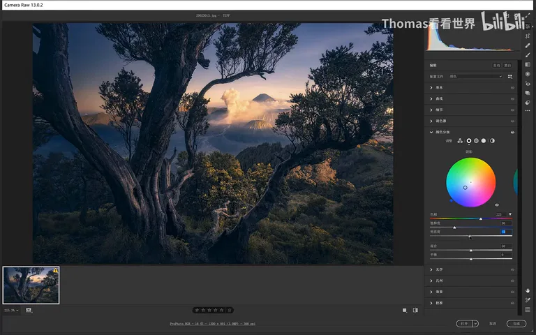
Highlights work exactly the same way: add a warm tone and adjust directly on the wheel. The wheel's strength is that hue and saturation are always tweakable while the preview window shows changes instantly — if the highlights drift purple, nudge toward yellow, add or trim saturation, and see it immediately. Two shortcuts help precision: hold Shift while dragging to change only saturation, and hold Ctrl (Command on Mac) to change only hue (at 2:54 in the video).
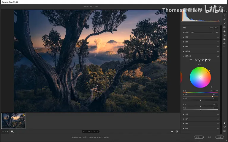
03 Midtones, Blending, and Balance
Beyond highlights and shadows, the new version lets you grade the midtones too: nudge them slightly blue, pick a hue and luminance, then darken the midtones a touch. The midtones that Split Toning could never touch now have their own wheel (at 3:53 in the video).
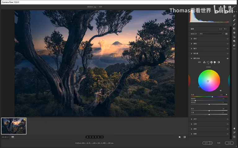
The very first icon — the 3-way mode — simply integrates the three wheels into one view: the midtone hue on top with saturation on the wheel and luminance below, and the same for shadows and highlights. Underneath are two more sliders: Blending and Balance (at 4:15 in the video).
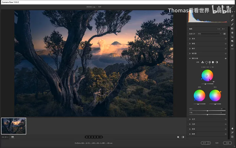
Balance carried over from Split Toning: slide it left and the overall cast leans toward the shadow color; slide it right and it leans toward the highlight color. It decides which of the two tones dominates (at 4:41 in the video).
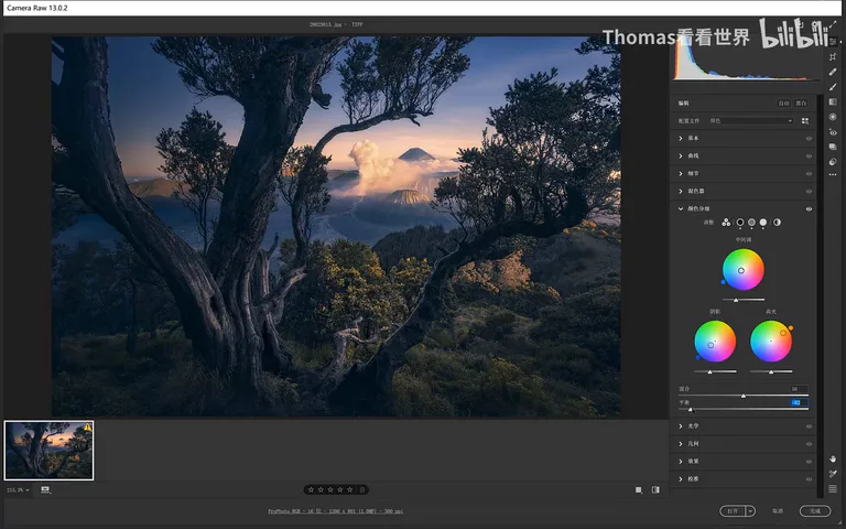
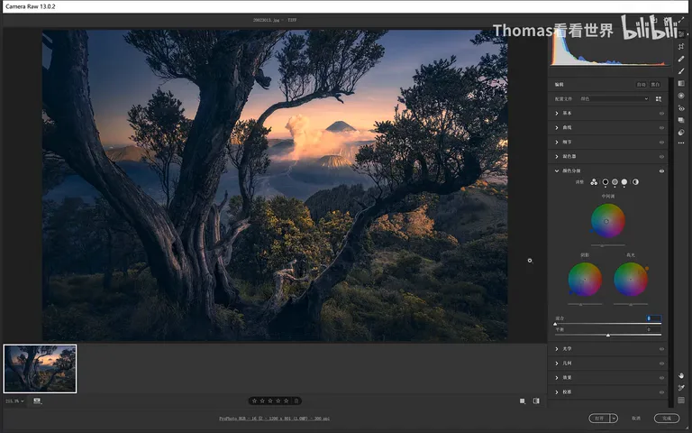
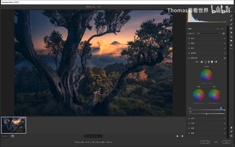
Blending is new, and it controls how much the highlight and shadow colors mix. At 0, the warm highlights and cool shadows stay cleanly separated; push it to 100 and lots of purple suddenly appears — where from? The shadows got blue, the highlights orange, and blue plus orange mixes into purple. With blending high, the midtones become a full blend zone that transitions the two beautifully, so the result reads natural. Most of the time blending helps; if you don't want it, zero it out for pure warm-highlight, cool-shadow separation (at 4:54 in the video).
04 Global: A Remedy for Color Casts
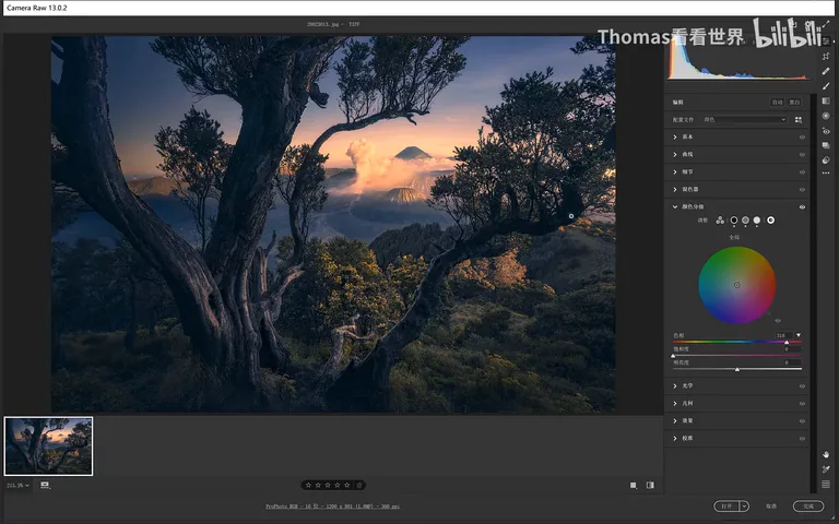
Finally, the Global option: it influences the entire image — highlights, shadows, and midtones alike — and stacks on top of the adjustments above; when you move Global, the other sliders don't change, acting as one more grading layer on top. That makes it a common remedy for color casts: if the blended result drifts a bit purple, shift Global slightly toward cyan and the purple cast gets neutralized across the whole frame (at 5:58 in the video).
One handy trick along the way: to reset any wheel to zero, just double-click anywhere on it with the left mouse button — no need to drag the point all the way back to the center (at 6:24 in the video).
05 In Practice: Blue Shadows, Orange Highlights
To wrap up, Thomas zeroes all the wheels and reruns the classic recipe: a touch of blue in the shadows, midtones untouched, orange in the highlights. The whole grade happens on the wheels while watching the preview — deeply intuitive and fast, which is exactly what makes Color Grading more powerful and more pleasant to use than Split Toning (at 7:08 in the video).
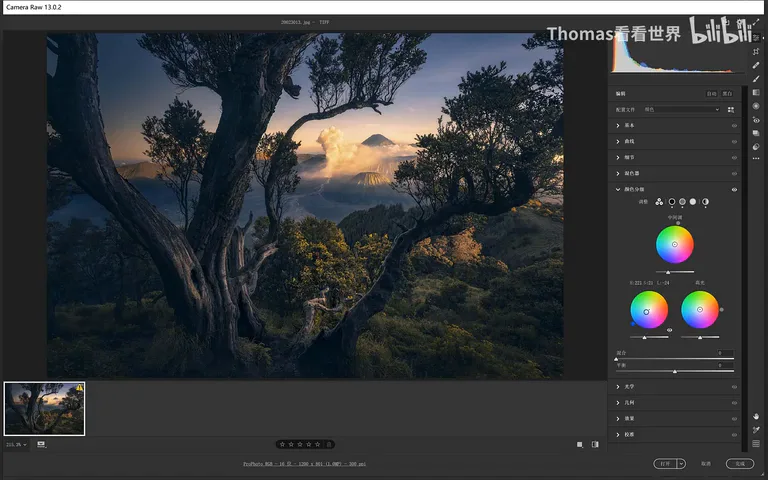
1. Split Toning isn't gone — it's now Color Grading, greatly upgraded with a midtone wheel plus Luminance, Blending, Balance, and Global controls; 2. Wheel mechanics: angle sets hue, distance from center sets saturation; hold Shift to adjust saturation only, Ctrl for hue only, and double-click any wheel to reset it; 3. Blending decides how the warm and cool tones fuse in the midtones — at zero they stay separated, at full they mix into a natural purple transition; 4. Global stacks over all grades without disturbing their sliders, making it the go-to fix for overall casts like purple-shifted images (add cyan).