Photography Tutorial · 2019-07-28
Color Grading Talk: Three Key Colors That Build Photographic Mood
Thomas Chu Photo
Most photography enthusiasts grade colors purely by feel. But for those with a weaker foundation in fine art, colors graded by intuition alone often turn out rather poor.
So Thomas will introduce some basic knowledge of flat-image color, one installment at a time, to help you use theory to assist your color grading.
In a flat-image work, colors can be divided by function into three main categories: dominant tone, accent (focusing) color, and supporting colors.
Understanding the roles of these three kinds of color in the frame helps us reasonably arrange the area, shape, position, hue, saturation, lightness, and other parameters of each color.
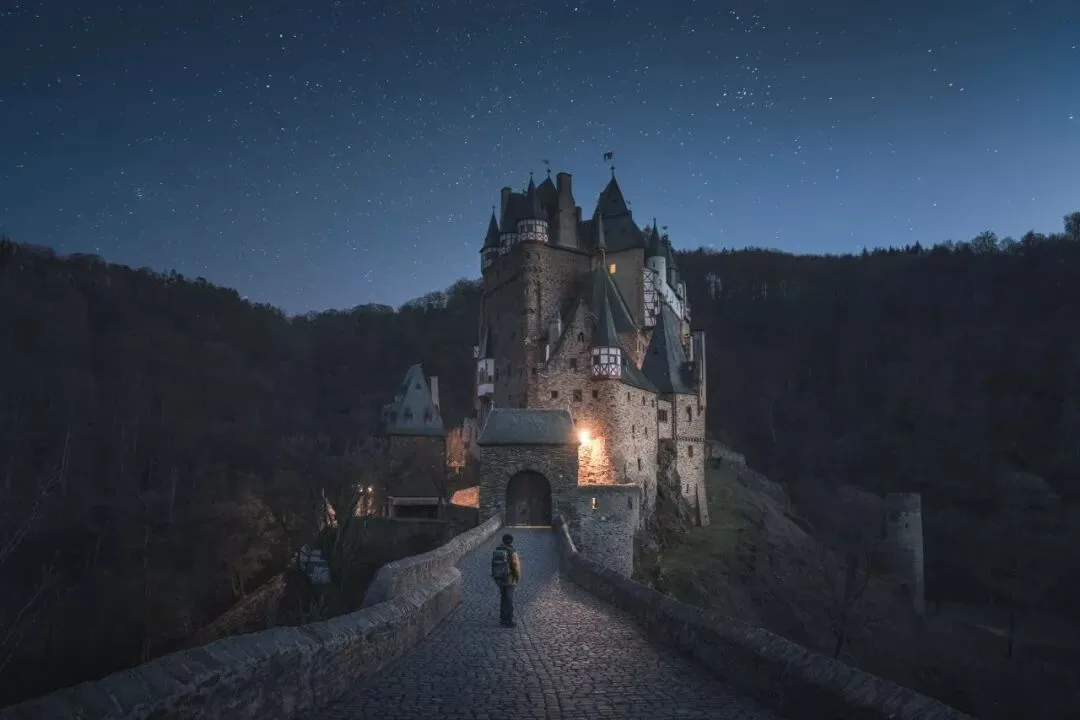
1. Dominant Tone
The dominant tone is the 1–2 colors occupying the largest area of the frame, representing the overall color tendency of the picture — usually appearing as the background color, environment color, or overall color cast.
The dominant tone helps unify the picture, making the various parts of the photo resonate with and echo each other.
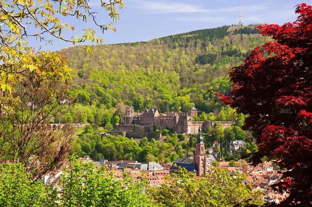
A common beginner mistake, like the photo below, is that the colors of the frame are too messy and jumbled, lacking a main thread.
The photo below also has rich colors — purple, green, red, and so on — but their areas are all relatively small, playing the role of supporting colors. The photo as a whole is occupied by the dominant tones: deep blue and pale yellow.
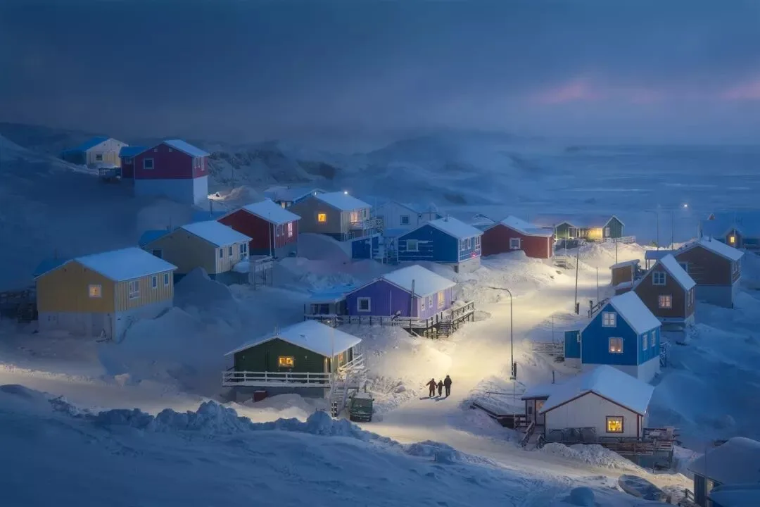
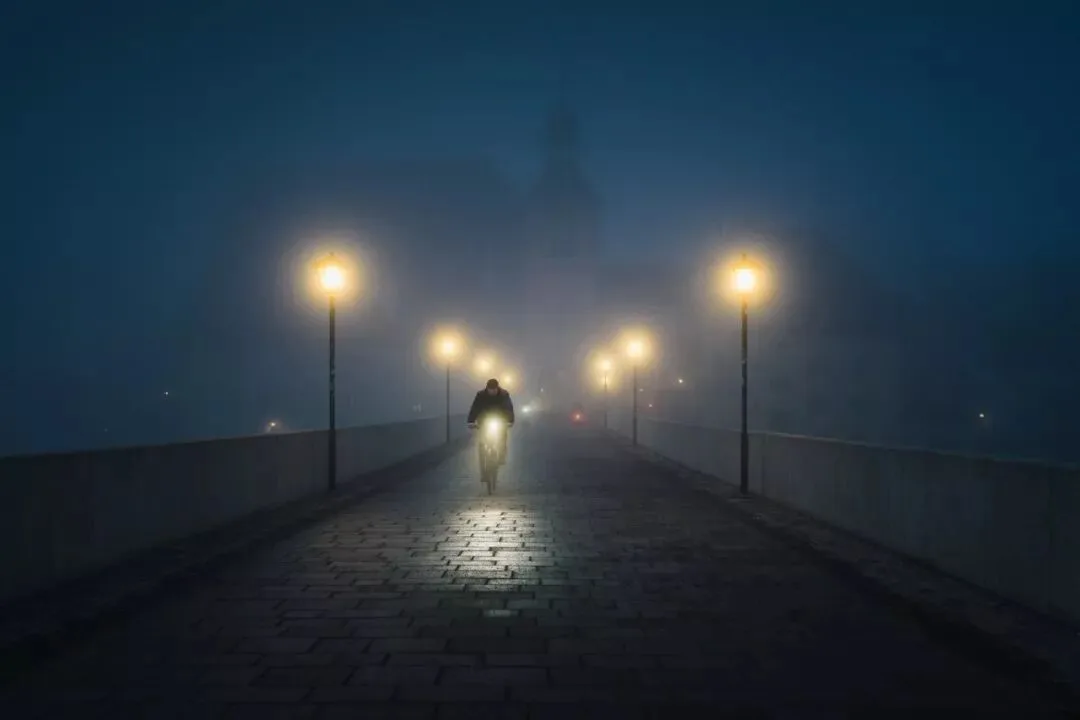
Blue, as the background color of the entire environment, matches the ice-and-snow terrain perfectly, setting off the cold of the Arctic climate. The yellow of the lights and houses, by contrast, plays against the blue and highlights the warmth of the small town.
As you can see, the dominant tone has an even more important significance: it brings a certain emotion or atmosphere to the picture.
People have different emotional associations with different colors. When one color dominates the frame, the photo naturally takes on the emotion inherent to that color.

If the frame lacks a dominant tone, the riot of colors interferes and conflicts with one another, making it hard to produce a unified overall atmosphere.
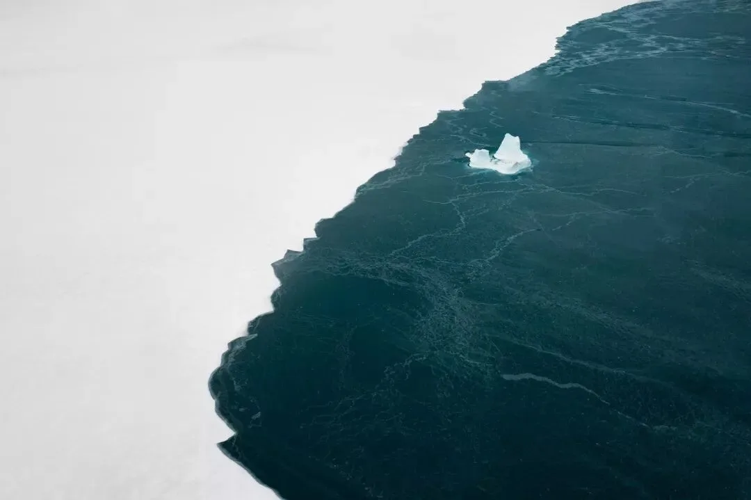
For example, to express a cold atmosphere, white can be chosen as the dominant tone. Ice and snow plus white appear fairly cold.

Deeper blues and cyans are often associated with glaciers, the sea, and night — so these two colors as dominant tones also work well to intensify the cold feeling of the picture.
Different dominant tones can make a photo feel completely different. For the same snow-mountain light-and-shadow scene, if only blue is chosen as the dominant tone, the picture looks very austere and cold.
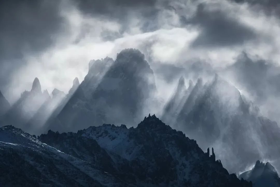
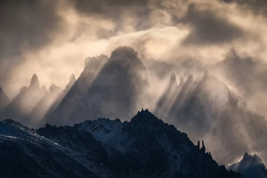
If orange is added to the dominant tone, creating a warm-cool contrast between the bright and dark parts of the image, the photo gains a stronger sense of conflict.
Compared with the all-cool version just now, the blue-orange dual-dominant version looks more magnificent.
Not only do different hues bring different feelings — different saturation, lightness, color area, and color position also give viewers different sensations.
For example, this beach photo in noon light below is well suited to expressing a sunny, joyful, comfortable atmosphere — so grading it toward high-saturation, high-brightness colors in post is more appropriate.

If I lower the lightness and saturation of the colors in the image above, the dominant tone appears very oppressive, creating a strong sense of discord with the theme.
Moreover, lowering the brightness reveals the details of the beach, making the photo look dirty.
Detail in a photo is not a case of the more the better — we must learn to subtract.

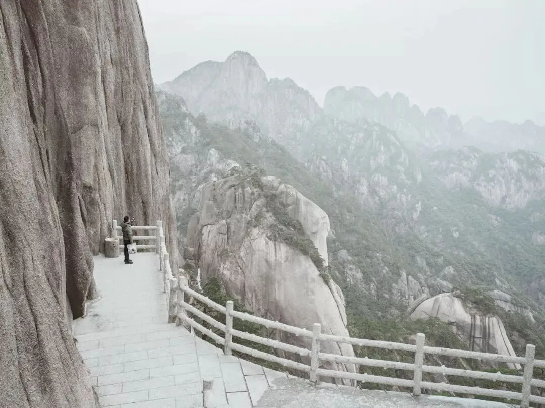
Low-saturation cyan and yellow as dominant tones, combined with a certain hazy feeling, are suitable for expressing more oppressive, objective themes.
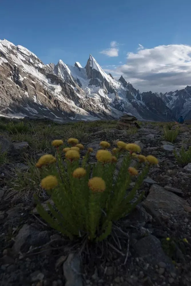
High-saturation yellow, by contrast, has a more fervent vitality.
In the photo below, the yellow area in the original is not yet large enough — only the flower part — and the saturation is not strong enough either.
The dominant tone of the frame is the blue of the sky and shadows, so the overall emotion is rather cold and austere.
When, through color grading in post, we render the clouds and peaks orange-yellow as well, while further strengthening the yellow of the flowers,
the yellow then overpowers the blue in both area and purity, becoming the absolute dominant tone of the frame — bringing the photo an impact of life surging upward.
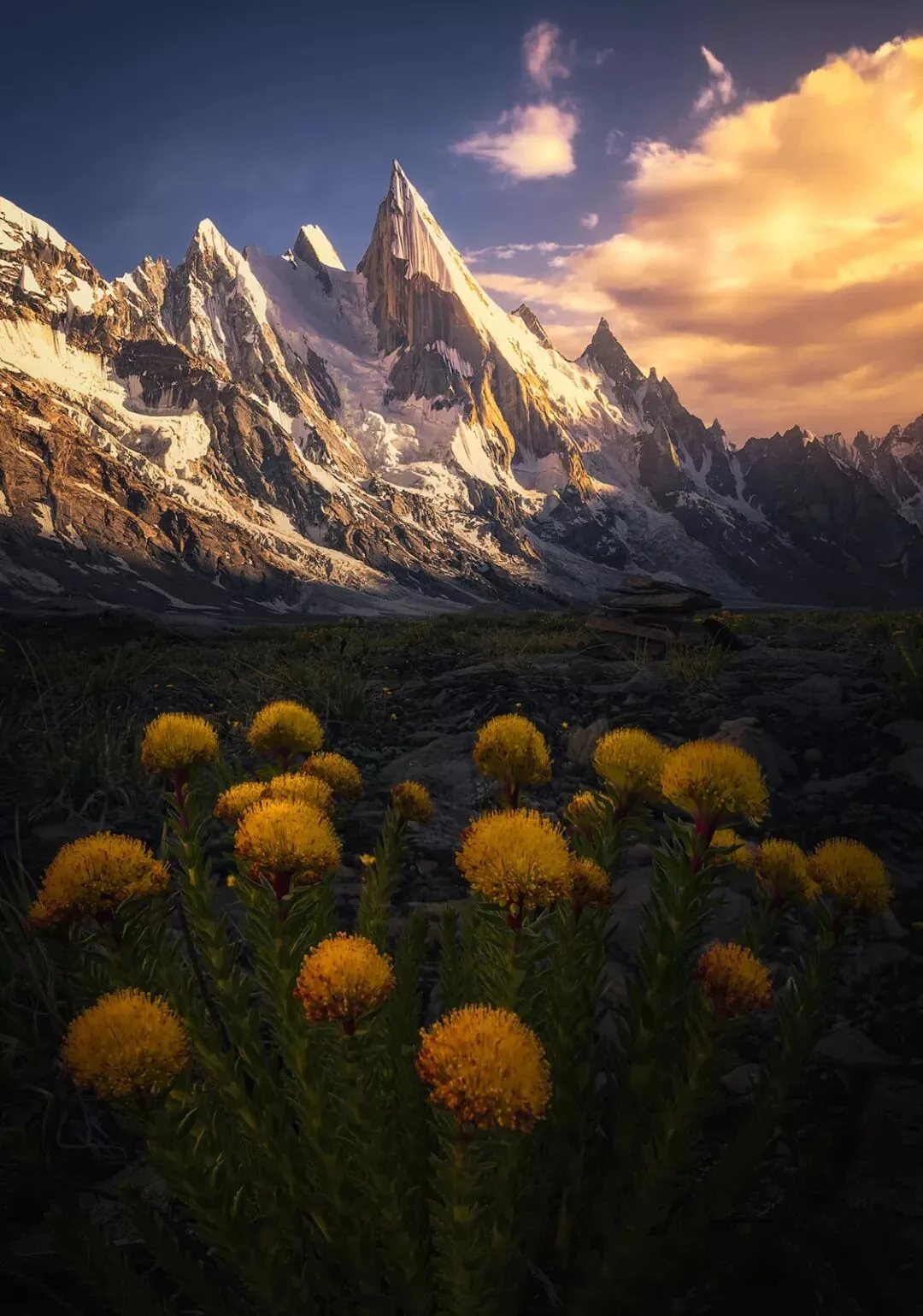
An important step in photo post-processing is controlling the colors in the frame: choosing a suitable dominant tone according to the theme, to set off the picture's emotion.
As for colors that run counter to the picture's emotion, we can unify them toward the dominant tone of the frame, or weaken these colors.
In the original of the photo below, the colors of the frame are rather jumbled, unable to highlight the lonely, quiet atmosphere of Greenland's uninhabited wilderness.
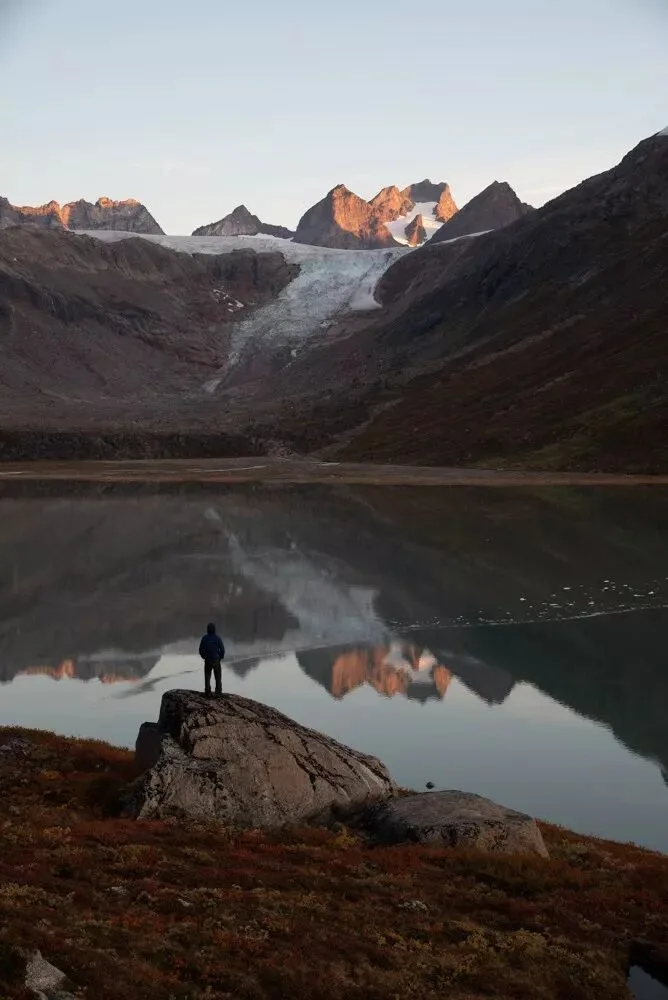
So when grading in post, I first established dark cyan and pale red as the dominant tones, to render the silence and solitude of the picture.
In the specific adjustments, I unified all cool colors into dark cyan — even over the originally brown rocks, I layered a faint wash of cyan.
The vegetation in the frame, and the peaks lit by sunlight, I unified into reds of medium-low brightness and low saturation. The atmosphere of the picture was instantly transformed.
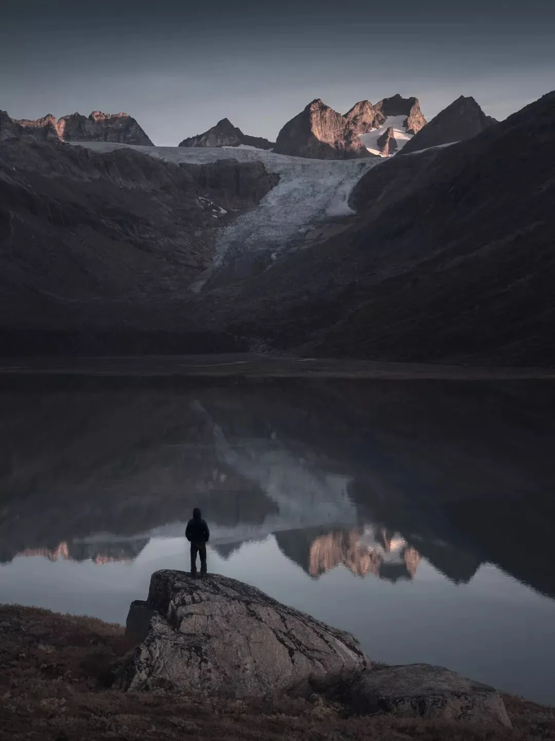
Of course, a photo's emotion is not rendered through color alone.
The lonely figure seen from behind, the quiet reflection on the water, the clean environment with clutter removed, the subdued tonality — these factors, together with color, set off the lonely atmosphere of the photo.
2. Accent (Focusing) Color
There is another kind of color in a photo with a special function: the accent color.
For a photo, the subject or point of interest is a very important element, and its color requires our careful consideration.
The accent color is used to strengthen the photo's subject and points of interest — usually a color with obvious contrast against the dominant tone, or strong contrast with the colors surrounding the subject.
In the photo below, the dominant tones are cyan and white. Cyan brings coldness; white brings the feeling of light. The clothing of the main figure in the middle of the frame was graded red-orange in post.
Red-orange and cyan-green form complementary hues, and also form a chromatic/achromatic contrast with the white — so the accent color is extremely eye-catching against the dominant-tone background, serving to highlight the subject.

An accent color can strengthen the frame's point of interest through differences in hue, saturation, and lightness.
In the photo below, the accent color is the purple of the flowers; the purple hue and relatively high brightness nicely highlight the foreground point of interest.
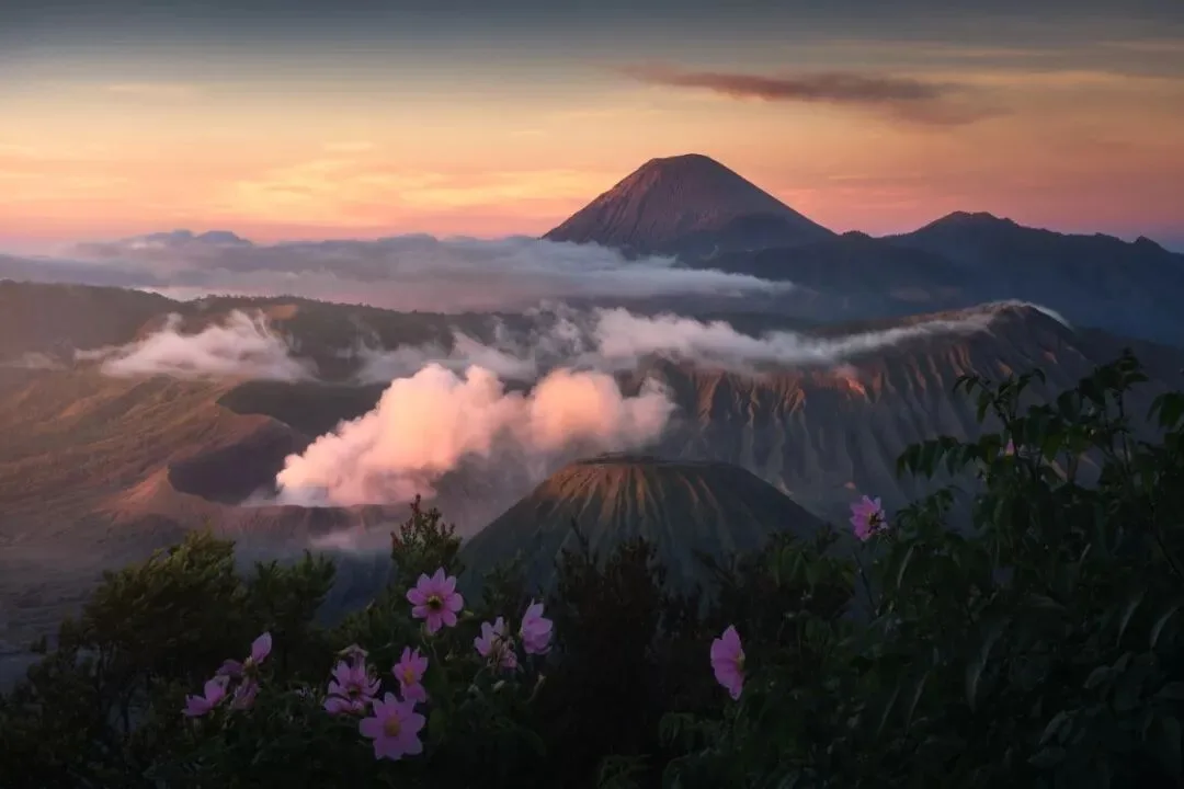
Because the accent color acts on key elements of the frame, it can also greatly influence the picture's emotion.
At this point we need to pay attention to how the atmosphere brought by the accent color and the emotion brought by the dominant tone work together.
In the picture of mountains and a great river below, the dominant tone is dark cyan, laying down a mysterious, magical color foundation.
The river surface is an important point of interest in the frame, serving as a leading line and a perspective line. For the river's accent color I chose to keep the cyan hue, so it echoes the dominant tone.
But the river's cyan has a relatively high brightness, so it can attract sufficient attention from viewers.
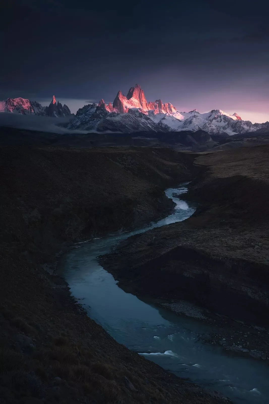
The distant peaks struck by sunlight are the subject of this photo; for the mountains' accent color I chose purple-red.
Sunlight rendered in post as purple-red, magenta, red, orange, yellow, white, and so on can all look fairly realistic — so it is the photographer's thinking and ideas that decide the final post-processing color of the sunlight here.
Purple-red is the hue on the color wheel closest to the cyan-blue dominant tone. In this photo I did not want a strong warm-cool contrast, but a more harmonious pairing of hues, to strengthen the picture's sense of mystery.
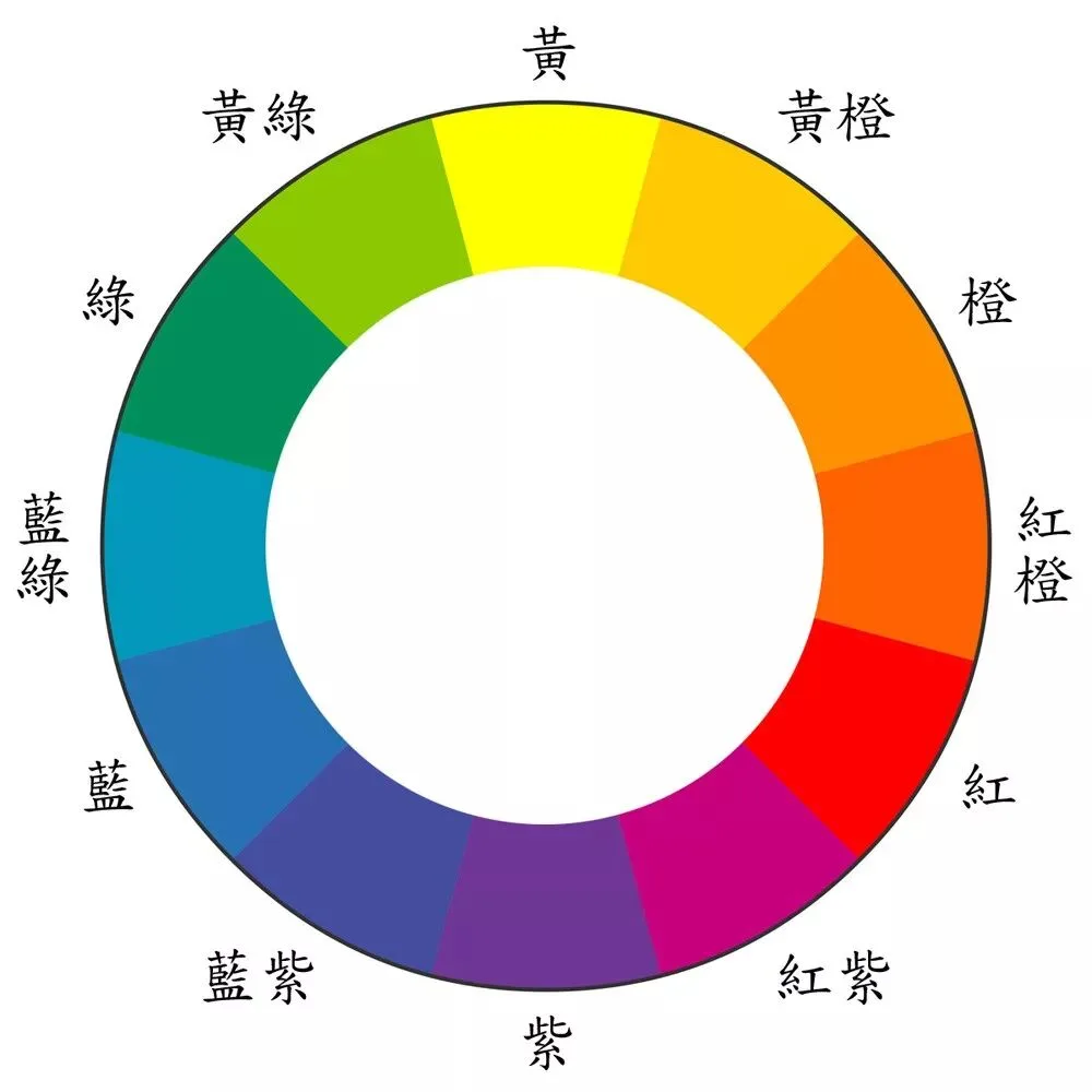
Red feels fervent, orange more impactful, yellow rather cheerful, while the purple family gives a feeling of nobility and mystery — and therefore better matches the atmosphere I wanted to express.
The purple-red accent color of the mountains highlights their visual status on one hand, while also cooperating well with the cyan dominant tone — bringing the photo a strong feeling of an otherworldly hidden realm.
Note that very often, to make the picture more harmonious or to preserve authenticity, not every accent color needs to contrast sharply with the dominant tone.
Sometimes the accent color is even the same as the dominant tone — it only needs a certain contrast with its immediate surroundings.
The dominant tones of the photo below are white and cyan-green; the subjects — three seagulls — keep the same white as the dominant tone.
White seagulls are more true to life, their contrast with the surrounding cyan-green is already obvious enough, and they echo the white of the glaciers. There is no need for the superfluous step of grading the seagulls red or yellow.

An accent color must on one hand highlight the point of interest, and on the other hand also take into account the photo's overall color pairing and atmosphere-building.
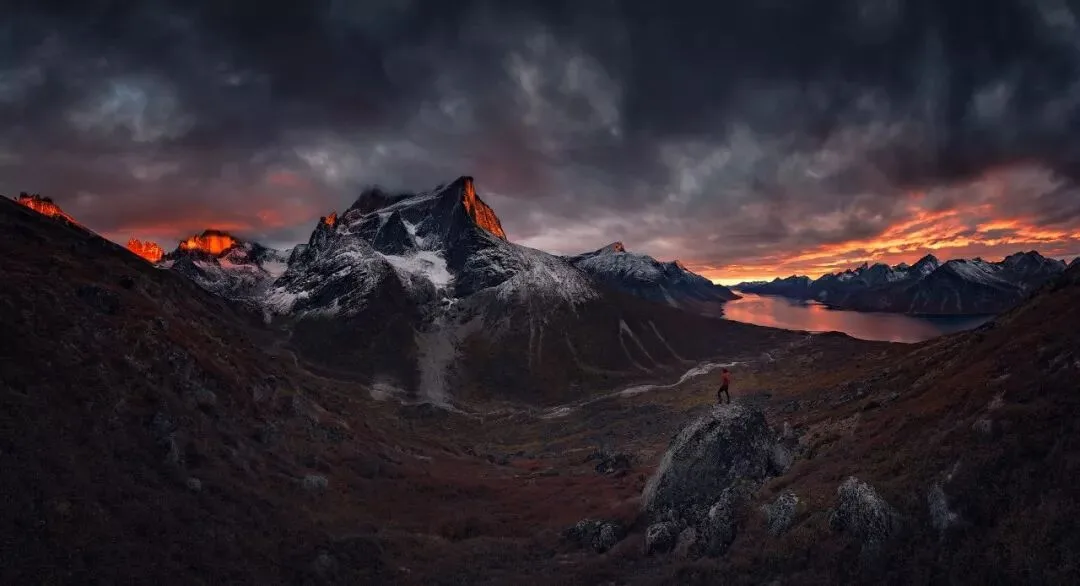
For example, in the photo below, if the figure's accent color were cyan, the cyan would stand out from the overall red dominant tone — but the figure's sense of popping out would be rather strong.
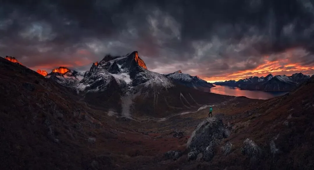
Set the figure's accent color to the same red as the dominant tone, and now figure and environment echo each other — giving an even greater sense of the person merging into the environment, a vastness of unity between man and nature.
3. Supporting Colors
The dominant tone occupies most of the frame's area, the accent color serves the core point of interest — together they control the picture's atmosphere.
But many photos with only a dominant tone and an accent color would undoubtedly look rather monotonous. So we also need supporting colors to embellish, balance, and enrich the picture.
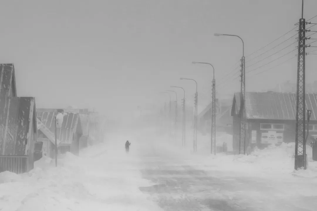
In the photo below, gray is the dominant tone, giving the photo a sense of silence at the end of the world. But I still kept the houses' faint pink, orange, and blue — this makes the picture more real and rich.
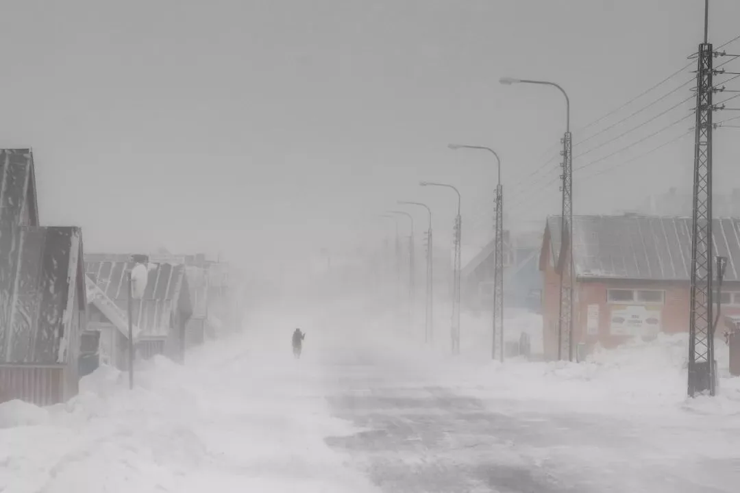
If we remove the supporting colors from the frame, the photo loses much of its interest and sense of reality.
The same logic applies to the photo below: although the dominant tones are blue and yellow, I did not unify the red and cyan lights in the distance into the dominant tone — I preserved this richness of color.
Also, photography differs from fine-art design: not every object's color can be freely arranged.
Unless it is a special theme, grading skin blue, strawberries purple, or sunlight green will all produce a strong sense of incongruity.
Therefore supporting colors in a photo can also serve the function of restoring true-to-life colors.
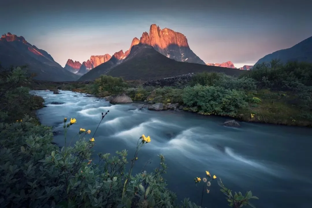
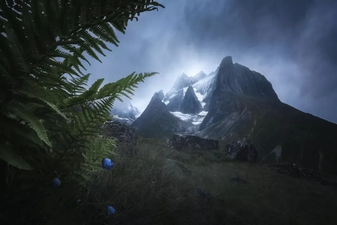
In the photo below, for example, the dominant tone is the background cyan; the accent colors are the gold of the peaks and the yellow of the small flowers; and the supporting color is the green of the shrubs.
Although some cyan was mixed into the shrubs' green, it was not fully graded to the same blue-cyan as the sky's dominant tone — otherwise it would look less real.
The core of color grading in post is to cooperate with the expression of the theme or the conveyance of emotion.
Different grading styles — magical style, minimalist style, Instagram green, cyberpunk, and so on — appear to be different pairings of dominant and supporting colors.
But in fact, photos of these different grading styles differ completely in shooting light, subject matter, and the emotion expressed.
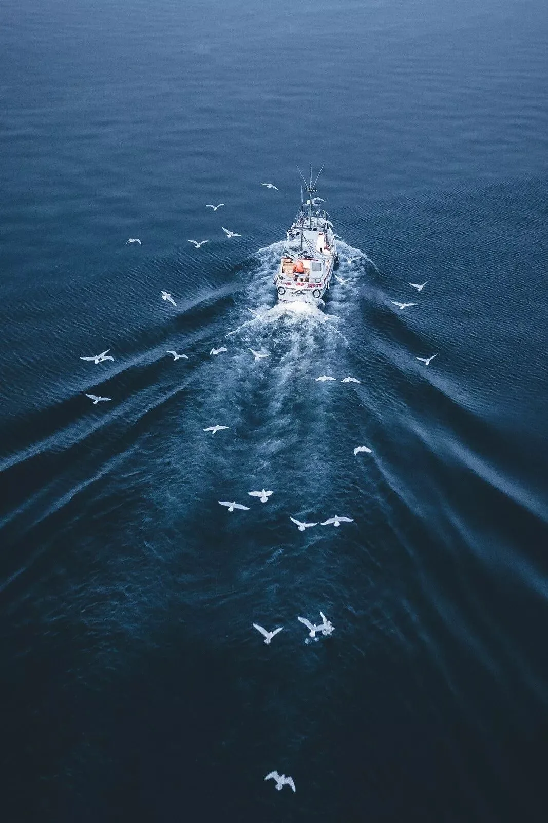
We need to choose the most suitable dominant tone to set off the atmosphere according to the environment's characteristics and the photo's expressive needs; combine it with accent colors to highlight points of interest and strengthen emotion; and then add a moderate amount of supporting colors to embellish the frame.
In this way, each color in a photo can perform its own duty and coexist in harmony, producing an excellent visual effect.
The content of this article is excerpted and adapted from the book "The Fundamentals of Landscape Photography Post-Processing" (《风光摄影后期基础》).