Photography Tutorial · 2020-11-29
Say No to Color Casts: Color Management Workflow & Key Points for Photo Editing
Thomas Chu Photo
Accurate color display is the foundation of post-processing. Otherwise, a masterpiece you spent hours editing can look awful once printed or viewed on another monitor.
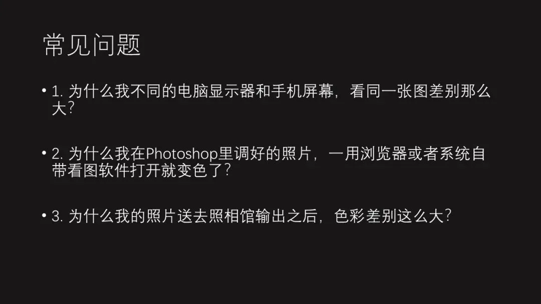
Students often ask me questions like these:
1. I spent a fortune on a wide-gamut professional editing monitor — why does every photo look oversaturated, even worse than on a regular display?
2. Why does the same photo look different on my phone and my computer? Which one should I trust?
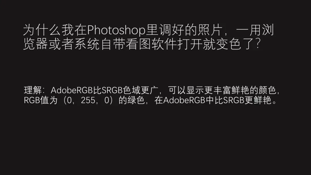
3. Why does a photo I finished in Photoshop shift colors the moment I open it in a browser or the system viewer?
All of these problems come down to color management.
Today, Thomas will walk you through the essential color management workflow and its key points — in plain, accessible terms!
Video Tutorial
▶ Watch the video tutorial on Bilibili
This is the illustrated companion to the video above. Why does one photo look different on a laptop, a desktop and a phone? Why does an image finished in Photoshop shift the moment it opens in a browser? All of it comes down to color management. In 25 minutes Thomas covers calibration, ICC profiles, gamut conversion and output — reorganized here into four chapters with every settings page and demo screenshot.
01 Color Gamuts and Where Differences Come From
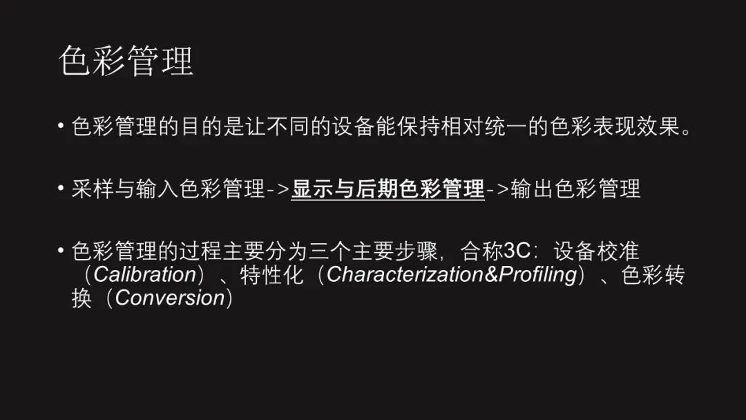
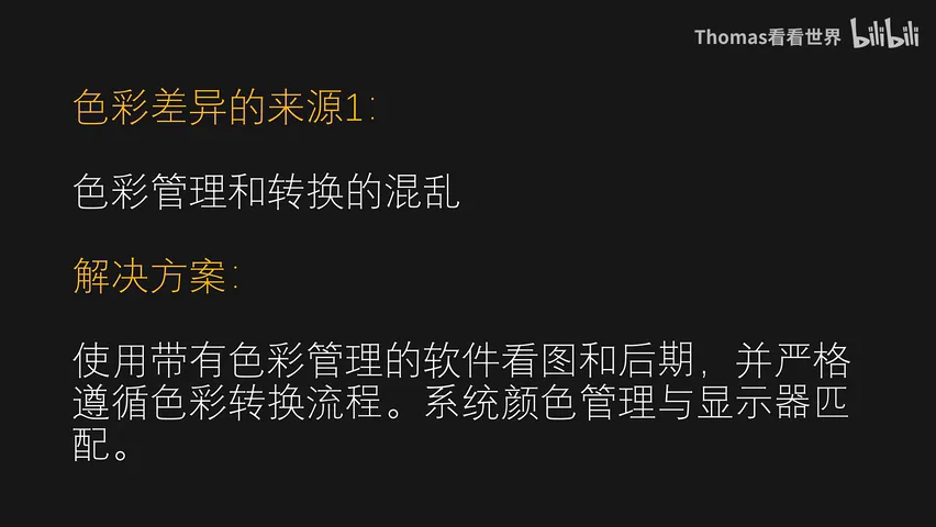
Color management aims at consistent color across devices, in three steps: calibration, characterization (building ICC profiles) and conversion. The first source of difference is messy management and conversion — the cure is color-managed software for viewing and editing, plus a strictly followed conversion workflow (at 2:34 in the video).
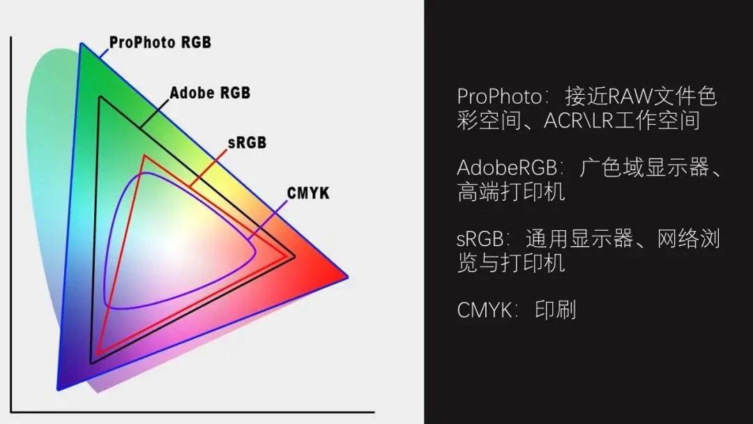
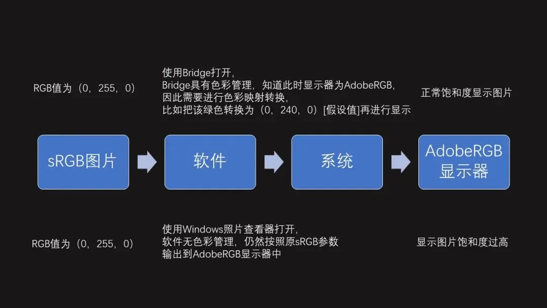
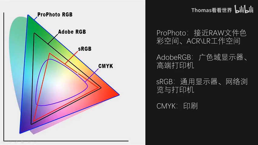
The root is gamuts: CMYK serves traditional printing, sRGB is the common language of monitors, the web and printers, Adobe RGB serves wide-gamut editing displays and fine-art printing, and ProPhoto RGB — ACR and Lightroom's default workspace — comes closest to all the color a Raw file records. An all-sRGB pipeline rarely sees differences; problems begin when a wide-gamut display and Adobe RGB enter the chain (at 3:16 in the video).
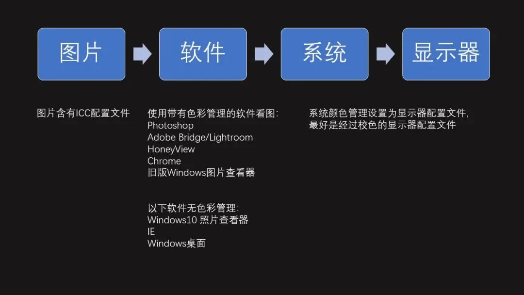
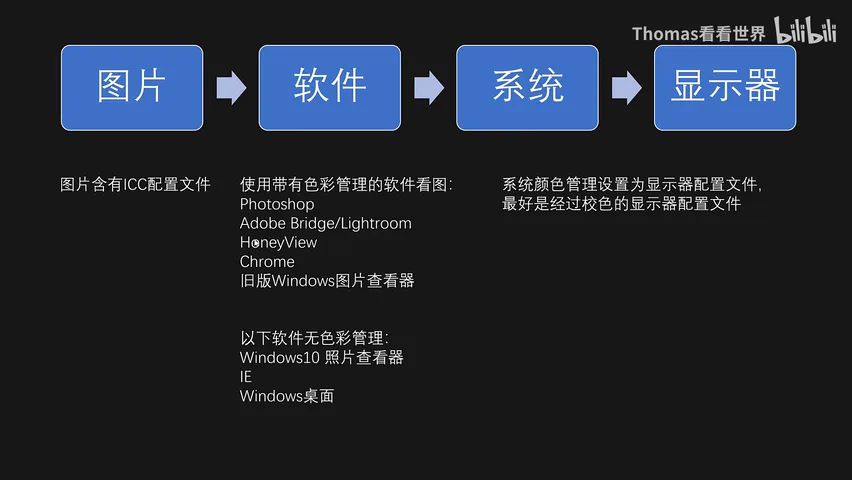
A picture passes through file, software, system and display before it looks right: embed an ICC profile in the file; choose color-managed software — Adobe apps (PS, Bridge, Lightroom) all support it, Win10's default Photos app does not (use Honeyview instead) and prefer Chrome over IE; and in the system's color management panel, set the display profile to your calibrated monitor's ICC — otherwise Windows keeps assuming sRGB (at 5:20 in the video).
02 Calibration: Bringing the Screen Back to Standard
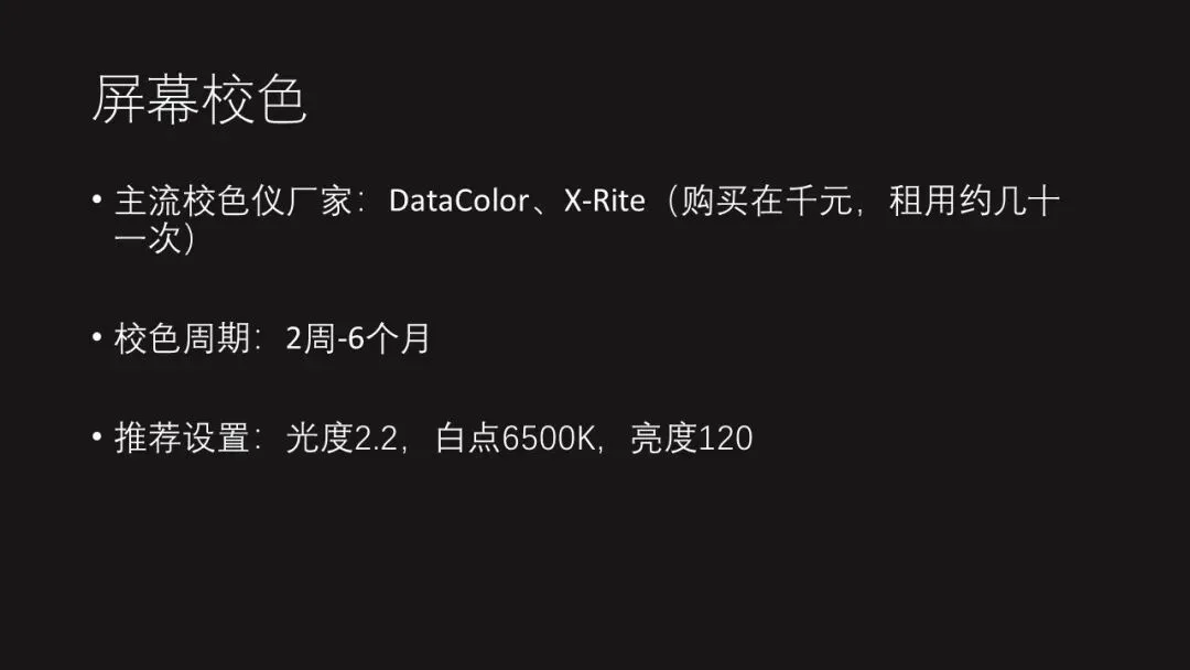
The second source is device character: even panels from the same batch differ, screens age and drift, and room lighting interferes. Calibrate regularly with a colorimeter — Datacolor (Spyder) and X-Rite lead the market; a unit costs 1,000+ yuan, but renting one online for tens of yuan works for most people. Recalibrate at least every six months, with Gamma 2.2, white point 6500K and brightness 120 as the recommended targets (at 10:27 in the video).
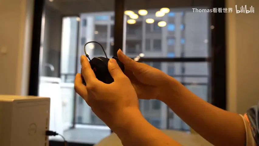
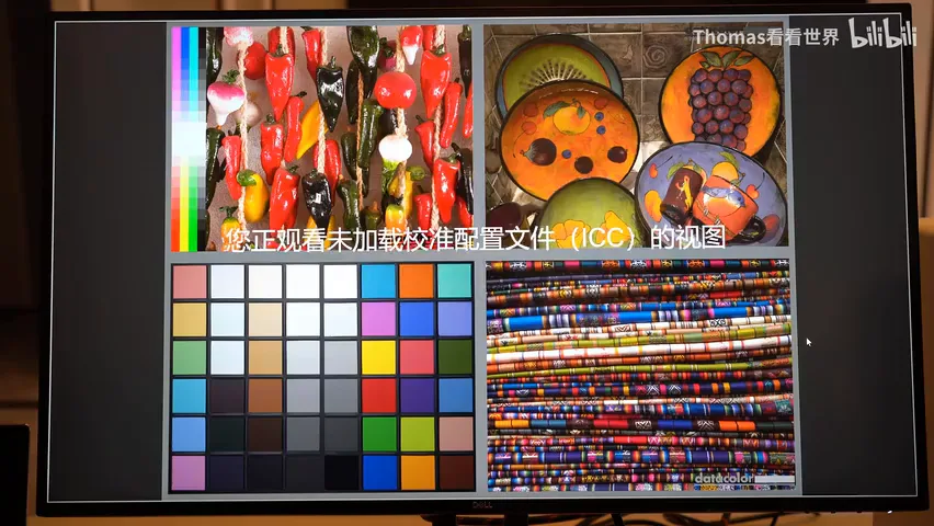
The calibration flow: install the vendor software, warm up the display, avoid direct glare, reset to factory settings, hang the colorimeter on screen, and the software sweeps through color patches automatically, then loads the new ICC profile into the system. After calibration brightness and color shift — warm tones looking slightly warm is normal, because the white point now matches printed paper, and gradations grow finer (at 14:53 in the video).
03 Color Settings in ACR and Photoshop
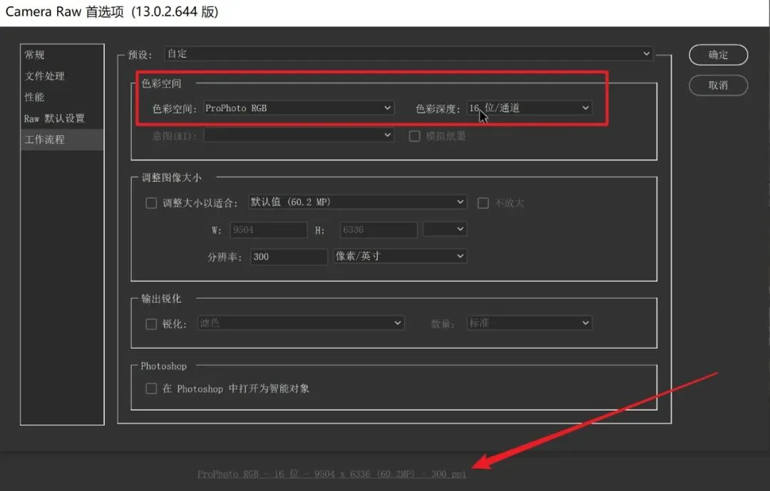
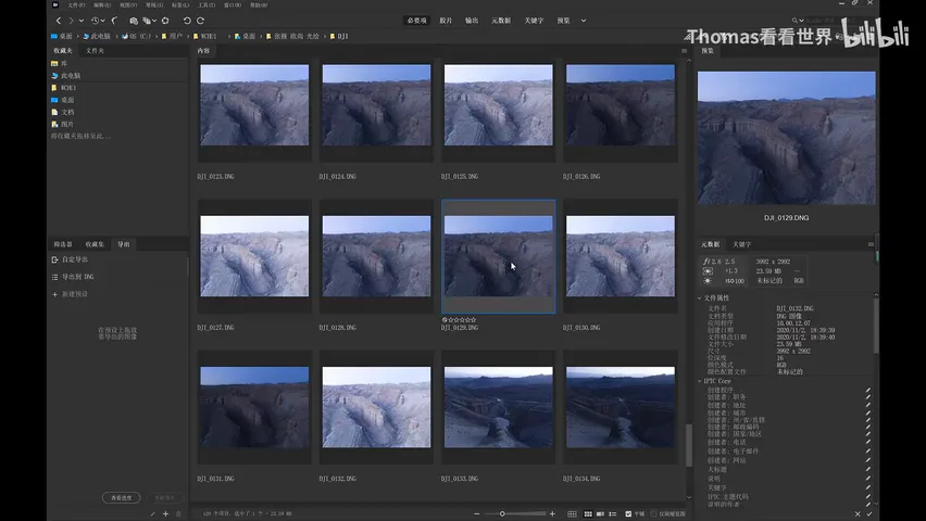
Raw files are always mapped to ProPhoto RGB inside ACR/Lightroom — fixed; what you can change is the handoff to Photoshop: choose ProPhoto RGB, 16-bit, keeping the maximum of the Raw data. The premise is a calibrated display; with no color management at all, keep everything sRGB — Camera Raw, Photoshop, output — the safest pipeline (at 16:53 in the video).
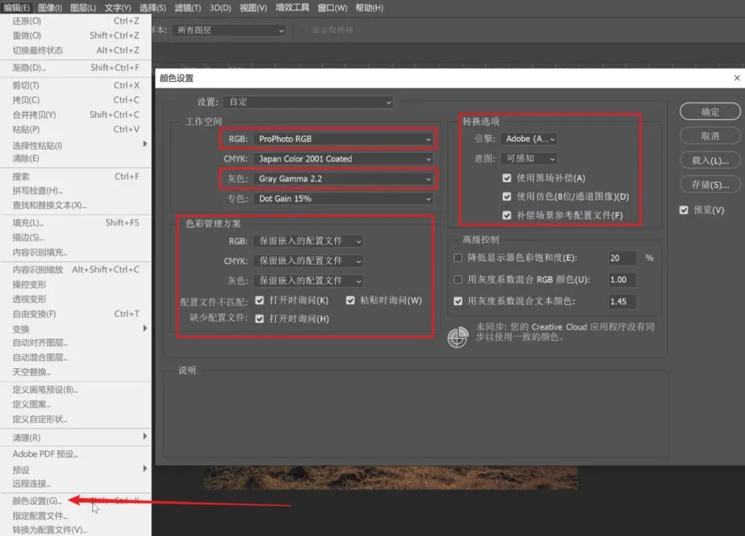
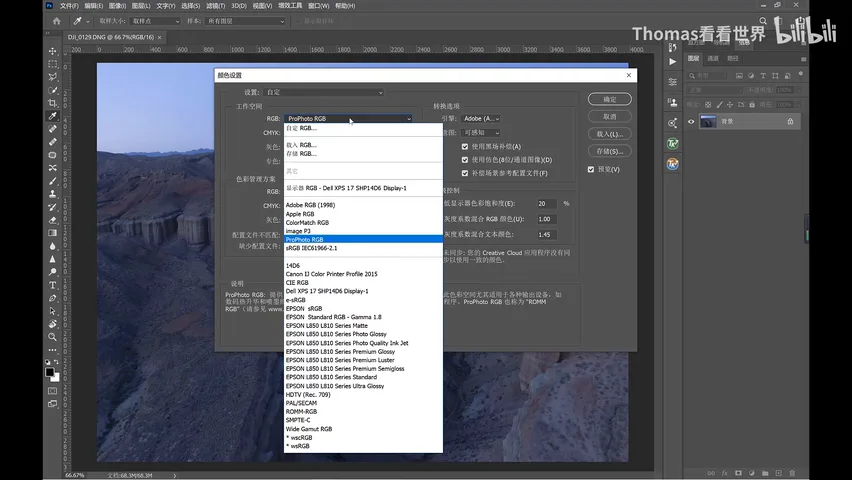
After reinstalling Photoshop, first open Edit > Color Settings: workspace per the rules above — ProPhoto RGB (or sRGB), gray Gamma 2.2; color management policies set to Preserve Embedded Profiles with 'Ask When Opening' checked — keep the profile for viewing, convert to working space for editing; conversion engine Adobe (ACE), Perceptual intent for wide-gamut screens, and tick all three bottom boxes (at 18:30 in the video).
04 Output: sRGB for Web, Adobe RGB for Print
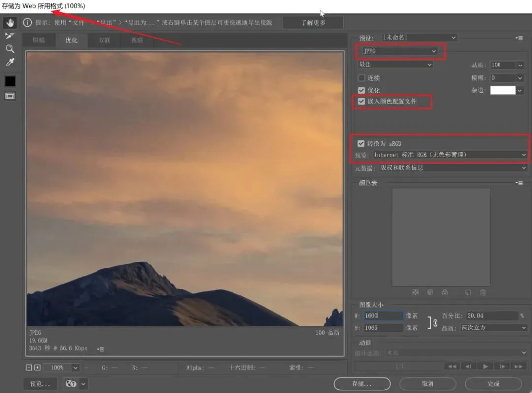
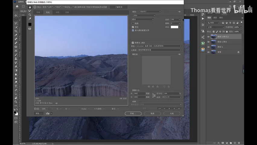
No display or printer understands ProPhoto, so output requires conversion. First save a ProPhoto RGB PSD working file with layers and profile for future edits; for the web use Save for Web: embed the color profile, convert to sRGB, quality 60+, long edge 1600-2000 px — only then do browsers show your colors correctly (at 20:12 in the video).
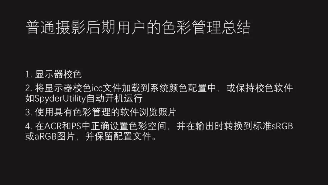
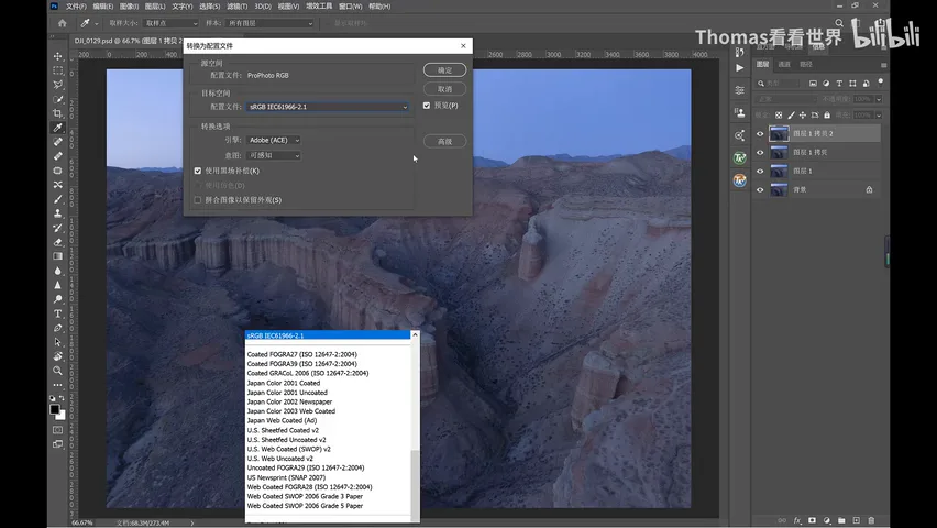
For fine-art printing, convert to Adobe RGB: Edit > Convert to Profile, flatten, then save a TIFF that keeps the profile and 16-bit depth so the print studio can deliver the best result. In four lines: always calibrate your display, load its profile into the system, view photos in color-managed software, set color spaces correctly in ACR and PS — and convert at output per the destination (at 22:45 in the video).
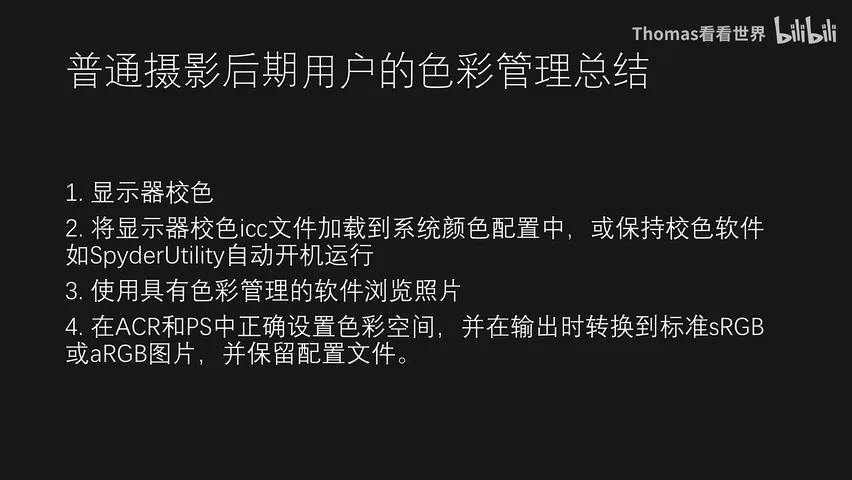
1. Without color management, keep everything sRGB — Camera Raw, Photoshop, output — the safest pipeline; 2. With color management, work in ProPhoto RGB 16-bit and convert at output: sRGB for the web, Adobe RGB for print, always embedding the profile; 3. Always calibrate your display — Gamma 2.2, 6500K, brightness 120, at least every six months; 4. View photos only in color-managed software, and load the calibrated ICC profile into your system.
Key Points PPT