Photography Tutorial · 2018-07-15
Learn Common Color Schemes and Fear Grading No More
Thomas Chu Photo
One tutorial every week — making photography easy to learn
Color grading is a major challenge when learning photo post-processing. The root of the difficulty is not that we don't understand the various color tools — it's that we often lack a framework, not knowing how to combine colors so they feel comfortable and look good.
In fact, disciplines like fine art and design have long worked out many rules of color combination that we photographers can borrow and learn from.
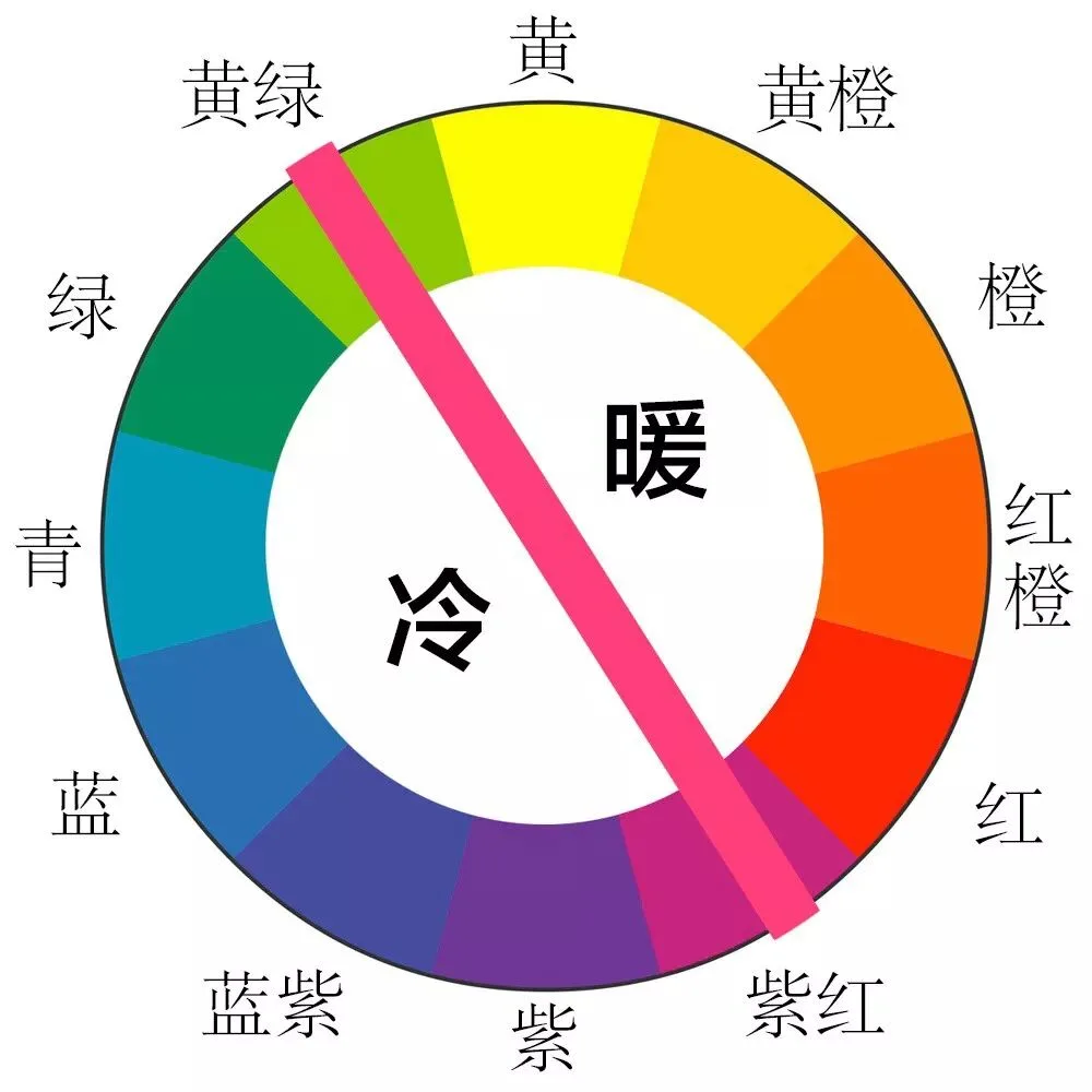
To learn hue combination, you first need to know the RYB color wheel (also called Itten's 12-hue wheel) — a wheel with red, yellow, and blue as its primary colors.
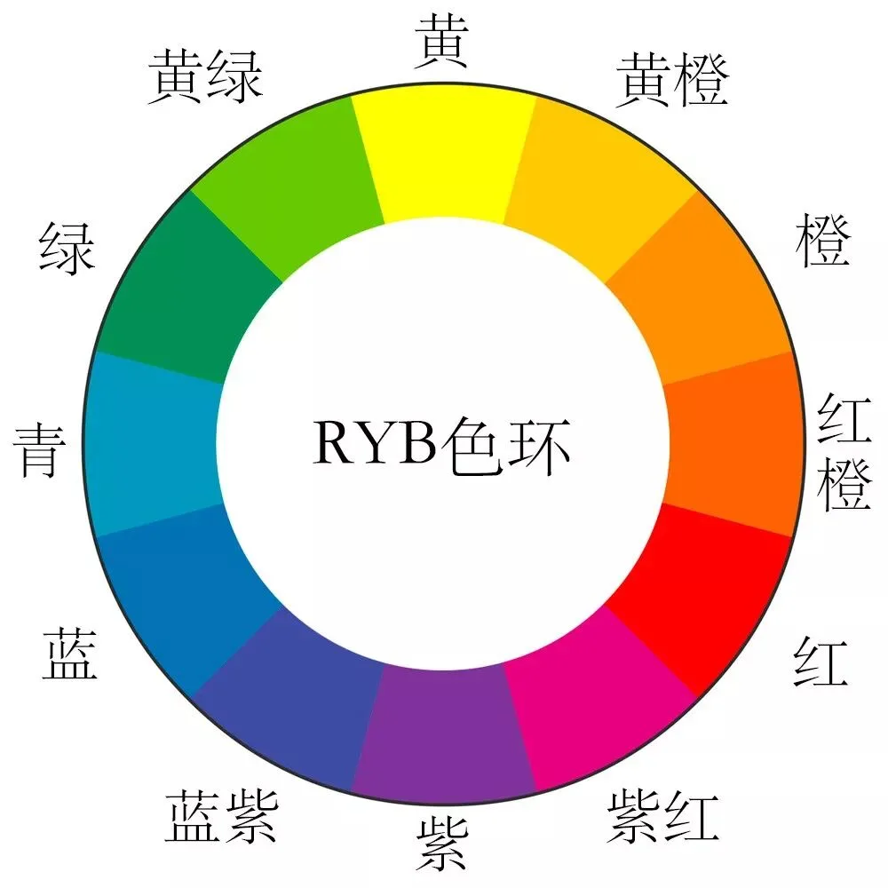
There are 12 main colors on the wheel. Yellow sits at 0 degrees, red at 120 degrees, and blue at 240 degrees.
Between yellow and red lie yellow-orange, orange, and red-orange. Between red and blue lie red-violet, violet, and blue-violet. And between blue and yellow lie cyan (blue-green), green, and yellow-green.
Based on the RYB color wheel, here are the common color combination models:
Monochromatic Combination
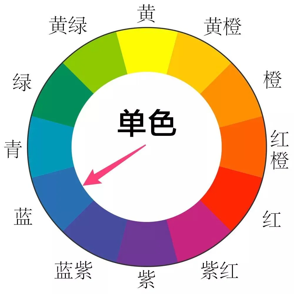
A monochromatic combination means the whole photo contains almost only one hue, relying purely on changes in lightness and saturation to create layering. The extreme case of monochromatic combination is the black-and-white photo.
Monochromatic photos have a strong sense of atmosphere. And with no competing colors to catch the eye, viewers can focus more on the picture's tonality, composition, and content.
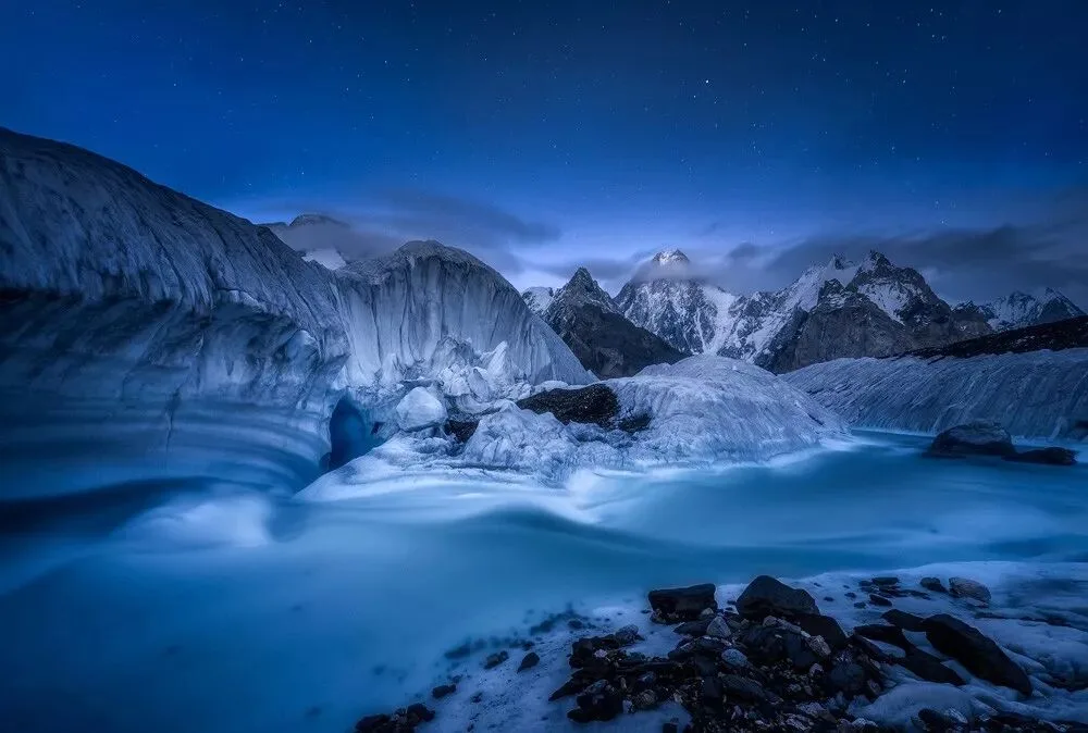
The photo below uses only a single color: blue. (Black, white, and gray can be considered various colors pushed to extremes of saturation and lightness, so in discussing color combination we won't mention them separately.)
With only one color, the image feels clean and pure — and blue brings a cold atmosphere that fits the feeling of glaciers and snowy mountains.
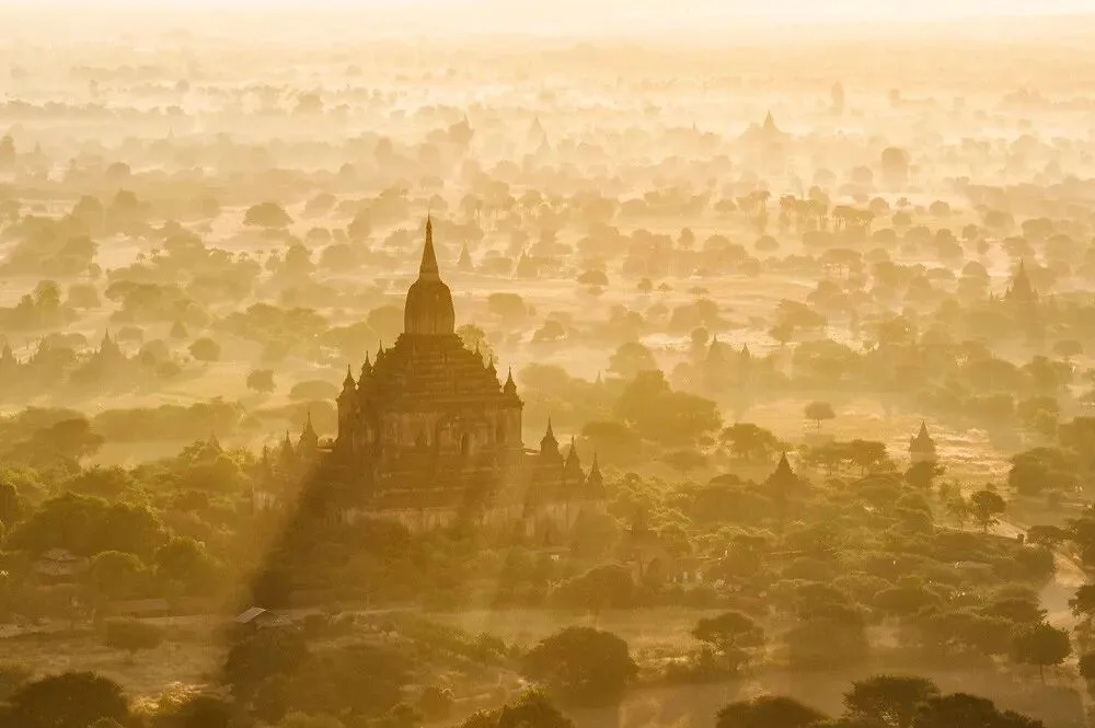
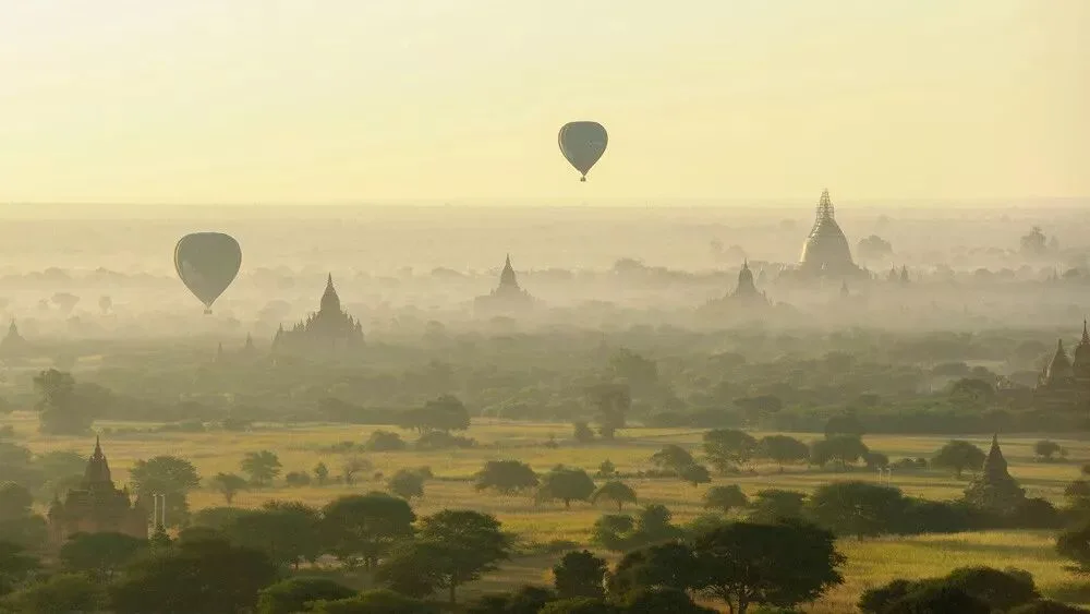
This photo of Bagan, Myanmar below uses an orange-dominated monochromatic scheme. Orange brings an intense feeling of splendor and brilliance. With no distracting extra colors, the viewer's gaze is drawn more to the pagodas' grandeur, the intense light, and the hazy mist.
Analogous Color Combination
Sometimes a scene has too many colors, and unifying them into a single hue would look very strange — yet we still want to keep the colors harmonious. That's when we can use the analogous color model.
An analogous combination means finding a group of neighboring hues on the RYB wheel to color the photo (it doesn't have to be exactly 3 neighboring hues — 2 to 4 hues that sit close together all work). Analogous colors are richer than monochromatic ones, but because the hues are close, they don't create much conflict.
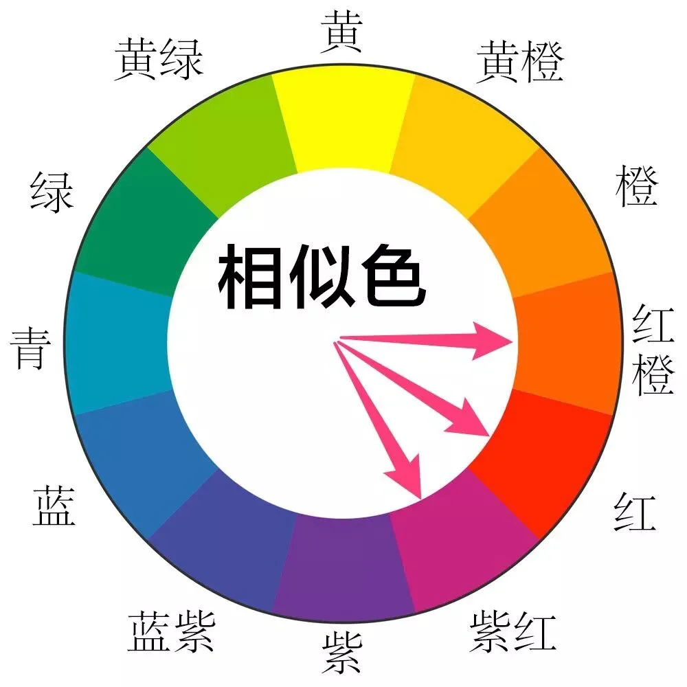
In this photo of Bagan, Myanmar below, I used the analogous model: the photo's colors are yellow, yellow-green, and green on the wheel. The analogous combination makes the whole photo feel more serene and harmonious.
Complementary Color Combination
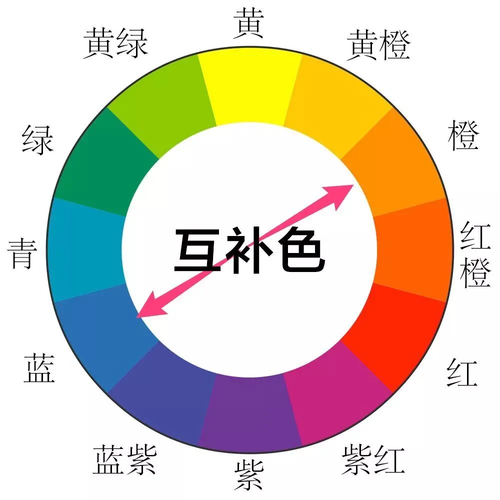
Ask what the most popular color model in landscape photography is, and the answer has to be complementary colors. The two golden complementary pairs — yellow-orange/blue-violet and orange/blue — are used extensively in sunrise/sunset masterpieces and city night scenes.
Complementary colors are two colors sitting 180 degrees apart on the RYB wheel. Complementary combinations are highly impactful.
Moreover, many natural scenes — like the blue sky and orange sunlight at sunset — are inherently complementary combinations. Through thousands of years of evolution, humans have been deeply shaped by nature and have a strong sensitivity to complementary colors.
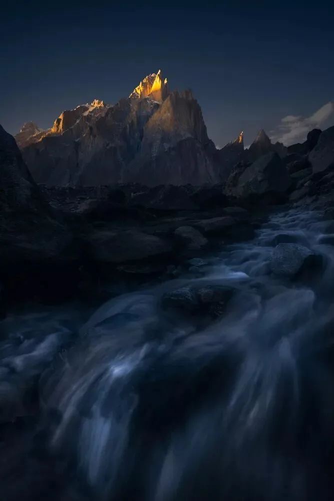
The photo of sunlit golden peaks below is a typical orange-blue complementary combination.
In sunrise and sunset photos, besides the blue sky and environment paired with orange light above, there is another common complementary scheme: grading the sky and environment blue-violet, and grading the sunlight and sunlit areas yellow-orange.
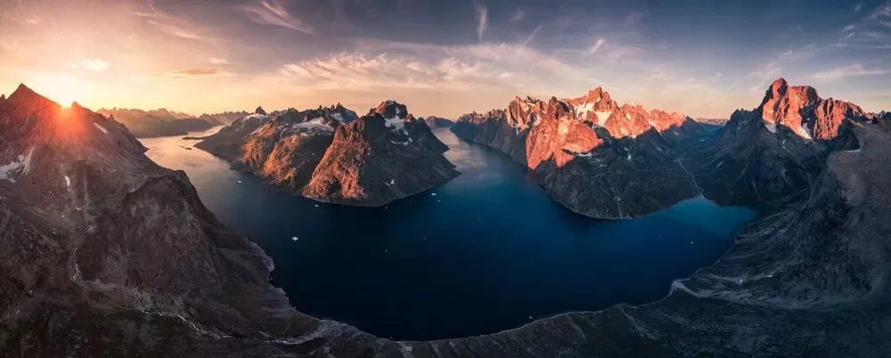
When applying color combination models, we mainly consider the dominant color and the important supporting colors. For other accent colors that are small in area or very low in saturation, it's great if they fit the model — and no problem if they don't.
For example, the green vegetation in the photo above was greatly reduced in saturation and lightness by me, making it inconspicuous — it doesn't break the blue-violet/yellow-orange complementary pairing.
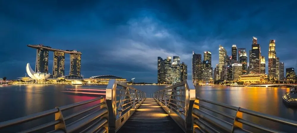
These two complementary pairs are also often used in city night scenes. In the Singapore night view below, for instance, the lights are unified into orange while the sky gets some blue — a complementary pairing that looks great. For the light trails of the boat in the middle, I deliberately kept their red as an accent color to embellish and enrich the frame.
Split-Complementary Combination
Sometimes we can't unify a scene into a perfect complementary pair. So there are variations built on complementary colors — split-complementary is one of them.
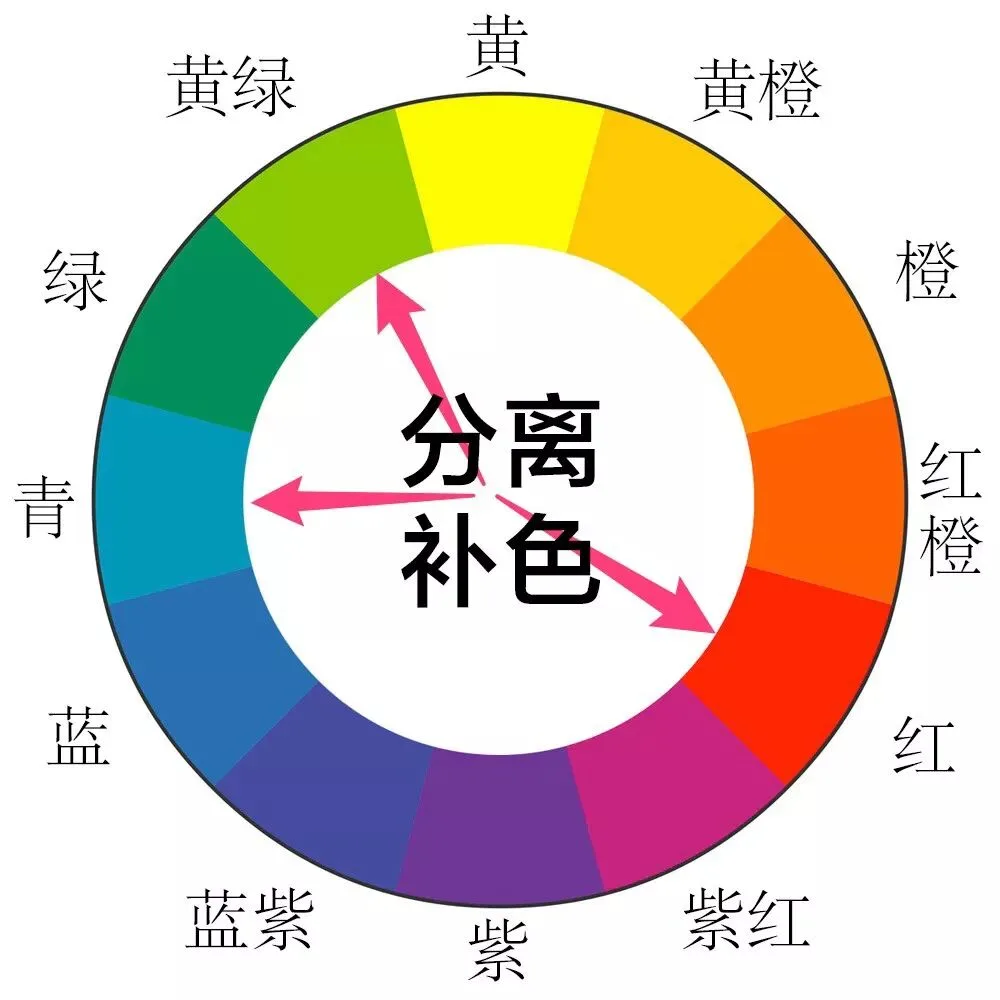
Split-complementary means taking one side of a complementary pair and splitting it into its two neighboring colors. For example, red and green are complementary, while red, cyan, and yellow-green form a split-complementary relationship.
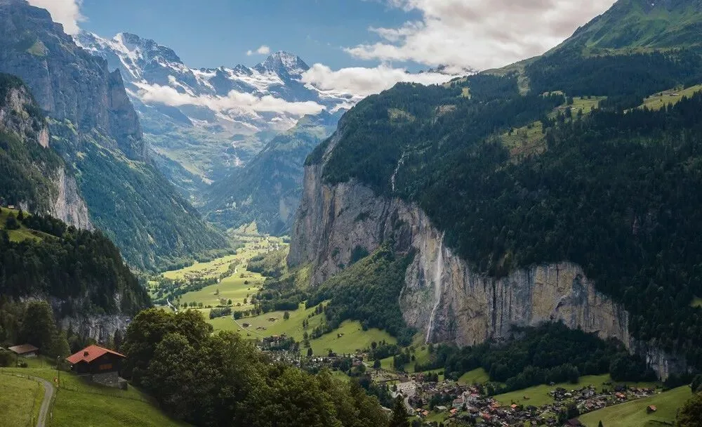
In the photo below, grading the sky blue, blue-violet, or cyan would all be acceptable. But since the vegetation is mainly yellow-green and the roofs lean red, grading the sky cyan works better — forming a split-complementary model.
Warm-Cool Color Combination
Very often we don't have to grade a photo into the golden complementary pairs like orange/blue or yellow-orange/blue-violet. In fact, simply pairing one cool color with one warm color is enough for an outstanding result.
On the color wheel, yellow, yellow-orange, orange, red-orange, and red are warm colors; green, cyan, blue, blue-violet, and violet are cool colors. Yellow-green and red-violet are relatively neutral, forming the dividing line between warm and cool.
In a warm-cool combination, we only need to find one warm color (or group) and one cool color (or group) to contrast with each other.
In this photo of an Alpine village below, I did not grade it into a strict yellow-orange/blue-violet complementary scheme. The photo was clearly shot at noon, so grading the sky the blue-violet of sunrise or sunset would look quite odd. In the end I simply graded the sky cyan, forming a yellow-orange/cyan warm-cool combination.
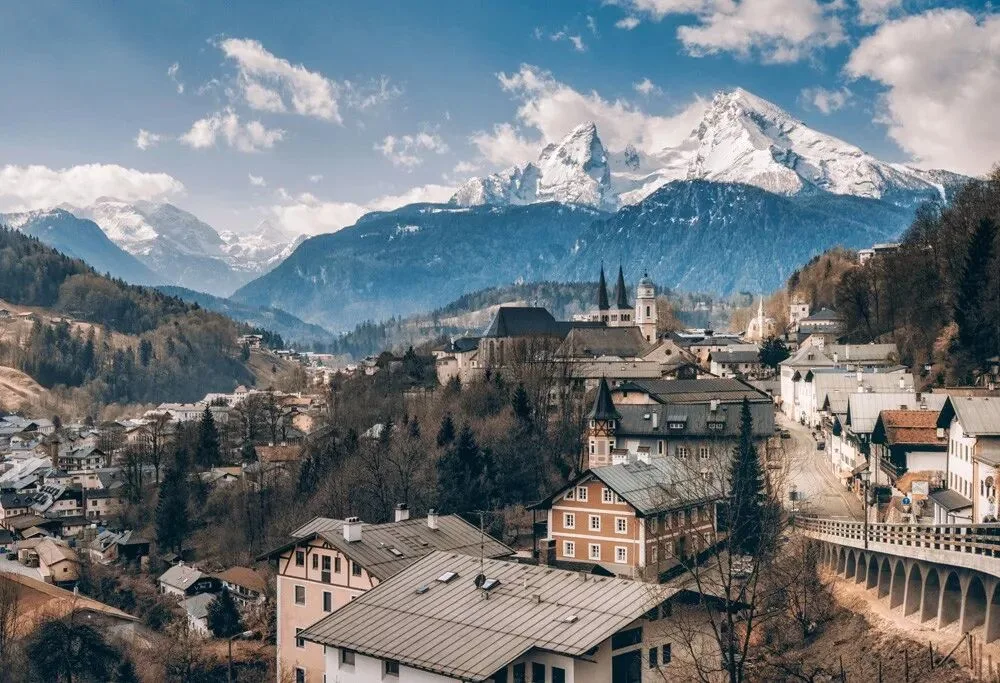
Warm-cool combinations can often greatly enhance the layering of a landscape photo. Next time you have a golden, glorious sunset photo, try adding cool colors like cyan and blue to the shadows; next time you have a cold, icy blue photo, try adding warm colors like yellow and orange to the highlights.
Naturalness of Hue Matters
Above we covered several color combination models — but that doesn't mean every photo must be forced into one of them. Because photography is not design: beyond the combination of hues, the naturalness and plausibility of hues matters even more.
The last photo above is a good example: although the scene's original colors were completely changed in post, a noon sky is still more harmonious graded blue or cyan. Forcing it into the blue-violet that only appears at sunrise and sunset would instead look out of place.
The same goes for this night sky below: purple skies generally appear only occasionally after sunset. Grading a night starry sky purple is guaranteed to look uncomfortable.
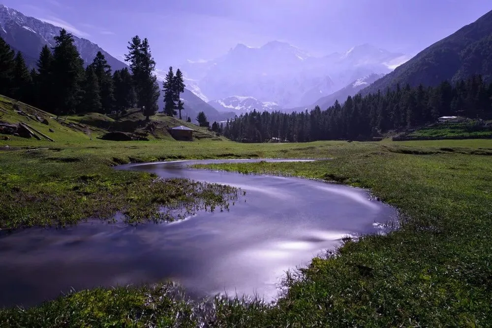
Making the sky's hue lean more toward blue is what gives people the immersive atmosphere of night.

By the same logic, human skin is generally yellow, orange, or red — forcing skin tones green or purple for the sake of hue combination turns the photo into science fiction.
Photo post-processing differs from graphic design: the prerequisite of color combination is that hues must remain natural and plausible.
This article is excerpted from Thomas's best-selling photography book "The Fundamentals of Landscape Photography Post-Processing" (《风光摄影后期基础》).
Follow @Thomas Chu Photo,
and learn one photography skill every week.
Thomas has been trekking in the mountains of Pakistan these weeks and may not be able to reply to your comments and messages in time.