Photography Tutorial · 2017-07-09
Master Color Grading, Starting from Color Itself
To truly understand color grading, you first need to understand fundamental color theory: RGB, CMYK, HSL, complementary colors, and so on.
Almost all post-processing color tools are built on top of these color models.
1
RGB vs CMYK
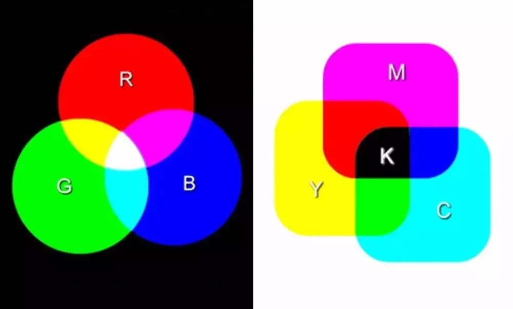
Without light there is no color. In nature, we can see two types of light.
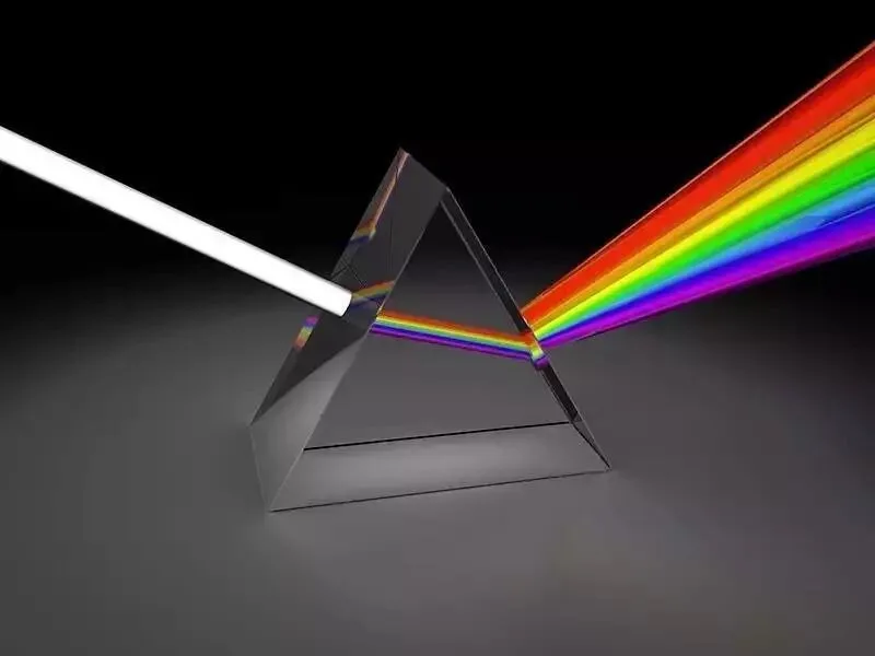
The first type is light emitted by objects themselves — light bulbs, monitors, TVs, and so on. In middle school we all learned the prism experiment: the white light of nature is not monochromatic; after dispersion through a prism you see the many colored rays that make up white light.
White light is formed by adding these colorful rays together. So these self-luminous objects correspond to the additive color model.
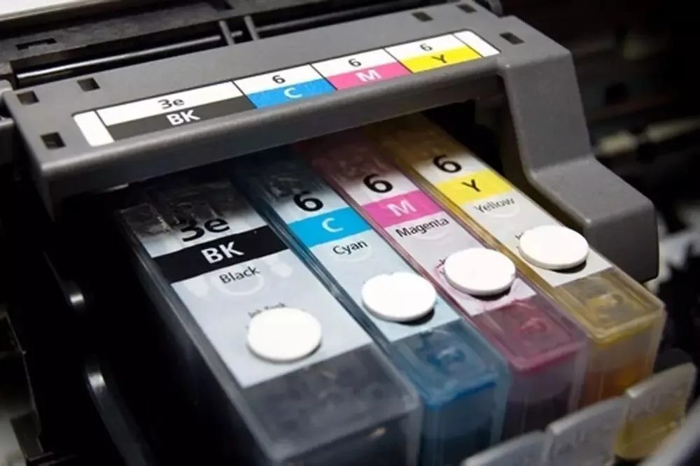
The second type is light reflected by objects — pigments, paints, printed materials, and so on.
These objects absorb part of the light and reflect the rest, thereby displaying different colors. Therefore these reflected colors correspond to the subtractive color model.
Whichever color model we use, we must first define a concept called "primary colors." Primaries are the "basic colors" that cannot be obtained by mixing other colors.
In the additive model there are three primaries: red (R), green (G), and blue (B). Mixing the RGB primaries in pairs produces the three secondary colors yellow, cyan, and magenta. Keep mixing, and you can blend out all kinds of colors.
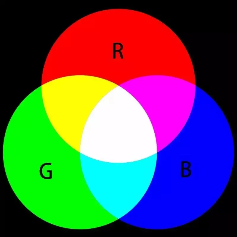
Imagine the image above is a black monitor. First I display a red circle on it, then a blue circle — you will find that where red and blue overlap, they mix into magenta.
If I then display a green circle, you will see red and green mix into yellow, green and blue mix into cyan — and where all of red, green, and blue overlap, pure white light is emitted.
Unlike the additive model, in the subtractive model the three primaries become cyan (C), magenta (M), and yellow (Y).
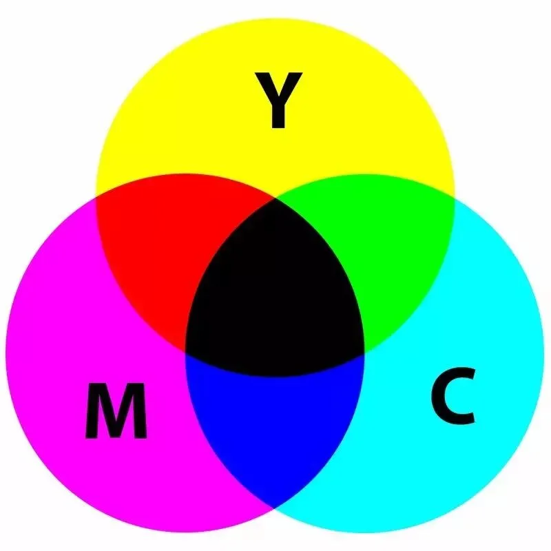
Imagine the image above is a sheet of white paper. First we paint a circle with yellow pigment, then a circle with cyan pigment — you will see yellow and cyan mix into green.
If we then paint a circle with magenta pigment, you can see red mixed from yellow and magenta, and blue mixed from cyan and magenta. And where cyan, magenta, and yellow all mix together, it becomes black.
In large-scale printing, the black produced by mixing CMY pigments is not pure enough and costs too much. So printing presses have a dedicated black (K) ink. The final K in CMYK refers to exactly this black.
2
Complementary and Adjacent Colors
Whether RGB or CMY, although their primaries differ, the mixing relationships between colors are the same — for example, green mixed with red produces yellow in both.
If we draw RGBCMY together in the image below, we can discover some interesting color relationships. (This image is very important — best to memorize it well.)
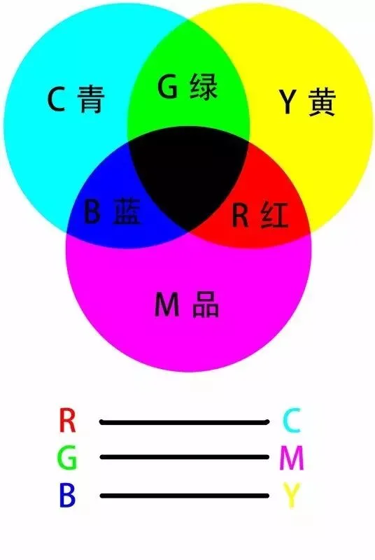
We call the two colors adjacent to a color its adjacent colors. As shown above, cyan's adjacent colors are green and blue; green's adjacent colors are yellow and cyan.
And the color opposite a color is called its complementary color. For example, red's complement is cyan, and green's complement is magenta.
Adjacent colors and complementary colors are an important basis for our color grading.
To increase a color, there are two ways: first, increase its adjacent colors; second, decrease its complementary color.
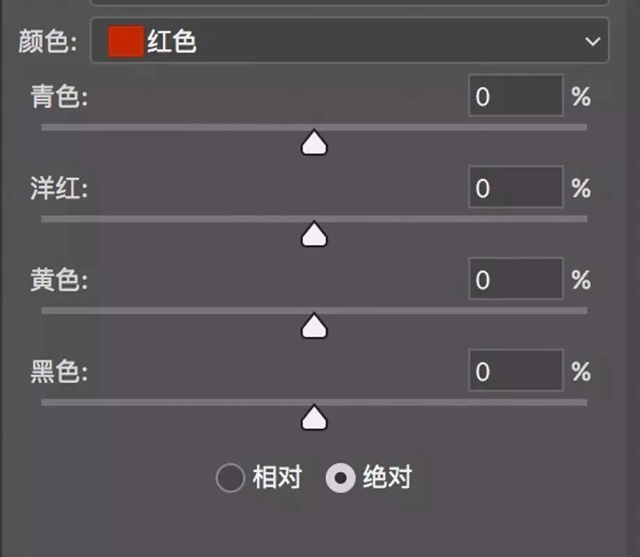
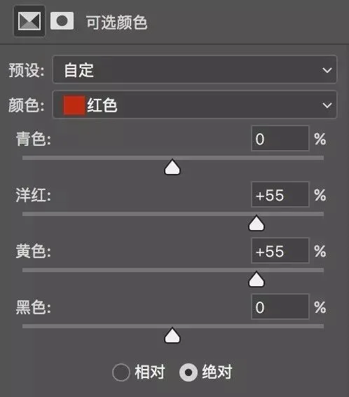
For example, to increase red, we can either simultaneously increase its adjacent colors yellow and magenta, or decrease its complementary color cyan. We can use the Selective Color tool in Photoshop:
We can move the "Magenta" and "Yellow" sliders of Selective Color to the right. Magenta and yellow mix into red (red's adjacent colors are magenta and yellow), so increasing magenta and yellow together means increasing red.
We can also move the cyan slider to the left. Since cyan and red are complementary, reducing cyan means adding red — likewise increasing the red in the photo.
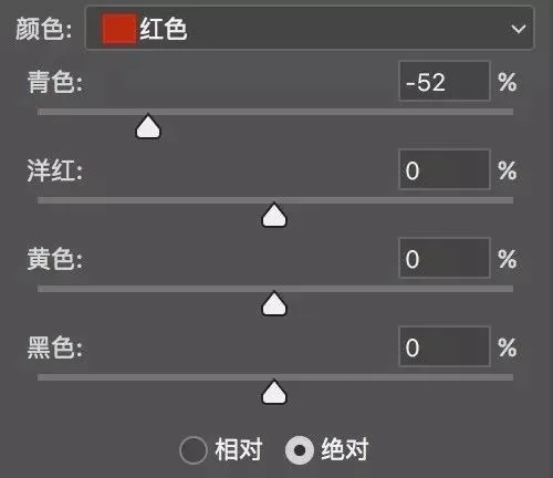
The concepts of adjacent and complementary colors are the cornerstone of many PS color tools. Besides Selective Color, the Color Balance tool works the same way: the three complementary pairs cyan/red, magenta/green, and yellow/blue are laid out in a row of sliders — any color can be dialed in.
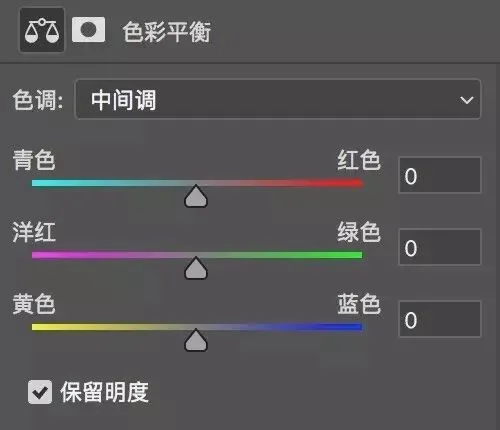
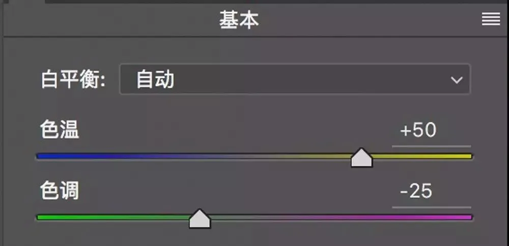
If you condense the three pairs of complementary sliders down to two, you get the Temperature and Tint tool in white balance adjustment.
Moving the Temperature slider right adds yellow; moving it left reduces yellow (adds blue). Moving the Tint slider right adds magenta; moving it left reduces magenta (adds green).
So here comes the question: how do you use the Temperature and Tint sliders to make a photo lean red, or lean cyan?
Simple: red's adjacent colors are yellow and magenta. So move Temperature and Tint right at the same time — adding yellow and adding magenta — which is adding red.
Cyan's adjacent colors are blue and green. Move the Temperature and Tint sliders left together, and the photo leans cyan.
Once you understand the adjacent/complementary relationships of RGBCMY, many complex color grading problems solve themselves.
For example, the S-shaped red channel curve below adds red to the highlights and subtracts red from the shadows. The resulting photo therefore leans red in the highlights and cyan (red's complement) in the shadows.

In short, the relationships among the six colors RGBCMY (red, green, blue, cyan, magenta, yellow) in the image below must be memorized — many color grading challenges will then resolve themselves.
3
The HSL Color Space
The RGB model is not intuitive for humans. If I say a color consists of 60% red, 30% green, and 90% blue, you would find it hard to imagine exactly which color that is.
So people designed the HSL color space to express colors more intuitively. HSL is short for the three color attributes Hue, Saturation, and Lightness.
Hue is the basic attribute of a color — what people ordinarily call the color's name, such as violet, cyan, magenta, and so on. We can represent all hues on a ring.

The 0°, 120°, and 240° positions on the ring correspond to the RGB primaries red, green, and blue. The primaries mix in pairs to form the secondary colors: yellow (60°), for example, is mixed from red and green; blue and green add into cyan (180°); magenta (300°) is composed of red and blue.
Between the primaries and secondaries there are rich transitional tertiary hues — for example, violet at 270° lies between magenta and blue, and orange at 30° is mixed from red and yellow.
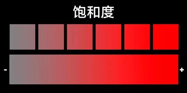
Saturation refers to the purity of a color: the higher the saturation, the purer and richer the color; the lower the saturation, the grayer and paler it becomes.
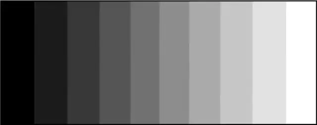
Lightness refers to how bright or dark a color is: the higher the lightness value, the whiter the color; the lower, the blacker.
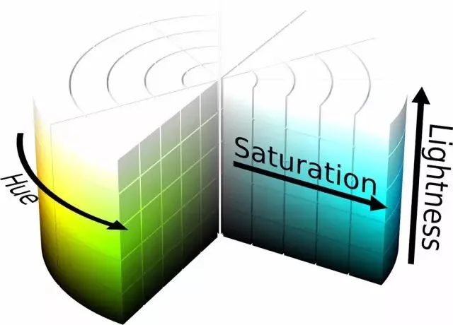
Integrating the three attributes Hue, Saturation, and Lightness into a cylinder forms the HSL color space model.
Any point in the HSL cylinder corresponds to a color. The degree on the ring represents the color's hue; the distance from the central axis represents its saturation; and the height of the point corresponds to its lightness.
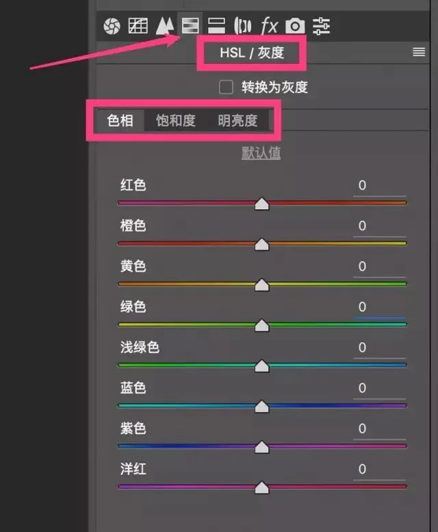
In ACR (and Lightroom), the 4th adjustment panel — the HSL panel — is a post-processing color tool based on the HSL color space. For a detailed tutorial on the HSL tool, see "Learn Color Grading by Understanding the HSL Panel First" (《学会调色,从理解HSL面板开始》).
Summary
1. Color exists because of light. Self-luminous objects correspond to the additive model, whose primaries are RGB (red, green, blue). Reflective objects correspond to the subtractive model, whose primaries are CMY (cyan, magenta, yellow).
2. Red/cyan, blue/yellow, and green/magenta are the three complementary pairs. To increase a color, you can either increase its adjacent colors or decrease its complementary color.
3. Hue (H), Saturation (S), and Lightness (L) are the three basic attributes of a color.