Photography Tutorial · 2020-07-12
What Brightness Level Feels Most Comfortable in Landscape Photography?
Thomas Chu Photo
Author: Miller Yao Minglai
Tonality is a vital part of landscape photography. Whether the currently popular moody dark style or the bright, airy high-key style, both are built upon tonal rendering — how to find the most comfortable level of brightness is especially important, and that is what this article wants to share.
(1) Is the Histogram Really That Important?
A histogram arranges a photo's pixels from bright to dark. With it we can intuitively judge the tonality of an image and whether highlights are blown or shadows crushed. In my in-camera work it is truly essential, because the camera's tiny screen cannot accurately show the state of highlights and shadows — the histogram assists that judgment, and exposure compensation then yields more accurate exposure.
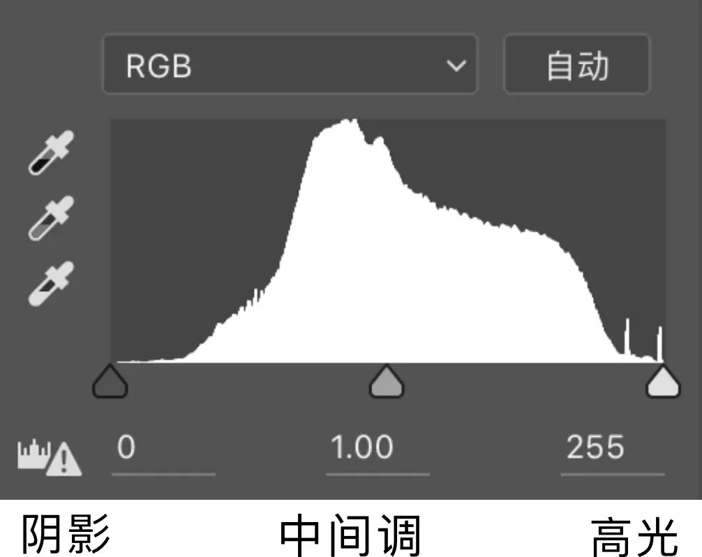
But in Photoshop post-processing, apart from occasionally checking histogram clipping when working on shadows and highlights, I never look at the histogram at all.
Post-processing is artistic creation, and art is 100% sensibility. The moment you start relying on these formulaic frames as your standard, your wings have already been clipped.
In landscape post-processing, the only things you can rely on are the feeling of your own eyes and your inner aesthetic.
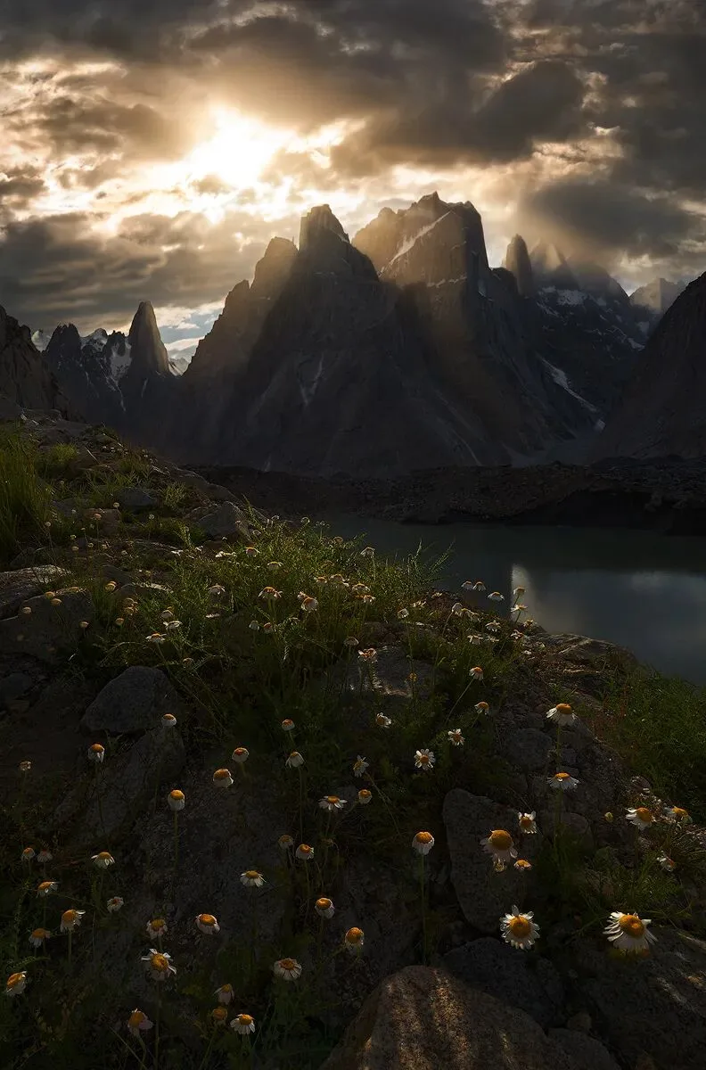
In many people's eyes, this image's histogram is a failure — severely clipped at both ends.
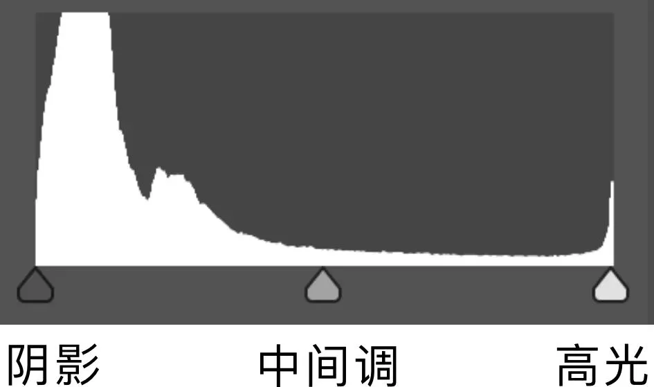
But would you call it a bad image? Quite the opposite: the crushed blacks and blown highlights don't deduct a single point. This extreme visual of bright against dark is exactly what creates the bold, dazzling feeling of shooting against the light.
If you rigidly followed the dogma that neither end of the histogram may clip — darkening highlights and lifting shadows — this image would lose all its brilliance.
There are too many tutorials online that edit entirely according to histogram curves. As the saying goes: the moment you start editing while staring at the histogram, you have already lost.
(2) When May Highlights Be Overexposed?
The answer first: it is fine when shooting against the light, but not when shooting with the light.
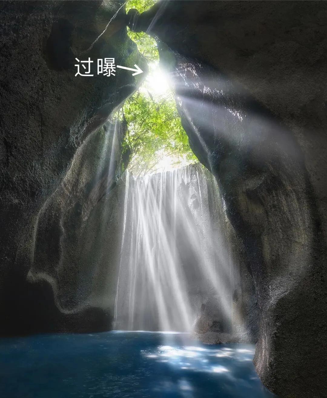
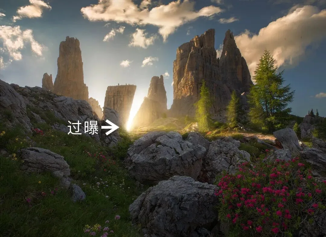
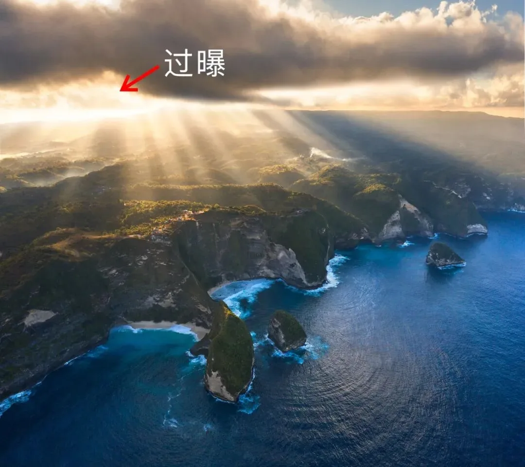
The three backlit images above all have more or less overexposed areas, and these clipped pixels are precisely the finishing touch of each image. The dazzling highlight area is not only a visual point of excitement but also the origin of the whole image's pathway of light — the light radiates from here.
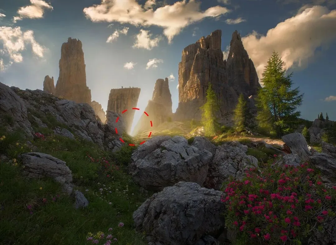
If we followed the traditional thinking that highlights must never clip and darkened the overexposed area where light shoots out between the rock walls (above), the image would look much plainer by comparison — and far less luminous.
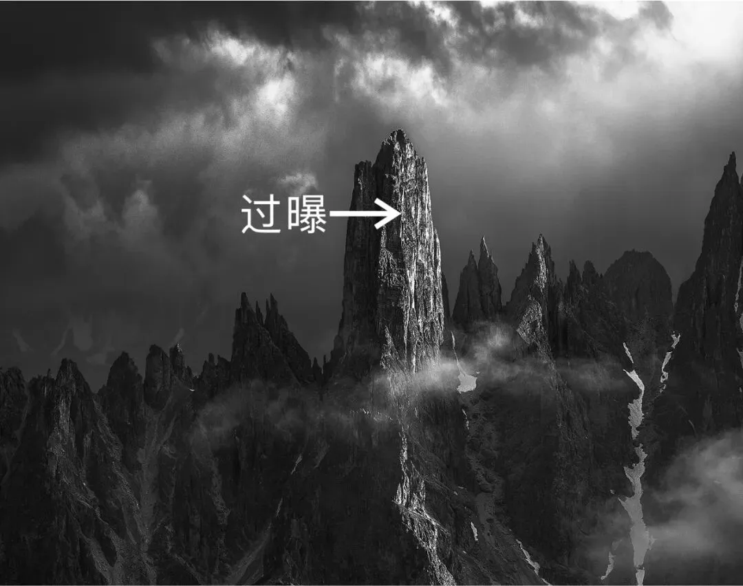
On the lit right face of the peak in the image above, I created slight overexposure while dodging locally — and it is exactly this overexposure that strengthens the bright texture of the reflective rock. This little touch of ingenuity gives us more room to imagine the mountain: rock that can reflect light must be smooth, polished by wind and sun...
Imagine standing against the sun and looking at the scene before you: it is dazzling, the highlights are extremely bright, and we can hardly make out detail in the brightest areas. That is why overexposed highlights in backlit photography still feel comfortable — it matches the dynamic range of the human eye, which is reasonable and therefore not jarring.
But front-lit images are different. In the two images below, I deliberately blew out the highlights on the mountain and the clouds:
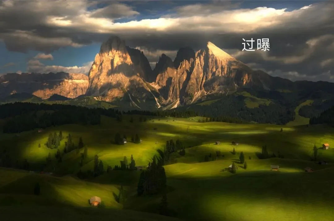
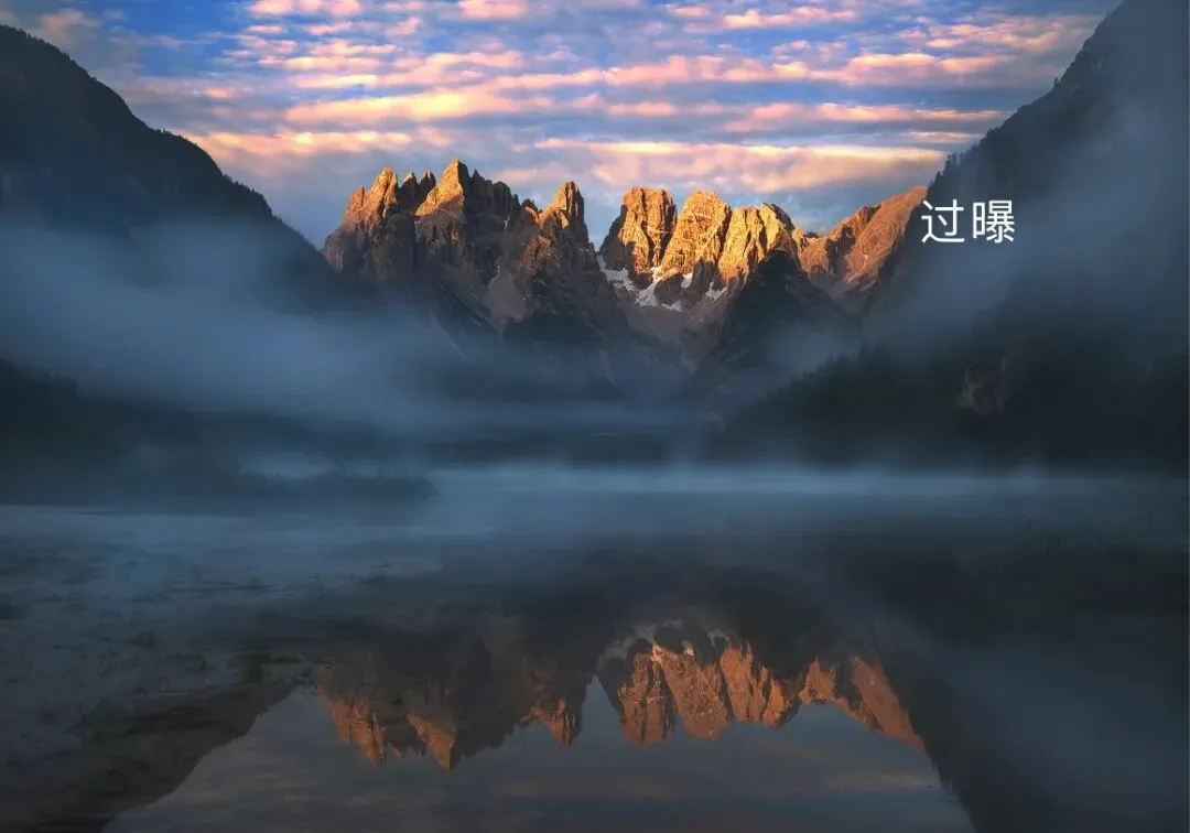
With the same overexposed highlights, a front-lit image looks uncomfortable — even a bit heavy-handed and over-processed.
Why? In reality, when we look at a scene along the direction of the sun, from the bright lit surfaces to the dark shadows, the human eye's dynamic range can make out almost all the detail. That is why overexposure in a front-lit image looks abrupt.
Comfortable post-processing must be built upon real vision.
So my usual approach is: whether front-lit or backlit, capture full detail from shadows to highlights when shooting. In post, never overexpose a front-lit image; for a backlit image, overexpose judiciously to create a dazzling sense of light.
(3) What Images Don't Suit Dark-Tone Post-Processing?
Dark-tone post-processing is very popular lately. This moody, magical tonality is what many want to learn — and it is also my strongest style. I have many such works:
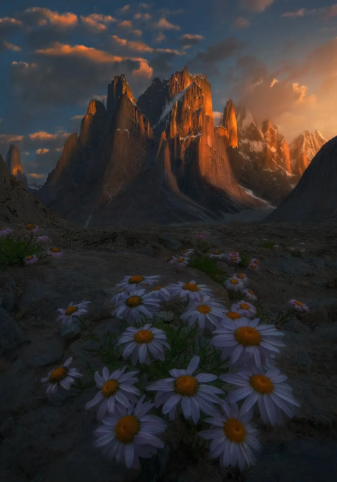
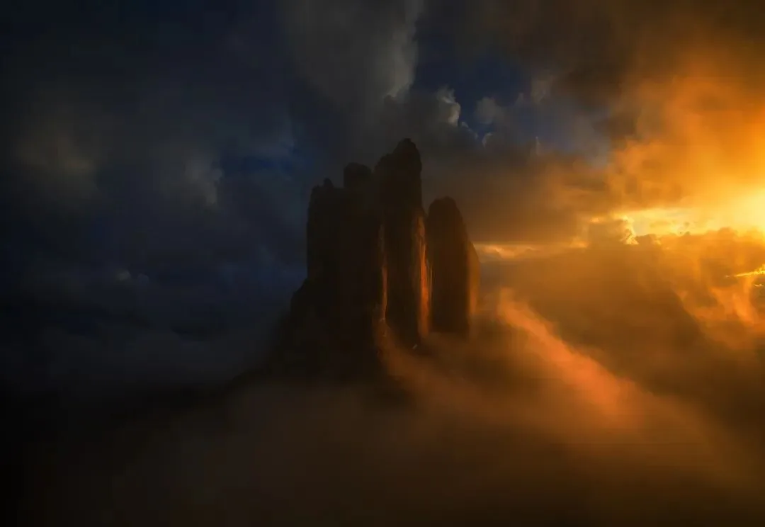
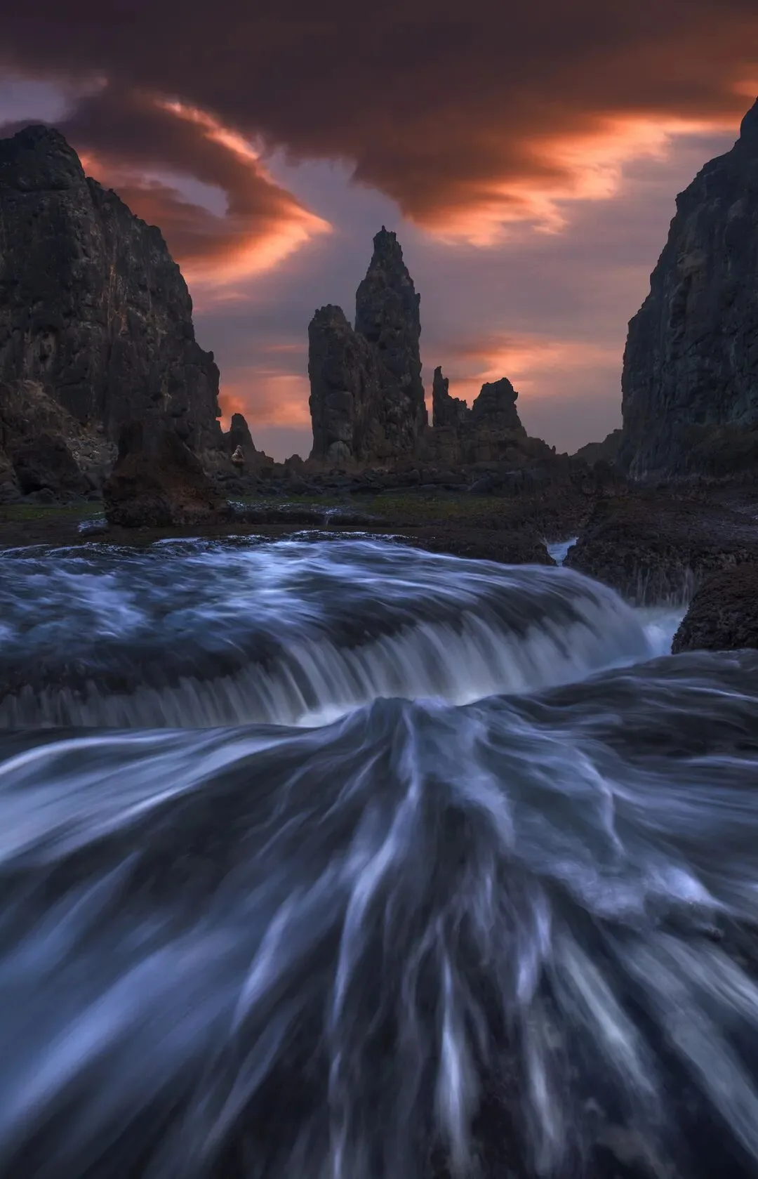
Dark tones do emphasize texture and light. The essence of this style is darkening the midtones, turning the visually dominant midtones dark, so that the pixels cluster in the shadows and highlights.
Imagine this: in the daytime, turn on a lamp in a room with windows and the light looks faint; but draw all the curtains, and the same lamp looks far more dazzling.
That is the principle of dark-tone post-processing: remove the visually distracting midtones, and the highlights become more dramatic, with a magical feel.
Understanding this tells you which images don't suit dark-tone post: the image must have contrast range! If the raw file's pixels are almost all in one tonal zone (only highlights, only shadows, or only midtones), it doesn't suit dark-tone post — because dark-tone post requires at least two tonal zones present in large amounts, darkening one to set off the other.
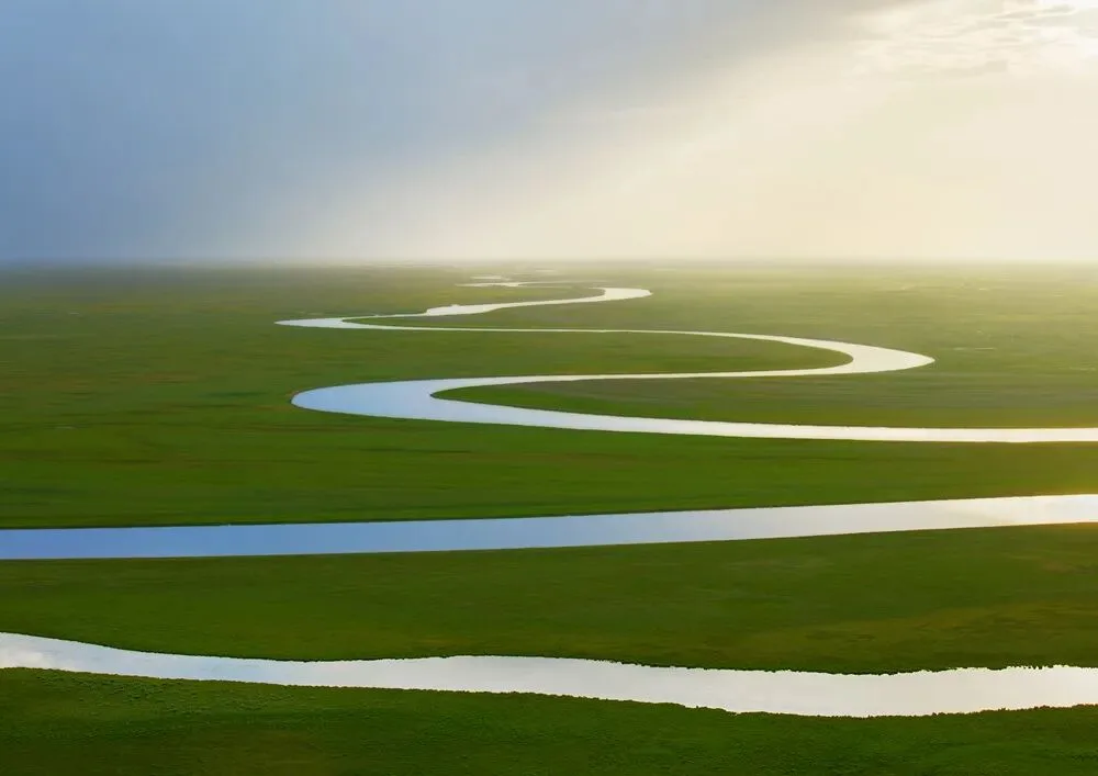
This winding grassland river was shot in near-overcast conditions; the whole frame sits almost entirely in the midtones. So it doesn't suit dark-tone post — keeping its fresh, bright style is the best choice.
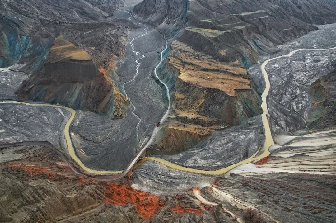
Likewise an overcast shot with no contrast range, entirely in the midtones — so it was not graded into a dark style in post.
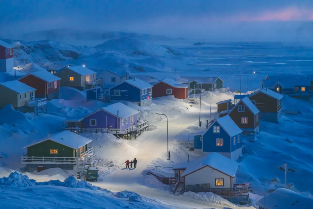
2019 National Geographic global grand prize, image by Thomas Chu Photo. This is a midtone image. Many snow scenes also don't suit dark-tone processing — too dark, and the pure, soft texture of the snow is gone.
So we must judge each image's tonality properly rather than blindly applying one fixed style.
(4) Comfortable Shadows
How dark should shadows be to look comfortable? That depends on the image's content and tonality. For dark-style images, slightly grayish 'light shadows' feel more comfortable to me.
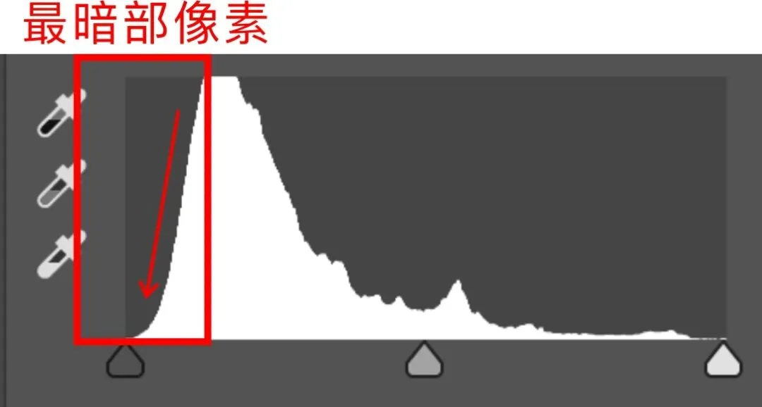
So-called 'light shadows' mean very few pixels in the darkest zone: on the histogram, where brightness turns from fairly dark to darkest, the curve drops off a cliff. In the image, it shows as dark-but-not-black — crisp yet soft.
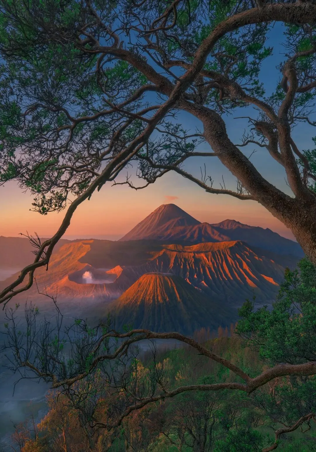
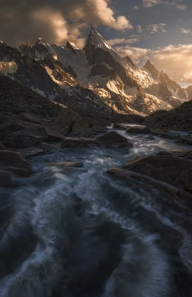
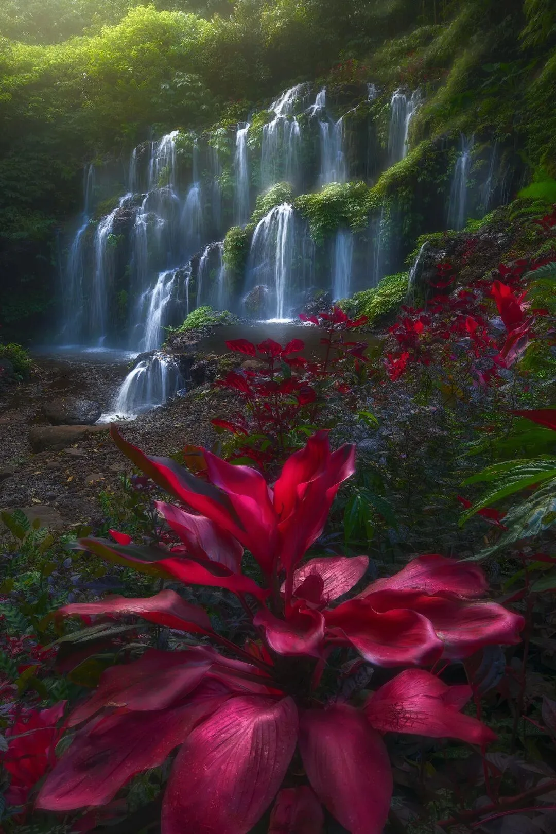
Look at the three images above: the overall tonality is dark, yet the shadows feel soft. If you can't judge whether an image's post-processing is good, it's simple: stare at it for 10 seconds — if it feels harsh and you don't want to look anymore, the post work is problematic. Good post-processing is like a bottle of fine wine: intense in aroma yet smooth on the palate, worth savoring again and again.
How do you create this dark-but-not-black shadow tonality?
The first method is the simplest:
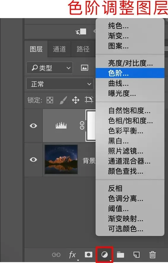
Add a Levels adjustment layer. Move the leftmost slider to the right, usually within a value of 5.
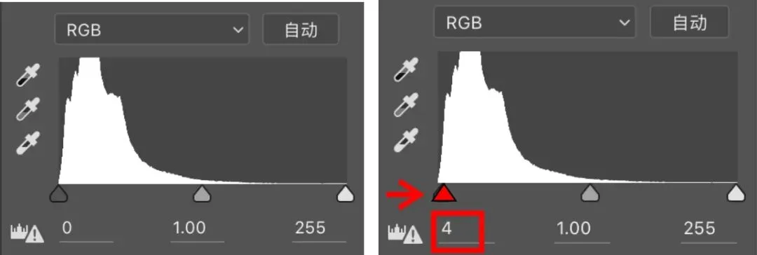
This gives the shadows a gray cast so they no longer look too black.
This quick method has a problem: besides the very darkest areas, it also affects the slightly brighter shadow areas — which often don't need adjusting.
The second method below is the one I often use — it acts only on the darkest areas of the frame.
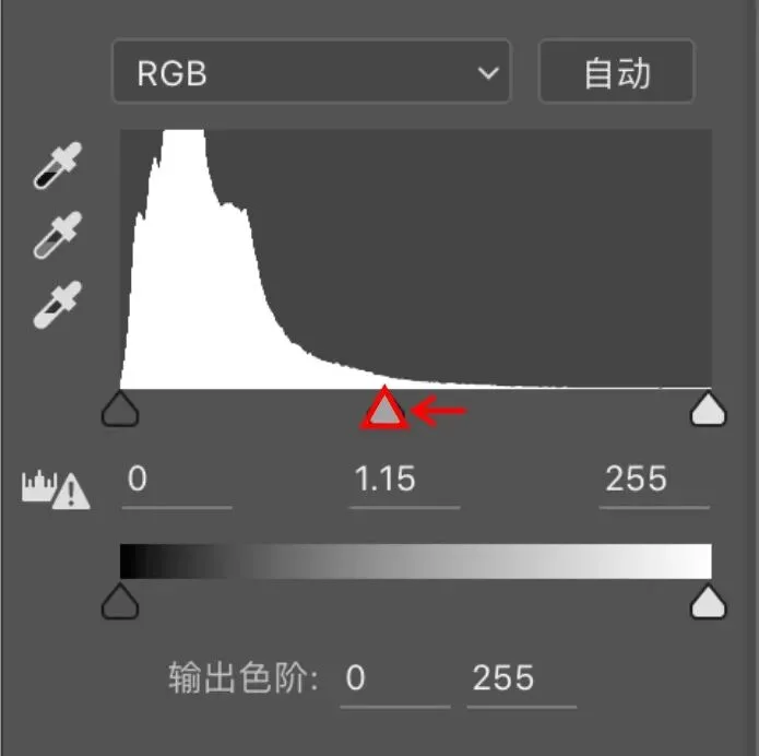
First add a Levels adjustment layer and move the middle slider to the left (the amount depends on the image) — you'll see the whole image becomes noticeably brighter and softer.
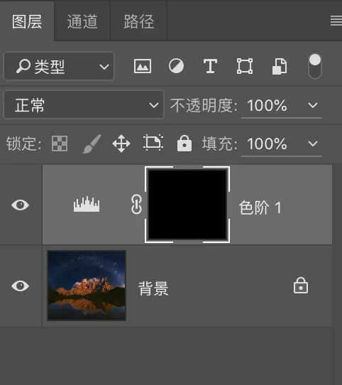
Press Ctrl+I to invert the mask, hiding the effect entirely for now.
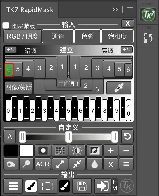
Then, in the RapidMask module of TKactions, load the Darks 6 channel (if the selected area is too small, load Darks 5).

For how to use TKactions, see: 'TKactions: From Beginner to Master'.
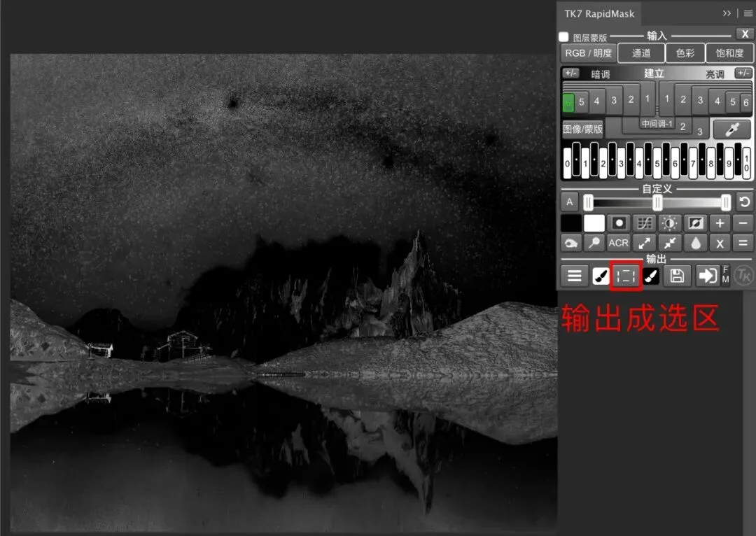
Then output the channel as an active selection.
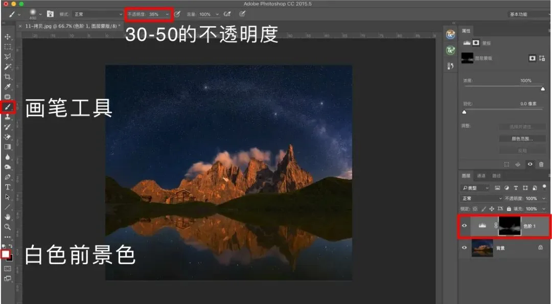
Then paint with a white brush at 30-50 opacity on the black mask. Because TKactions has produced a precise selection of the dark areas, the brightening effect acts only on the darkest parts of the image without affecting anywhere else.
Both methods quickly create the 'light shadows' effect, making the shadows look softer.
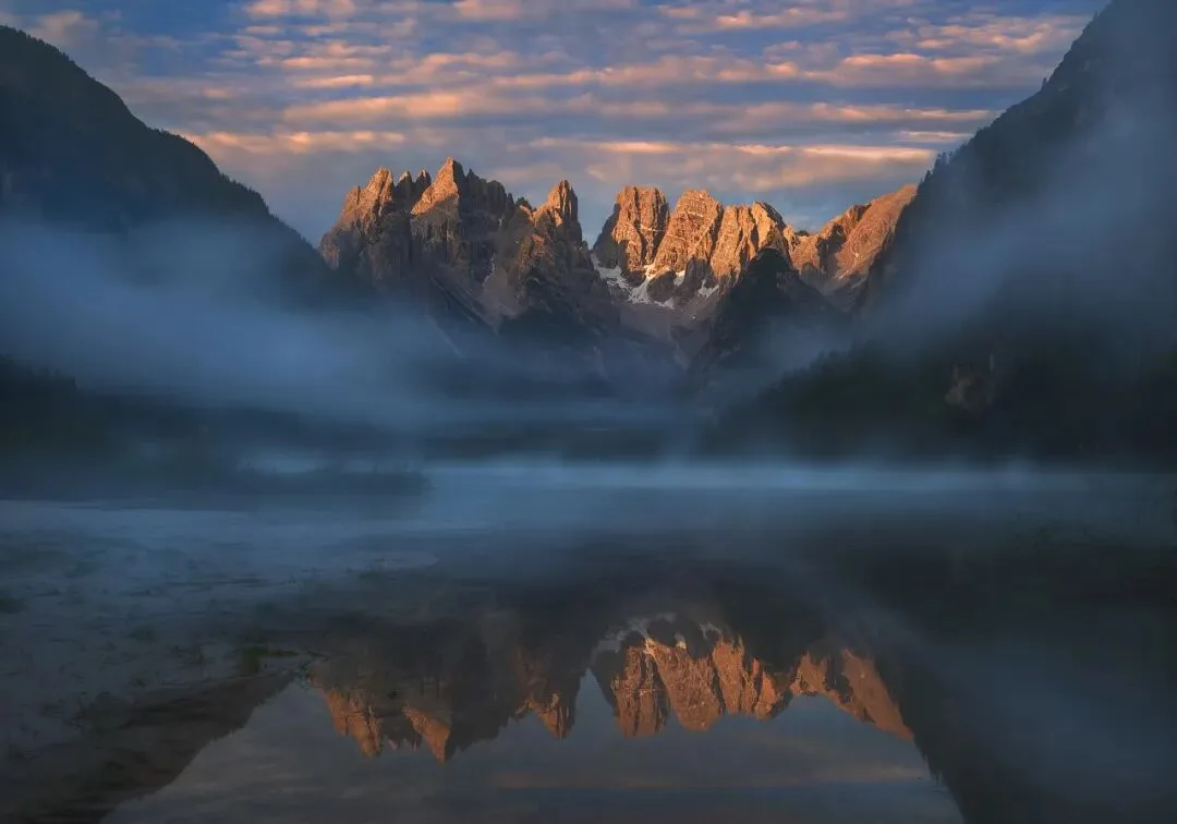
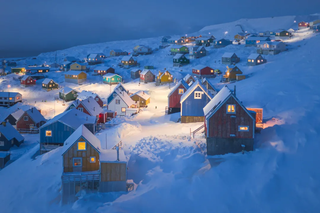
(Image above by Thomas Chu Photo)
In addition, for subjects like clouds, mist, ice and snow, the low-contrast softness and dreaminess are often emphasized, so the shadows are usually lifted even more.
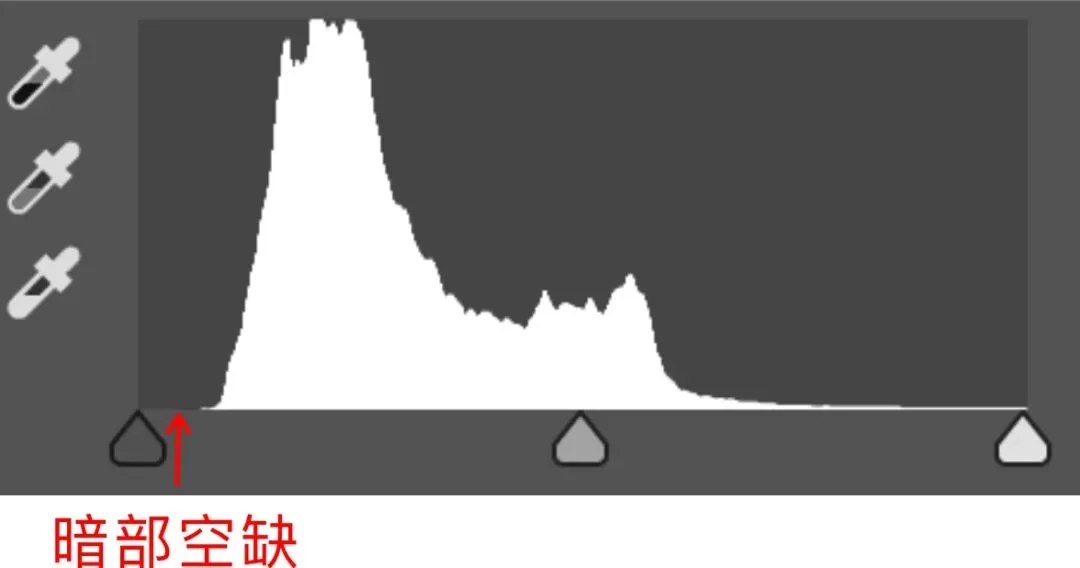
That produces a histogram like the one above, with the darkest end completely empty — meaning the image no longer has any truly dark area at all.
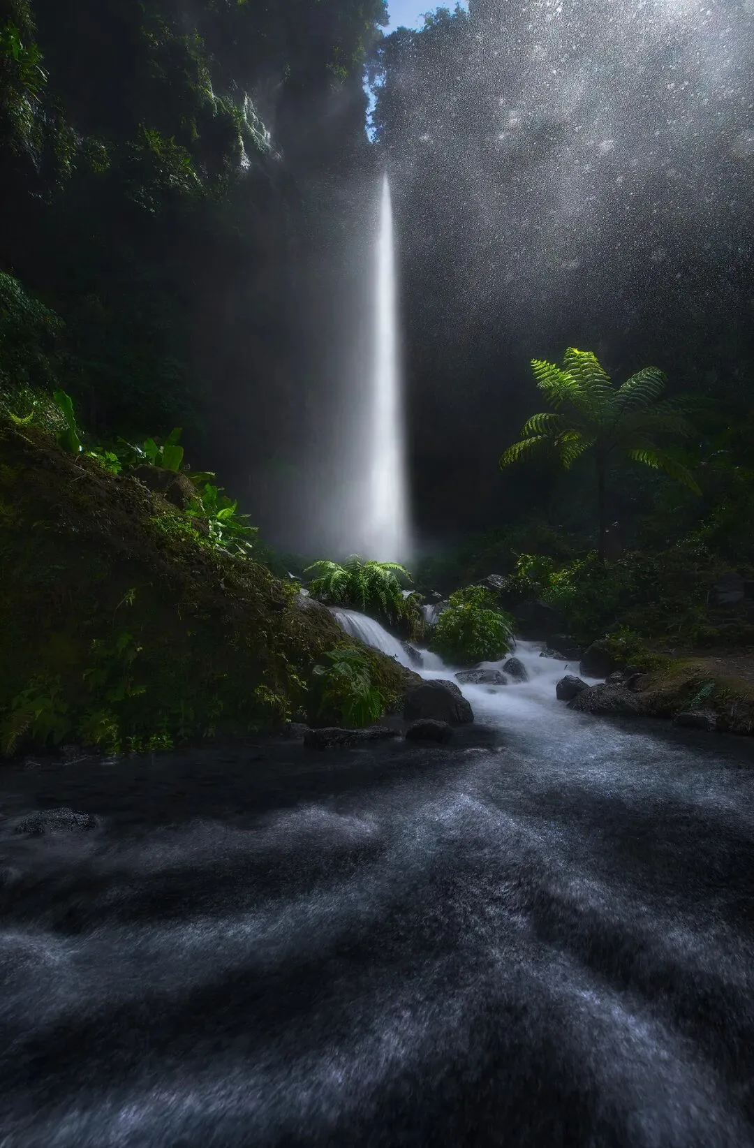
For high-contrast backlit images like this one, however, darker shadows — even clipped ones — are fine, sometimes better simulating the dynamic range of human vision and creating a dazzling, atmospheric feel of light flooding in.
How dark is comfortable? Ultimately it comes down to your personal aesthetic. When in doubt, look at masters' images of similar subjects and lighting online, and learn through imitation.
That is all for today.