Photography Tutorial · 2017-11-24
Everything You Want to Know About Composition
Introduction
To take good photos, gear and technique alone are not enough.
A photo must have a soul, which comes from the photographer's conception and intent. That is to say, a photo must have visual or emotional impact — and that impact is usually expressed through framing, composition, and light.
A good photo must have a distinct theme, but it doesn't depend only on what the theme is — it also depends on how the theme is presented and arranged within the frame.

Composition exists to express the theme: it arranges the elements of a photo appropriately and uses artistic means to strengthen or weaken certain parts, ultimately achieving an artistic effect where the subject stands out, the layout is unified, and the structure is balanced. In plain terms, composition is the method of arranging people, scenery, and objects within the frame to achieve the best layout.

Good composition is the first element of a good photo. Even if the image lacks deep emotion, it can at least bring visual beauty.
When shooting, pay attention to how lines, light, and color affect composition. Sometimes a single line can decide a photo's success, and the relationship between light, color, and composition is equally close — none can be ignored while shooting.

1. The Structural Elements of a Frame and Their Relationships
Structural elements
Just as a good story has an opening, a middle, and an ending, an expressive photo, structurally speaking, should include a foreground, a subject, and a background as its basic elements.
The subject is easiest to understand — it is the main object the photographer wants to express. The subject is both the focus of the content and the main carrier of the photo's theme, as well as the structural center of the composition. It can be a single object or a group of objects.
The foreground is the scenery located in front of the subject. It adds a new layer of interest to the frame and draws the viewer into the photo's scene. To a large extent, the foreground determines whether a work shines.
The background is usually the overall environment behind the subject — generally part of the surroundings, such as mountains, the sea, the sky, or a street market.
Not every photo needs all of these elements, but if they are arranged well, using layers to create depth, the photo will be far more expressive.


Mutual relationships
The subject should be the photographer's first consideration; it plays the leading role in the frame's composition. When shooting, first decide the subject's position and proportion in the frame, then consider the foreground, environment, and other factors.
Once the subject is arranged, the foreground and background must not be neglected. The foreground can help express the theme, convey content, embody spatial characteristics, and show the environment of the scene. For example, using flowers, ice, or maple leaves as foreground can leave the viewer with a vivid seasonal impression, and can form a meaningful correspondence with the subject.

2. The Role of the Foreground
To capture a wonderful image, the choice of foreground is crucial. A foreground sets off the subject, decorates the environment, helps strengthen the spatial depth of the frame, balances the composition, and beautifies the picture.
Many people, when shooting grand, sweeping scenes, end up with images that are flat and dull, failing to capture the shock and beauty felt on location — because they didn't arrange the frame's layers well. With grand scenes, looseness and clutter are the common problems: everything is visible at a glance yet nothing holds the viewer's gaze, and there's no sense of depth or distance. The most effective remedy is arranging a foreground in the composition: the frame immediately tightens, and the eye converges from a scattered field to a single point.
This matters especially when shooting with an ultra-wide lens, which takes in so many elements that grasping the foreground becomes the top priority. A photo should have distinct layers — foreground, subject, distance — and rich content. The choice of foreground is diverse: rocks, wildflowers, paths, and flowing water can all serve. Take two photos I shot at Vestrahorn in Iceland as examples.

"Phantom" uses a small pool and its reflection as the foreground,
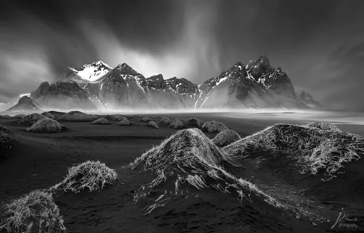
This one uses tufts of grass on the sand dunes as the foreground.
3. How to Use Leading Lines
A photo without careful composition often lacks a focal point, leaving the viewer unsure where to look. To avoid this, arrange leading lines in the frame to guide the viewer's gaze to the subject or deep into the image. Using the wide-angle lens's exaggeration of near-large-far-small, tangible or intangible lines converge and vanish at a single point. Place the subject at the vanishing point: while emphasizing the subject, you firmly hold the viewer's gaze and increase the time their eyes linger on the photo.


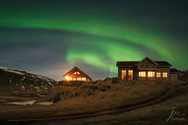
Leading lines don't have to be literal lines — they can be street lamps, rocks, roads, steps, and so on. The key is finding an angle from which these separate objects connect, which requires some observational skill from the photographer.
There's also a special kind of leading line that can't be seen on location: in seascape photography, waves are often used as leading lines. Because the human eye can only freeze an instant while the camera records a span of time, the image the camera presents is invisible to the naked eye on location — which is exactly the unique charm of seascape photography, and why the results often surprise you. Using waves as leading lines requires some seascape experience and foresight.


4. Compositional Forms in Detail
The basic compositional form: nine-grid composition
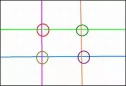
Nine-grid composition is also known as thirds composition, simplified from the golden ratio principle. The golden section is an ancient mathematical method founded by Pythagoras of ancient Greece, who boldly asserted under the limited scientific conditions of his time: if the ratio of one part of a line segment to another part exactly equals the ratio of that other part to the whole segment — 0.618 — then this proportion gives people a sense of beauty. Later, this law was hailed as the "golden ratio".
This is the most basic compositional method: place the subject at the intersection points of the nine-grid. It doesn't need to be precise — an approximate position is enough. According to human visual habits, the upper right is best, followed by the upper left. This composition suits people's visual habits, makes the subject naturally become the visual center, and both emphasizes the subject and moves the frame toward balance.
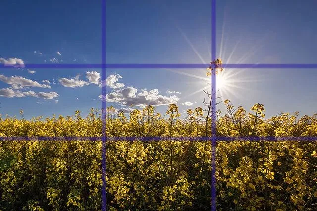

The rule of thirds is only the starting point — composition has many more forms, far beyond placing the subject at some position in the frame. Arranging the frame's structure is somewhat like a geometry problem, using lines and shapes to express relationships among elements. Below, various compositional forms are explained with example images.
Compositional forms that express lines
As lines in the language of photography, they not only have length, direction, and position — they can also express movement and emotion. Lines give a photo dynamism and rhythm, make it more expressive, and let the viewer's gaze naturally settle on the subject along the lines' guidance. The expressive power of lines in a photo is irreplaceable by other elements, and different lines express different emotions.
Lines generate emotion and guide the reader's gaze; as their direction changes, the visual experience and psychological effect on the viewer change as well. So when arranging the frame, you must not only compose according to the relationship between subject and background, but also handle the relationship between lines and subject — let the lines be well-spaced and staggered to set off the subject. At the same time, consider what emotion and psychological feeling the direction and role of the lines will bring to the viewer.
Lines are everywhere in nature. As long as we have the eye to discover them — finding beauty among intricate, crisscrossing lines and extracting it into the frame — photos gain more tension and imagination, and lines become important eye-catching elements.

Horizontal lines are among the most common in photography, injecting a stable, calm emotion into the frame, and are mostly used in landscape orientation. Horizontals give the frame an atmosphere of steadiness, tranquility, vastness, and comfort — often used to express lakes, seas, and grasslands. Depending on your intent, you can place the horizontal line at different positions with the classic thirds composition.



Vertical lines fully display the tallness of scenery and express a sense of depth, giving a visual feeling of solemnity, order, majesty, and striving upward. They suit towering subjects such as forests, cliffs, cascading waterfalls, and skyscrapers.

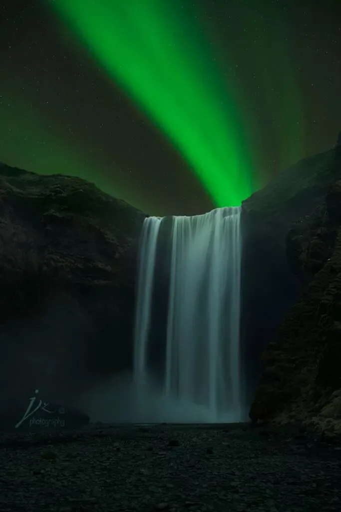
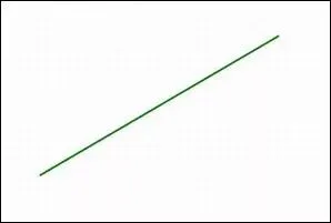
Diagonals are full of motion and give the frame vitality; they easily create a converging trend that draws the eye and highlights the subject. Placing the theme along a diagonal makes effective use of the frame's diagonal length, achieving a sense of depth and dimension. Often used for streams, waterfalls, architecture, and roads.


Curves are lines that change regularly with an arc-like bend — the most elegant of lines. With their elongating, varying character, curves create a rhythmic sense that guides the viewer's gaze along them, letting the viewer feel the beauty of soft lines and experience emotions of grace, elegance, liveliness, and rhythm. Often used for streams, winding paths, forest trails, and rolling peaks. S-curve composition is also common in portrait photography, showing the unique curving charm of the female form.

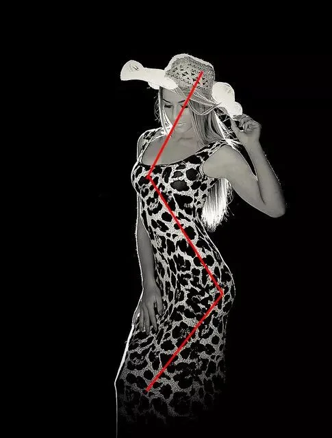

Converging lines and crossing lines can give the frame a strong visual impact. Lines or tones arranged in an A (or X) shape create strong perspective, helping guide the eye from the edges toward the center. They are the most magical sight-guiding lines and also give the frame more spatial depth. Often used for bridges, highways, fields, and similar subjects.


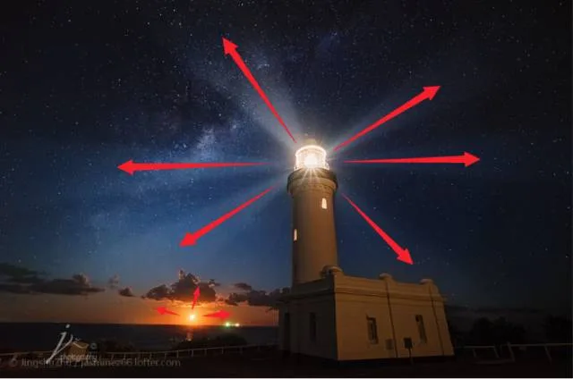
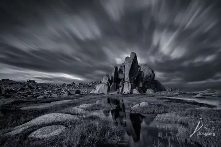
Radiating lines, as the name suggests, spread outward like rays, expressing a visual effect of diffusion or convergence with strong impact. In radiating lines there is usually a central convergence point: the gaze either follows the lines inward to the center or spreads outward along them — so radiating lines fill the frame with tension. Examples include beams from a lighthouse, sunset rays piercing cloud layers, or the motion of clouds across the sky in a long exposure.
Compositional forms that express shapes

Use L-shaped (or C-shaped) lines or color blocks to enclose the object you want to emphasize, highlighting the theme. The L shape is like half a frame — upright or inverted — and either way it concentrates attention within the enclosure, making the subject stand out.

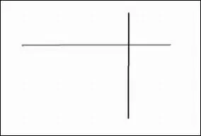
When the scenery, tones, or colors in the frame form a cross shape — often used for subjects with stable, ordered arrangements.

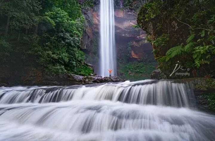
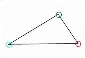
Triangles can also give the frame a deep sense of dimension — upright, oblique, or inverted, with the oblique triangle more common and more flexible. Triangle composition is stable and balanced yet flexible. Some A-shaped compositions are also triangle compositions.



Symmetrical composition is a method that breaks the rule of thirds: it usually splits the frame in two, top-bottom or left-right, forming a symmetrical artistic image with qualities of balance, stability, and mutual echo. Often used for architecture, reflections, and similar scenes.


Frame composition encloses the subject with foreground elements — bushes, rocks, walls — forming a frame in the foreground through which the viewer appreciates the subject. Using a frame of scenery as the foreground adds vertical contrast and decorative effect, giving the photo depth and interest. Frame composition has a strong visual-guiding effect, concentrating vision toward the center of the frame — use this to prominently present the scenery you want to emphasize.
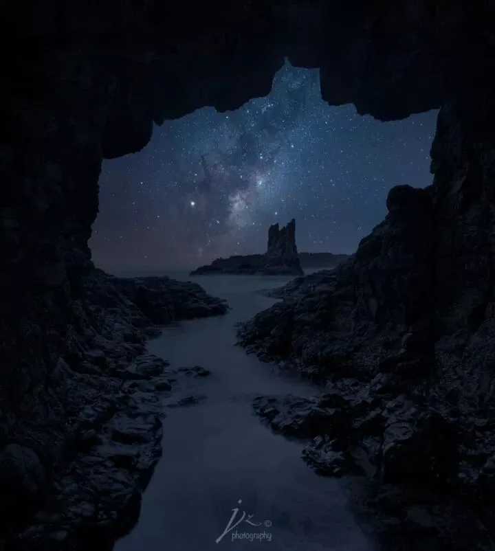

Sometimes a photo embodies not a single compositional form but several at once. Some of the earlier example photos also show two or more compositional forms.

Take the photo above: it shows both cross-shaped and symmetrical composition at the same time.
Perfectly composed photos usually require heartfelt appreciation, and sometimes patient waiting. After long, persistent training, you no longer need to think about which form to apply to a scene when shooting — composition becomes part of photographic thinking and finally turns into intuition. When you truly understand and master these theories, you can break the rules according to your own conception, presenting a more impactful or more personal perspective.
Author: Jingshu Zhu (朱静姝)
Tuchong / WeChat: JingshuZhu

The goddess's Tuchong homepage: https://tuchong.com/957710/
AdventureX (极影)
Push the Limits
Ultimate Imagery
Geek Sharing
http://www.theadventurex.com