Photography Tutorial · 2016-11-27
The Core Skill of Composition: Not the Rule of Thirds, Not Subtraction
I was once obsessed with the golden ratio, leading lines, layering, and a whole dazzling variety of compositional rules — for five full years. So when I accidentally realized the core skill of photographic composition, I was truly shocked.
Because the core of composition is genuinely this simple. So simple that most people already know it, yet dismiss it and ignore it in practice — sinking into the quagmire of compositional routines and techniques.
1
The Core Skill of Photographic Composition
Yesterday Thomas asked everyone on the WeChat official account (thomaskksj) and Weibo (@Thomas看看世界) about their go-to composition techniques. From over 300 answers, here are the techniques ranked by number of mentions:
Rule of thirds (grid composition, golden ratio)
Center composition (symmetry)
Leading lines (extended lines, converging lines)
Diagonals (X-line composition)
Framing
The subtraction principle
Contrast composition
Balance (harmony)
Layered composition (foreground, middle ground, background)
Triangle composition
Perspective (proportion)
Repetition
。。。
The rule of thirds took over 80% of the answers without breaking a sweat, followed by the leading lines, framing, and subtraction so often mentioned in photography books.
Only a few answers were truly interesting:
"There are many composition techniques — diagonal, grid, contrast, triangle — but I think picturing the final result in your mind before shooting matters most, rather than arriving on location and just firing away." "The most important composition rule is, and always has been, removing elements unrelated to the theme." "I think one saying puts it well: emphasize the key point. Keep shifting your composition in the viewfinder until what you want to express stands out most — that's good composition."
The core skill of photographic composition is really simple — so simple that most people have known it all along yet chosen to ignore it:
The core skill of photographic composition is to first think through and confirm the photo's subject, or the theme you want to express.
Really — many people will still shrug at that sentence. But when I put it another way, everyone, including Thomas himself, can't help being shocked, cold sweat on their backs:
The reason most people's compositions fail is not that they don't know the rule of thirds or symmetry — it's that they have never thought about what the photo's subject or theme is. They compose by feel, by luck, or by simply applying rigid compositional formulas.
"Feels okay"
"Looks kind of beautiful"
"Seems to fit the golden ratio — nice!"
。。。
Thomas himself has often pressed the shutter in exactly this kind of autopilot state, never having thought about what subject he wanted to emphasize, what theme he could express, or what final effect he wanted.
(If you think it through, you may discover another startling fact: the reason most people edit poorly is not that they can't use Lightroom, Photoshop, or Meitu — it's that they never think about what the photo should look like in the end!)
Once we understand composition's core principle, we can also spot many popular but imprecise claims.
Wrong claim 1: Photography is an art of subtraction.
Correction: photography is both subtraction and addition. The core lies in what subject we want to emphasize and what theme we want to express. Elements that interfere with the subject or don't fit the theme — we subtract them from the frame. Elements that set off the subject and help express the theme — we add them to the frame.
Wrong claim 2: Don't place the subject in the exact center of the frame; place it at a third of the frame.
Correction: which geometric composition to use still depends on our subject and theme. Thirds composition (grid, golden ratio) suits natural, relaxed scenes. Central composition suits scenes where the subject is oversized, solemn, or naturally symmetrical.
Once more, because it matters: the reason most people's compositions fail is not that they don't know the rule of thirds or symmetry — it's that they have never thought about what the photo's subject or theme is!
2
Photography Is Both Subtraction and Addition
Once we understand that the core of composition is confirming subject and theme, we naturally know what to add to a photo and what to subtract:
Elements that help emphasize the subject and express the theme — we add them to the frame.
Elements unrelated to the subject and theme, or that interfere with them — we subtract from the frame.
For the very same scene, as soon as we change the subject or the theme, our composition must change accordingly.
Take the scene below, for example:

If our subject is the snow mountain and the theme is the majestic grandeur of Kangchenjunga, the world's third-highest peak, then the previous image clearly took in too many compositional elements: the grassy foreground not only fails to set off the mountain's grandeur but occupies a large share of the frame, making the mountain look small.
So subtraction is needed — remove the irrelevant foreground grass and the mid-ground sea of clouds, and change the composition to what's shown below.

Then should we keep subtracting — drop the person too, and give the mountain a tight close-up?
As in the image below, the mountain occupies more of the frame, yet it somehow feels less magnificent than the previous one. That's because we also subtracted the person who echoes the mountain and sets off its enormity.

So subtraction in photography is not simply removing everything except the subject. We only remove elements that fail to set off the subject or express the theme. Elements related to subject and theme must stay in the frame — they must never be carelessly subtracted.
In the composition above, my theme was to highlight the grandeur of the world's third-highest peak, so subtraction was needed.
But if I change the theme — say, to express the magnificent scenery of that moment — then not only do I not need subtraction, I need addition: using a panoramic composition to bring more elements in.
In the composition below, the mountain looks smaller — but that's fine. I'm not trying to highlight the mountain's grandeur; I want to convey the vastness of the entire sunset scene. So the grass, the person, the mountain, the sea of clouds, and the sun — I spared none of them; all went into the composition.
Also note: addition is not ruleless — not everything can be added. Only elements that express nature's grandeur, such as the sea of clouds and the setting sun, may be added. Elements that badly break the mood — power poles, transmission towers — must never be allowed into the frame.

From the examples above we can draw one more lesson:
There is no best composition — only the composition that best suits your subject and theme.
For the same scene, if the subject you want to emphasize or the theme you want to express differs, the composition should adjust accordingly.


3
Draw Inferences and Integrate
Over many years of teaching thousands of New York Institute of Photography students, we found that so-called rules of composition only confuse students. A photo's success has little to do with these rules. The only rule all photographers agree on is that "all rules are made to be broken"! — New York Institute of Photography course
All compositional rules — thirds, leading lines, central symmetry, and so on — and even the saying "all rules are made to be broken", exist in service of the photo's subject and theme.
Once we understand that the core of composition is confirming subject and theme, we naturally understand when to use thirds, when to use central composition, and when to blaze a new trail.
Take the rule of thirds (placing the subject at a third of the frame rather than dead center) — the most familiar technique of all. It works so well because a dead-center subject feels stiff and solemn, while a subject placed too far toward the edge easily unbalances the frame — and a spot near the thirds is usually just right.
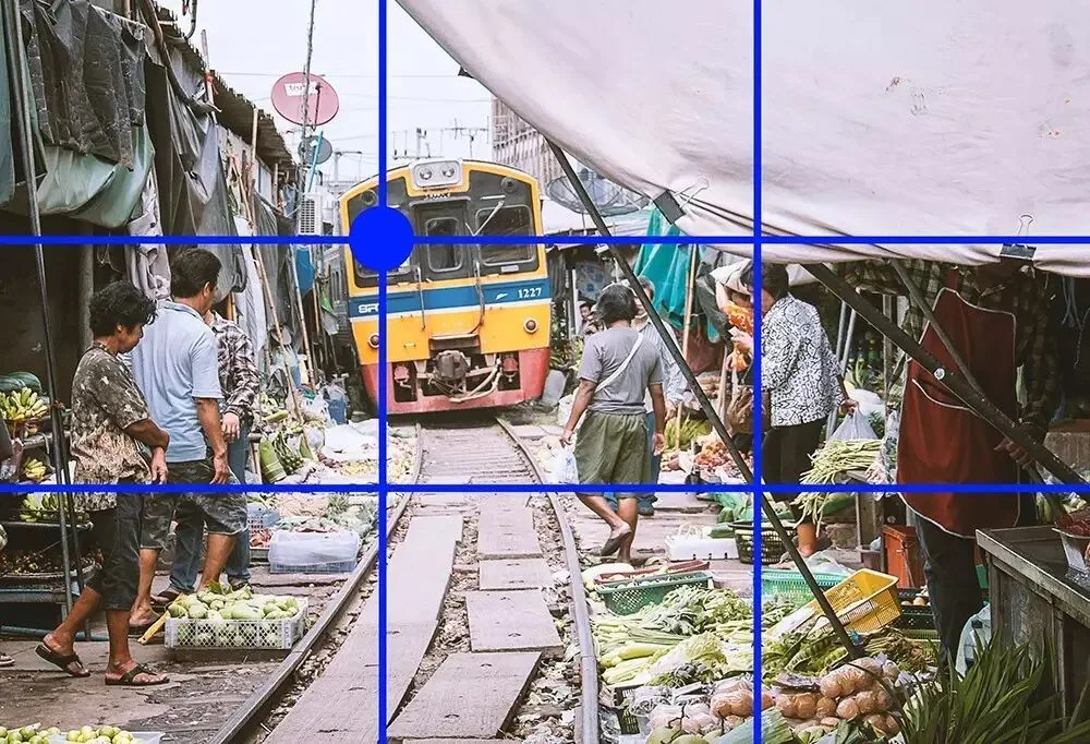
Thirds serves the subject: it keeps the subject from feeling too rigid while preserving the frame's balance. Understanding this, you can imagine situations where thirds is actually inferior to centered symmetry.
The first case: when subject and theme are inherently serious and formal — churches, palaces, ceremonies — centered symmetrical composition is more fitting. (You might also ponder why travel portraits rarely place the person in the center, while ID and professional headshots almost always do.)

The second case: when the subject itself is large — placing it at a third would unbalance the frame.

When the subject fills a large part of the frame and no other object can balance it, the only choice is placing the subject near the center.

There's also the case of a naturally symmetrical subject, such as a reflection. Then symmetrical composition is the more fitting expression.

And it's not just thirds and central symmetry — leading lines, frame composition, layered composition, and the rest all serve subject and theme. Holding onto subject and theme as the center, we can understand and apply every compositional technique by analogy.

Once you understand that every compositional rule serves subject and theme, you can analyze which rule best fits your subject's characteristics — or even break convention and blaze a new trail.
Summary
1. The reason most people's compositions fail is not that they don't know the rule of thirds or symmetry — it's that they have never thought about what the photo's subject or theme is. They compose by feel, by luck, or by applying rigid formulas.
2. Photography is both subtraction and addition. The core lies in what subject we want to emphasize and what theme we want to express. Elements that interfere with the subject or don't fit the theme — subtract them. Elements that set off the subject and help express the theme — add them.
3. All compositional rules — thirds, leading lines, central symmetry, and so on — and even the saying "all rules are made to be broken", exist in service of the photo's subject and theme.
Hold onto the photo's subject and theme, integrate and draw inferences, and you'll find photographic composition is really quite simple!
Follow @Thomas Chu Photo,
and learn one photography skill every Sunday.

If you found this article useful, please share it with more friends.