Photography Tutorial · 2017-04-02
The Secret of Great Photos: Contrast and Conflict
A plain, straightforward story is boring. A good novel or film is mostly full of ups, downs, and twists.
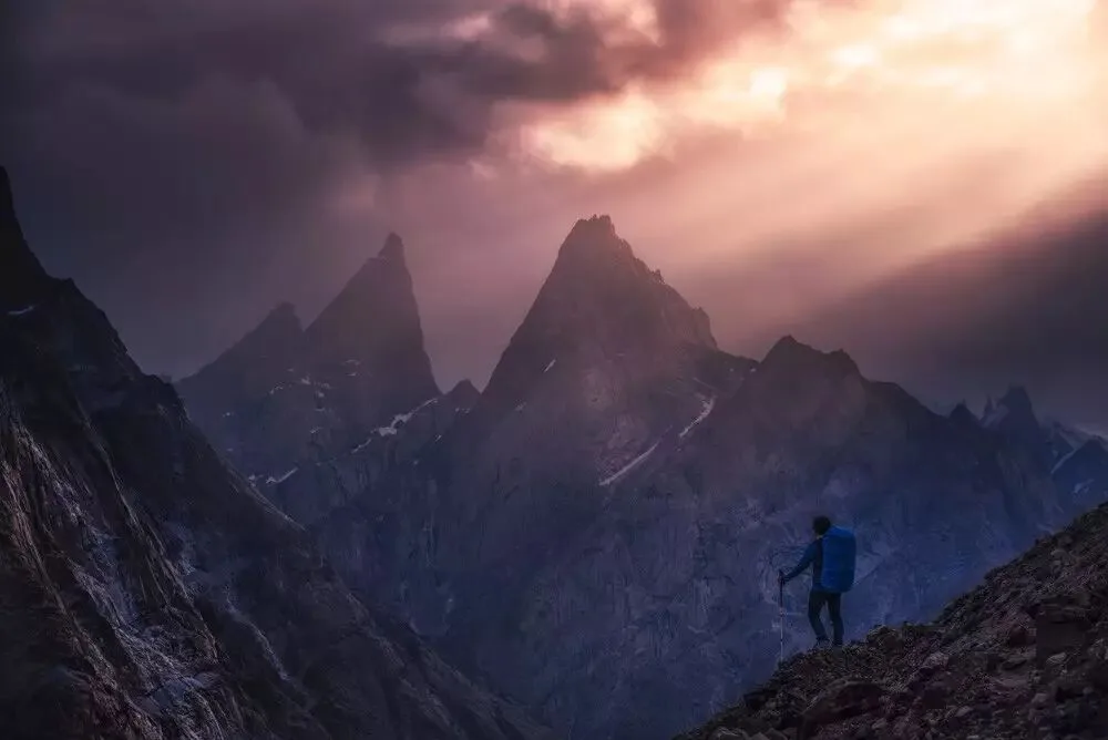
Similarly, a good photographic work usually contains all kinds of contrast and conflict.
Without contrast in form, a photo lacks points of interest for the viewer and feels dull. Without conflict in meaning, a photo fails to provoke thought and is forgotten at a glance.
1
Two Kinds of Contrast: Form and Meaning
When we talk about contrast and conflict, we actually mean two situations. One is contrast in form — that is, within the picture — such as big vs. small, light vs. dark, warm vs. cool. The other is contrast in meaning, such as war and peace, humanity and nature, sorrow and joy.
Contrast in form fills the picture with expressive power and catches the viewer's eye.
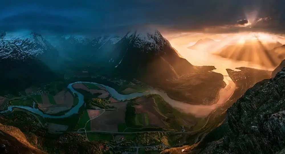
Take this photo by landscape photographer Max Rive, for example: the cool, dark tones on the left side of the frame form a strong contrast with the warm, bright tones on the right. The conflict of light and dark, warm and cool not only presents a magnificent panoramic scene, but firmly grips the viewer's eyes, leaving them in awe.
Author: Max Rive, maxrive.tuchong.com
Contrast in meaning, on the other hand, fills a photo with dramatic tension and provokes the viewer's thinking.
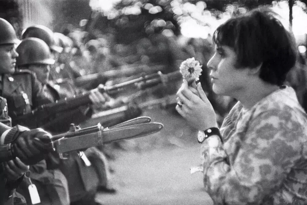
For example, this signature work by the famous photographer Marc Riboud relies more on contrasts of meaning.
Flowers and bayonets, women and men, soldiers and civilians, the few against the many... These symbolic icons one after another deeply shake the viewer's soul, prompting reflection on freedom and power, war and peace, government and the will of the people.
Author: Marc Riboud
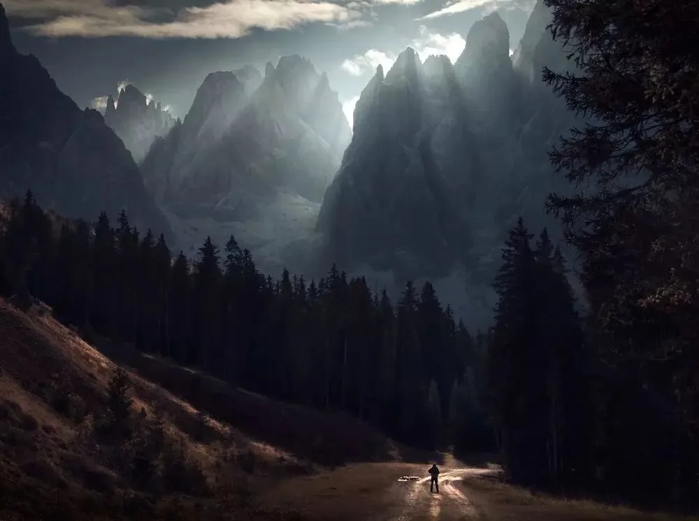
Many great photos possess both. In this classic work by Max Rive, for instance, the formal conflicts of warm/cool, light/dark, and big/small greatly enhance the picture's expressiveness, while the underlying contrast between humanity and nature intensifies the shock even further.
Author: Max Rive, maxrive.tuchong.com
2
Common Contrasts in Photos
When composing in the field and processing in post, if we can find and strengthen various contrasts in the frame, the photo's expressive power will be greatly enhanced.
Finding contrast is very simple: just look for all kinds of antonyms in the photo. Antonyms of form include light/dark, warm/cool, big/small, motion/stillness, black/white, hard/soft, sharp/blurry, many/few, square/round, and so on. Antonyms or contrasts of meaning are even more numerous: ancient and modern, artificial and natural, confusion and hope...
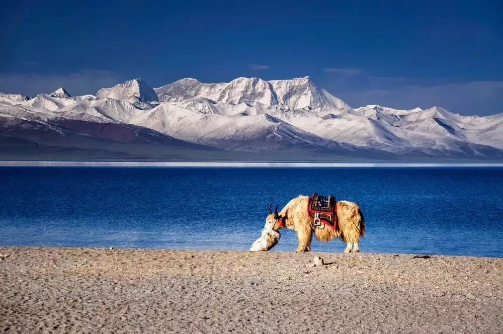
The photo below is mainly about the contrast between cool and warm colors. The foreground leans yellow and the background leans blue; these two opposing colors easily pull the foreground and background apart, adding a sense of layering to the image.
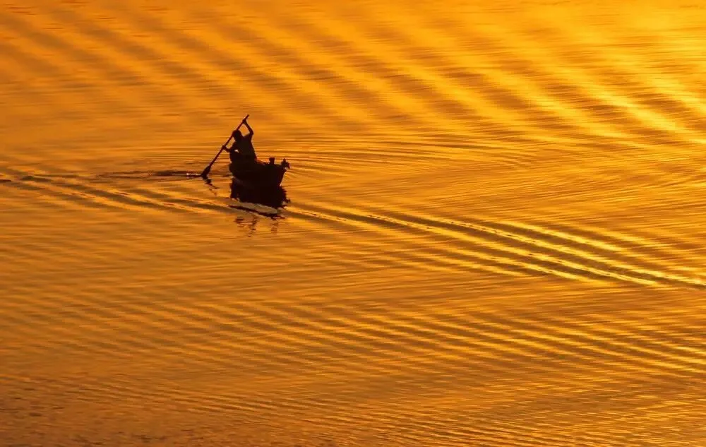
The next photo is mainly about the conflict between brightness and darkness. The almost fully black silhouette of the fisherman stands out strikingly against the bright river surface.
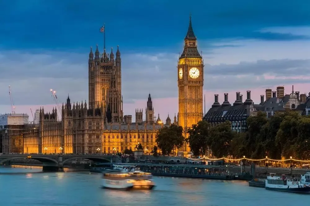
This photo of London below has both the contrast of warm/cool and light/dark, and the conflict of motion and stillness. The boat trails recorded by the long exposure make an originally static photo feel dynamic and impactful.
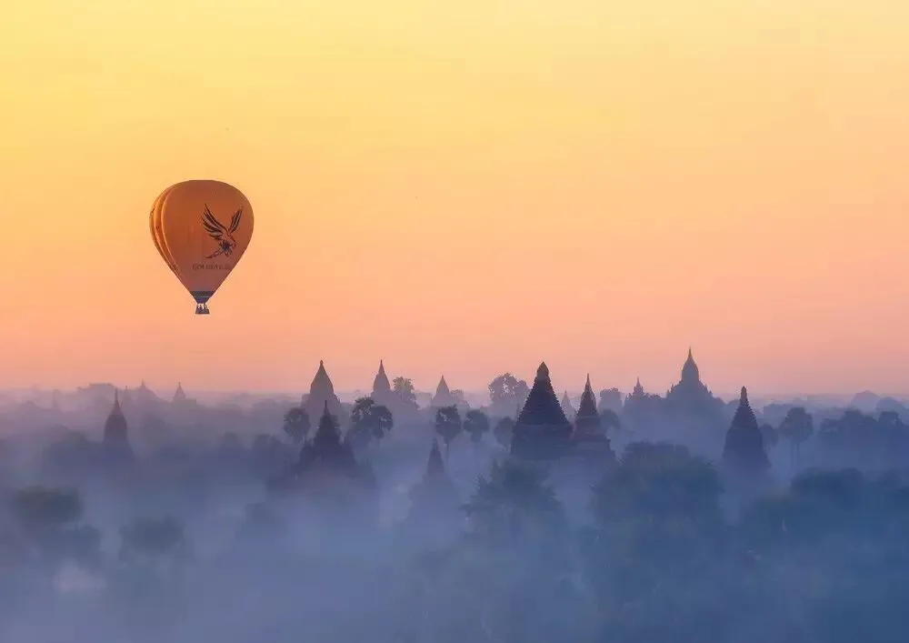
In this photo of Bagan, Myanmar below, besides the contrasts of warm/cool and sharp/blurry, there is also the conflict of ancient and modern. A hot-air balloon full of sightseeing tourists drifts above countless pagodas that have withstood a thousand years of wind and rain, adding more room for imagination to the picture.
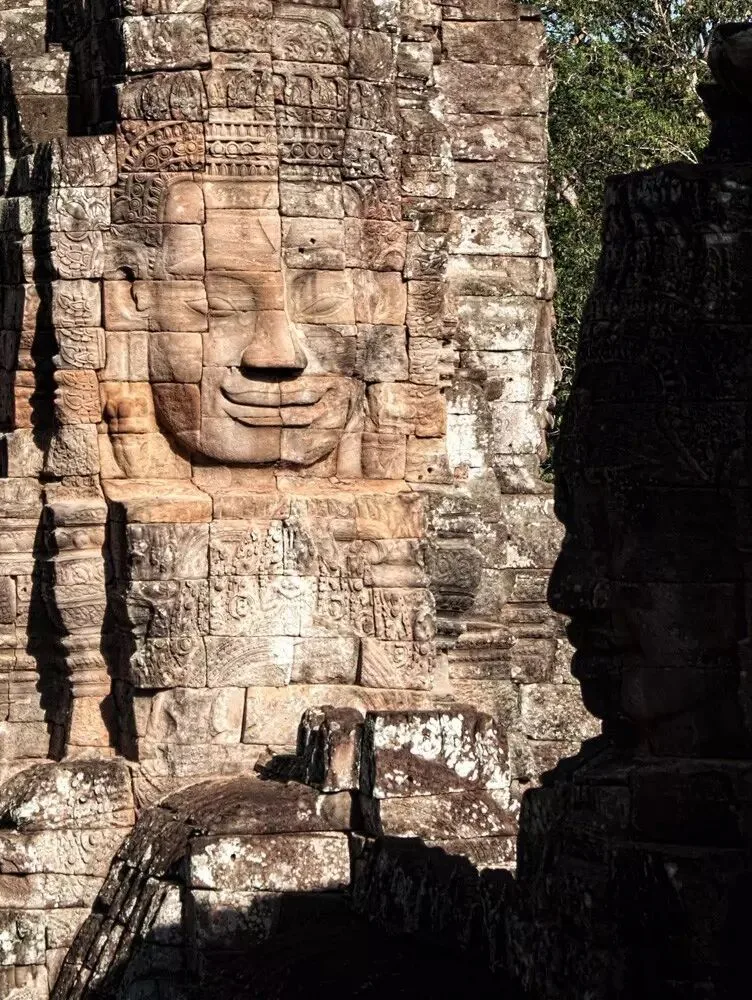
A photo often contains more than one kind of contrast and conflict. In the photo below, for example, I simultaneously captured light and dark, high and low saturation, rich and sparse detail, frontal and profile faces — it is these many contrasts that make a photo of Angkor Wat, a heavily photographed location, more interesting.
3
Extracting Contrast from Life
Life is full of contrast everywhere, and one purpose of our composition in the field is to distill these interesting contrasts. In post-processing, we also need to further strengthen and express the conflicts in the image through dodging and burning, color adjustments, and other means.
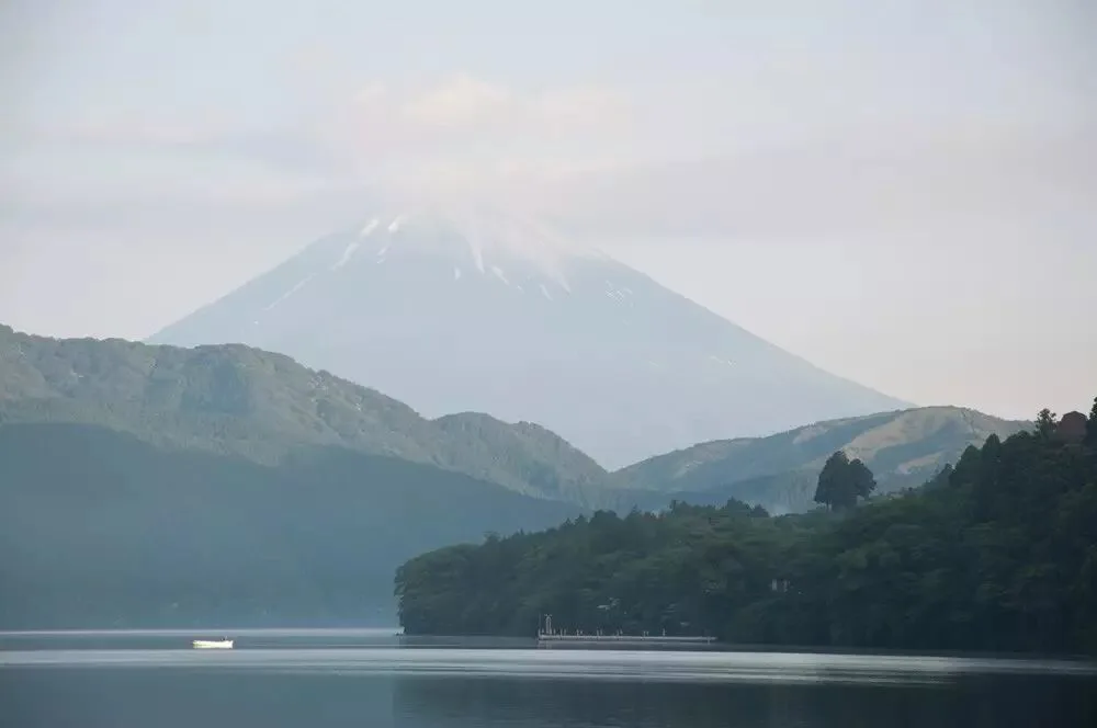
For example, in the photo below, if composed this way, the contrast and conflict in the frame would not be obvious enough.
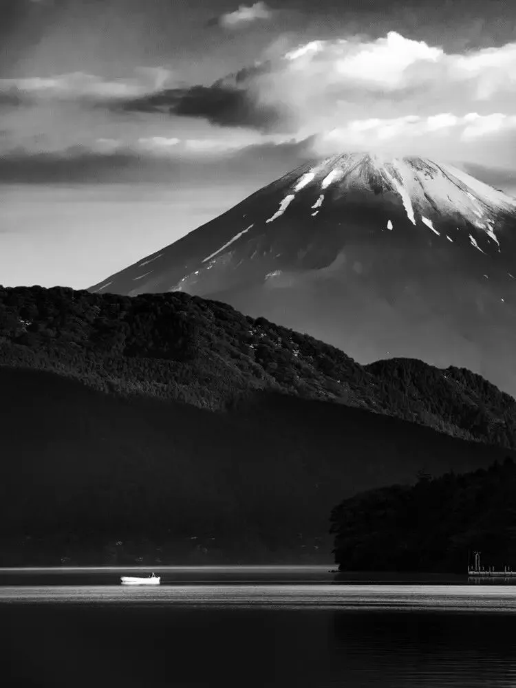
So I used a telephoto focal length to focus the frame on the small boat and the volcano, using the boat's tininess to emphasize the volcano's towering background. At the same time, in post I darkened the details of the mountainside and forest, highlighting only the brightness of the boat, the snow on the summit, and the clouds — using the contrast of light and dark to make the subject stand out.
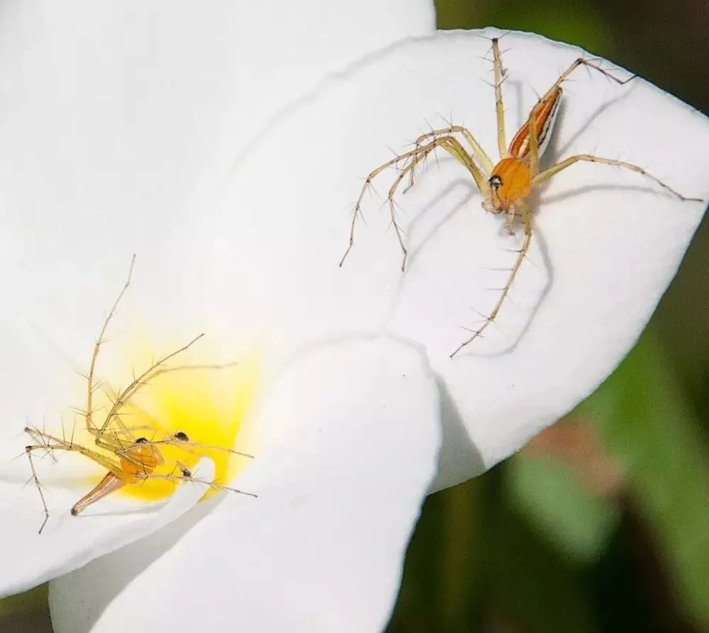
The photo below shows two spiders on a flower petal that I photographed. If composed as-is, the frame would lack conflict and appear rather flat.
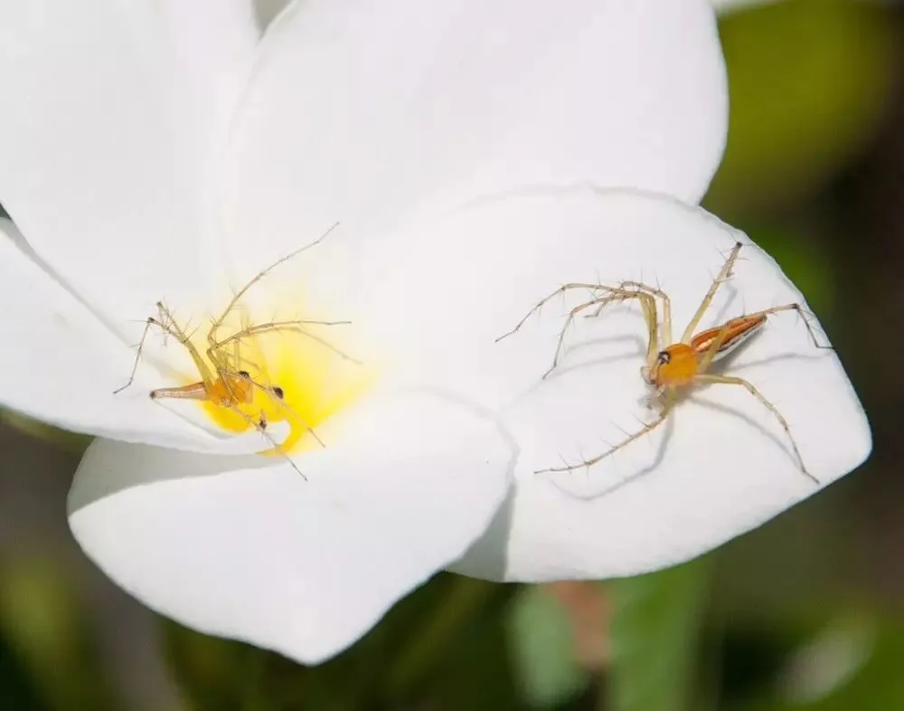
In the end I used a diagonal composition, photographing the two spiders — originally at the same height — as one above and one below.
The upper spider bares its fangs and brandishes its claws, as if ready to attack at any moment. The lower spider spreads its stance, as if prepared to defend.
One above and one below, one attacking and one defending — with some conflict and contrast in the frame, the photo becomes much more interesting.
Summary
1. A good photographic work usually contains all kinds of contrast and conflict.
2. Contrast and conflict come in two kinds: contrast in form — within the picture — such as big/small, light/dark, warm/cool; and contrast in meaning, such as war and peace, humanity and nature, sorrow and joy.
3. Contrast and conflict are everywhere in life. Discovering conflict, distilling conflict, and expressing conflict is one of the secrets to making good photos.
Follow @Thomas Chu Photo, and learn one photography skill every week.
The knowledge points in this article are excerpted from my online course "Photographic Composition: Beauty Has a Methodology" (《摄影构图:美,也有方法论》).