Photography Tutorial · 2020-07-05
The Magic of Darkness: Why Photography Masters Love Dark Tones
Thomas Chu Photo
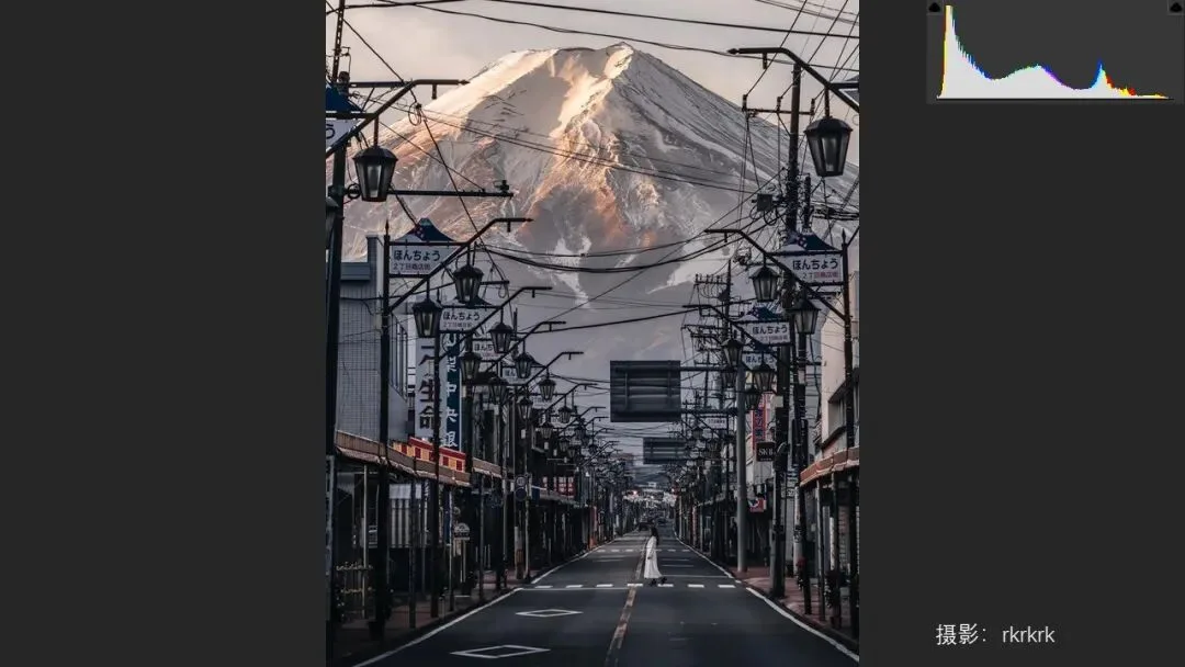
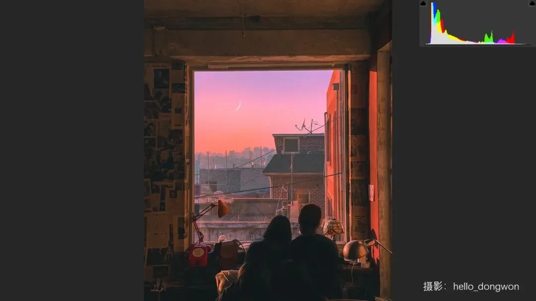
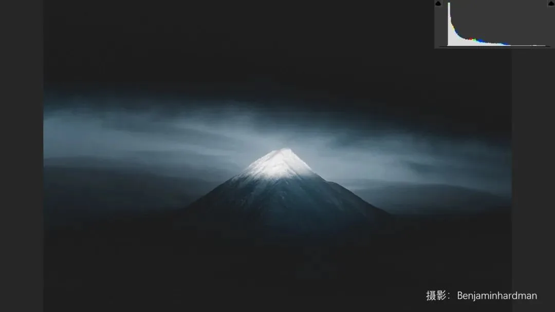
A dark-toned photo is one whose overall tone (especially the background) leans dark, with most pixels piled up on the left side of the histogram.
If you have read Thomas's earlier articles recommending outstanding photographers, you may have noticed one thing: quite a lot of them love processing their photos into dark tones.
Why exactly are dark-toned photos so aesthetically appealing? What is the principle behind it?
In today's video, Thomas breaks down the unique charm of dark-toned imagery.
Video tutorial
▶ Watch the video tutorial on Bilibili
This is the illustrated companion to the video above. In this 9-minute talk Thomas answers a question many followers had noticed: from trending Instagram work to classics by Salgado, Karsh, Robert Frank and Sugimoto, why do so many unforgettable photos lean dark? He distills the answer into three points — dark tones carry richer tonal levels, express more moods, and hide clutter so the subject stands out — paired here with keyframe screenshots so you can skim first, then watch.
Start with the overview: this summary card, captured at 7:43 in the video, lists the three pillars of the whole talk — rich levels and detail, a wide range of moods, and hiding clutter for clear hierarchy.

01 Dark Tones Hide Richer Levels
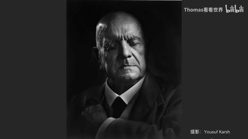
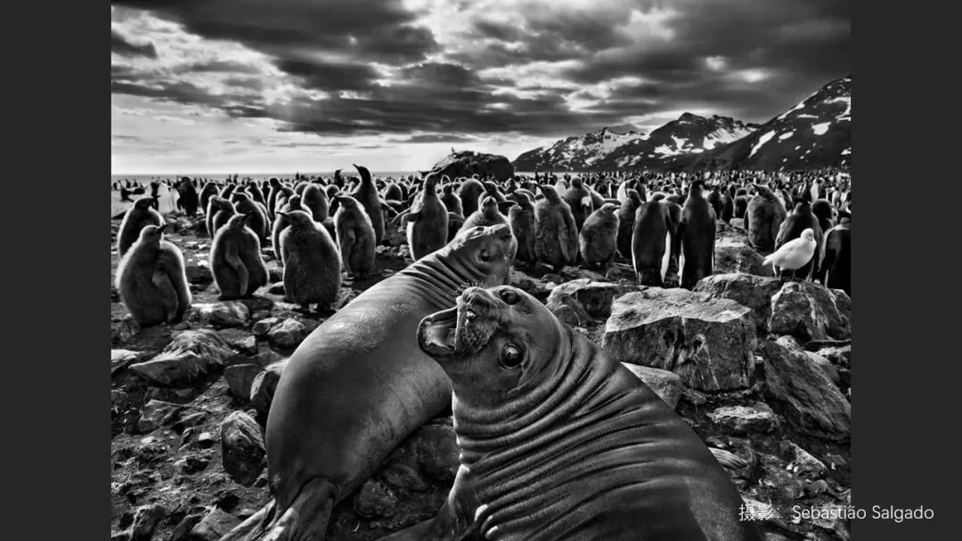
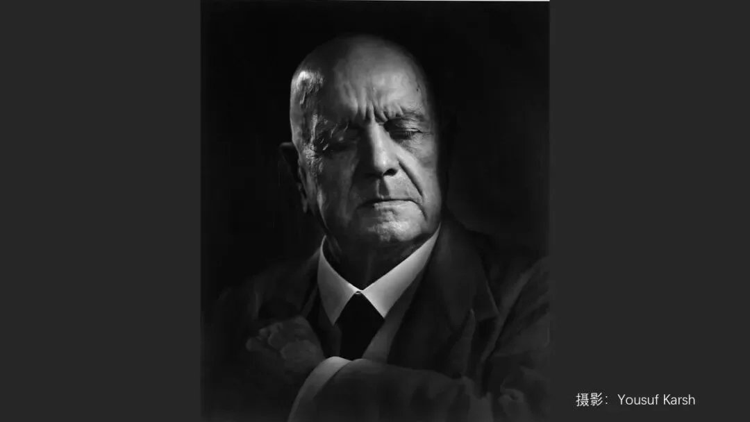
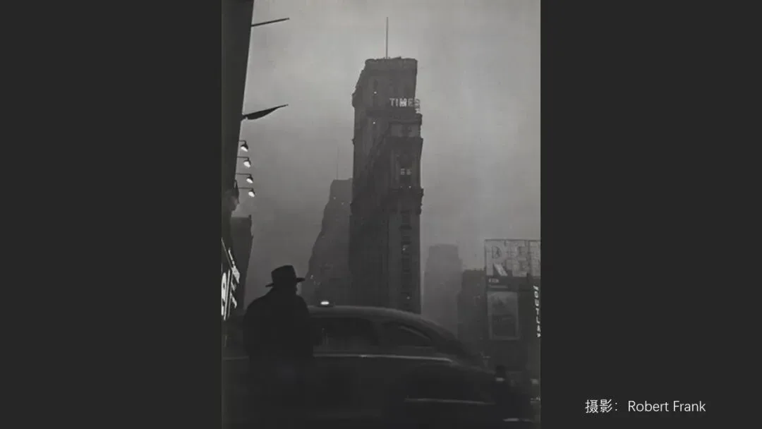
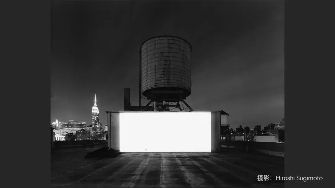
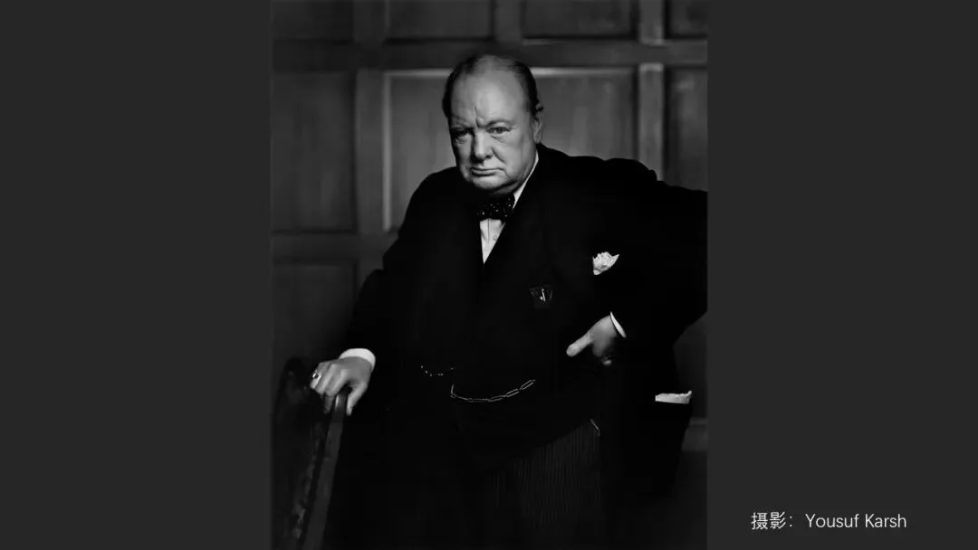
The first point is the most counterintuitive: a dark-tone photo is not a black void — it often carries richer levels and detail. The masters' works lined up at the start of the video — Salgado's penguins, Karsh's Churchill portrait (at 0:43), Robert Frank's streets, Sugimoto's seas — all lean dark with histograms piled on the left, yet not one of them is hard to read.
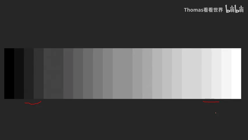
Thomas explains why with a 21-step grayscale strip (at 2:44 in the video): every adjacent pair differs by the same 15 levels of brightness, yet in the shadows the boundary is clearly visible while the equivalent bright pair shows almost no edge. It comes from how human vision works — we are far more sensitive to brightness differences in the dark range.
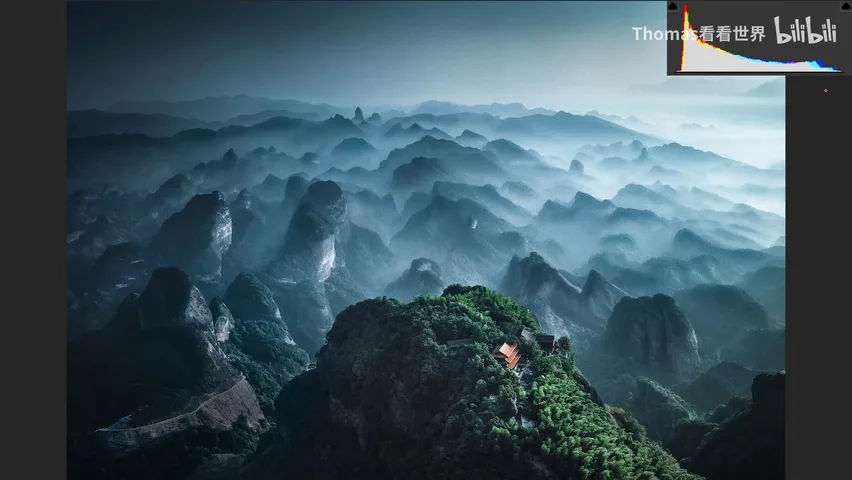
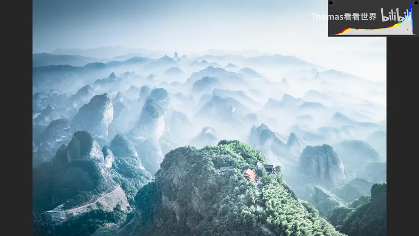
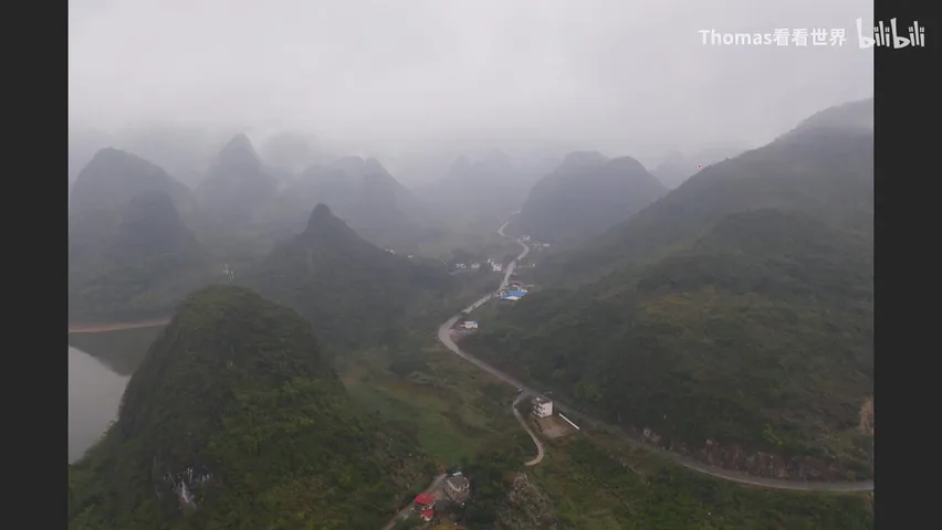
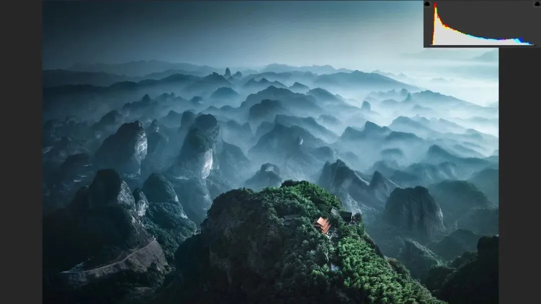
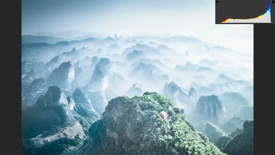
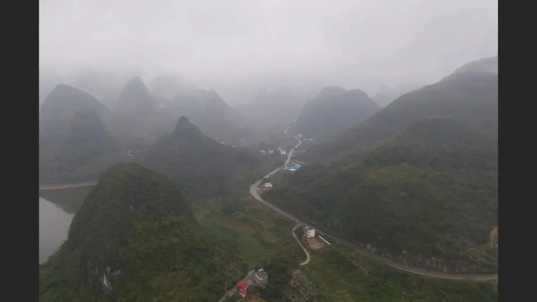
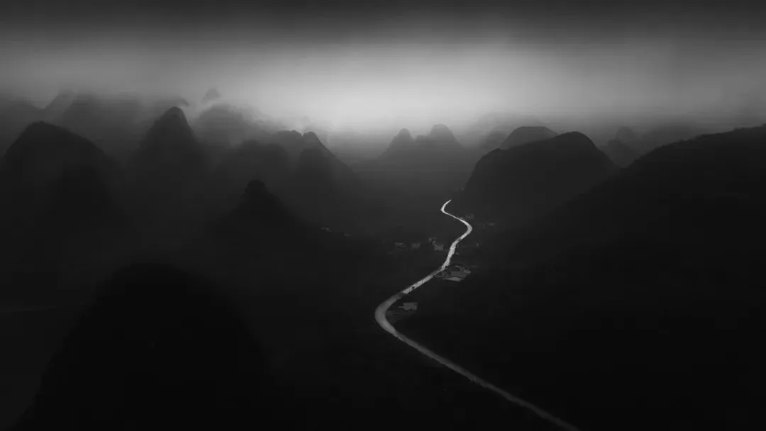
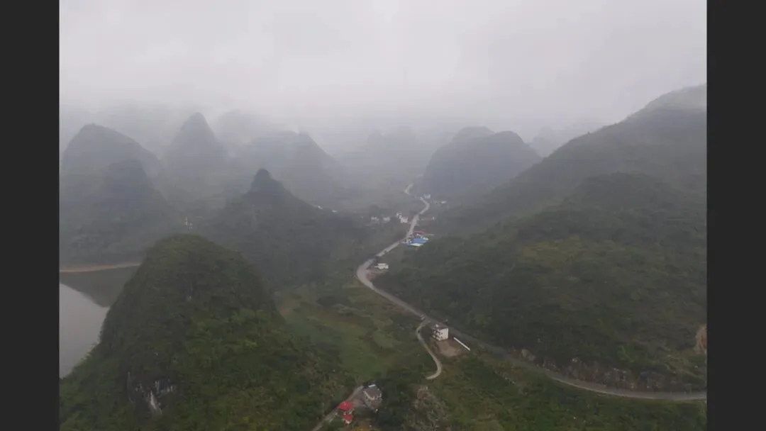
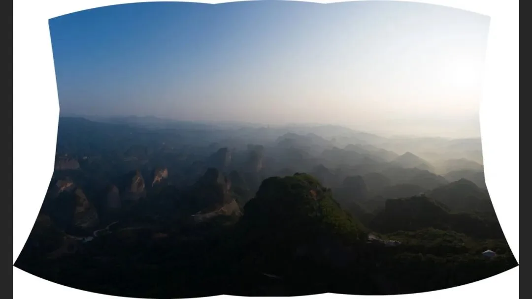
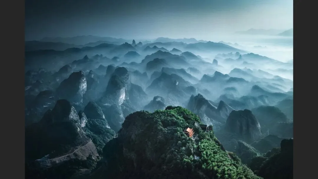
He verifies it live on one of his own Guilin landscapes (at 3:30 in the video): keeping the contrast identical, he moves the histogram from the left side to the right to make a bright-tone version — and the mountain layers, fog transitions and tree detail visibly lose substance. Same photo, same contrast, yet the dark version simply looks richer. That is why so many painters and photographers favor dark tones — there is real science behind it (the bright version follows at 4:10).
02 One Dark Tone, Many Moods
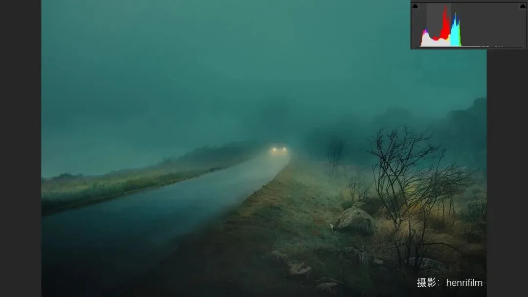
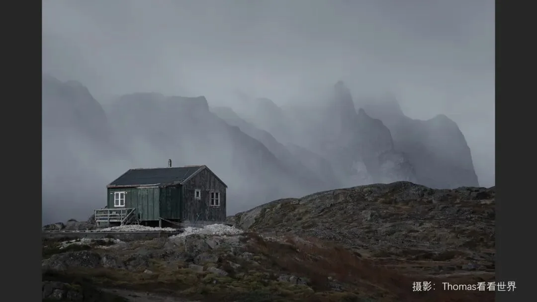
The second point: dark tones can carry an enormous range of moods. Desolation, loneliness, quiet gentleness, mystery — even horror. Think of it this way: has any horror film ever unfolded in bright, even lighting? (The section card appears at 4:24 in the video.)

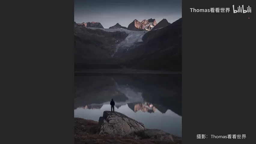
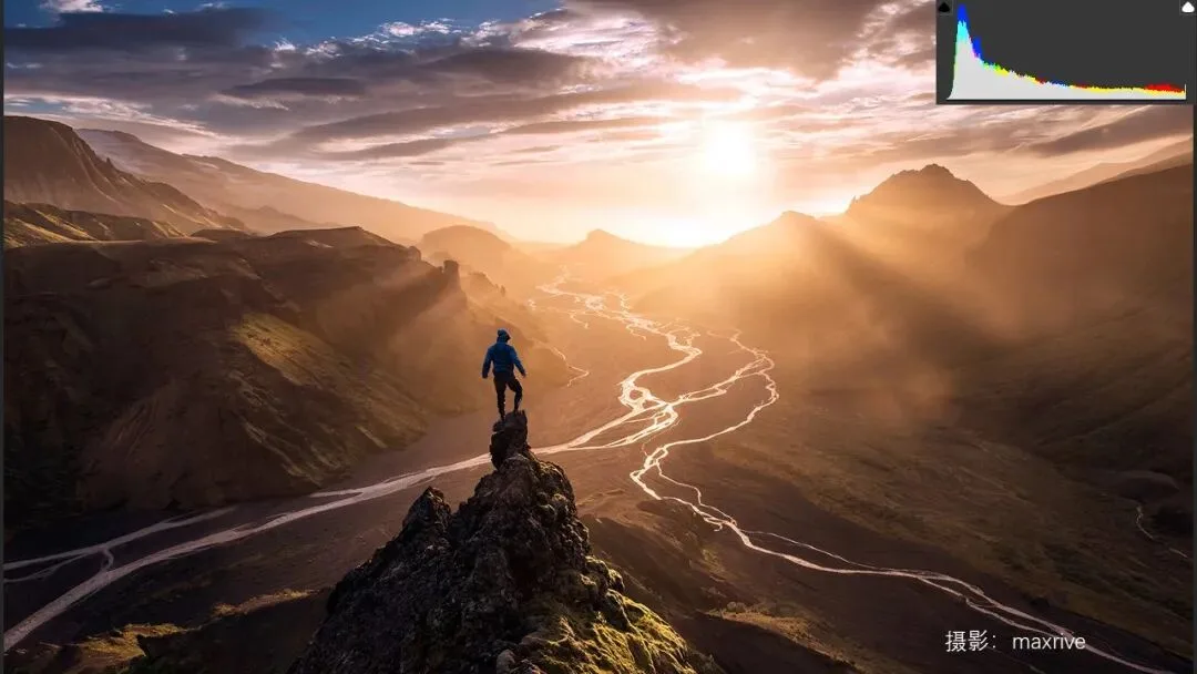
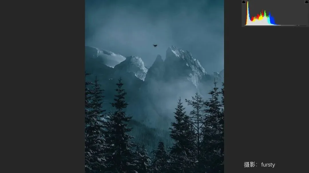
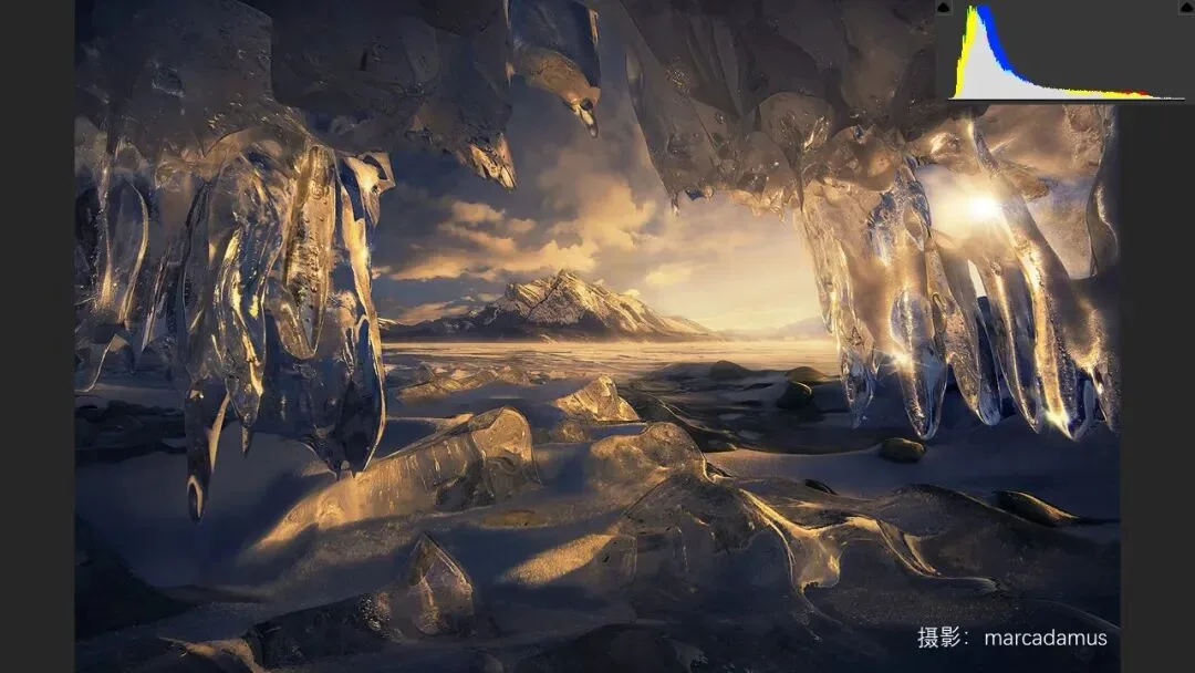
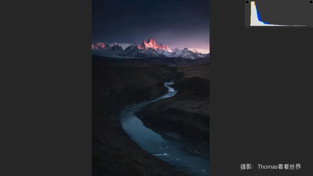
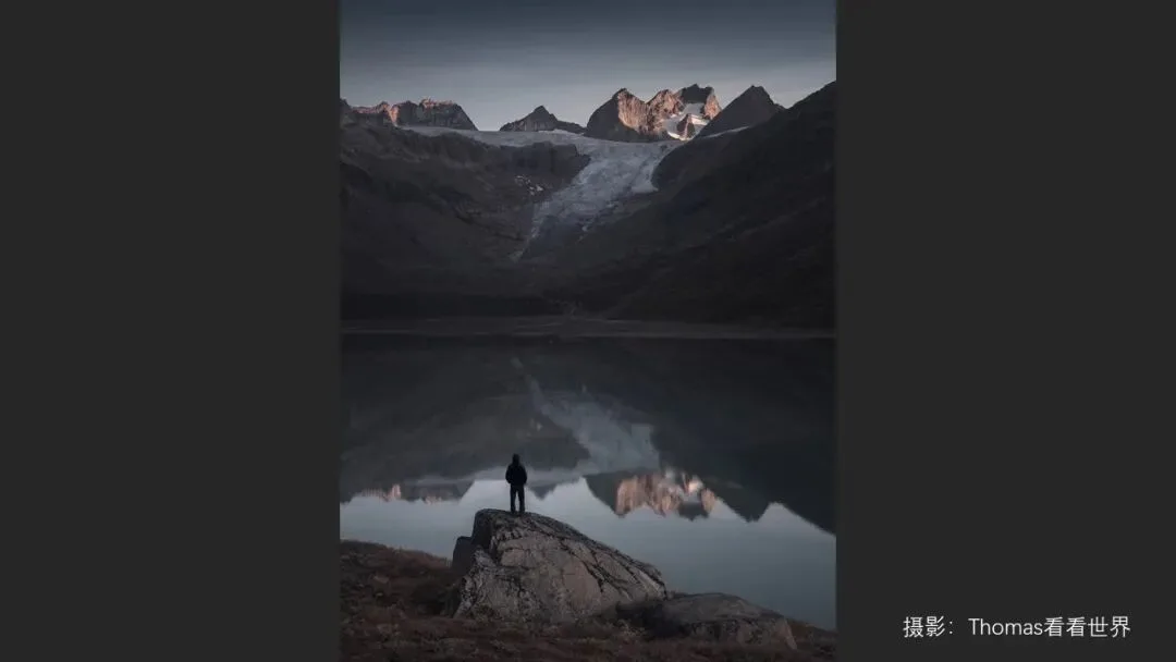
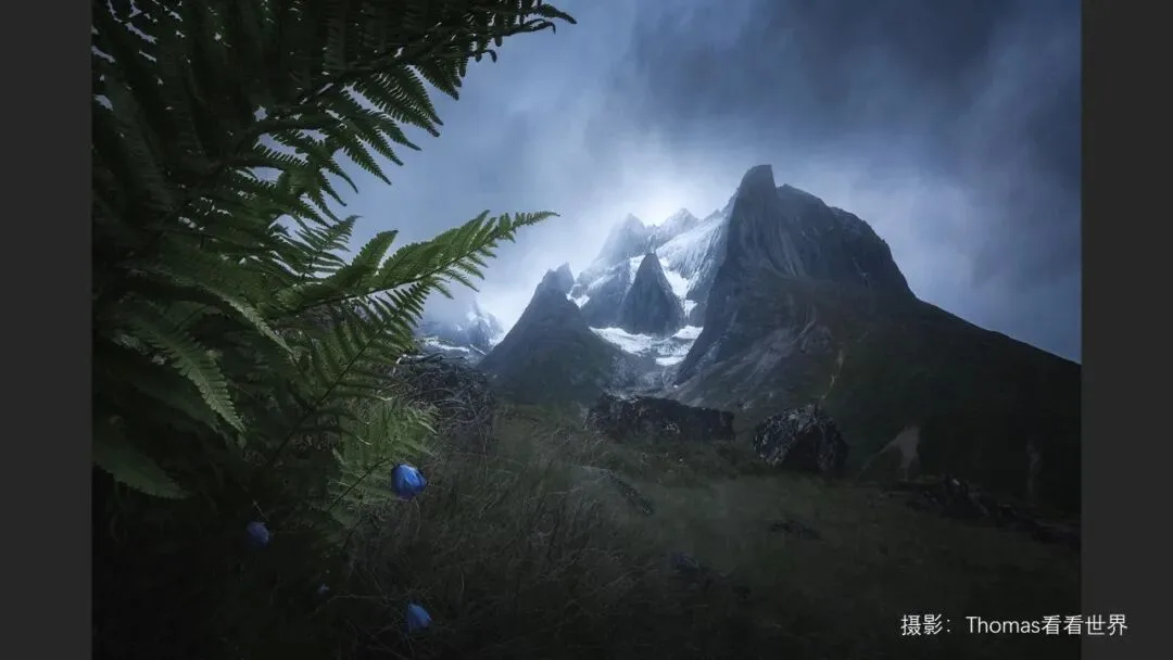
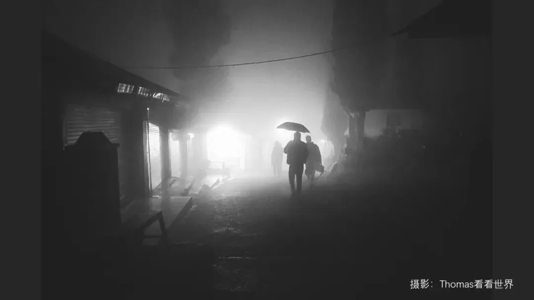
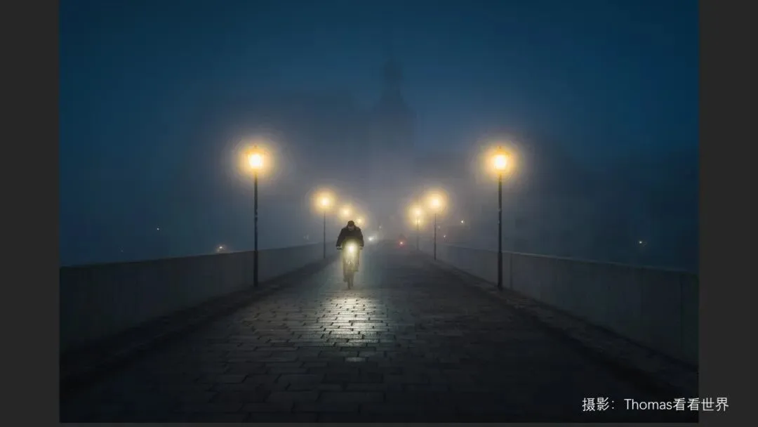
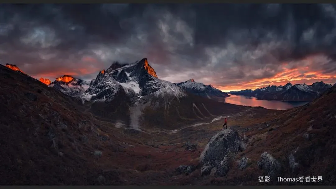
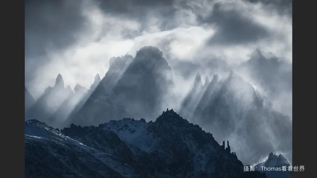
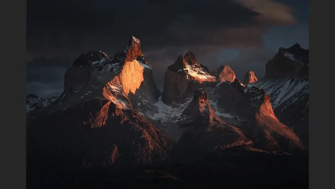
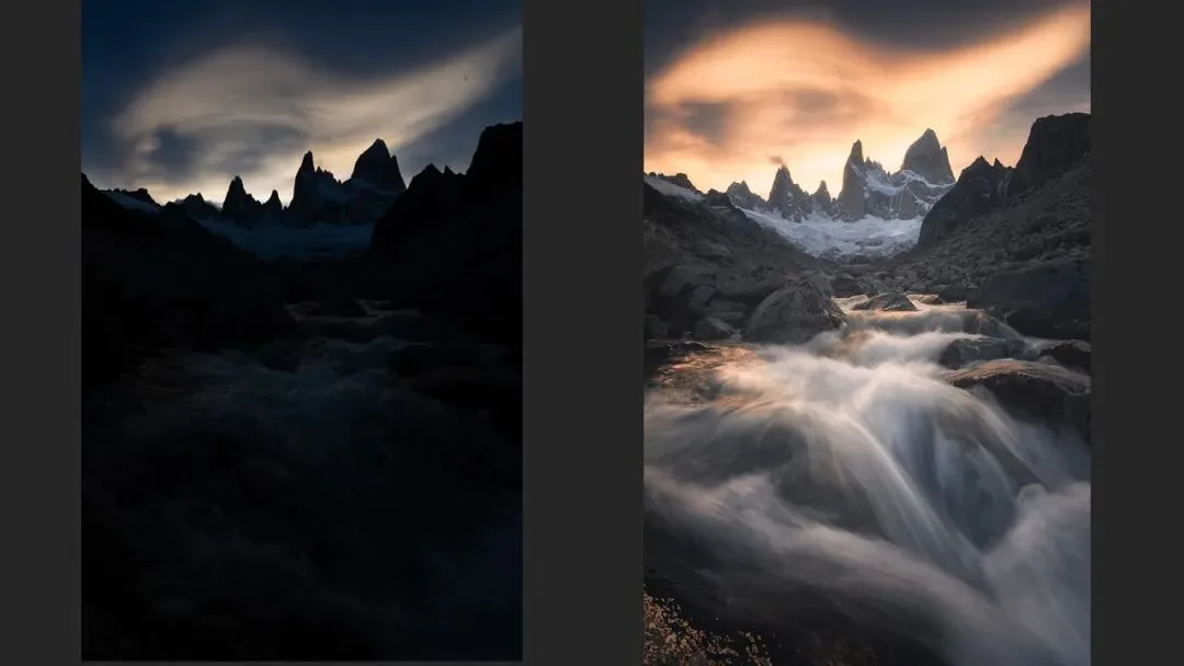
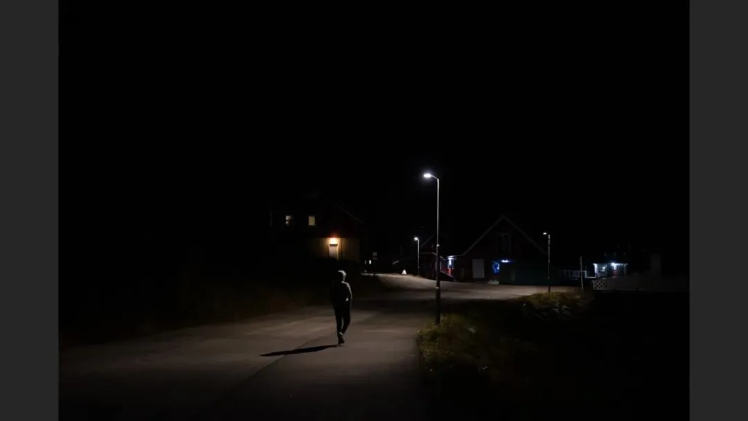
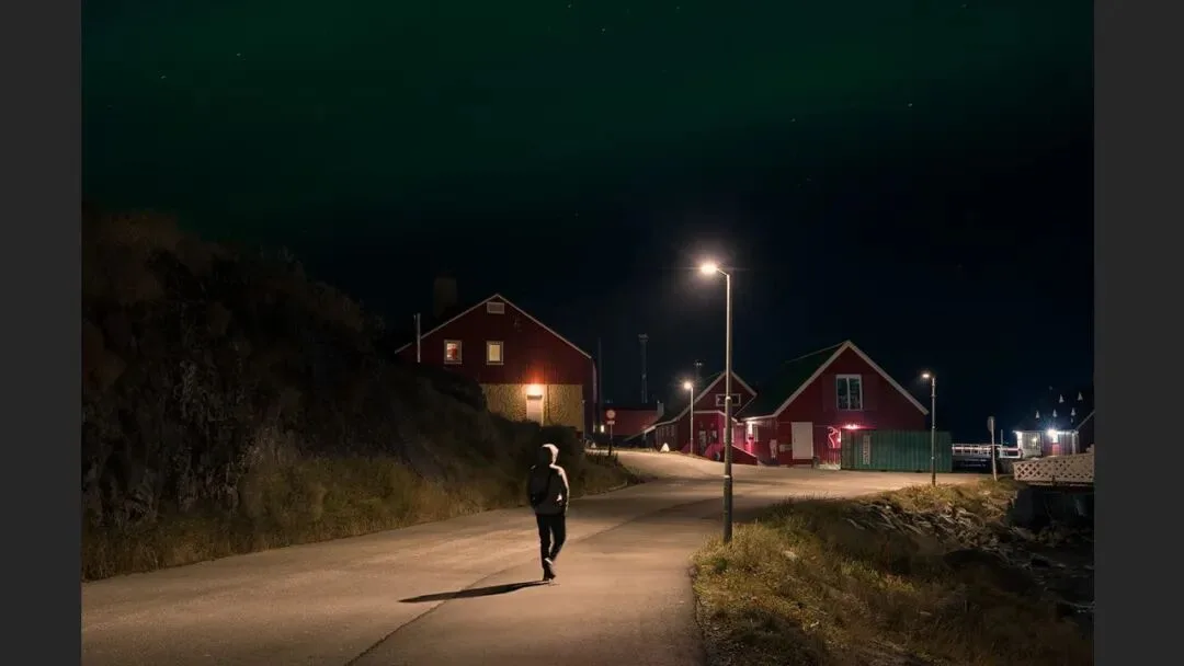
He walks through several of his own images: a lone figure seated by a lake conveys serenity (at 4:48 in the video); a silhouetted umbrella under a rainy doorway feels subdued and restrained (at 4:57); a person walking a dog home under street lamps glows with warmth; snow peaks under darkened burning clouds turn majestic. Add in the magical-school landscapes of Marc Adamus and Max Rive — all dark tones, yet utterly different emotions. Somber, oppressive, mysterious, magical, grand: dark tones carry them all.
03 Hiding Clutter, Clearing Hierarchy
The third point is the most practical: dark tones hide clutter and make the hierarchy obvious. Studio portraiture shows this most directly — moody portraits are shot against a dark, sometimes pure-black backdrop that swallows every distraction, and whatever the light touches becomes the subject, full of atmosphere (the section card appears at 5:44 in the video).

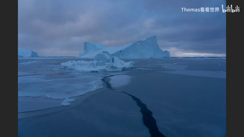
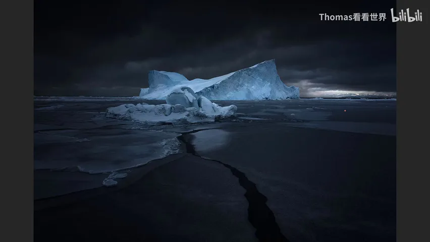
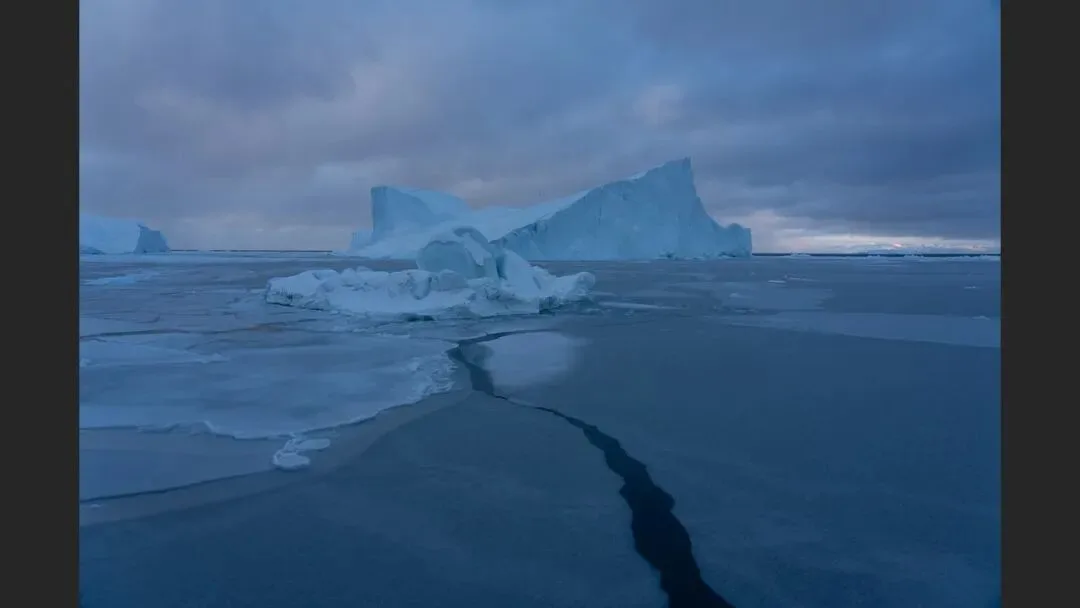
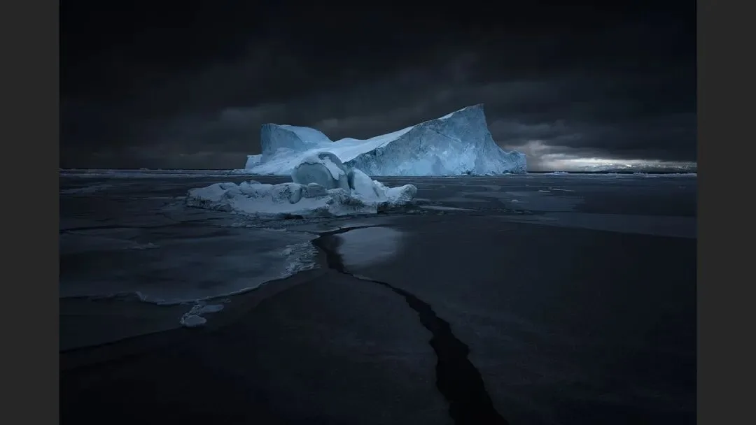
The same logic applies to landscapes. A raw frame from an Icelandic glacier lagoon is thoroughly ordinary (at 6:48 in the video); after a dark-tone treatment, what should be dark sinks and what should be bright rises, the iceberg emerges from the gray water, and the image turns clean, mysterious and pleasing (the dark version at 6:58).
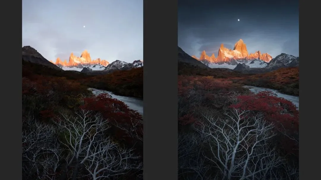
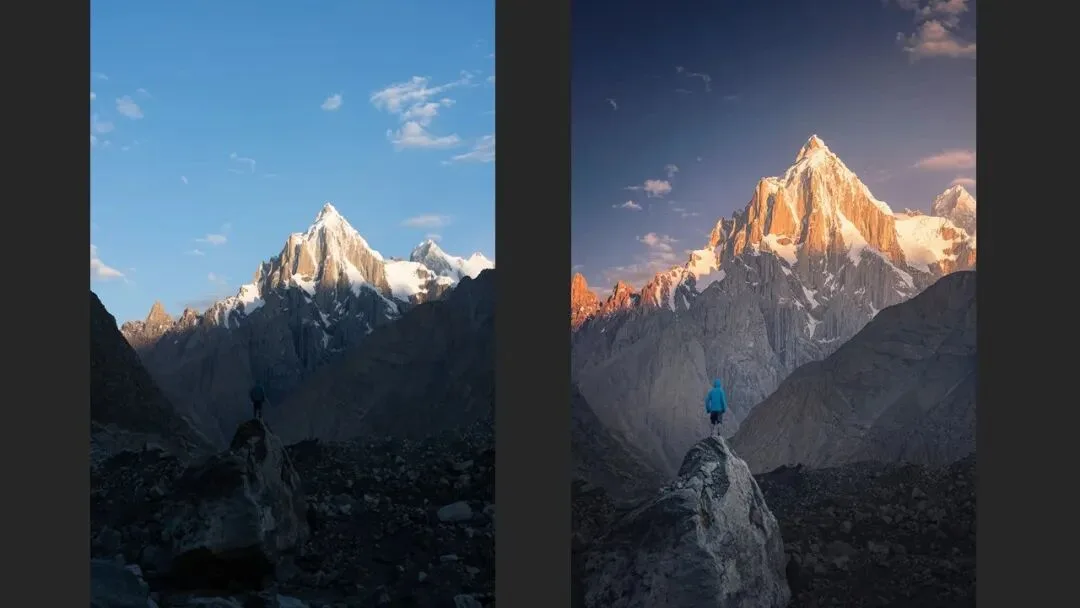
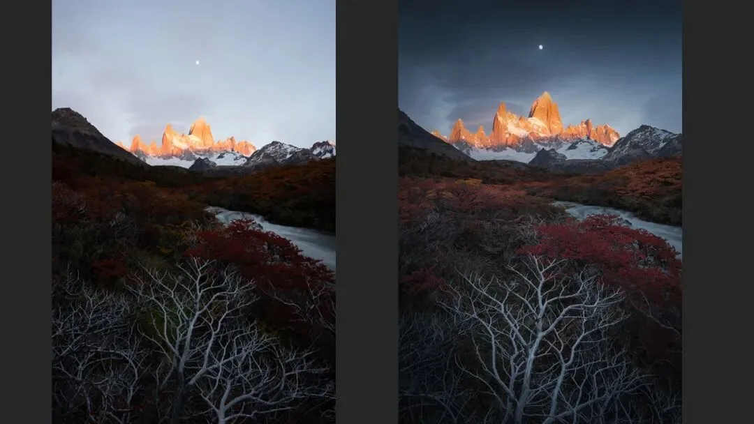
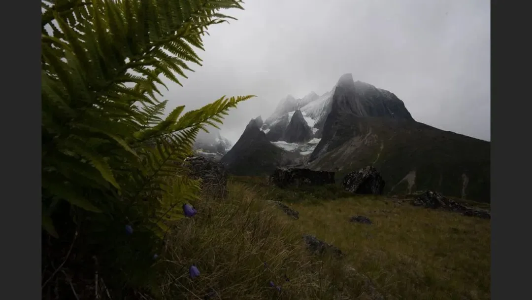
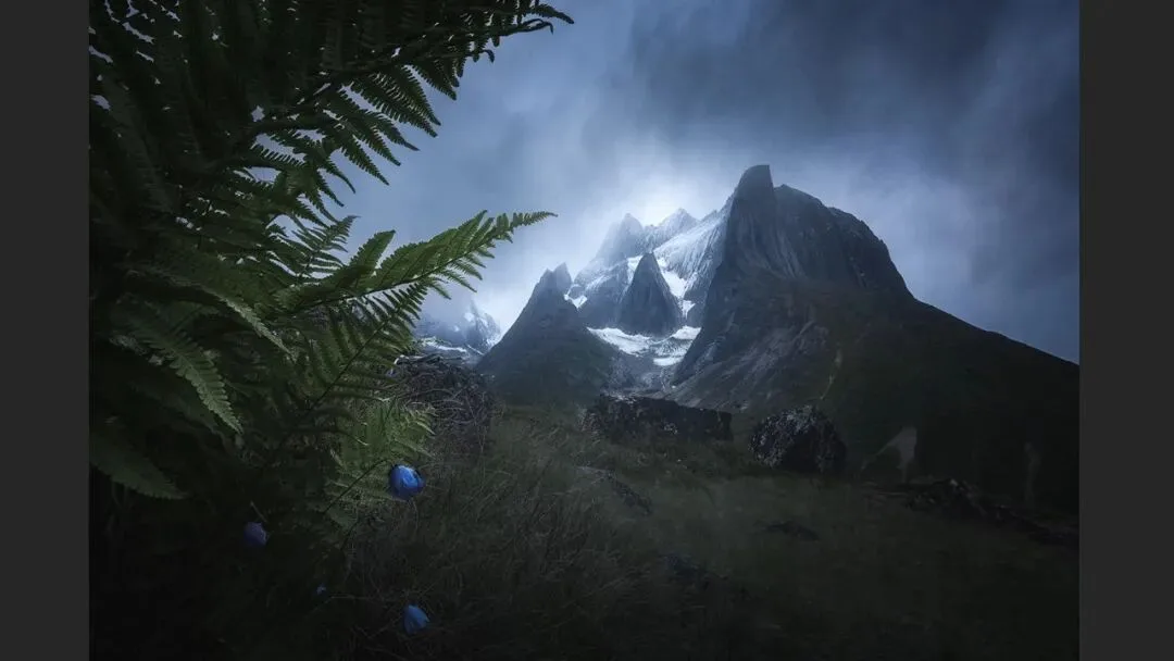
Cleverer still, darkening can replace erasing. When clouds are too loud you could clone-stamp them into a clean sky, but darkening them is far more natural; when bushes on both sides steal the eye, you need not remove them — darkening alone cuts their visual pull; and darkening the sky makes the sunlit mountain stand out on its own (a before/after pair at 7:32 and 7:40 in the video). The difference between light and dark becomes the difference between subject and background.
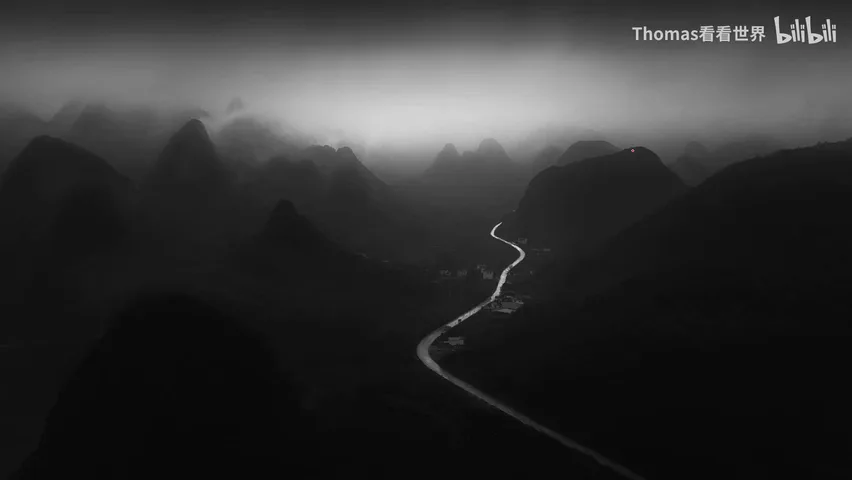
1. Dark tone is not dead black — human eyes are more sensitive to shadow differences, so at equal contrast a dark-tone photo simply looks richer in levels; 2. Dark tones carry an enormous emotional range — serenity, mystery, oppression, warmth, magic and grandeur all work in low key; 3. Darkening is the most natural way to erase — hide clutter, spotlight the lit subject, and the hierarchy falls into place. Next time you grade a photo, try pushing it toward low key first.
HD video:
https://www.bilibili.com/video/BV1RK411n7TF/
Tutorial slides (PPT)








Related tutorials:
"How to Post-Process Dark, Moody-Magic Style Photos? Done in a Few Steps in Camera Raw!"
"The 5 Landscape Photographers Most Worth Following on 500px"
"Lost Without Red Clouds? Check Out These 3 Landscape Photographers~"
"Stunning Tones! These 4 Instagram Photographers Use Teal Like Magic!"
"The Best Style Is Taking It to the Extreme — 4 Niche Landscape Photographers Worth Following"
"Only Taking Tourist Snapshots on Trips? 4 Imaginative Photographers Recommended"