Photography Tutorial · 2021-01-10
How to Create a Dreamy Teal Tone: Perfect for Overcast and Rainy Days
Thomas Chu Photo
On overcast, rainy, or cloudy days, colors tend to look flat. In post, we can add a color grade so the image no longer feels monotonous.
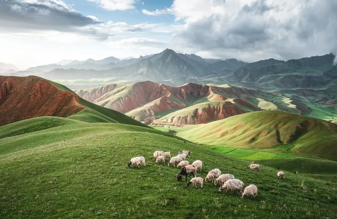
This week's tutorial uses a photo shot at Zhuo'er Mountain in Qinghai to share the mindset and process behind a dreamy teal grade — done entirely in ACR (Lightroom)!
Video Tutorial
▶ Watch the video tutorial on Bilibili
The video above is Thomas's dreamy teal-grade tutorial: a grassland and sheep photo taken in the Qilian Mountains, transformed from a flat original into a clean, airy, slightly ethereal teal image. This grade suits plain weather best — overcast, rainy and cloudy days alike. This article is the full illustrated write-up with a screenshot for every step, and everything works the same in Lightroom.
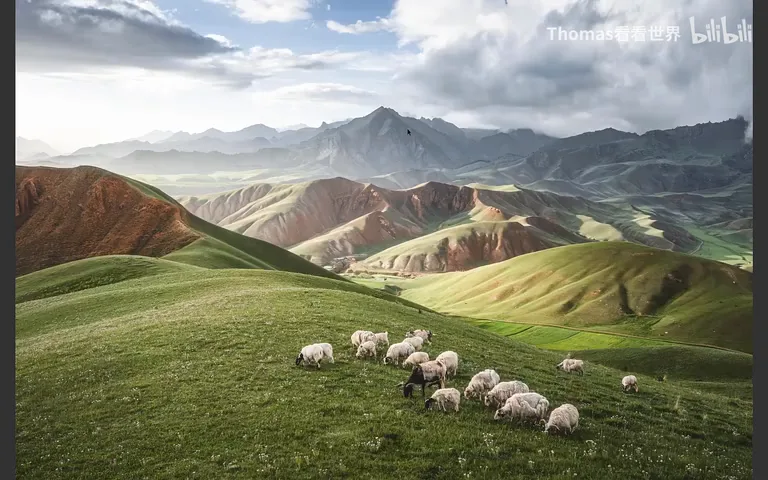
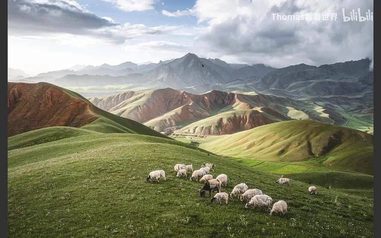
First, the comparison. The original above the fold: yellowish grass, a plain sky. The graded result: sky and far mountains shift into teal-blue, the grassland settles into yellow-green, and the frame stops being a record and becomes a mood.
01 The crop: a fix for a plain sky
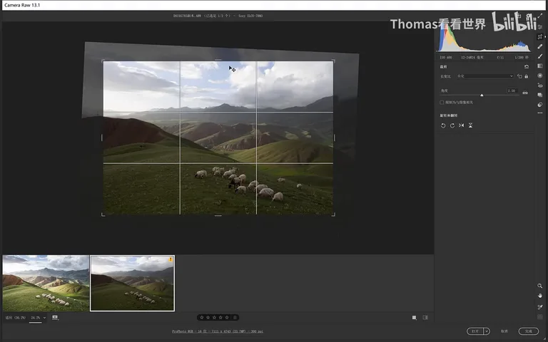
Once the file is open in Camera Raw, Thomas's first move is not color but composition: straighten the horizon slightly (around 0:56), then re-crop the frame.
The cropping logic follows the weather: when the sky is plain it does not deserve much room, so trim the foreground as well and let the sheep grow larger and more eye-catching in the frame (1:01-1:13). He trims the sky a little further with one more cut, and the composition improves dramatically (around 1:17).
02 Curves and the Basic panel: a bright foundation
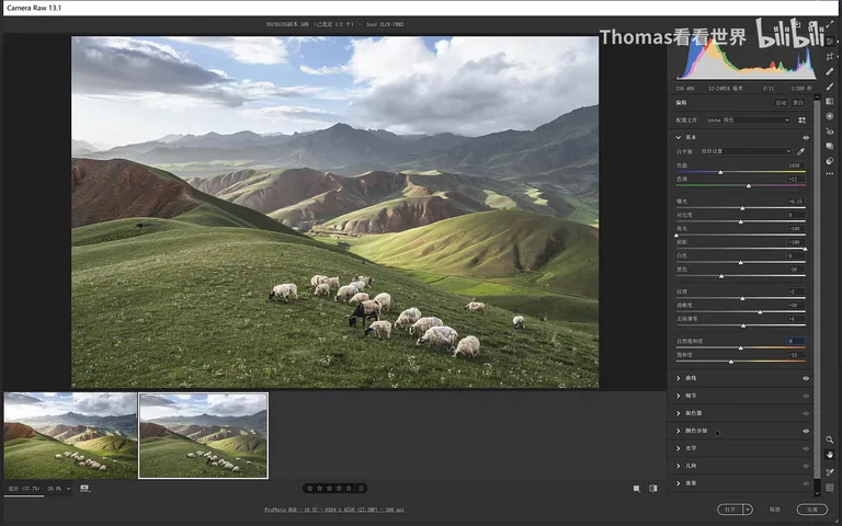
The final image's histogram has a distinctive signature: highlights pushed slightly bright, even a touch clipped, while the shadows hold no crushed black at all — that is a curves move (1:27-1:48). Lift the leftmost point of the curve, and pure black disappears from the frame entirely (around 2:27).
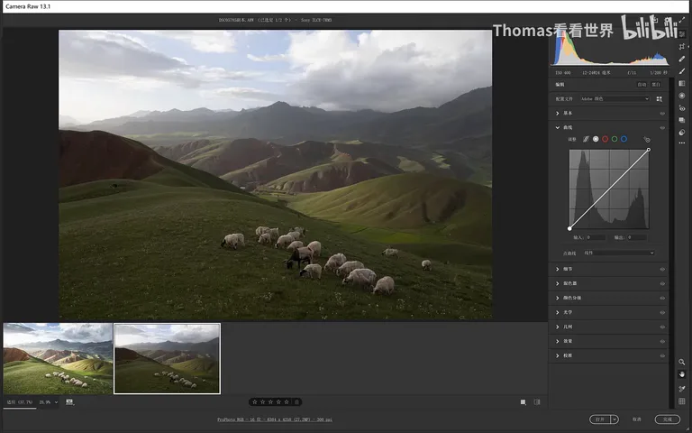
Lifting blacks turns the image flat, so an S-curve goes in next to restore contrast (around 2:50). Back in the Basic panel: highlights drop straight to -100 to recover detail in the bright zones (around 3:03); shadows come up strongly, and suddenly the foreground feels sunlit (3:07-3:20); exposure gains another +0.15 (around 3:26).
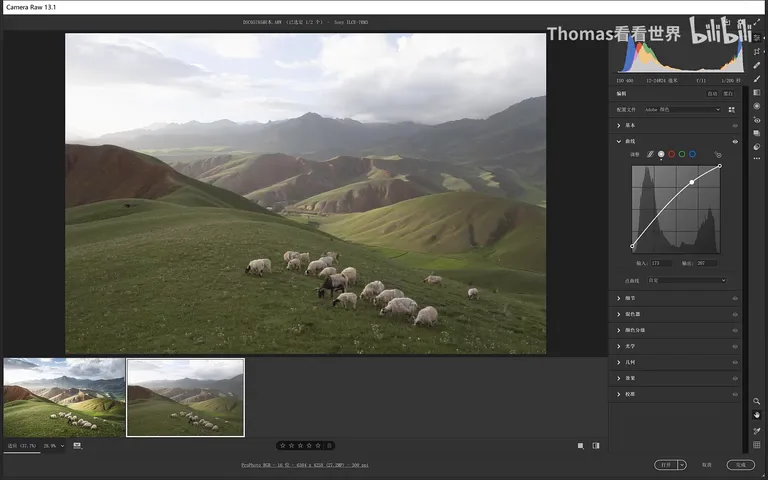
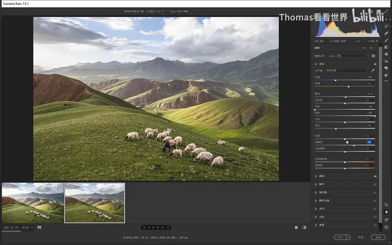
Overall brightness alone is not enough — the bright areas must glow while the dark ones still anchor the frame: the snowy peaks, the dark sheep, the grass. So the blacks slider comes back down, pinning the deepest values in place (3:41-3:56). At this point the foundation — no crushed black, overall bright and airy — is done.
Texture lives in the sliders below: Clarity at around +30 makes the photo visibly crisper, but too much turns it dirty, so a moderate value is the rule (4:19-4:31); Texture handles the finest detail and needs only a touch (around 4:33); and Dehaze rises just a whisker — this frame depends on its misty distance, so the sense of air must survive (4:49-4:57).
03 Color grading: teal at hue 210
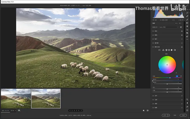
Now for the grade itself. The tool is Color Grading — Split Toning in older Camera Raw versions; Thomas switches from the three-wheel layout to just shadows and highlights, adding teal only there (5:13-5:31). One step of groundwork comes first: pull overall saturation down a little, so the fading original color blends naturally with the teal to come (4:59-5:11).
Set the hue around 210, at the border of cyan and blue (around 5:36), and add only a whisper of saturation — somewhere between 10 and 20 is ideal; any more and the teal overpowers the original colors into something ugly (5:43-5:53). The highlights get the same treatment with the wheel. Once this is done the frame already carries that dreamy, harmonious teal (6:05-6:09).
04 Blue primary and HSL: restoring vibrance
After the teal and the earlier desaturation, the image needs its vibrance back. The tool is the blue primary saturation in the Calibration panel: unlike the Basic panel's saturation or vibrance sliders, which instantly feel artificial when pushed, the blue primary lifts color in a way that stays comfortable and natural — a landscape staple (6:17-6:48).
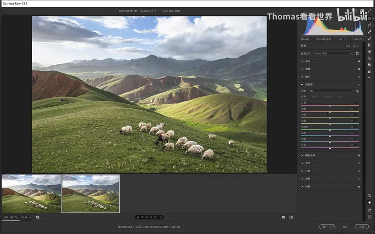
Fine-tuning goes to the HSL panel: shift orange slightly toward red so the rocks redden against the grassland in a red-green contrast (around 7:04); nudge yellow toward orange and green toward teal so the two grass tones separate and the grassland gains layers (7:18-7:28); drop green saturation a touch (around 7:34). For luminance, raise yellow — the sunlit patches brighten — but luminance costs vividness, so yellow saturation compensates (7:39-7:59), and green luminance lifts a whisker too (around 8:01).
05 Local filters: making light, building texture
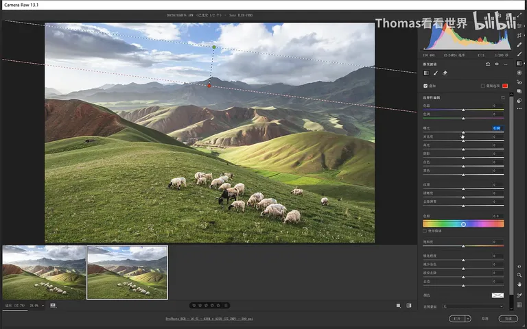
With the global pass done, go local. First a graduated filter across the sky, easing the exposure of the uppermost sky down a touch (8:13-8:20); another gradient on the ground, and the frame instantly gains depth and layering (8:20-8:25).
Next, manufacture the light. Pull a radial filter from the direction the light comes from: raise exposure just slightly — too much clips easily; the key is lifting shadows, because lit areas never hold deep shadows, so raising shadows is raising the sensation of light; then warm the temperature a touch for a little yellow (8:33-8:59). Then pull a bigger one, and a bigger one still — stacked layer upon layer, the light effect becomes utterly natural (9:01-9:11). Finally brush a touch of warm tone over the sheep so they glow (around 9:14).
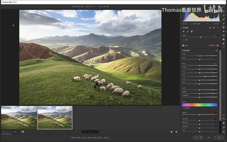
The distant ridgeline texture matters greatly in this frame, and a radial filter strengthens it: add Dehaze inside the texture zone — the area turns darker and heavier, so immediately lift the highlights and push the whites further, reclaiming the contrast the Dehaze just pressed down (9:33-10:15). The resulting texture is superb; repeat with a weaker second radial elsewhere, refining the light and texture of the frame in fine detail (10:16-10:53).
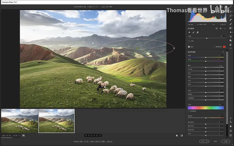
1. The foundation of the dreamy teal is brightness: lift the curve's black point to kill crushed blacks, restore contrast with an S-curve, then highlights -100, shadows up, exposure +0.15 and blacks pinned — bright but never flat. 2. Grade by subtracting first: lower overall saturation to make room, then add hue-210 teal to shadows and highlights in Color Grading, saturation only 10-20. 3. Restore vibrance with the Calibration panel's blue primary — more natural than pushing vibrance — then fine-tune orange, yellow and green shifts and luminance in HSL. 4. Use a local gradient to deepen the sky for layering, stacked radial filters (shadows up, temperature warmer) to conjure natural light, and a radial with Dehaze plus lifted highlights and whites to build out the distant texture.