Photography Tutorial · 2018-03-16
Can You Imagine Editing It Like This? Thomas's Photo-Editing Mini-Contest, Episode 2 Exhibition
Thomas Chu Photo
A substantive article every week, making photography no longer hard to learn
After the "Help Thomas Edit Photos, Episode 2 (Unreleased Italian Dawn Original)" (《帮托马斯修图活动第二期(未发布意大利早霞原图)》) activity was published last month, Thomas received nearly a thousand submissions. Thank you all for your support and participation.
Here Thomas has selected some representative edited works. Can you imagine the same photo being edited into so many different effects?
Let's first review the two original photos from the second contest:
Location: Santa Maddalena, Dolomites, Italy
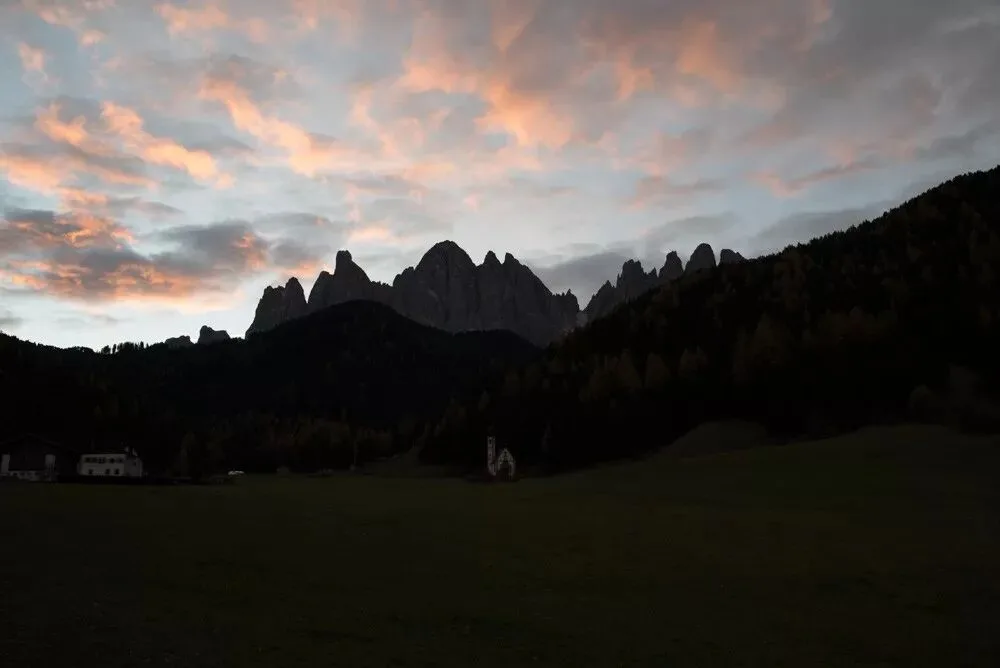
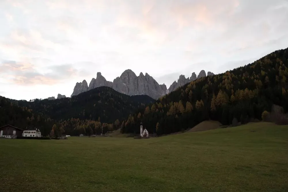
Download address:
https://pan.baidu.com/s/1dtLEZ8
Thomas's Selection Award x2
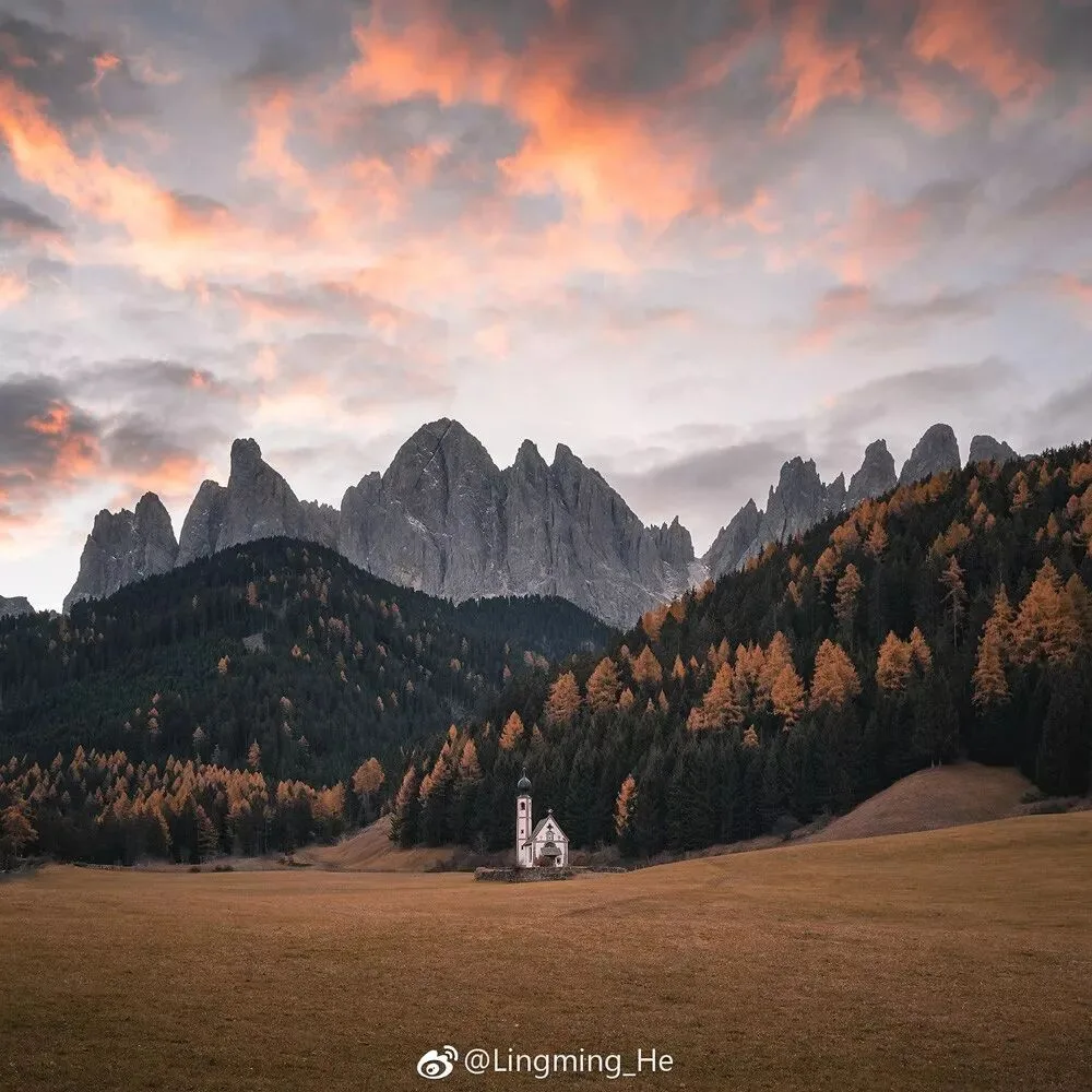
Work by Lingming_He
Thomas's review:
The color grading of this edited work is very delicate and soft, with harmonious and natural color combinations.
The low-saturation, low-luminance orange and green of the ground makes us feel as if we were in an early morning in the Alps in late autumn. The low-saturation blue sky also echoes the overall tone of the image. The orange of the morning glow in the sky only needed a slight boost in saturation to stand out brilliantly from the frame.
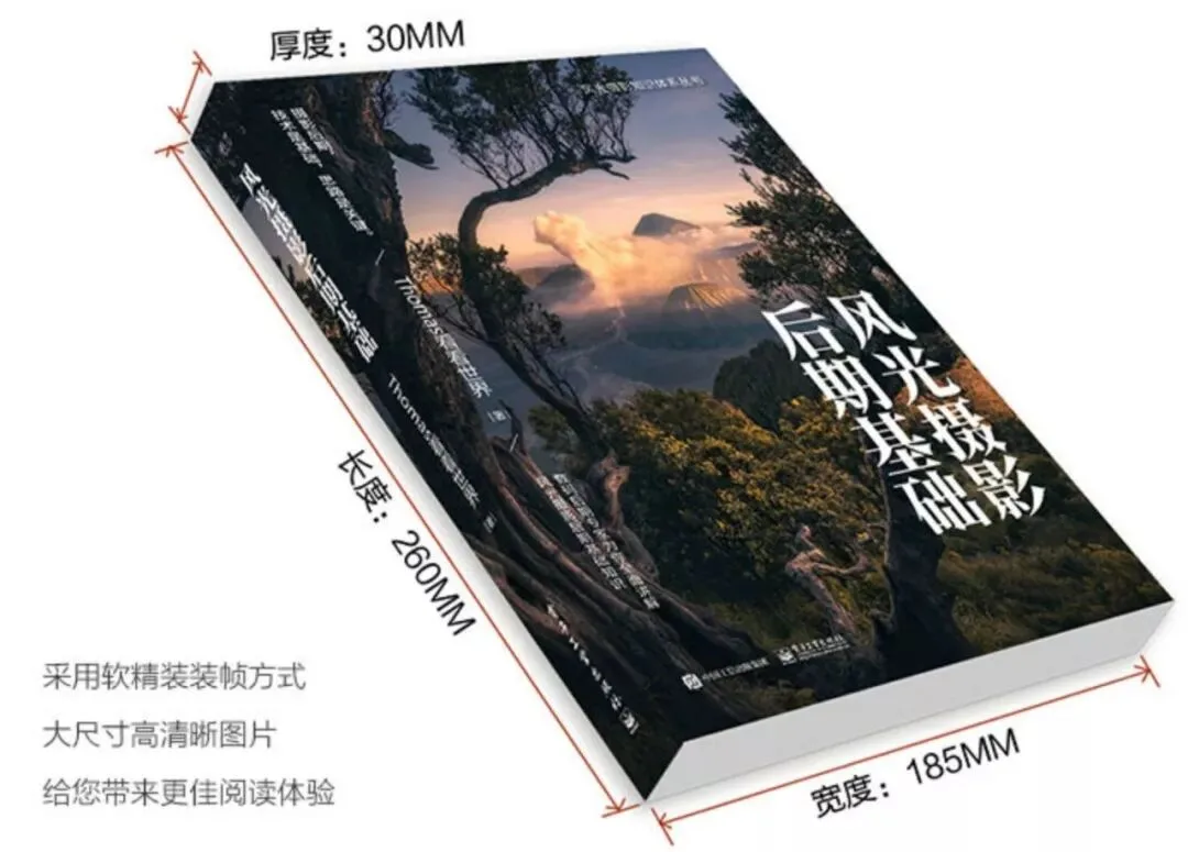
In Thomas's new book "The Fundamentals of Landscape Photography Post-Processing" (《风光摄影后期基础》), he discussed several key principles of color combination: the atmosphere of the dominant tone, not using too many hues, natural hues, color wheel matching, and the relativity of luminance and saturation, and so on.
Analyzing Lingming's work carefully, it conforms to all these characteristics summarized in the book; the photo's colors are very pleasing and rewarding to look at.
The author's final square composition cleverly crops away the redundant mountains and buildings around the frame, firmly drawing the viewer's gaze to the points of interest: the church and the sunset glow.
Work by KoshimaK
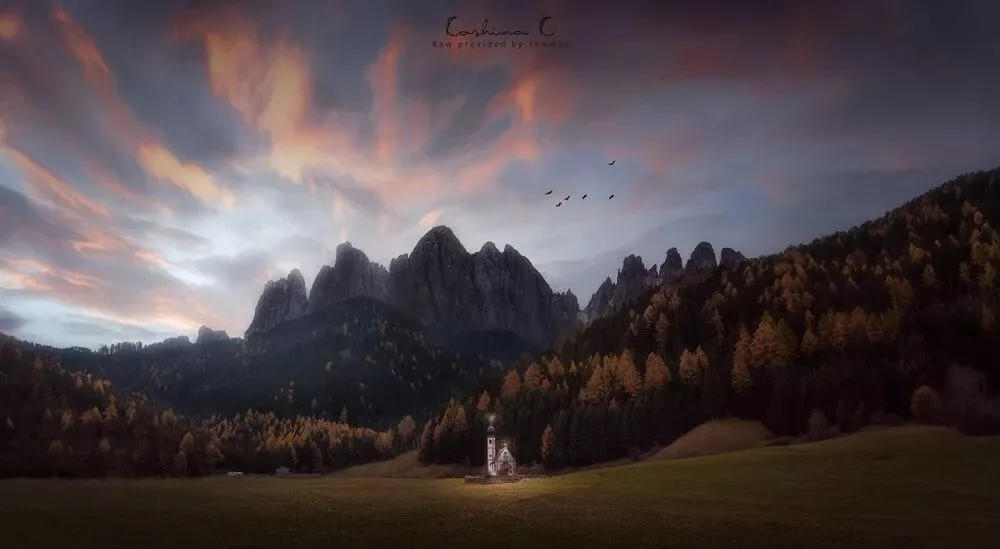
Thomas's review:
The author of this image did a lot of creative post-processing. To judge whether these creative edits are good, we don't look at what techniques the author used or how difficult or flashy those techniques are. Instead, we look at whether these ideas make the subject more prominent, the atmosphere stronger, and the image more impactful.
Creativity that is superfluous and overreaching, no matter how superb the technique, is not good creativity.
The author used the clone stamp to erase all the cluttered buildings in the background, while using the brush to "light up" the church in the middle. Are these two operations good? Of course they are! Because they make the subject of the image more distinct and the atmosphere more prominent.
As for the clouds in the sky, it's clear the author also did some warping and dodging and burning, making the leading-line effect of the clouds more apparent. Very good.
As for whether those birds needed to be added, I think adding them or not is both fine. With them, motion and stillness combine, bringing a bit of life to the darkness. Without them, the image is more serene and the church subject more striking.
In modern landscape photography, as long as the work isn't submitted to nature or documentary categories, the post-processing latitude is quite wide. But that doesn't mean you can composite blindly. Only natural, harmonious creative editing that doesn't overreach is good editing.
Thomas's Selection Award prize: the same Haida ultra-high-quality polarizer Thomas uses!
Other excellent works:
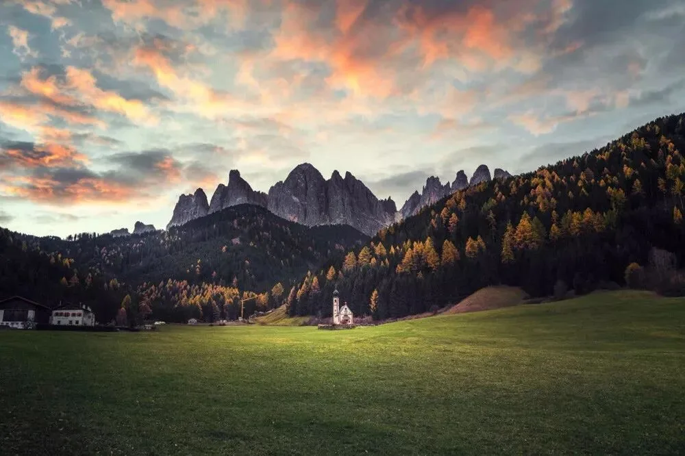
Work by 啃梨
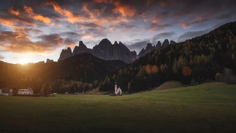
Work by 南京大萝卜
Work by inspiresun
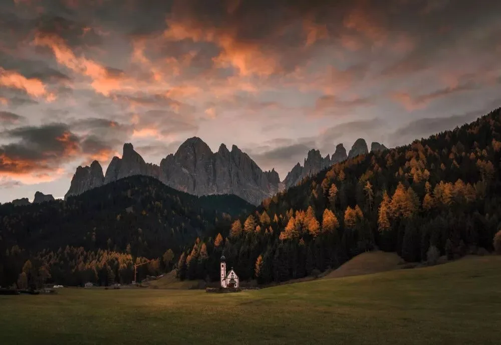
Work by 八月夏虫
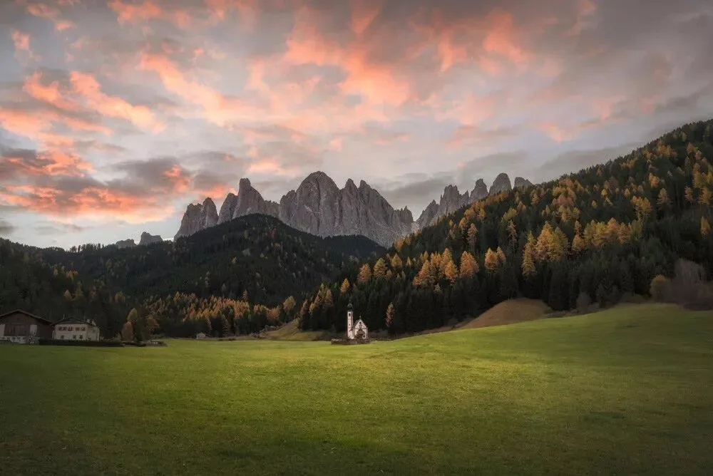
Work by 凡容歌者
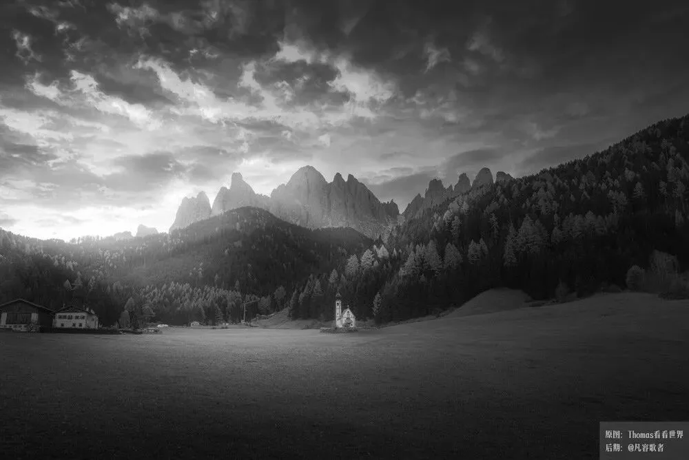
Work by Qin Pengbo
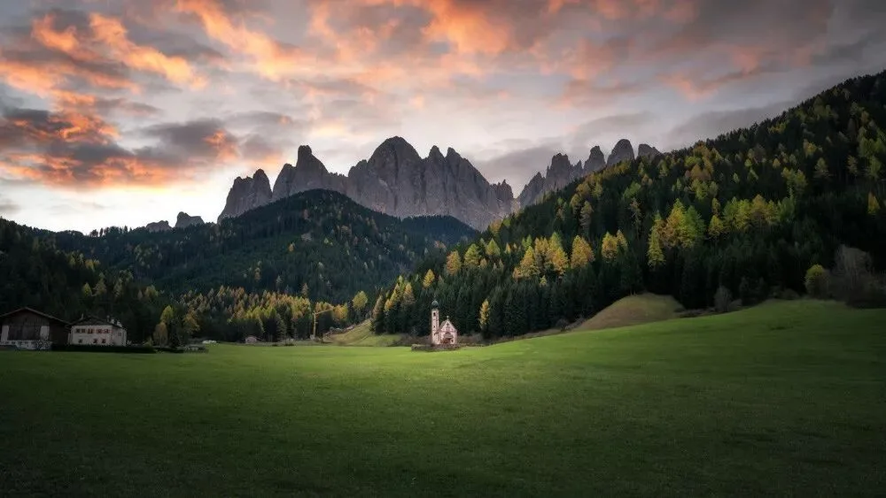
Work by 绘心_Aries
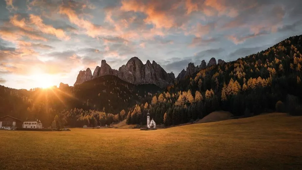
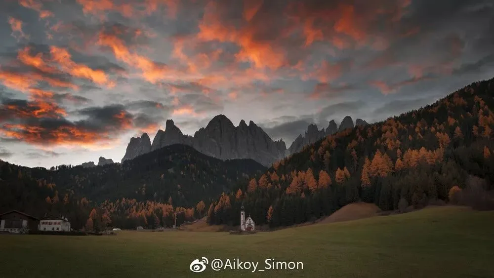
Work by Aikoy_Simon
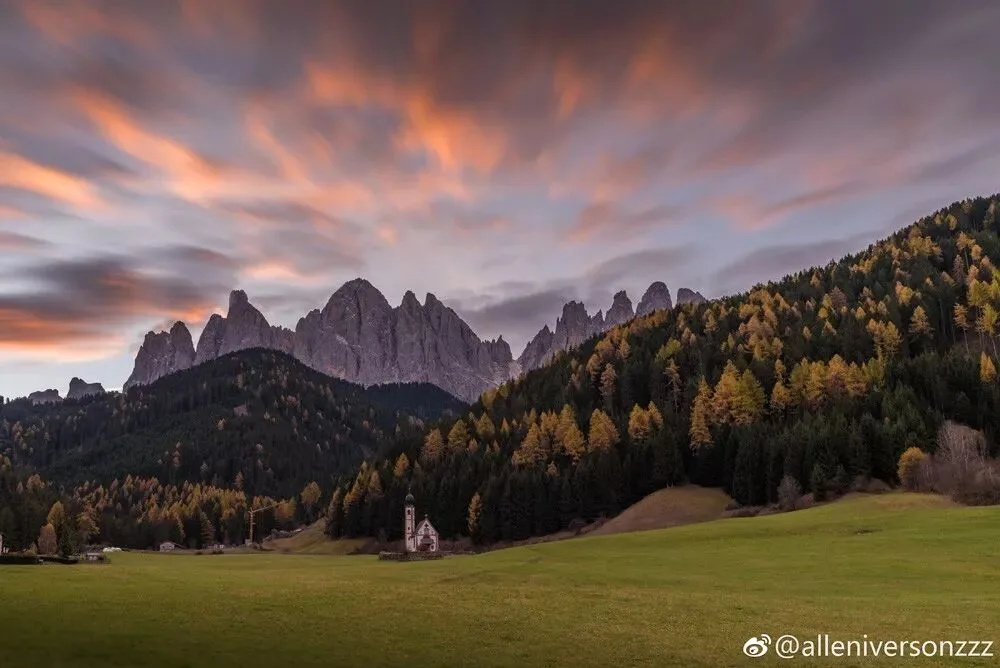
Work by alleniversonzzz
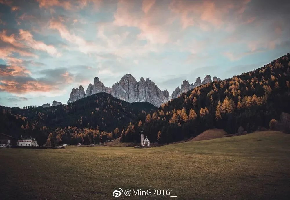
Work by MinG2016
Thank you all for your participation and support. The two Selection Award winners, please leave a message to contact Thomas for prize distribution.
Follow @Thomas Chu Photo,
and learn one photography skill every week.