Photography Tutorial · 2018-07-04
How to Control Color Combinations in Photos - Photo-Editing Mini-Contest, Episode 3 Review
Color is the key to determining whether a photograph is good or bad. How to make color combinations harmonious without being messy is the topic Thomas wants to explore with everyone today.
Let's first review the two originals from the third contest, "Dreamy Night Scene Post-Processing Practice in Cinque Terre, Italy!" (《意大利五渔村梦幻夜景后期练习!}). Location: Cinque Terre, Italy
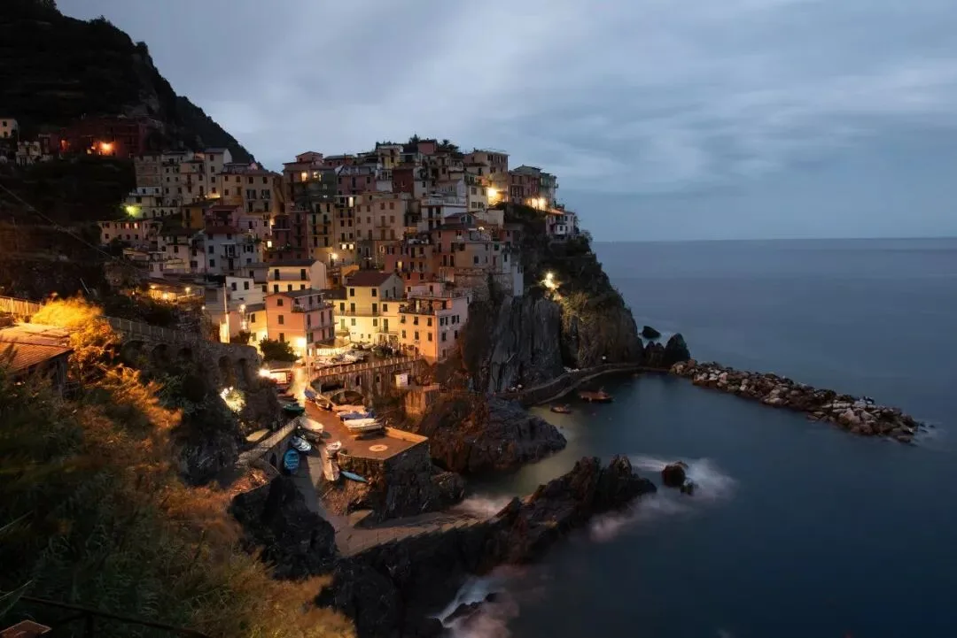
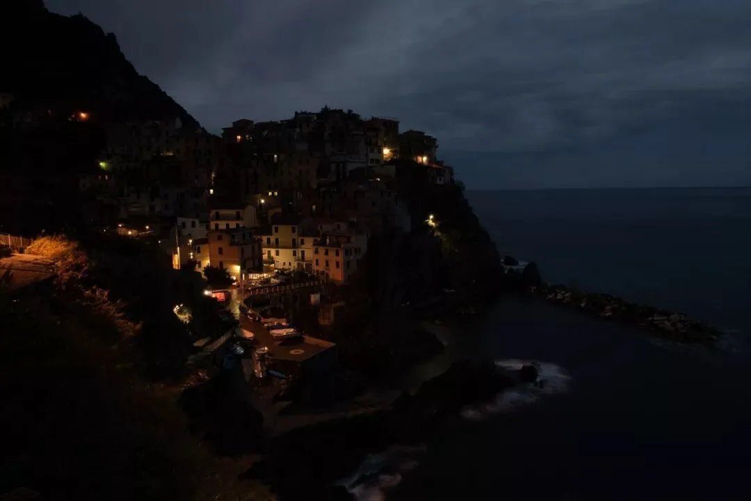
Thomas's Selection Award x2
Work by KeviePan

Thomas's review:
This work shows the author's excellent command of tonality and color control. The whole background uses a unified, dim deep blue that effectively sets off the cold, damp atmosphere of a rainy night. The town is unified into a relatively bright, saturated golden-yellow tone, looking very warm and clean.
As I mentioned in the tutorial "Local Adjustments Are the Core of Post-Processing" (《局部处理是摄影后期的核心》), many excellent works are simultaneously full of contrast and unity. This work is a great example: the overall contrast between light and dark, and cool and warm, is very prominent, full of atmosphere. Yet the warm tones of the town are very unified, without interference from stray yellows, greens, or purples, appearing quite clean.
The author's detail handling is also on point: the somewhat messy branches and leaves in the foreground have been darkened, the stray lights and rocks in the town are well unified, and the color of the sea waves has been edited to look natural.
In my personal opinion, one thing that could be improved is that the softening of the town area is a bit excessive; it should be sharper.
Work by 来来头
Thomas's review:
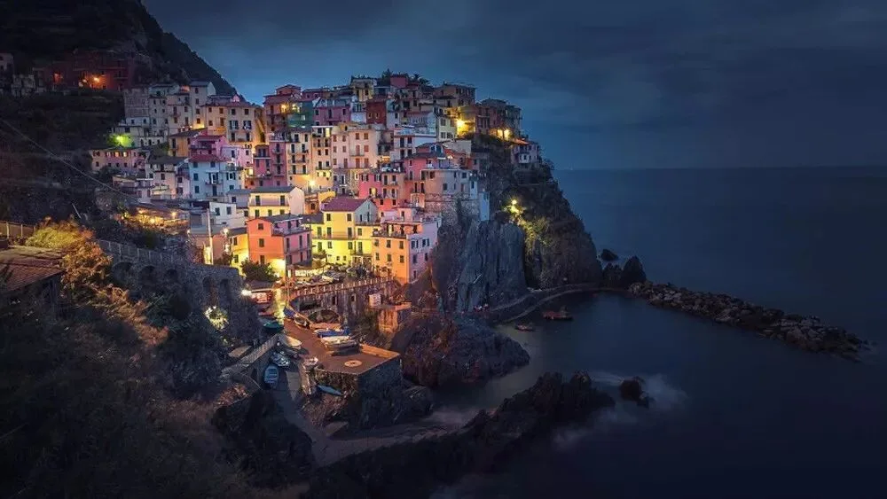
This work is one of the rare submissions that both highlights the colorful buildings of the town and doesn't feel messy, demonstrating the author's excellent local-adjustment thinking and technique.
To have a photo with many colors yet not too messy, three points are important:
1) There must be a dominant tone overall
2) Control the area of the small-proportion colors
3) Keep the colors pure
The image below is a work with diverse colors but somewhat messy. Compared to the overall blue tone of 来来头's work, this photo's dominant tone is a bit chaotic: the large sky is blue, the sea is blue-purple, and the rocks are yellow - not well unified.
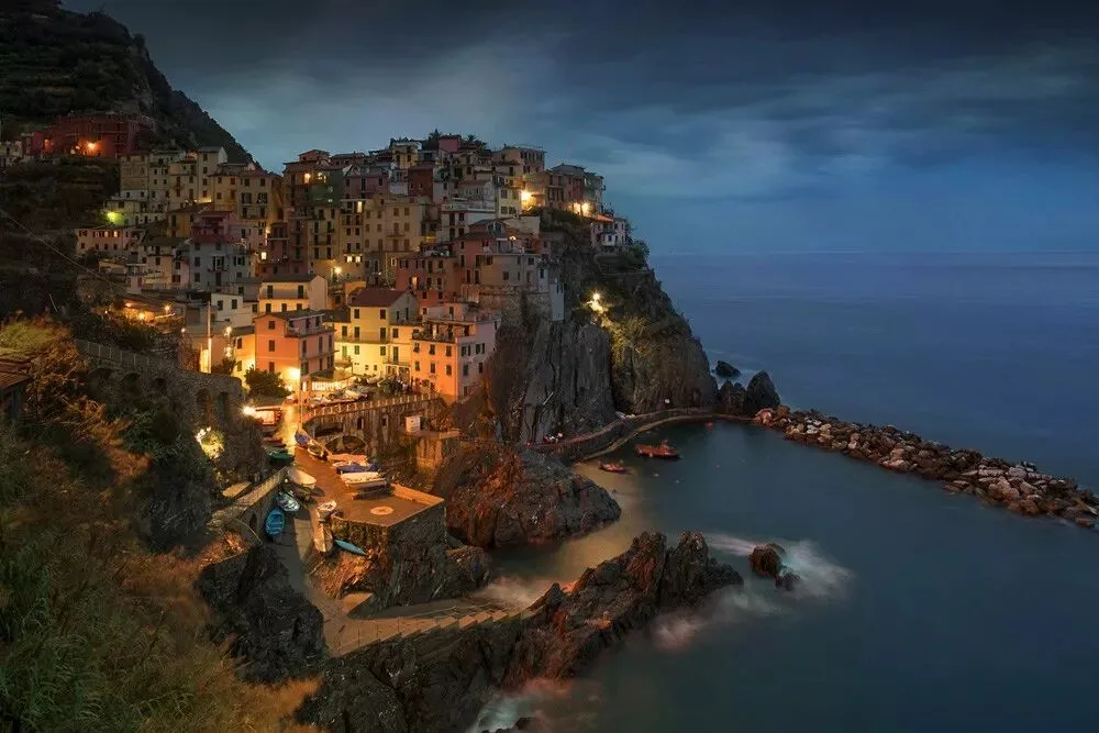
Secondly, the green used as an accent in the frame occupies too large an area and somewhat steals the show, especially the green of the foreground shrubs, which isn't very harmonious.
Finally, the colors of the objects in the frame aren't very pure, appearing somewhat dirty. For example, the rocks were originally a striking yellow, but they carry high-saturation red reflections, which isn't very attractive. In 来来头's work, the saturation of the rocks is handled at a lower level, so the color-mixing effect isn't obvious.
What could be improved in 来来头's work is the boundary between the town and the blue sky, where the luminance transition is still a bit harsh. In addition, the sharpening is a bit excessive, with noticeable white halos on the mountains.
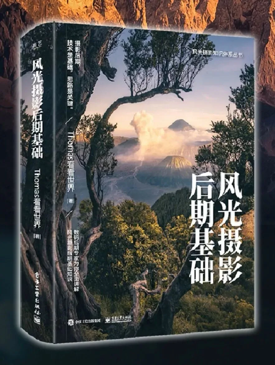
Selection Award prize: Thomas's signed copy of "The Fundamentals of Landscape Photography Post-Processing" (《风光摄影后期基础》)
Other excellent works (excerpts):
(There are many excellent works; only one representative is chosen for each style.)
Work by 刘小豪
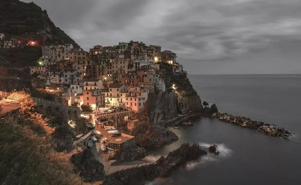
Work by 粘锅
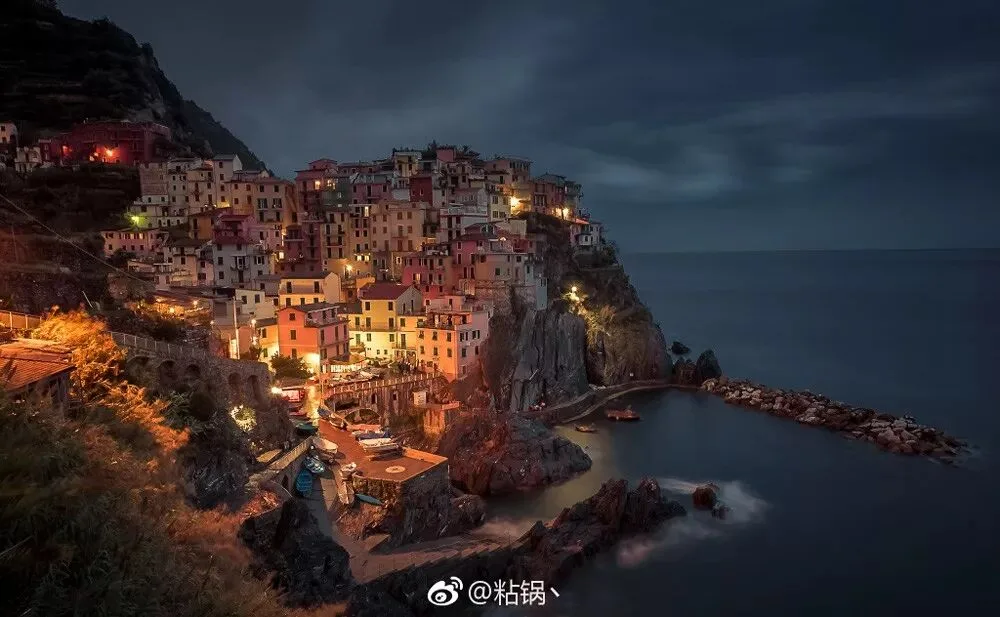
Work by 海底
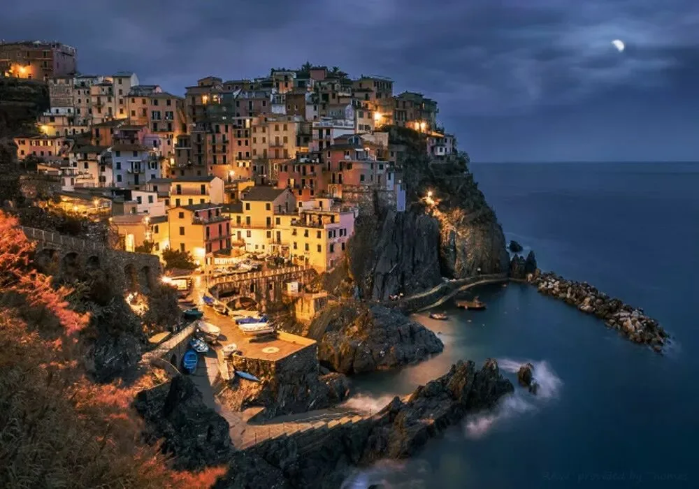
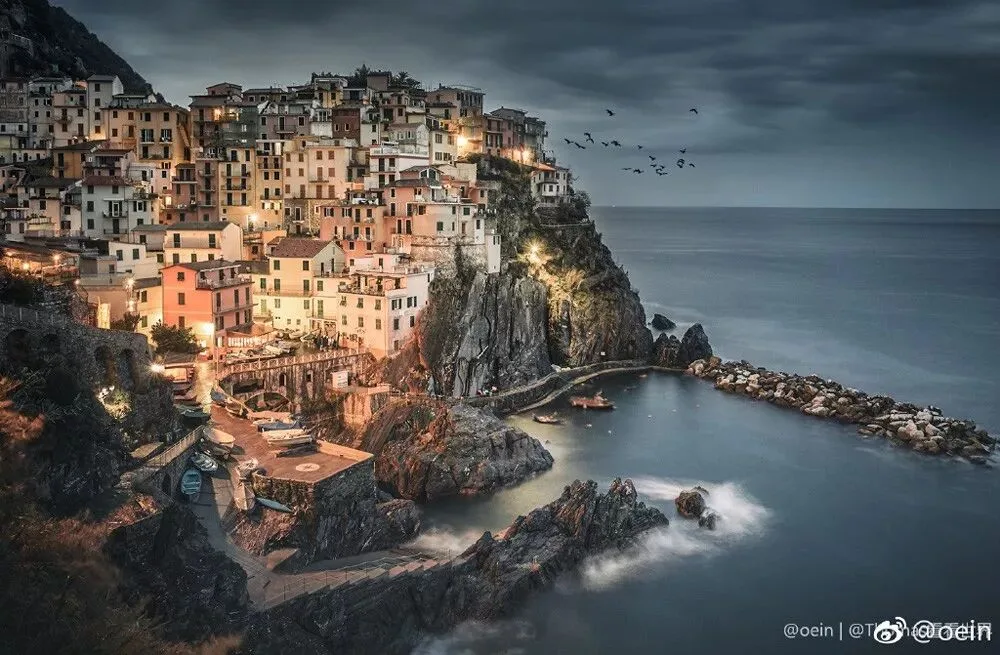
Work by oein
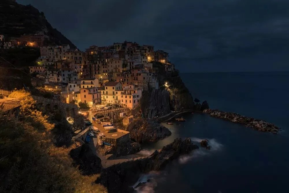
Work by EdwardChan
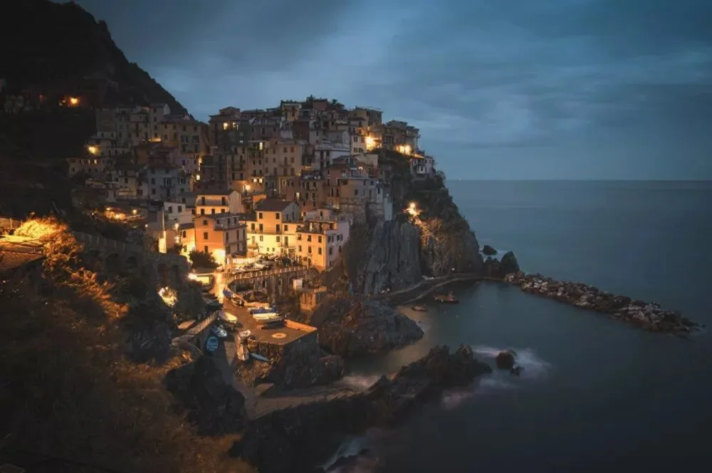
Work by Ealam
Thank you all for your participation and support.
The two Selection Award winners, please leave a message to contact Thomas for prize distribution.
Follow @Thomas Chu Photo,
and learn one photography skill every week.
Welcome to purchase Thomas's best-selling book "The Fundamentals of Landscape Photography Post-Processing" (《风光摄影后期基础》)
Click "Read the Original" to study Thomas's dreamy landscape video course series