Photography Tutorial · 2020-05-24
Do You Really Understand Exposure vs Highlights vs Whites in Post?
Thomas Chu Photo
In the article 'Beautify Your Photos with Ease — Understanding the Tone & Contrast Controls in Lightroom's Basic Panel', Thomas briefly introduced the general usage of the Exposure, Contrast, Highlights, Shadows, Whites and Blacks sliders.
But the algorithms behind these sliders have been iterated by Adobe many times and are not as simple as you might think. Can you answer the following questions?
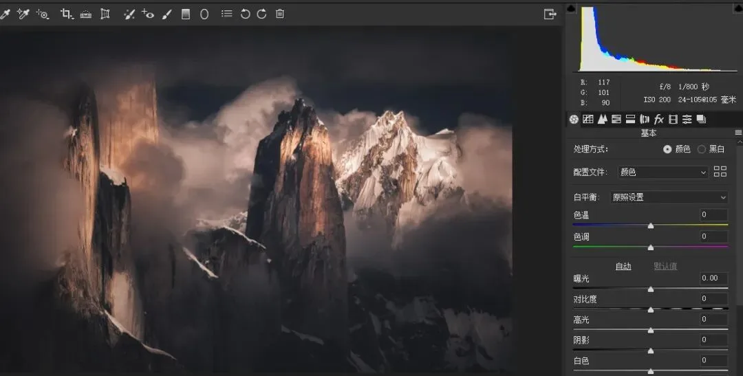
1) Why does moving the Exposure slider left not clip the shadows but loses highlights, while moving it right doesn't lose shadows but clips the highlights?
2) Did you know the Highlights and Shadows sliders also affect a photo's clarity and texture detail?
3) In which situations should you not only avoid reducing Highlights, but actually increase them?
4) What's the difference between raising Shadows while lowering Blacks, versus raising Blacks while lowering Shadows?
If you're not sure about the questions above, today's tutorial video is worth watching.
Video Tutorial
▶ Watch the video tutorial on Bilibili
This is the fully illustrated companion to the video above. Everyone recognizes the six Basic panel sliders in Camera Raw and Lightroom — Exposure, Contrast, Highlights, Shadows, Whites, Blacks — but few can explain exactly how they differ, or why pulling down Highlights recovers detail better than pulling down Whites. In this video, Thomas built a 21-step grayscale ramp to run experiments, letting each slider reveal its true range on the histogram, then demonstrated flexible combinations in three real-world edits. Below is the video turned into text, with keyframe screenshots.
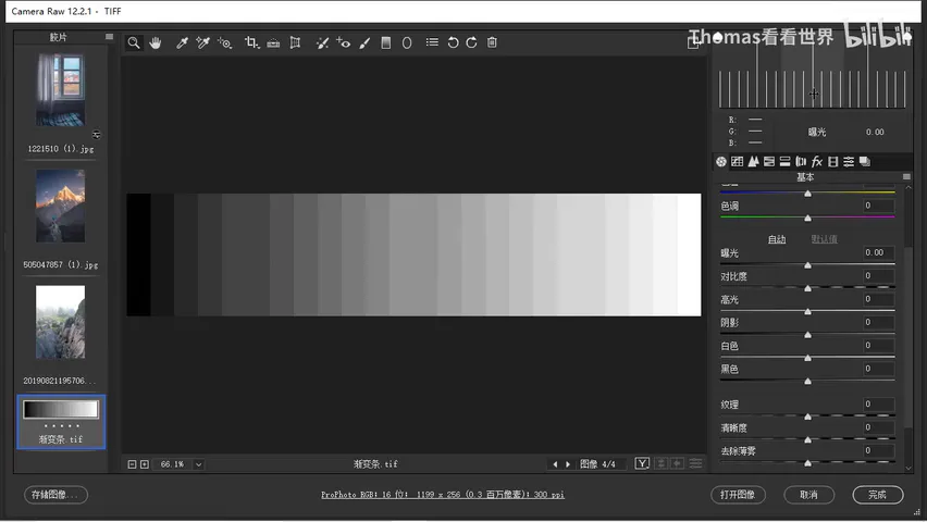
01 Exposure: the Master Switch for Setting the Tone
The test image is a ramp from 0% pure black to 100% pure white in 5% steps — 21 swatches, so the histogram shows 21 bars with identical spacing and height. To create reference points, Thomas doubled the area of three swatches: midtone 128 and its neighbors 51 and 204. That produces three peaks on the histogram, making any change in shadows, midtones, or highlights immediately visible (at 1:23 in the video).
Drag Exposure left. In small doses the whole image darkens, but what really gets compressed is the midtone region; around -1 the highlights start being pulled in too, and beyond that everything collapses into a black mass with contrast and highlight detail gone. In other words, small Exposure moves mostly adjust midtone brightness, while large moves reshape the overall contrast as well (at 2:38 in the video). Raising Exposure works the same way in reverse: the black and white endpoints stay put while the midtones shift right, and pushing too far piles every brightness level to the right into clipped, blown-out white.
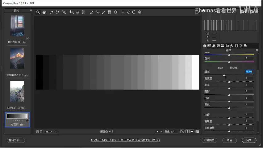
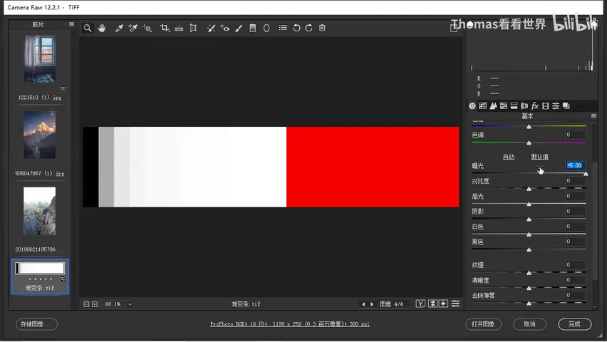
But the algorithm hides two asymmetric protections. Turn on Shadow Clipping Warning and lower Exposure: the existing pure black does not grow — most brightness merely piles up into deep gray, so darkening never costs you the shadow floor. Raise Exposure to +5, though, and the highlight warning floods half the frame with pure white, completely clipped (at 5:15 in the video). Conversely, no amount of positive exposure moves the darkest region at all. Darkening protects shadows; brightening does not protect highlights — this is a behavior Photoshop designed around camera exposure and photographers' needs, not a simple brightness offset.
02 Low Key, High Key, and Contrast
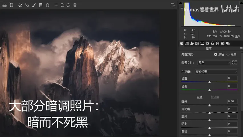
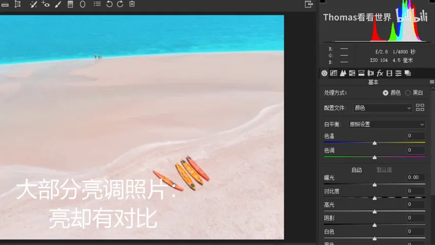
Once you understand that asymmetry, Exposure's role falls into place. The fear with low-key photos is crushing large areas into dead black, yet lowering Exposure piles pixels into deep gray instead of pure black — dark without being dead (at 5:58 in the video). High-key photos can be bright across large areas but need enough black for contrast to look good, and raising Exposure leaves your blacks untouched. So whether a photo is under- or overexposed, or headed low-key or high-key, Exposure is always the first tool to reach for.
Contrast runs on different logic: raising it rapidly pulls the midtone bars apart toward both ends, boosting contrast, yet no matter how far you push, neither end clips — it carries built-in highlight and shadow protection (at 7:16 in the video). Lowering Contrast piles the midtones toward the center and looks flat and gray, but the black and white points stay put and the overall range survives. That matches what we usually want: less contrast normally means calmer midtones, not sacrificing the endpoints.
03 Highlights and Shadows: Local Sliders That Sharpen Edges
One premise first: whether you drag it left or right, the Highlights slider acts almost entirely on the right side of the histogram — brightness above 128 — leaving midtones and shadows nearly untouched; Shadows is the mirror image, governing only the dark side (at 8:44 in the video). They are the most strictly local of the six sliders.
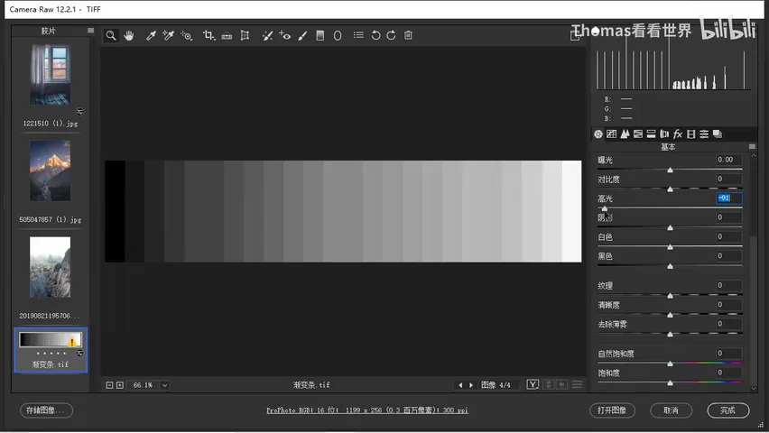
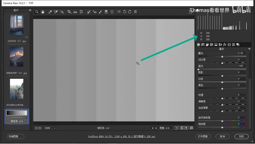
The magic happens when you lower Highlights. Drag it left and the brightness bars fall back toward the midtones, revealing detail — expected. But zoom in and you'll find gradient bands of alternating light and dark appearing along the edges of what used to be perfectly flat swatches (at 11:45 in the video). This is the same mechanism behind Clarity, Sharpening, and Dehaze: detect edges and add gradients on both sides to boost local contrast. To keep midtones from mushing together and looking muddy while highlights are pulled down, Photoshop automatically adds edge acutance to those regions. That's why for recovering highlight detail, the Highlights slider beats both Whites and Exposure: it brings brightness down while pushing detail up.
Raising Highlights has its own uses: it compresses the tonal layers of the bright regions into a unified, glowing mass, and no matter how far you push, it never clips — even if it looks slightly blown to the eye, the histogram stays below pure white (at 21:59 in the video). Styles like Japanese aesthetics that want a clean, uniform sky often raise Highlights against intuition. The Shadows slider mirrors all of this: raising it recovers shadow detail with the same bonus edge acutance, lowering it unifies the dark regions; and neither slider will ever create new pure whites or pure blacks (at 15:49 in the video).
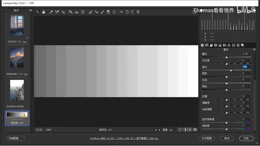
04 Whites and Blacks: Global Sliders for the White and Black Points
Pulling Whites left also lowers the brightest tones, but with zero edge-acutance compensation — all that brightness piles into the midtones, swatch boundaries mush together, and the image turns muddy. So recovering highlight detail should always go to Highlights first; Whites is only for a final trim when highlights still feel too bright after that (at 16:15 in the video).
The more critical difference is range: Whites is a global slider — the whole histogram shifts, just with the brightest tones affected most (at 17:01 in the video). Lower it and the only thing that never moves is pure 255 white; raise it and more and more regions clip to pure white. That defines its real job — setting the white point: when highlights lack punch and contrast feels weak, adding Whites pulls back both brightness and overall contrast.
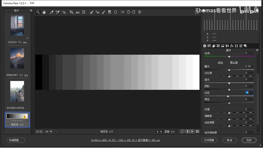
Blacks mirrors Whites exactly: the darker the tone, the stronger the effect. Raising it lifts the shadows while pure 0 black stays put; lowering it — the most common move of all — plants the black point and instantly strengthens contrast (at 18:47 in the video). The full division of labor now clicks: Highlights and Shadows are local and never clip; Whites and Blacks are global, set the white and black points, and do clip; Exposure and Contrast sit in the middle, handling overall tone and midtone contrast.
05 Three Real-World Cases: From Theory to Mastery
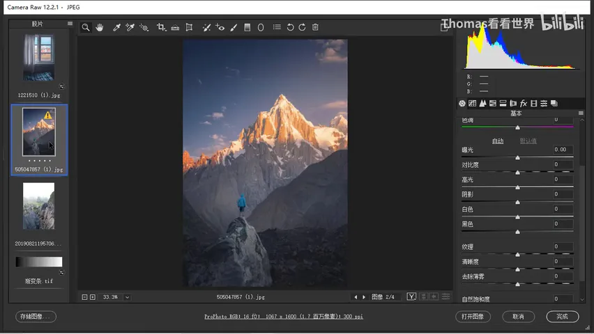
Case one is a finished snow-mountain shot that Thomas found insufficiently magical — he wanted a richer low-key mood (at 19:26 in the video). The edit chain follows the theory exactly: Exposure down to set the low-key base; Whites down to restore the contrast that the exposure cut surrendered; and when the snow felt dull, instead of pushing Whites — which would lift midtones and shadows too — he raised Highlights to brighten only the sunlit slopes; finally Shadows came up slightly, its built-in acutance restoring dark-region detail along the way (at 21:16 in the video).
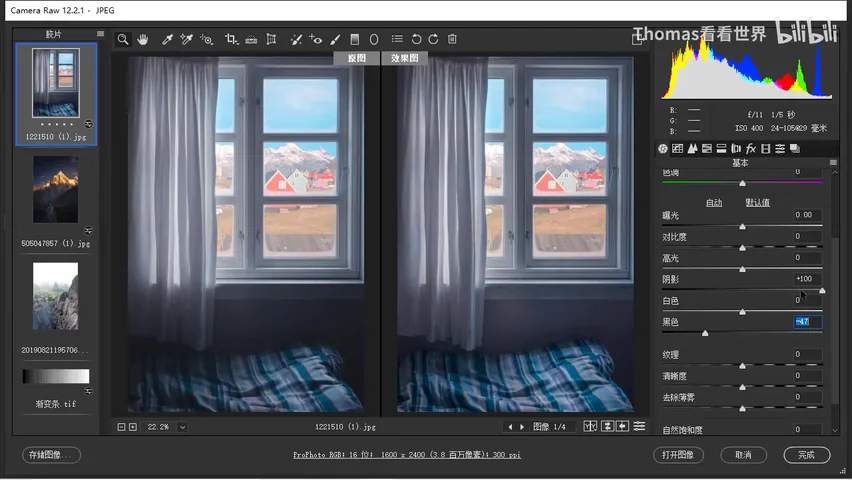
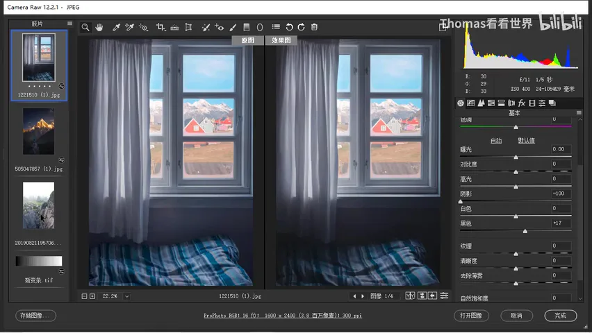
Case two answers a counter-intuitive question: lower Shadows and raise Blacks, or raise Shadows and lower Blacks? Most people instinctively do the latter, but in this interior Thomas chose the former — the curtains and the buildings outside already supply plenty of detail, and the wall exists only for atmosphere, not information (at 23:48 in the video). Shadows at -100 unified the dark regions with zero clipping risk, and a touch of positive Blacks lifted the result from too dark; the edit even used the extreme pairing of Shadows -100 with Highlights +100 — when you want the bright regions unified, Highlights can be pushed boldly, with Whites fine-tuning any leftover contrast deficit (at 25:36 in the video).
Case three is a mountain scene that shot too bright and unsettled (at 26:14 in the video): Exposure comes down first to set the tone; Highlights drop just enough to recover a bit of distant-mountain detail — fully restoring the cloud detail would actually look worse; Contrast rises to strengthen midtone separation; and Shadows are lowered, not lifted, with a touch of positive Blacks to prevent dead black, so the dark mass in the center plays against the bright clouds behind it. Three photos, three directions — the common thread is knowing, at every move, exactly which tonal region you are touching.
1. Small Exposure moves touch mainly the midtones, making it the first tool for low- and high-key looks: lowering piles pixels into deep gray without dead black, raising brightens but clips highlights; 2. Highlights and Shadows are local sliders whose detail recovery comes with built-in edge sharpening, outperforming Whites and Blacks; raising Highlights or lowering Shadows also unifies bright or dark regions with zero clipping; 3. Whites and Blacks are global sliders that set the white and black points, act strongest on the brightest and darkest tones, and do clip for real; 4. Decide first whether a region needs detail, mood, or tonal separation, then pick the slider — counter-intuitive moves like lowering Shadows and raising Blacks are the freedom that comes from real understanding.
Gradient test image download:
Link: https://pan.baidu.com/s/1NJr1hcbLohx0T8SuThEWBg Code: ihxs