Photography Tutorial · 2023-09-24
How I Developed My Style: Self-Taught Color Grading Explained
Today's video is a 60-minute open class — the first lesson in my series "A Color Course for Photography Lovers" (《给摄影爱好者的色彩课》).
In this tutorial, I will map out the knowledge system and framework of color learning, and share how I developed my own color-grading style through imitation, fusion, and innovation.
Video
▶ Watch the video tutorial on Bilibili
This is the illustrated companion to the video above — a 52-minute open class and the first lesson of the 'Color Course for Photography Lovers'. Thomas starts from his own pain point: almost no book or course teaches color grading systematically. So he built a four-pillar knowledge system — aesthetic, theory, technique and practice — and shares how imitation, fusion and innovation shaped his own grading style.
The whole class builds toward the three stages on this slide: first understand and imitate classic and popular palettes; then apply them flexibly according to each photo's actual conditions; finally create a color style of your own. The notes below follow the video's order.

01 First Class: Treat Grading as a Knowledge System
Thomas's self-study method starts with the table of contents: grasp the system and the threads, learn how the nodes connect and which come first, and efficiency follows. His own slow progress in grading came from the lack of any systematic, multi-angle course in any language — while grading actually involves four things at once: aesthetic, theory, technique and practice (at 1:34).

The 40-plus-lesson, 20-plus-hour series unfolds in four chapters, and chapter four — stylized grading research and practice — is the destination: teal-and-orange, teal-green, grey-gold, dusk and noon cartoon, overcast low-saturation, Japanese fresh, dark-cold, magic warm-cold contrast — the internet's most popular palettes as Thomas catalogued them, of which most influencer styles are mere variants (at 3:10). A discussion board lets students nominate photographers' colors for future lessons.
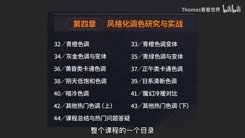
02 Nine Popular Palettes: Teal-Orange to Magic Contrast
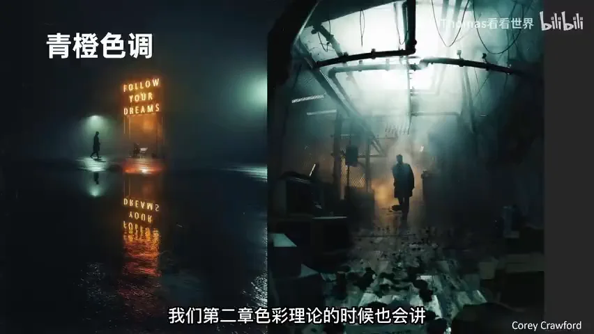
Teal-and-orange deserves the first lesson: the large-format film work of Stephen Shore, a pioneer of color photography, carries exactly this look (at 4:12). The mechanics are complementary warm-cold — cold for shadows, warm for light — bringing contrast, tension and layering, while the whole frame stays unified in two colors, clean rather than chaotic. It also 'obeys physics': photography answers to the real world, colors must follow physical rules, and whatever can be done in camera should be — golden tones belong to sunrise and sunset, not to a forced midday grade (at 7:30).
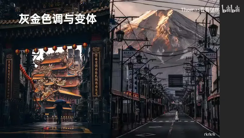
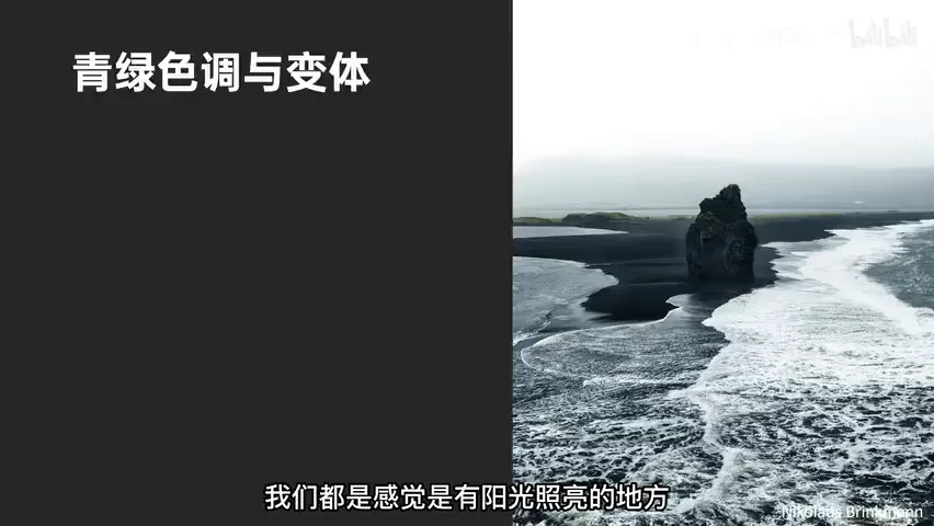
The grey-gold palette's standard-bearer is the Japanese photographer RK, whose work across China is exemplary (at 11:00). The key is understanding 'black' and 'grey': desaturate the shadows, even toward cool, and let gold come from what the light strikes — buildings at first light, or the golden roofs of Chinese architecture that RK loves; on overcast days, with no sunlight gold, you must find man-made gold instead. Teal-green is Thomas's own favorite: when rainy days turn the world grey, a layer of teal-green instantly soothes — overcast is cold by nature and suits cool colors, while forced gold feels wrong (at 12:44).
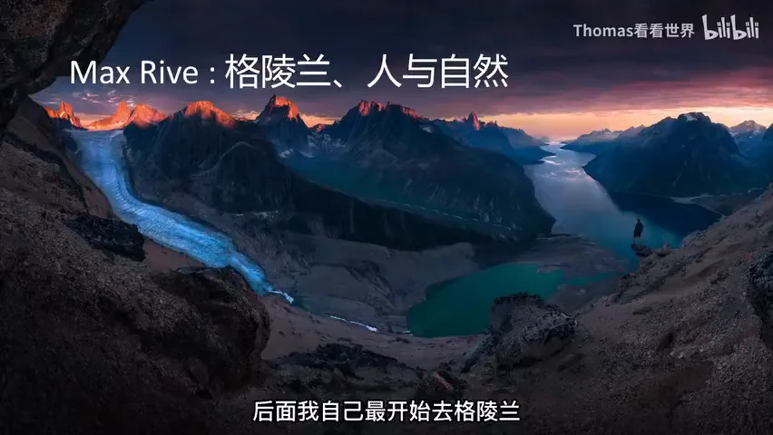
The rest each have a personality: dusk cartoon carries warm sunset dreaminess, while noon cartoon demands clean scenes and bright colors (at 14:40); the 'small figure, big scene' overcast low-saturation recalls Nadav Kander's grey large-format China; Japanese fresh (think Hideaki Hamada) is essentially teal-green blended with noon cartoon (at 18:37); dark-cold — low-key, monochrome or analogous — belongs to blue hour and rainy cities, and Dylan Furst's dark teal wildlife instantly escapes the genre's fatigue (at 20:48); in magic warm-cold, Marc Adamus reads natural while Max Rive pushes skies and shadows teal — more artificial, more personal. The more natural your color, the weaker the style; the less natural, the stronger the signature (at 22:43).
03 Right Palette, Right Weather: Shots in Any Light
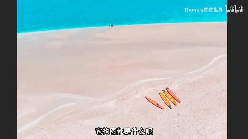
Thomas says he never picks weather or time of day — morning or night, overcast, snow, fog, haze, rain, harsh sun, moonlight or the Milky Way all yield keepers. The secret is having enough color templates mastered that any condition maps to a solution (at 23:44). Noon sun is the classic case: it reveals every object's color, so the frame must be clean — beach and sea as the backdrop, a few colorful boats as subjects, and noon becomes the best light (at 24:25).
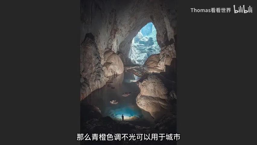
Adaptation runs through the whole class: in a cave with yellowish rock and harsh white lamps, he selects the lit areas, shifts white balance toward blue-green, and the teal locks into an orange pairing with the cave's own warmth (at 26:49); moonlit skies and orange-lit peaks become a dreamy orange-blue with a light touch; for quiet and lonely moods, drop the saturation — color carries emotion; even a phone shot turns 'Instagram' with a split-tone layer of teal (at 28:37).
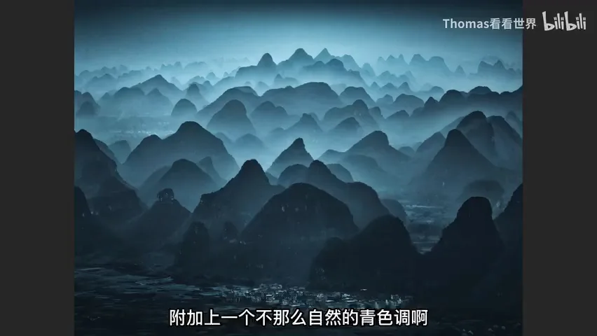
His China photos stand out half through composition, half through adaptive grading: some borrow the palette of classical Chinese painting — blue backgrounds, warm foregrounds, a painterly finish (at 29:20); others crush a blue sky into muted teal, turn the foreground orange, and use a figure's red clothing as the guiding accent (at 29:46); metallic cityscapes and rainy days go dark-cold; even the ink-wash Guilin can take a slightly unnatural teal — eerie, yes, but undeniably arresting in a feed. With multi-layer grading, selections and split toning prevent cross-contamination: teal and red mixed together turn a dirty grey (at 31:43).
04 From Imitation to Originality: The Greenland Answer
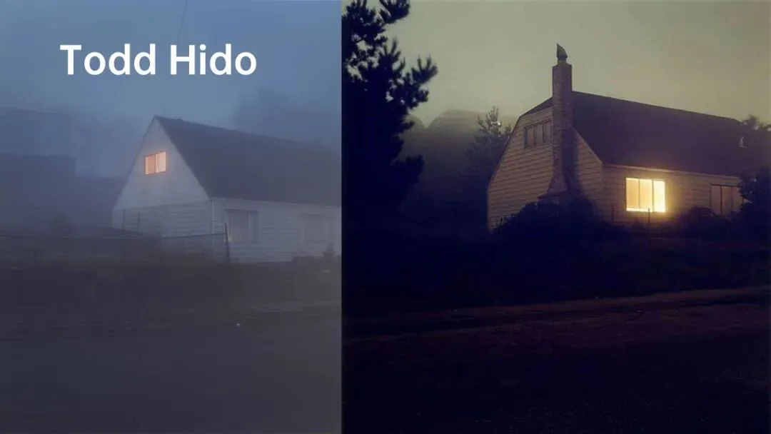
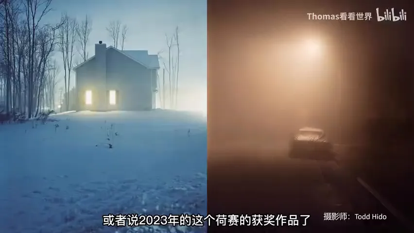
Break down the photo that won the 2019 US National Geographic grand prize and you might call its palette pure originality — it is in fact a fusion of imitations, one ingredient from each of four photographers: Benjamin Hardman's clean, quiet snowscapes (at 32:40), especially subtraction-by-snow — the same Greenland town is a messy sprawl of weeds and rock in summer, then spotless under a meter of snow; Todd Hido's mood, night and lamplight (at 33:50); Daniel Kordan's dreamy tones and airiness, blacks lifted by a curve (at 34:00); and Max Rive — whose fjord photos introduced Thomas to Greenland in the first place, and who taught him to place a figure in the frame for story (at 34:37).
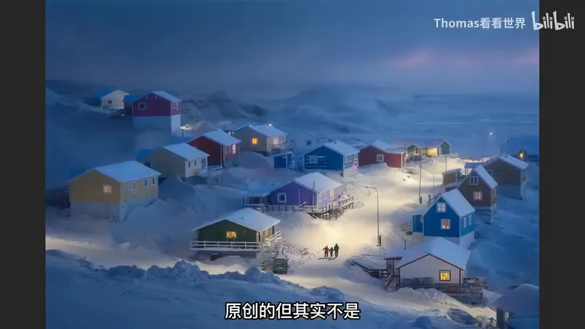
But he copied no one outright: where Todd Hido's suburban lamps feel oppressive, even sinister, the lamps here are pulled golden in white balance to render warmth — because the theme is 'warmth in the cold': at minus forty in Greenland, people survive through family and community (at 36:16). The silhouettes of a family of three holding hands and the saturated golden window lights all serve that single theme. The same thinking shaped the 'Faint Light' series: blacks turned dark teal, harsh white work-lights painted warm gold, cold-warm contrast stacked on tonal contrast for denser emotion — with debts to Todd Hido and to Tomasz Artur Bolek, a 3D artist working in Blender (at 38:07). Grading, in the end, is aesthetics more than technique: without years of looking at other photographers, there would have been no 2019 National Geographic prize and no 2023 World Press Photo award (at 38:52).
05 Three Building Blocks: Aesthetic, Theory, Technique
Before practice comes a triple foundation (at 41:15). First, aesthetic cultivation: study contest winners, the most-followed photographers and the classics — survivors of public, commercial and art-historical filtering; don't let mediocre images warp your taste; and as a flat visual art, photography can learn from painting, cinema and design. Second, color theory: how color forms, why we see it, why complements layer and analogous colors soothe — answered in art and design books, a dozen of which Thomas read for this course. Third, tools and technique: curves, split toning, white balance, HSL, primary colors, selective color — plus local adjustments to prevent contamination, the desaturate-then-recolor approach of photo colorization, and film emulation (at 47:02).

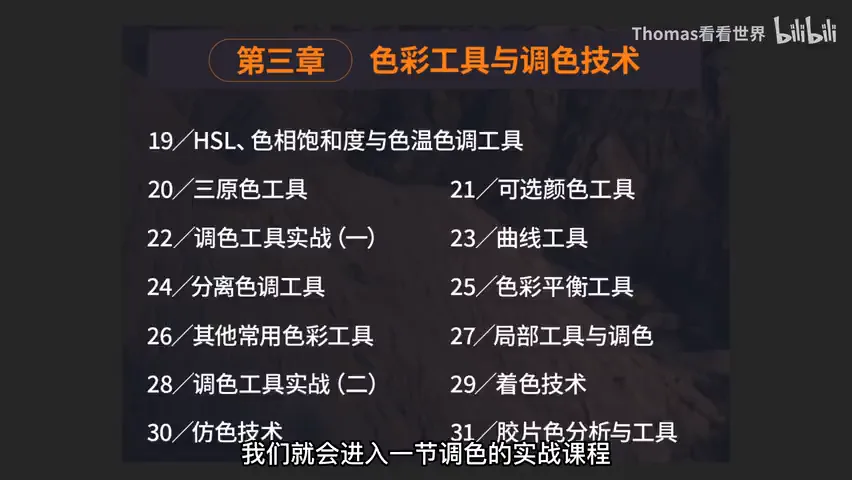
Why spend a whole lesson on the table of contents? Because a knowledge system gives new knowledge a home — a new plugin like Nik simply slots into chapter three, and nothing gets lost. And never memorize sliders: online tutorials hand you parameter lists, but without knowing which light suits which palette or what the tools actually do, 99% of your photos won't match the sample — which, by the way, relied on heavy local adjustments. Without aesthetic maturity even presets look bad. This first lesson is free; the series continues on Bilibili.
1. Build the system before the style: aesthetic, theory, technique and practice are all required — feeling and memorized parameters only carry you so far; 2. Match palette to conditions: teal-orange for fog and portraits, teal-green for rain, gold only from sunlight or lamps — the right color for the weather is how every frame becomes a keeper; 3. Originality is fused, not conjured: dissect the photographers you love, take one ingredient from each, then bind it to your own experience and intent; 4. Unnatural color reads as style, natural color fades — but only when it obeys the light and serves the subject.
HD video:
https://www.bilibili.com/video/BV1Z14y1D7Y8/