Photography Tutorial · 2024-05-26
Appreciating the 2023 Hasselblad Masters Finalists! How Do Professional Photographers Shoot?
In today's photography tutorial, Thomas will appreciate and analyze the finalist works of the 2023 Hasselblad Masters.
As a competition joined by a large number of professional photographers, the Hasselblad Masters finalist works are also wonderfully diverse and well worth studying and referencing.
Among them are works by different photographers with similar compositions and ideas. How do professional judges evaluate their subtle differences in skill? Today's video also shares case studies!
Video
▶ Watch the video tutorial on Bilibili
This is the illustrated companion to the video above, recorded by Thomas in the fields of Wanfenglin, Xingyi, Guizhou: the Hasselblad Masters has announced its finalists — from more than 80,000 entries, ten sets in each of six categories, sixty sets in all, advanced to the final round. He walks through them category by category, and also grades his own architecture submission.
Start with the finalists' page on Hasselblad's site: ten sets per category, three images per set, all in a row. The notes below follow the order of architecture, portrait, landscape, street, fine art and youth, noting the details most worth studying.

01 Architecture: Placing People Inside Geometry
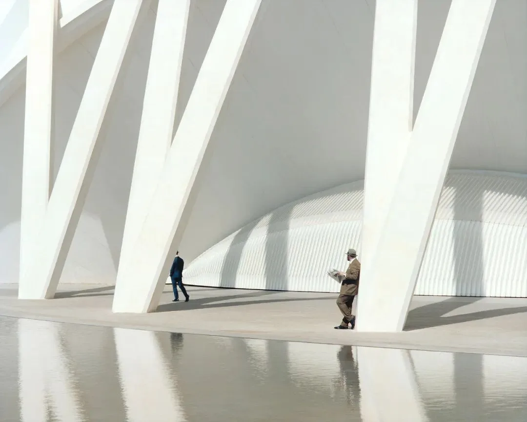
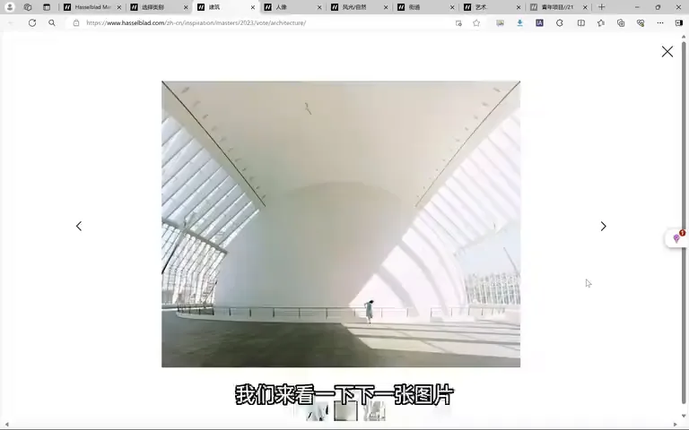
Of the ten architecture sets, Thomas focuses on four with a shared idea: each places a human inside the architecture, setting up an interaction — visually superb, top-tier in any ordinary contest. But in a field as strong as the Hasselblad Masters, putting the four side by side separates them at once (at 1:26). Strong sets pursue coherence: lighting, tonal distribution and figure scale basically unified, with variation inside that unity; even where scenes, colors and textures differ wildly, the 'small figure, big scene' proportion holds (at 1:44).
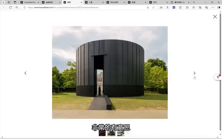
The weaker set uses tiny silhouettes throughout — the figures only add story and a sense of scale, with no real interaction between person and building (at 2:23). What counts as real interaction? In the better sets, figures stand along the architecture's own diagonal structure; clothes are clearly art-directed, red-yellow-blue echoing the building (at 3:01); within one frame the silhouette is negative space, then positive space of scenery, then the negative of shadow, the building itself, and the background beyond — positive, negative, positive, negative, richly layered; skin tone matches the building while black clothing answers its shadow (at 3:34).
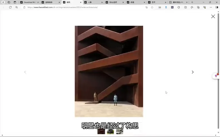
Thomas's favorite set goes further: clothing matches the architecture, and gestures answer it — where sunlight splits the building into light and shadow, the figure lifts a hat, splitting themselves the same way; the building's form resembles a pointed hat, its neighbor a crushed one, so the raised hat secretly rhymes with the structure (at 4:01). Over-reading? Quite the opposite — the same design across all three images proves intention. This is why professional contests judge sets: a single frame can be misread or be a happy accident, but if every image in a set sustains interpretation, the thinking was deliberate (at 4:42).
02 Portrait: Shooting People as Light
Portrait is just as competitive, all big-screen polish and remarkably varied themes (at 7:35). The first set shows African tribespeople's facial decoration: harmonious expressions, and astonishingly, adornments made entirely of local plants, colors and patterns — fresh and unique, and a vivid bond between people and nature (at 7:48). The second is a portrait series of children with Down syndrome: shot with full portrait beauty, while uncovering each child's gift — a music medal, talent for ball games, a knack for gymnastics — treating them as ordinary people and finding their strengths, which is deeply moving (at 8:16).

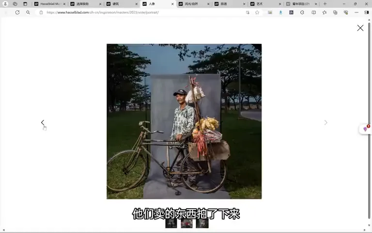
Two more sets shine: one photographs Indonesian street vendors with their bicycles and wares, rich with story, a canvas backdrop raised behind them creating the illusion of a stage on the street (at 8:57); the other portrays twins — interdependent yet different, with the tangled relationship, emotions and overall wardrobe texture all masterfully controlled (at 9:20).
03 Landscape: Seeing China from Trains Makes the Cut
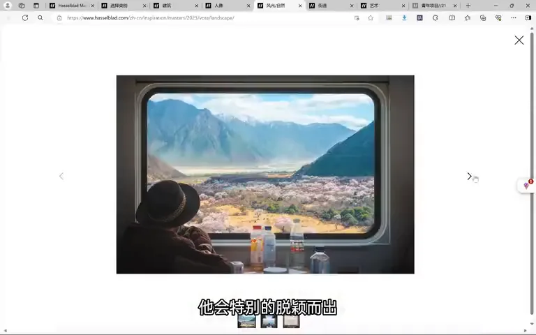
In landscape, Thomas's own 'Seeing China from Trains' also made the cut, and he thinks it has a real chance — it stands out among the ten, clearly unlike anything beside it (at 9:53). But standing out cuts both ways: it draws the jury's attention, while any juror who finds the details wanting, or deems it not quite traditional landscape, becomes a risk (at 10:02). The set's appeal is its layers: National Geographic-style human detail, decisive moments, and the new-topographic reflection on our relationship with nature (at 10:18).
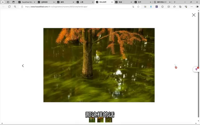
The strongest rival set is built on near-dichotomous compositions: brilliant cloudscapes above, human-altered terrain below, a fascinating reworking of the land (at 10:38). Another uses holes and mirrors to portray trees like portrait sitters with a classical-painting air — but varies too little, looking shot in one place on one day; had the three frames been tree and duckweed motion, a park tree with passing crowds, a lone tree against moving clouds, the theme would extend, unified yet far richer in meaning and vision (at 11:14). The rest are visually superb, a touch short on story and set-making (at 11:59).

04 Street and Fine Art: A Contest of Atmosphere
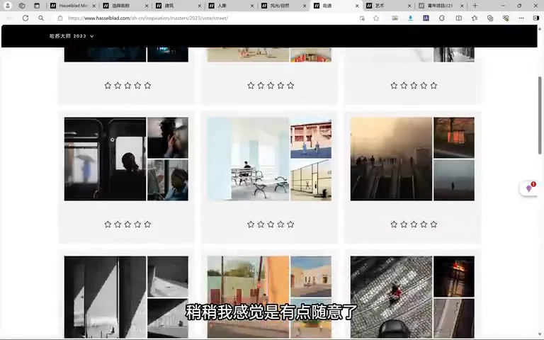
Street holds many fine sets. One has admirable color but its scenes and figures feel slightly arbitrary (at 12:10); Thomas prefers the set that turns layered car windows into a complex spatial structure, the people inside and outside the glass displaced yet connected (at 12:21). Another radiates ease, comfort and calm — geometry, framing, perspective, gesture and light all carefully chosen, craftsmanship evident (at 12:35).
Fine art rewards attention: one set is pure cinema, drenched in loneliness (at 13:00); one ponders human pursuit in three acts — hurrying past, finding a goal or faith, then a state of unfettered freedom (at 13:07); three sets channel Gregory Crewdson, staged figures under film-set lighting — curiosity between people and nature, the oppression of confinement, even a human-and-animal soccer match in front of bleachers, conflict rendered playful (at 13:22). Thomas's favorite is the wittiest: laundry hung out to dry that takes animal shapes — a koala, a unicorn, a fox — each against snow mountains, sea and forest (at 13:51).
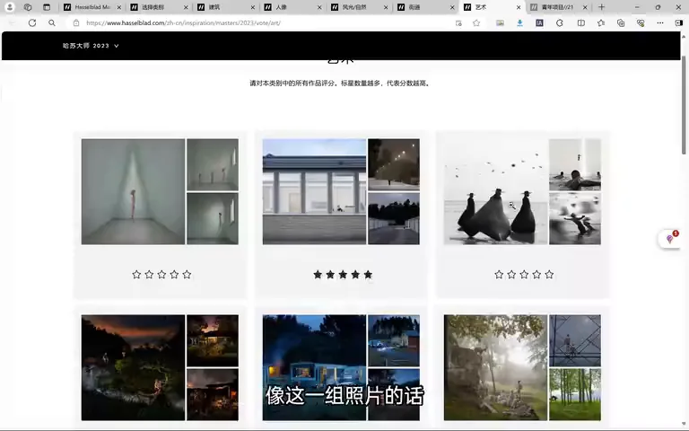
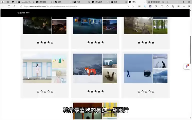
05 The Youth Category, and Your Vote
In the youth project category his favorite is the middle set of displacements: each figure's head seems missing, replaced by something else — a cloud in the first frame, free and weightless; colorful balloons in the second, warm with family joy; in the third, a billboard figure's hair swapped for real branches and canopy, the line between person and nature gently erased (at 14:17). This year's jury is heavyweight — Magnum, National Geographic, Foam, the Hasselblad Foundation, an art academy, and Getty Images among eight professional voters — and the ninth seat belongs to the audience: public voting counts as one vote (at 15:03).

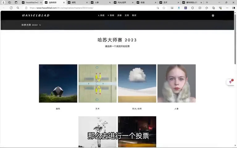
So visit the Hasselblad Masters 2023 page and cast your own vote, scoring each set like a juror and voicing your attitude. More importantly, compare: the four architecture sets all contain people, yet differ in telling ways — and that kind of side-by-side observation is what genuinely moves your photography forward (at 15:31).
1. Sets persuade more than single frames: a design repeated across three images proves intention; 2. People and buildings should truly interact — position follows structure, wardrobe is art-directed, gestures answer forms; silhouettes as mere scale bars fall short; 3. Standing out is double-edged: individuality draws attention and 'not traditional' criticism alike — rich layers of interest are your insurance; 4. The best way to learn is comparison: read same-theme works side by side and the differences in quality reveal themselves.
Hasselblad Masters finalist works website:
https://www.hasselblad.com/zh-cn/inspiration/masters/2023/
Full Tutorial List:
Full Photography Tutorial Directory (updated 2024.4.16)
HD video:
https://www.bilibili.com/video/BV13f42197h3/