Photography Tutorial · 2016-05-29
Using the Histogram in Post: How to Create 8 Tonal Styles
Last week's article 'Without It, There's No Exposure — The Histogram in Capture' discussed the histogram's three roles in the field: spotting over/underexposure, prompting exposure bracketing, and guiding expose-to-the-right.
This article focuses on how to use the histogram in post to redistribute a photo's brightness and create images in 8 tonal styles.
Review: what are the histogram and tonality?
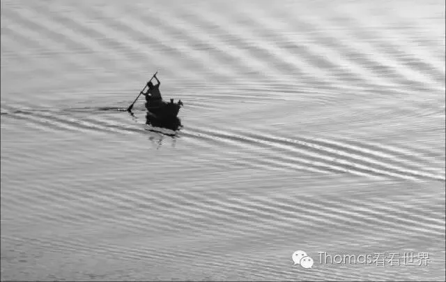
When we strip a photo of its color information, the remaining black-and-white image shows only the brightness layers and line contours. This brightness and contour is the photo's 'tonality'. When we say an image is dark and moody, bright and fresh, contrasty, or hazy and ethereal — we're describing its tonality.
People divide photo brightness into 256 values from 0 to 255: 0 is the darkest pure black, 255 the brightest pure white, and the numbers between are grays of different brightness.
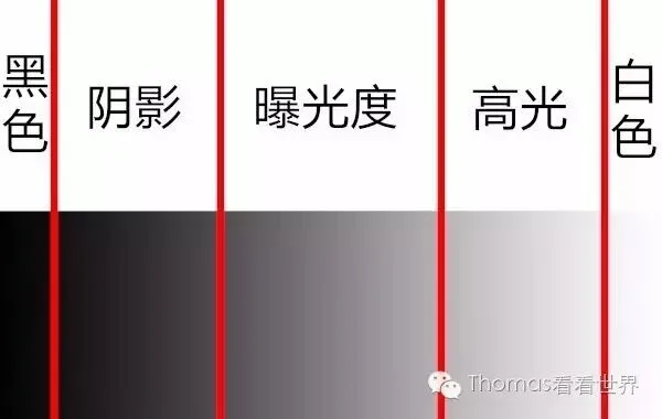
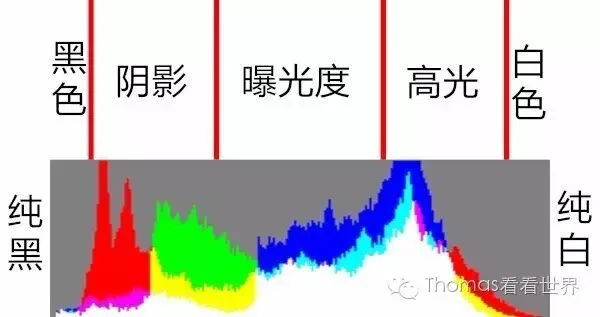
We can further split brightness into 5 zones. Exposure (midtones) is the middle brightness region — tonality here is richest and finest, and most detail is rendered at this moderate brightness.
Shadows and Highlights on either side correspond to the darker and brighter regions; though their detail is less fine than the Exposure region, they still hold plenty of information.
Finally, Blacks is the darkest region and Whites the brightest — these zones contain basically no detail, but their pixels give the photo contrast.
When the horizontal axis represents the 0-255 brightness values and the vertical axis the number of pixels at each brightness, this function graph is called the luminance histogram.
Tonality falls into 3 major categories:
(1) Low key, middle key, high key
(2) Long scale, medium scale, short scale
(3) Hard gradation, soft gradation
Every photo maps to one style in each of the 3 categories — the photo below, for example, is simultaneously low-key, long-scale and hard.
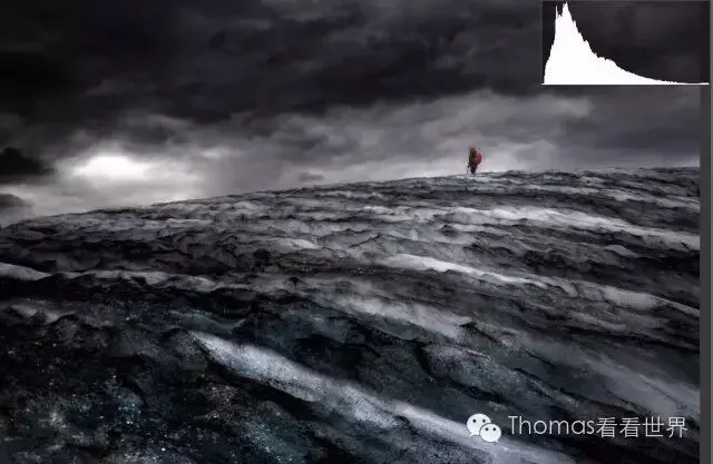
A photo's tonality and histogram are closely linked. Next, Thomas explains the histogram and adjustment method corresponding to each tonal category.
Low-key, middle-key and high-key styles
Low/middle/high key concern the photo's overall brightness. You can tell a photo's key from where the histogram's pixel peak clusters.
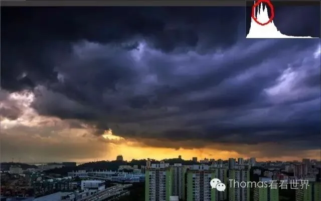
In low-key photos, black and dark tones occupy most of the frame while whites and lights are small — the overall tonality is heavy and somber. On the histogram, the pixel peak piles up in the Shadows and Blacks, with very few pixels in Highlights and Whites.
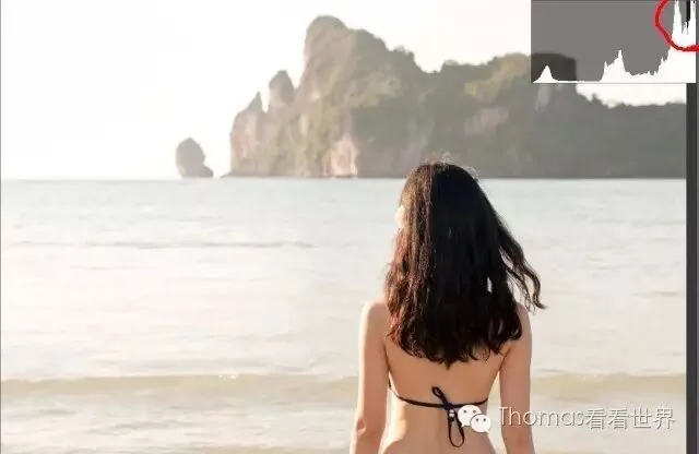
High-key photos are the opposite: most of the frame is bright white tonality, giving a pure, sunny, cheerful feeling. On the histogram the pixel peak clusters in Highlights and Whites.
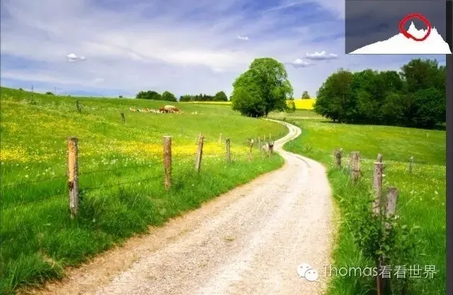
Middle-key photos are the most common: the frame has both black and white, but most pixels sit in the histogram's middle Exposure region, giving a normal, neutral feeling.
Different tonalities carry different moods — none is 'best'. Our goal in post is to use the histogram to redistribute brightness and achieve the atmosphere we want.
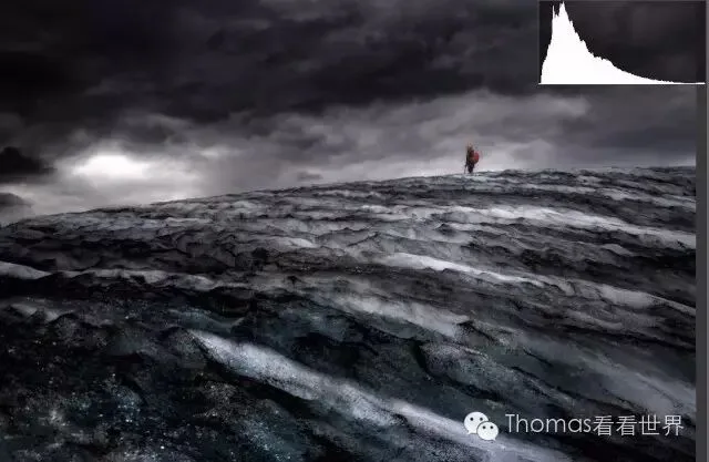
For example, in this Iceland photo's original, the white glacier and sky concentrate the pixel peak in the Highlights — a typical high-key photo with a sunny, bright mood. But I wanted to give the hiker a feeling of solitude and smallness in the vast land.
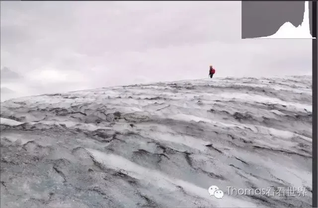
So in Lightroom I set Exposure -2, Highlights -100, and used a graduated filter to further darken the sky. Pushing the histogram's peak into the Shadows instantly changed the style from high-key to low-key — an oppressive, gloomy, end-of-the-world feeling, exactly what I wanted.
Long-scale, medium-scale and short-scale styles
Long/medium/short scale concern how widely a photo's brightness spreads. On the histogram, it's the distance from the leftmost to the rightmost pixels.
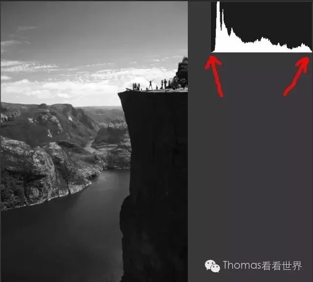
Long-scale photos are the most common: brightness stretches from the darkest Blacks to the brightest Whites. With such wide distribution, long-scale photos usually have rich layering. In this Preikestolen (Norway) photo, for instance, the near-black foreground cliff, the mid-gray fjord and the bright-white sky separate immediately — clear layers.
Medium-scale photos are usually hazier and softer; on the histogram, the left-to-right span is only about two-thirds of the full length.
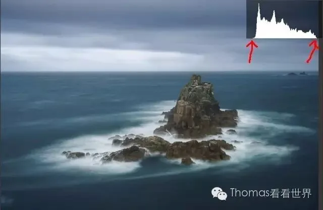
Many night photos are medium-scale. Night itself feels dark; if a photo has too much in the Highlights and Whites, it loses that mood. Many night shots graded to look like daytime commit exactly this tonal mistake.
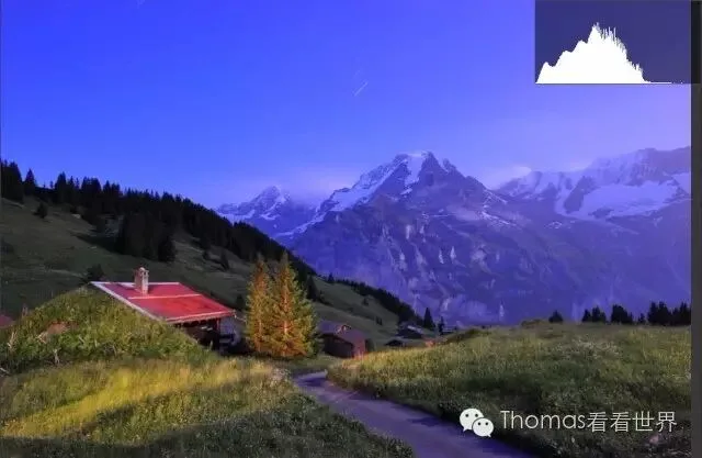
Short-scale photos are very rare and very hard to handle: the histogram's left-to-right span is under a third of the total length, giving a strong hazy, oppressive feel.
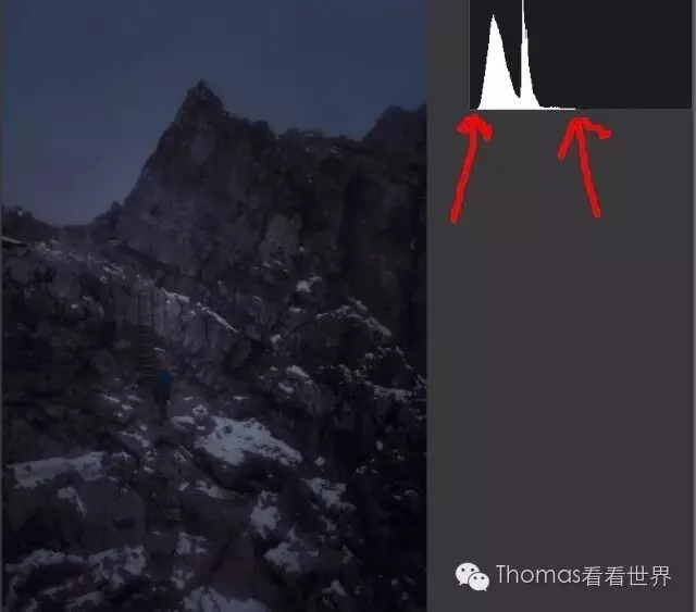
The longer the scale, the more layered the photo; the shorter, the more oppressive. This Neuschwanstein photo, shot through the cable car's frosted glass, looks grayish. The histogram makes the cause obvious: pixels are missing from the Whites and Blacks, with brightness compressed in the middle — a medium-scale original.
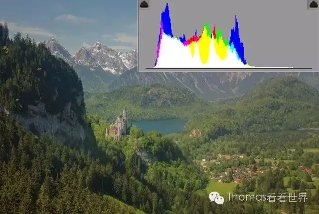
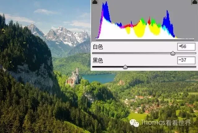
So in Lightroom I raised Whites to +56 and lowered Blacks to -37, letting pixels reach pure black and pure white and fill the whole histogram. Once the photo went from medium-scale to long-scale, the layered mountain ridges I wanted emerged.
Hard and soft gradation styles
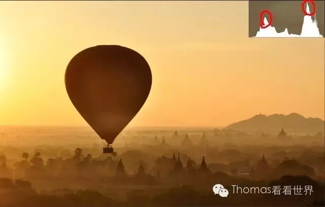
Soft-gradation photos are hazy and fresh with a calm, soft-light mood and very rich detail. On the histogram their pixels distribute fairly evenly, like a trapezoid, so tonal transitions are delicate.
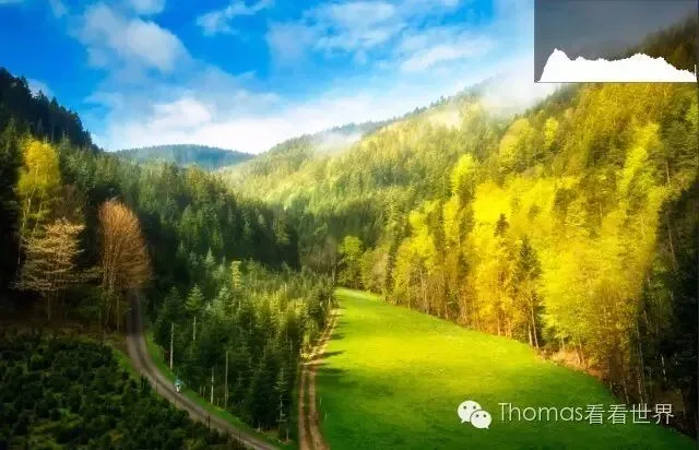
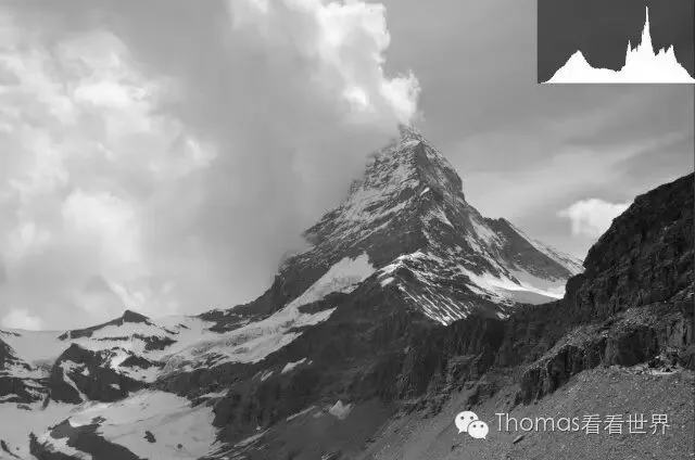
Hard-gradation photos have strong contrast, hiding unnecessary detail to emphasize the subject. On the histogram they show a peak in both the Highlights and the Shadows — pixels cluster in brighter and darker parts, pulling the photo's contrast apart.
This Matterhorn photo below is already hard-gradation. But I felt it wasn't 'hard' enough — the mountain's dark parts weren't prominent enough to convey the peak's majesty. So I needed to further widen the gap between the brighter and darker peaks.
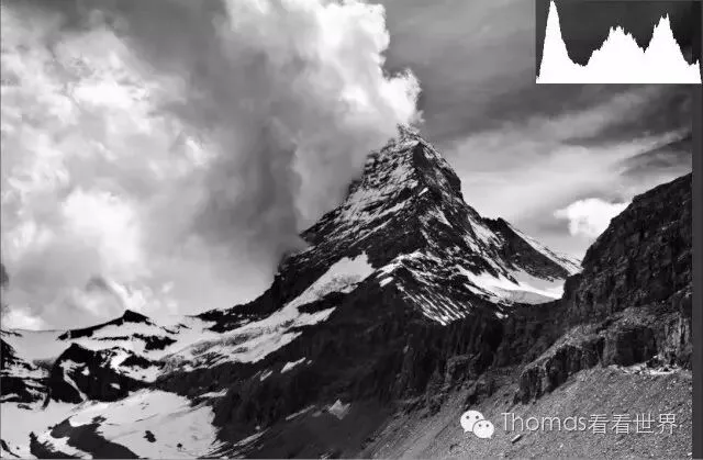
Below is the result after lowering Blacks and Shadows and adding contrast: the Shadows peak is higher and further left, and the Highlights peak moved right a bit. With the two peaks pulled apart, the photo feels harder, grander, more imposing.
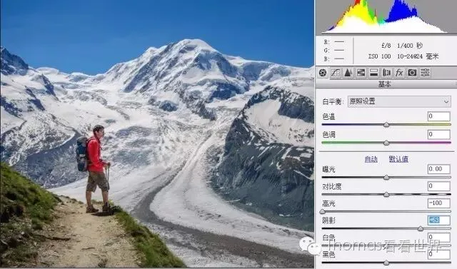
Hard-gradation images lack rich detail and are generally avoided for people shots. But shooting people under afternoon or midday sun usually gives this hard effect — the person pitch black, the background missing detail, not pretty at all. The histogram shows two peaks in Shadows and Highlights — huge contrast.
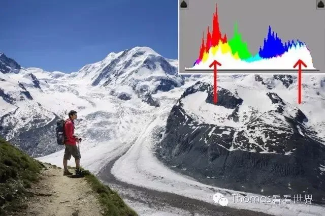
So in ACR I set Highlights -100 and Shadows +53, moving both peaks toward the middle so the histogram approaches a trapezoid. We know the middle Exposure region has the finest detail and tonality — after this adjustment, both the person and the background look much better.
Weekly summary
By overall brightness, photos divide into low key, middle key and high key. Low-key histograms peak in Shadows/Blacks — somber and heavy. High-key histograms peak in Highlights/Whites — bright and cheerful. Middle-key photos are neutral and natural, peaking in the Exposure region.
By brightness spread, photos divide into long, medium and short scale. Long-scale histograms stretch from black to white with rich layering. Medium-scale spans only about two-thirds — hazier and dimmer. Short-scale spans under a third — oppressive and hazy.
By contrast, photos divide into soft and hard gradation. Soft-gradation histograms are trapezoidal with even middle distribution and delicate transitions. Hard-gradation histograms have a high peak in both Shadows and Highlights with fewer mid-brightness pixels — obvious contrast and a hard, prominent subject.
I'm @Thomas Chu Photo — every Sunday evening I share an original piece of photography know-how.