Photography Tutorial · 2017-03-05
Learn Color Grading by Understanding the HSL Panel First
HSL is a very intuitive way to represent color. The HSL panel in ACR and Lightroom is a powerful tool for color grading in post.
This article will guide you in learning and understanding color through the HSL panel.
1
What is HSL
Many of you have heard of the RGB color model — any color is formed by adding the three primaries Red, Green and Blue in different proportions.
But the RGB model is unintuitive for humans. If I say a color is made of 60% red, 30% green and 90% blue, you'd find it hard to imagine what color that actually is.
So people designed the HSL color space to express colors more intuitively. HSL stands for the three color attributes: Hue, Saturation and Lightness.
Hue is the basic attribute of color — what we commonly call the color's name, such as purple, cyan, magenta. We can display all hues on a ring.
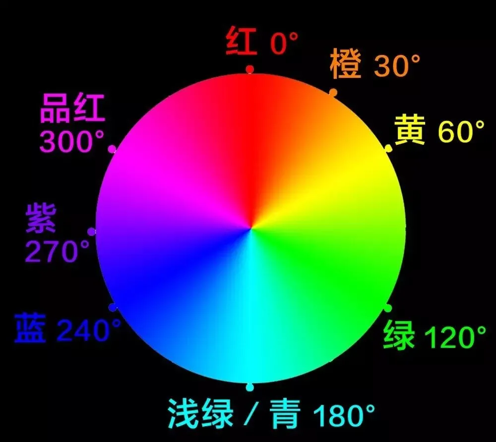
The 0°, 120° and 240° positions on the ring correspond to the RGB primaries red, green and blue. Pairs of primaries mix into secondary colors: yellow (60°) is red plus green; blue plus green makes cyan (180°); magenta (300°) is red plus blue.
Between primaries and secondaries there are rich hue transitions — e.g. purple at 270° lies between magenta and blue; orange at 30° is red mixed with yellow.
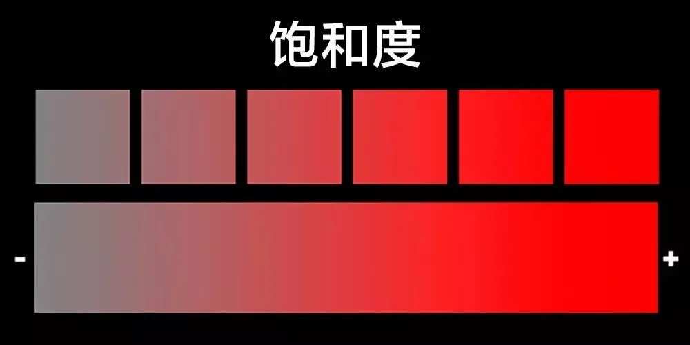
Saturation refers to a color's purity — higher saturation means purer, stronger color; lower saturation means grayer, paler color.
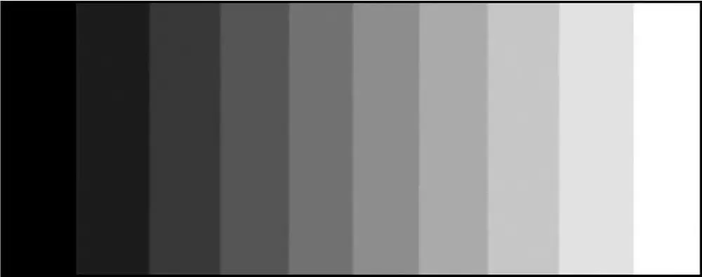
Lightness refers to how bright a color is — higher lightness means whiter; lower means blacker.
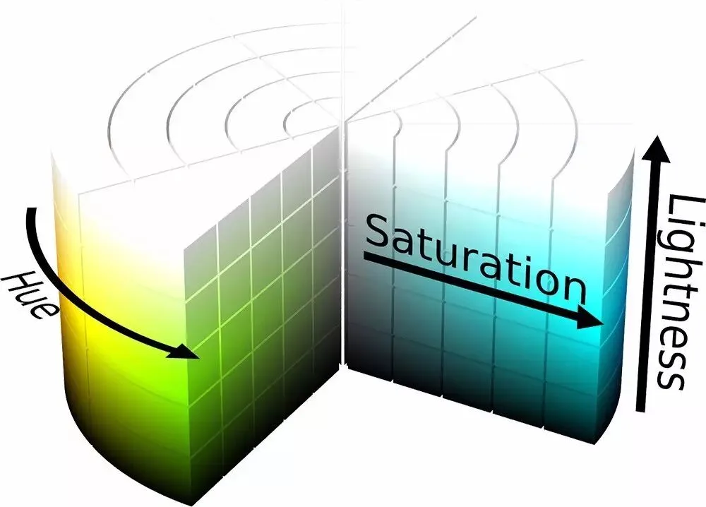
Combining Hue, Saturation and Lightness into a cylinder forms the HSL color space model.
Any point in the HSL cylinder corresponds to a color: the angle on the ring is the hue, the distance from the central axis is the saturation, and the height corresponds to lightness.
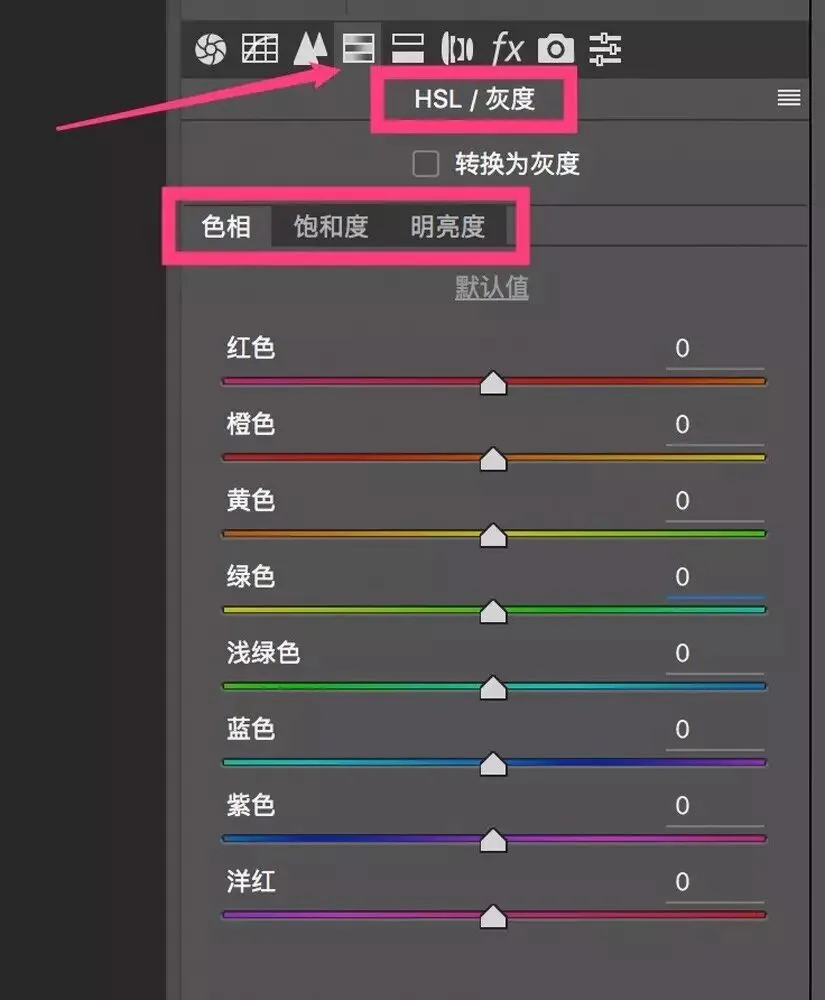
In ACR (and Lightroom), the 4th adjustment panel — the HSL panel — is a post-grading tool based on the HSL color space.
2
Learning to use the HSL panel
The HSL panel consists of three sub-panels: Hue, Saturation and Luminance. Each sub-panel has 8 sliders, each adjusting one of 8 colors in the image.
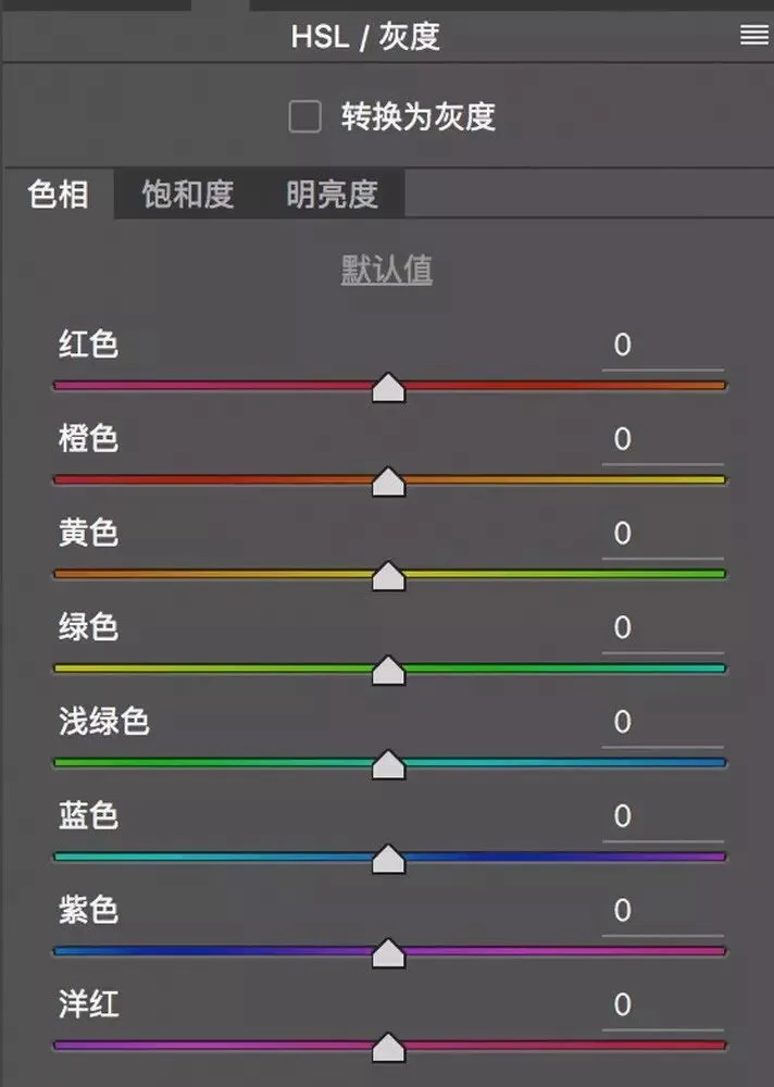
These 8 grading sliders correspond to the 8 major colors in nature we discussed: red, orange, yellow, green, aqua (light green), blue, purple and magenta. This lets us adjust different colors in a photo separately.
When we adjust red, it affects not only the pure red at 0° on the ring, but also the reddish hues around it.
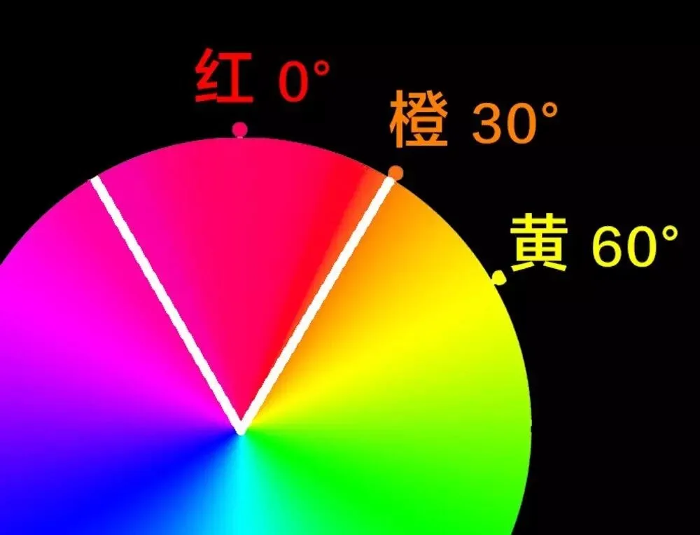
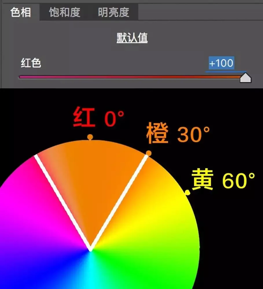
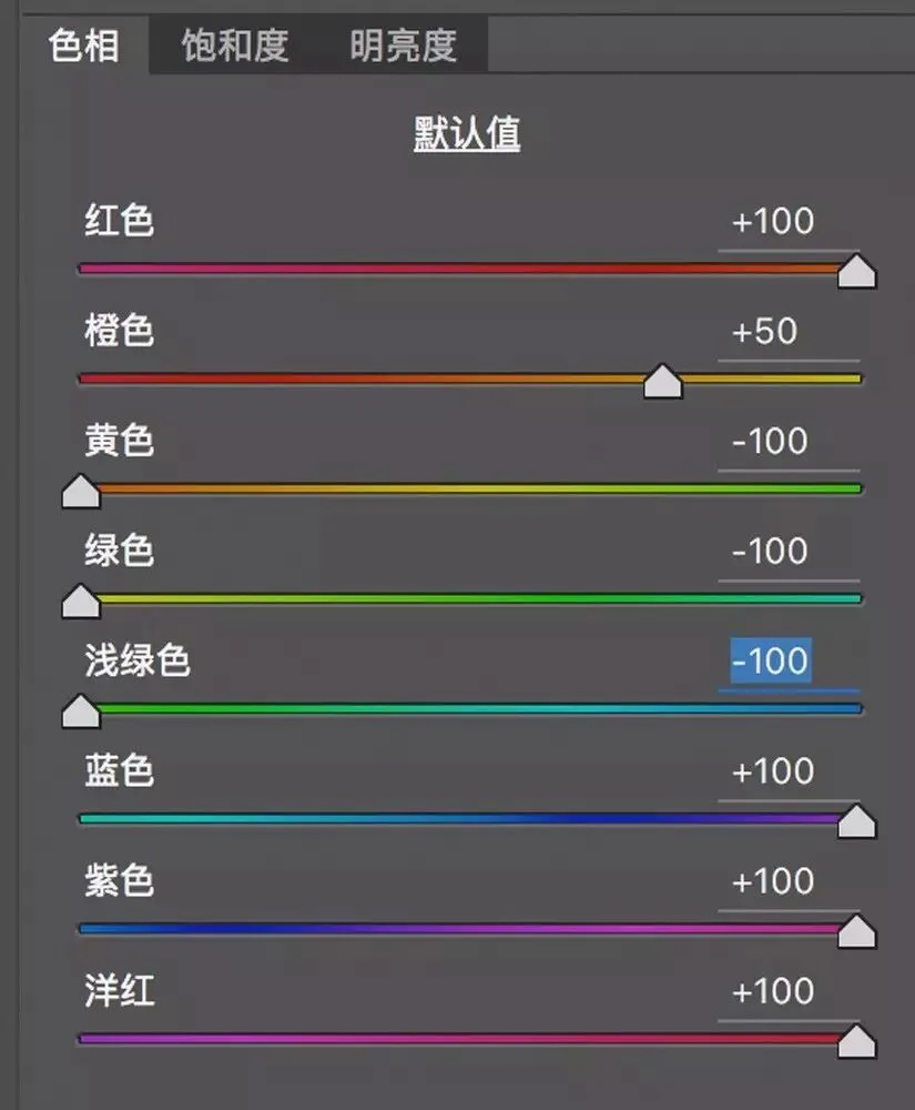
For example, in the Hue panel I move the Red slider right. The reds in the photo shift clockwise on the ring — toward orange. Below, after Red hue +100, red and its neighboring region on the ring all become orange.
If I move the Red hue slider left, the reds shift counterclockwise — toward magenta. Below, after Red hue -100, red and its neighbors all lean toward magenta.
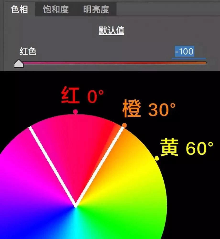
For green on the ring, clockwise is cyan; counterclockwise is yellow.
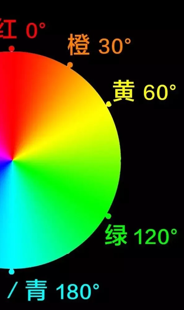
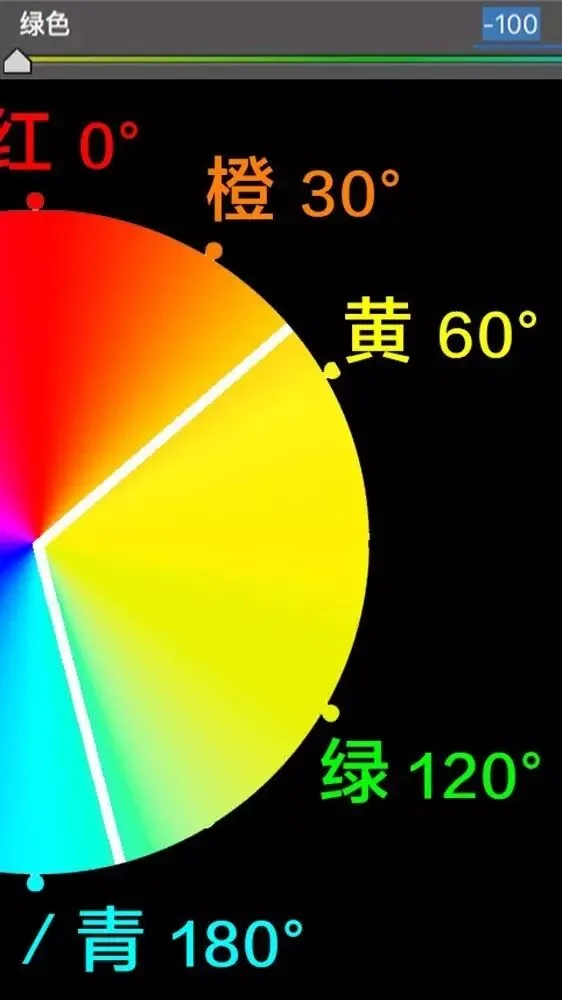
So if we set Green to -100 in the Hue panel, green and its surrounding hues on the ring all shift toward yellow.
If we set Green to +100 in the Hue panel, green and its neighbors all shift toward cyan.
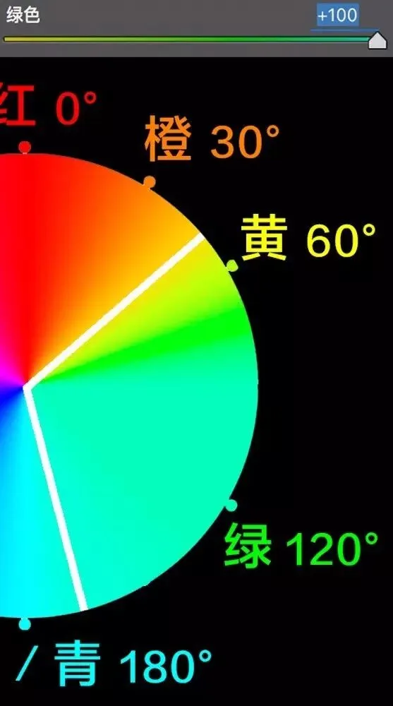
Move a hue slider right (adding value) and the color shifts clockwise on the ring; move it left (subtracting) and it shifts counterclockwise.
Understand these two sentences and you've learned HSL hue adjustment.
The Saturation panel in HSL is easy to understand: slide right to increase that color's purity and intensity; slide left to make it grayer and paler.
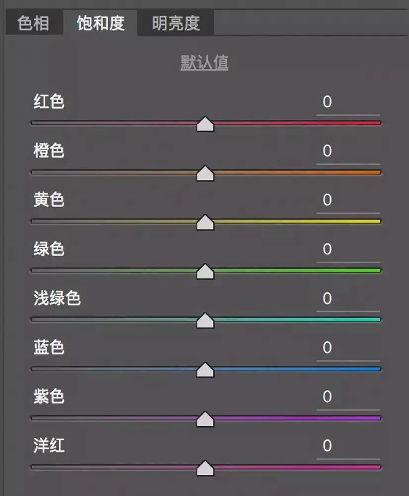
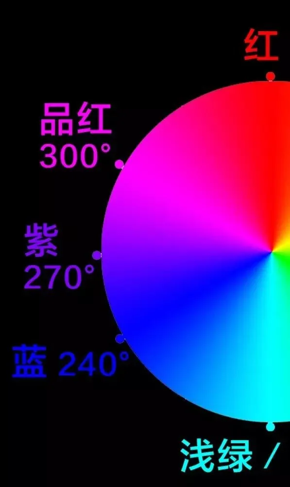
Take the blue region of the ring, for example.
If we move the Blue slider in the Saturation panel all the way left, the blue region on the ring fades and grays considerably.
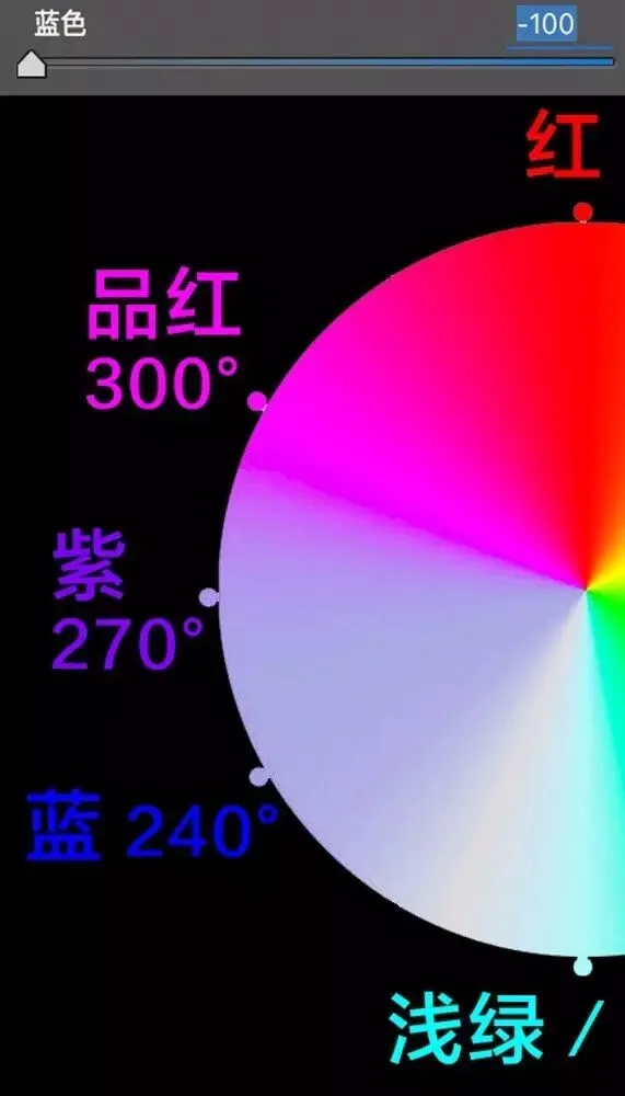
But why doesn't the blue region turn fully neutral gray? Because this color range is affected not only by the Blue slider but also by the Purple slider.
If I also reduce Purple saturation to -100, the entire blue-purple region of the ring turns pure gray.
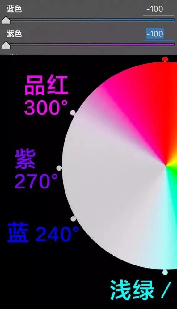
The last HSL panel is Luminance: slide right and the color brightens toward white; slide left and it darkens toward black.
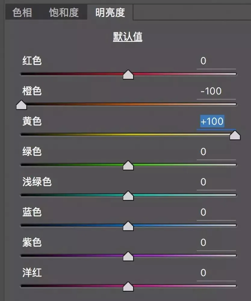
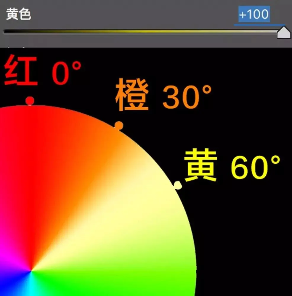
For example, moving the Yellow luminance slider to +100 visibly brightens the yellows on the ring.
3
Hands-on grading with the HSL panel
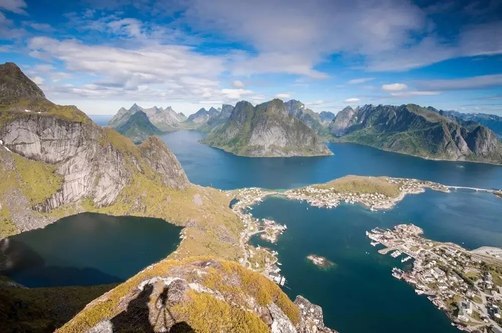
Next, Thomas uses the photo below to show how to grade with the HSL panel.
Reply with the keyword 'raw15' on Thomas's WeChat official account 'thomaskksj' to get the download link for this photo's RAW file.
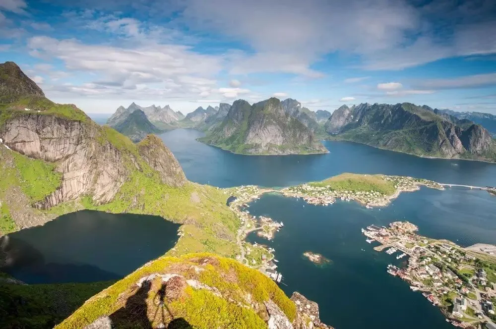
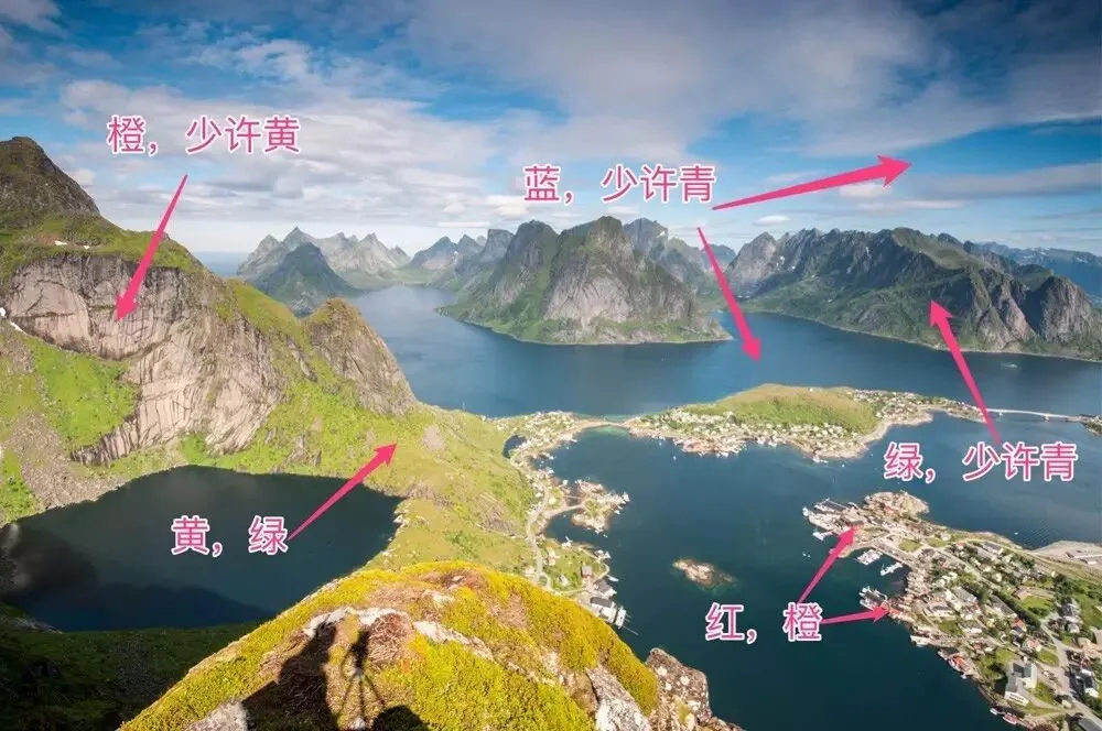
Before grading, we must first identify which colors compose this photo.
The exposed rock on the mountain is mainly orange with a little yellow. The sky and water are mainly blue with a little cyan. The small red cabins scattered on the ground are actually affected by both red and orange.
The green vegetation is more complex: the sunlit plants on the near mountain are mainly yellow, then green; the dark-green vegetation on the distant mountains is mostly green with a little cyan.
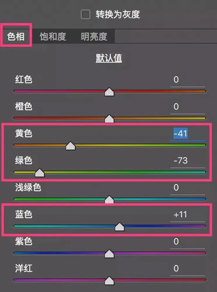
First, adjust in the Hue panel. Move both the Yellow and Green hue sliders left so their colors lean toward yellow — turning the lush spring green of the frame into the orange-yellow of golden autumn.
The original sky leaned cyan, so I moved the Blue slider right, shifting the hue of sky and sea slightly toward purple.
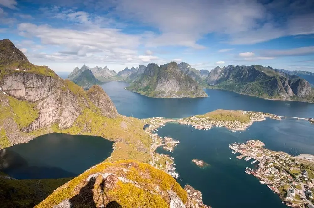
The formerly green vegetation turned yellow; the sky went from cyan-blue to slightly purple-blue.
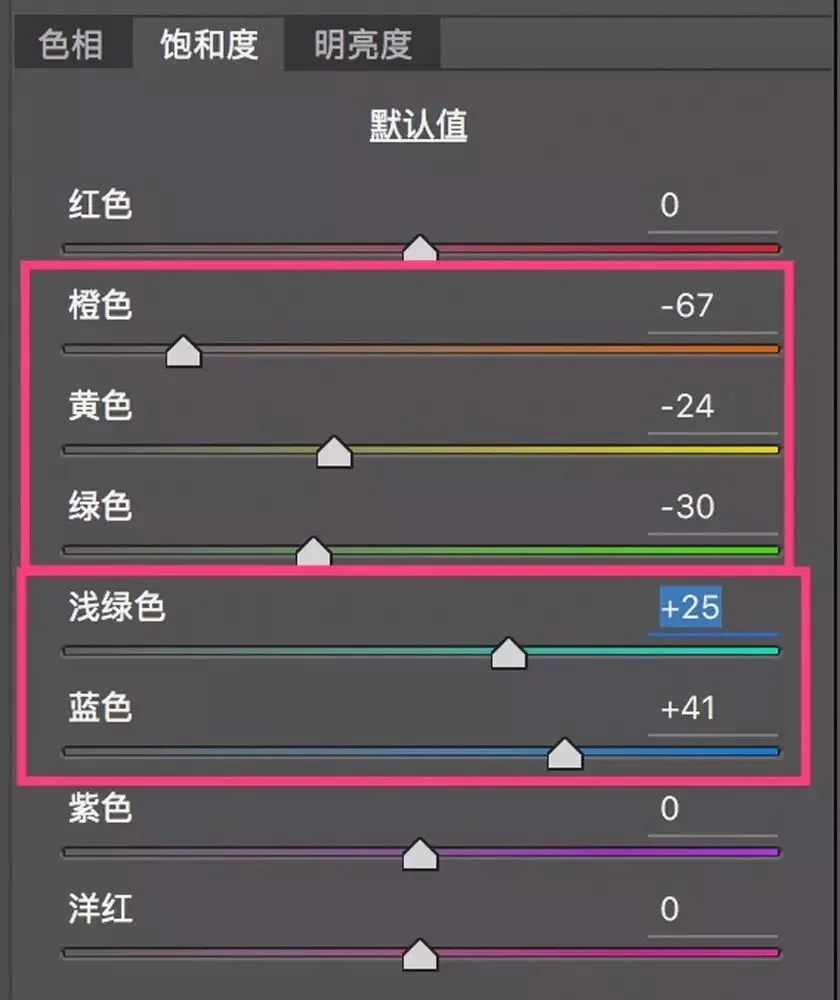
Next, the Saturation panel. I want not just autumn colors but the desolate feel of late autumn's withering plants — so I reduced the saturation of yellow and green.
Reducing orange saturation keeps the rock color from being too jarring.
But I moved the Blue and Aqua sliders right, increasing saturation — so the blues of sky and sea become purer and richer.
After the saturation adjustments, the vegetation looks bleak and the sky crystal clear.
Finally, luminance adjustments. The mountain in the photo consists of vegetation and rock. Through luminance separation we can make the boundary between vegetation and rock clearer.
I lowered orange luminance — darkening the rock — and slightly raised yellow luminance — brightening the vegetation. Now rock and vegetation on the mountain are fully distinguished.
Then I lowered blue luminance, making the sky and sea deeper and more engaging.
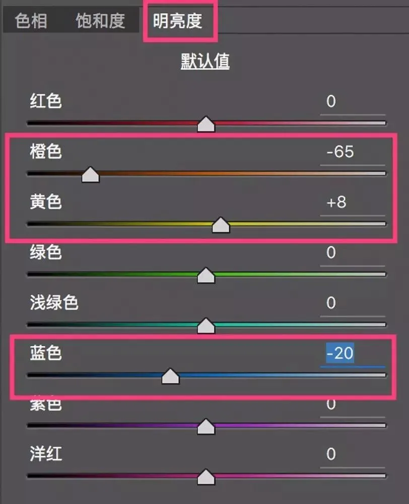
After the luminance adjustments, the darker rock and sky make the image feel more composed.
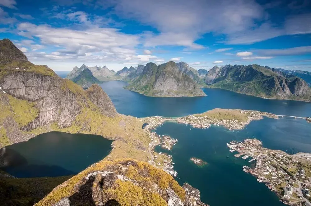
Compare before and after HSL grading — the image feels completely transformed.
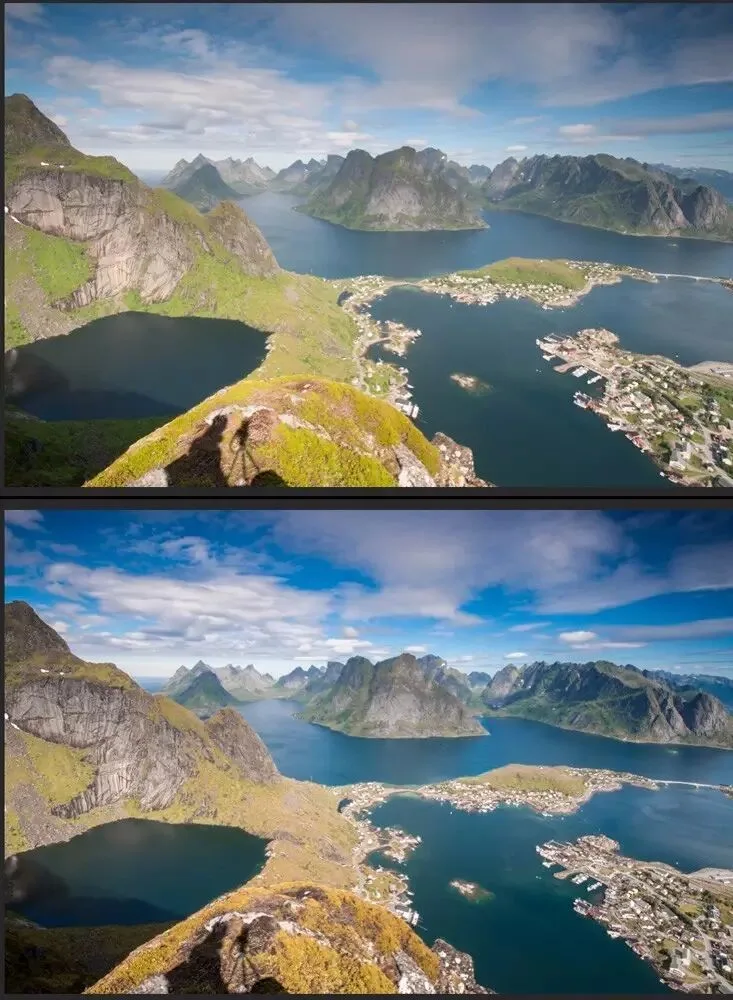
Of course, we can also use the 'Targeted Adjustment Tool' to adjust HSL properties even more simply and intuitively — I'll demonstrate that in a future video tutorial.
Summary
1. A color is composed of Hue, Saturation and Lightness.
2. The HSL tool in ACR and Lightroom consists of 3 sub-panels — Hue, Saturation and Luminance — each with 8 sliders corresponding to 8 color ranges in the photo.
3. The first step of HSL grading is to classify the colors in the photo and their corresponding objects; then we can separately adjust the hue, saturation and luminance of differently colored objects.
Follow @Thomas Chu Photo — learn one photography skill every week.