Photography Tutorial · 2017-12-10
A Powerful Color Adjustment Tool: Hue/Saturation
Among the common grading tools, ACR's HSL tool and Photoshop's Hue/Saturation tool — the subject of this article — are both built on the HSL color model.
As mentioned in our discussion of color, most grading tools — channel curves, Selective Color, Color Balance — are fundamentally built on the RGB color model.
In the RGB model, every color is formed by adding the three primaries — red, green, and blue — in different proportions.
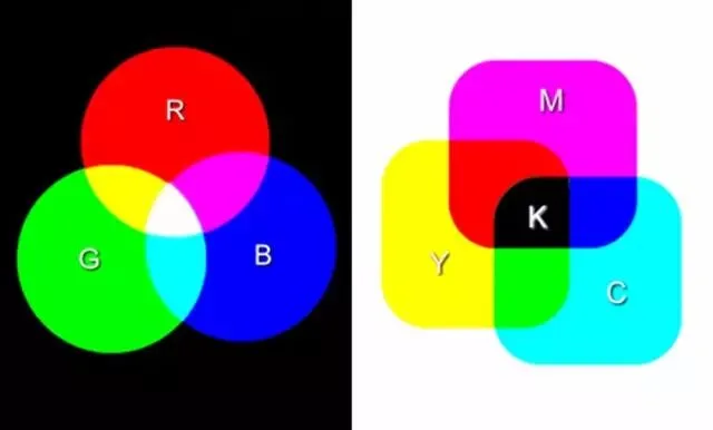
But RGB isn't intuitive for humans. If I say a color is 60% red, 30% green, and 90% blue, you'd struggle to picture what color that actually is.
So the HSL color space was designed to express color more intuitively. HSL stands for Hue, Saturation, and Lightness.
Hue is the basic property of color — what we ordinarily call the color's name, like purple, cyan, or magenta. All hues can be arranged on a wheel.
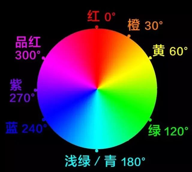
Positions 0°, 120°, and 240° on the wheel correspond to RGB's red, green, and blue primaries. Primaries mix pairwise into secondary colors: yellow (60°) comes from red plus green; blue plus green makes cyan (180°); magenta (300°) comes from red and blue.
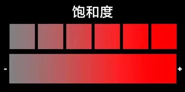
Saturation is a color's purity: the higher the saturation, the purer and richer the color; the lower, the greyer and duller.
Lightness is a color's brightness: higher values push the color toward white, lower values toward black.
Integrating Hue, Saturation, and Lightness into a single cylinder gives us the HSL color space model.
In ACR (and Lightroom), the fourth adjustment panel — the HSL panel — is a grading tool based on the HSL color space. See "Master Color Grading by Understanding the HSL Panel" and "HSL Grading in Practice: The Urban Black-and-Gold Look" to learn more.
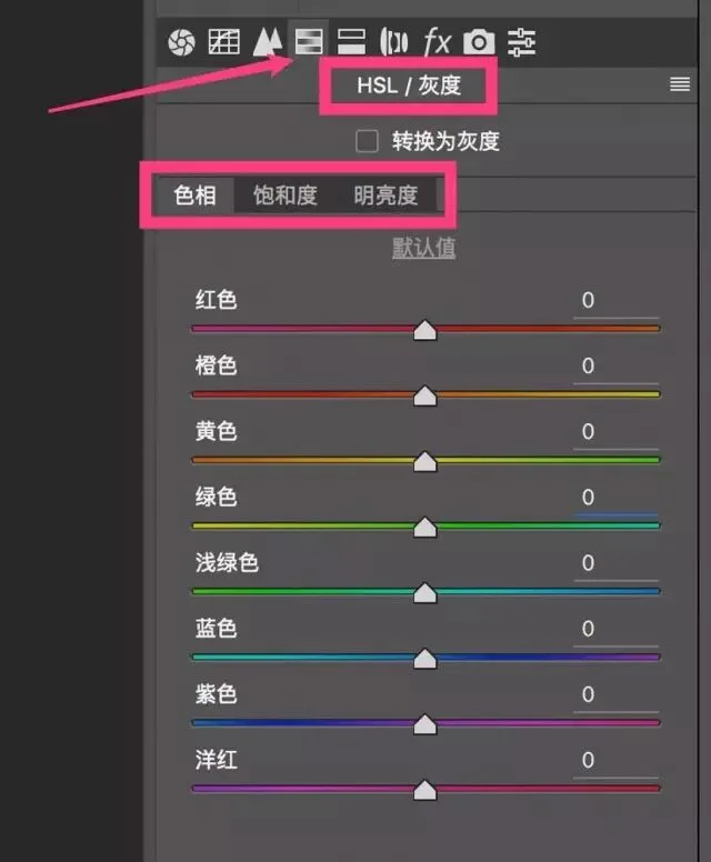
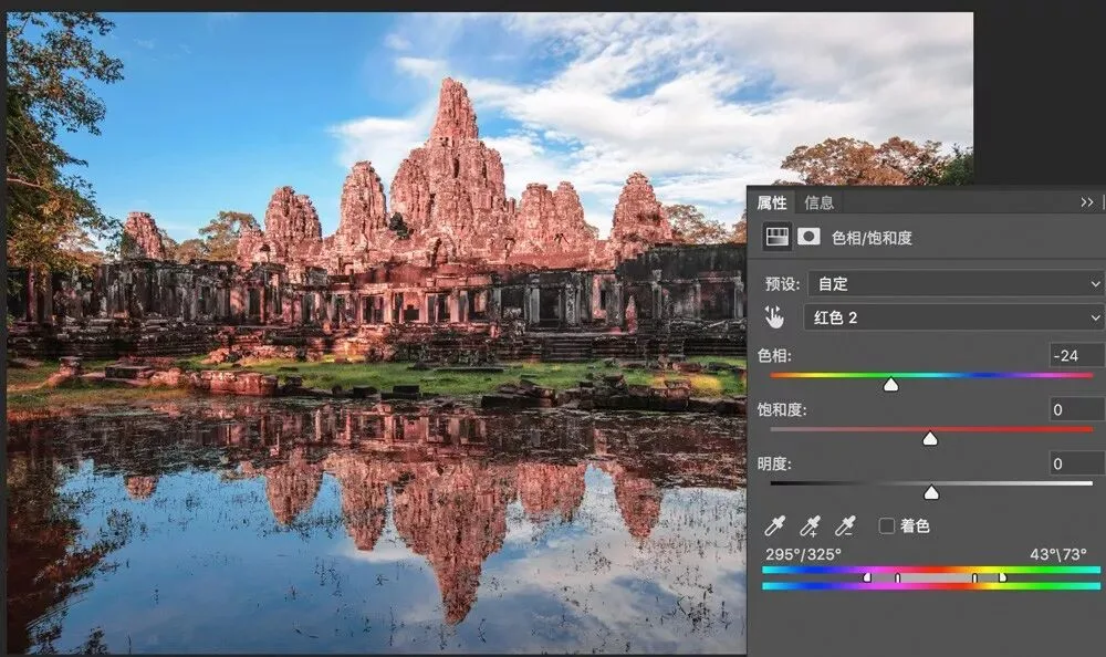
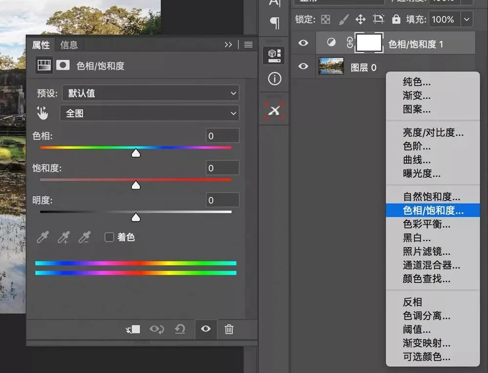
In Photoshop, the HSL-based grading tool is the even more powerful Hue/Saturation tool. Open it via Image > Adjustments > Hue/Saturation, or via New Adjustment Layer > Hue/Saturation.
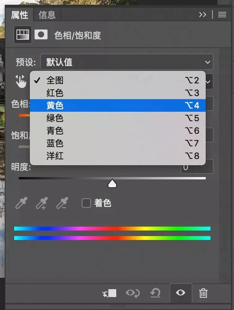
Much like the HSL tool, Hue/Saturation lets you pick from six colors in the frame — red, yellow, green, cyan, blue, magenta — and adjust each range's hue, saturation, and lightness.
What makes Hue/Saturation stronger than the HSL tool is, at its core, the ability to customize the selected color range.
At the bottom of the Hue/Saturation tool are two color bars: the upper bar represents the original colors, the lower bar the corresponding adjusted colors. Their relationship lets you read the grading result at a glance. If the red section of the upper bar has become yellow in the same region of the lower bar, the tool is turning the frame's reds into yellows.
Between the bars sit four sliders controlling the custom color range. Between sliders 2 and 3 lies the fully selected range — colors there receive 100% of our hue/saturation/lightness adjustments.
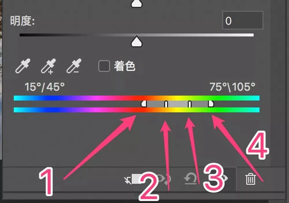
Between sliders 1 and 2, and between 3 and 4, lie the transition ranges — colors there are only partially affected by the adjustments.
A proper transition range matters greatly: it keeps adjustments natural and even, with no visible color breaks.
Beyond the four sliders, Hue/Saturation's three eyedroppers directly add or exclude colors in the photo.
In the image below, for instance, I want to adjust the yellow pagoda. I take the plus eyedropper and click the pagoda area — adding much of its yellow to the selected range.
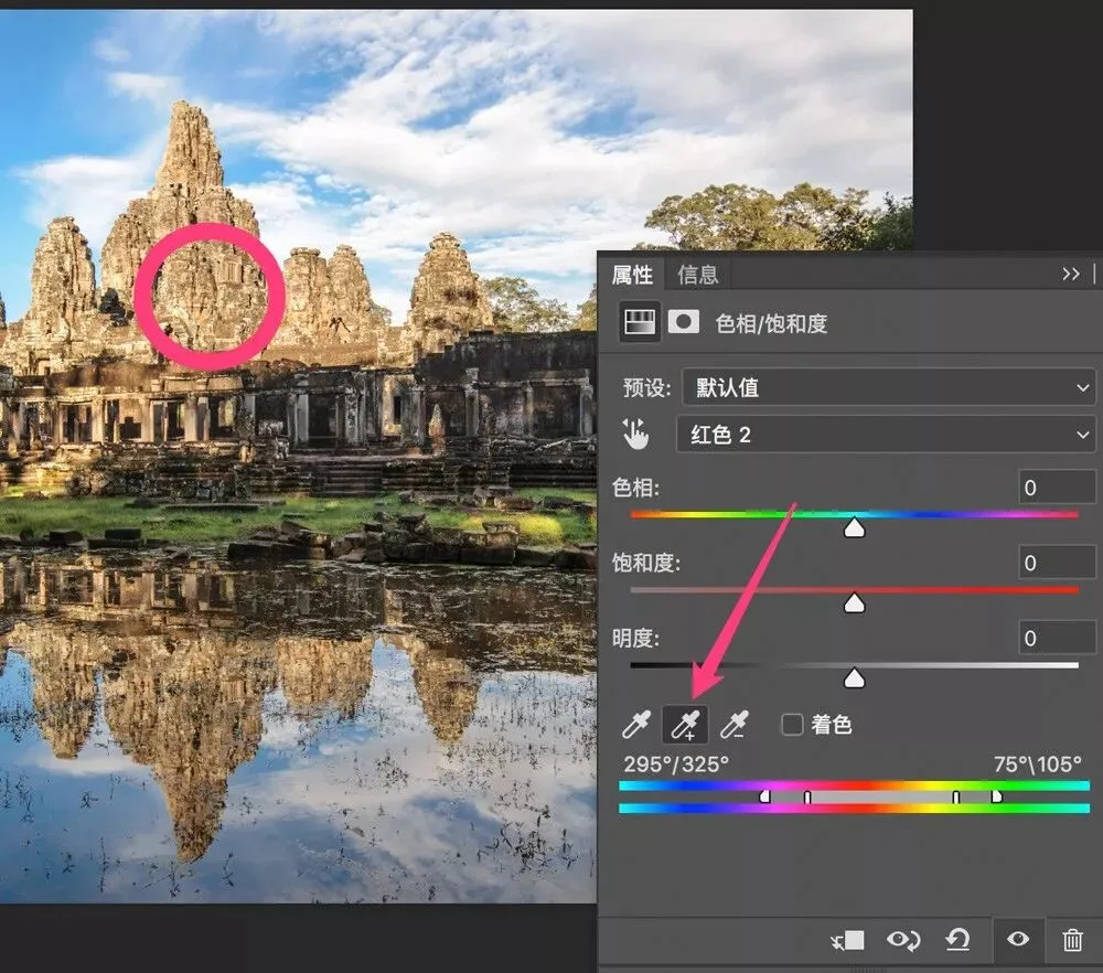
On the color bars you can see that green and yellow-green are now selected too — but those are the meadow's colors, and they need to be excluded.
So I take the minus eyedropper and sample the meadow, excluding its colors from the selection.
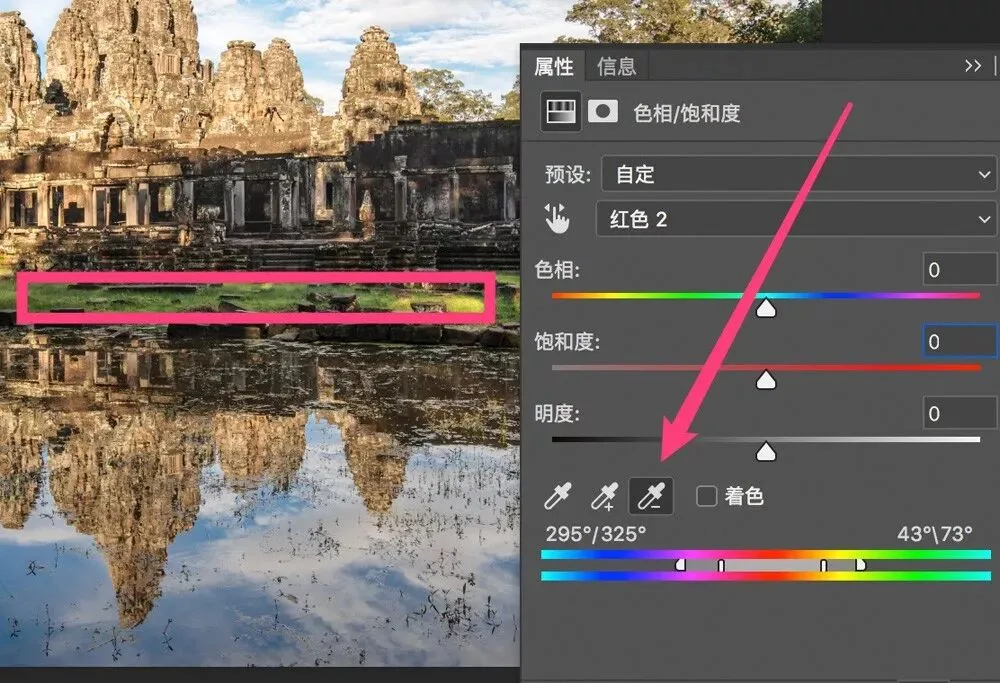
Now the selected range is mainly reds, oranges, and yellows — the yellow-greens and greens are left out.
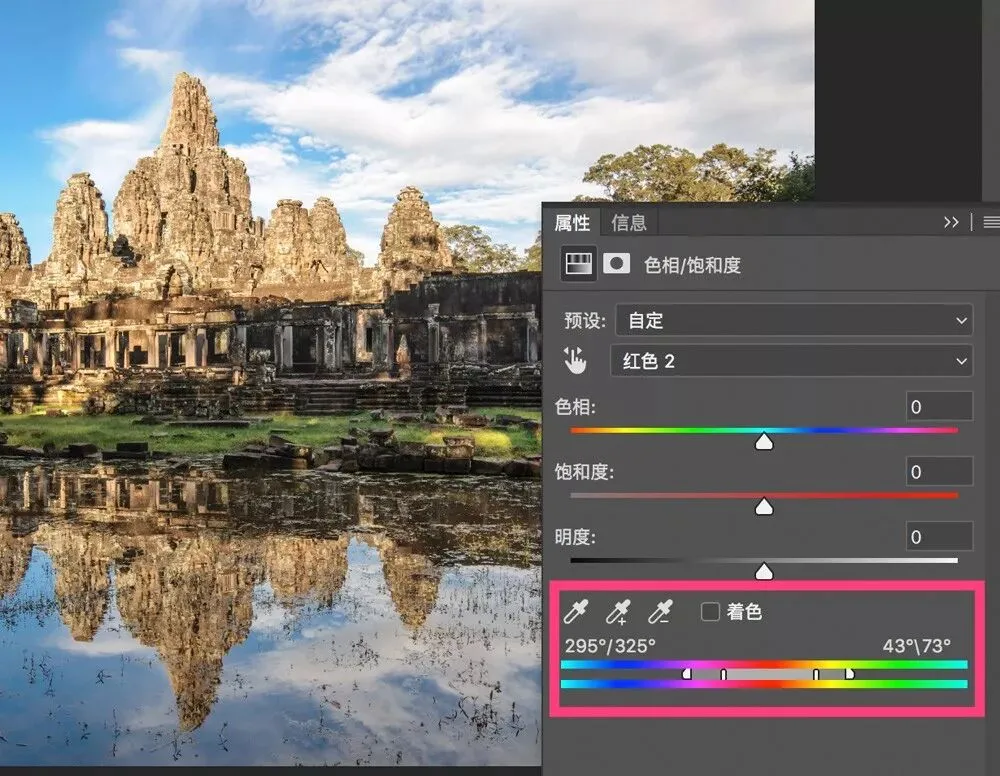
So when I drag the Saturation slider to -100, only the yellow pagoda turns black-and-white; the meadow is almost unaffected.
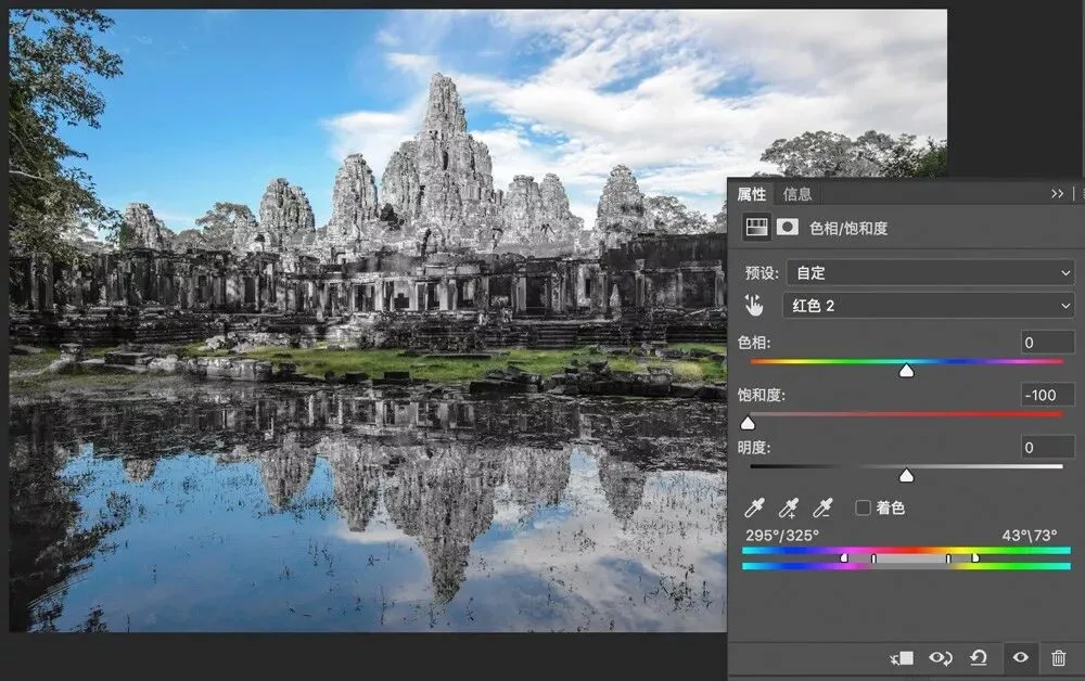
The Hue/Saturation tool combines selection and effect in one: it can adjust the hue, saturation, and lightness of any specific color in a photo.