Photography Tutorial · 2019-04-21
How to Create That Stunning Instagram Blue Tone
Thomas Chu Photo
Blue is everywhere — the sea, the sky, and the ambient light of nature.
In photographs, blue often sets the atmosphere. Beyond the common vivid, saturated blues, today Thomas introduces a low-saturation blue tone that's popular on Instagram.
Graded this way, blue feels calmer and more comfortable.

Video Tutorial
▶ Watch the video tutorial on Bilibili
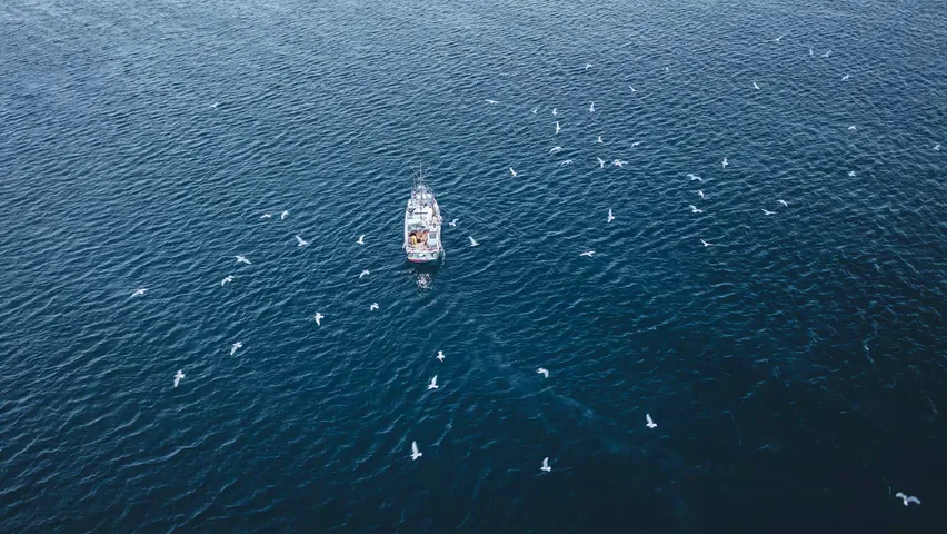
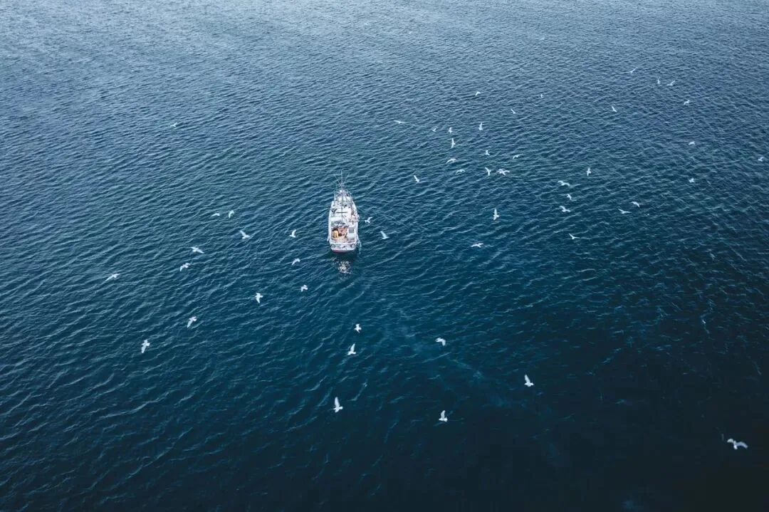
This is the fully illustrated companion to the video above. Using an aerial shot from Greenland — gulls chasing a fishing boat — Thomas demonstrates the full Camera Raw workflow behind Instagram's popular low-saturation blue: lens corrections, transform fixes, a secondary crop, then the Basic panel, film curve, HSL and split toning, finishing with batch-syncing the recipe to photos shot in overcast and sunny conditions. Every key step is captured in screenshots below, with the exact values spelled out in the text.
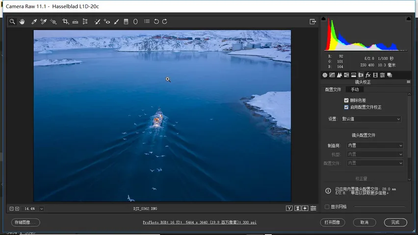
01 Corrections: Straighten First, Style Later
As always, corrections come before color. Open the Lens Corrections panel and tick Remove Chromatic Aberration and Enable Profile Corrections (at 0:28-0:34 in the video). Then move to the Transform tools and try Auto — but here it does a poor job, so switch to drawing guide lines instead (at 0:42-0:54 in the video).
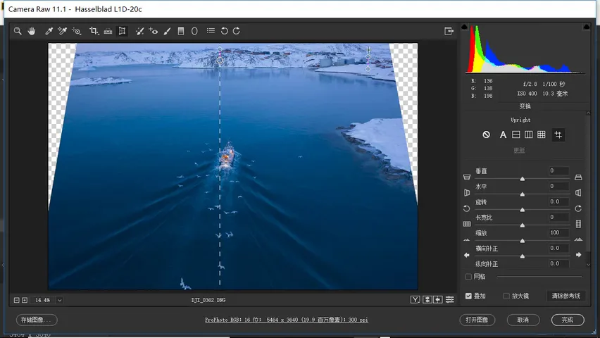
Zoom in and draw vertical and horizontal guides along references: the fuel storage tank is a vertical cylinder, so its edges must be plumb, and the buildings in the distance should be vertical too. Once the guides are set, the software applies a dramatic rotation and perspective correction — the tanks and houses return to true vertical. The boat gets stretched ever so slightly, but compared with the skewed distortion, the corrected perspective feels far more comfortable (at 1:00-2:23 in the video).
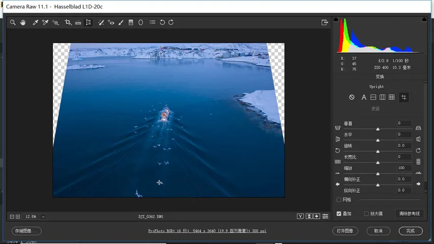
With corrections done, it's time for a secondary crop. Thomas sticks to his usual 3:2 ratio (the default of his Sony camera), and while stretching the crop frame deliberately brings in a gull below — as if chasing the boat. The final frame is a vertical composition with the fishing boat right at the lower third, a classic rule-of-thirds placement (at 2:25-3:03 in the video).
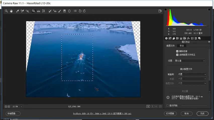
02 Basic Panel: Pull Highlights, Lift Shadows, Cut Saturation
Now for the Ins-style, low-saturation blue look. Step one: pull the highlights way down, which flattens the bright foreground so the frame reads even rather than bright-in-front, dark-in-back (at 3:12-3:32 in the video). Then lift the shadows a fair amount — another staple of the Ins look (at 3:34-3:41 in the video).
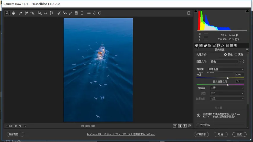
Drag the blacks slider left and the image deepens dramatically, recovering a lot of contrast; push the whites right and the photo's overall contrast comes back (at 3:42-3:59 in the video). Add a bit of clarity; and since the target is a low-saturation blue look, cut saturation hard — about -30 here — with further HSL work to come, because a global cut also mutes the reds and oranges (at 4:00-4:27 in the video).
03 The Film Curve: Lift the Blacks, Add an S
Next comes the crucial tone curve. For the Ins look — and many film looks — you draw a film curve, which is really simple: a lifted-black curve plus an S-curve. The lifted black means raising the darkest tones so no pure black remains in the frame: grab the leftmost point of the curve and lift it substantially (at 4:30-4:59 in the video).
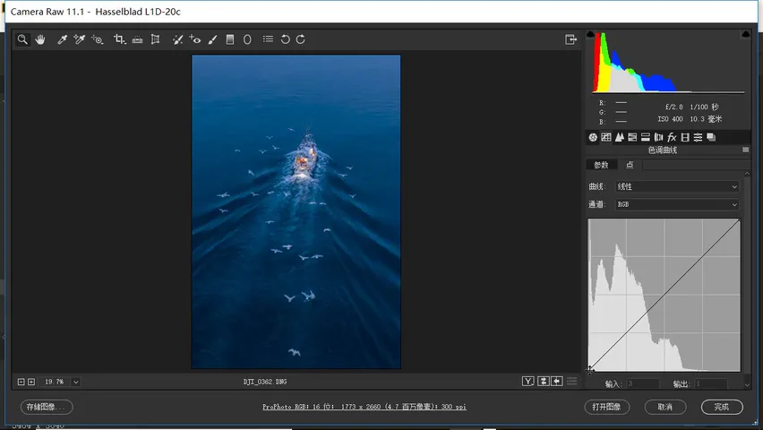
But lifting the blacks alone makes the image look flat, so add an S-curve on top to restore contrast while keeping the lifted toe. Lifted blacks plus an S — a curve combination used across countless editing styles (at 5:00-5:19 in the video).
04 HSL and Split Toning: the Ins Blue at Hue 210
The HSL panel here is simple — saturation and luminance only: drop the blue saturation hard, to around -60 (at 5:20-5:36 in the video); boost orange and red saturation moderately for warm-cool contrast; and in luminance, nudge orange up and blue down slightly — again for contrast (at 5:37-5:51 in the video).
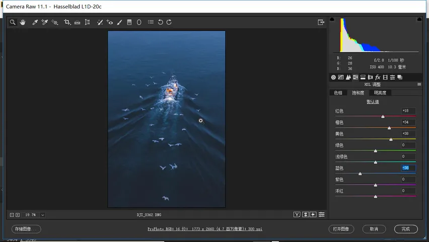
At this point saturation is very low, and the blue still falls short of the real Ins blue. The trick: keep the blue saturation low, then add the Ins blue back through split toning. Here is a rule worth memorizing — the blue that's popular on Instagram sits at a hue value of about 210 (at 5:52-6:27 in the video). Set the highlights' hue to 210 and add a touch of saturation, and the highlights pick up that Ins cast; not much is needed — they go from pure white or slightly purple to much more pleasant (at 6:30-6:47 in the video).
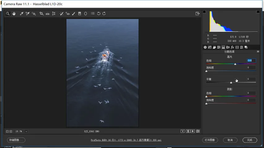
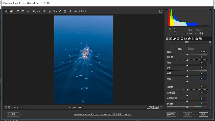
Don't forget the shadows: set their hue to the same Ins blue around 210 and raise saturation to about 11 — a perfectly fine result (at 6:48-7:06 in the video). Finally he felt the blacks were not deep enough, so the blacks slider goes down a bit further — that is what makes the blue feel deep and profound (at 7:14-7:27 in the video). And with that, the low-saturation Ins blue edit is complete.
05 Before and After, and Batch Syncing
Now the before-and-after: without the transform corrections the boat was visibly distorted; after them, its perspective feels right (at 7:37-7:49 in the video). On color, the original was a highly vivid blue that isn't particularly pleasant; the sea blue now reads quiet (at 7:50-8:00 in the video). The recipe holds up for blues shot in both overcast and sunny conditions.
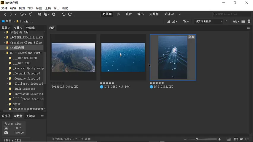
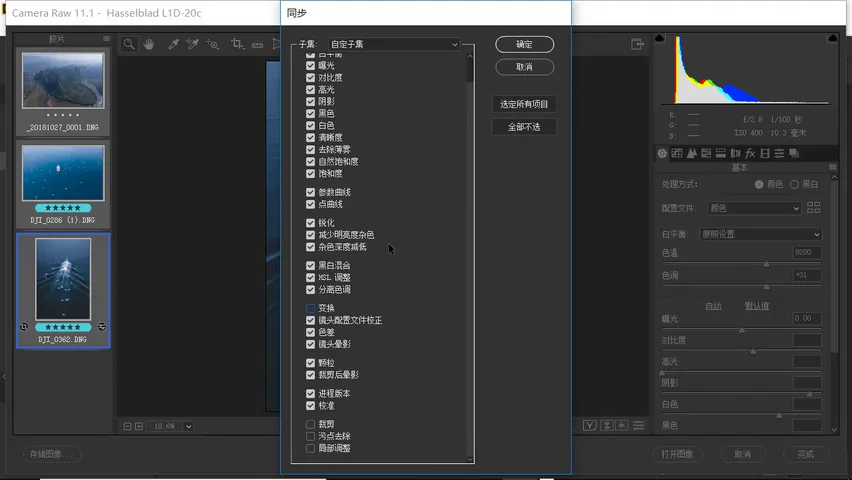
The recipe also scales: open several photos together in Camera Raw and sync the settings or apply a preset. Select all the photos in the library, right-click and choose Sync Settings, transferring everything except transform, crop, local adjustments and spot removal (at 8:09-8:35 in the video) — corrections and crops differ per frame, but the look is universal.
After syncing: the overcast frame goes from flat to far deeper, and the sunny one turns calmer and more pleasing (at 8:36-8:52 in the video). That is the whole secret of the low-saturation Ins blue — corrections as the foundation, the film curve for structure, and hue 210 as the finishing touch.
1. Correct before you style: lens corrections first, then transform guides to plumb the tanks and buildings, a 3:2 vertical crop with the boat on the thirds line; 2. The Basic panel sets the base: highlights down hard, shadows up, blacks left and whites right to restore contrast, saturation cut by 30 first; 3. The film curve = lifted blacks (no pure black) plus an S (contrast back); 4. The Ins-blue rule: drop blue saturation to -60 in HSL, boost orange-red for warm-cool contrast, add hue-210 blue to highlights and shadows in split toning, then sink the blacks for depth — sync it to every blue photo, cloudy or sunny.
This tutorial also comes with a RAW file to download and practice with.
Practice file download:
Link: https://pan.baidu.com/s/1ivIaAXZMhgd-LpcPgjPWug
Extraction code: 96g2
Copy this text and open the Baidu Netdisk mobile app for easier access