Photography Tutorial · 2019-11-03
Those Stunning Muted Teal-Blue Instagram Photos — Here's the Recipe
Thomas Chu Photo
In the article "Stunning Tones! These 4 Instagram Photographers Use Teal to Perfection!", Thomas recommended several Instagram photographers — including @benjaminhardman and @fursty — who create gorgeous teal-toned photos.
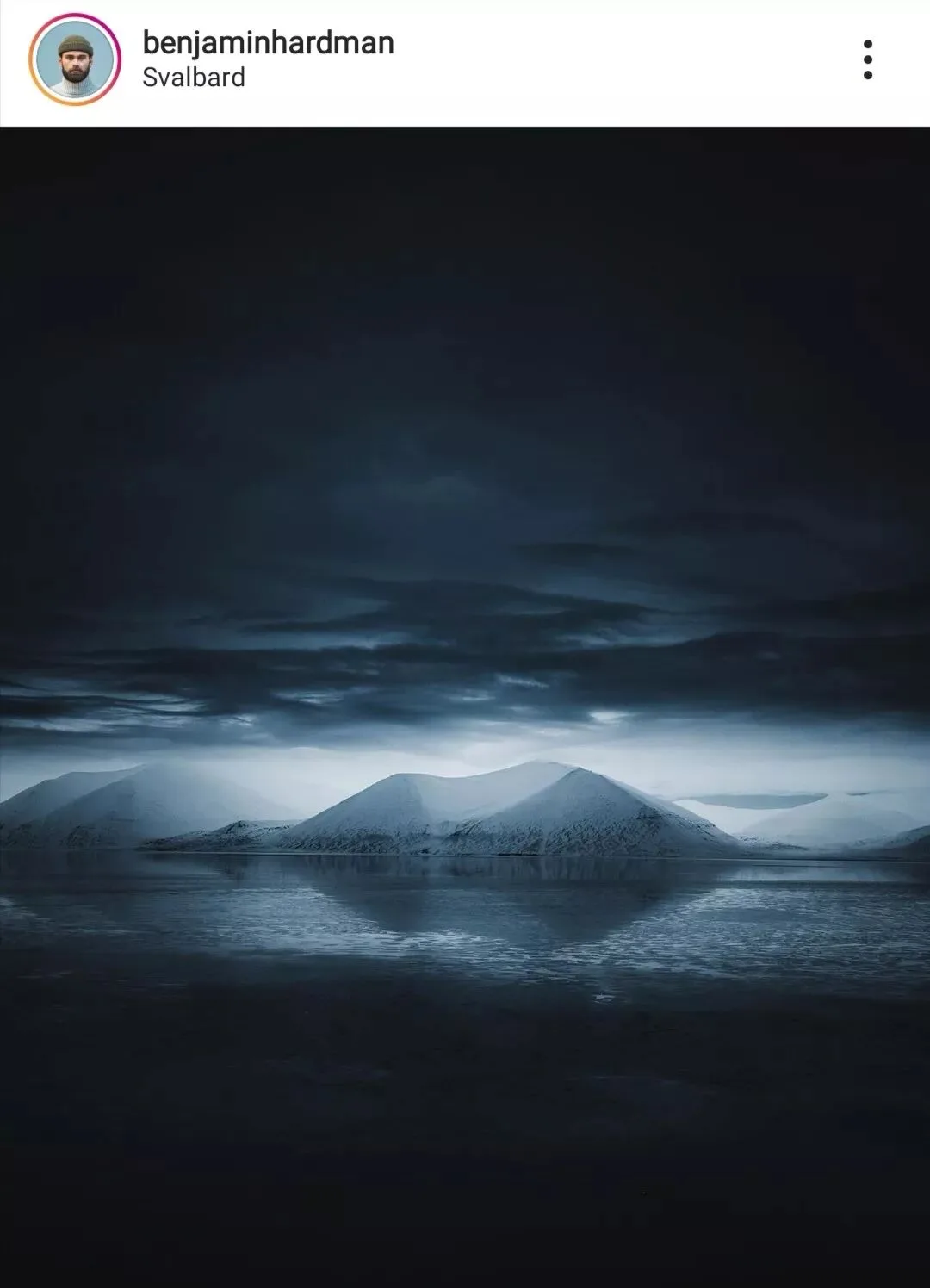
In today's tutorial, Thomas will use the photo below as an example,
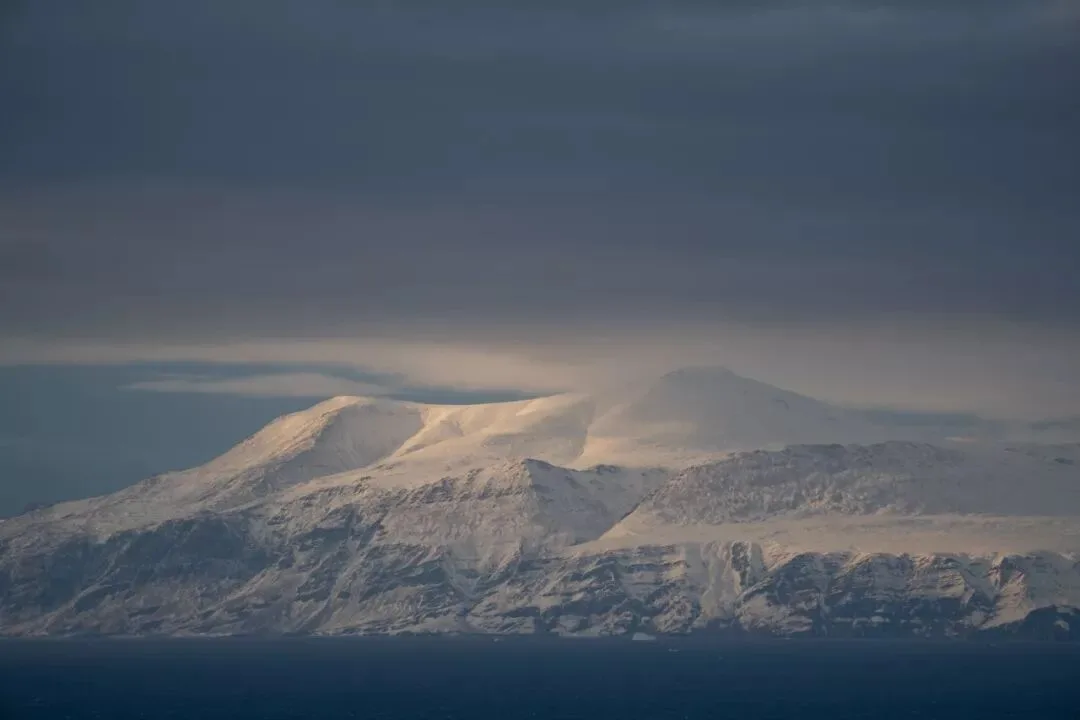
showing you how to create this beautiful muted teal-blue style in Lightroom or ACR (Camera Raw) in just a few steps!
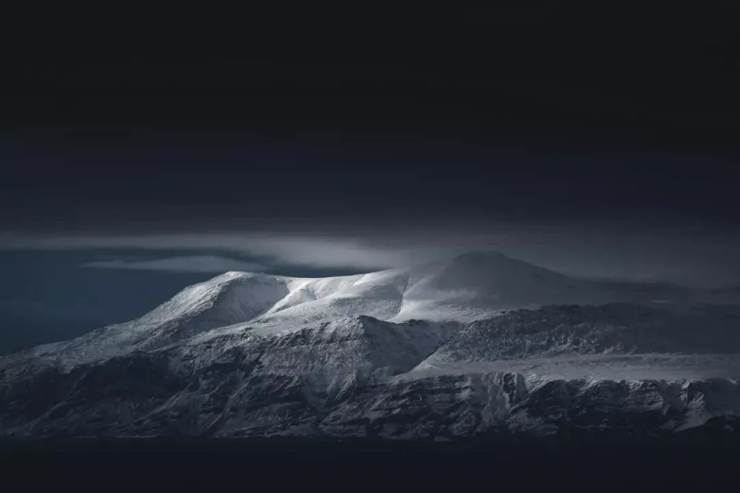
Video Tutorial
▶ Watch the video tutorial on Bilibili
This is the full illustrated write-up of the video above. Thomas first breaks down what unites Instagram photographer Benjamin Hardman's dark teal images — left-packed histograms, strong contrast, low saturation, and an overall cyan-blue cast — then, using a snowy mountain raw file, demonstrates the full recipe: a dark-but-contrasty tone, and a "desaturate first, then tint" color workflow, with timestamps for every key step.
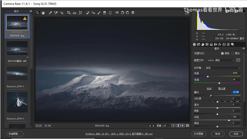
01 Decoding the Style: Dark, Contrasty, Desaturated
Benjamin Hardman's photos are almost all shot on overcast or rainy days, yet they keep some real light in the frame — that light isn't painted in post; it exists on location, and the dark look is built in post. Check the histogram in the top-right corner: most pixels pile up on the left, meaning the image sits dark overall — but the contrast is strong, because the sunlit areas in every frame are pushed bright (at 0:54 in the video).
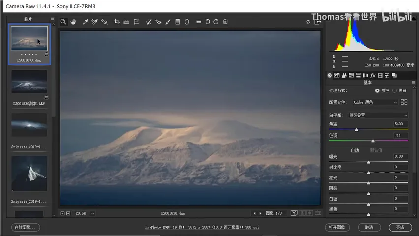
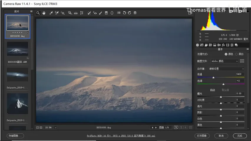
In color, this is a strongly desaturated style: sampled pixels show R, G, and B values very close together, with an overall cyan-blue lean. Once the traits are clear, the recipe follows — tonally, darken the whole frame while preserving contrast, especially in the highlights, using exposure, whites, and local adjustments; in color, push both highlights and shadows toward cyan-blue. A simple, effective way is "desaturate first, then tint": strip the original yellows with the saturation or HSL tools, then add the teal-blue back via white balance, split toning, and HSL (at 1:37 in the video).
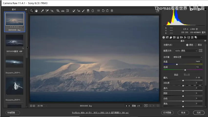
02 Tone: Darken Without Losing Highlight Contrast
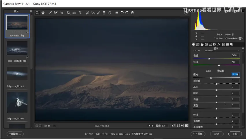
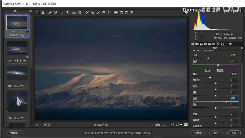
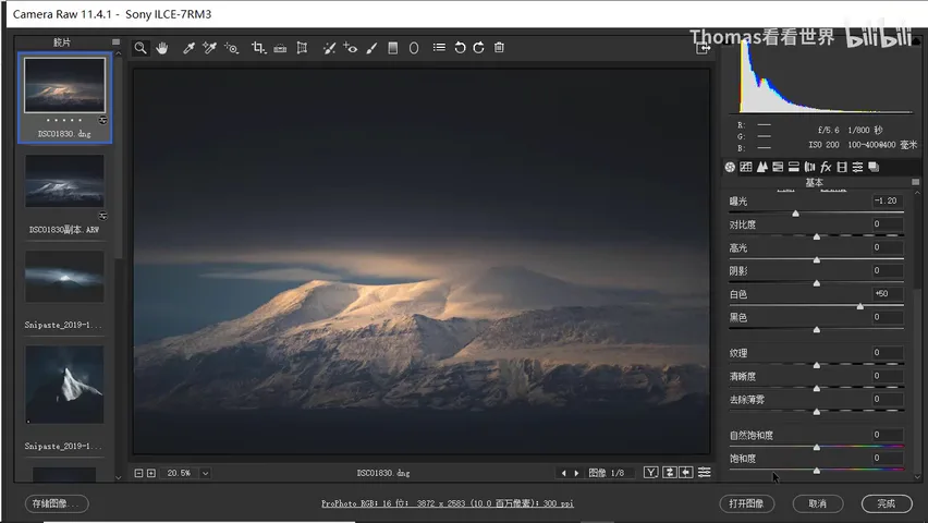
Step one: pull the exposure down. The image is a low-key shot, so lowering exposure pushes the whole histogram toward the left. That flattens contrast, which is where the whites slider comes in — whites set the brightest point of the frame, and raising them makes the bright areas glow again, restoring contrast. But don't overdo it: too much and the whole image, dark clouds included, brightens again. Find a middle value where the clouds stay dark and the snowy mountain stays bright (at 2:35 in the video).
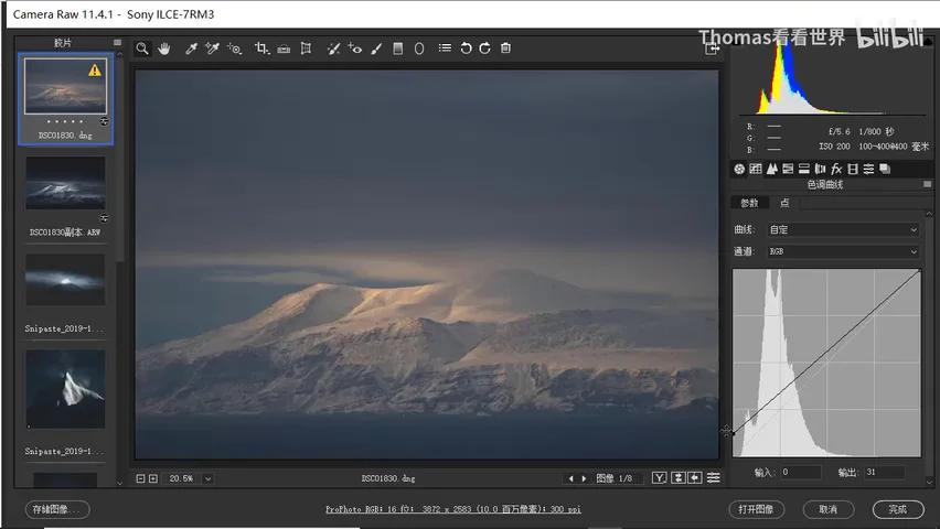
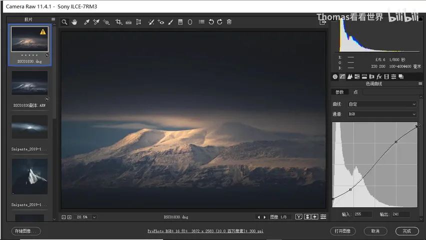
Look closer at Hardman's photos and there's another detail: the deepest shadows aren't pure black but a dark gray. The classic film curve does exactly this — lift the black point so the darkest pixels turn dark gray instead of black; but that lifts the whole image and softens contrast, so add an S-curve on top for punch. Lifted blacks plus an S-curve: the timeless film curve (at 3:31 in the video).
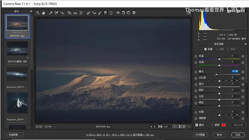
Next, shape the frame with local adjustments. Hardman's images are always brightest in the lit center — the mountain — while the sea and sky on both sides sit dark. The recipe: pull gradients with exposure at -0.5, one across the sky (a second if one isn't enough), another for the bright top-right corner, and one more over the sea — and the sky and sea darken as a whole (at 4:23 in the video).
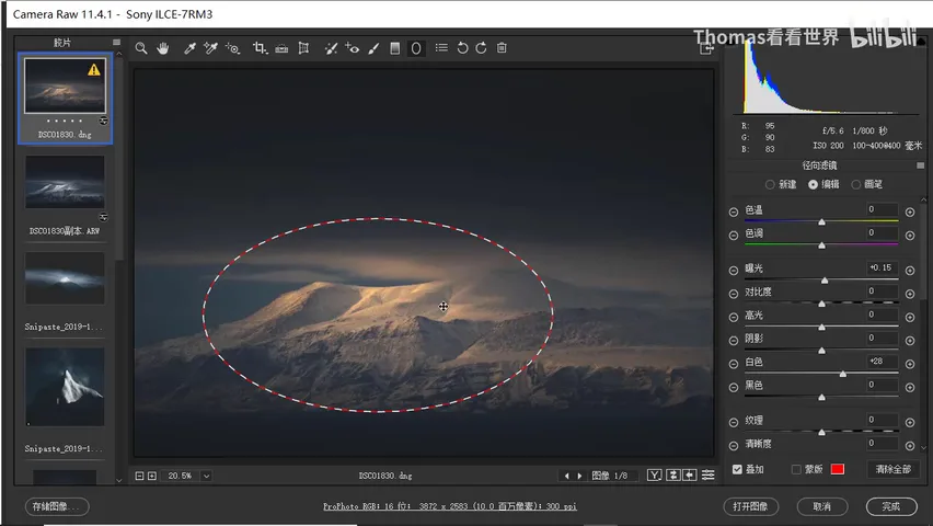
Darkening the edges isn't enough — the center needs lifting too. Reset the local adjustments, then raise exposure for overall brightness and boost whites — since whites govern the brightest values, the brightest snow gets the biggest lift. Then use gradient filters along the direction of the light: it comes from the left, so add a gradient there, plus a larger overall one for a smooth, even transition. Watch for clipping while brightening — go back to the curve tool and pull the very top point down slightly so the highlights never blow out (at 4:45 in the video).
03 Color: Desaturate First, Then Tint
Desaturating is simple: pull the global saturation down to mute the photo, then use HSL to cut the yellows and oranges further, stripping out most of the original color. But moderate the reduction — don't drop it to zero, or you get a black-and-white image and tinting gets much harder; keep a little of the native color as a base (at 5:51 in the video).
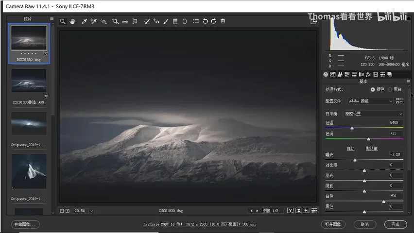
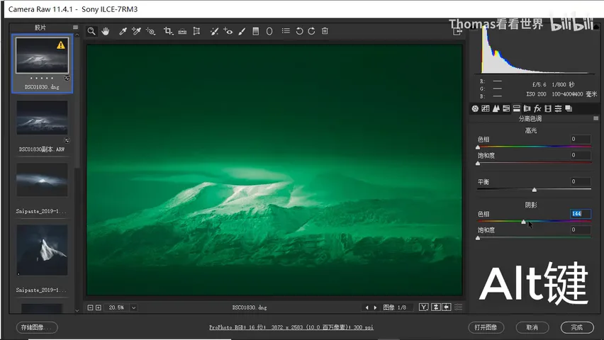
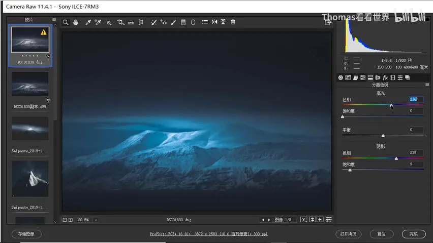
Tinting starts with white balance: set the temperature around 4900 and nudge the tint slightly left, and the whole photo leans cyan-blue. Then comes the key step — split toning. Hardman's highlights and shadows actually sit at slightly different hues. A trick while tuning the shadow hue: dragging the slider gives no live preview, but hold the Alt key and you can see exactly what color you're adding to the shadows. Push the shadow hue toward blue, even blue-violet — say 239 — and keep saturation modest: Hardman's pixels have R, G, B values very close together, so around 9 is plenty (at 6:26 in the video).
For the highlights, pick a slightly cyan-leaning blue — hue 209, 216, and so on — offset from the shadow blue so the two are related but not identical, which gives the image layered depth. Highlight saturation is a matter of taste: for that captivating cyan cast in the bright areas, push it a bit higher. Hardman varies too — some photos read clearly cyan and moderately saturated in the highlights, others stay very desaturated. For this frame Thomas didn't want heavy saturation, just a touch of cyan in the highlights (at 7:34 in the video).
04 Finishing Touches and a Full Recap
At this point the image is essentially done. If it still isn't dark enough, lower the exposure a touch more, and don't lift the curve's shadows too high — keep a little depth in the blacks. That completes this dark, teal-toned, very Instagram-look photo (at 8:24 in the video).
Looking back, the recipe is remarkably simple. Tone: lower exposure, raise whites for a contrasty dark look, then darken the edges and brighten the center with gradients. Color: desaturate first — drop global saturation and use HSL to cut whatever colors the scene has (yellows and blues here; greens and purples too if present); then tint — white balance plus split toning for that captivating teal-blue. Fine-tuning comes last: if the blue hue feels off, adjust it in HSL toward purple or cyan, entirely by your own taste (at 8:47 in the video).
1. The style recipe: left-packed dark histogram, strong contrast (bright sunlit areas), low saturation (RGB values nearly equal), and an overall cyan-blue cast; 2. Three tone moves: drop exposure, raise whites to restore highlight contrast, apply a film curve (lifted blacks plus S-curve) for dark-gray shadows, then gradients darken the edges, the center gets lifted, and the curve's top point is pulled down to prevent clipping; 3. The color mantra "desaturate first, then tint": saturation plus HSL to strip native colors (not all the way to black-and-white), temperature 4900 with tint left for a cyan lean, split toning at shadow hue 239 and highlight 209/216 for layered blues at low saturation; 4. Handy trick: hold Alt to preview live the color you're adding to the shadows in split toning.