Photography Tutorial · 2017-04-18
Advanced Post-Processing for Landscape Portraits
The author of this article is Terry F, a brilliant portrait and conceptual photographer. Today he brings us the post-processing installment of "How to Shoot Distinctive Portraits While Traveling — Shooting Strategy", detailing his editing process for this photo.
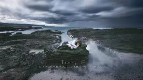
Landscape portraiture is somewhat harder to shoot than other genres, but for a careful photographer it poses no great pressure. In the previous tutorial I briefly covered the preparation and shooting process for landscape portraits and long-exposure portraits. Once the shoot is done and you're home from the trip, it's time to think about how to process the photos.
This tutorial explains in detail the post-processing approach and method for the trickiest kind of landscape portrait — the long-exposure portrait. In short: how to blend one (or more) long-exposure frames of the environment with another one (or more) frames exposed for the person.
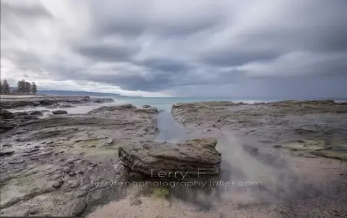
Many people have asked: why not just long-expose the person directly? Generally, keeping a person still in a sleeping or sitting pose for a few seconds isn't hard. But if wind moves their hair, the shot is ruined. So the safest approach is to shoot the person and the environment separately and composite them in post. The compositing is simple — you'll see in the tutorial below. But be sure to use a sturdy tripod when shooting, so you avoid the pain of aligning frames in post.
Friends who have read my previous editing tutorials should remember the three points those tutorials emphasized again and again:
·Have a goal for the photo — know the effect you want.
·Have a clear plan for reaching that effect — know what each step is doing.
·Solve the technical problems.
1
Basic Compositing
With those three points clear, we can begin editing. What follows covers the most basic two-photo composite and its post-processing.
Photo 1 (aperture: f/10, shutter: 1/20s, ISO: 100)
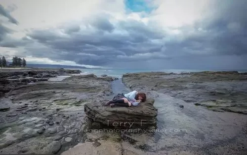
Photo 2 (aperture: f/10, shutter: 75s, ISO: 100, with an ND1000 filter)
The first step is placing both images in Photoshop. Use the environment frame as the background and create a mask on the portrait layer.
Figure 4
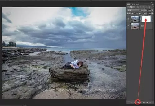
(A quick intro to masks: white marks the visible area of the layer, black the invisible. To erase part of a layer, simply paint with a black brush on the white mask. The advantage over the Eraser tool is that you can always paint white back in to restore what you erased.)
Since the person occupies a small area here, select the mask, invert it with Ctrl+I, then paint with a white brush to roughly reveal the person. (You can also hold Alt and click to create a black mask directly.)
Figure 5
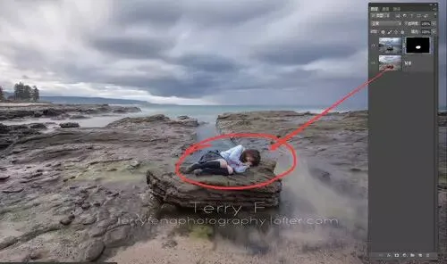
While painting the mask, also reveal some of the rock area below the person, so the person's shadow falls naturally on the rock. And since the two exposures are nearly identical, the rock areas blend together naturally.
Figure 6
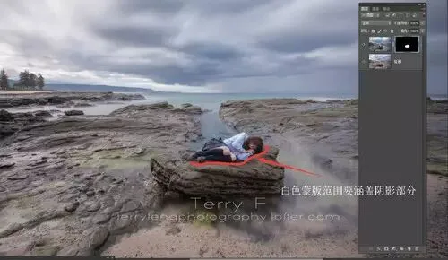
But above the person, the water from the two different exposure times doesn't blend perfectly. Here we need a smaller black brush to erase this part of the mask along the person's edges.
Figure 7: the blending problem
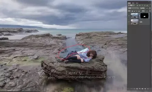
Figure 8: carefully paint out the seawater above the person with a black brush
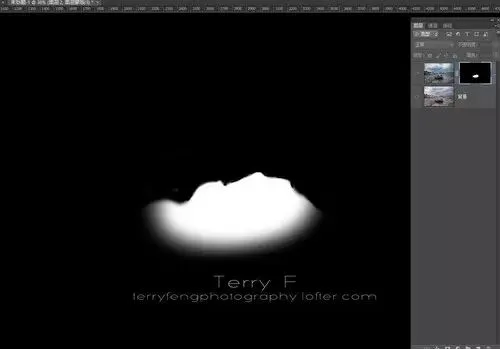
Figure 9: the finished composite
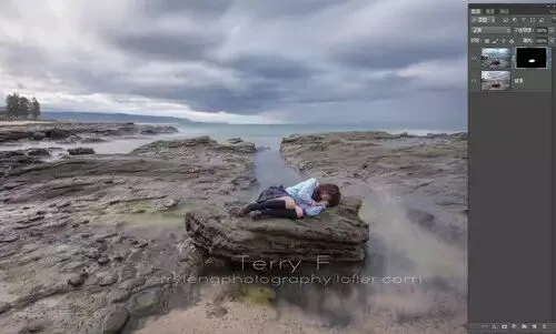
After compositing, if you're unhappy with the blend — say the white balance or exposure differs between the frames — you can use Curves or Hue/Saturation to adjust one of the images so the two merge better.
Figure 10
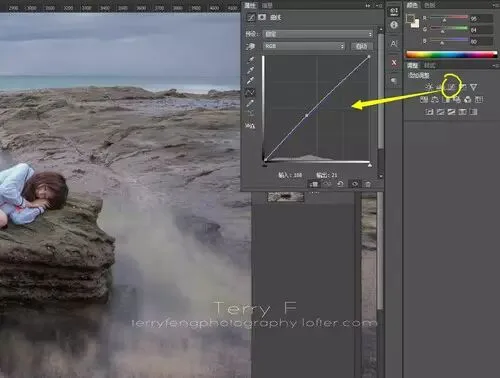
Here I fine-tune with Curves, and Alt+left-click the layer below so the Curves layer only affects the layer directly beneath it.
Figure 11
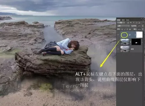
2
Color Grading and Tonal Direction
Once the composite is done, it's time to grade the image. Before formally grading, let's analyze how to approach it.
·The image uses center composition, so in post I need to draw the viewer's eye toward the middle — emphasize the person and weaken the surrounding environment's influence.
·The waves weren't big, so the long-exposure water effect isn't obvious enough — the water surface needs strengthening in post.
·The photo's mood is somber and the theme quiet and heavy, so the grade will mainly use cool tones.
Figure 12
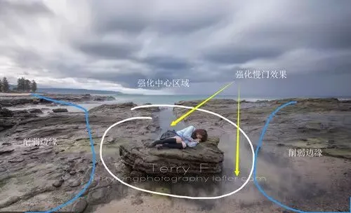
First, use Curves to darken the ground portion of the image overall, and mask out the person to keep their brightness. This raises the light-dark contrast between sky and ground, shifting the visual weight downward. Keeping the person bright makes them stand out more.
Figure 13
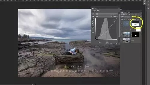
Next, strengthen the water effect: click Select - Color Range, hold Shift, and click the water multiple times with the eyedropper to select it, then confirm.
Figure 14
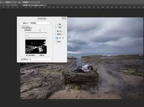
Figure 15
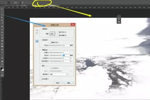
Then create a Levels layer to brighten the selection. But as you can see, the brightening is harsh, and many areas that shouldn't be brightened (like the sky) got brighter too — because the Color Range tool selected many things we don't need.
Figure 16
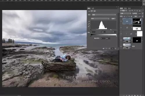
So the mask needs further work with a brush to remove the unwanted parts.
Figures 17, 18
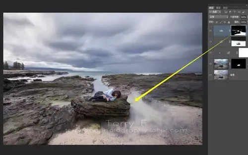
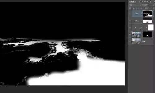
Next, tint the environment as a whole — first to strengthen the overall mood, second to make the cool tones more pronounced. Here I use a LUT: choose Color Lookup and select NightFromDay (LUT files can be downloaded online; if you're not used to LUTs, you can tint with a Photo Filter instead). After tinting, the whole frame turns very blue and purple.
Figure 19
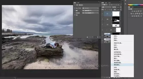
Figure 20
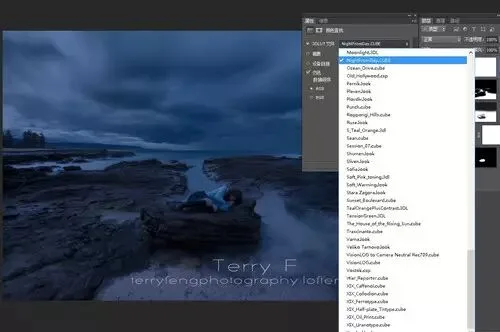
Then use the Xueren plugin (any similar luminosity-mask plugin works) with a dark-tones mask to limit where the LUT applies.
Figure 21
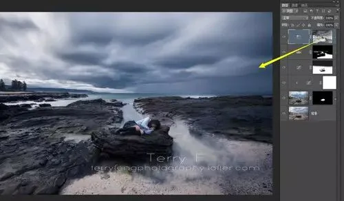
But the mask isn't perfect — some colors that should be removed aren't covered by the LUT — so refine the mask further with a brush.
Figure 22
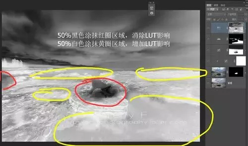
After this step, the colors are somewhat more ideal, but the overall blue cast is still too strong. Next we need to locally neutralize the blue.
Figure 23
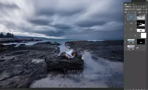
The way to neutralize blue is adding yellow — here we can use Selective Color to add yellow in the blacks. Incidentally, reduce black in the reds (mainly the skin areas), which effectively brightens the skin tone.
Figure 24
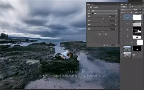
Figure 25
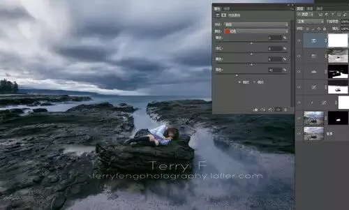
Then, use Curves to brighten the shadows and darken the midtones. This lifts the darkest areas while lowering overall exposure, creating a "gray tone" feel that increases the perceived latitude.
Figure 26
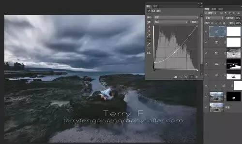
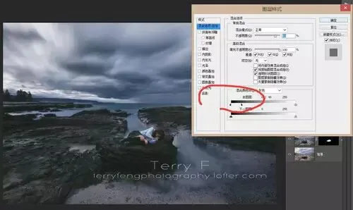
But this curve sacrifices a lot of detail, so double-click the layer to open Layer Style. Under "This Layer", hold Alt and drag the small arrow below to recover some shadow detail.
Figure 27
Next, we can create a soft-glow effect. Soft glow is actually simple — I know of five or six ways. Here's a convenient one. First, press Shift+Ctrl+Alt+E to stamp a layer containing everything below. Then press Shift+Ctrl+U to desaturate it to black-and-white, so the glow won't affect the original colors.
Figure 28
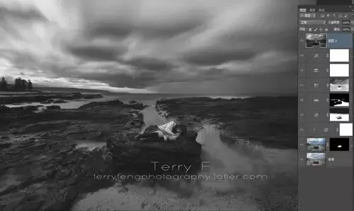
Adjust this layer's Levels to add contrast — brighter brights, darker darks — so the glow barely affects the dark areas.
Figure 29
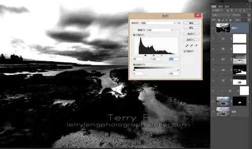
Next, apply Gaussian Blur — around 10 is generally fine.
Figure 30
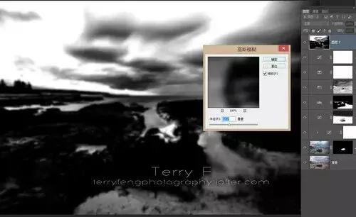
Then duplicate the layer: set one copy's blend mode to Soft Light and the other to Screen, and adjust both opacities. The Soft Light layer adds contrast while glowing; Screen filters out the black parts, brightening the whole frame during the glow and offsetting part of the darkening from the Soft Light layer.
Figure 31
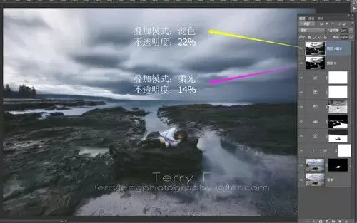
After this step, the global-effect adjustments are done. Next comes local refinement to perfect the image.
3
Image Refinement
First, strengthen the sky's layering. Use the rectangular marquee to select the sky — if the horizon is complex, use the lasso to select the sky manually.
Figure 32
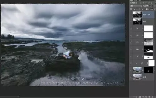
With the selection made, create a Levels layer to darken the sky and increase contrast, making its layering more distinct. Then adjust the opacity to fine-tune.
Figure 33
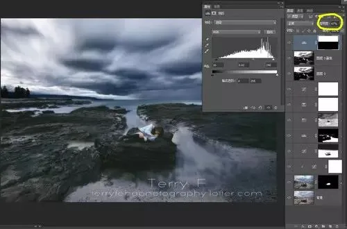
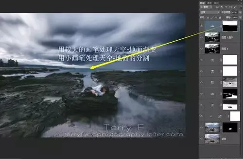
Then use a black brush on the mask to remove the ground portion.
Figure 34
Now I notice the dark parts of the sky look too saturated — viewers' eyes get drawn to the clouds. So use Color Range again to select the dark parts of the clouds, create a Saturation layer, and reduce that range's saturation.
Figure 35
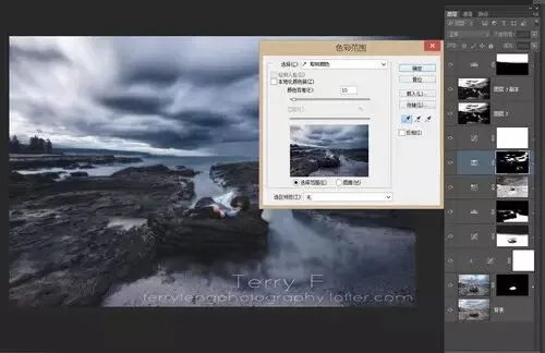
Figure 36
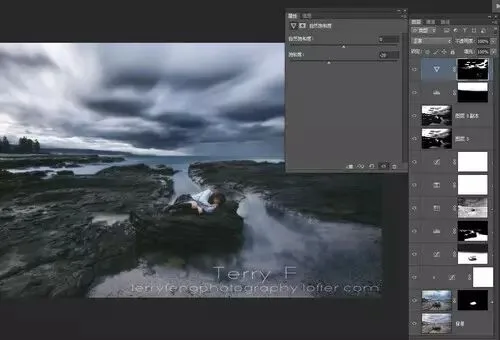
The image is composed of "water", "sky", "rock", and "person". The tree on the left adds an unnecessary element, so we can stamp a merged layer and remove it with the clone stamp — and remove the beach along the way.
Figure 37
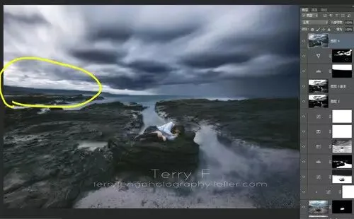
After this step, it's worth reviewing the image with fresh eyes (something I actually do after every photo). Ideally, do this review half an hour later — or even the next day — so you see the image anew.
In this review, I found the following problems with the image:
First, the clouds, water, and person all lean right, shifting the frame's momentum from the planned convergence toward the center into a drift toward the right.
Second, the image is too dark overall; the light-dark structure isn't clear enough yet.
Finally, the person needs some correction, and the image still needs an overall crop and sharpening.
Figure 38
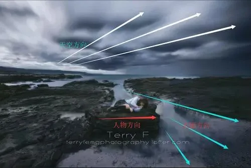
To emphasize the center through light and shadow, you can either darken the edges or brighten the center. As mentioned, the image is dark overall, so we'll brighten the center.
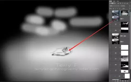
First stamp a merged layer and set its blend mode to Screen, brightening the whole image. Then on a black mask, paint white to reveal the center area — I also brushed a bit over the clouds' dark parts so the sky's contrast isn't too harsh.
Figure 39
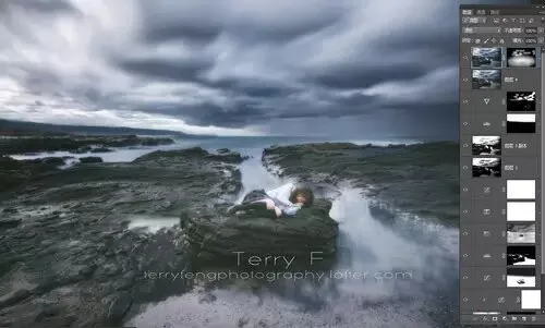
Then, since the person was brightened along with everything else, use a black brush to remove the brightening where the person doesn't need it — manually enhancing the subject's light-shadow structure.
Figure 40
Next, use Levels with a mask to strengthen contrast in the center area.
Figure 41
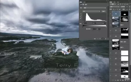
Then adjust the person's skin tone: first use the Magic Wand to quickly select the skin areas, and lightly feather the selection with the Refine Edge button.
Figure 42
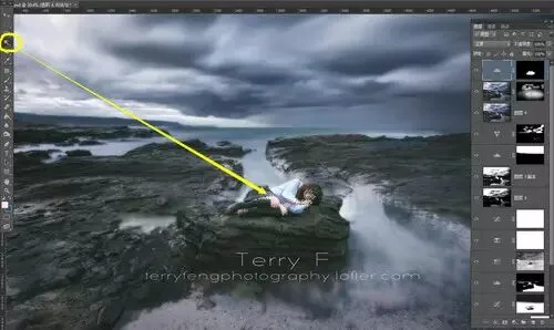
Because the skin leans cyan and magenta, use Curves to slightly raise red and green and lower blue. Then adjust opacity to bring the skin back to normal. Since the overall environment is cool, the skin shouldn't be pushed too warm or yellow either.
Figure 43
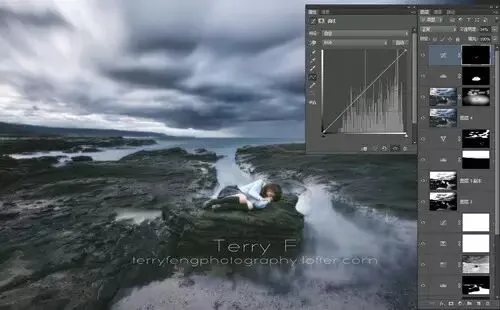
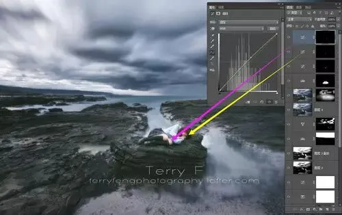
Then continue with several more Curves layers to fine-tune different parts of the skin. (For detailed skin-tone methods, look forward to the skin-tone tutorial to be published later.)
Figure 44
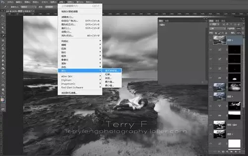
Once the image is essentially complete, use High Pass to sharpen the whole frame.
Again, stamp a merged layer, convert it to black-and-white, and go to Filter - Other - High Pass.
Figure 45
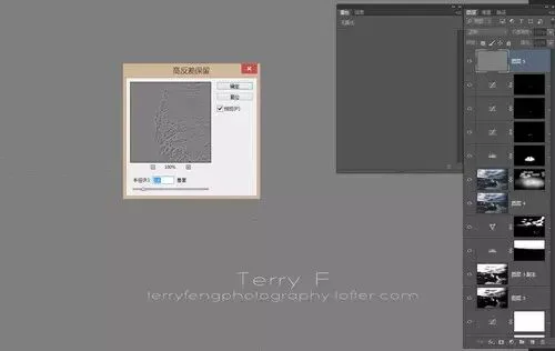
Choose a low High Pass radius — here I used 2.6.
Figure 46
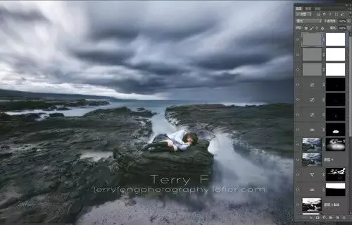
Then set this layer's blend mode to Soft Light, duplicate it twice more, and give each sharpening layer a mask. With three sharpening layers the whole image now looks over-sharpened — but this setup exists to sharpen different areas by different amounts.
Figure 47
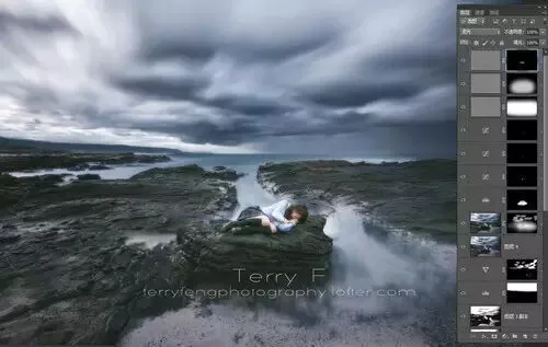
Next, use brushes to sharpen local areas to different degrees: the first layer sharpens the ground overall, the second sharpens the subject area, and the third sharpens the person's details. This way you sharpen while minimizing damage to the earlier soft glow, and it also improves the image's layering.
Figure 48
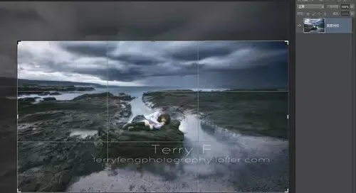
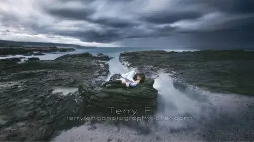
Once all steps are complete, we can crop the image. Place the person in the center to reinforce their central role. Here I crop out most of the sky at 16:9, which weakens the sky's directionality. A big benefit of 16:9 is the sense of horizontal extension — and it makes a convenient desktop wallpaper. But remember: do this step last. Ideally save the image as JPG and PSD first, then crop the saved JPG separately — that way, if you regret it or change your mind, the original dimensions are preserved.
Figure 49
The finished image:
Conclusion:
Creating an image is a complete process from field to post. When shooting, it's best to already consider what effect you want in post and what processing can be done. Post-processing is a way of working — even creating — on the basis of a qualified original. Therefore, shooting and editing are equally important.
Many people nowadays overemphasize post and still can't produce good work — because if any link in the continuous chain from field to post is weak, the final result will hardly satisfy.
By the way, let me share a bit more of my thinking on post-processing.
Some people feel post doesn't matter; others think post is just piling up assets. Both views are quite wrong.
From a creative standpoint, post is part of photographic creation; but from a photographic standpoint, stacking assets is closer to design than photography. How to steer your photographic direction depends on your future needs.
Nowadays the vast majority of photography competitions don't allow swapping skies or stacking assets — but most also set up a dedicated category for heavily post-processed work. So accepting post-processing is the general trend, while respecting photography itself remains a basic principle.
The handsome author
▲ Feng Tao (Terry F)
Getty Images contributing photographer
Huagai Creative contributing photographer
Lofter master
Weibo: @Terry-F
Lofter: terryfengphotography.lofter.com
Follow @Thomas Chu Photo,
and learn one photography skill every week.