Photography Tutorial · 2019-06-09
The Low-Saturation Teal-Green Tone Taking Over the Internet — How It's Done
Thomas Chu Photo
In "Five Popular Post-Processing Color Styles Explained," Thomas shared several trending looks from abroad, such as cartoon colors and advanced grey.
In today's tutorial, Thomas continues with another style trending overseas — the low-saturation teal-green tone — covering both the overall mindset and the editing process.
Video Tutorial
▶ Watch the video tutorial on Bilibili
This is the fully illustrated companion to the video above. Using a photo of Burg Eltz in Germany, Thomas shows step by step how the viral Instagram low-saturation teal-green look is built — from style analysis and the film curve, through HSL warm-cool rebalancing, to split-toning and local finishing, all inside Lightroom's Camera Raw filter. Skim this version for the framework, then hear the details in the video.
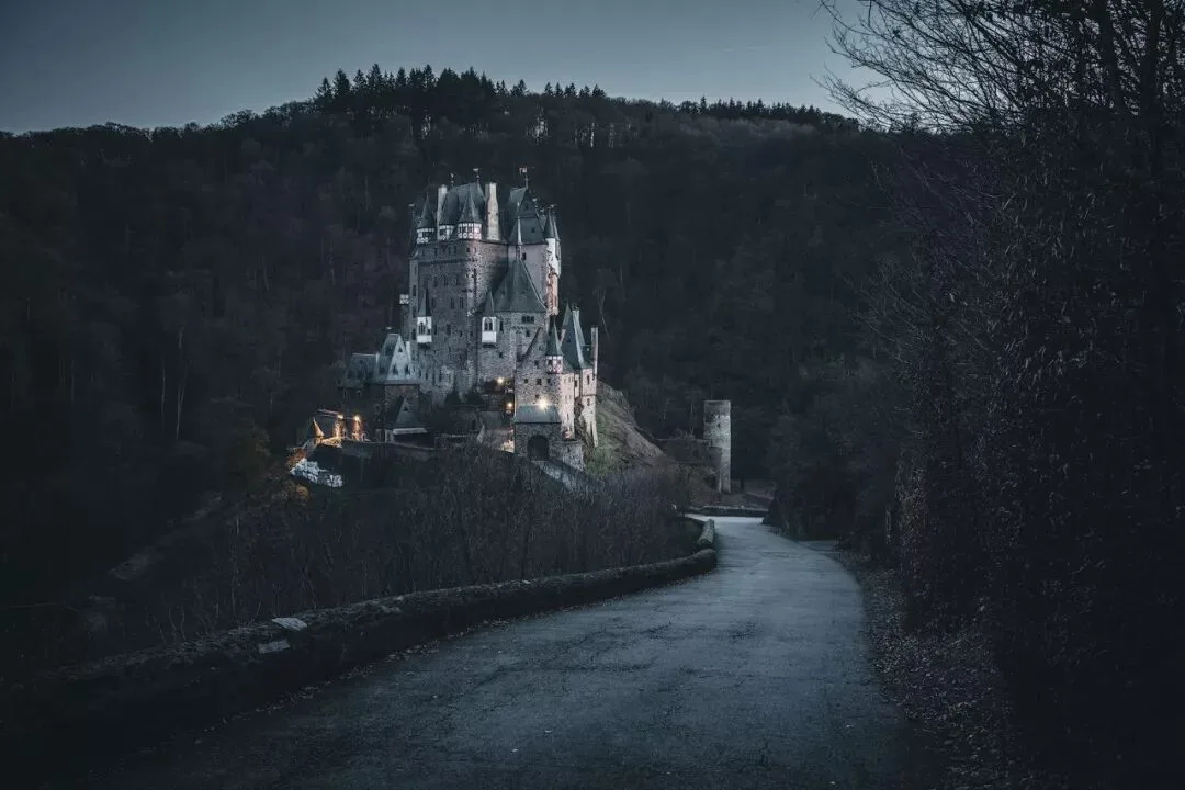
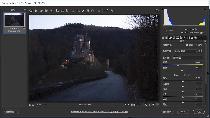
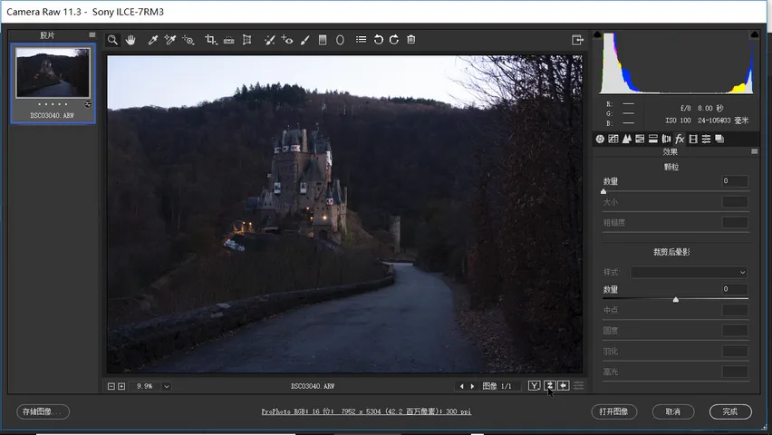
First, the starting point and the goal. Below is the photo as imported (at 2:20 in the video): a normal-saturation castle scene under a blue sky. We will turn it into a low-key, desaturated, teal-tinted "ghost forest" style image.
01 Style Breakdown: Low-Key Tones and Muted Color
Analyze the style before touching any slider. In terms of tonality, the final histogram is a classic low-key, full-range (low-long) one: most pixels pile up in the darker half, yet highlights remain — the lights and the bright castle push up the far right of the histogram. The crucial part is the black end: the leftmost region is empty, and the darkest areas in the image are not pure black but a lifted deep gray. That "blacks are never black" adjustment is exactly what the film curve will do later.
Contrast is kept low overall — local contrast in particular is intentionally flattened. The only bright elements are the castle in the center and the road beneath it. Color has two signatures: very low saturation across the board, and a cool range unified into teal-green while the warm range keeps traces of orange and pale yellow-green — moody, but never flat and lifeless.
02 Tonal Foundation: Basic Panel and the Film Curve
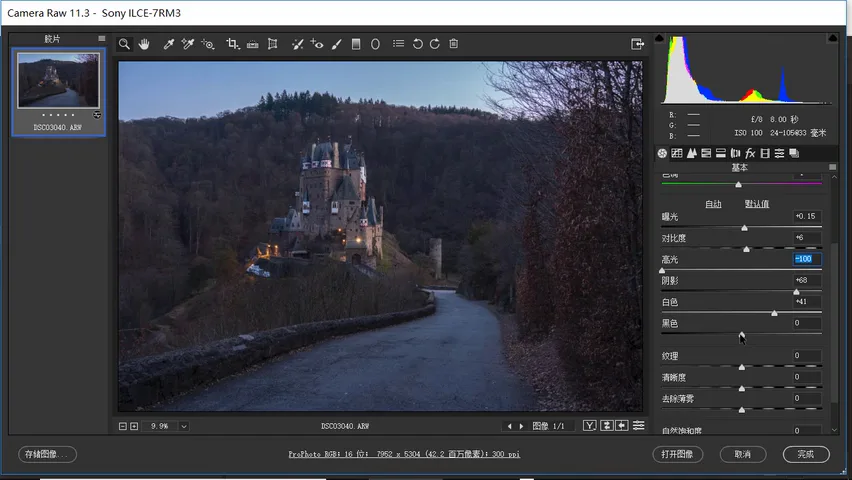
Tonal work starts in the Basic panel: nudge exposure up slightly and leave contrast alone. Pull highlights down hard, because the sky in the original is very bright; raise shadows to bring back detail in the dark forest. Push whites to the right so the bright areas truly glow, then trim highlights a touch more — the histogram now reaches the right edge while the overall mass still leans left; a slight pull-down of blacks restores some contrast (at 3:20 in the video).
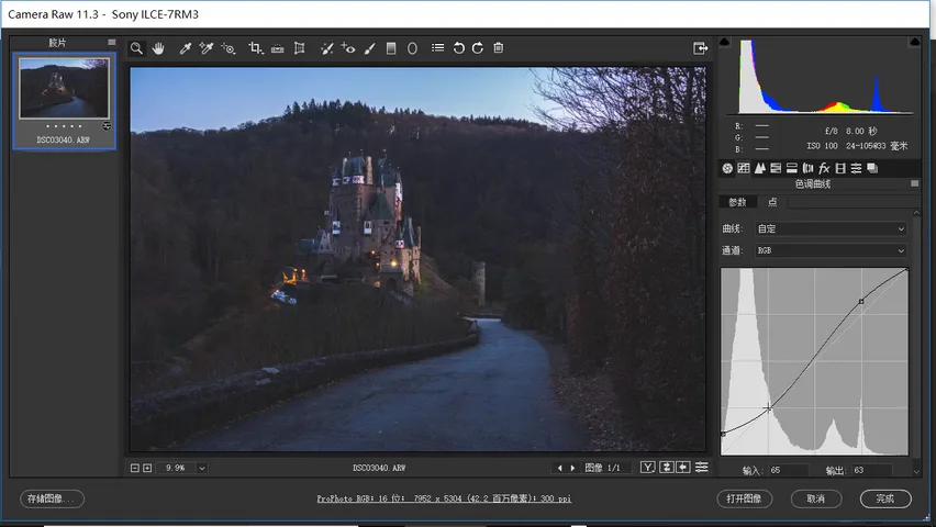
Now for the style's secret weapon — the film curve. The goal is explicit: the darkest point of the histogram must not be pure black but a deep gray. Lift the black-point anchor at the bottom-left corner of the curve; every darkest region in the frame turns into a lifted dark gray with no crushed black left (at 3:50 in the video). If the black-point and white-point concepts are new to you, check the curve tutorials on Thomas's WeChat account.
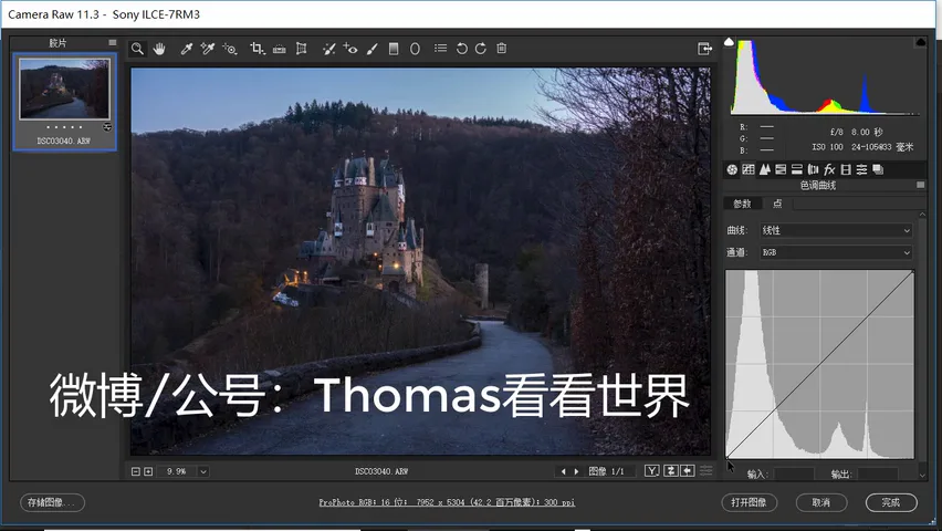
Lifting the blacks alone, however, makes the whole photo flat and washed out. So a second step: add an S-curve on top to bring contrast back. Lifted blacks plus an S-curve together form the famous "film curve" — the shared foundation of most viral color grades (at 4:25 in the video).
03 Color Reshaping: Desaturation and HSL Warm-Cool Rebalancing
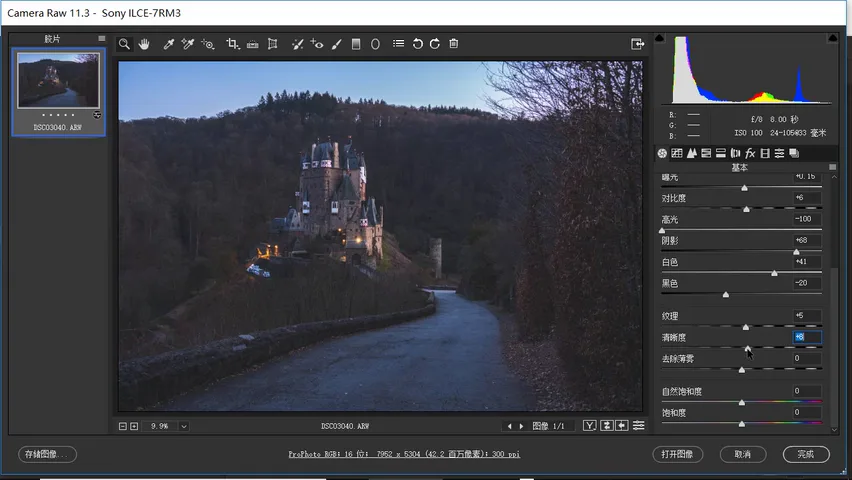
Color starts with subtraction. Raise texture and clarity slightly for a bit of extra detail; the original is highly saturated, while this style is all about a faded feel — so pull global saturation way down, to -32 as a first pass in the video (at 4:45).
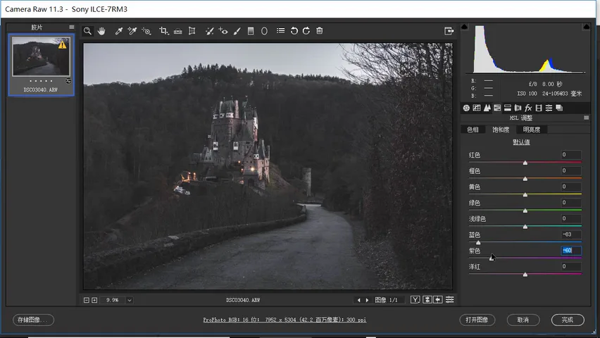
After the global desaturation, the blue ground and water still glare. Move to the HSL panel and keep pushing the cools down: blue saturation drops hard, with purple and magenta lowered as well, letting these colors fall back toward neutral — the unifying teal tint itself is left for the split toning later (at 5:30 in the video).
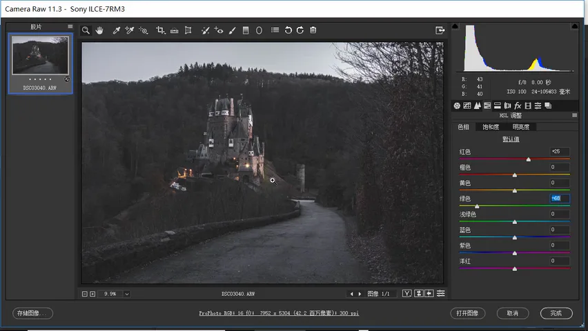
The warms move the other way: raise yellow and orange saturation moderately — the castle's warm glow is the only protagonist — without letting it get gaudy, and lift red slightly. On the hue tab, shift red toward orange and green toward yellow, unifying the warm range while keeping a touch of orange, pale yellow and pale green for richness (at 6:08 in the video). Finally, on the luminance tab, brighten the warms to lift the castle out of the forest, and darken the blues in the sky and ground (at 6:35 in the video).
04 Split Toning: Veiling the Frame in Teal-Green
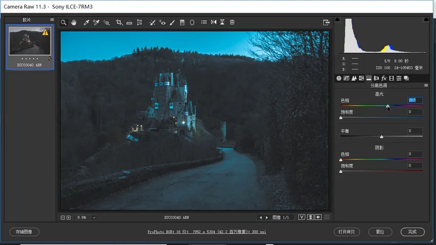
Now the pivotal step — re-coloring. Open the Split Toning panel and add teal into the highlights: pick a hue around 210 in the cyan region — 207 in the video — and push saturation to about 13 (at 7:05).
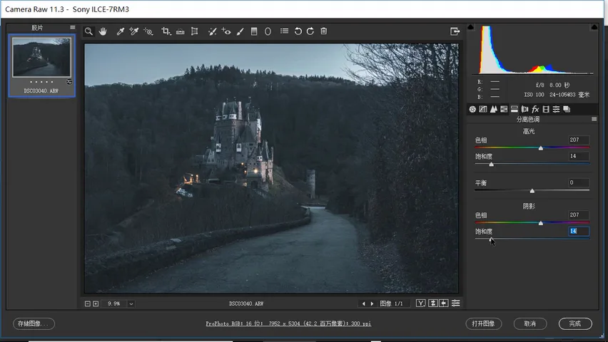
Give the shadows the same teal treatment, with a hue a touch higher than the highlights (215 is suggested in the video) and saturation again around 13-14. At this point the entire frame is veiled in a unified teal-green cast — the viral look itself lives in this one step (at 7:25 in the video).
05 Local Finishing: Vignette, Radial Filter and the Result
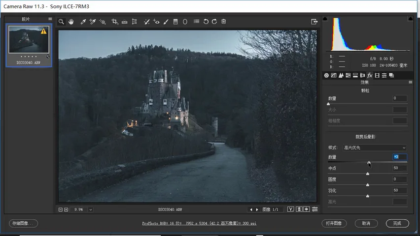
The first local weapon is the post-crop vignette: drag the amount far negative so the corners darken noticeably and the center brightens naturally, pulling the eye to the middle of the frame — a move almost every Instagram-style grade uses. Shift the midpoint left so the bright area shrinks and concentrates on the castle and the road (at 7:50 in the video).
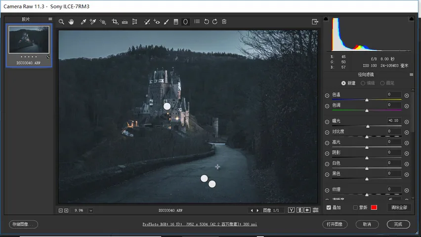
Then strengthen the subject with the radial filter: draw an ellipse over the castle and road, add +0.10 exposure and +5 clarity so the single bright subject pops brighter and sharper (at 8:40 in the video). Finish with a graduated filter — reset its settings, drop exposure by just -0.2 and lay it over the edges to press in even more depth (at 9:08 in the video).
Compare before and after: from an ordinary, normally saturated castle photo under a blue sky, to a dark forest mood that is low-key, desaturated and uniformly teal — the low-saturation teal-green look trending on Instagram, complete (at 9:26 in the video).
1. The tonal skeleton of this look is a low-key full range: the film curve lifts the black point so the darkest areas read as deep gray, then an S-curve restores contrast; 2. Subtract color first, then redistribute: heavy global desaturation, HSL pushes down blues/purples/magentas while lifting yellows/oranges/reds, hue shifts red toward orange and green toward yellow, and warms are brightened as cools darken; 3. Split toning is the finishing touch: teal at about 207 for highlights and 215 for shadows, saturation 13-14 each, veiling the frame in green-cyan; 4. A post-crop vignette darkens the edges with a left-shifted midpoint, plus a radial filter on the subject and a graduated filter on the edges, focusing attention at the center.