Photography Tutorial · 2016-05-15
Beautify Photos Easily: Understanding Tone and Contrast in Lightroom's Basic Panel
I hate Lightroom tutorials that list features and parameters like a tool manual. Every photo is completely different — if you can't read a photo, how can you use tools to beautify it?
This article will give you a brand-new understanding of Lightroom's Basic panel from the angles of tonality and color. I'll reorganize the 11 adjustment sliders of the Lightroom/ACR Basic panel in a more understandable way, so you can easily learn to use them and make your photos beautiful.

What are tonality and color tone?
Before getting to know Lightroom's Basic panel, we must first understand two 'fancy' terms — 'tonality' and 'color tone'. Every photo is composed of these two parts. Take this photo of a fishing boat in the setting sun — we can think of it as two layers stacked together.

The first part is the black-and-white image below, which shows the photo's brightness layers and line contours. This brightness and contour can be understood as the photo's 'tonality'. When we say an image is dark and moody, bright and fresh, contrasty, or hazy and ethereal — we're talking about its tonality.

The second part is the color palette below, which shows the hues and intensities of the photo's colors. When we describe a photo as cool, warm, rich or pale — we're talking about its color tone.

When we 'paint' this palette onto the black-and-white image of part one, color tone (hue, intensity) and tonality (brightness, contour) recombine into the original photo.
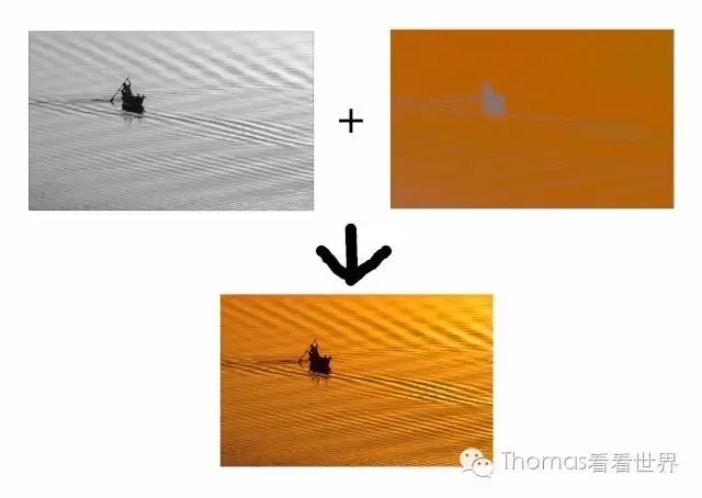
Understanding Lightroom's Basic panel from the photo's perspective
Below is Lightroom's Basic panel: 11 adjustment sliders in a row, often leaving beginners baffled, because they can't grasp the significance and power of these 11 parameters.
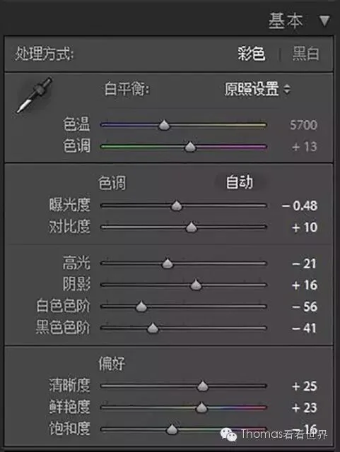
But once Thomas reorganizes these 11 sliders, you may have a sudden moment of clarity.
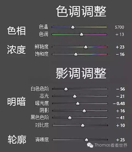
The 11 sliders fall into 4 groups, controlling the photo's overall hue, intensity, brightness and contour respectively. And don't hue and intensity make up the 'color tone' from section one? Aren't brightness and contour the photo's 'tonality'?
These 11 parameters completely control a photo's color tone and tonality — that's exactly why Adobe picked them for the foremost, most important 'Basic' panel in Lightroom and ACR.
Next, Thomas will teach you step by step how to use them to control a photo's light, shadow and color. Since Adobe Camera Raw (ACR) has panels identical to Lightroom's, I'll sometimes use ACR screenshots as examples.
Color tone control in Lightroom's Basic panel
Temp and Tint control the photo's overall hue — they can make your photo 'cold as ice' or 'warm as fire'.
Moving the Temp slider left makes the photo bluer and cooler; moving it right makes it yellower and warmer.
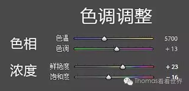
For ordinary photos, we adjust Temp left or right so the photo matches the neutral colors the human eye saw. In a photo with accurate temperature, gray objects like walls, plates and clouds should carry no color cast.
But humans attach subjective emotion to color: blue tones feel calm, cold and technological; warm tones feel warm, dynamic and sacred. So we can deliberately warm or cool a photo to give it more mood.
Take this photo of Bagan below — the original temperature was bland, failing to convey the warmth of morning sunlight spreading over the land and the divine glow of pagodas in the mist.

So I moved the Temp slider right to add warmth, and a magnificent golden radiance emerged.

The second slider, 'Tint', shifts the photo toward green when moved left, and toward magenta when moved right. Green feels fresh and peaceful — that's why almost all Japanese-style fresh photos online lean cyan-green. Magenta feels mysterious and elegant.
In the photo below, the starry sky and night should have been grayish-black. I moved the Temp slider left to add cold, making the snow mountain and glacier feel more 'frozen to the bone'. At the same time I moved the Tint slider right by 32 units — the purple-tinged atmosphere is like a dream.

Temp and Tint control the photo's overall hue, while the 'Saturation' and 'Vibrance' sliders adjust color intensity. ('Vibrance' is sometimes translated as 'vividness'.)
Moving the Saturation slider right strengthens the purity of all colors in the photo, making them richer; moving left reduces purity — at -100 the photo becomes black and white.
Vibrance, as the name suggests, adjusts color more 'naturally': it focuses on boosting less-saturated colors while protecting already-saturated ones.
Of the three images below, the second has Vibrance +50, the third Saturation +50.

You can see that in the second image, the already-saturated broom bristles only gained slightly while the background ladder's color improved. In the third, the yellow of the bristles was boosted to an unrealistic degree.
The Saturation slider easily over-saturates photos, causing color clipping and loss of realism — use it in smaller increments and with more caution.
Tonality control in Lightroom's Basic panel
Have you noticed? In Thomas's reorganized tonality (brightness) sliders, their order changed from the software's 'Exposure, Contrast, Highlights, Shadows, Whites, Blacks' to the order shown below.
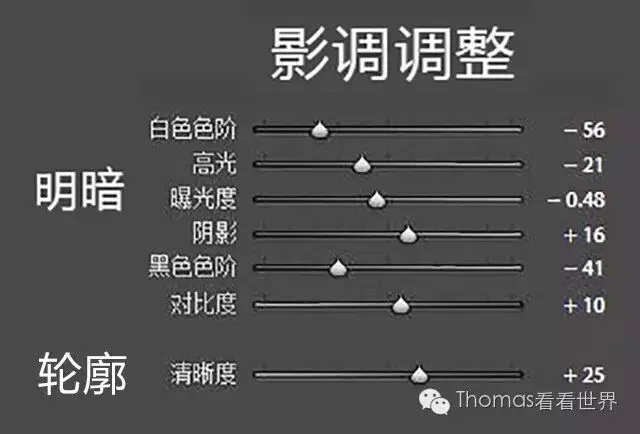
That's because Whites, Highlights, Exposure, Shadows, Blacks correspond to brightness regions from bright to dark.
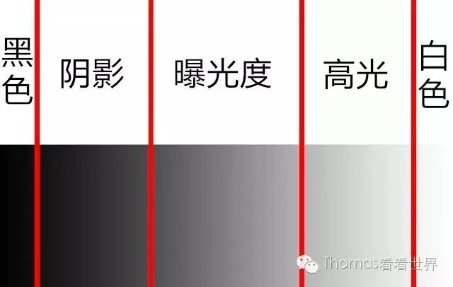
Exposure is the photo's middle brightness region, where tonality is richest and finest — lots of detail is rendered at this moderate brightness.
Shadows and Highlights on either side correspond to the darker and brighter regions. Though their detail isn't as fine as the Exposure region's, they still store plenty of information. When we say 'raise shadows, lower highlights to recover detail', we mean moving these two regions' brightness toward the middle Exposure region, making transitions and layers finer.
Finally, Blacks is the darkest region and Whites the brightest — these areas contain basically no detail. But their presence gives a photo true black and white parts, keeping it from looking 'hazy gray'.
If we build a function with brightness from pure black to pure white on the horizontal axis and pixel count at each brightness on the vertical axis, that graph is the photo's 'histogram'. Remember: the histogram's horizontal axis is brightness, so the five brightness regions above map onto it.

Keeping this image in mind greatly helps understanding Lightroom's Basic panel, because the Exposure slider doesn't affect the whole photo's brightness equally — it focuses on the Exposure region. Blacks, Shadows, Highlights and Whites likewise control almost only their corresponding regions, with little effect elsewhere.
Only by truly understanding Blacks, Shadows, Exposure, Highlights and Whites can we 'prescribe the right medicine' based on a photo's histogram.
For example, the image below is a typical 'hazy' photo — why does it look 'grayish'?
The histogram gives the answer: pixels are piled up in the Shadows and Exposure regions; the Blacks and Whites regions are completely missing.
Knowing the photo's 'illness', the 'prescription' is obvious: move Whites right to +56 so pixels enter the white region, and Blacks left to -37 so pure black appears — instantly the photo is clearer with more depth. (Don't memorize the numbers; memorize the cause and effect.)

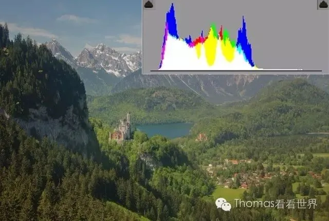
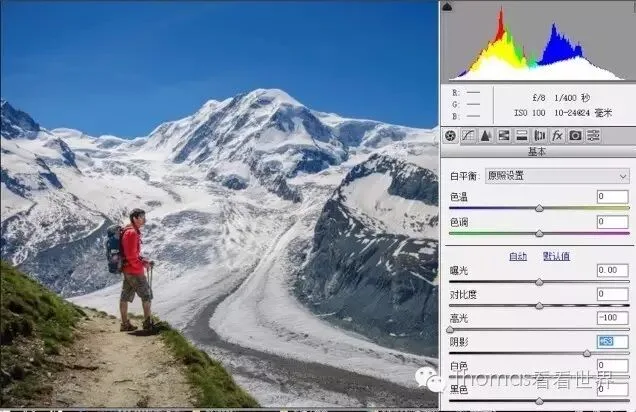
When shooting on sunny days we often encounter excessive contrast like below, making the photo less refined. The histogram is at top right — can you tell why the photo looks poor?

Note the two arrows on the histogram — two peaks where masses of pixels pile up, in the Shadows and Highlights regions. Pixels concentrated in the less detailed Shadows and Highlights make the photo look harsh.
So reduce Highlights to -100 and raise Shadows to +63, moving both piled-up peaks toward the middle Exposure region. The photo's detail comes right back.
The Exposure slider affects global exposure, but emphasizes midtone brightness — the middle of the histogram.
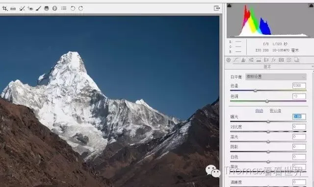
Moving the Exposure slider left reduces exposure; Lightroom's algorithm automatically protects the Blacks region. In the previous image at Exposure -2.50, pixels piled into Shadows without clipping Blacks. To turn a daytime photo into night, pull Exposure down hard.
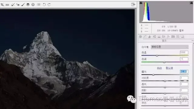
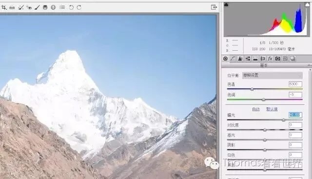
But the Exposure slider's algorithm doesn't protect the Whites region, so raising exposure too much may blow out the photo.
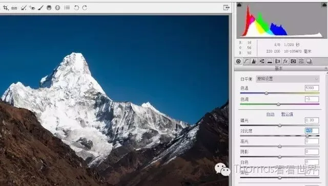
Besides the five parameters above, Contrast also affects the photo's tonality.
The Contrast slider conveniently controls the overall black-to-white gradation. Sliding right increases contrast and the number of gradation steps, enriching color expression. Since separating Highlights, Shadows, Whites and Blacks achieves the same effect, I rarely touch the Contrast slider directly.
The last tonality parameter is 'Clarity'.
Moving Clarity right increases midtone (Exposure region) contrast, focusing on strengthening edge contrast so textures and details become clearer. For richly textured surfaces like rock, eyes and clothing, more clarity makes their detail stand out.
But overdoing Clarity makes edges too sharp and dirty, making the photo unrealistic — moderation matters.
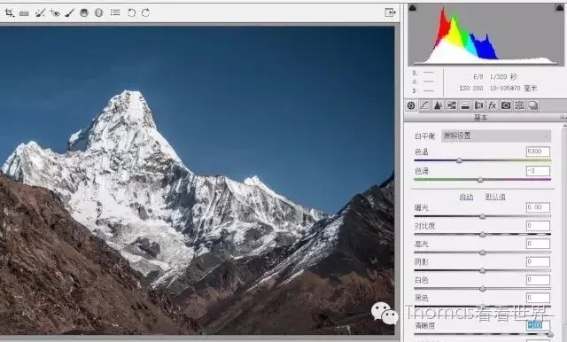
That's all 11 adjustment sliders of the Lightroom/ACR Basic panel. Do you now understand their effects on a photo's tonality and color tone?
Weekly summary
This week we re-examined Lightroom and ACR's Basic panel from the perspective of tonality and color tone.
Temp and Tint affect the photo's overall color cast, while Saturation and Vibrance control color intensity. These 4 sliders globally command the photo's color tone.
Whites, Highlights, Exposure, Shadows and Blacks correspond to the five regions from brightest to darkest, letting us precisely control each region's brightness. Contrast conveniently strengthens tonal layering. Clarity strengthens or weakens the edges and textures of objects.
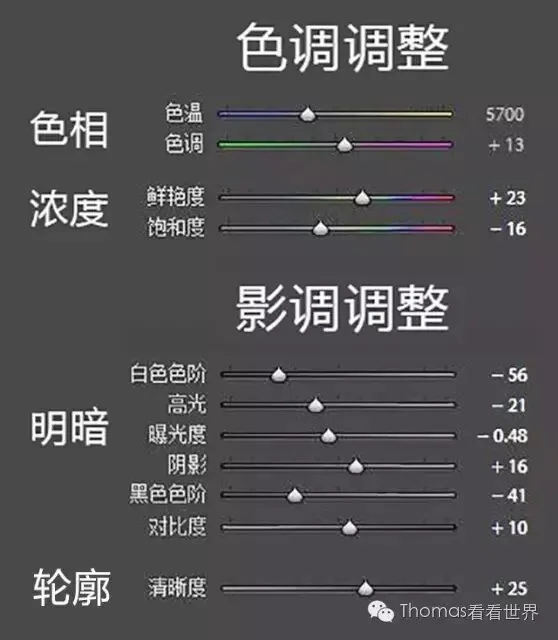
After reading this, do you better understand the 11 'magic' sliders of Lightroom's Basic panel?
I'm @Thomas Chu Photo — every Sunday evening I share an original piece of photography know-how.