Photography Tutorial · 2018-08-26
Contrast Demystified: Nik's 4 Contrast Tools Compared
Thomas Chu Photo
One tutorial every week — making photography easy to learn
The Color Efex Pro set in Nik Collection includes five contrast-related filters: Contrast Only, Contrast Color Range, Pro Contrast, Tonal Contrast, and Dark Contrasts.
Dark Contrasts is far too heavy-handed and rarely used in serious post-processing. But many people are confused about what the other four contrast filters actually do and how they differ. Today Thomas will walk through them in detail.
1
Contrast Only
First open Photoshop and go to Filter - Nik Collection - Color Efex Pro 4 to launch the Color Efex Pro 4 grading filter set. The far left of the interface shows a list of filters, where you'll find "Contrast Only".
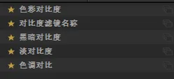
Contrast Only has five sliders: Brightness, Contrast, Contrast Only, Soft Contrast, and Saturation.
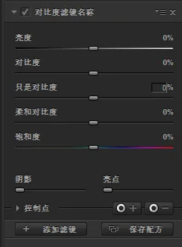
Brightness, Contrast, and Saturation work exactly as they do in Photoshop and other software, so I won't go into detail. The core sliders of this filter are "Contrast Only" and "Soft Contrast", which I'll demonstrate with this photo from Greenland.
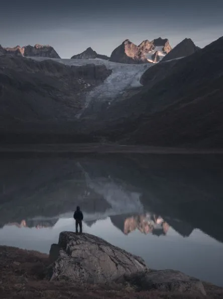
If you pay attention in everyday editing, you'll notice that when we raise contrast in post, the photo's saturation also increases significantly.
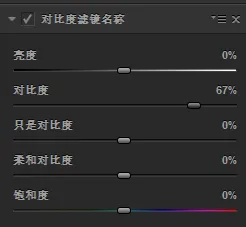
In this photo, for example, raising contrast by 67 also makes the colors much richer.
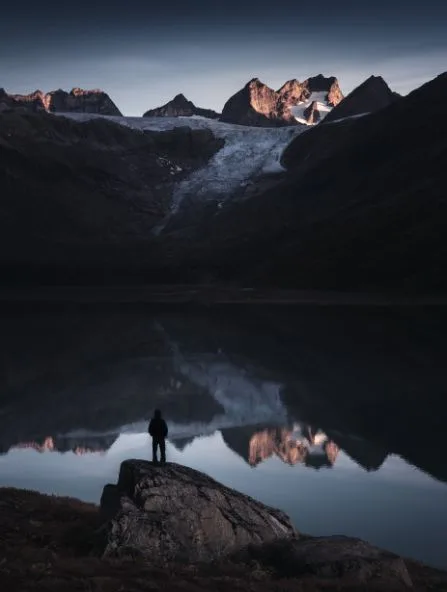
If I only want to change the tonal contrast without affecting the colors, I can use the "Contrast Only" slider.
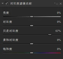
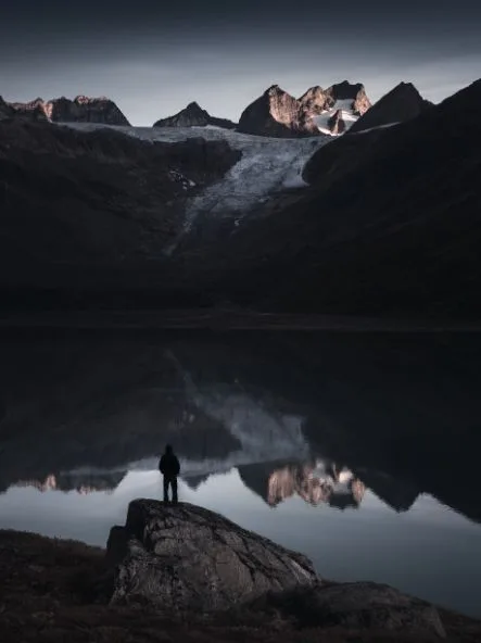
Here I raised "Contrast Only" to 67% as well. You can see that although the contrast is stronger, the saturation does not intensify the way it does with the regular "Contrast" slider. That's what makes "Contrast Only" so useful.
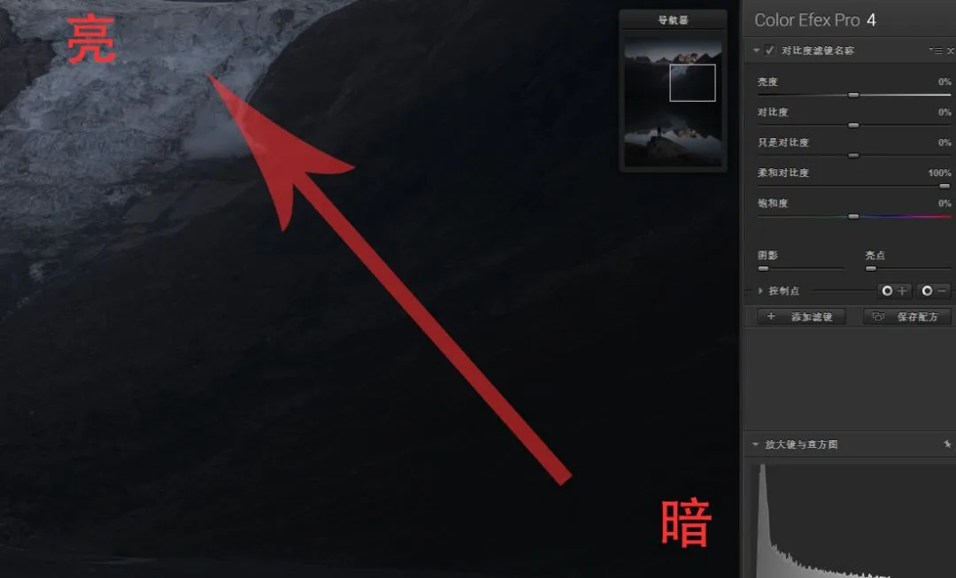
"Soft Contrast", as the name suggests, produces a gentler, more refined contrast effect. With ordinary contrast, all the bright tones get brighter together and all the dark tones get darker together, making the boundary between light and shadow harsh and obvious.
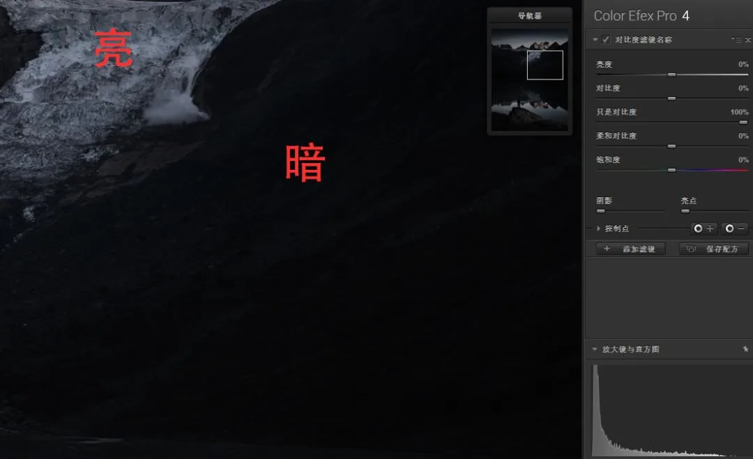
"Soft Contrast" adds less contrast near the light-dark boundaries and more contrast farther away from them, creating a gradual transition from dark to bright that looks more harmonious.
2
Contrast Color Range
The "Contrast Color Range" filter strengthens contrast between complementary colors in the frame.
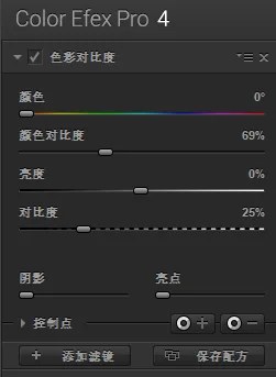
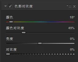
Its adjustment panel is shown below. Brightness and Contrast work as usual; the core controls are the "Color" and "Contrast Color Range" sliders.
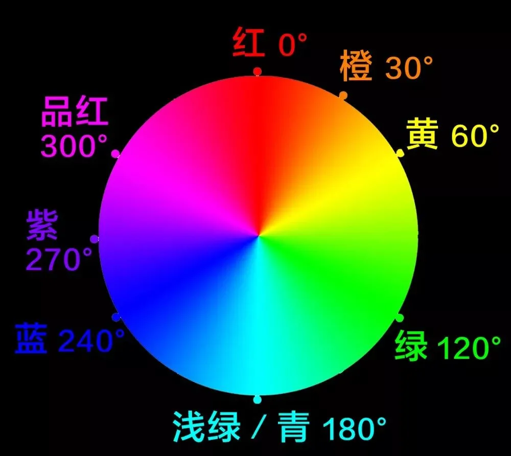
On the RGB color wheel, the color 180 degrees opposite a given color is called its complementary color. For example, red is the complement of cyan, and blue is the complement of yellow.
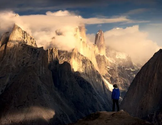
The "Contrast Color Range" filter brightens the color you select and darkens its complementary color, increasing contrast between colors. I'll demonstrate with this photo from Pakistan.
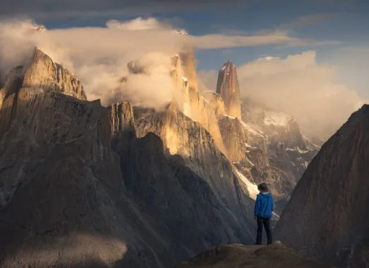
If we pick yellow on the color bar and raise the color contrast to 49%...
...you'll see the yellows in the photo become much brighter while the blues (yellow's complement) become much darker.
What if we select blue with the color slider?
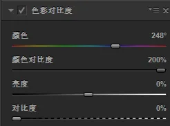
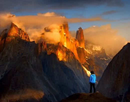
Then the frame flips: blues are brightened and yellows are darkened.
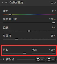
These contrast-related filters all include "Shadows" and "Highlights" sliders at the bottom, similar to the highlights and shadows controls in Photoshop, which protect the dark and bright areas of the image.
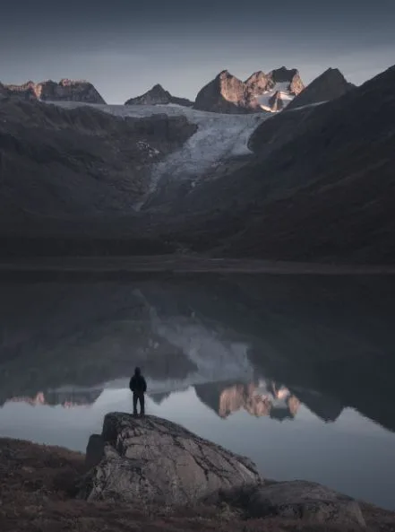
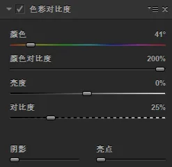
For example, in the photo above, if I select yellow and push the color contrast to 200%...
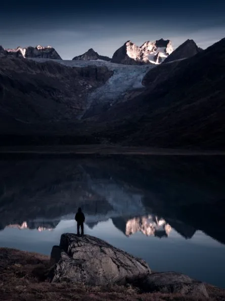
...the color contrast is greatly enhanced, but the shadows look underexposed and the highlights slightly blown out.
Raising the "Shadows" and "Highlights" sliders protects the highlight and shadow regions from clipping in the final result.
3
Pro Contrast
Pro Contrast is one of Nik's secret weapons, with three sliders in total.
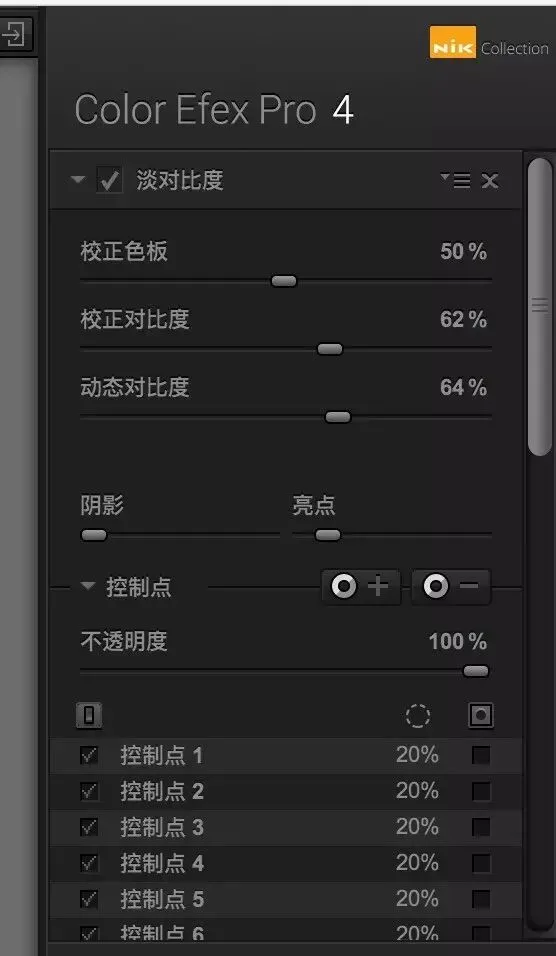
Correct Color Cast: automatically detects the photo's color cast (yellowish, bluish, etc.); moving the slider right weakens the overall color cast by adding the complementary color.
Correct Contrast: increases the photo's overall tonal contrast.
Dynamic Contrast: the core feature of this filter. It intelligently adjusts the internal contrast of individual objects while protecting highlights and shadows.
"Dynamic Contrast" is the key slider of Pro Contrast, and it has two major strengths over the other contrast filters:
1. Dynamic Contrast focuses on the midtones, so it rarely causes over- or underexposure.
2. Dynamic Contrast automatically recognizes objects in the frame and adjusts them locally, preserving and enhancing internal detail while boosting overall contrast.
For more on the Pro Contrast filter, see the tutorial "Still Using S-Curves? Try Nik's Contrast Filters Instead".
4
Tonal Contrast
The "Tonal Contrast" filter behaves more like Clarity in Photoshop — it mainly enhances detail and texture.
After selecting "Tonal Contrast", its control panel appears on the right side of the interface. From top to bottom:
Highlights slider: controls detail and contrast strength in the bright areas
Midtones slider: controls detail and contrast strength in the midtones
Shadows slider: controls detail and contrast strength in the shadow areas
Saturation slider: controls the photo's overall saturation
Contrast type: controls the overall character of the filter
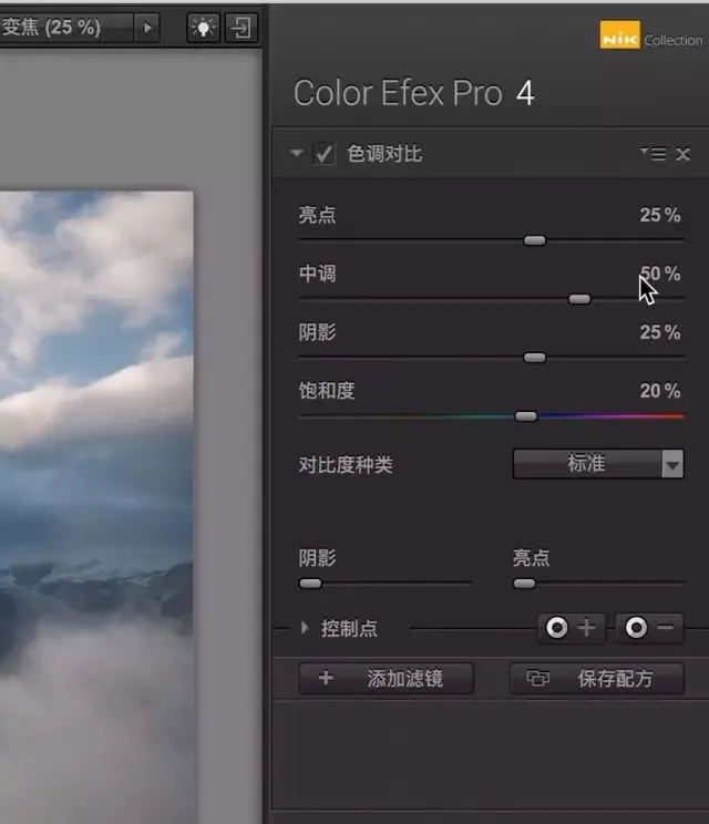
I usually start by trying the different contrast types — there are five options:
Standard: the default tonal contrast look, with moderate detail and contrast
High Contrast: strengthens edge contrast around objects
Fine: an HDR-like low-contrast detail extraction, at low strength
Balanced: an HDR-like low-contrast detail extraction, at medium strength
Strong: an HDR-like low-contrast detail extraction, at high strength
When I switch the contrast type to "High Contrast", you can see the light-dark boundaries in the photo become extremely punchy.
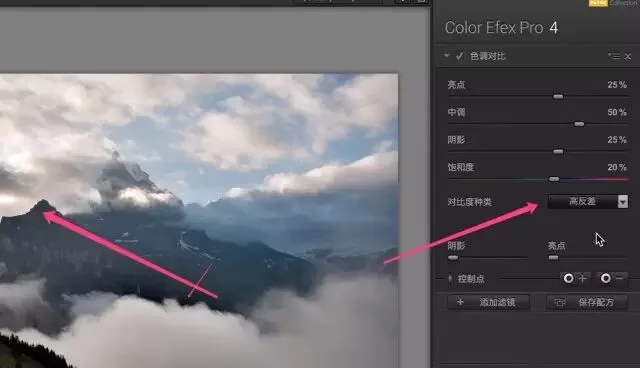
"Fine", "Balanced", and "Strong" extract detail while keeping overall contrast low, giving the photo an HDR-like look.
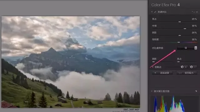
For most images, the "Standard" contrast type is enough.
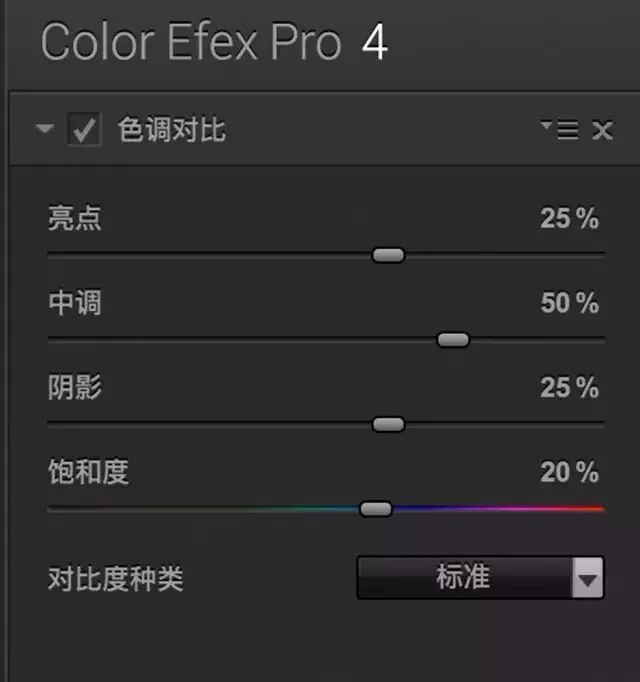
Next I adjust the four sliders: Highlights, Midtones, Shadows, and Saturation. Their defaults are 25%, 50%, 25%, and 20%. My habit is to zero them all out and re-adjust one by one while watching the image.
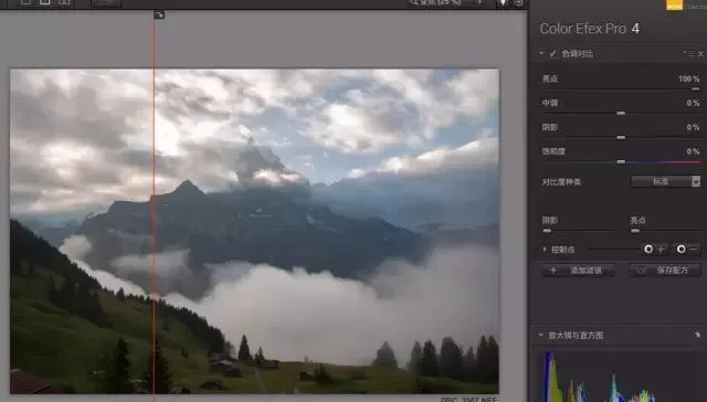
First, move the "Highlights" slider all the way right to 100%. Left of the red line is before, right is after. You can see detail in the bright parts of the clouds is greatly enhanced and contrast in the highlights increases — even to the point of overexposure.
Move "Highlights" all the way left to -100%, and detail in the bright clouds is almost flattened out, with highlight contrast weakened.
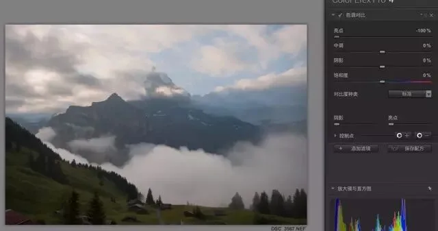
On soft subjects like skin, we usually want to reduce detail strength instead, which means moving these sliders left. In this image I only slightly boosted highlight detail, moving the Highlights slider to about 10%.
"Midtones" controls detail and contrast in the middle brightness range. Moving it right greatly strengthens midtone detail and contrast. In the image below, the clouds in the red box were originally a shapeless gray-white mass; now their internal tonal variation is revealed.
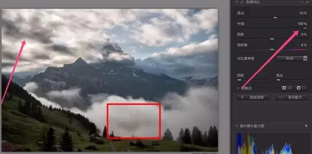
As the saying goes, too much is as bad as too little. Adding tonal contrast is like raising Clarity or applying HDR — push it too far and the photo looks dirty and fake, so moderation matters. Here I raised Midtones to about 30%.
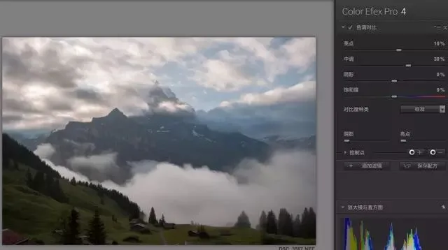
The Shadows slider controls detail contrast in the darker areas. At 100%, detail in the dark regions (mountains, trees, etc.) becomes exaggerated.
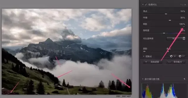
Here I set Shadows to 40%, at which point the mountain detail looks fairly clear. The darkest parts of the photo are now clipped to black, but I'll correct that later.
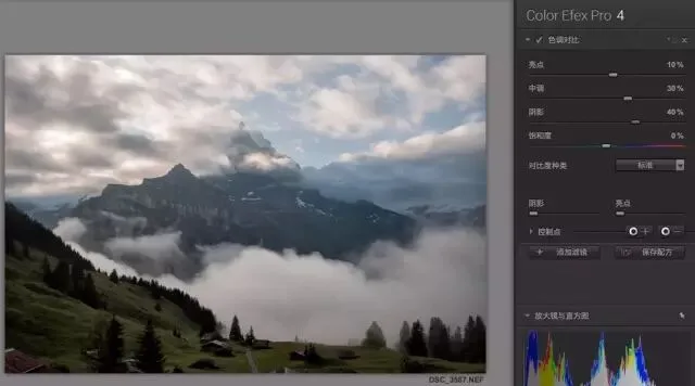
Adjusting contrast also affects the photo's colors, so Nik adds a "Saturation" slider here, similar to the one in Lightroom or Photoshop, controlling overall color vibrancy. This photo was fairly dull, so I raised saturation by 20%.
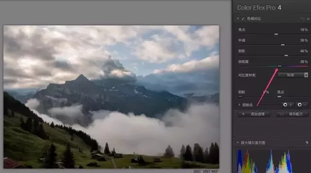
After these adjustments, the mountain detail matches what I wanted, but the dark areas like the trees have turned into a black mass. Checking the histogram confirms the shadows are indeed clipped.
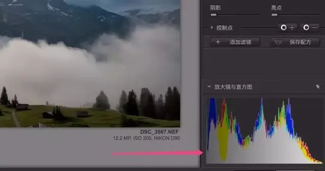
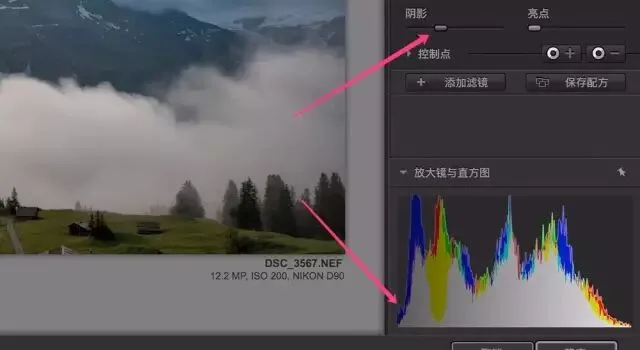
The Shadows and Highlights protection sliders at the bottom exist precisely to protect the dark and bright areas. Moving the Shadows slider right keeps the dark areas from going too dark; moving the Highlights slider right keeps the highlights from blowing out.
Based on the histogram, I raised Shadows to about 35% for this photo, and the shadow clipping in the histogram disappeared.
Those are the four main contrast-related filters in Nik. Do you understand their uses and differences now?