Photography Tutorial · 2017-01-08
Boost Photo Detail: Nik Tonal Contrast Filter Explained
The Tonal Contrast filter in the Nik Collection can effectively strengthen or weaken texture and detail in a photo — a go-to post-processing tool for landscape photographers.
1
Nik Tonal Contrast Filter
The Nik Collection is a free plugin suite; its Color Efex Pro 4 set bundles 50+ filters photographers commonly use. Today's subject is the detail-control filter among them: Tonal Contrast.
Nik Collection download links for China (version 1.2.11):
Windows: https://pan.baidu.com/s/1o8jhgxk
Mac: https://pan.baidu.com/s/1hsJlkpQ
Installation works like any other software, so I won't go into detail — Baidu has plenty of guides.
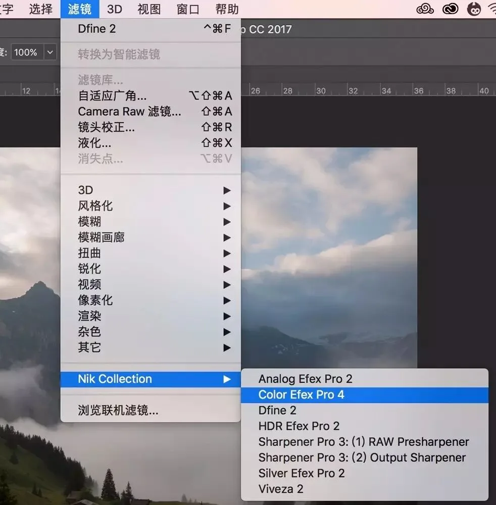
After installing, open Photoshop and choose Filter → Nik Collection → Color Efex Pro 4 to launch the filter set.
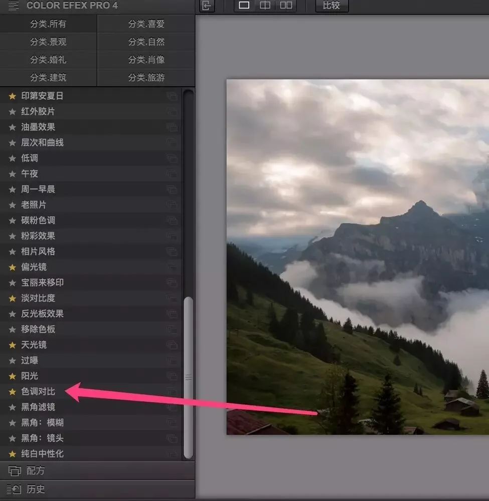
In the Color Efex Pro 4 interface, the far left is a list of filters, where you'll find "Tonal Contrast."
The Tonal Contrast filter can strengthen or weaken detail contrast, controlling fine textures like rock texture, skin texture, and cloud layering.
2
Controlling the Tonal Contrast Effect
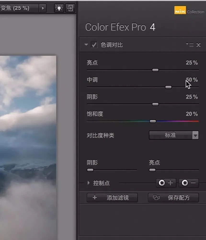
With "Tonal Contrast" selected, its control panel appears on the right. From top to bottom:
Highlights slider: controls detail and contrast strength in the bright areas
Midtones slider: controls detail and contrast strength in the midtones
Shadows slider: controls detail and contrast strength in the shadow areas
Saturation slider: controls overall saturation
Contrast Type: controls the filter's overall character
Shadow/Highlight protection sliders: protect shadows and highlights from under- or overexposure
Control Points: Nik's core technology — a mask-like effect that confines the filter to local areas.
I usually start by trying the "Contrast Types" — there are 5 options:
Standard: the default tonal-contrast look, moderate detail and contrast
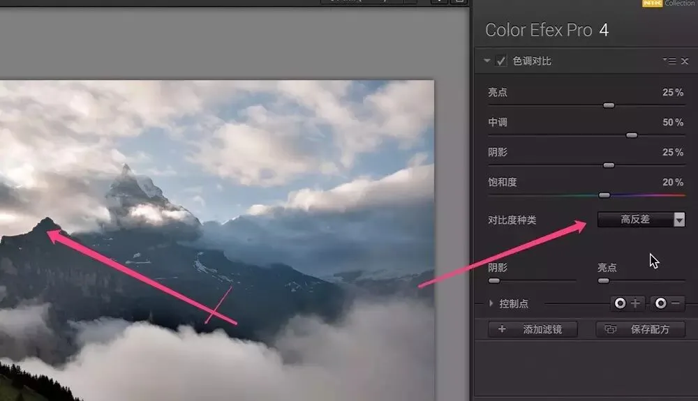
High Contrast: strengthens edge contrast
Fine: an HDR-like, low-contrast detail-extraction effect at low strength
Balanced: an HDR-like, low-contrast detail-extraction effect at medium strength
Strong: an HDR-like, low-contrast detail-extraction effect at high strength
When I switch the Contrast Type to "High Contrast," you can see the light-dark boundaries in the photo become extremely punchy.
The "Fine," "Balanced," and "Strong" types extract detail while keeping contrast low, giving the photo an HDR-like feel.
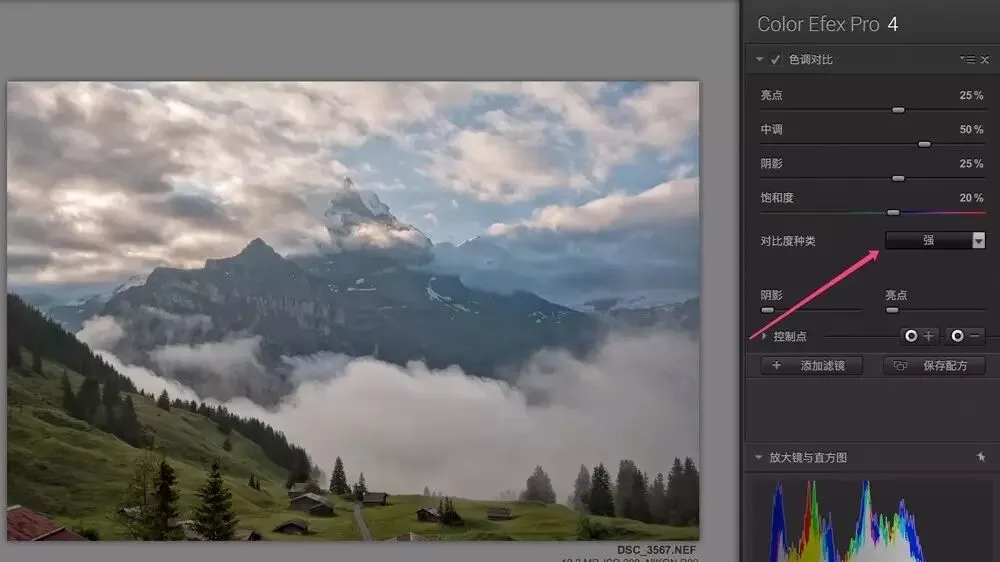
For most images, "Standard" is enough.
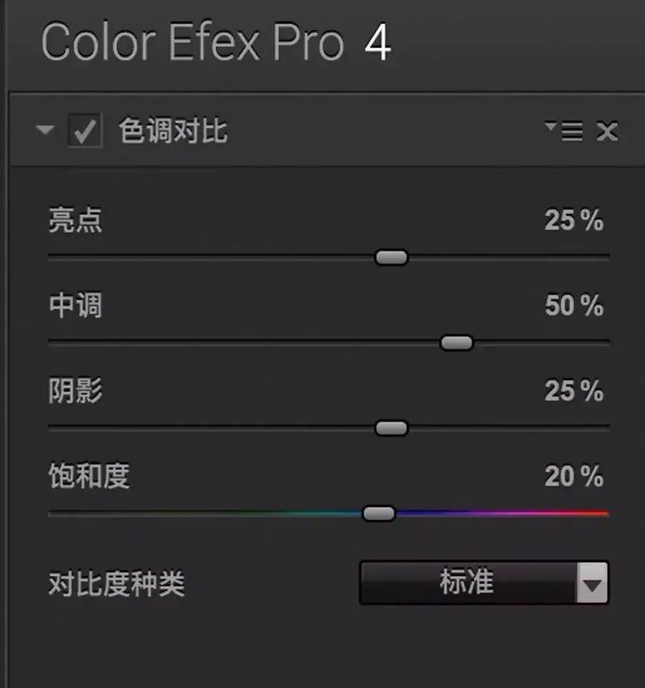
Next I adjust the four sliders: Highlights, Midtones, Shadows, and Saturation. Defaults are 25%, 50%, 25%, 20%; my habit is to zero them all out and re-adjust one by one while watching the image.
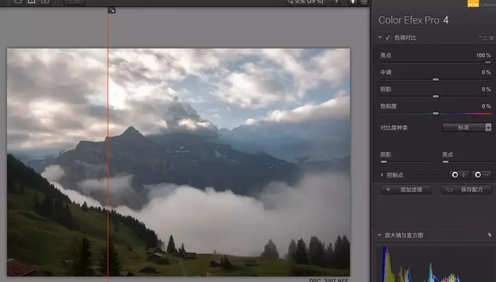
First drag "Highlights" right to 100% — left of the red line is before, right is after. Cloud-highlight detail is greatly enhanced and bright-area contrast increases, even to the point of overexposure.
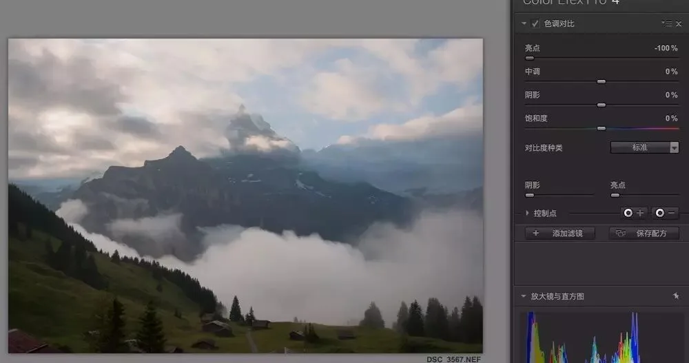
Drag "Highlights" left to −100% and cloud-highlight detail is nearly flattened, with bright-area contrast reduced.
On soft subjects like skin, we usually want to reduce detail strength instead — drag the sliders left. For this image I slightly boosted highlight detail, setting Highlights around 10%.
"Midtones" controls detail and contrast in the middle brightness range. Dragging it right greatly strengthens midtone detail contrast — for example, the mist in the red box below went from a gray-white blob to showing internal detail.
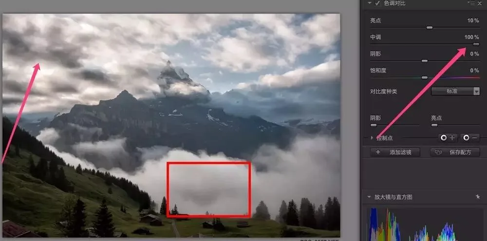
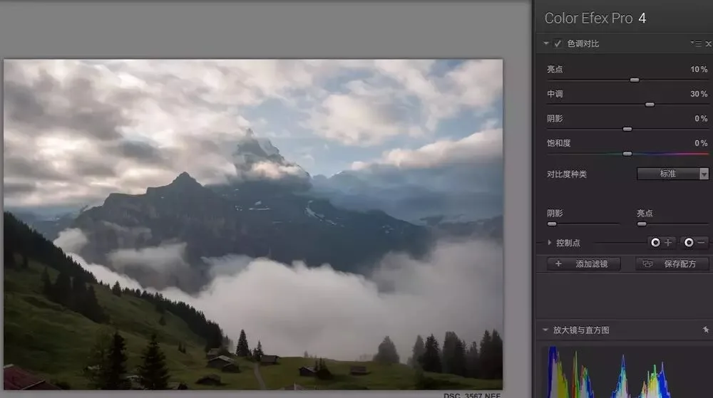
As the saying goes, too much is as bad as too little. Adding tonal contrast is like raising Clarity or applying HDR — push it too far and the photo looks dirty and fake, so moderation matters. Here I raised Midtones to about 30%.
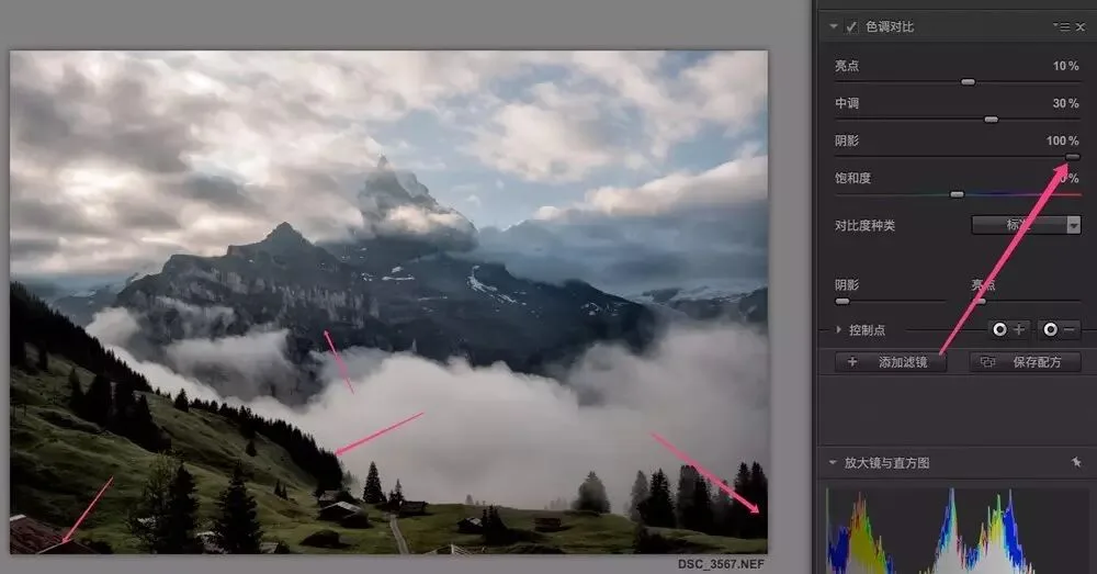
The Shadows slider controls detail contrast in darker areas. At 100%, shadow detail (mountains, trees) becomes exaggerated.
Here I set Shadows to 40% — mountain detail is now fairly clear. The darkest areas are clipped to underexposure at this point, but I'll correct that later.
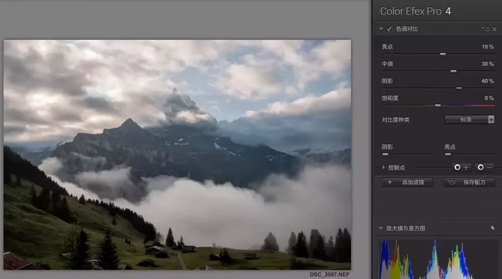
Adjusting contrast also affects color, so Nik adds a "Saturation" slider here — like Saturation in Lightroom or PS, it controls overall color vividness. This photo was rather dull, so I raised Saturation by 20%.
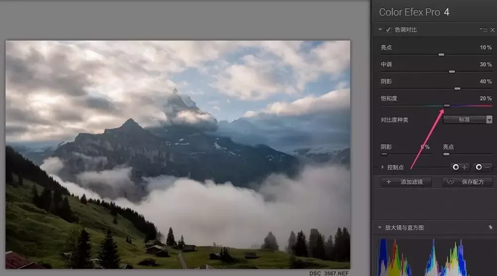
After those adjustments, mountain detail matches my expectations, but dark areas like the trees have gone pitch black. The histogram confirms the shadows are clipped.
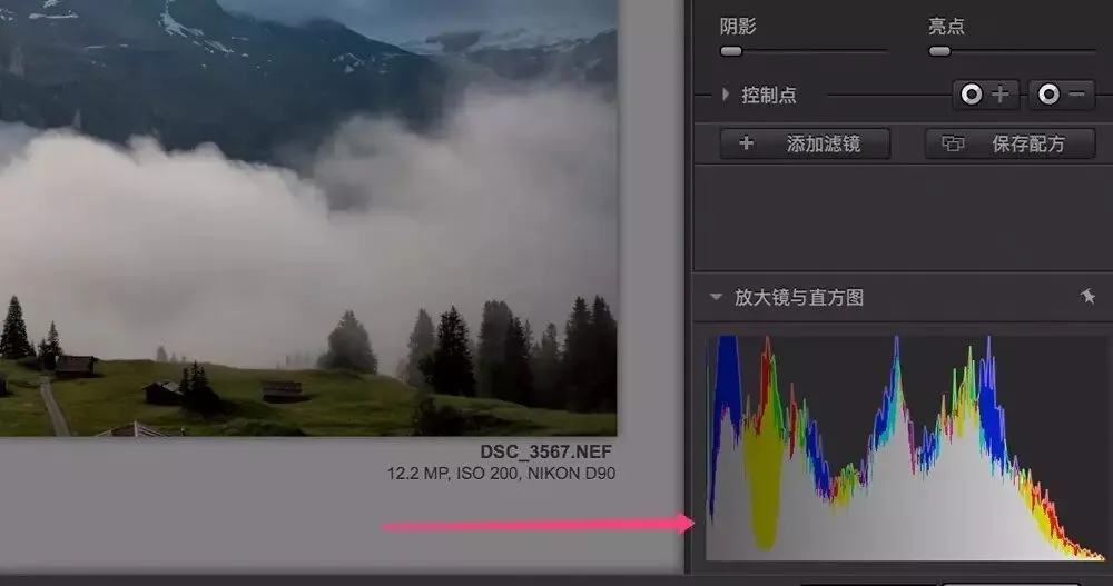
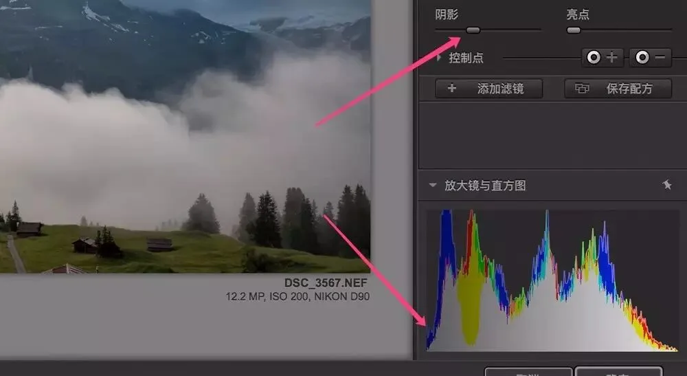
The bottom Shadow and Highlight protection sliders exist precisely to protect those areas. Dragging the Shadows slider right keeps dark areas from going too dark; dragging the Highlights slider right keeps highlights from blowing out.
Based on the histogram, I raised Shadows to about 35%, and the shadow clipping disappeared from the histogram.
3
Applying Tonal Contrast Locally
More detail isn't always better. Adding detail contrast only locally can enhance depth and emphasize the subject.
Take this photo: boosting cloud detail makes the sky look dirty, and strengthening the foreground grass texture makes it grab attention everywhere, stealing the show from the majestic distant snow mountains.
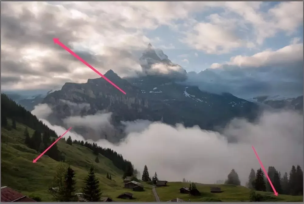
So I need Control Points to apply the filter locally.
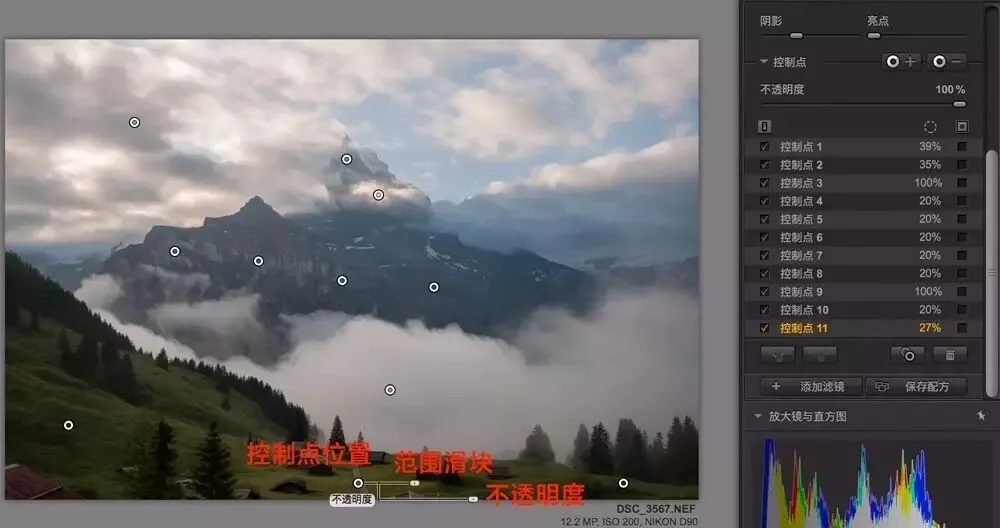
Add control points with the "+" or "−" buttons on the right side of the Control Points panel.
After choosing "+" or "−", click the corresponding area in the photo to place a control point, shown as a small dot.
A control point has two sliders. The first is range, which sets its area of influence: a circle centered on the point with the range as radius, limited to areas similar in color, texture, and brightness to the center. (The control point uses algorithms to automatically recognize objects in the photo.)
The second slider is opacity. At 100%, the Tonal Contrast effect fully applies to the controlled area; at 0%, it doesn't apply at all; in between, the effect applies partially.
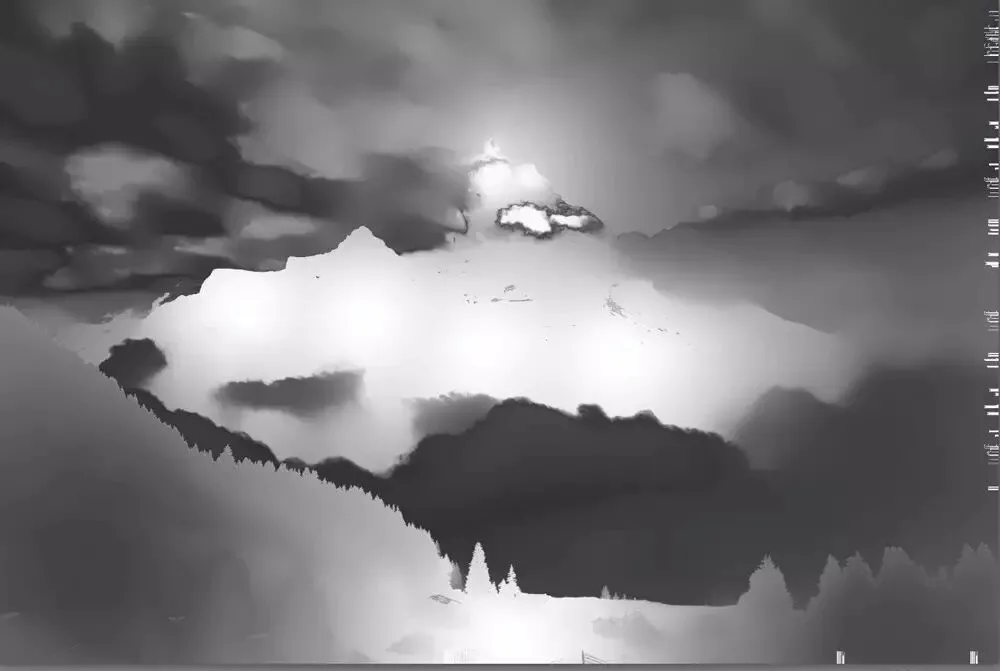
Control points are simple and flexible. After adding a few, we've built the mask shown below: the tonal-contrast effect mainly lands on the peaks and the road in the middle foreground (white in the mask), while the clouds, mist, and grass on both sides get only a slight boost (gray-black in the mask).
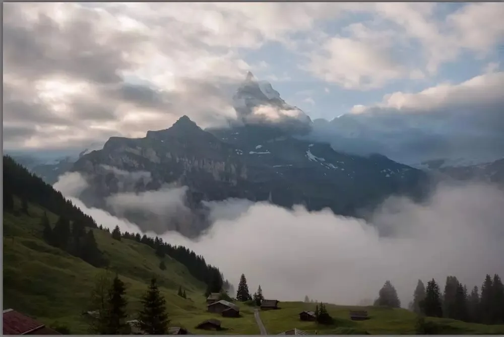
That completes the Tonal Contrast adjustments.
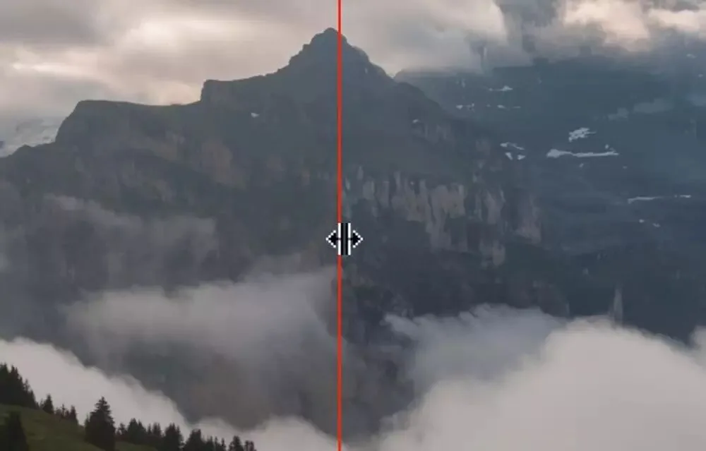
Zooming into peak detail: left of the red line, without the filter, the mountain is nearly a blurry mass; on the right, after Tonal Contrast, the rocks and shrubs on the peaks are much clearer.
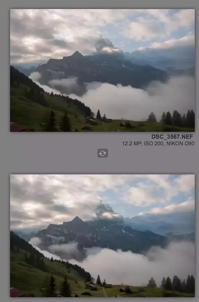
Thanks to the shadow/highlight protection sliders and the localized control points, the result isn't as exaggerated or fake as an HDR filter — it restores detail fairly naturally. (The image below compares before and after.)
Summary
1. The Nik Tonal Contrast filter can strengthen or weaken detail and texture.
2. There are 5 Contrast Types for different contrast intensities. The Highlights, Midtones, and Shadows sliders control detail contrast in each brightness range.
3. The lower Highlight and Shadow protection sliders keep highlights and shadows from clipping. Control points confine the effect to local areas for a more natural result.
Follow @Thomas Chu Photo, and learn one photography skill every week.