Photography Tutorial · 2016-08-07
Remove Haze for Clearer, More Transparent Photos
"Clarity" is a buzzword in photography. Many photos look shrouded in haze, and we can sense they lack clarity — but what actually causes it?
In this Sunday's photography share, Thomas explains from the perspectives of tone and color why photos lack clarity — and how to prescribe the right fix to make them crystal clear.

Many things make a photo unclear: smoke in the air, backlighting, shooting through glass, and so on. Yet unclear photos all present the same way.
When we say a photo lacks clarity, we really mean two things: it looks gray, and it looks dull. Gray means the colors aren't pure or saturated enough, with too many stray casts. Dull means the tonal range is too murky — an indistinct subject, poor detail, insufficient contrast.
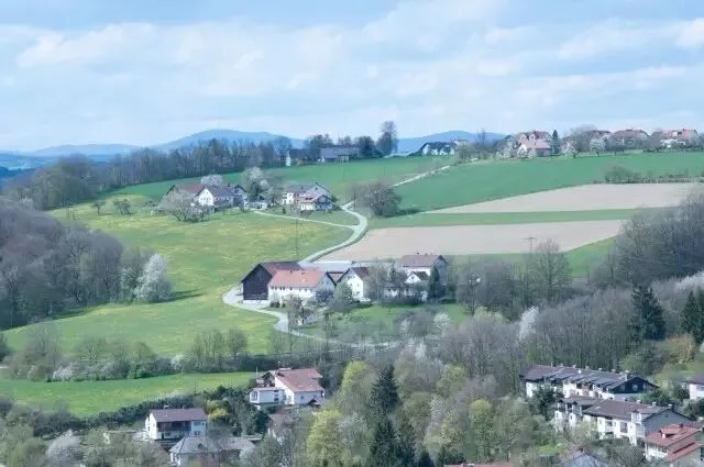
So to make a photo clear, we need two things: brighter, airier tones, and purer, more saturated colors.
1. Tonal Adjustments to Cure Dullness
A photo free of dullness generally has three traits:
a crisp subject; rich detail; sufficient black-and-white points and contrast.
1.1 A Crisp Subject
When people think of clarity, many instinctively crank up Clarity and Sharpening across the whole image. In fact, we never feel that photos of drifting mist or surging seas of clouds lack clarity.
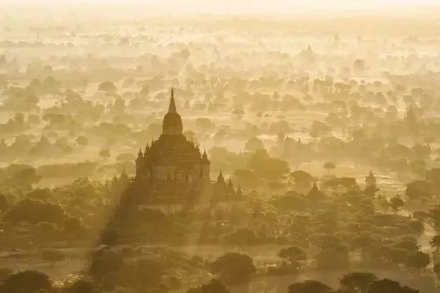
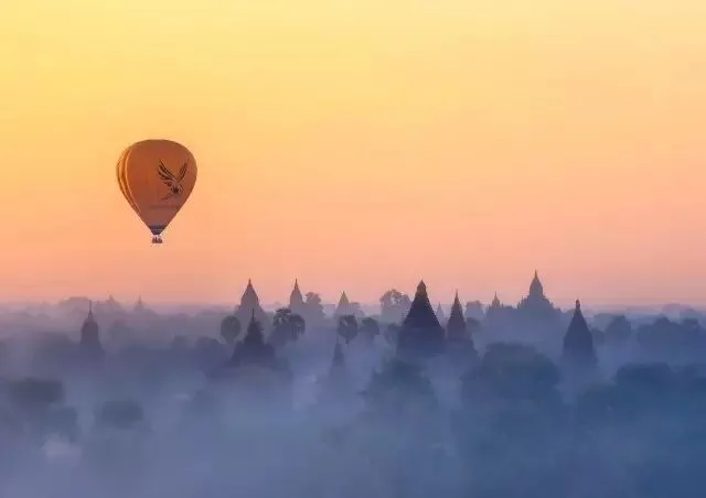
That's because every photo has centers of interest — subjects — where viewers focus most of their attention. In the image above, our eyes go to the giant pagoda. As long as the pagoda is crisp, the misty forest behind it doesn't feel unclear at all; it actually enhances the mood.
The photo below is similar — the whole image looks a bit hazy and unclear.
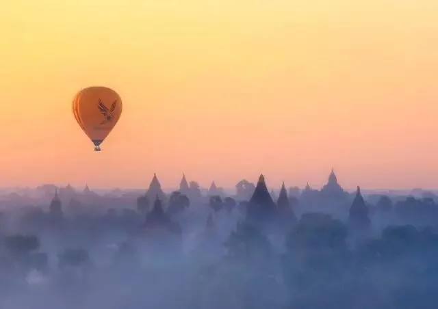
So in ACR I raised Clarity to +40 and Sharpening Amount to 80 — the whole image is visibly crisper.
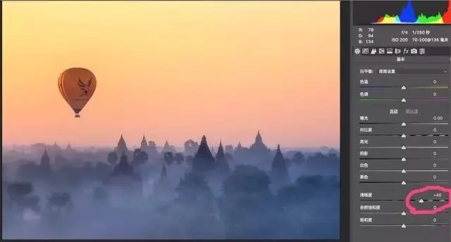
But when we look at this image, we first notice the hot-air balloons, then a few prominent pagodas — we rarely study the tree details up front. So I only need to add clarity to the points of interest, using the mask shown below.

The final result: the hazy, unclear feel is gone, while the morning-mist atmosphere remains.
1.2 Rich Detail
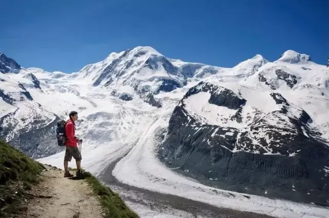
Unclear photos lack detail; objects seem wrapped in dull gray or grayish-white haze. In the image below, the distant glacier looks covered by bright white vapor with zero detail.
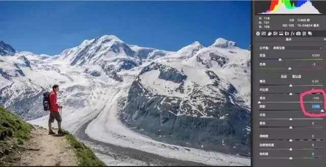
So in ACR's Basic panel I pulled Highlights to -100 and Shadows to +100, recovering over- and underexposed detail.
Sometimes the local contrast range is too wide. In the next image, even with Highlights at -100, the sky is still a blurry wash.
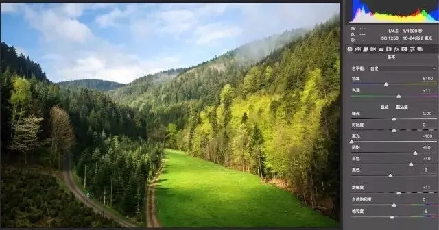
That's when local tools come in — masks, Radial Filters, Graduated Filters — to adjust exposure and contrast in specific areas. Here I used a Graduated Filter to reduce the sky's exposure, bringing out sky and cloud detail and greatly reducing the haze.
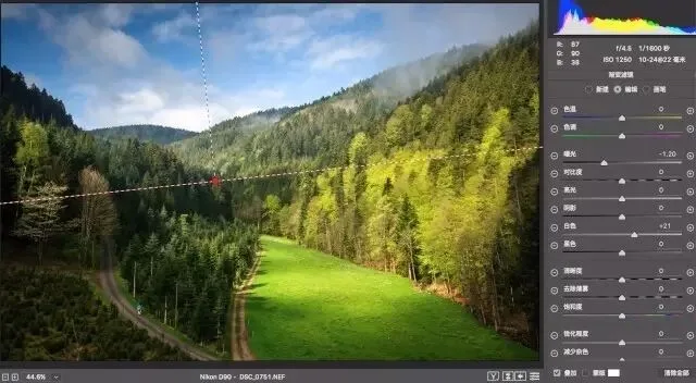
Other detail-boosting tools include the Detail Extractor and Tonal Contrast filters in the Nik Color Efex Pro 4 plugin.
1.3 Sufficient Black-and-White Points and Contrast
In an unclear photo, what should be white isn't white enough, what should be black isn't black enough, and the separation between objects is weak — so the photo feels dull.
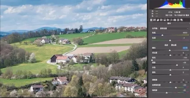
For the photo above, I pushed Contrast to +22 in ACR to strengthen separation. Blacks -39 makes the shadows truly black, and Whites +11 makes the bright parts of the houses pure white. The photo gains depth and dimension, and the stronger contrast also intensifies color brightness — more clarity overall.
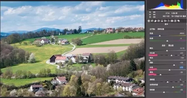
Other common tools for contrast and black-and-white points include Levels and Curves in PS, and Pro Contrast in Nik Color Efex Pro 4.
2. Color Adjustments to Cure Grayness
A photo free of grayness likewise has three main traits:
accurate white balance; pure colors; sufficient saturation.
2.1 Accurate White Balance
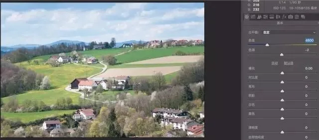
Inaccurate white balance makes everything in a photo lean blue or yellow, as if veiled in blue or yellow fog — the opposite of clarity.
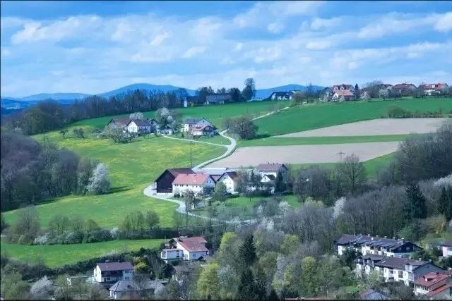
So the first step in fixing color muddiness is correcting white balance, letting objects show their true, varied colors.
2.2 Pure Colors
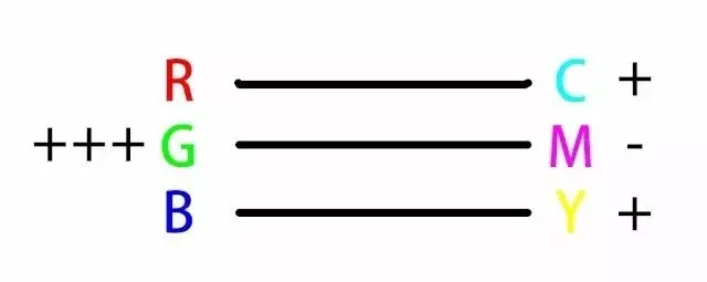
A color's purity depends on the ratio of supporting to subtractive components in it. Colors often look gray because they're contaminated by large amounts of subtractive components. To understand this, we first need the three primary pigment colors: Cyan, Magenta, Yellow. Cyan + Yellow = Green; Cyan + Magenta = Blue; Yellow + Magenta = Red.
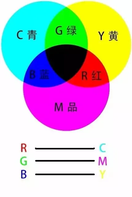
In the color wheel above, the colors adjacent to a given color are its analogous colors. Blue's analogous colors are cyan and magenta; red's are yellow and magenta. A color's analogous colors are its supporting components — to boost blue, add its analogous cyan and magenta; to reduce red, subtract its analogous yellow and magenta.
The color opposite a given color on the wheel is its complementary color. Complementaries are subtractive components — blue's complement is yellow. Add yellow, and the original blue fades toward gray.
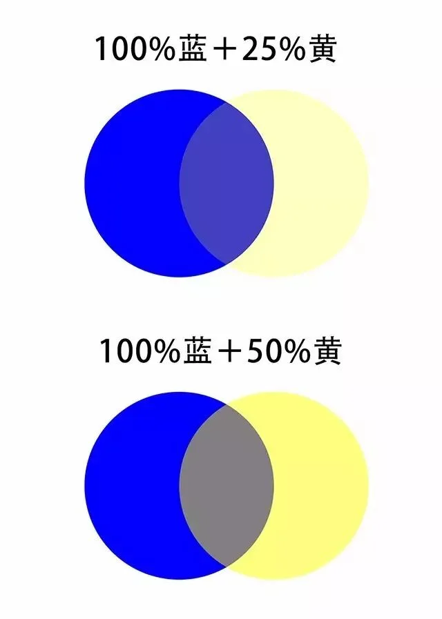
The image above makes it obvious: add yellow at 25% opacity to blue, and the blue starts looking gray and impure; at 50% opacity, it becomes a dirty gray.
So to strengthen the blue of sky and water, boost its analogous cyan and magenta, and reduce its complementary yellow.
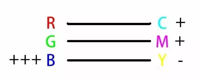
To make grass green purer, boost green's analogous cyan and yellow, and reduce its complementary magenta.
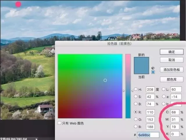
Below is a real example of a muddy sky. I sampled the sky's blue at the red dot, and the CMYK panel shows 68% cyan + 31% magenta + 19% yellow.
Since cyan + magenta + yellow = gray-black, and cyan + magenta = blue,
68% cyan + 31% magenta + 19% yellow = 19% (cyan+magenta+yellow) + 12% magenta + 49% cyan = 19% gray + 12% blue + 37% cyan.
The sky's intended pure cyan-blue is contaminated with 19% gray — no wonder it looks muddy.
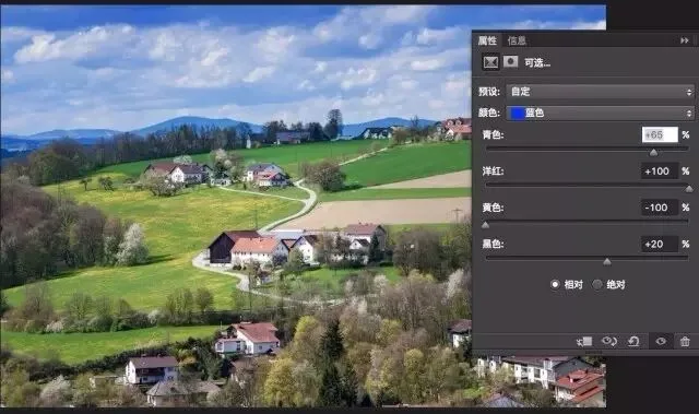
So use the Selective Color tool: select the sky's blues, add the analogous cyan and magenta, and subtract the complementary yellow.
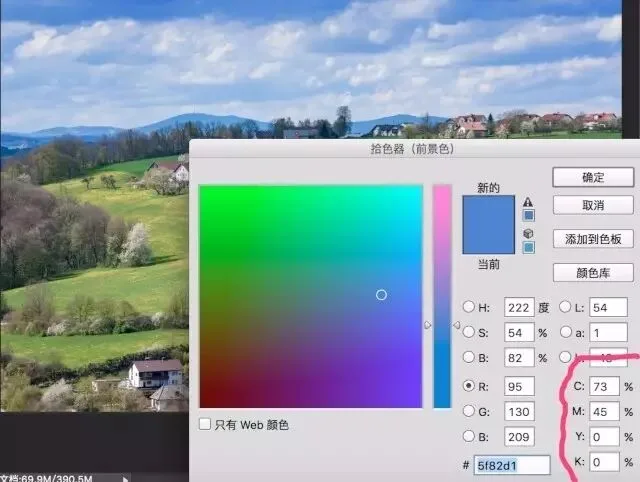
In the resulting sky, the Y (yellow) value in CMYK drops to 0% — free of yellow interference, the sky regains its clear cyan-blue.
On pure color, I strongly recommend teacher Li Tao's video "How Controlling Primary Colors Makes Your Photos Clear" — it will give you a much more intuitive, in-depth understanding. ( http://www.zcool.com.cn/article/ZMTQyMTEy.html )
2.3 Sufficient Saturation
The higher the overall saturation, the more everything looks crisply illuminated — which increases the sense of clarity and reduces the haze.
To add saturation, simply use the "Vibrance | Saturation" adjustment in ACR or an adjustment layer.
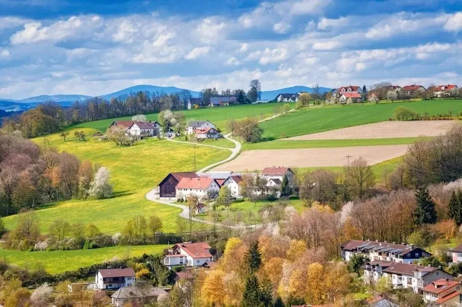
Hands-On Practice (raw file download)
Reading about it is never enough — you have to do it. After all this theory and tooling, how could we not put it into practice?
Here's an extremely unclear raw file from Thomas. Shot through the dirty, reddish glass of a mountain cable car, the whole Neuschwanstein area looks wrapped in red haze: indistinct subject, hazy detail, low contrast, color casts, mixed stray colors, insufficient saturation... Every cause of muddiness in one photo — a perfect example!
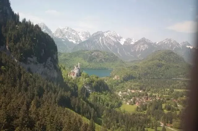
Space is limited, so Thomas will walk through my complete "de-gray, de-dull" workflow for this photo next week. For now, download it and practice yourself.
https://pan.baidu.com/s/1csUZQu
You're welcome to send your results to my WeChat account (thomaskksj), or share them with Thomas on Weibo @Thomas Chu Photo.
Weekly Summary
An unclear photo is either gray or dull. Gray is about color: inaccurate white balance, impure colors, insufficient saturation. Dull is about tone: an indistinct subject, poor detail, insufficient contrast.
How to remove the haze from the practice file step by step? Stay tuned for Thomas's photography share next week.