Photography Tutorial · 2020-09-20
Why Do My Photos Look Flat? Three Ways to Add Real Depth
Thomas Chu Photo
Photographers often run into this problem: other people's photos look wonderfully layered, while their own look flat and lack a sense of depth.
Today, Thomas will analyze the works of renowned photographers such as Hiroshi Sugimoto, Gregory Crewdson and Max Rive — where exactly does the depth in their images come from?
Video Tutorial
▶ Watch the video tutorial on Bilibili
This is the fully illustrated companion to the video above. Why do the masters' photos look layered and three-dimensional while ours fall flat? In this 15-minute tutorial Thomas distills depth into three sources — structure, occlusion and perspective in composition; variation in brightness and clarity; and the correlation between color and region — unpacking each with works by Gregory Crewdson, Hiroshi Sugimoto and Max Rive, plus his own field examples. Skim it here for the framework, then dive into the video for the details.
Start with the overview: this summary slide, captured at 0:50 in the video, lays out the three threads of the whole tutorial — photos lacking structure, occlusion and perspective; lacking variation in brightness and clarity; and colors not strongly tied to regions. Each is unpacked below.

01 Composition: Structure, Occlusion and Perspective
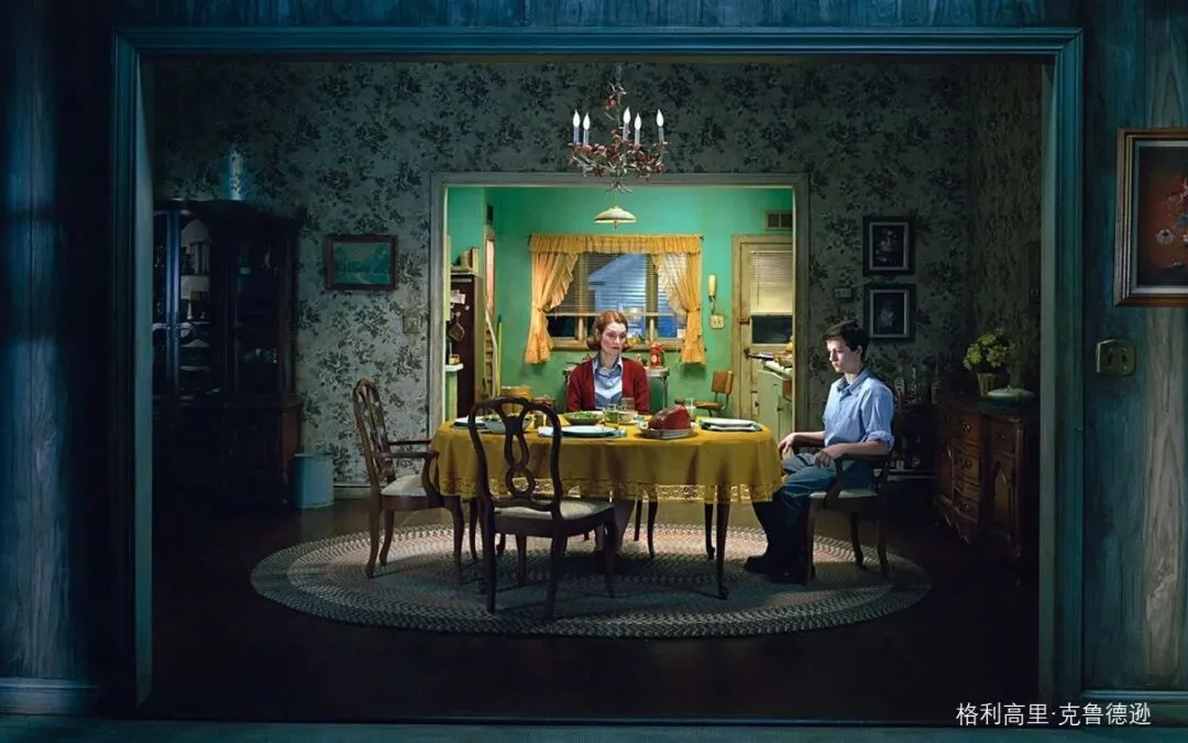
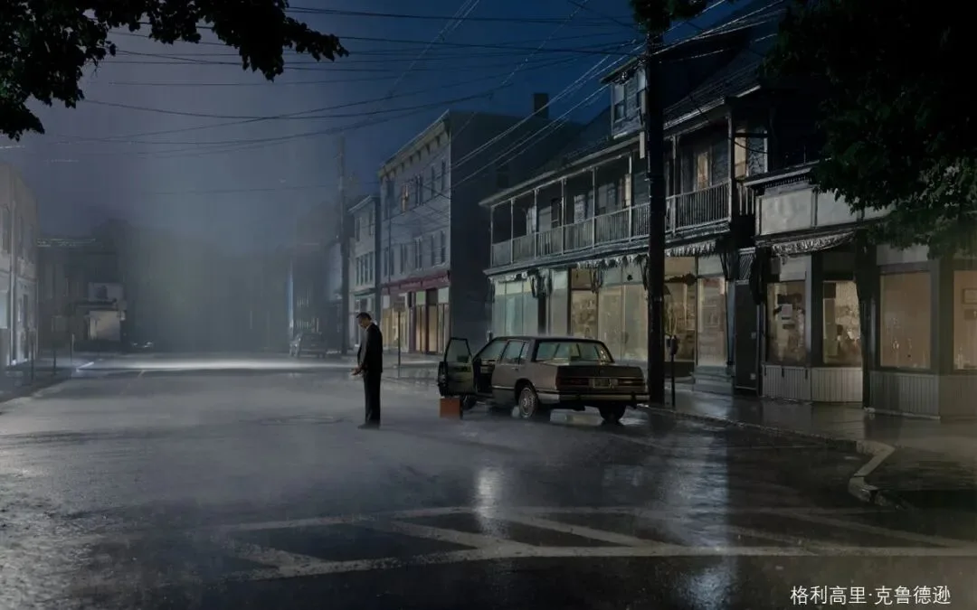
The first source of depth is pictorial structure. At 0:24 in the video, Thomas points out that many photos fall flat because the composition is too simple — no occlusion, no perspective, no leading lines. His first master example is the American photographer Gregory Crewdson, who shoots the way films are made: sets, models and lighting are all arranged in advance, and every detail in the frame is placed there deliberately by the photographer (at 1:15 in the video). That is exactly why his work is the perfect specimen for studying intentionally constructed depth.
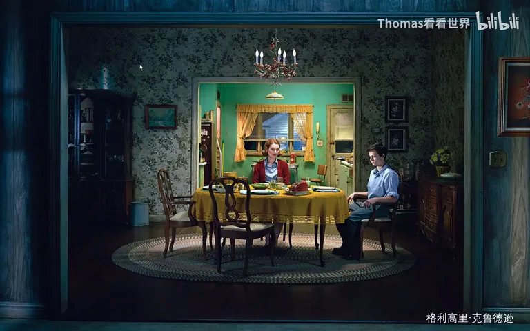
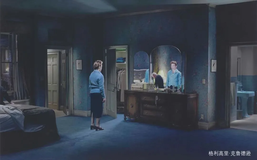
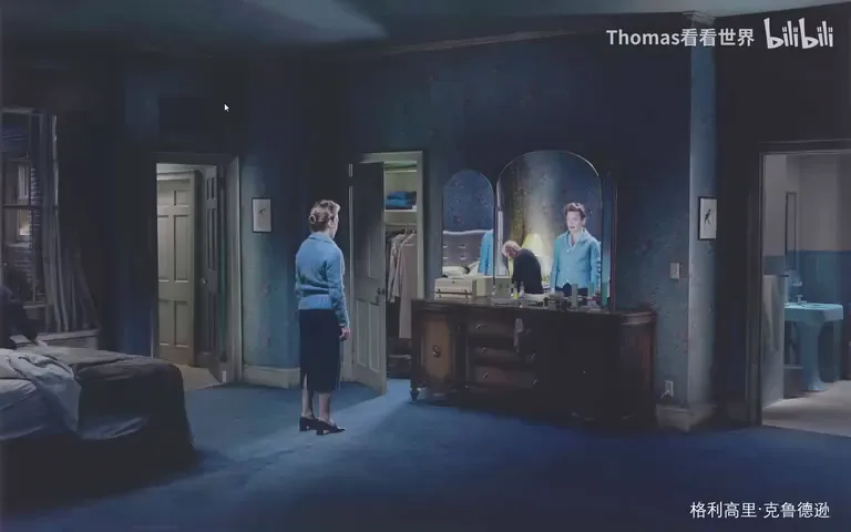
Study the composition of the work above: a doorway, beyond it a broad room with a mother and child at the table; behind them a second doorway opening into yet another space; side doors on the left and right, and further back a window with an illuminated building beyond it (at 1:55 in the video). Instead of simply placing a table to state the subject, the photographer meticulously constructed layers of space — door after door, side doors and windows nested one inside another, giving the composition a remarkably extensible sense of depth. The next work goes further: besides doors and windows a mirror joins in, shot from the side so the perspective effect is unmistakable and the whole scene reads intensely three-dimensional (at 2:38 in the video).
02 In the Field: Putting Structure into Practice
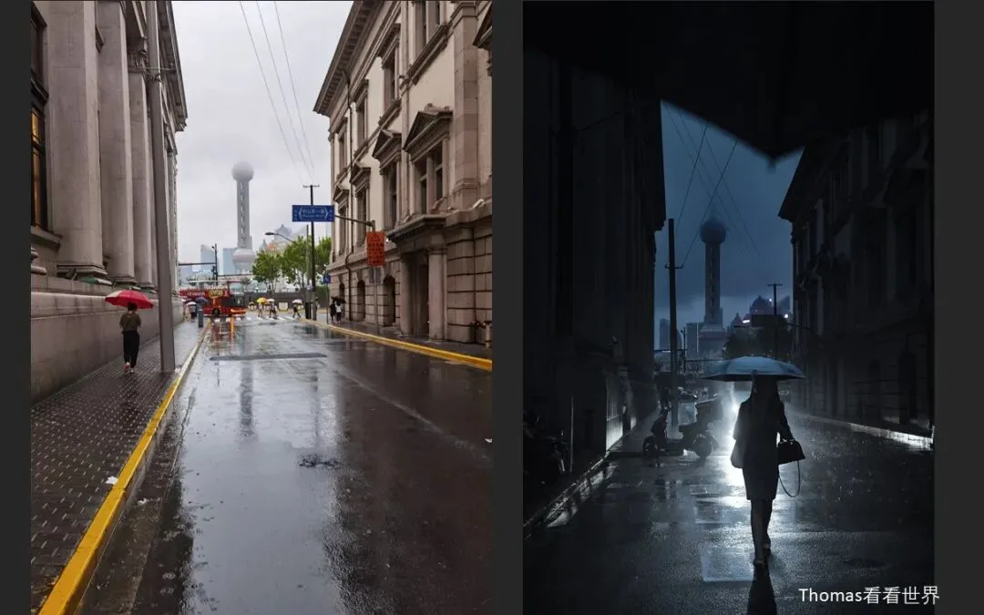
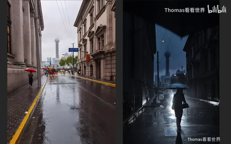
How do you apply this to your own shooting? Thomas starts with two city examples. For his Shanghai rainy-night shot, the phone snapshot on the left is just an ordinary tourist view, a bit bland; the one on the right was carefully composed and timed — beyond its richer tonal layering, the key is an umbrella he held in the foreground as a prop, creating yet another layer of space, and then a passer-by walking in, whose figure and shadow added one more (at 4:03 in the video). Structure and the deliberate arrangement of objects instantly made the image dimensional.
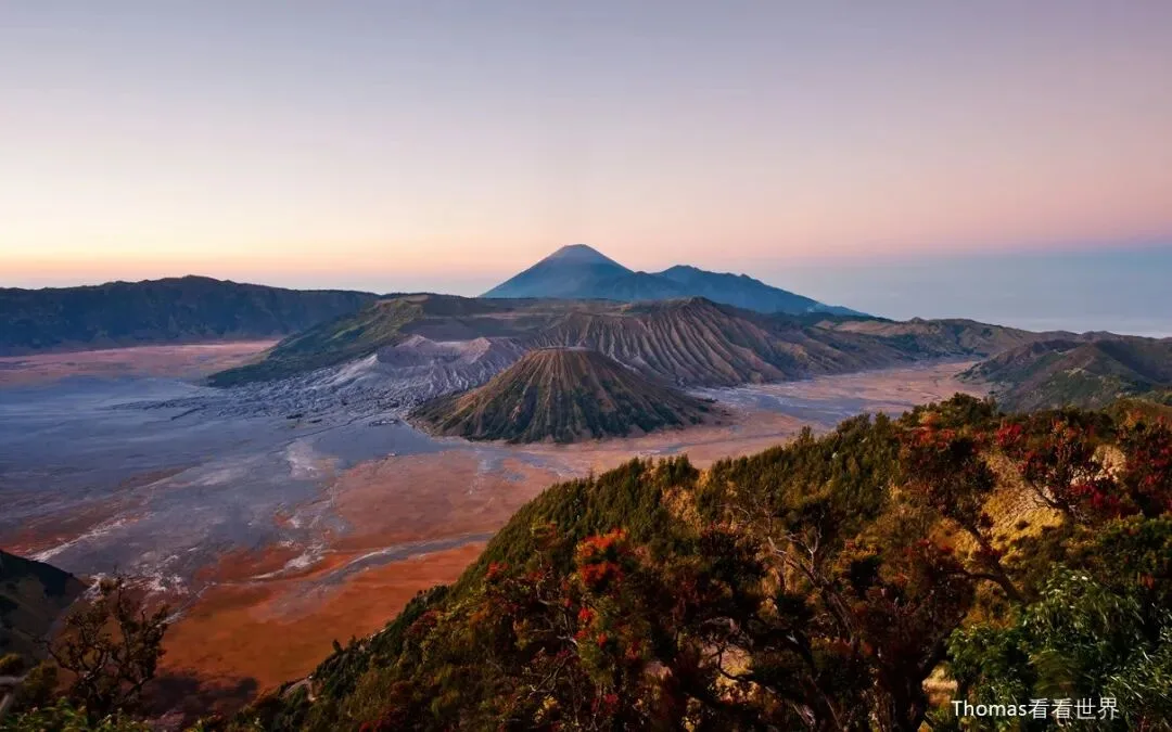
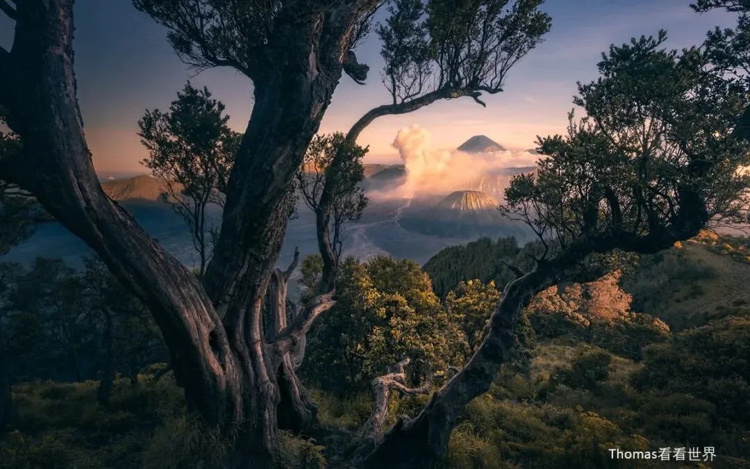
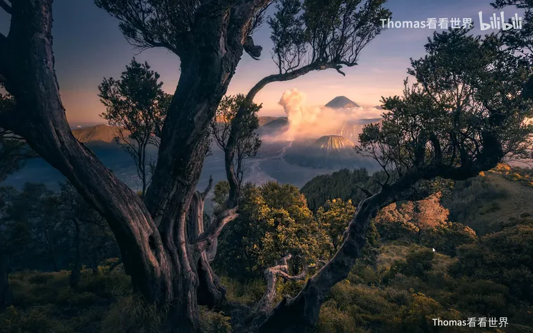
Landscapes work the same way. at Mount Bromo in Indonesia, the ordinary tourist view comes out utterly flat and depthless; Thomas found a tree that happened to form a frame — and a strongly sculptural tree at that — then pushed the separation further with the tonal and color structure covered in the next chapter (at 4:50 in the video). Same scene, same sunrise light, completely different feeling. He also shares a series shot from a train: at noon under harsh overhead light it is hard to separate tones and colors, yet you can still build depth through composition alone (at 5:52 in the video).
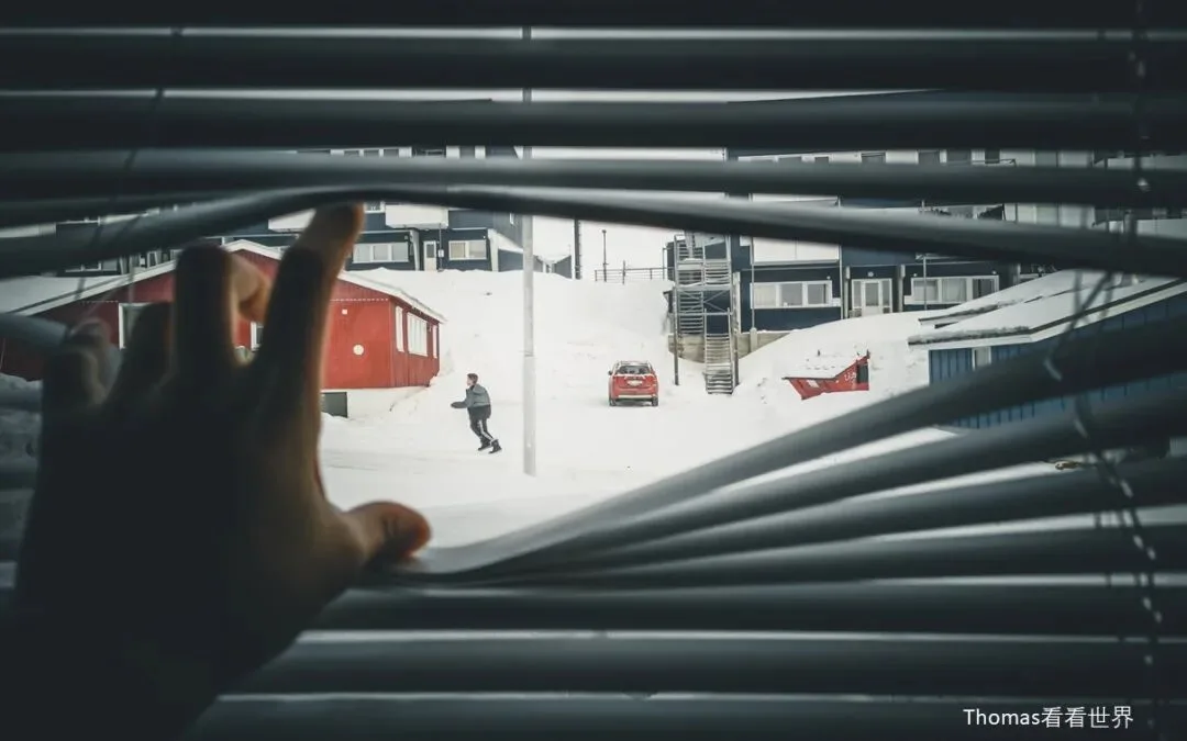
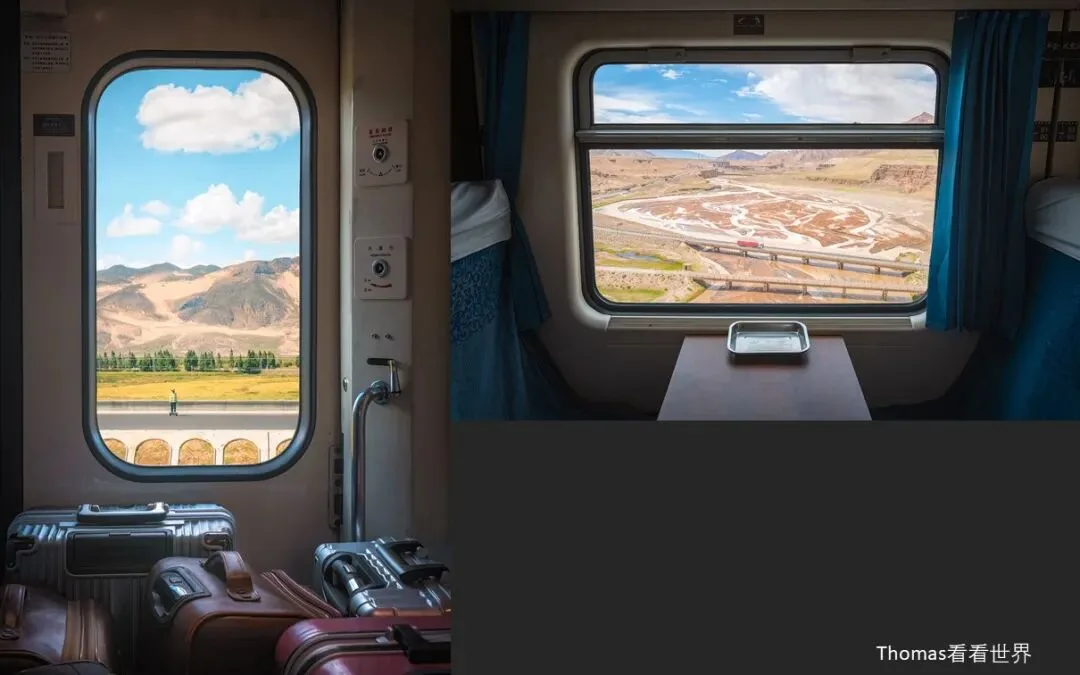
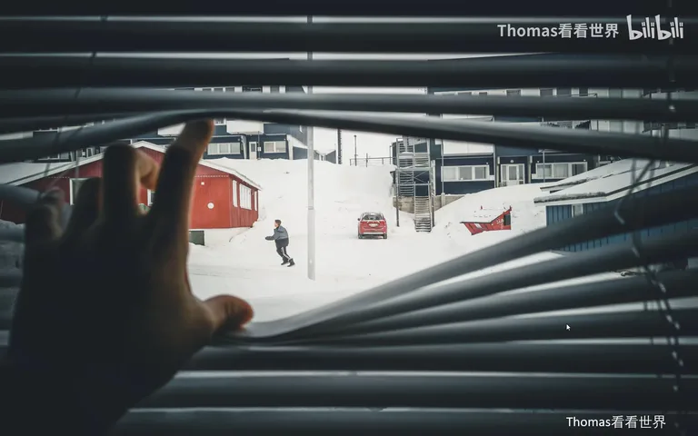
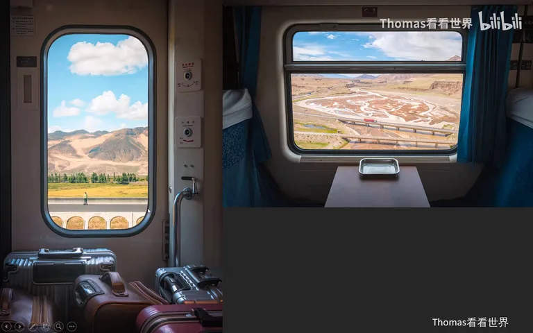
This train series is packed with reusable tricks: a window plus one hand as a prop, waiting for a passer-by to run down the street (at 5:30 in the video); the window and the road outside forming a frame-within-frame "multiple worlds", while the view itself stacks into layered strata — roadbed, then grass, then snow mountains, then blue sky (at 6:08 in the video); suitcases deliberately arranged in the foreground, occluding one another and receding in sequence to create a strong sense of aerial perspective; and a downward tilt that makes the seats and tables show near-wide, far-narrow perspective, adding another layer inside the carriage itself (at 6:38 in the video). Whether landscapes, cinematic street scenes or portraits, props, staging and improvisation can always uncover fresh structure and composition.
03 Tone: Variation in Brightness and Clarity
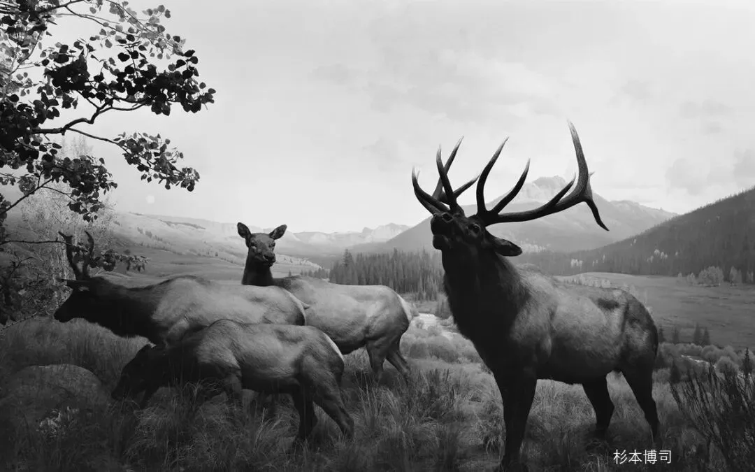
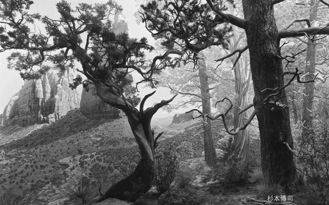
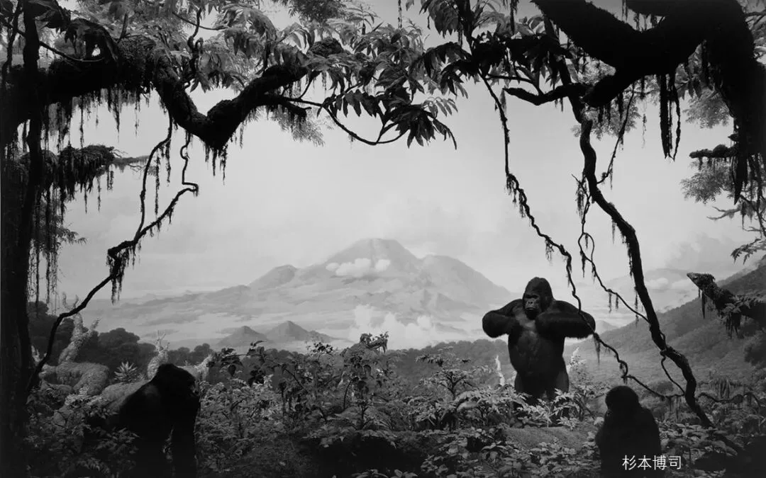
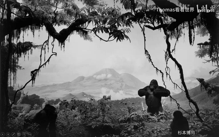
The second source of depth is variation in brightness and clarity (at 7:19 in the video). Thomas demonstrates with Hiroshi Sugimoto's black-and-white photographs of museum dioramas: although monochrome, the spatial feel is overwhelmingly strong — the silhouetted trees around the edge are pitch black, the mid-ground trees a shade lighter, the distant mountains lighter still, the highest peak lighter yet, and finally the sky the palest gray of all. This progressive tonal gradation is where the depth comes from (at 7:46 in the video). Dark-near, bright-far is the usual order, but the reverse works too: a beam of light breaking through clouds to lift the foreground, with brooding, pitch-dark snow mountains behind, reads just as layered.
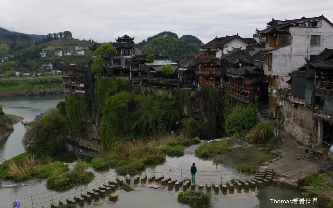
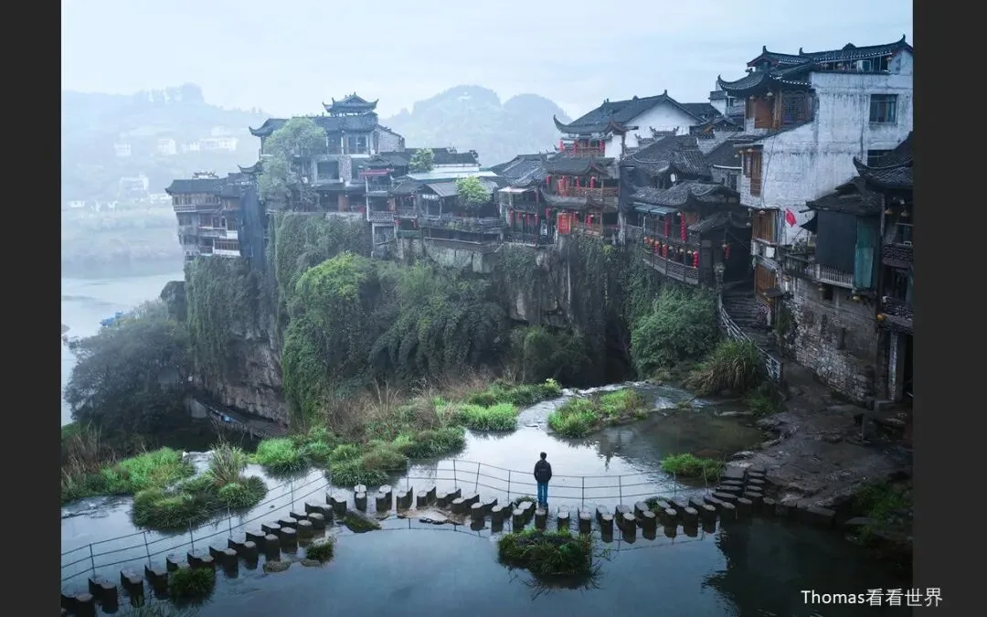
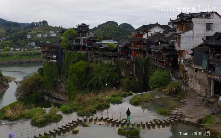
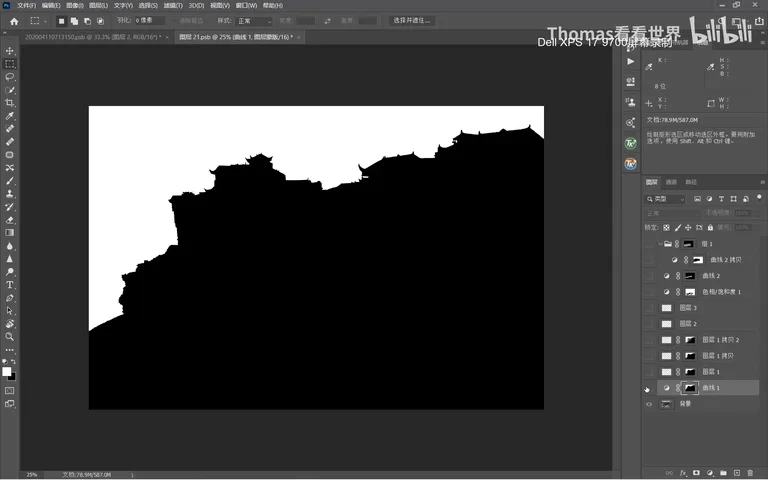
Thomas then pulls up the original of one of his village photos: shot in a vast, near-to-far three-dimensional space, yet on the flat image it reads as exactly that — flat, with no depth (at 8:54 in the video). In the video he opens the photo's PSD file and walks through the edit: first he selects the far distance and brightens it repeatedly while adding blur, making the background brighter and softer so the near-far layers snap apart; he feathers the transition so it flows naturally; then desaturates the greens, darkens the mid-ground slightly to build shadow, and cools the image; finally he lifts the top-left corner further and darkens the bottom-right — the whole picture becomes a gradient from bottom-right to top-left, growing progressively blurrier and brighter (at 9:32 in the video). The before-and-after is striking.
04 Color: Tying Colors to Regions
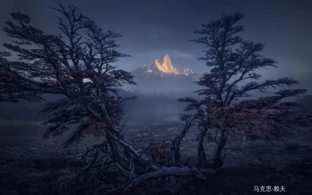
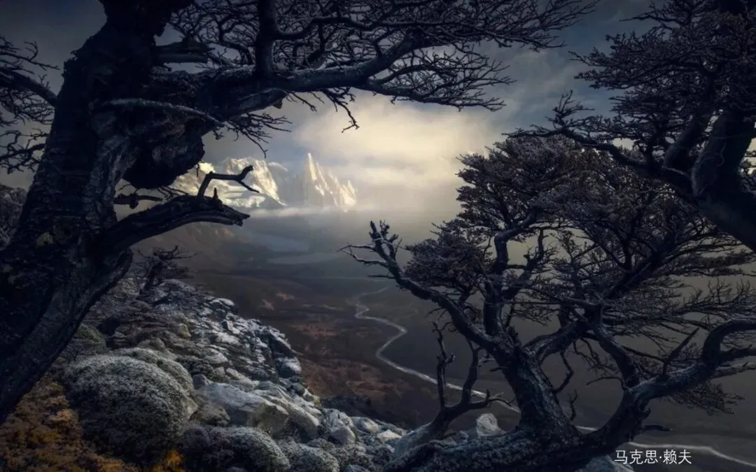
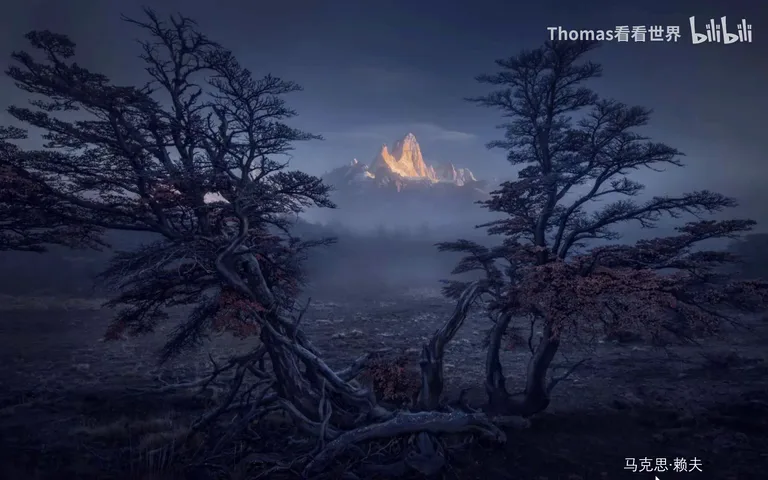
The last major source is the correlation between color and region (at 10:38 in the video). The Dutch photographer Max Rive offers the most intuitive demonstration: the foreground holds a structure, a frame — and it is dark and cool-toned, while the snow mountains beyond are warm-toned and bright — a double separation of tone and color that gives depth a powerful visual cue (at 10:44 in the video).
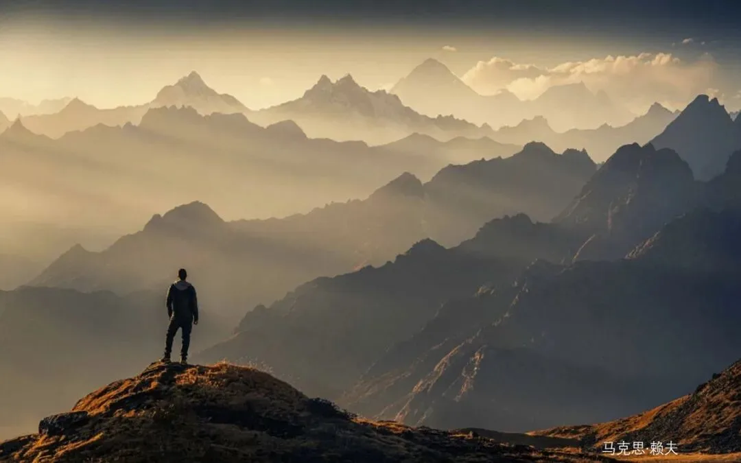
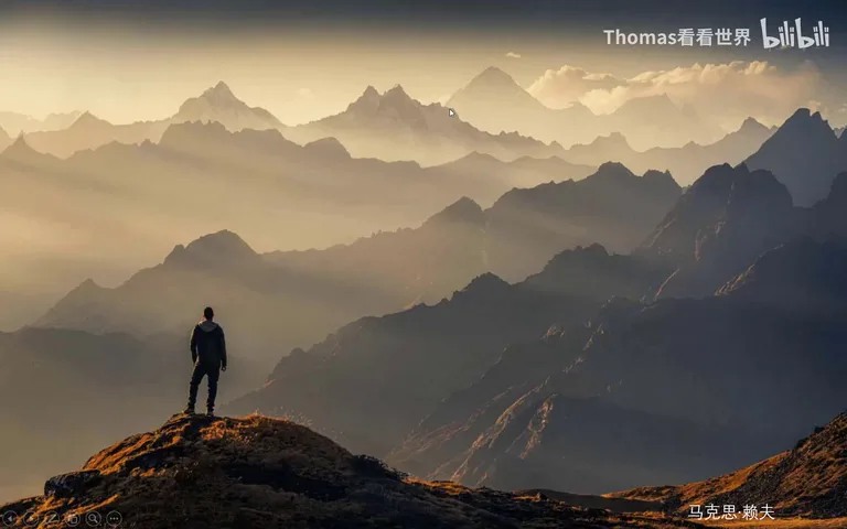
A more sophisticated approach alternates cool and warm. In another work, the nearest band leans cool, the sunlit peak leans warm, the shadows behind turn cool again — cool shadows, warm highlights, cool, warm, alternating layer by layer into the distance, until the sky finally transitions from warm to cold. Thomas singles out the sky: if it were uniformly warm it would read as a single plane, but with the cool-to-warm transition the upper sky feels closer and the yellow sky farther, and the depth emerges at once (at 11:12 in the video). The photographer also separates along the original direction of light — the right side darkened and cooled overall, the left lifted and warmed — pulling the left and right apart into layers too (at 12:00 in the video).
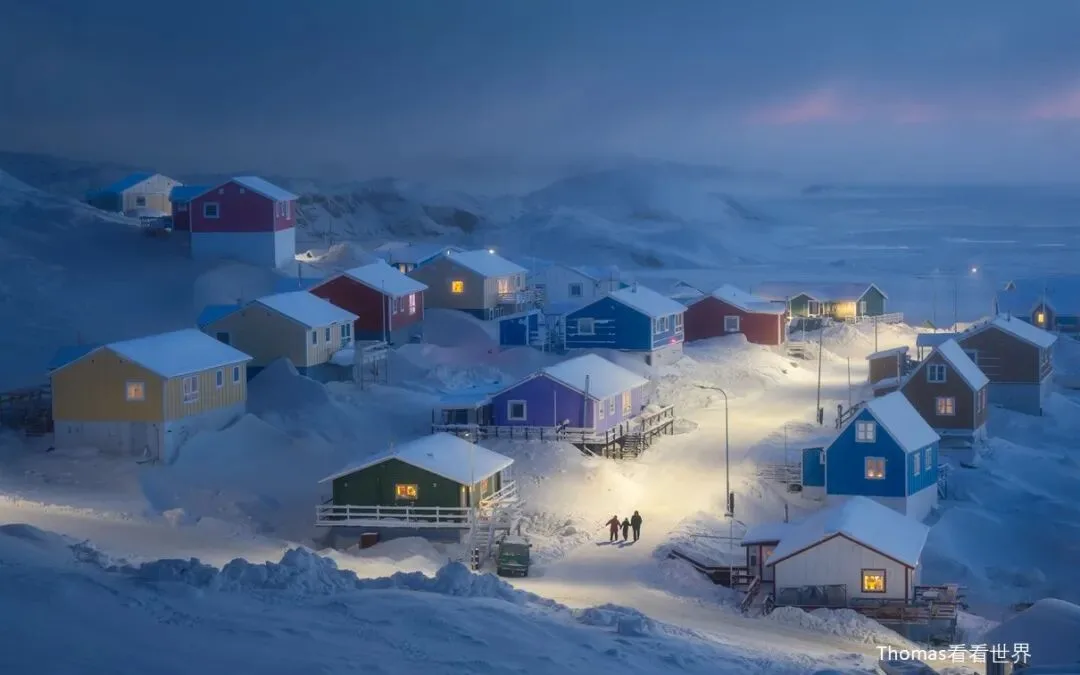
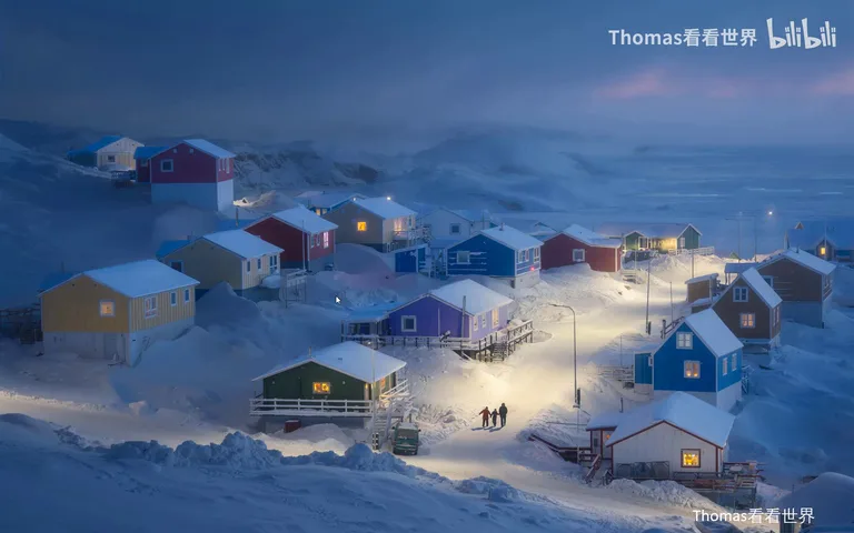
One of the hottest works on 500px uses the same cool-near, warm-far separation (at 12:45 in the video). So does Thomas's Greenland village photo: cool shadows across the snowy foreground, the far lamplight deliberately warmed from white, and the frozen sea beyond reinforced with purple — warm, cool, warm, cool meeting again and again, and the layering grows naturally stronger (at 13:00 in the video). In practice: for portraits, keep skin tones warm and push the background cool for a strong separation; to layer the background further, don't use a single flat cool tone — stack cool, warm, cool, warm receding into the distance. As long as colors come in blocks tied to regions, and tones are tied to regions as well, your photos will brim with depth and dimension (at 14:02 in the video).
1. Compose with structure, occlusion and perspective in mind: frames from doors and windows, objects occluding one another, lines receding — depth is designed, not stumbled upon; 2. Strengthen dimension by separating brightness and clarity — dark-near/bright-far or its reverse, with clarity grading along the same axis; 3. Make colors work in blocks tied to regions: cool shadows and warm highlights alternating in layers — the warm-cool split is the strongest visual cue for depth; 4. Shoot structure in the field, refine tone and color in post — attack from all three angles and even the flattest photo turns dimensional.
PPT