Photography Tutorial · 2019-03-24
The Most Important Post-Processing Step That 90% of Enthusiasts Ignore
Thomas Chu Photo
What is the most important step in photo post-processing? Color grading? Compositing? Skin retouching? Actually, none of them.
Photography enthusiasts often have a bad habit: the moment they get a raw file, they start trying all kinds of edits — dragging this slider, liquifying that spot — editing purely by feel and luck.
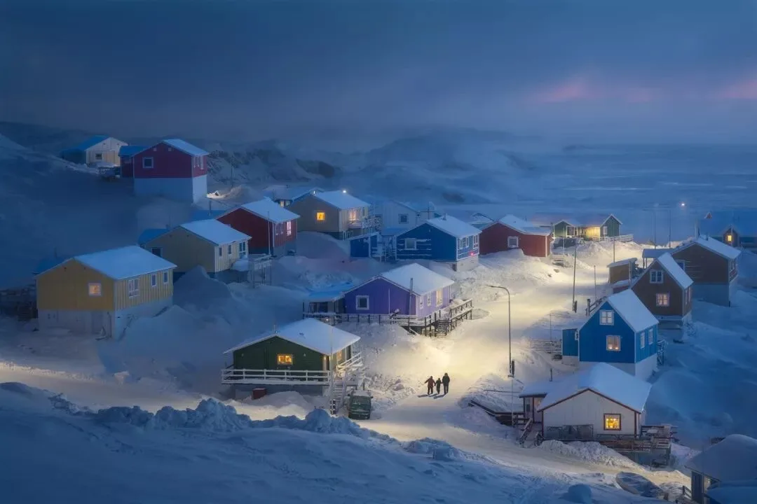
What they overlook is the most important step of post-processing: at the very beginning, analyzing the photo as a whole and establishing a clear idea.
When we get a raw file (or even before pressing the shutter), we should first carefully observe and analyze the photo — establish its overall form, identify its points of interest, and consider the general direction of post-processing — and only then start working with all the tools and techniques.
1
Establish the Photo's Overall Form
The same photo can be graded into different tonalities, colors and styles depending on the direction of expression — all of which should be roughly decided at the start.
Even the degree of post-processing depends on our purpose: photos leaning toward documentation need to stay closer to reality, while photos leaning toward expression allow more room for manipulation.
For photos with similar compositions, different intended themes may lead to completely different post-processing ideas.
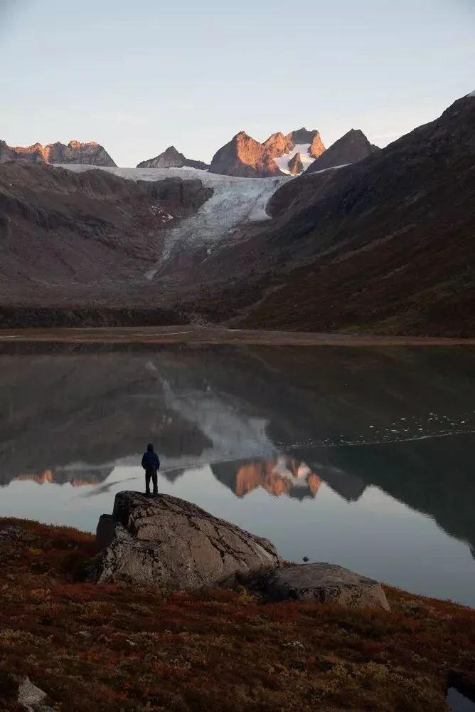
The raw file above was shot in Greenland on a rather calm morning, without any particularly grand scenery. What I mainly wanted to express was a sense of human solitude. So the overall post-processing tone was set as follows:
The overall tonality needs to be dark, which feels more oppressive. Contrast should not be high, to underscore the calmness of the environment.
Color saturation must not be too high, or the mood becomes too heated. The hues should lean cooler to bring a sense of tranquility.
Apart from the person and the hilltop, other areas must not carry too much detail, especially eye-catching detail. So although the sky was already cloudless, the few faint clouds needed further blurring and removal, and the excessive detail on the water had to be reduced.
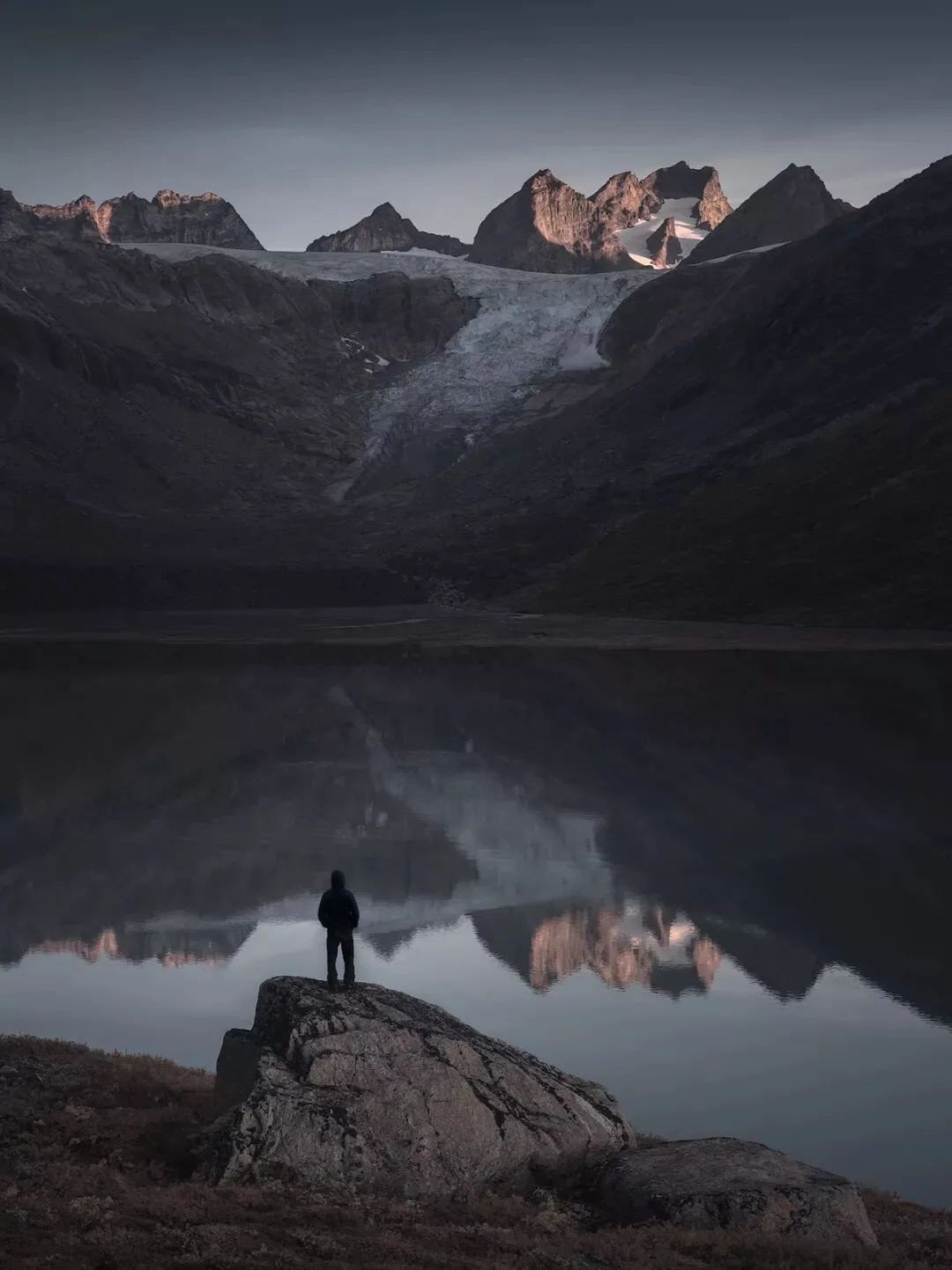
Only with an overall idea and direction can post-processing achieve a unified emotion — avoiding a shocking, fiery red mountain top above a quiet, cold water surface, with adjustments conflicting with each other.
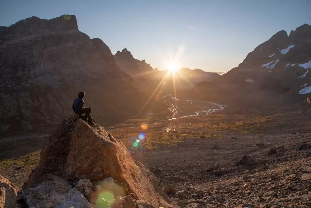
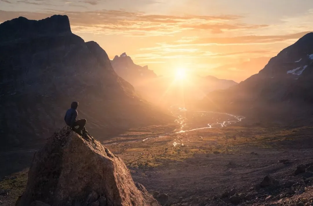
The photo above was also taken in Greenland, again with a person standing (sitting) on a rock.
But because my theme was different, I wanted this photo to be associated with words like hope and glory, so the post-processing idea was entirely different:
The tonality must not be too dark, and the contrast should be full, giving people the strength of hope.
The colors need to be warm and highly saturated, so that the photo feels brilliant and passionate.
The picture detail cannot be too plain — it should feel like stars and seas lie ahead — so I decided to add some clouds to the sky in post.
I mentioned in my book 'The Fundamentals of Landscape Photography Post-Processing' that technique serves form, and form serves content.
So in post-processing, the first thing to determine is the content and direction: is it a majestic landscape, a tranquil mood, or a reflection of the inner self?
Only after the direction of expression is set can we decide the tonal form — cooler and darker, or warmer and brighter.
As for which grading tool or technique to use, those are execution details that come later.
When producing a photo series, it is even more important to confirm and unify the form of the whole set from the very beginning.
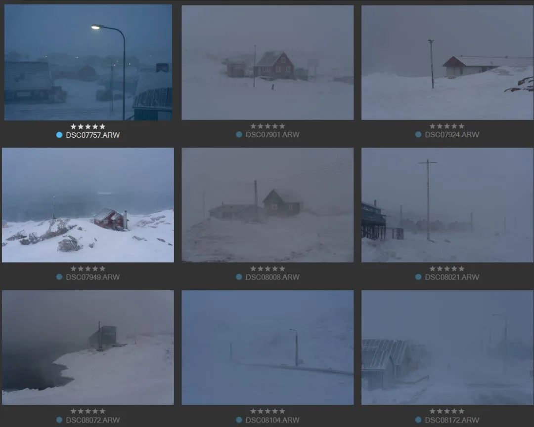
For example, the set of raw files above shows street scenes of a Greenlandic town I captured during a snowstorm — some brighter, some darker, some neutral in color, some cooler.
If I want to publish them as a series, I need to unify their color and tonality from the perspective of the whole set from the start — one photo cannot be bright and cheerful while the next is low-key and oppressive.
Writing an essay requires deciding the theme first; likewise, when editing photos, we need to confirm the theme, idea and direction first.
2
Analyze the Photo's Points of Interest
When writing, we usually decide the theme before picking up the pen. Photography projects should be the same, but the real world is full of complexity and surprise, and when shooting we often still rely on intuition to capture moments.
Therefore, at the very beginning of post-processing, we need to re-examine our photos and extract the points of interest from them.
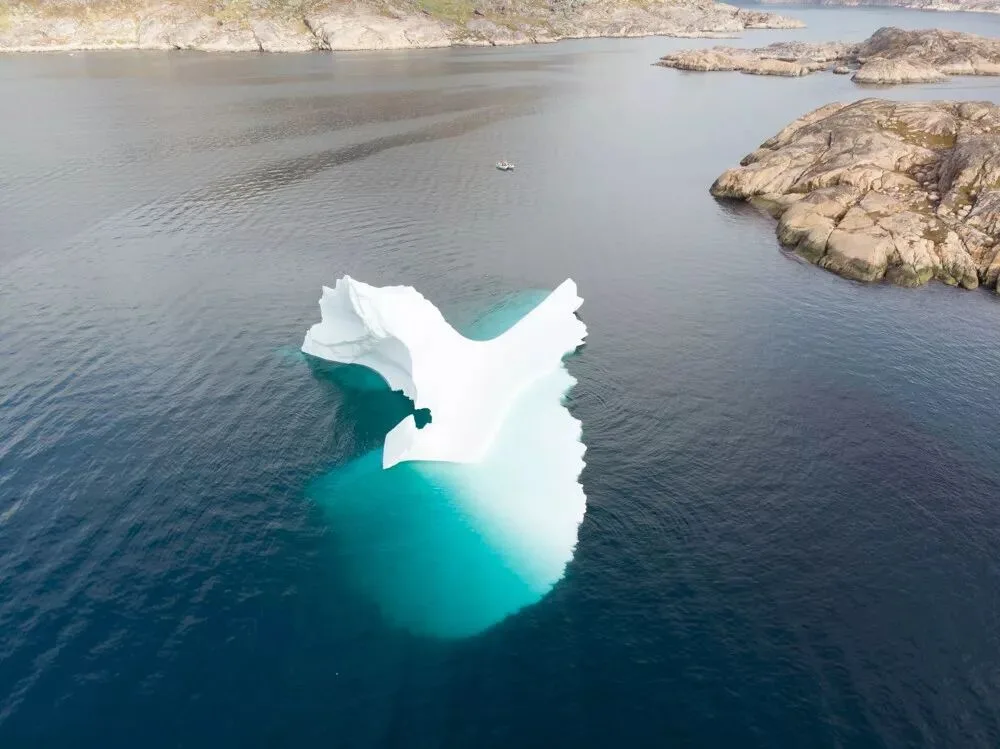
The raw file above is a drone shot of an iceberg — fascinating, capturing the hidden parts beneath the iceberg.
The point of interest of this photo is undoubtedly the iceberg. The small boat beside it is also interesting, serving as a reference that sets off the iceberg's enormity.
The land behind provides background information — for example, that the iceberg is near the coast — but this is not very interesting or important. So in post I decided to recompose and crop out the redundant parts.
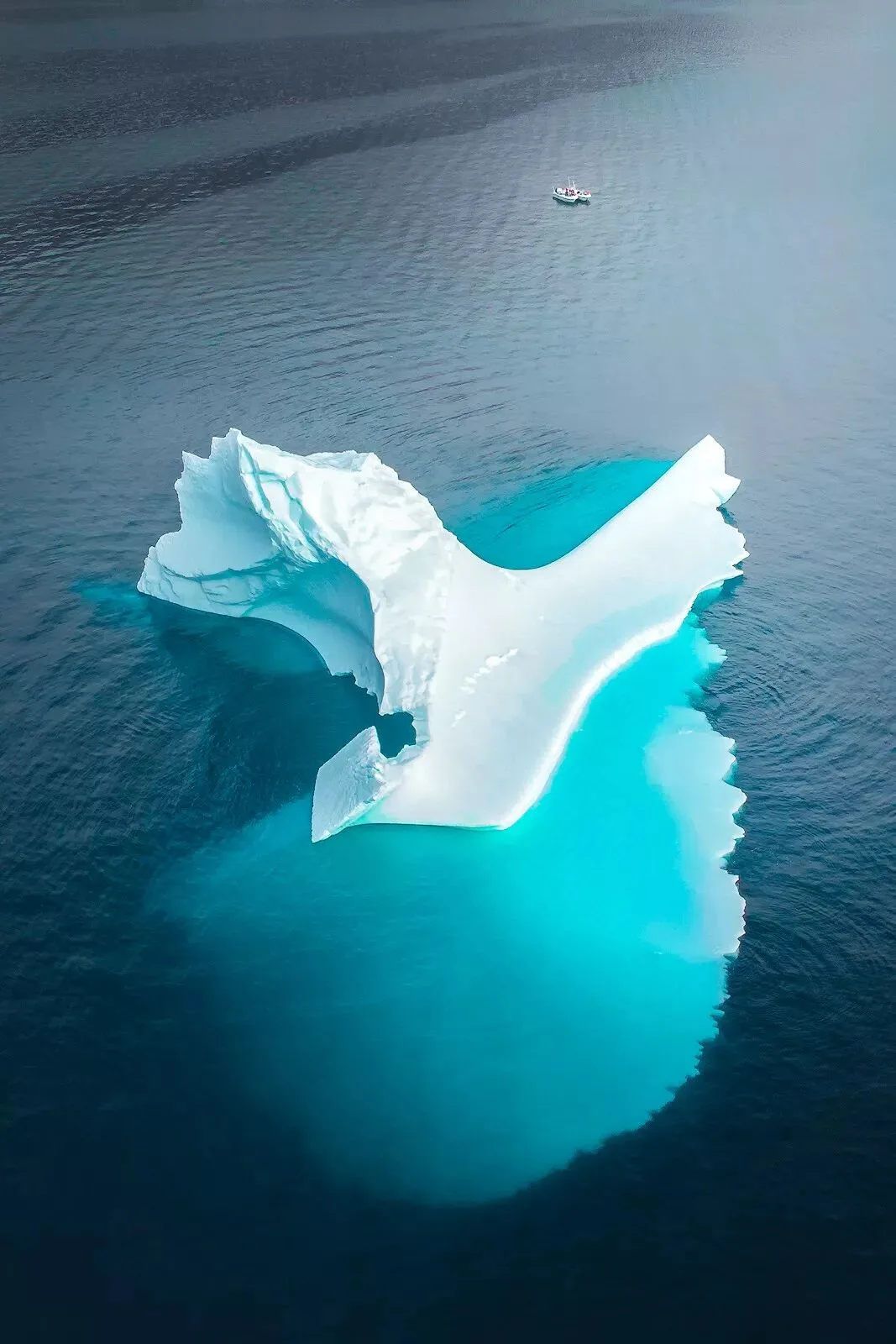
This way the content is more unified, and visually far more striking.
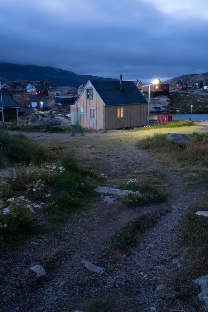
The image above records a chilly morning in a fishing village. The scene is cluttered; without making choices, viewers would have no idea what the photographer wanted to express.
So I decided to keep only one main point of interest — the bright street lamp — and two secondary ones: the faint lights of the houses and the hurried passerby.
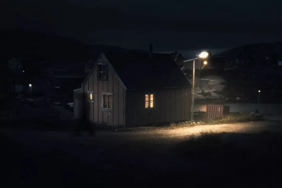
By cropping in post and darkening and softening the other elements, we visually extract the points of interest, letting viewers feel the distinctive atmosphere of an Arctic fishing village.
Identifying points of interest means more than re-cropping — it also affects the brightness and color of local areas.
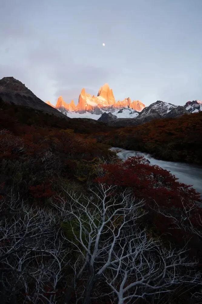
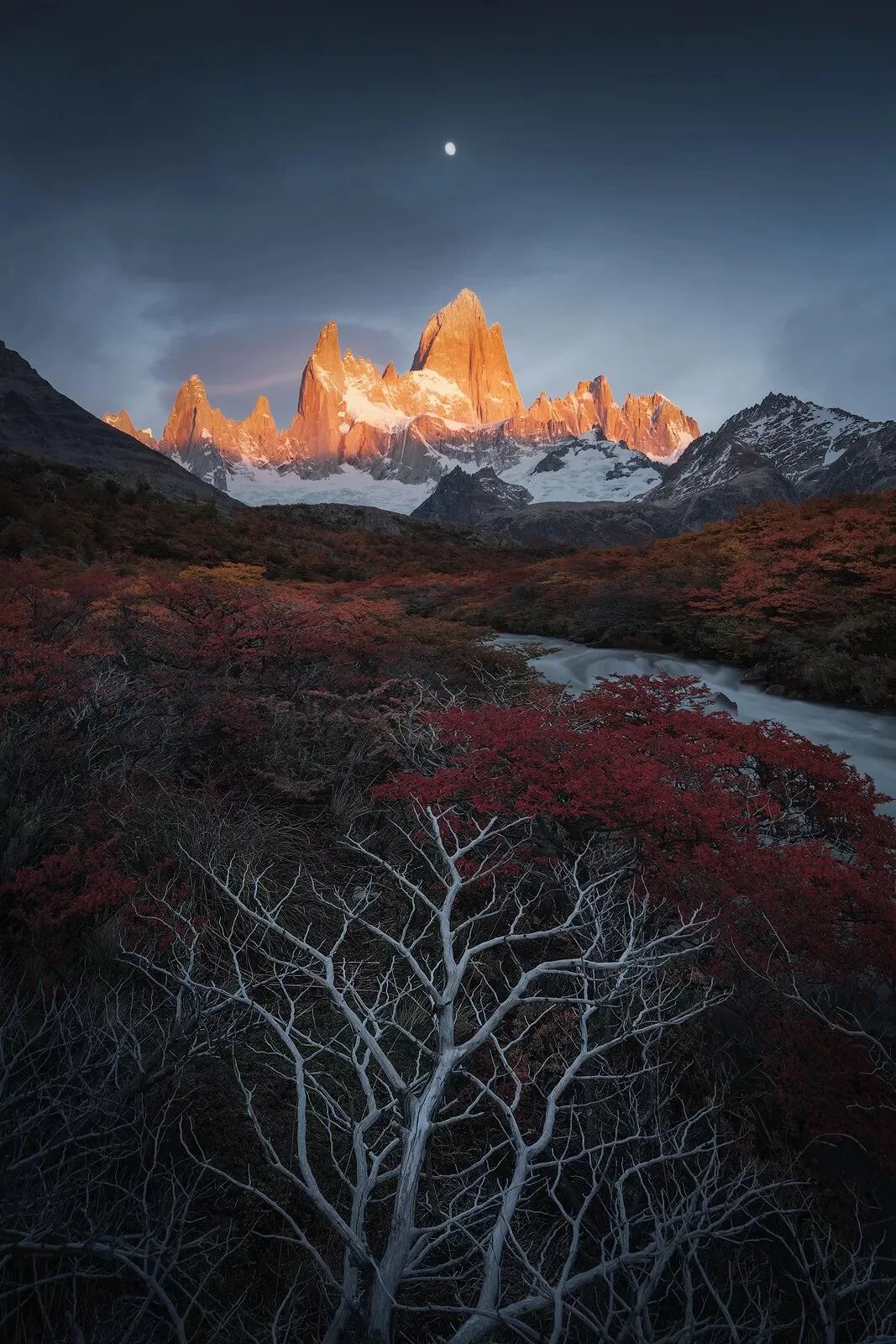
For example, in the Patagonian autumn scene above, we need to analyze the main elements before starting post-processing.
The sunlit golden Fitz Roy massif in the middle is undoubtedly the highlight of this photo and needs to be emphasized.
There are many ways to emphasize it. For instance, the peak on the left of the golden mountain actually looks taller than our point of interest due to perspective, so it needs to be cropped out.
To make the golden mountain stand out, its color and brightness must 'rise above' the rest of the photo.
So the sky needs to be darkened in post, preferably into cool tones, so that the golden peak firmly holds the viewer's eye through its distinct hue, saturation and brightness.
Sometimes, what looks like a failed photo at first glance can reveal its bright spots through post-processing observation and thought.
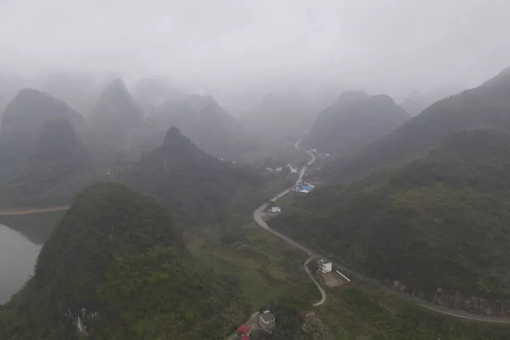
The raw file above, an aerial shot of Guilin in the rain, is certainly not eye-catching.
But looking closely, we can still find interesting things: the misty peaks have a wonderful sense of layering, and the roads and mountain edges form striking geometric lines.
However, the complex information in the raw file — dull colors, messy houses, dense trees — draws the viewer's attention to these uninteresting places, making the photo seem like a failure.
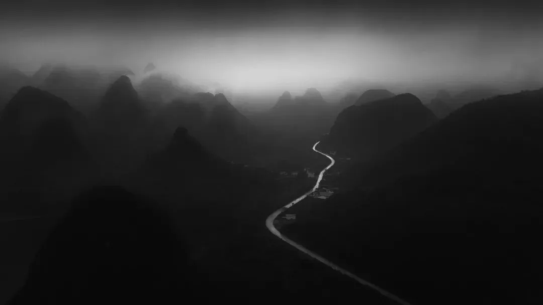
If in post we boldly remove these irrelevant colors, details and information, and extract the rich geometric structure of the scene, we can 'turn waste into treasure'.
3
Consider the General Direction of Post-Processing
In photo post-processing, technique is the foundation, but ideas are the key.
Many photos do not need complex post-processing — simply unifying the colors, strengthening the tonality, and highlighting the subject is enough.
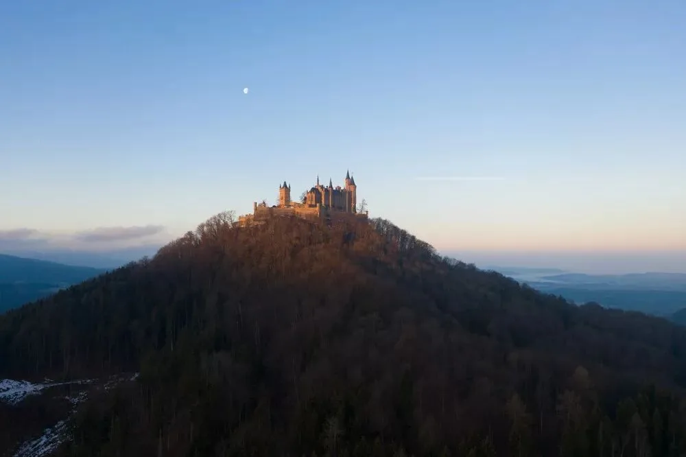
For example, the raw file of the German castle above was processed almost entirely in Camera Raw. Once the idea was confirmed — strengthen the sky gradient and highlight the castle's glow — it was done quickly.
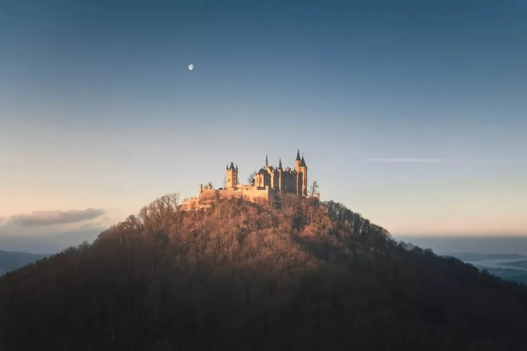
Many photos change dramatically between capture and final edit, yet the techniques used are actually very simple.
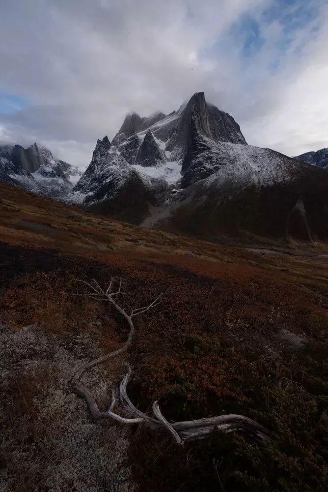
For the raw file above, post-processing mainly used the dodge-and-burn tool — a simple tool I introduced in my article 'Learn Dodge and Burn to Improve Your Photo's Expressiveness'.
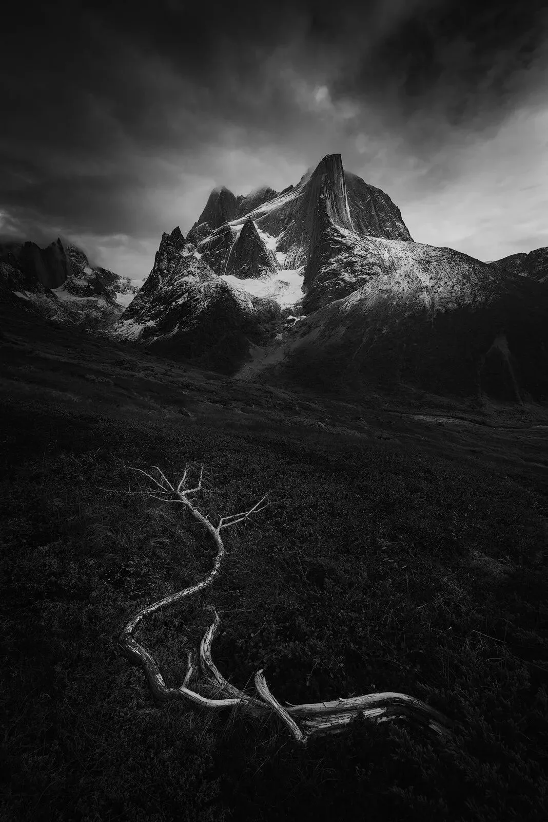
What matters more is analyzing the photo: knowing where to brighten and where to darken. That is the key to making a photo look completely different after post-processing.
A photo is not better with more detail.
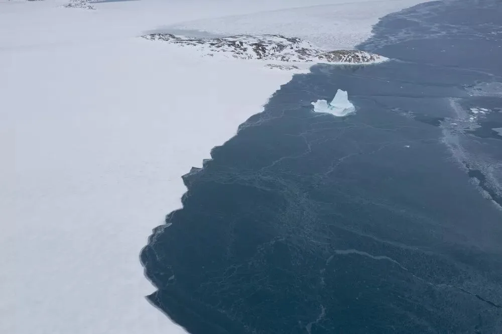
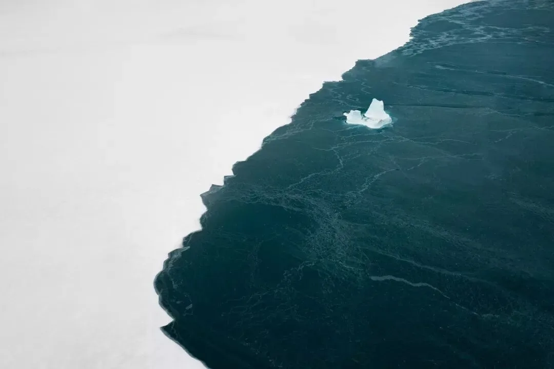
For the raw file of sea ice above, I decided to remove most of the detail in the white snow and ice, emphasizing the lines of the coastline and the color contrast.
But detail is not a case of less-is-always-better either.
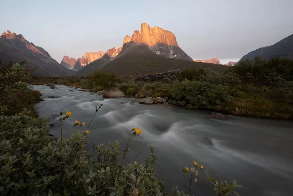
For the mountain photo above, I decided to use brushes in post to further strengthen the texture of the water surface and the foreground flowers and grass, and to create a gradual transition in the sky that was not obvious before.
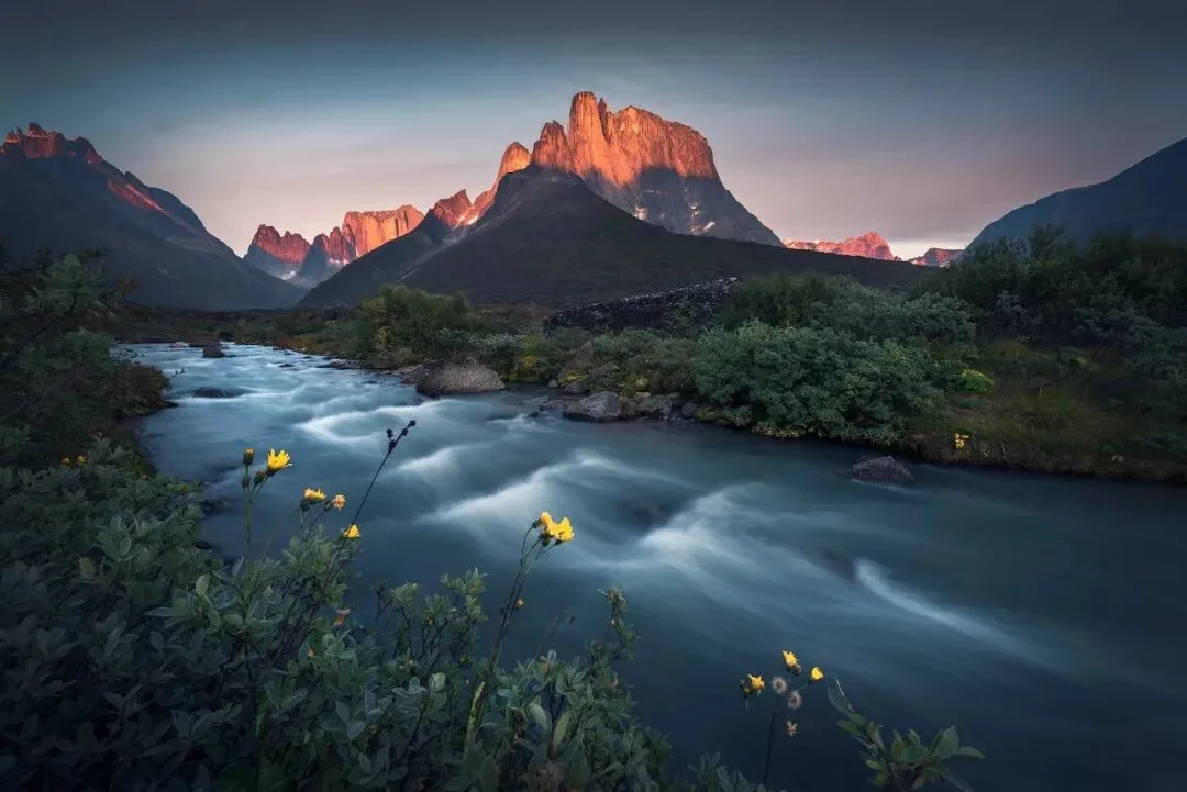
Should detail be increased or reduced? Which areas need work? These are all questions of thinking, and they require us to look more, think more and analyze more.
The most crucial step in post-processing is analyzing the picture and confirming the idea. Once the idea is set, the final form of the photo is set.
Whether you use curves, color balance or brushes for the actual work is really not as important as people think.
Technique determines the floor; ideas determine the ceiling. The most important step in post-processing is confirming the idea!