Photography Tutorial · 2022-04-17
Three Big Post-Processing Mistakes: Are You Guilty of Them?
Thomas Chu Photo
In today's tutorial, Thomas shares three common post-processing mistakes made by beginners — and even by veterans.
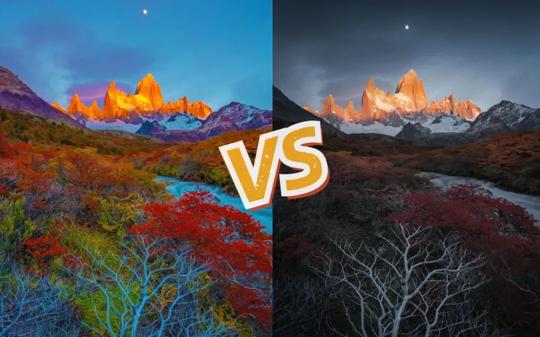
Is more detail always better in a photo? Should you just drag Highlights to -100 and Shadows to +100?
For autumn or spring color photos, the more colors and the more vivid, the better?
Are sharper peaks and slimmer, taller people always better?
After today's case-by-case comparison, you may gain a more intuitive understanding of these common pitfalls.
Video
▶ Watch the video tutorial on Bilibili
This is the fully illustrated companion to the video above: Thomas turned this 9-minute talk into text and paired it with keyframe screenshots — live Lightroom panels, the detail trade-offs in the Huangshan and ice-cave examples, color comparisons on rainy and autumn scenes, and the before/after of dune reshaping. Skim it here for the framework, then dive into the video for the details.
Start with the overview. The whole video revolves around three mistakes: more detail is better, more vivid colors are better, and sharper peaks or thinner people are better. The "Mistake No.1" card below, captured at 0:16 in the video, is the first of three title cards — each mistake is unpacked below.

01 More Detail Is Not Always Better
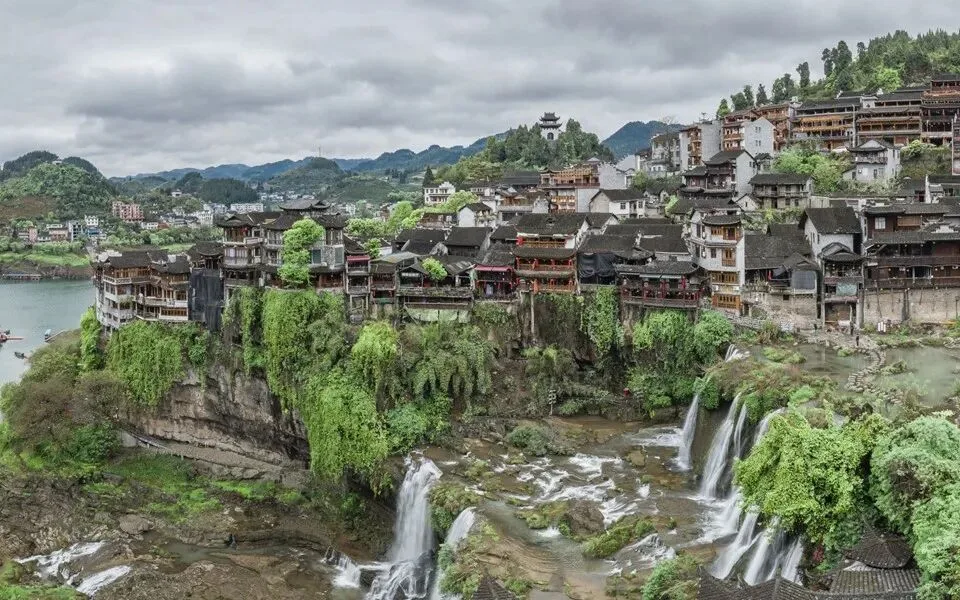
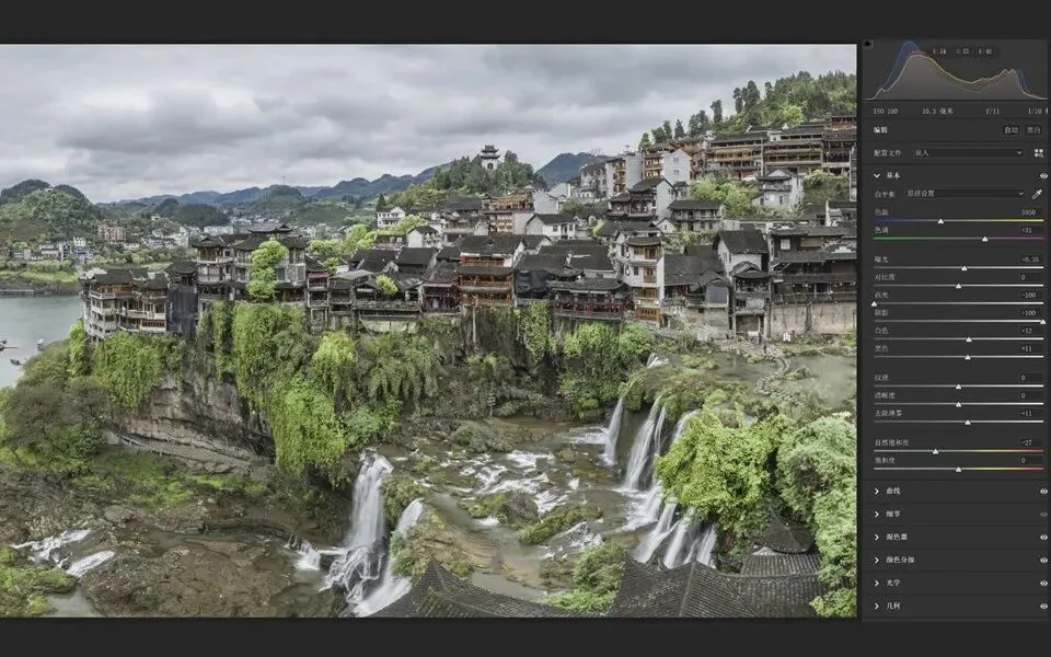
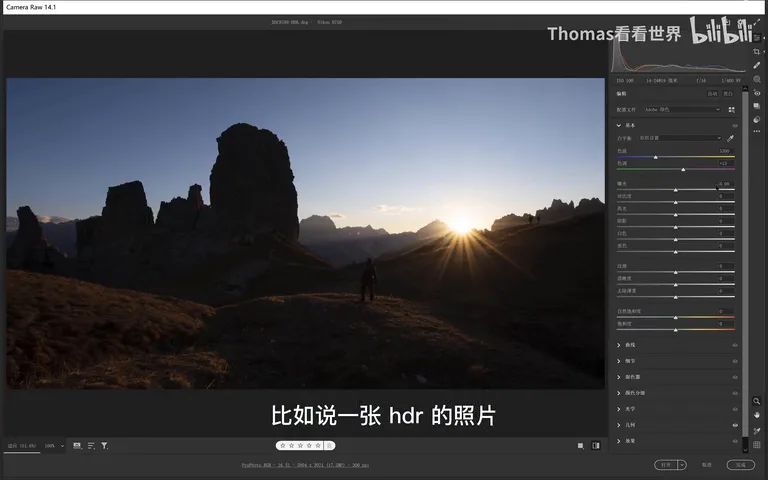
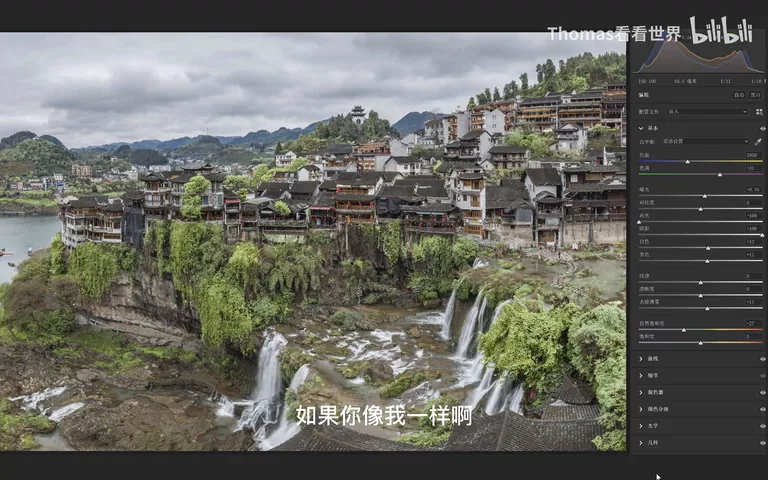
The first mistake is believing that more detail is always better. On an HDR daylight shot, the typical move is Highlights -100, Shadows +100, then maxing out Clarity, Sharpening and Dehaze, as if every last highlight and shadow detail had to be squeezed out (at 0:26 in the video).
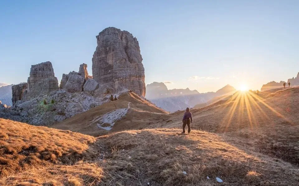
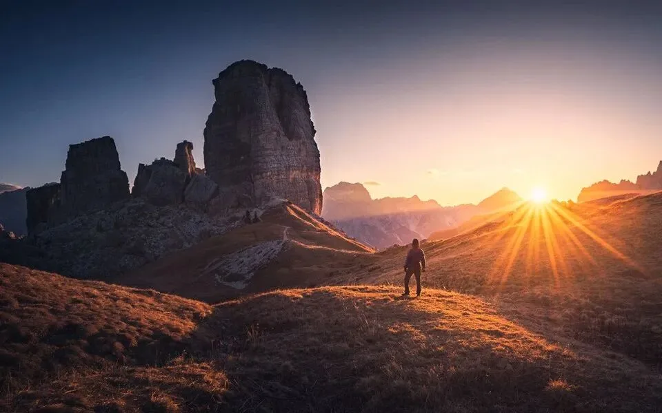
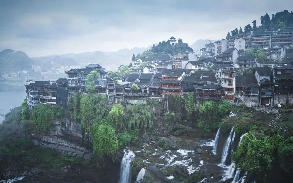
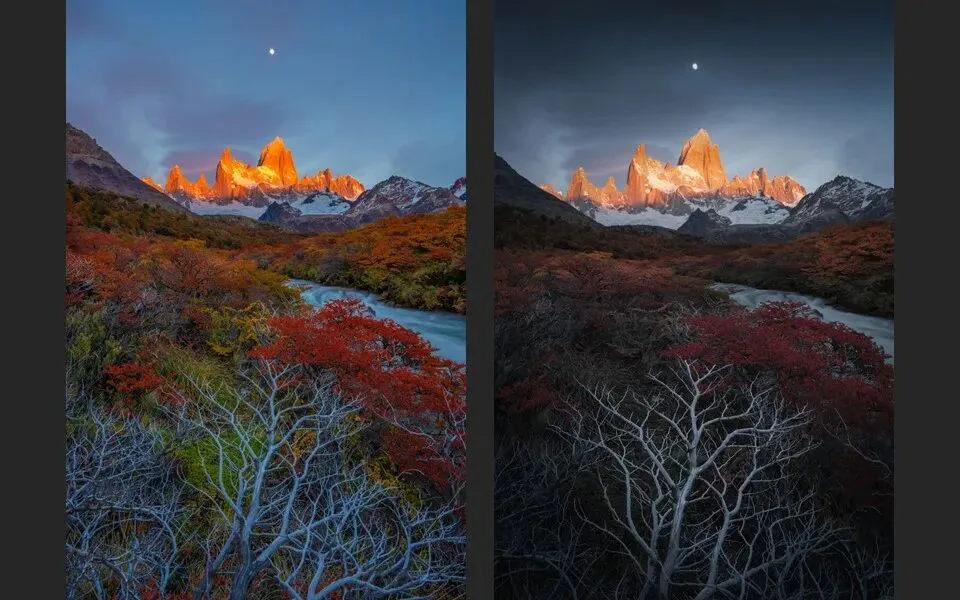
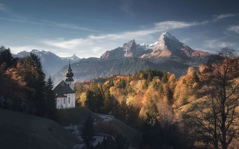
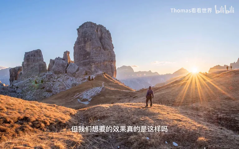
Yet the result has no light-and-shadow hierarchy at all and feels nothing like what our eyes actually see. In a truly good photo, what should be bright stays bright and what should be dark is allowed to go dark — highlight and shadow detail that carries no mood never needed showing (at 0:43 in the video). The frame below is what this photo should look like.
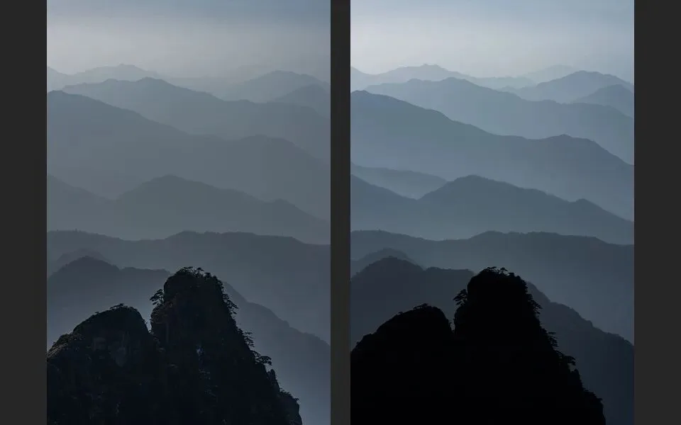
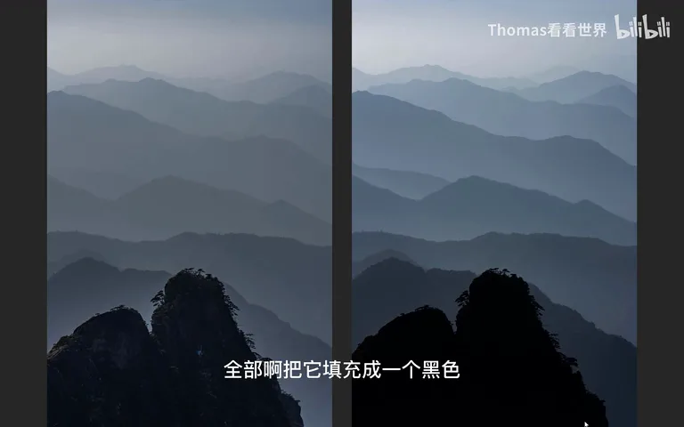
The Huangshan example makes the point clearly. On the left, shadows have been lifted: the three foreground peaks show detail and cliff texture, yet that texture is not the mood we are after — what we want is the layering of the distant ranges (at 1:13 in the video). On the right I selected the three foreground peaks and filled them solid black; with the clutter hidden, the image becomes cleaner and stronger.
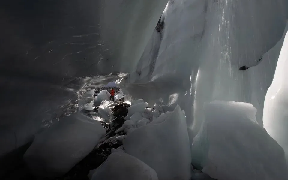
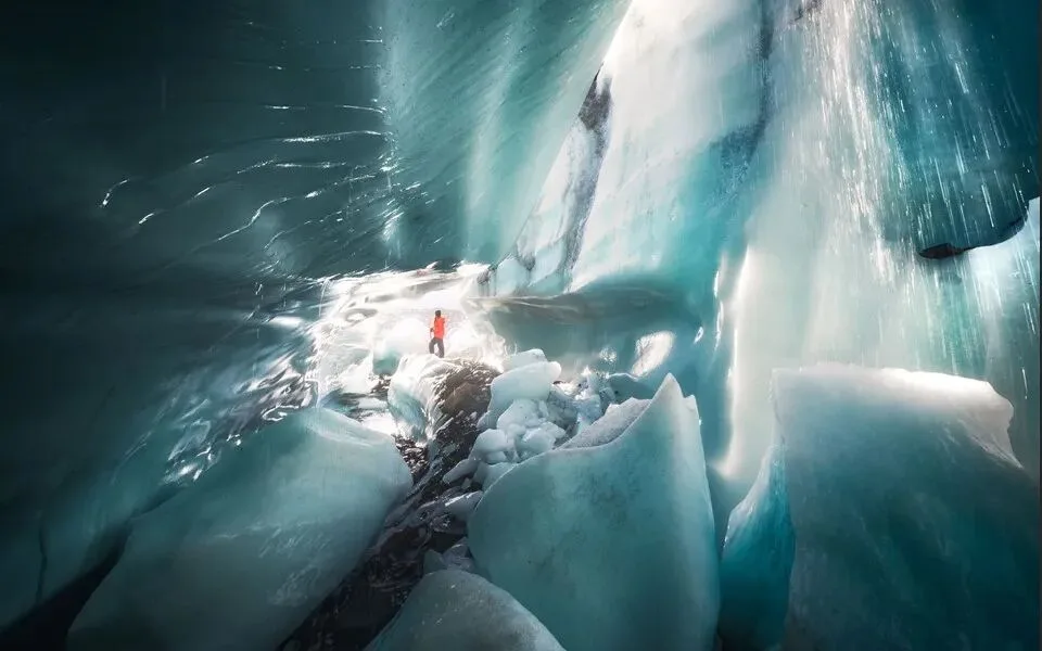
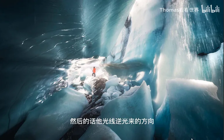
The ice-cave shot follows the same logic. The ice behind the figure was cluttered and genuinely ugly, so I pushed the backlit background into a mild overexposure that hides the detail and creates the feeling of light pouring in (at 2:00 in the video).
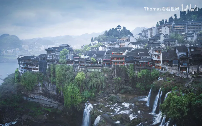
Overcast rainy shots suffer most. After Highlights -100, Shadows +100 and heavy sharpening and dehaze, there is indeed "wow, so much detail" — and no beauty at all (at 2:13 in the video). Once you truly grasp that detail is not the goal, the answer is obvious: if the subject is the village on the near cliff, select the village across the valley and fog it out, then shape light and shadow on the near one with a clear hierarchy (at 2:44 in the video).
02 Color Is About Pairing, Not Quantity
The second mistake: the more colors and the more vivid, the better. Facing spring or autumn foliage, or a rainy-day shot whose original colors look dull, the reflex is Vibrance +100, Saturation maxed, and the saturation sliders in Calibration and HSL all pushed to the limit as well (at 3:05 in the video).

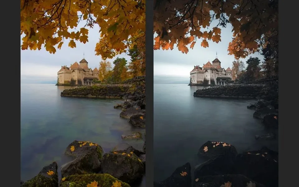
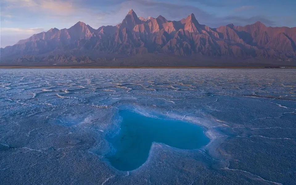
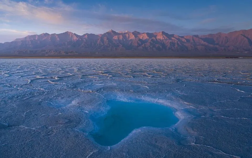
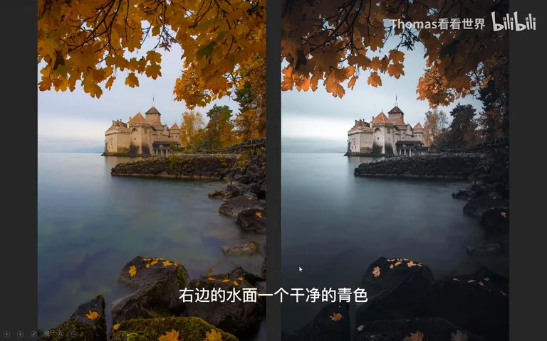
The result is water crowded with cyan, purple, green and blue at screaming saturation — colorful, not beautiful. In a genuinely good photo, colors are always paired: brightness, saturation and hue all need rises and falls. Compare the pair below: the water on the left is a jumble of colors, while on the right it is one clean shade of cyan within an overall warm-cool scheme — a completely different effect (at 3:49 in the video).
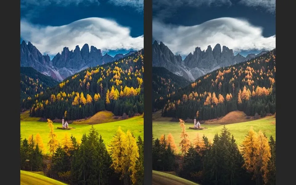
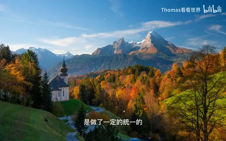
The same goes for autumn scenes shot in broad daylight: a global saturation boost is simply uncomfortable. Dial the saturation and brightness of the blue sky down a touch, then deliberately separate the grass in the lower-left corner from the grass in the middle — same green, different brightness and saturation — and the image instantly settles (at 4:45 in the video). A side note: truly "high-saturation" looks are deliberate signatures of distinctive creators — candy colors, cartoon colors, or the trademark palette of photographers like Mika Ninagawa (at 3:56 in the video) — which is another thing entirely from blindly boosting saturation.
My final autumn frame is actually not very saturated: with the greens and blues desaturated and darkened, only the gold stands out — its golden saturation is far lower than in the previous version, yet the gold reads far more distinctly. To keep the palette unified I did not, as many would imagine, split the gold into yellows and reds, but unified it instead (at 5:13 in the video).
03 No Sharper Peaks, No Thinner People
The third mistake: the sharper the peaks and the thinner the people, the better. Social platforms are full of photos whose peaks show obvious pixel-stretching and grain — unreal at a glance. If China truly had such razor-sharp snow mountains, they would be famous ones like Meili or Namcha Barwa; an unknown summit this sharp is simply exaggerated. Peaks "stretched tall" behind ordinary tourist spots not only look fake, they also lose their geographic meaning (at 5:57 in the video).

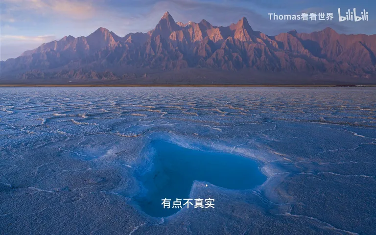
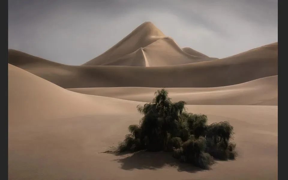
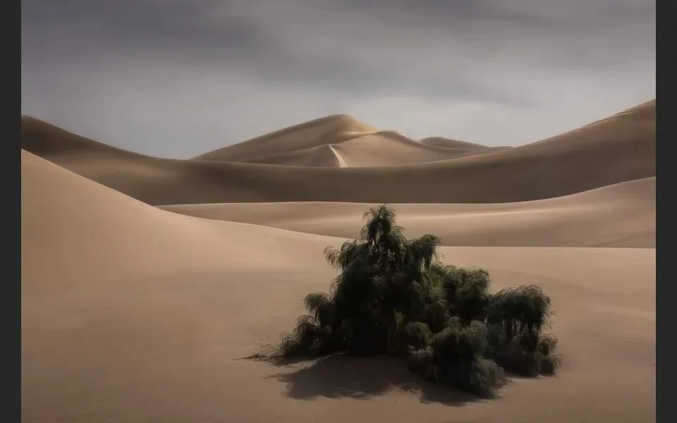
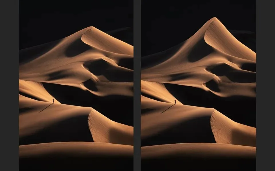
Desert photos are no different: some people stretch dunes into pyramids or sharper, which flatly violates physics. That said, stretching, warping and Liquify are not forbidden, and neither is slimming a face — but the deformation has to stay moderate (at 6:47 in the video).
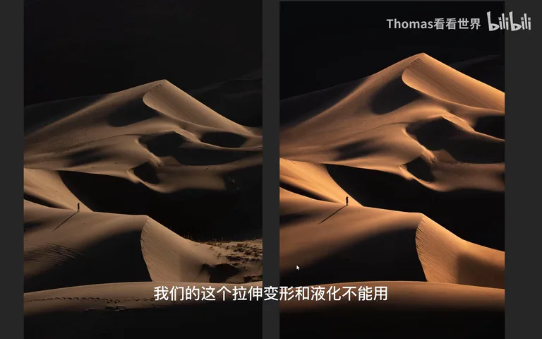
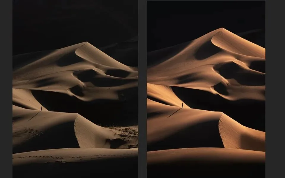
In this desert frame I reshaped the rear dunes in moderation: the original had gentle slopes on the left and steep ones on the right, leaving the composition lopsided. After the reshape, front and rear dunes mirror each other in slope with parallel lines — balanced, orderly, and rhythmic — and dunes at such angles are common in nature, so the result satisfies the eye and stays scientifically plausible (at 7:21 in the video). Push the dune much sharper, though, and the balance and parallel structure collapse at once, taking the harmony and rhythm with them. Slimming faces and bodies, whitening and blemish removal obey the same rule: keep it natural and believable — no snake-spirit jawlines (at 8:31 in the video).
1. Detail serves mood: let what should be bright stay bright and what should be dark go dark, and hide highlight/shadow detail that carries no emotion; 2. Color is about pairing: suppress distracting hues and let the dominant one lead — a unified warm-cool scheme outlasts any global saturation boost; 3. Warping and Liquify can serve balance and order, but only in moderation, consistent with nature and common sense; 4. The goal of post-processing is not stacking sliders but bringing the image back to the mood and hierarchy you want to express.
PPT