Photography Tutorial · 2020-05-17
Five Underlying Concepts of Photo Post-Processing That Matter More Than PS Skills
Thomas Chu Photo
Photo post-processing is not just about the 'techniques' of editing software and tools — there are also universal concepts and ways of thinking, the 'principles', that apply to most photos.
Today's tutorial is a hardcore one: I'll share the five underlying concepts of post-processing that I've summed up. With these mindsets, your editing will achieve twice the result with half the effort.
Video Tutorial
▶ Watch the video tutorial on Bilibili
This is the fully illustrated companion to the video above. In this 15-minute talk Thomas skips individual sliders entirely and lays out the five underlying concepts behind his post-processing: ideas beat technique, work with the raw material, every parameter is relative, whole before parts, and details make or break the image. Keyframe screenshots below include the five concept cards, before/after case studies, and works by Max Rive and Duan Yueheng — read it for the framework, then hear the full argument in the video.
Start with the overview. The video pairs each concept with a title card; the one below, "Concept 1" captured at 0:59, is also the thesis of the whole talk — post-processing ideas and taste matter more than tools and techniques.

01 Ideas and Taste Come Before Technique
Concept one: ideas matter more than technique. Look at the work of great photographers — harmonious palettes, clear subjects, creativity and personality — none of it comes from secret techniques. Thomas has worked with many photographers at home and abroad and watched them edit up close: no hidden tricks, just the same curves, layers and masks everyone uses (at 1:26 in the video). So why do they get better results? The gap is in ideas and taste.
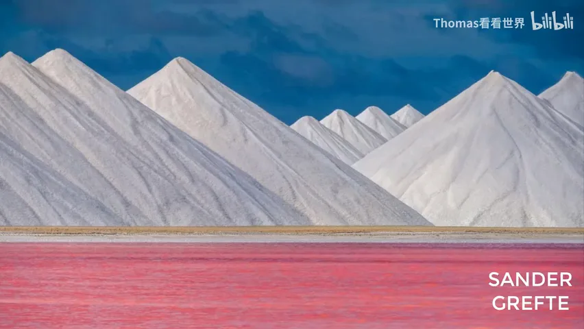
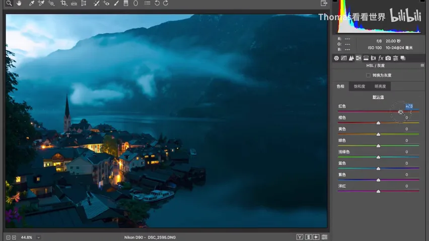
So when learning, don't just collect flashy techniques — Curves, Color Balance, Split Toning, Channel Mixer. Spend the time studying great photographs, and don't just look: analyze how they were conceived and composed, why those colors and that overall tone — even download the image, check its histogram, sample its colors with the eyedropper (at 2:04 in the video). Likewise, before editing, resist nudging sliders at random; first ask what the photo should express, what mood and style suit it, and how its existing colors should be paired. With a wrong idea, a failed frame just gets polished into a more exquisite failed frame.
02 Work with the Raw Material, Not Against It
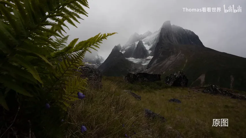
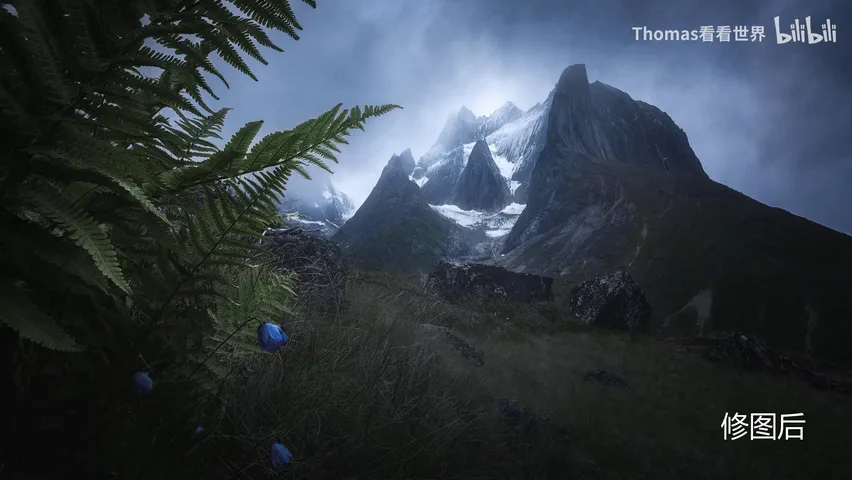
Concept two: post-processing is mostly about going with the flow, not defying fate — forcing a weak frame into a masterpiece rarely works. When using someone's presets, filters or workflows, study their capture conditions first. Never separate capture from processing: overcast light, front light or backlight dramatically changes what the edit should be. Dragging an overcast frame into a romantic, magical sunny look is technically hard, and without the aesthetic chops it breaks apart and feels instantly wrong (at 4:13 in the video).
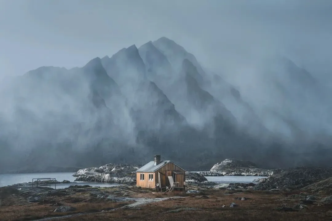
Take this overcast frame: instead of fighting the weather, lean into the mood that grey skies provide — mist-shrouded mountains carry a natural sense of mystery, and the edit simply renders that atmosphere with color and tone (at 4:27 in the video).
A real "failed frame to portfolio shot" case: the misty mountains carry mystery, and the rain-wet road below is naturally bright, so a gentle lift turns it into a strong leading line and spatial rhythm. Thomas simply removed all color — color was never this frame's strength, so why force a rainbow — and amplified its strengths instead: the mystery and the line (at 5:47 in the video). The techniques involved are trivial: convert to black and white, dodge and burn, and the clone stamp.
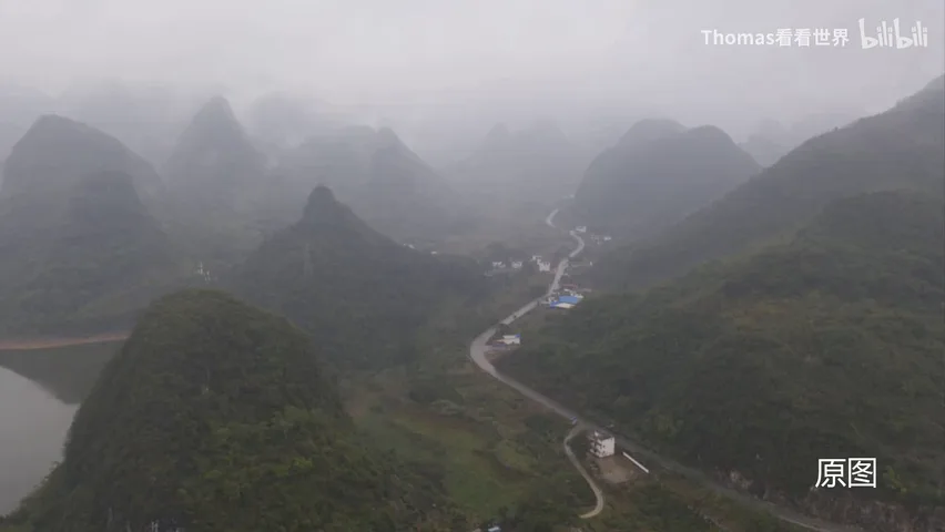
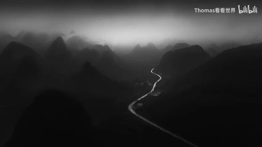
What limits us in turning a failed frame into a great one is rarely technique — it is observation and imagination: spotting what makes the frame special and what every corner of it could become (at 6:09 in the video). Open your mind and follow the material, instead of forcing a rainbow out of a grey day.
03 Every Parameter Is Relative
Concept three: techniques, sliders and final effects are all relative. Once you grasp this, many problems dissolve. Beginners love to slam contrast, max saturation, and drag Highlights -100 / Shadows +100 the moment they open a file — which is exactly a failure to understand relativity (at 6:55 in the video).

To emphasize a subject you don't have to brighten it — work in reverse: add saturation and brightness where you want attention, subtract a little everywhere else, and the layers separate on their own. Sometimes the subject needs no touch at all; darken its surroundings and it pops by itself (at 7:15 in the video).
This alpenglow frame is the classic case: the snow peaks are bright, saturated and warm, so the sky is rendered cooler, less saturated and darker — the two set each other off. There is no need to push the peaks into a fake red like so many alpenglow photos do; keep the mountains untouched and simply cool the sky while dropping its saturation and brightness, and the peaks glow on their own (at 7:45 in the video).
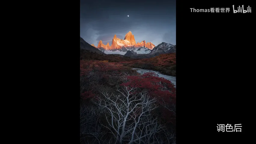
The same principle explains why so many photographers favor dark tones: a dark base sets the register, so whatever is lifted slightly — a leading line, the subject, the light source, a figure — stands out dramatically (at 8:41 in the video). Color pairing works the same way: identify the dominant hue, then push the accompanying colors in the opposite direction, and a layered rhythm emerges on its own (at 14:52 in the video).
04 Whole First, Details Later
Concept four: always process the whole before the parts. Many people open a portrait and immediately zoom into nose and eyes, or a landscape and start cranking texture on every bush — a bad habit. First, photos are relative: skin and clothing colors have no absolute value independent of the background; shift the ambient color temperature and skin must be re-balanced. Vegetation detail must follow the mood and light of the whole frame. Get the whole wrong, and every extra detail multiplies the error (at 9:29 in the video).
Second, it comes down to how photos are viewed today: on computers and phones. Thomas does not always edit at 800% magnification; he keeps zooming out to check how the frame reads as a thumbnail on a phone (at 10:31 in the video). If the overall mood and effect are missing, nobody will notice even flawless detail — a 150-megapixel file still gets swiped past at a few million pixels on a phone screen (at 11:01 in the video).
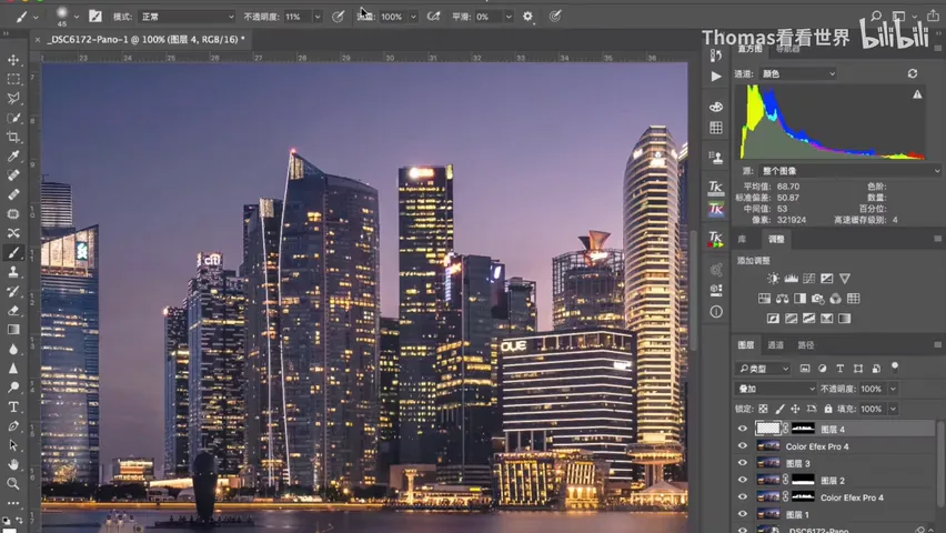
The whole always outweighs the parts: only when the strategy of the whole is right do tactical local adjustments become useful — tactical wins cannot hide a strategic failure (at 11:22 in the video). Hence the standard order of processing: whole first, details later (at 11:29 in the video).
05 Details Make or Break the Image
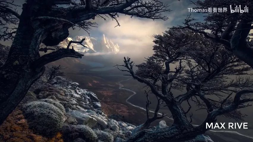
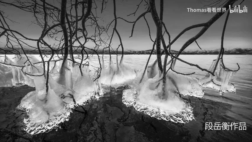
Concept five: details make or break the image. Thomas has co-taught with the Dutch photographer Max Rive, whose work is famously grand and dramatic (at 11:43 in the video); he also traveled to Beijing for a costly workshop with Duan Yueheng and Li Tao specifically to find out whether Duan's superb black-and-white prints hid some secret technique. They don't — he uses the same motion blur and dodge and burn as everyone else (at 12:01 in the video).

The difference is the level of care: Duan processes almost every object individually, tuning each one until it both serves the whole and shines on its own (at 12:05 in the video). He doesn't even use layers — his techniques are primitive, almost outdated — but his obsession with refinement makes his prints extraordinarily rich in detail.
Max Rive is the same: one to two hours per photo is fast for him, and some of his tutorials run three to four hours of post-processing, because every rock and every river gets individual attention (at 12:55 in the video). He shot a Nikon D800 and now a D850 — but the layering and depth in his images come from meticulous processing, not the camera.
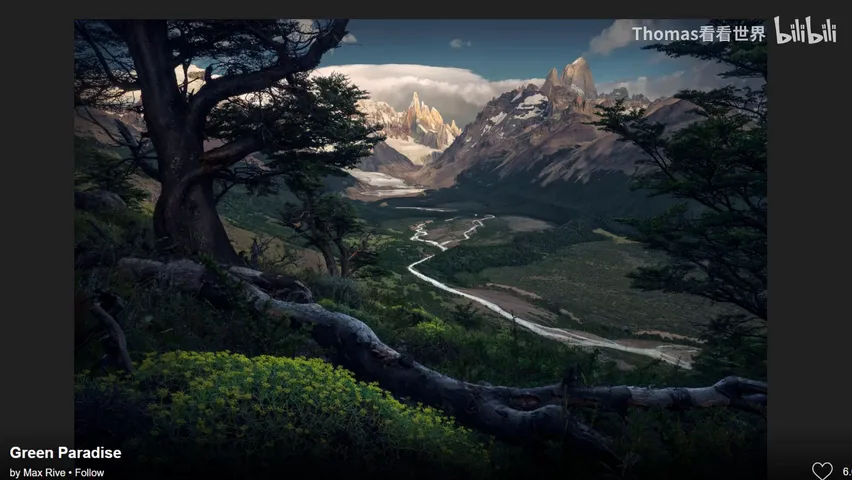
Detail and wholeness are not in conflict: the first 80 points come from the overall vision, and refining every detail until it sits in perfect, harmonious proportion lifts a photo from 80 to 90 or even 100 points (at 13:41 in the video). That pursuit of excellence is the final step that separates a good photo from a great one.
1. Ideas and taste beat tools and techniques: study great work, analyze it, and know what you want to express before touching a slider; 2. Work with the material — build on the light and weather you captured instead of defying them; 3. Every parameter is relative: to strengthen a subject, start by weakening its surroundings; 4. Whole before parts, then refine the details to push a photo from 80 points to 100.
A summary of the five underlying concepts from the video:
1. In post-processing, ideas matter more than techniques
2. Post-processing should go with the flow of the photo, not against its nature
3. Parameters and effects in post are all 'relative'
4. Post-process globally first, then locally
5. Refining details is the key to a finished photo