Photography Tutorial · 2017-06-01
Five Common Myths in Photo Post-Processing
Photography is a visual art. There is no universal formula or set of parameters for post-processing. Many habitual operations actually lead us into misconceptions.
Teacher Terry F has summed up the five most common post-processing mistakes photographers make. Are you guilty of any?
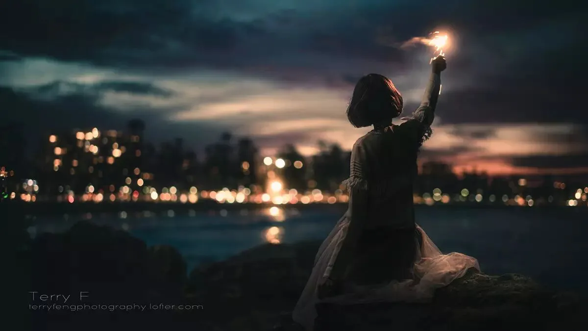
After learning post-processing for a while, many people unconsciously develop bad habits and notions. Here we list and analyze the five most common mistakes for your reference. Some cases are quoted in this article for teaching purposes only, randomly picked from Baidu Images — they target the phenomena, not any individual.
1
Myth 1: The More Detail, the Better
The ability to render detail is indeed one measure of post-processing skill, and a must-have for commercial or stock photographers, because such images often need to be printed at large sizes, where the amount of detail greatly affects the final result.
However, after learning post-processing for a while, some friends care too much about detail, which easily makes the picture lose its sense of layering and even look 'dirty'.
This is very common in travel (landscape) photography. For example:
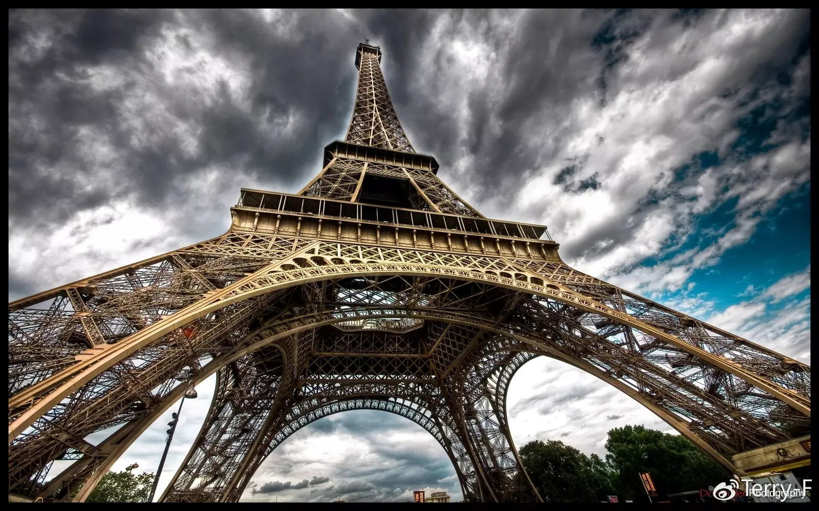
Author: Don Julien
And also:

Source: wreck-photography
And:
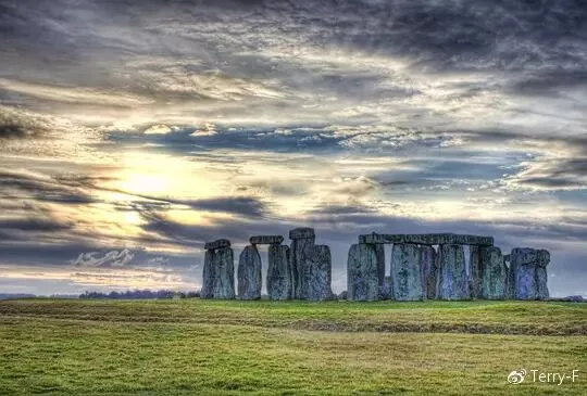
Author: Degsy
These works all, without exception, excessively boost detail across the whole frame, making originally redundant detail stand out and the picture look unclean.
The same misconception exists in portrait photography — most notably the HDR portrait style common in wedding photography in recent years.
For example:

Luis Fernando Medrano Navarro
And also:
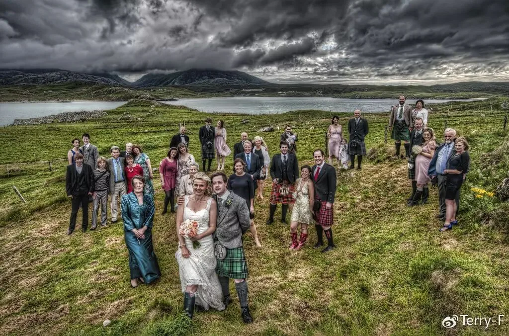
Author: Fraser Ross
Both photographers above have excellent works, but these two photos fall short: the former has a distorted light-and-shadow structure, and the latter has such high clarity that it looks dirty.
Besides, the editing process in some tutorials is also questionable. For example:
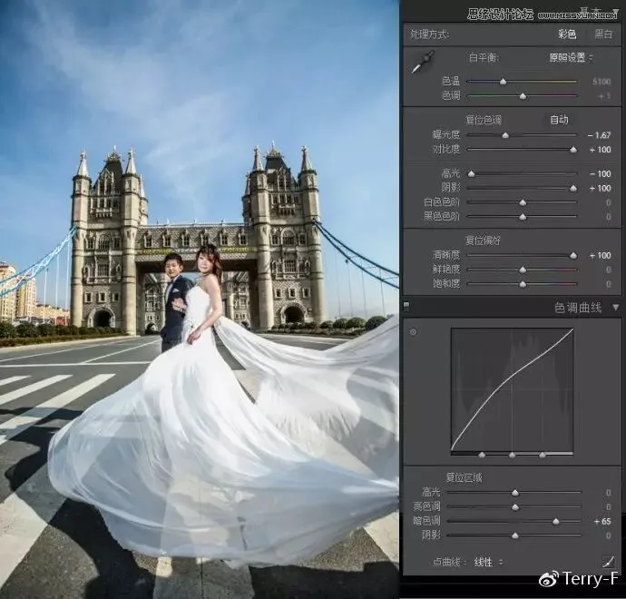
Author: Retoucher Xiao Yue
In this step, to create a portrait HDR effect, the author pushed both Clarity and Contrast to +100.
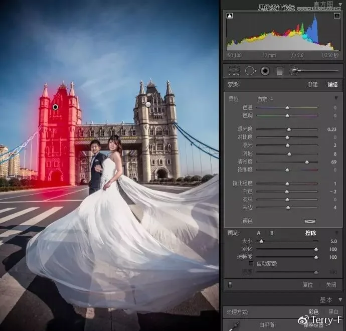
Author: Retoucher Xiao Yue
In the next step, clarity was further increased dramatically on the buildings.
The Clarity slider strengthens the edges of objects in the frame, but it can also over-emphasize detail, making things look 'dirty' or 'harsh'. So even for an HDR effect, clarity and sharpening must be kept at a visually comfortable level — especially when the subject conveys something 'soft' or 'quiet', use HDR with extra caution.
A successful portrait HDR also needs a suitable subject, strong post skills and good aesthetics.
The image below, for instance, is an excellent HDR portrait.
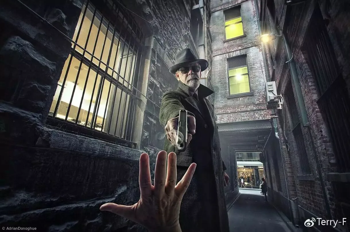
Author: Adrian Donoghue
A successful landscape photo preserves detail rather than forcibly carving it out.
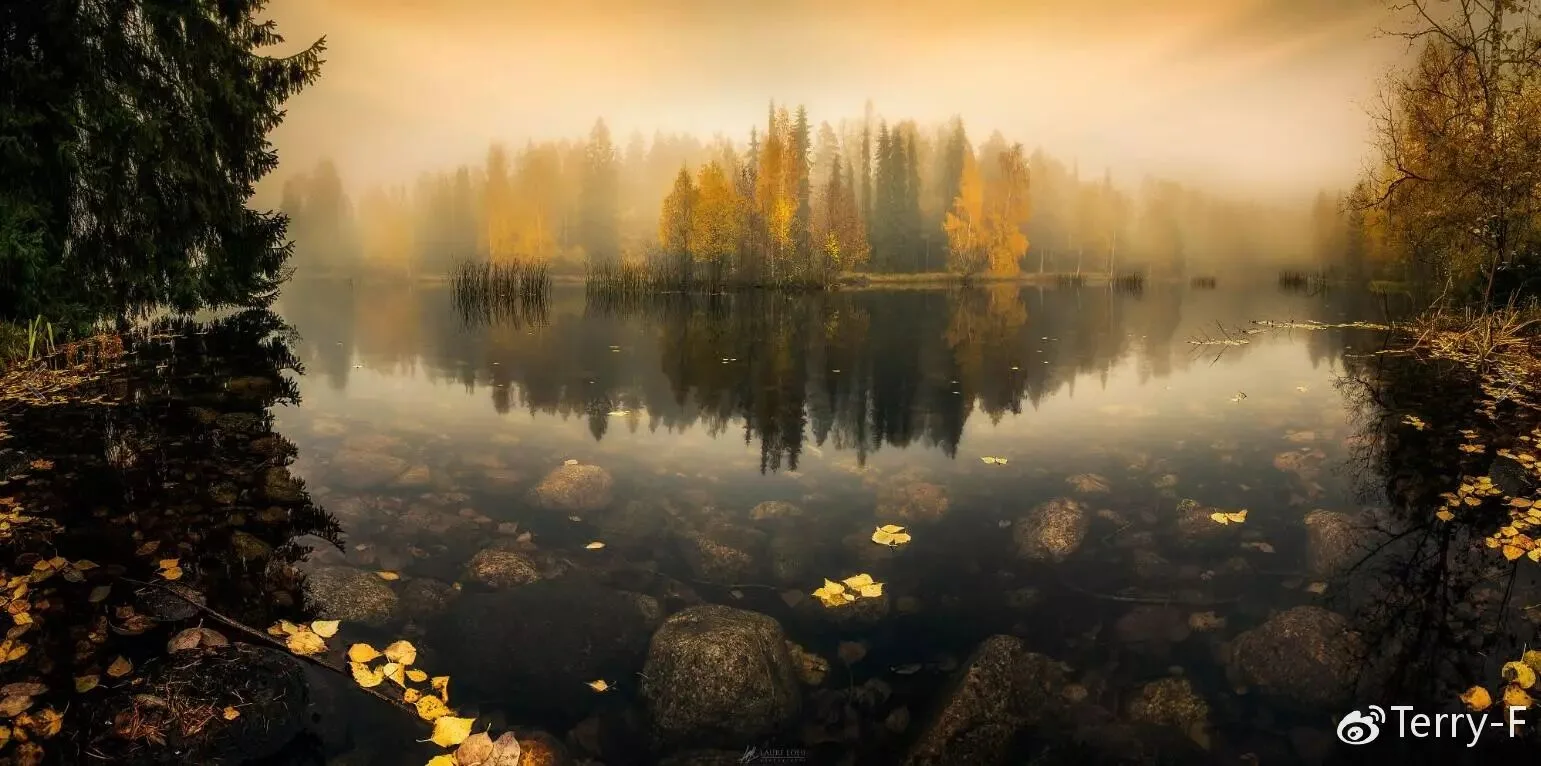
Author: Lauri Lohi
2
Myth 2: Highlights -100, Shadows +100
Nobody knows who spread this bad habit, but it has led many people to blindly and violently drag the Highlights and Shadows sliders — some even treat it as a mandatory step in post.
First we must understand: lowering Highlights recovers some bright detail in the Raw file, and raising Shadows recovers dark detail. But not every image needs aggressive highlight/shadow adjustments. In the tutorial below, for example, after the author set Highlights to -100 and raised overall and shadow brightness, the original light-and-shadow layering of the scene was destroyed. Although the author greatly improved clarity and sharpness by other means, the texture of the mountain actually degraded.
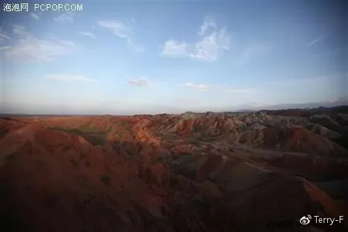
Author: Li Wenchao
In the raw file, the mountain's bright and dark areas are distinct, the light direction is clear, and the texture is strong.
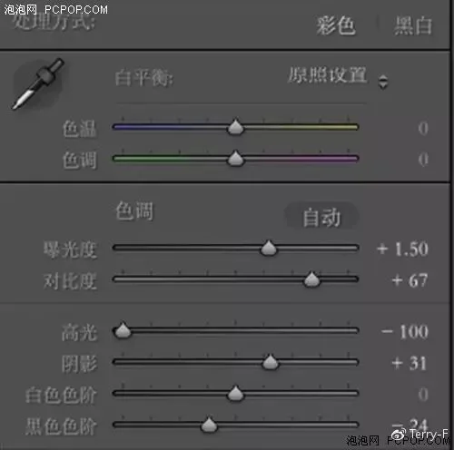
The author lowered Highlights by 100 and raised Shadows by 31 — not a full +100 on shadows, but enough to greatly reduce the sense of light-and-shadow layering in the original.
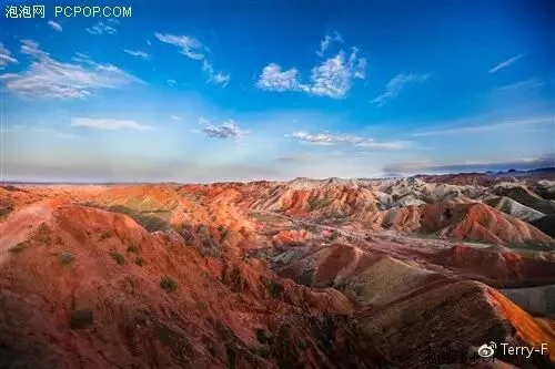
In the finished image, the gap between the mountain's bright and dark areas is small, the light direction is unclear, and the texture is weak. So violently compressing highlights and shadows is inappropriate for images whose tonal contrast is already low.
The situations that genuinely call for big -Highlights/+Shadows moves are generally only these two:
1. Works that need their light structure rebuilt in post (mostly composites)

Works shot in high dynamic range scenes or backlit

Author: TJ Drysdale
3
Myth 3: Abusing the Film Curve
So first of all, what is a film curve? Here we quote a tutorial by 'Crayon Xiao C' on POCO to explain.
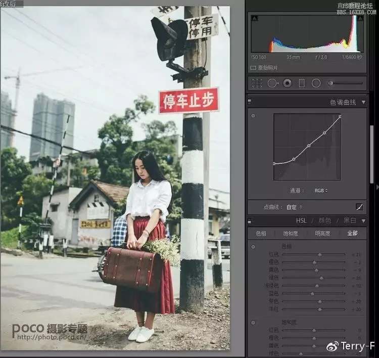
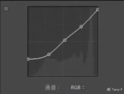
As shown, slightly darkening highlights and whites while greatly lifting shadows and blacks basically forms the typical 'film curve'.
The most immediate effect of this move is grayish highlights and shadows with reduced shadow detail. Used well, it can strengthen the mood of a picture. But once related tutorials appeared, many people applied this curve blindly without fully understanding it, and the internet was soon flooded with photos abusing the film curve.
Yet when this curve (and the many presets or filters containing it) is used on unsuitable photos, the effect often backfires. Two cases below:
Case 1:

Author: Terry-F
The image has low contrast to begin with; the subject is in the dark area with little detail.
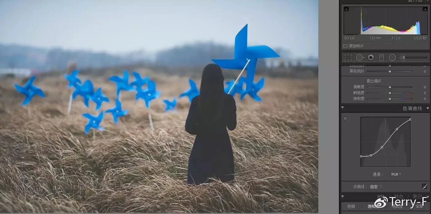
Applying a film curve here causes a serious loss of detail on the subject, making the picture gray, stuffy and visually 'dirty'.
Case 2:
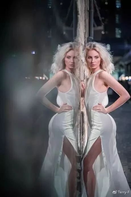
Author: Terry-F
In the raw file, the subject is in the bright area, the environment is dark, and the light contrast is strong.
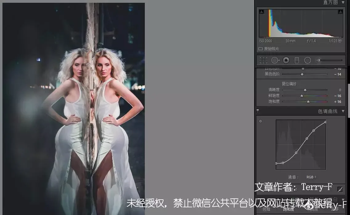
Applying a film curve here does not hurt the subject's detail much; instead it weakens the clutter in the environment and improves the texture of the picture.
All in all, the film curve has pros and cons — use and adjust it according to the characteristics of each image.
4
Myth 4: The Brighter the Photo, the Better
Perhaps influenced by client (model) demands, many people brighten their images as much as possible in post to make skin look fairer.
But the brighter the image, the fewer the shadows, and the weaker the sense of layering. If 'brightness' is overemphasized, the work loses texture and may even end up with overexposed highlight areas.

Author: Huai Huai
The subject is bright and clear, but unfortunately the overall image is too bright and the highlight detail was not protected, resulting in large overexposed areas — the big patches of dead white on the window and the sheets are clearly inappropriate, and the texture and layering of the scene suffer as a result.
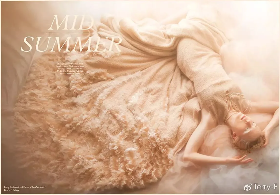
Author: Vivianne Mok
Maintaining texture while staying bright is very important and very hard — it takes extensive post-processing experience and carefully crafted lighting when shooting.
5
Myth 5: Going Black and White for 'Class'
This is probably the most serious and common misconception in post-processing.
First, let's be clear: black and white is a photo style, not a badge of 'class'.
Some may find it classy only because they have seen too few black-and-white photos and find them novel. If the world were full of black-and-white images, these people might well think color has more class.
Removing color may reduce the problems in a bad photo, but a bad photo is still a bad photo — black and white merely reduces its color problems.
Since it is a style, you need to find suitable images to match it.
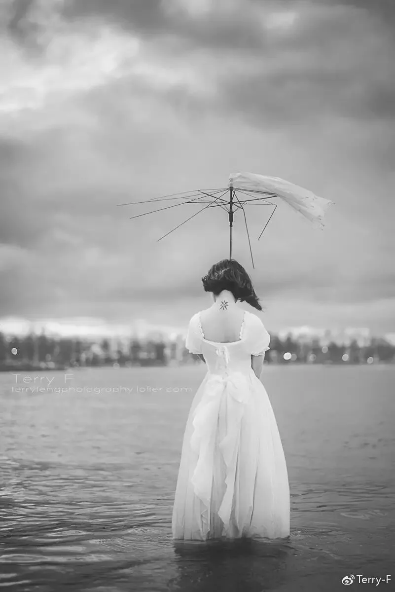
Take the set below: images with weak layering and low light contrast turn bland when converted to black and white, losing the atmosphere that color would have rendered.
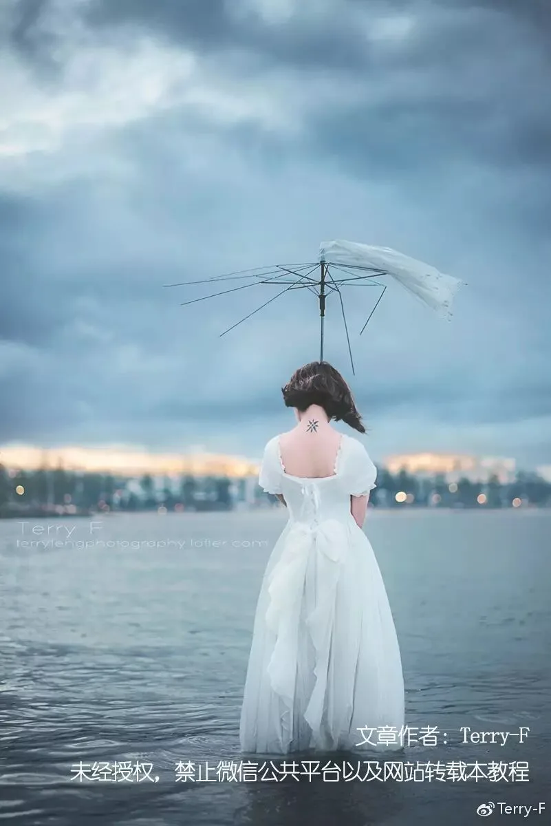
Author: Terry-F
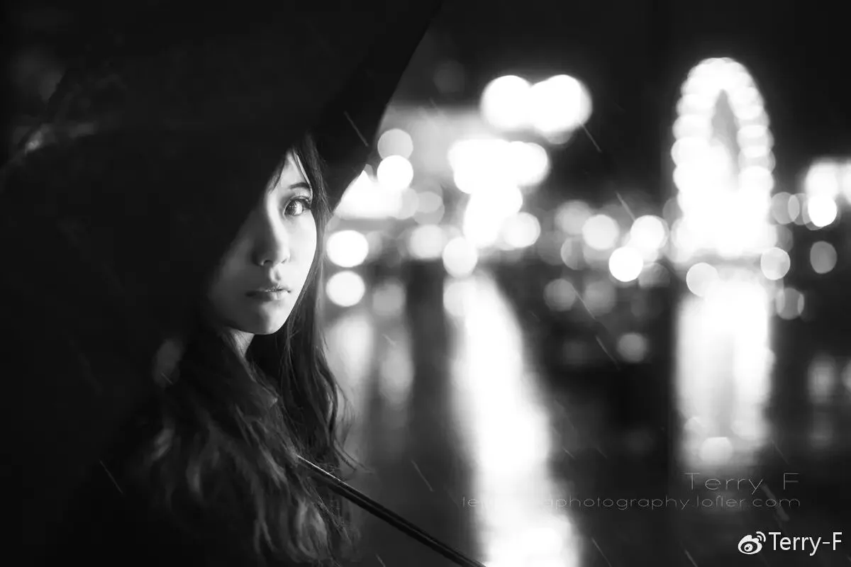
But when a photo has strong light texture and its tonal expression outweighs its color expression, converting to black and white reduces color interference — a sensible 'subtraction' that improves the image.
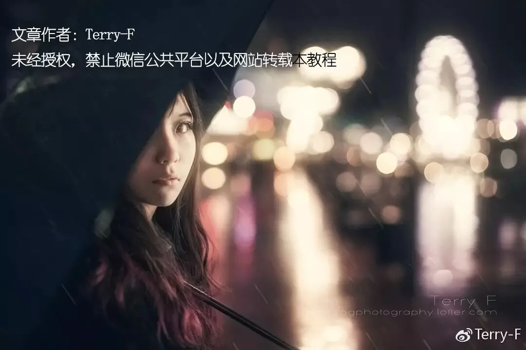
Author: Terry-F
Summary
The five common mistakes summarized above tend to appear in the work of those with some post-processing foundation, and even experienced editors occasionally fall into some of them.
Solving these problems takes more than technique — it also requires a proper, rigorous attitude toward post-processing and an aesthetic sense that keeps up with the times.
About the Author
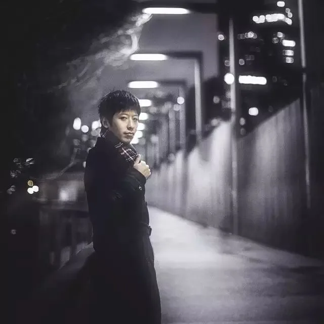
▲ Feng Tao (Terry F)
Getty Images (US) contributing photographer
Viewfind / Hua Gai Creative contributing photographer
Lofter master photographer
Weibo: @Terry-F
Lofter: terryfengphotography.lofter.com
Follow @Thomas Chu Photo,
and learn one photography skill every week.