Photography Tutorial · 2017-08-20
In Post-Processing, Technique Is Not the Most Important Thing
Techniques like focus stacking and luminosity masks often fail to turn a bad photo into a masterpiece — they merely turn it into a sharper bad photo.
Whether a photographic work succeeds in the end does not depend on how complex the techniques are, but on the form, content and impact the photo finally presents.
As photography enthusiasts, we easily fall into the quagmire of gear and technique, eager to ask which gear is better and which technique is more advanced. On photography forums, the most common comments are 'What gear was this shot with?' and 'Did you use technique X in post?'
What many fail to see is that gear and technique both serve the photo's form — its visual presentation.
Whether a photo looks good does not depend on whether we used curves, levels, soft-light layers or radial filters to dodge and burn. It depends on whether the areas that should stand out were brightened, whether the areas that should recede were darkened, and whether that dodging and burning made the photo more beautiful.
Of course, blindly pursuing grand, beautiful visuals leads into another trap of being flashy but hollow. Because a photo's visual impact must ultimately serve its content and emotion.
We apply composition rules, color schemes and visual guidance not just to make a photo pretty, but to highlight the subject, intensify the mood, and tell the story of the scene.
Technique serves form, and form serves content — never put the cart before the horse.
This year I was fortunate to help bring in two courses: landscape master Max Rive's 'Secrets Behind 500px Perfect-Score Photos', and portrait master Sean Archer's 'Russian Portrait Post-Processing Style'. Many students were amazed: the masters' techniques are so simple, even old-fashioned?
In Max Rive's course, many students were surprised that he pushes the dynamic range hard, works on a single layer, and prefers the clone stamp over brushes. But what is even more surprising is how he uses these seemingly 'outdated' techniques to finish a visual masterpiece perfectly.
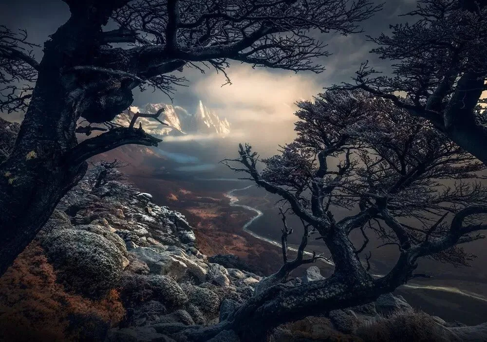
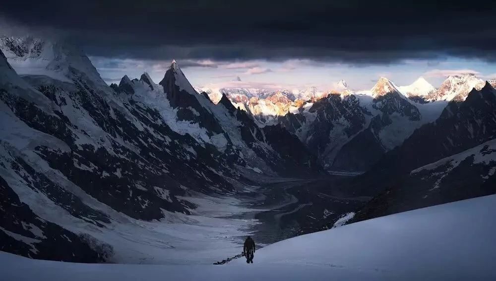
Photographer Max Rive
In his photos, the layers are distinct, the depth is striking, and the rendering of light balances the natural and the magical, presenting viewers with magnificent natural landscapes.
He also often highlights the relationship between people and nature, expressing the emotion of humans challenging themselves. His works, with their exquisite form and rich meaning, are widely quoted by companies and media.
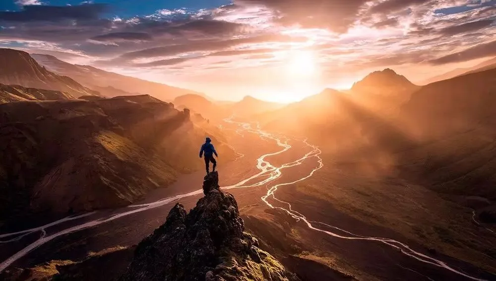
Photographer Max Rive
And Sean Archer's recent 'Russian Portrait Post-Processing Style' course likewise proves that form and content matter more than post-processing technique.
This photographer, with 140 million views on 500px, not only takes an unconventional approach in-camera, insisting on natural light,
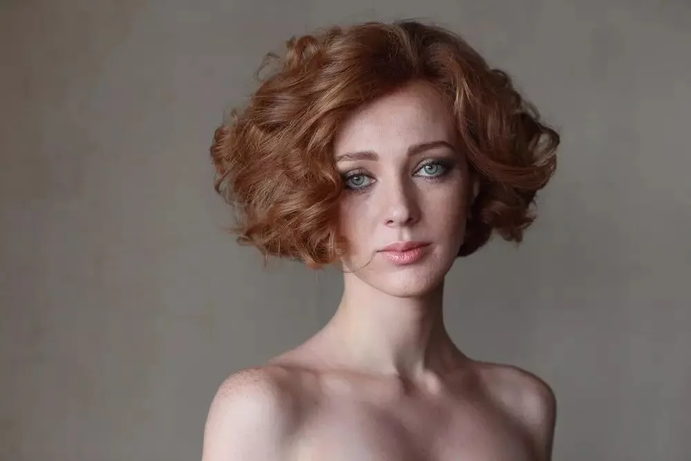
Photographer Sean Archer
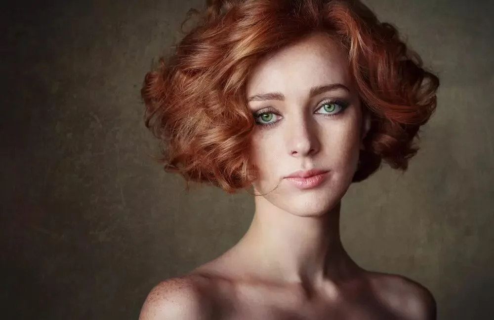
but his post-processing is also very simple — no dual curves, no frequency separation, no fancy masks, only simple tools and filters that even beginners can master.
His color grading is quite 'blunt' too — he simply applies a few filters. It is not what people imagine, that masters hone their grading with curves and such.
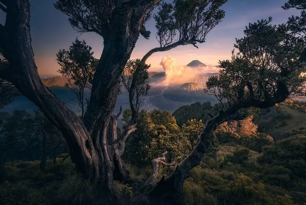
Recently, while post-processing my photo 'Jurassic Park', I also found that almost every operation could be done in Camera Raw alone, without even entering Photoshop.
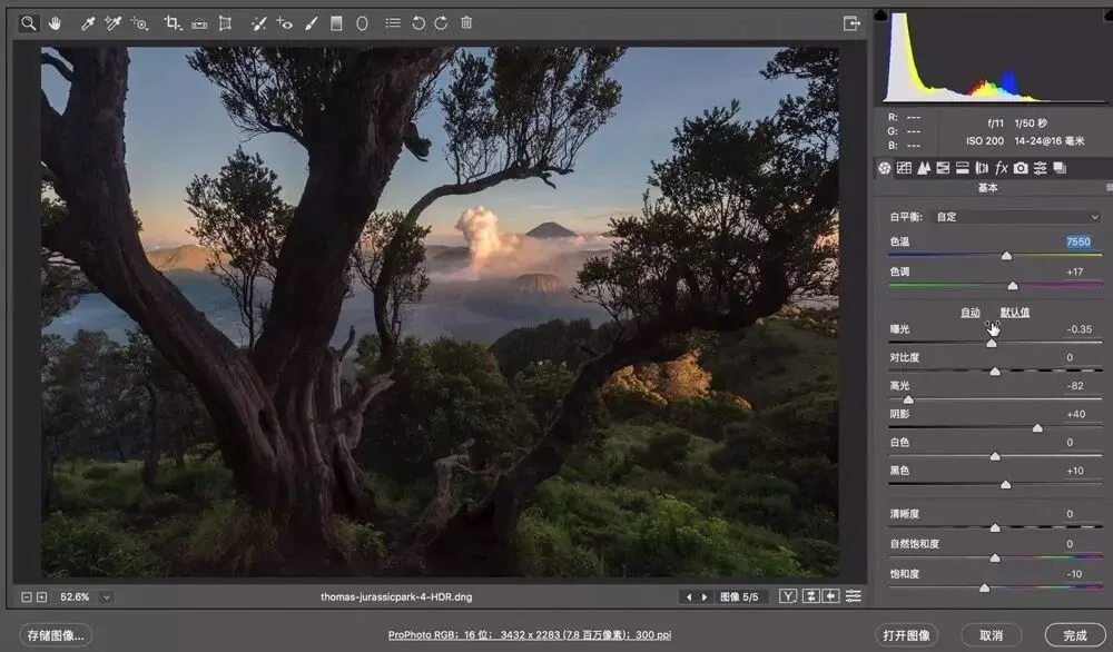
The key is to think for yourself: which areas do I want to emphasize and render the mood, and which things are too eye-catching in the raw file and need toning down.
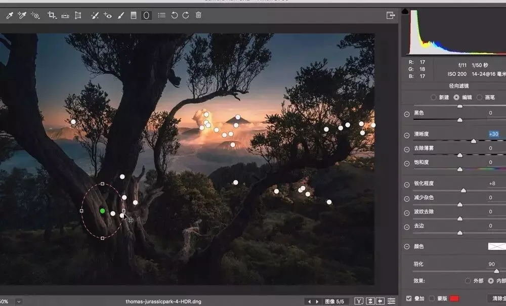
As long as the basic technique is in place, the decisive factors for a landscape photo are the uniqueness of its content and the impact of its form.
Recently, while processing 'Frozen Wonderland', I also made a new attempt: deliberate overexposure in post. Where the raw file had clearly recorded detail, I intentionally blew those areas out to pure white, to render and emphasize the brilliant light.
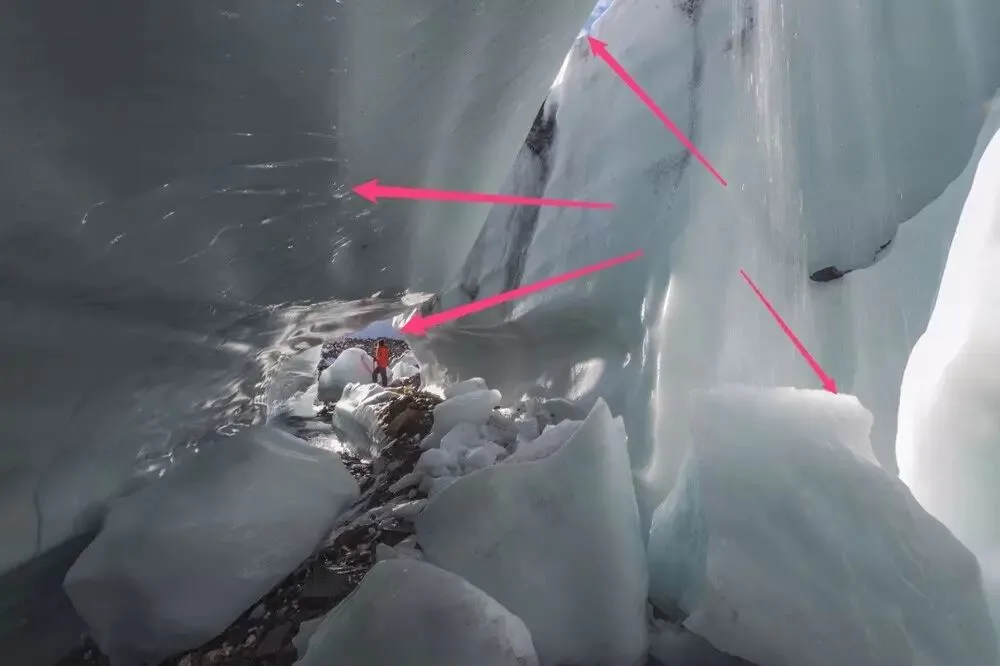
I used to believe that the more detail a photo has, the better, and that any slight over- or underexposure meant failure.
But now I have gradually come to understand that detail which fails to enhance beauty or express content is detail that should be removed. Where a photo should be overexposed, underexposed or blurred, making it perfectly clear is actually worse.
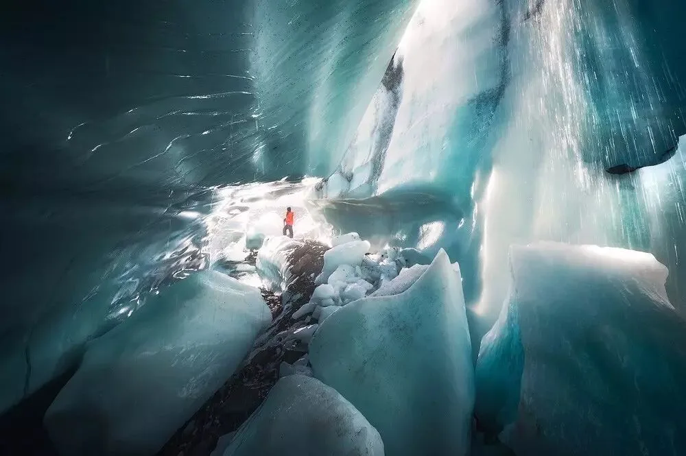
After all, content determines form, and form determines technique.
While learning various post-processing techniques and building a solid foundation, we need to observe and think more, constantly improving our aesthetic sense and enriching the form, content and meaning of our work.