Photography Tutorial · 2023-11-19
From Tourist Snap to Art Photo: Post-Processing Ideas for the Potala Palace
Photography can become art because the capture embodies the photographer's observation, and the color grading blends in the photographer's thinking.
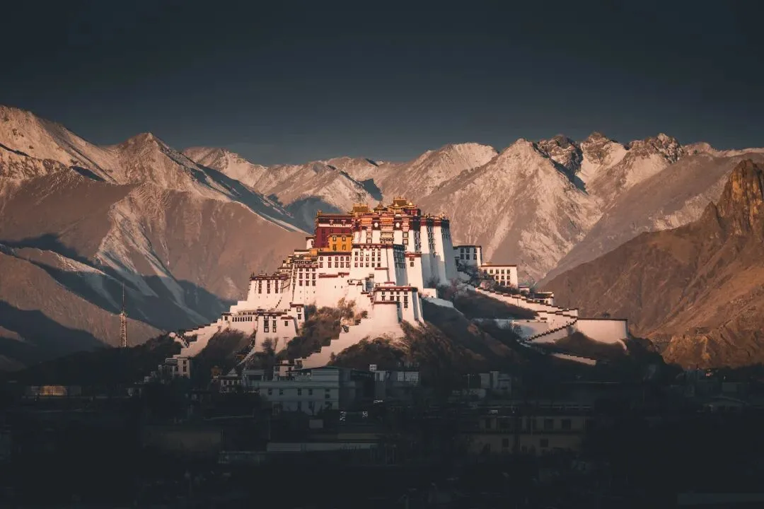
In today's tutorial, Thomas uses a photo of the Potala Palace as an example, sharing how it was processed to feel more solemn and sublime.
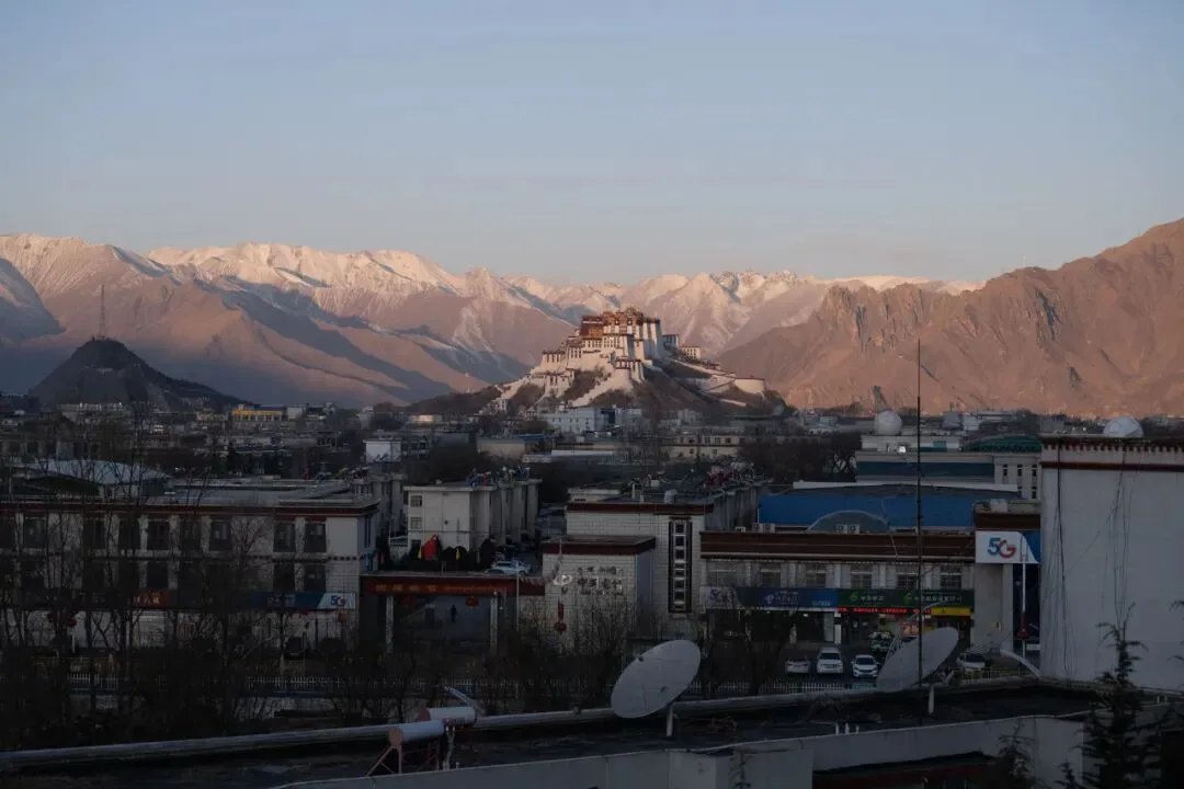
From tourist snapshot to 'work of art' — these post-processing ideas and techniques will surely be useful to you!
Video
▶ Watch the video tutorial on Bilibili
This is the fully illustrated companion to the video above. How does a tourist snapshot become a work of art? Using his own photo of the Potala Palace — taken from Najin Road in Lhasa, Tibet — Thomas walks through the whole journey: choosing the vantage point and the light, cropping and building the tonal skeleton in ACR, then local masks and fine finishing in Photoshop. The single goal throughout: make the palace feel more solemn and sublime. Everything below follows the video in order, with parameter panels and mask states captured as screenshots.
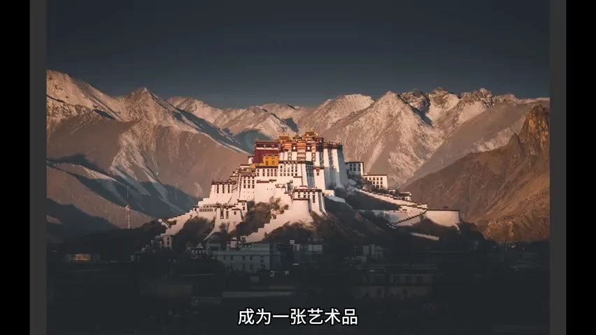
Start with the finished image: the palace kissed by top light, snowy peaks sacred behind it, the ground calm and quiet (at 10:30 in the video). The untouched original, by contrast, is still a tourist snapshot — cluttered buildings, a sky that steals the show. Everything between the two is what this tutorial covers.
01 On Location: Waiting and Selecting at Najin Road
Before even arriving in Lhasa, Thomas already wanted a deeply solemn photo of the Potala Palace. The city is ringed by mountains, so all he needed was a vantage point with a peak right behind the palace — and in winter those peaks carry snow, their solemnity echoing the building (at 0:31 in the video). He settled on the spot along Najin Road.
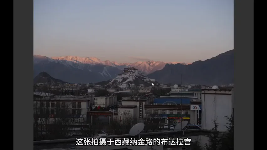
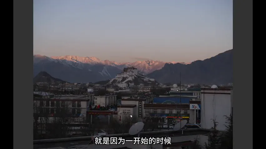
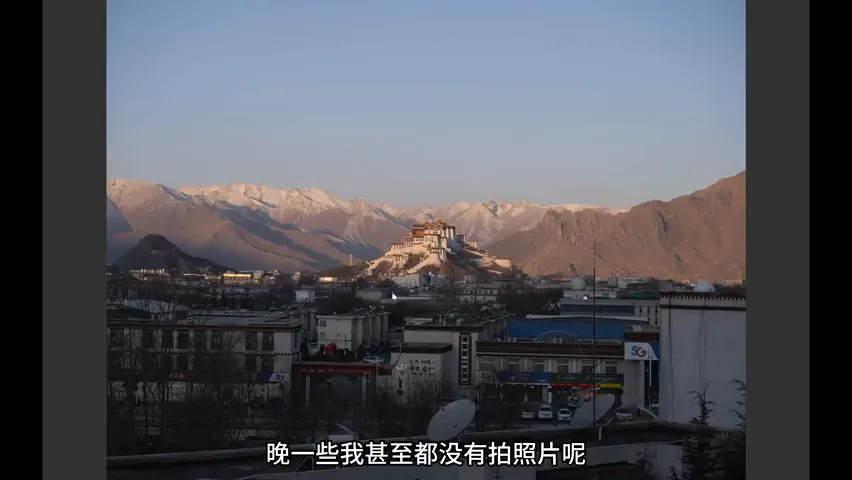
He shot a whole series through sunrise, and the selection criterion came from a gap in the light's timing: at first only the snowy peaks behind were lit while the palace's golden roofs stayed dark, leaving the subject weak; but once the palace caught the light, the buildings below lit up too — cluttered blocks that look unnatural if you darken them afterwards (at 0:57 in the video). So the chosen frame is the exact moment when the palace has just caught the light and the messy houses are still sunk in shadow (at 1:12 in the video).
02 Crop and Tonal Skeleton: Subtract First
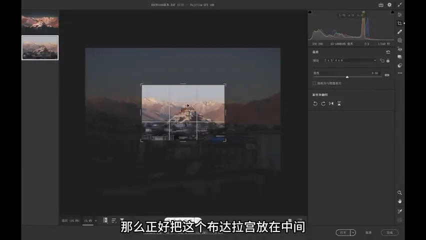
The photo was shot on medium format — slightly better image quality than full frame, with the drawback of a limited focal range: even at its longest 100mm the framing fell short, so a crop was unavoidable (at 1:44 in the video). Thomas crops almost everything to a 3:2 ratio; here he trimmed the cluttered rooftops in the foreground while keeping a strip of ground, placing the palace center-upper with sky and ground roughly on thirds (at 2:19 in the video).
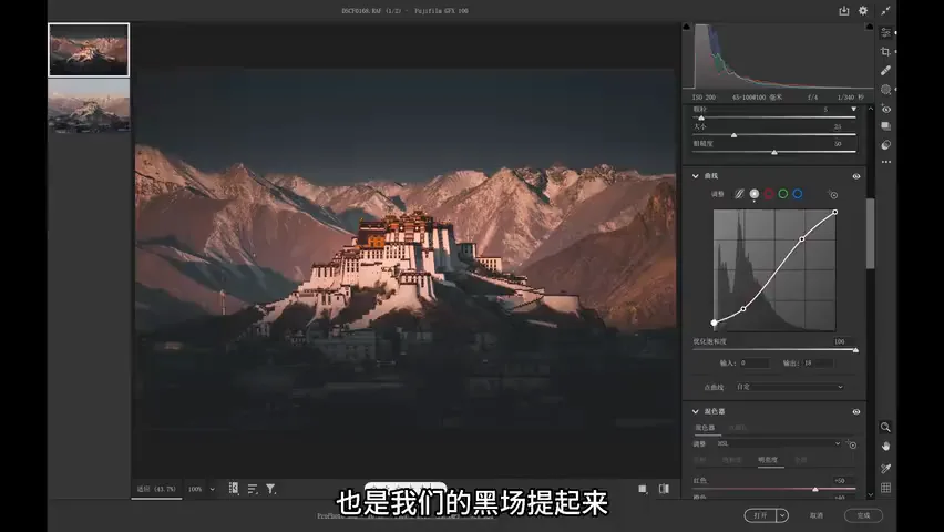
In Camera Raw the tonal work centers on Curves: first an S-curve for overall punch, then the black point at the far left is lifted — with it, shadow contrast drops and shadow detail melts together, so the cluttered buildings at the bottom "dissolve" into the dark and stop competing for attention (at 2:48 in the video). The lost shadow detail is deliberate: sacrifice what the eye cannot read anyway, and buy a clean frame with it.
03 Color Direction: The Logic of Solemnity
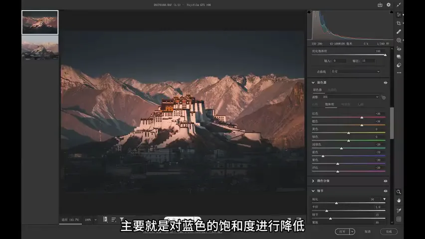
A sacred, solemn mood needs a dark, desaturated, grounded base; a bright, saturated photo reads as flighty. But the subject must stay bright and saturated to stand out and glow (at 3:27 in the video). In HSL terms: pull blue saturation down hard — or the sky steals the show — and raise the luminosity and saturation of the warm tones (at 3:14 in the video). Cool colors retreat, warm colors advance.
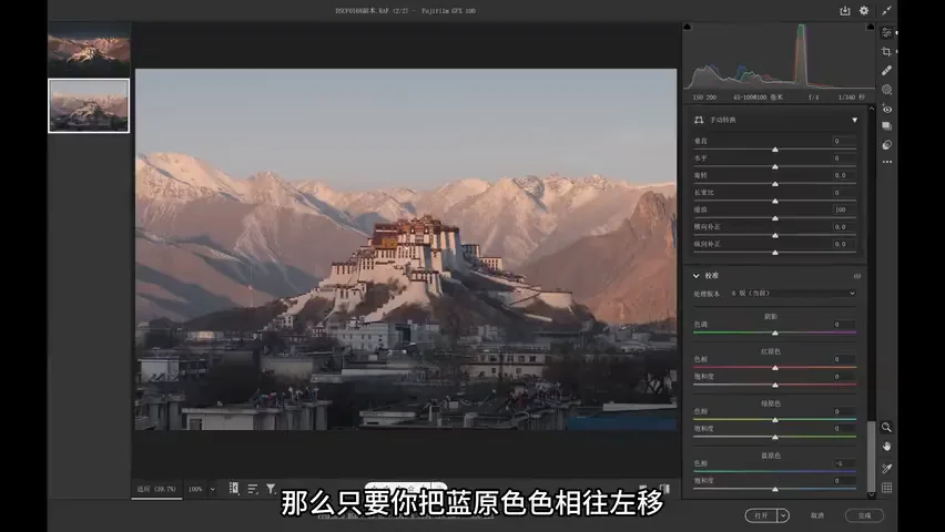
Below that sits the classic Calibration panel move: shift the blue primary's hue left and the red primary's hue right, and most colors in the frame unify into two families — teal and orange — which simply looks good (at 4:10 in the video). Done in ACR the warm cast leaned a bit too red, so Thomas saved the fix for Photoshop. With teal-orange as the base plus the cool-warm contrast in brightness and saturation, the color framework of solemnity is in place.
04 Local Masks: Layering Sky and Ground
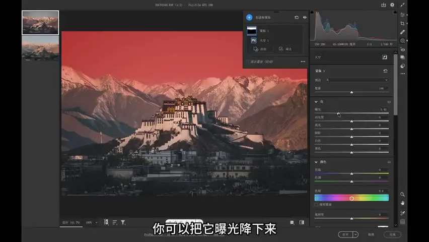
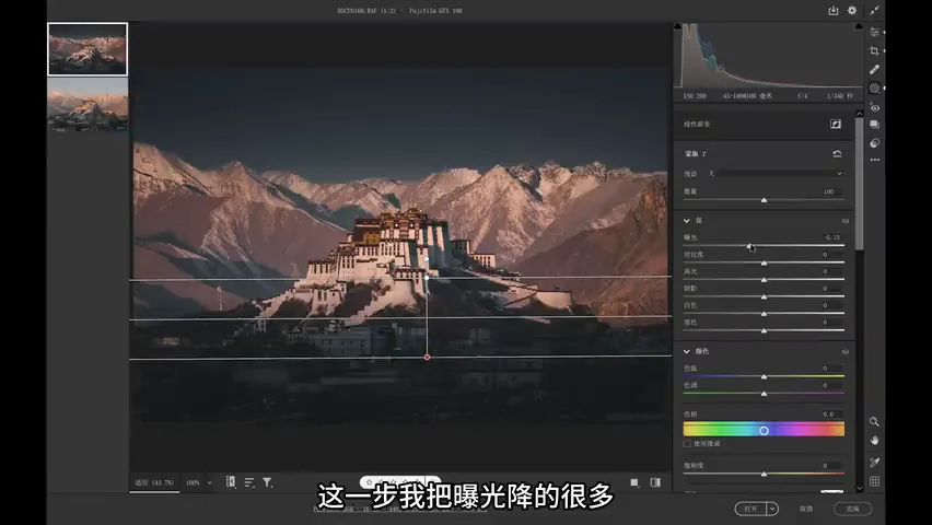
Then come the local masks (at 4:45 in the video). Step one, darken the sky: create a mask over it and pull the exposure down — a sky brighter than the palace would dominate the frame. The sky also carries a fair amount of warm yellow, so cool tones are brushed in; if that gets too saturated, dial saturation back, but the core move is always the exposure drop (at 5:17 in the video).
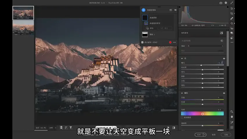
Next, a few linear gradients keep the darkened sky from becoming a flat slab, preserving natural transitions; Thomas works by "many strokes, small amounts" until the sky sits right (at 5:47 in the video). Then the ground: exposure down again, and lowering exposure and highlights alone is not enough — this pass drops exposure hard, which risks a bottom that is black and detail-free, implausible under sunlight. So he softens the contrast slightly, raises the blacks, lowers the highlights — shadows that can be faintly read, yet never jarring (at 6:26 in the video).
05 In Photoshop: Separating the Subject, Lighting the Roofs
In Photoshop, Color Balance first cools the midtones and warms the highlights (at 7:27 in the video). Then the most laborious step: patiently cutting the palace out from its background and darkening that background — a bright subject over a dark ground completes the separation (at 7:35 in the video). The darkening uses Hue/Saturation with minus Lightness, which lowers saturation at the same time: the background drops in both brightness and color while the palace stays vivid, sharpening the hierarchy (at 8:07 in the video). One more midtone-lifting Curves layer keeps the whole frame from going too dark (at 8:31 in the video).
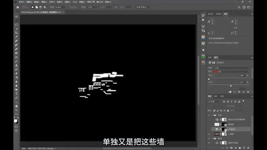
The color finish addresses that "too red" cast from chapter 03: nudge the white balance, shift red toward orange in HSL, then isolate the red walls and push their red with Selective Color until they glow golden and resplendent (at 8:50 in the video); brighten the snowy peaks and mute the yellow inside the snow for a more comfortable frame (at 9:11 in the video); finally the overall reds and yellows still feel too saturated, so a global trim finishes the edit (at 9:18 in the video).
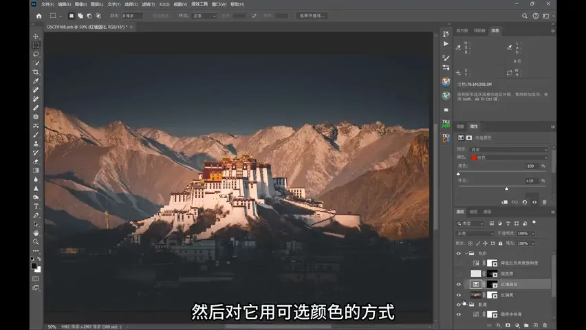
Look back at the final image: the light was planned on location — "which parts should be lit" — and post-processing tidied the clutter that the real world always contains, darkening the base and unifying the color. The sense of the sacred comes from desaturated, dim cool tones set against saturated, luminous warm ones; the resplendent walls get their own treatment, and the image gains layers instead of everything blending into a mess. That is what post-processing is for — on top of reality, fold in the atmosphere and emotion you intend, until the photograph becomes a work of art (at 10:26 in the video).
1. Great photos start on location: find a vantage point with snowy peaks behind, and trip the shutter at the moment the palace has just caught the light while the cluttered houses still sleep in shadow; 2. Subtract first in tone: a 3:2 crop, an S-curve for punch, and a lifted black point that melts messy shadow detail into darkness; 3. The color logic of solemnity: a dark, desaturated base (deep cuts to blue saturation, teal-orange via Calibration) with a bright, saturated subject (warms lifted in brightness and saturation) and red walls lit individually with Selective Color; 4. Local masks in small doses: darken sky and ground, keep transitions with linear gradients, then cut the subject in Photoshop and dim the background until the hierarchy reads.