Photography Tutorial · 2023-09-03
The Hidden Color Gem in PS! The Primaries Tool Explained in Depth
The primaries tool in Photoshop's Calibration panel is one of the fundamental techniques behind many popular color gradings.
In previous tutorials, Thomas shared quite a few related cases and explanations.
Today's half-hour video is excerpted from an open class of my 2023 course 'Color Lessons for Photography Lovers', with many teaching summaries refined — it should give you a deeper, more intuitive understanding of this grading gem!
Video
▶ Watch the video tutorial on Bilibili
This is the fully illustrated companion to the video above — an open class from Chapter 3 of Thomas's course "Color Lessons for Photography Lovers", on the primaries tool inside the Lightroom and Camera Raw Calibration panel. Using a test color wheel and three practice photos, he works through the shift rules of all six hue and saturation sliders, then demos four popular looks live: night teal-orange, black-gold, candy tones and a cartoon street. Everything below follows the class in order, with every wheel deformation and parameter panel captured as screenshots.

01 Meet the Primaries Tool
First, know where it lives: in Camera Raw, scroll all the way down to the Calibration panel — three primaries, Red, Green and Blue, each with a Hue and a Saturation slider (at 0:27 in the video). It was born as a repair tool for camera sensor color casts, but now that white balance is so accurate, photographers mostly use it for something else entirely: unifying color and sculpting a look.
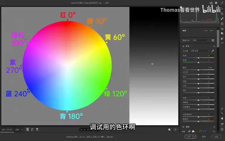
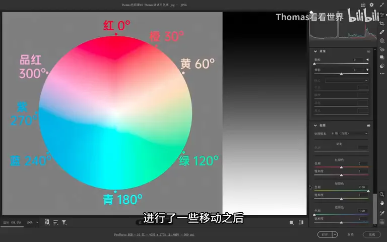
The class uses a test color wheel as a microscope (at 0:18 in the video). Nudge any primary slider and the full wheel — red, orange, yellow, green, cyan, blue, purple, magenta — instantly collapses into two or three colors: blue-primary left plus red-primary right, for instance, leaves nothing but teal and orange, the classic teal-and-orange grade (at 1:15 in the video). One or two sliders to unify every color in a photo — that is the raw power of this tool.
02 Hue Sliders: One Move, Everything Shifts
Shift the blue primary's hue left and everything around blue — purple, cyan — slides toward cyan-blue while magenta saturation collapses; on the opposite side green all but vanishes, replaced by yellow-orange (at 2:49 in the video). The whole wheel is twisted into the complementary pair cyan-blue versus yellow-orange. Move it right and you get another pair — cools toward purple-magenta, the far side toward green — though red survives as orange and cyan only fades through desaturation, so the unification is less thorough (at 3:45 in the video).
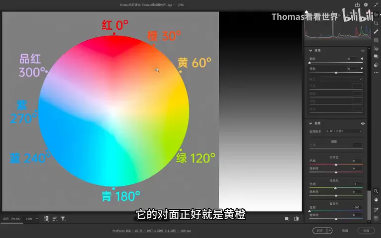
The memory trick is delightfully simple: look at what color sits beside the direction you move (at 4:44 in the video). Blue's left neighbor is cyan — moving left pulls the photo cyan-blue with a yellow-orange complement; right neighbor purple — moving right pulls purple against yellow-green. Green's neighbors are yellow-green (left) and cyan (right); red's are magenta (left) and orange (right). Want a green-versus-magenta scheme? Green left, red left, blue right — three sliders twist the wheel into that complement pair (at 7:26 in the video), though such combos see little real-world use.
03 Saturation Sliders: The Gentle Way to Boost Color
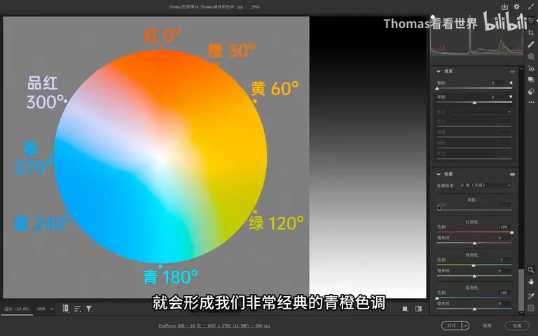
In the field, ninety percent of the work is the teal-orange formula: move blue first — left — to pull out the cyan (at 6:23 in the video); red first instead gets you yellow-orange against blue, missing that classic cool cyan (at 8:44 in the video). With blue set, nudge red a little further right and the teal-orange grade locks in — no need to max red; leaving some color variety often ages better (at 8:17 in the video).
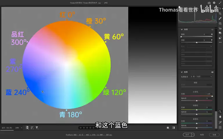
The saturation sliders are the other treasure. Raise the blue primary's saturation and blue plus its neighbors — magenta, purple, cyan — deepen dramatically, while the warm red-orange-yellow side barely changes, transitioning with total naturalness (at 9:23 in the video). Skin is red-orange-yellow and foliage runs orange to green, so to give skin and plants a healthy glow, the blue primary beats the plain Saturation slider hands down: the latter carves ugly cliffs through the low-saturation warm zone, and even Vibrance cliffs when overpushed (at 10:28 in the video). The side effect — oversaturated cools — is fixed in HSL by pulling blue, cyan and purple back down; that is why so many landscape photographers simply slam blue primary saturation to 100 (at 11:29 in the video).
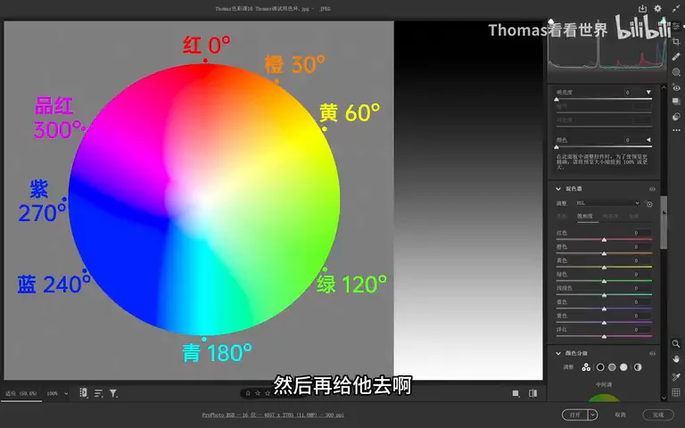
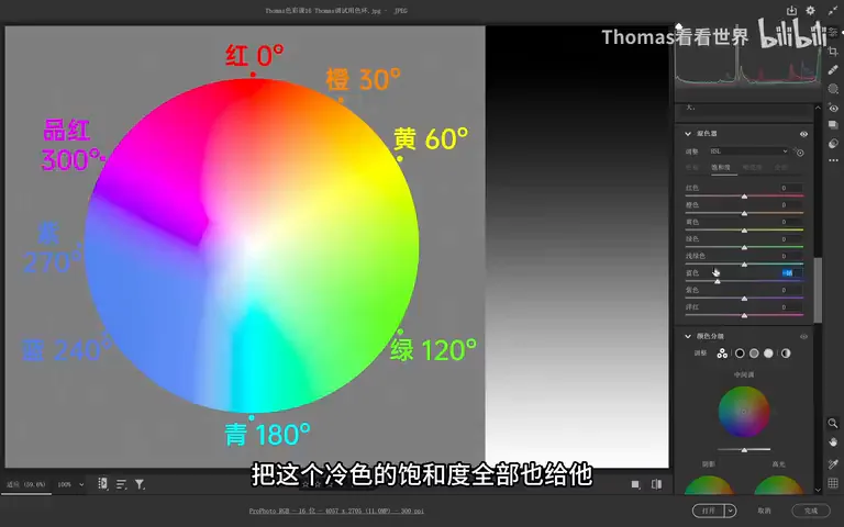
The green primary's saturation works the same way — raising or lowering it mostly touches green and its neighbors yellow and cyan, perfect for unifying vegetation in one move (at 12:13 in the video); red's saturation governs red and its surroundings. Two sentences sum it all up: hue sliders drag the whole photo toward "that side's color plus its complement"; saturation sliders act strongly on their own primary and neighbors, barely and naturally on the far side (at 13:16 in the video).
04 Live Demo One: Night Teal-Orange and Black-Gold
The first practice photo is the internet-famous night teal-orange. Base first: composition and brightness must be in place before color — raise exposure, trim the highlights, let the photo breathe (at 14:11 in the video). Then the blue primary hue goes left (not too far) and a cyan-versus-red-orange contrast appears at once; with red still lingering, keep moving red right until every warm tone is orange and every cool tone is cyan (at 14:46 in the video).
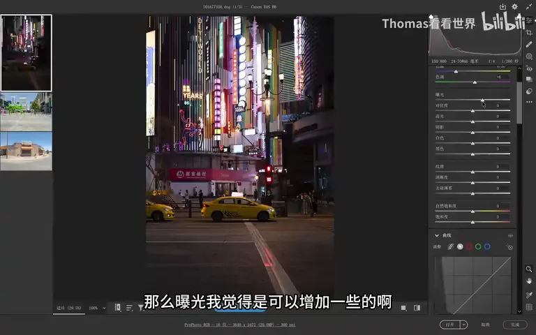
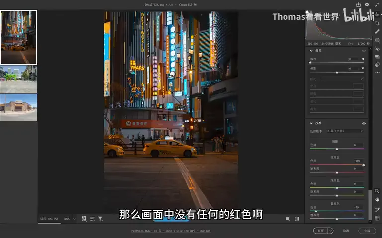
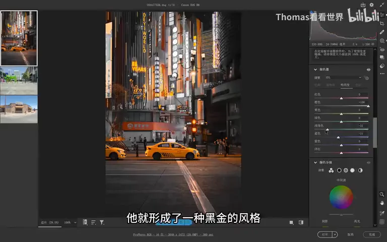
Thomas's taste is restraint: blue left, red just a touch, keeping some green and red neon so the night scene glitters in many colors instead of one flat wash (at 15:47 in the video). To tint the black shadows, shift color temperature slightly left so shadows catch a cyan-blue cast — though raw it often looks bad, so handle with care (at 15:27 in the video). Then HSL polish: lift the brightness of oranges and cyan-blues, add a little saturation to red, orange, yellow, cyan and blue; or use the earlier trick — blue primary saturation way up, then bring blue back down in HSL (at 16:17 in the video). Any patch that turned too purple-magenta gets its hue bent back toward red and orange.
Want it purer? Keep blue left and push red further right until only cyan and orange remain; then fine-tune hues to taste — cyan can lean cyan or violet-blue, yellow merges into orange (at 18:04 in the video). Black-gold is simply teal-orange extended: from that base, drag blue and cyan saturation straight to the bottom and ease luminance down, and nothing survives but gold and gray-black — pushed too hard it turns fake, so in real life keep a whisper of faint color (at 19:32 in the video). That is how the skeletons of popular looks are pulled out of the primaries plus HSL.
05 Live Demo Two: Candy Tones and a Cartoon Street
The second practice photo is a riot of color — greens, deep blues, light blues, yellows (at 20:15 in the video). One move of the blue primary hue left and it snaps into a candy grade — warms drifting toward yellow and red, sky toward cyan; red slides right a bit for deeper unification, though the rule stands: never flatten every variation away (at 20:32 in the video). The heart of candy color is high luminance, not high saturation (at 21:29 in the video): raise exposure, lift blacks and shadows, brighten midtones with a curve, and the candy feel arrives instantly; its palette of cyan against orange-pink falls right out of the blue and red primaries. Green too yellowish? Nudge green right to refresh it; blue too rich? Trim blue saturation; adjust per-color brightness and a hint of macaron appears once the cyan-blues lift (at 21:50 in the video).
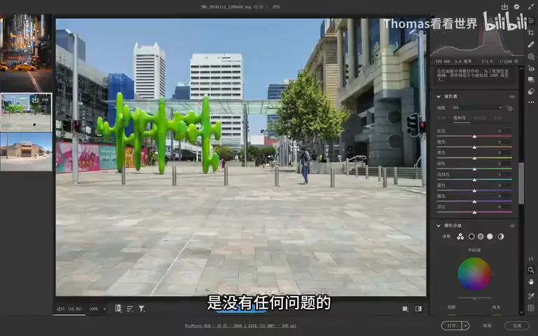
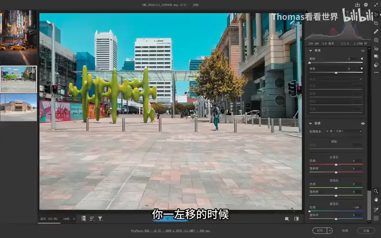
The third photo, a street scene, starts with subtraction: fix the geometry so lines run true, crop out the messy utility poles, keep one street, two people, a little more sky (at 23:17 in the video). Then blue left, red right to push the wall's pink toward yellow; raise saturation, then bring blue back down; lift the whole curve, raise blacks and shadows, raise contrast, tame highlights — and a macaron grade emerges (at 24:20 in the video). Finally the fork of personal taste: darken the sky for the surreal, or keep a natural cartoon feel? Lift orange brightness a touch — raising brightness in HSL trims saturation slightly — and another photo is done (at 24:51 in the video).
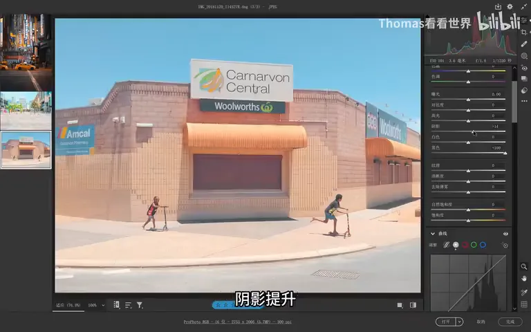
The class closes with a universal workflow: color temperature and tone set the base mood → HSL handles basic saturation control → the primaries unify hues into complement pairs → HSL refines locally (at 25:26 in the video). Learn the rules on the color wheel first, then practice on the class photos or your own images. One caveat: primaries grading suits teal-orange, cinematic looks and man-made city scenes; much natural landscape does not want it — not every photo needs the primaries treatment (at 25:50 in the video). The next lesson covers Selective Color, another gem worth learning.
1. The hue memory trick: move a slider and the whole photo shifts toward "that side's color plus its complement" — blue left gives cyan against yellow-orange, blue right purple against yellow-green, red right orange against blue; 2. Saturation sliders act mainly on their own primary and neighbors — blue-primary saturation is the secret to naturally boosting skin and foliage, with HSL trimming any oversaturated cools; 3. The teal-orange formula: lead with blue-primary left to mint the cyan, then red a little further right — no need to max it; 4. The universal workflow: temperature sets the base, HSL controls saturation, primaries unify hues, HSL refines locally — night teal-orange, black-gold, candy and macaron all grow from it.