Photography Tutorial · 2022-03-06
What Got Edited in 4 Hours? Layer-by-Layer PSD Analysis of a Landscape Masterpiece
Thomas Chu Photo
Few photographers share their working PSD files, because they contain the core post-processing steps honed over many years — and the before/after of each step reveals the photographer's complete grading logic.
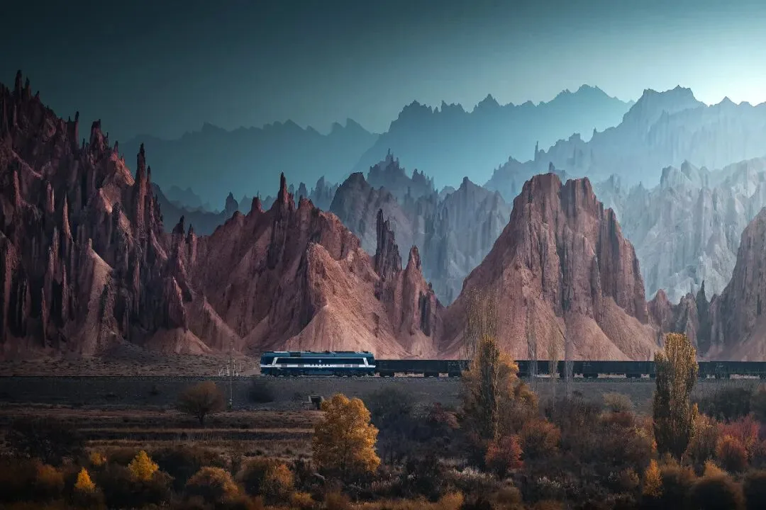
In today's tutorial, Thomas shows the full-layer PSD file of the photo above, sharing the thinking and ideas behind every step.
Video Tutorial
▶ Watch the video tutorial on Bilibili
This is the fully illustrated companion to the video above. Thomas opens the full-layer PSD of his photo of the Ku'e Railway beneath the red rock forest and replays, step by step, what four hours of editing actually did: from capture settings, cropping and warping to color separation, darkening passes and depth rendering, down to brightening the train and the keep-or-remove debate over one utility pole. The notes below follow the video's order, with screenshots of nearly every stage — ideal to read alongside your own PSD.
Start with the overview. The video opens (at 0:37) with raw and final side by side: a hazy record shot versus a layered, warm-cool landscape — and everything in between is what the rest of this article unpacks.
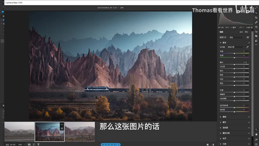
01 Capture: Leaving Room for the Edit
Why edit this heavily? Thomas's standing answer: capture is composing, post is performing — only after artistic processing does the work gain reach and expressiveness. The photo was shot on a Sony A7R IV; since the subject was a moving train, shutter came first. Even in Aperture priority, he worked ISO and aperture until exposure sat around 1/640 s so the train would stay sharp (at 0:37 in the video).
F7.1 was chosen because the telephoto view stacks many layers of depth; to keep everything front to back sharp the aperture could not go wider, with ISO accordingly around 250. With time pressing, the final composition was still undecided — the triangular peaks on the right, the mass of trees below, the stream in front all had appeal — so he leaned on the body's 60-plus megapixels, shot first, and left the final crop to deliberate later at the desk (at 1:10 in the video).
02 Crop and Warp: Building the Frame's Skeleton
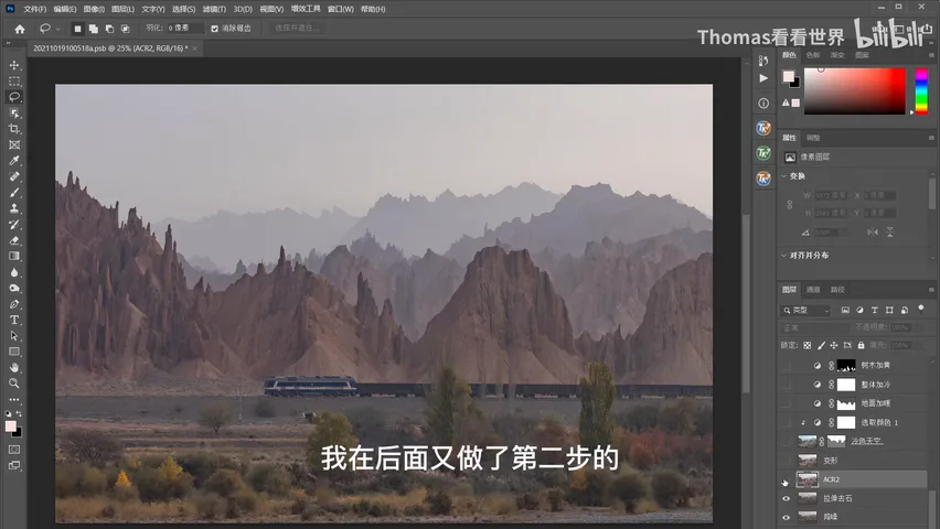
Post begins with a crop in Camera Raw: rich as the original is, too much of it is dead space like sky, so the sky above, the rocks below and both sides come off, leaving the core — autumn forest and railbed, the distant train, and far beyond it the layered red rock forest (at 1:42 in the video).
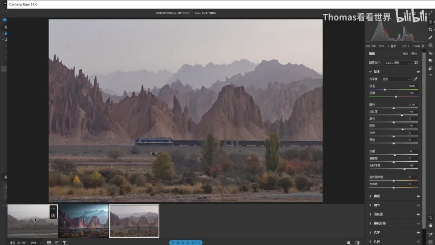
The Camera Raw adjustments stay basic: contrast and dehaze definitely go up, shadows lift, turning the hazy capture into a clear one; the curve lifts shadows and HSL gets a light touch (at 2:14 in the video). Once in Photoshop, the first step is noise reduction — Thomas's habit is to denoise first on entering PS and sharpen last, right before output.
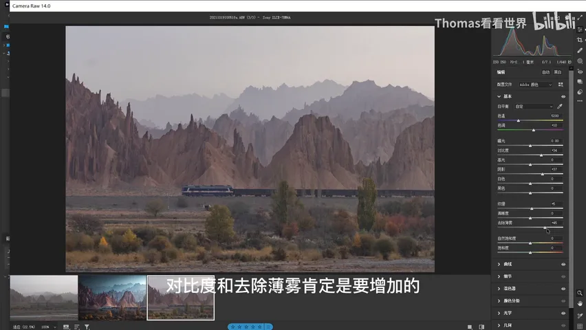
Next comes a warp aimed mainly at removing the boulder at the bottom of the frame. A second Camera Raw pass follows, adding clarity and pushing colors further with HSL and Split Toning (at 2:56 in the video). Then a second warp: the sky still holds too much empty space, so its area is compressed while the peaks are made a touch more precipitous — and any such stretching must stop at moderation.
03 Color Separation: Depth Through Warm and Cool
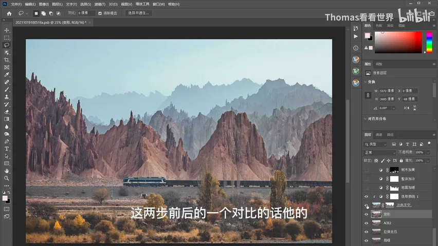
Then comes a pivotal step: color separation. The original already has rich layers, and the edit pushes them further — between the autumn train and the rock forest behind. Layers can be separated through brightness, color, clarity and more; here the sky is cooled, so the cool rear half recedes against the warm front, and the before/after of these two steps shows an entirely new sense of depth (at 4:07 in the video).
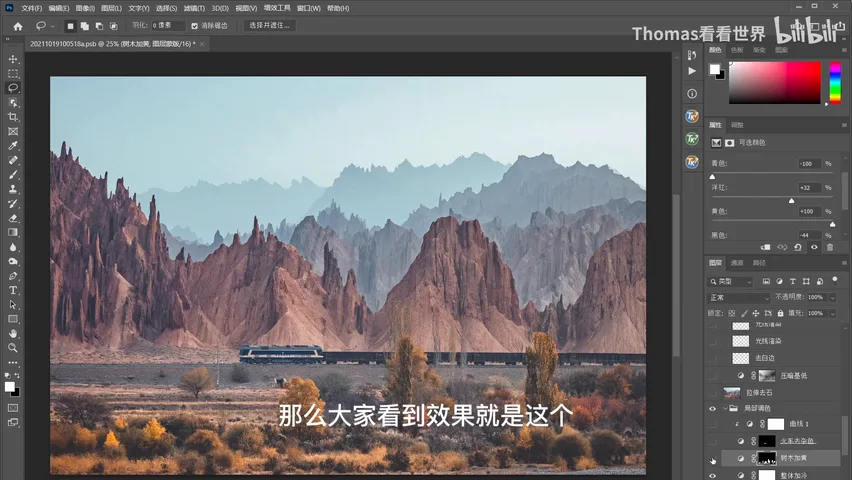
Color Balance comes next: lots of yellow and red into the ground highlights, especially on sunlit foliage, to strengthen the warm rendering, with some cool added into the midtones so nothing clashes. A final overall cool layer unifies the register — the top and bottom must not read as two different photos; the frame keeps a warm-within-cool base even as warm and cool oppose each other (at 4:36 in the video).
Then Selective Color: pick yellows, reduce cyan (equivalent to adding red), plus a little magenta and yellow. The foliage, still yellow-green, turns a deep saturated orange — more autumnal, and closer to the orange of the rocks, tightening the image's unity. A photo needs variation, but too much turns to chaos, so it also needs unification — a balance only long-trained taste can strike (at 5:10 in the video).
04 Darkening Passes: Light and Shadow
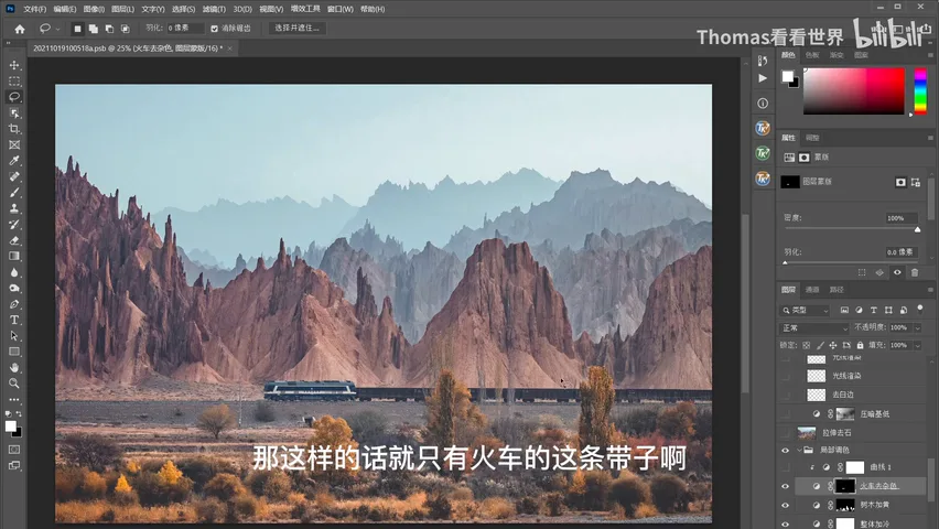
Small details can do outsized work: the white band of the train needed purifying. A Hue/Saturation layer raises the luminance of yellows — brighter yet less saturated — with a mask confining the effect to the train, so the white strip turns cleaner and brighter; a Curve then lifts the locomotive itself, making the train pop (at 6:15 in the video). As for the boulder originally kept for texture, the verdict was removal: what it added in detail was less than what it added in clutter.
The next key move is a darkening pass. The color story is done; now the tone story. A Brightness/Contrast layer darkens the whole frame, then masks — luminosity masks plus brushwork — restore what should glow: the highlights on the rocks, the right side of the frame, the sunlit patches of forest. Contrast and layering in light emerge from this push-pull (at 7:25 in the video).
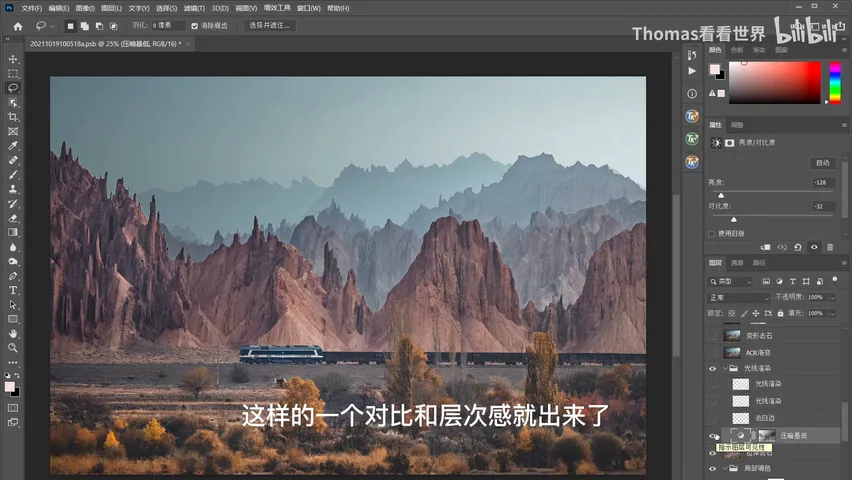
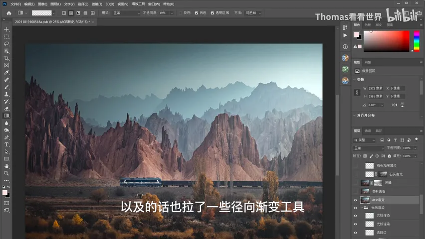
Light rendering follows: new blank layers set to Soft Light or Normal — Normal gives a hazier glow, Soft Light a stronger luminance push. The earlier clarity pass left ugly halos along the rock-sky boundary, which get cleaned up too (at 7:42 in the video). Then Linear and Radial Gradients in Camera Raw lift the light from the right while the edges darken in step, so the light reads as streaming in from the right — a true sidelight. In the field only a wide view shows light falling off like that, so a telephoto frame needs the reinforcement; one more global darkening with brush recovery follows, since doing it in a single pass tends to leave harsh transitions.
05 Depth and Details: The Final Polish
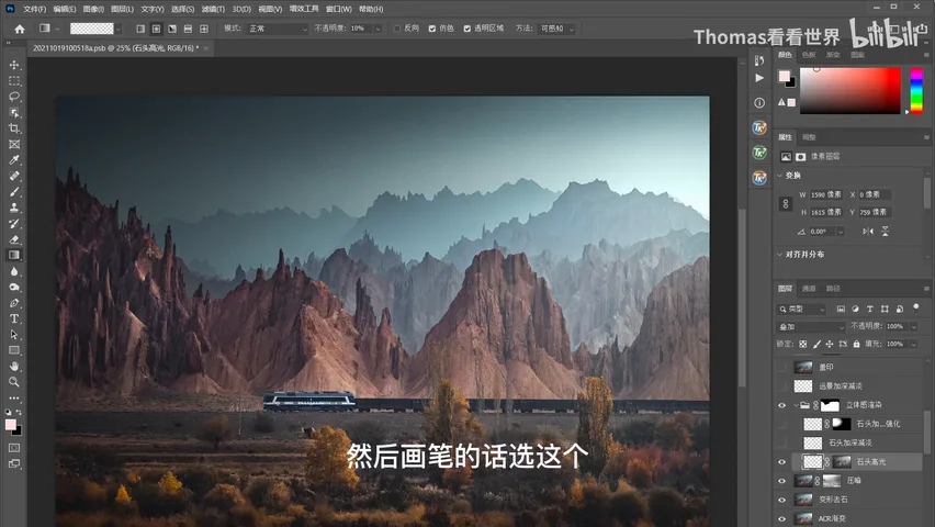
Depth rendering is the other core. First the sky is selected so the painting never touches it; a luminosity mask isolates the rock highlights, an overlay-blend layer is created, and a bright yellow brush paints where light should sit — without that mask the strokes would bleed into shadow and look unnatural (at 9:15 in the video). A freehand brush refines further, white to lift and black to darken; the layer is duplicated to concentrate extra depth rendering on the sharpest, most important peaks. The distant ridges get dodge and burn as well, strengthening their black-white texture; where two ridges sit too close in tone, the layering technique — darken below, brighten above — pulls them apart.
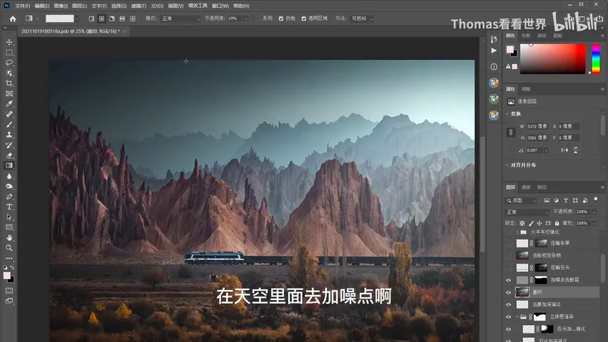
The main body is done; what remains is detail. Stamp a new layer first, then add noise into the sky to break up banding (at 10:51 in the video). The smooth, reflective bright rocks along the railbed — pockmarks that steal attention without meaning anything — get blacked down through a luminosity mask; the brightest weeds are darkened the same way; the train's headlight is strengthened so the locomotive stands out; and the withered branches that never turned yellow are painted with warm color in Soft Light mode so they stop clashing and the light feels coherent.
One final crop trims the excess at the bottom and a peak on the right, so enlarging the frame makes the train and the far mountains hit harder; a touch of overall blue then sharpens the magical mood (at 12:15 in the video).
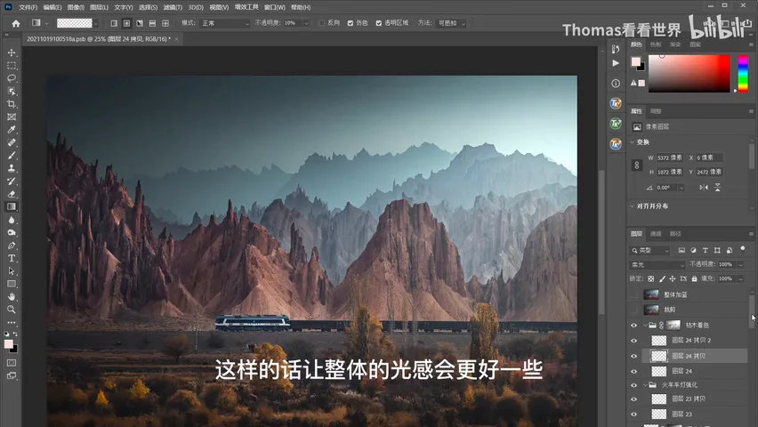
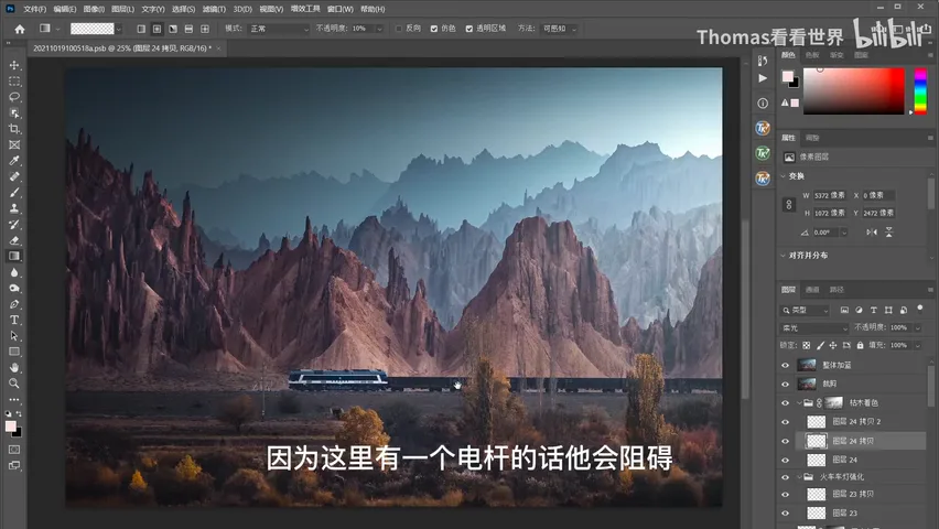
One last judgment call people keep asking about: why keep the utility pole? Purely aesthetically it should go — it blocks the eye's path, as if something stood in the train's way. But this photo is precisely about a grand Chinese landscape where, beyond the spectacular rock forest, human infrastructure — the railway, the guardrails — persists in a harsh natural environment. Content-Aware Fill would erase the pole in seconds; from the standpoint of content and information, Thomas chose to keep it (at 13:17 in the video). The final criterion in editing is always what you want to say.
1. Capture composes, post performs: shutter first to freeze the train, aperture for depth, and generous pixels to leave room for the crop; 2. Build the skeleton before color: crop away dead space, warp in moderation, and keep Camera Raw adjustments basic; 3. Layering comes from both color and tone — cool the sky, warm the foreground, unify the register, then darken globally and restore with masks; 4. Render depth block by block with luminosity masks and brushes, and let the message decide the last call — the utility pole stays or goes depending on what you want to say.